Article by Irmak Bilir – Square des Frères-Charon, by Affleck + de la Riva Architects, in Montreal, Canada. Small beautiful public spaces can be the signature of the cities to which they belong. Square des Frères-Charon is this kind of public space in Montreal, Canada, designed by Affleck + de la Riva Architects. It has become an essential component of McGill Street’s larger network of historic spaces and a key element in Montreal’s cultural tourism branding strategy. It provides identity, civic pride, and generous outdoor areas for all-season public use. In the year 2009, when the project was constructed, it won three design awards. There are various components which make the square fascinating but some reasons are at the forefront like respecting its history, cooperation, and participation.
Square des Frères-Charon
Commemorating the Old
Before the 17th century, the area where Square des Frères-Charon is located was a marshy meadow located outside the walls of Old Montreal. Then, a windmill had been installed on the site, by the Charon brothers, who were the owners of the land. Later, the area was used for the storage of construction materials and for car parking. Now, in the 21st century, historical remembrance is still alive there because the Square des Frères-Charon project respects the history of the area and seeks inspiration from it.

Square Des Frères-charon. Photographer: Marc Cramer
Remembering the Windmill
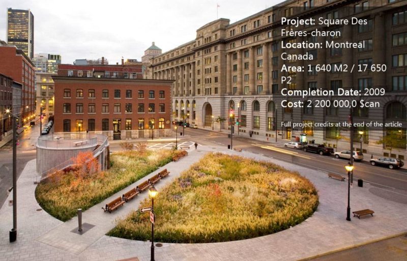
The windmill no longer stands; it was demolished in 1840, but the two axes of the square were designed like the propellers of the mill. One of them connects the northeast and southwest corners and the second one connects the southeast and northwest corners of the square. The main axle has a darker pavement than the outer part of the square; the second axle is quite narrow and a little bit lower than the main axle. It looks like propellers which are viewed from not the front but the sides. And the paving stones are rectangular in the main axle, yet they are small squares in the narrower pathway.

Square Des Frères-charon. Photographer: Marc Cramer
Design Details and Wheelchair Accessibility
The site is a rectangular pavement with filleted corners in the midst of four streets, and a big circular planting area which is a little bit lower than the pavement, and which is divided with two axes which are overlapped. The street-level public domain was designed to be comfortable for wheelchair accessibility. The surface of paving is coated with light granite corresponding to Old Montreal. The pavement inside the intervention invites the passers-by to come across the square.

Square Des Frères-charon. Photographer: Marc Cramer
A Meaningful and Functional Park Pavilion
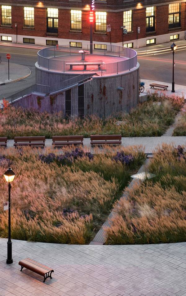
A park pavilion is in the form of a belvedere-folly, which is perched on the site. It houses the technical equipment for sewers and provides access to infrastructure and technical services by a 20-meter–deep cylindrically-shaped underground tower. Access is possible with stairs but it is a long way to the base.
Square Des Frères-charon. Photographer: Marc Cramer
A Place to Enjoy the View
A collector is located inside and it is one of the largest sanitation and water control facilities in Montreal. The belvedere also has some spiral stairs to go up, but much, much less than at the bottom. The access is provided from the street side and it has a vertical, linear texture with a few openings. It also provides a view to the area from above and a seating element for those who want to enjoy the view.
Planting Design
The planting design of the project also commemorates the past. As a reminder of the original landscape and the site’s natural state, a meadow consisting of grasses and shrubs was installed. No tall trees were used for the planting design of the project; instead, tall grasses and shrubs offer a fairy-tale aspect. Sustainable initiatives include the planting of local species of wild grasses which take a significant load off the municipal irrigation system and the use of durable Quebec granite for hard landscaping and the cladding of the park pavilion.

Square Des Frères-charon. Photographer: Marc Cramer
Seating and Lighting in Design
The seating elements which are back-to-back are located in the middle of the main axle and some of the benches are recumbent at the axle’s edge. The others are interspersed at the outer parts of the square, next to the lighting. Furthermore, the square has a specifically-shaped drinking fountain. The lighting of the project is pretty colorful, it is provided by the various size vertical lightings which surround the square and with smaller lights which are on the inner side and on the pavilion.

Square Des Frères-charon. Photographer: Marc Cramer
The Power of multidisciplinary Work
Square des Frères-Charon is the result of a rich inter-disciplinary collaboration and an innovative consultation process. The design team’s main members were an artist, an architect, and a landscape architect. The team’s objective was to cross traditional disciplinary boundaries, collaborate, and converge on common ground rather than divide and distribute tasks according to habitual professional domains.

Square Des Frères-charon. Photographer: Marc Cramer
No Project is Wonderful Without Public Participation
The design team worked at encouraging and facilitating citizen involvement in the design process with communication tools. As well as roundtables and public presentations, a citizen-friendly communications channel was set up on Montreal’s web portal. It helped to connect and exchange ideas between the public and the design team.

Square Des Frères-charon. Photographer: Marc Cramer

Square Des Frères-charon. Photographer: Marc Cramer

Square Des Frères-charon. Photographer: Marc Cramer
Full Project Credits For Square des Frères-Charon :
Project Name: Square Des Frères-charon Location: Montreal Canada Area: 1 640 M2 / 17 650 P2 Completion Date: 2009 Cost: 2 200 000,0 $can Photographer: Marc Cramer Design Team: Affleck + De La Riva Architecture And Urbain Design Robert Desjardins Landscape Raphaëlle De Groot Arts Consultants: Éclairage Public Lighting Sandra Baronne Horticulture Morelli Designers Inc. Industrial Design Moitiémoitié Exposition Inc. Museology Genivar Structural / Mechanical / Electrical / Civil Construction: Quartier International De Montréal Constuction Management Terramex (Landscape) / Celeb Ltée (Pavilion) Contractors Materials Floor: Quebec Granite & Eastern Cedar Walking Paths: Quebec Granite Furniture: Eastern Cedar, Painted Steel & Stainless Steel Illumination: Colour-changing Led Plants: Wild Grasses Others: Galvanized Steel (Railings) Recommended Reading:
- Becoming an Urban Planner: A Guide to Careers in Planning and Urban Design by Michael Bayer
- Sustainable Urbanism: Urban Design With Nature by Douglas Farrs
Article by Irmak Bilir
Published in Blog


