‘In Place’ is a Land8 column that resurrects the design field trip. If you haven’t yet, read the intro here.
What’s a path, really? A way to move people from one place to another? Or a design statement? Visiting 100 Acres in Indianapolis, I initially assumed the former (and in fact wondered why a big name landscape architect was needed to lay out a few paths). But I’ve changed my mind.
The officially named “100 Acres: The Virginia B. Fairbanks Art + Nature Park” is one in a series of landscapes managed by the Indianapolis Museum of Art. IMA is what some would call an encyclopedic museum—meaning it has a little bit of everything, from across historical artistic periods. Most major cities have one of these, but the IMA is odd in that it also “collects landscapes,” as Frank Edgerton Martin wrote in Landscape Architecture Magazine (January 2011—the first issue with the new graphics). I also wrote about IMA for LAM some years ago, when local office Browing Day Mullins Dierdorf reworked an old Sasaki design to create a lovely formal garden atop a new parking garage (LAM, October 2007).
Including 100 Acres, IMA’s landscape collection now includes an Olmstedian “Country Place,” a mid-century sculpture garden, a modern icon (Kiley’s Miller House, farther south in Columbus, Indiana), a contemporary entry, and a naturalistic sculpture park.
But to get back to the paths….
The walkways at 100 Acres are nothing but crushed white aggregate, likely local limestone, and they wander through the forest somewhat haphazardly. Picture yourself strolling through any state or national park, and you get the idea. But there’s more to them than that. In a few places, the paths turn a big circle around nothing in particular, like a highway roundabout. In some places they run in broad sweeps, while in others they wiggle through the woods. The reasons behind this are not perfectly clear right away, but there are reasons.
The landscape is the work of the late Ed Blake, a landscape architect best known for a pretty soft touch and a deep, almost obsessive, desire to know a landscape. He collaborated with local art/landscape architecture office NINebark (Eric Fulford and Ann Reed. As Frank Martin wrote in LAM, just after the park opened (and just after Blake died suddenly) in 2010, Blake found and mapped a degree of subtlety in the landscape that is frankly hard to see when you’re actually there. His analysis graphics (published in LAM), note magically named landscape types such as “flatwoods drain stand,” “ridge hammock side slope,” and “old river swamp bottom.”
The paths follow and cut through these landforms, varying their texture and alignment as they go. For instance, the roundabouts tend to signal your ascent up onto the “floodplain ridge hammock,” which happens to be just a foot or so higher than the rest of the site. On this hammock sits the park’s interpretive center (designed by Marlon Blackwell).
That’s a nice trick. But at the moment the landscape itself gives no signal. Apparently, Blake did complete a set of restoration guidelines that will guide IMA staff in stewarding the landscape over the coming decades. For now, you’ll have to trust the paths.
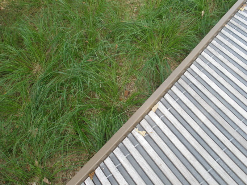
And also their associated low steel bridges, which cross little gullies seemingly unnecessarily (only 4 or 5 inches between bridge and soil!), which proves they are completely necessary to communicate the landscape. I would have missed the “old river swamp bottom” if not for my feet clinking on metal all of a sudden.
If you visit, pay attention to when the paths change–in alignment or width–or when they split from each other. Look more closely at the landscape, the groundplane, the surrounding elevation (and by elevation, I’m talking inches). The landscape is probably changing, too. The paths help you tune into that.
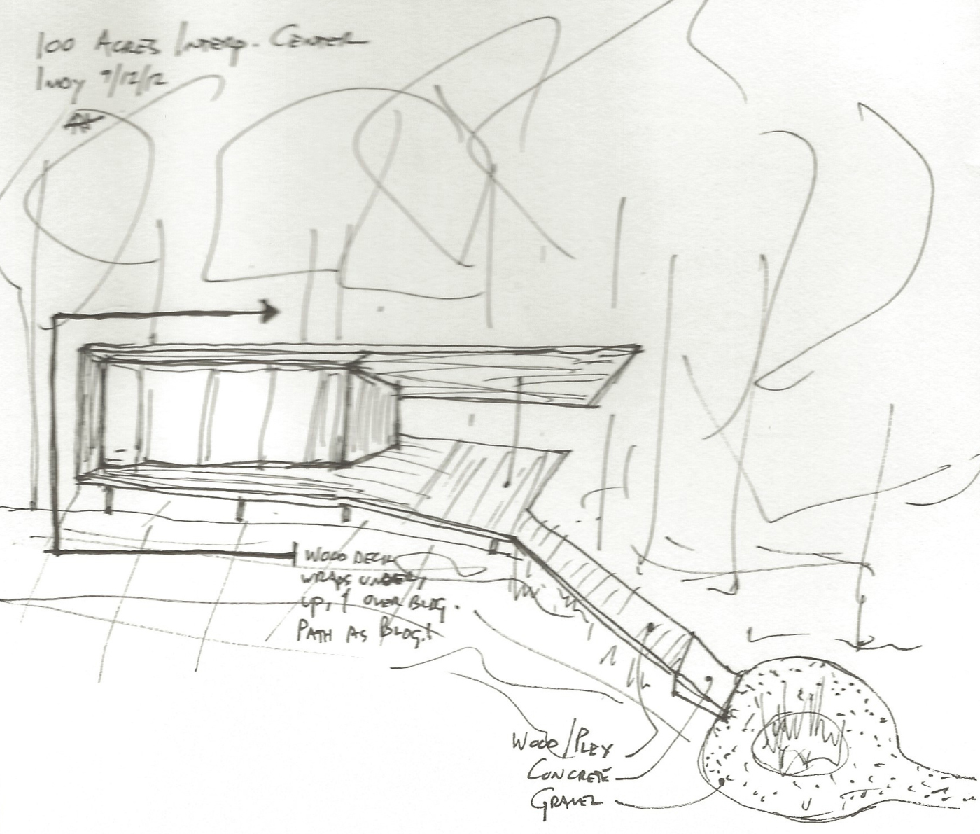
Near the interpretive center the paths gain their full expression. The white gravel gives way to white concrete as it rises up out of the earth. A wood and plexiglass walkway slices into the concrete at an angle and rises farther up to form the floor (and roof, actually, and some walls) of the interpretive center itself. Where Blake’s work ends and Blackwell’s begins is hard to tell–which is a good thing.
Path interprets landscape nuance. Path becomes building. And here I thought paths were just for moving people around….
— Adam Regn Arvidson
All photos and sketches copyright the author.
Published in Blog






Martha Pechlivanidou
It’s beautiful!!!!!!