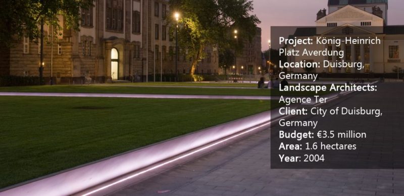
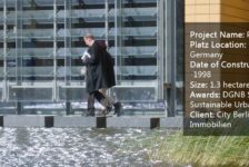
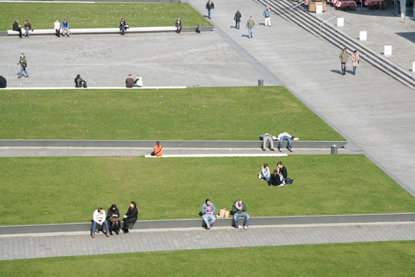
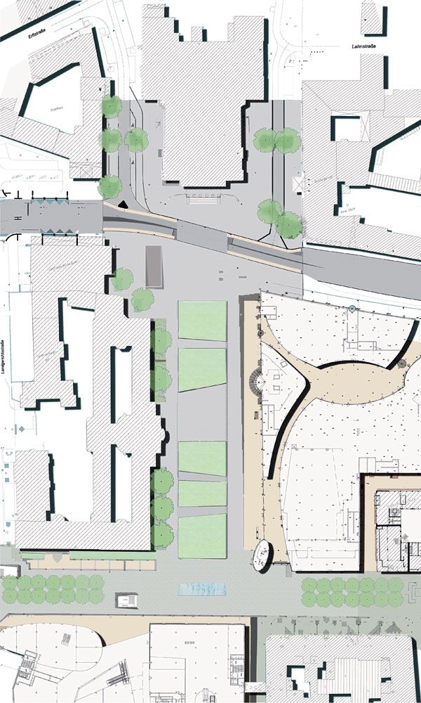
König-Heinrich Platz Averdung, by Agence Ter, in Duisburg, Germany. In the heart of the city of Duisburg, Germany, lies a large, grassy, park space in front of the theater. The König-Heinrich square is a busy gathering place for the city’s residents, made even more popular by the addition of a shopping center, casino, and pedestrian street right next to Konigstraat. It became necessary to rethink this public space in light of the new uses, while maintaining its urban park appearance. Thus, the French landscape architecture firm Agence Ter proposed a project inspired by the existing green space, claiming that the development of a wide lawn would not be a hindrance in making the square a central site for the city. Instead, a simple lawn can provide a meeting place where everyone can settle as he wishes.
König-Heinrich Platz Averdung. ©agenceter
König-Heinrich Platz Averdung
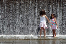
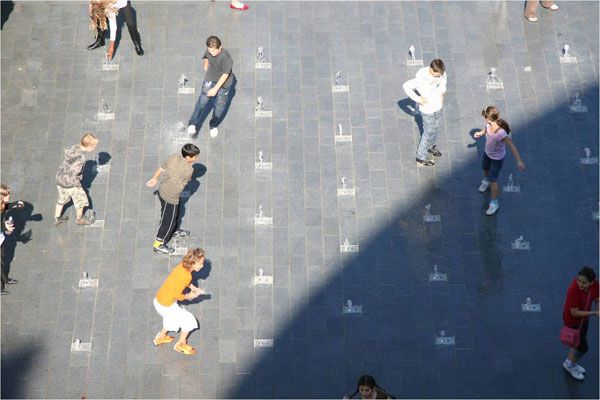
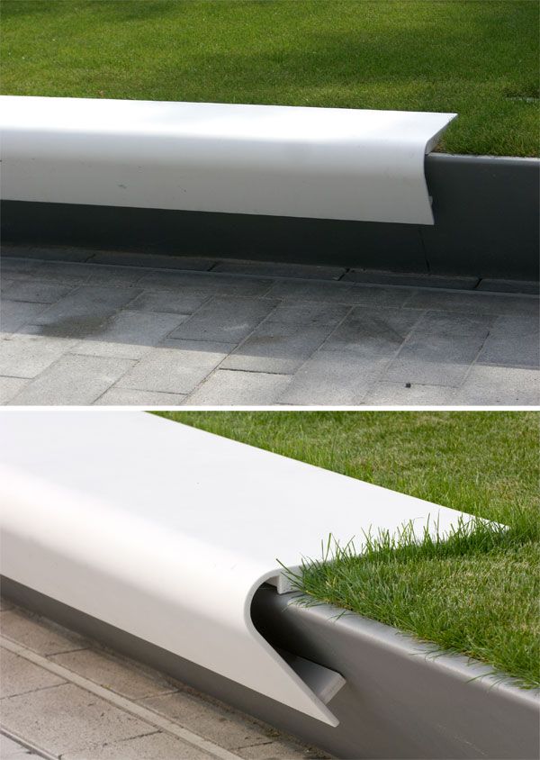
In addition, the Ter team noted that having a vast green expanse in the heart of a post-industrial city as dense as Duisburg is currently a luxury. Indeed, this space will preserve open space in the city and offer benefits to insects, small animals and, of course, human visitors. For all these reasons, it was important to preserve this green and open space. A Simple But Effective Design Agence Ter has created a project with a wide expanse of grass on which people can relax. The project consists of a game between the mineral, vegetation (which covers a large part of the site) and water jets that animate the central space. Some crocuses were planted in the lawn to color the grass in spring.
König-Heinrich Platz Averdung. ©agenceter
König-Heinrich Platz Averdung. ©agenceter
König-Heinrich Platz Averdung. ©agenceter
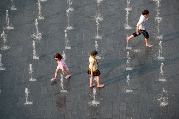
König-Heinrich Platz Averdung. ©agenceter
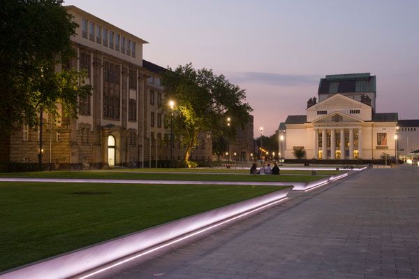
König-Heinrich Platz Averdung. ©agenceter
- Aqua Magica Park: The Dark Magic of Ephemeral Experience in Landscape Architecture
- Urban Jungle Created to Perfection by Agence TER
The redesign maintained the function of the earlier basic green space while adding new points of interest and improving function. This project shows us once again that sometimes the simple things are the most popular.
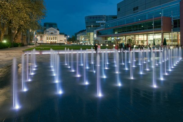
König-Heinrich Platz Averdung. ©agenceter
- Urban Design by Alex Krieger
- The Urban Design Handbook: Techniques and Working Methods (Second Edition) by Urban Design Associates
Article by Alexandra Wilmet Return to Homepage
Published in Blog


