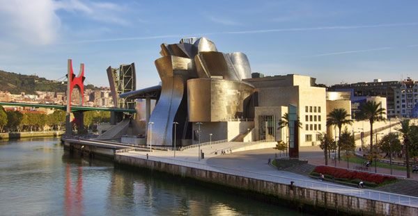
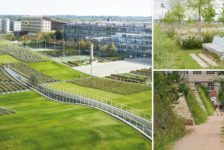
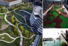
Plaza Euskadi, by Balmori Associates and Lantec, in Bilbao, Spain. Not so long ago, the name “Bilbao” would have had little meaning to most people. But if you mention the name now, the response will be something like “oh that’s where the shiny curvy building is”. Yes, the city has been put on the cultural and tourist map by an extremely extroverted building, the Guggenheim Bilbao, by Frank Gehry. But before you landscape architects stop reading you should know that architecture is not the only outrageous and exciting aspect of Bilbao – its landscape architecture is pretty fantastic too! In fact, landscape design is the key element that has enabled the old city to connect to the new in a manner which is fun, beautiful and very green.

Guggenheim-Museum Bilbao. Photo credit: Phillip Maiwald. Licensed under CC-BY-SA 3.0
There are three parts to the new landscape interventions: the Campa de los Ingleses Park, Plaza Euskadi and The Garden That Climbs the Stairs. All three provide important green links which correspond to pedestrian and traffic movement. For this article, we’re going to have an in-depth look at Plaza Euskadi.
Plaza Euskadi
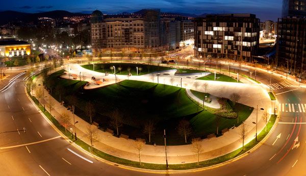
Plaza Euskadi is not the traditional square. It is not the typical urban design scenario where the edges are defined and activated by buildings and it is definitely not simply a paved area punctuated by historic monuments. Firstly, it is oval not square, secondly it is actually technically a large traffic island and thirdly it is green. This green oval creates a new kind of public plaza which combines a park-like landscape with urban design elements and creative expression.

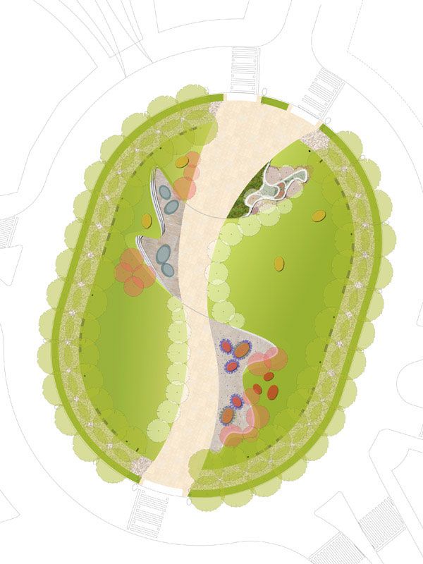
Masterplan of Plaza Euskadi, Image courtesy of Balmori Associates
Balmori and Associates envisaged the plaza as a green space with a wide central path connector and an outer circular walkway. This allowed for the space to fulfil its role as a connector between the old area of El Ensanche to the new former industrial area of Abandoibarra. At the same time, the large area of planting on the plaza provides an inner city green habitat, integrating the natural environment into the city.
Designing with Contrasts and Context Balmori succeeded in complementing the energy of the new architecture of Bilbao by contrasting hard and soft elements in a fun and contemporary manner. They also succeeded in creating a space which acknowledges the vast scale of the surrounding context, while creating intimate and people-friendly spaces. This can be seen in the way that three smaller spaces are defined off the fluid main pathway: the reflecting puddle space, the ottoman seating space and the “garden” space. Each space has its own character, providing a program in an aesthetic yet functional manner.

Visualisation for Plaza Euskadi. Image courtesy of Balmori Associates
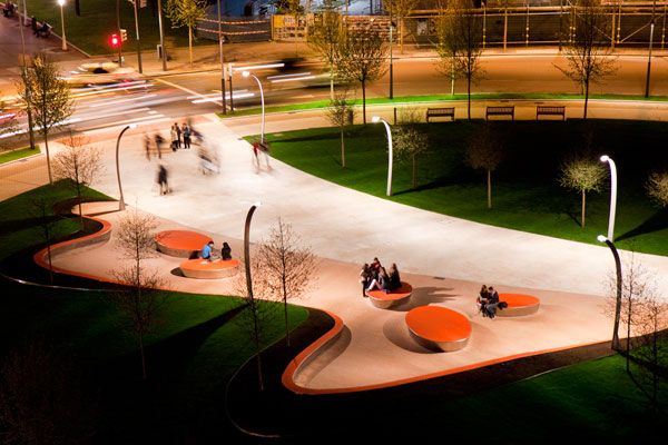
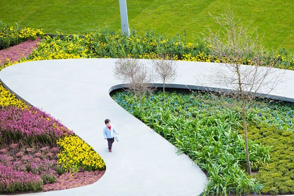
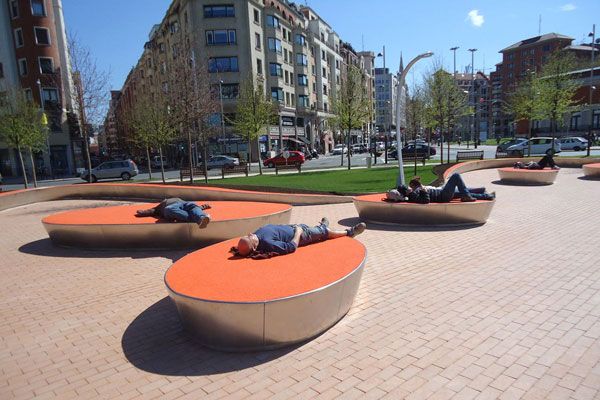
The “reflecting puddle” space creates a quiet amphitheatre-like setting with bright blue stepped seating which contrast dramatically to the green planting edge. A similar contrast is created in the “ottoman seating space” as bright recycled rubber seating elements with shiny edges interact with the public and in the “garden space” an organic concrete pathway is raised above flowering shrubs while acknowledging a 100 year old Laegostremia tree. The remainder of the oval is filled with plants and trees, providing a green island of tranquillity. Another surprising aspect of the plaza is that it is part roof garden as beneath its green surface is a 1000 space car park!

Plaza Euskadi. Photo credit: Borja Gomez Photography
The construction of the plaza coincided with the economic crisis of 2008 which resulted in the initial budget being drastically reduced. Balmori managed to work within these restrictions and utilised the final budget of 1.37 million euros by carefully simplifying the materials and elements. The original plan had allowed for a large degree of grading, planting and fountains which had to be discarded. Original sketches depict a forest-like concept, but the budget constraints led to a reduction in trees.
100 Trees for the Future The final build was opened in 2011 and included 100 trees with large oak trees in two rows along the perimeter and smaller lime and apple trees in the centre. Balmori also opted for the more cost effective option of mixed prairie planting, creating textures with grasses and wildflowers. The materials were re-considered and non-slip concrete forms the majority of the walkways, with paving confined to the smaller pocket parks. Lighting on the plaza was simplified to tall pencil structures on the periphery and curved post top lights in the central space.

Plaza Euskadi. Image credit: Sociedad Bilboa Ria 2000

Plaza Euskadi. Photo credit: Gonzalo Urgoiti Photography
Plaza Euskadi does not aim to create a statement as profound as the Guggenheim, but rather aims to provide a public space that unites the new and old, man and nature, architecture and landscape. The beauty of the plaza lies in the expression of the forms and the use of colour, texture and materials and not in the placement of buildings or monuments. Plaza Euskadi provides a template for a new expression of a public square, subtly pushing the design boundaries of urban design through landscape architecture.
Related Articles:

Plaza Euskadi. Photo credit: Borja Gomez Photography
Plaza Euskadi
Location: Bilbao, Spain
Client: Sociedad Bilbao Ria 2000
Size: 10,000 sq. m
Status: Open 2011
Design Team: Balmori Associates / Lantec
Photos: Iwan Baan, Sociedad Bilbao Ria 2000, Gonzalo Urgoiti, Balmori Associates
Show on Google Maps
Recommended Reading:
Article by Rose Buchanan
Return to Homepage
Published in Blog