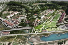
Teikyo Heisei University Nakano Campus, by Studio on Site (Hiroki Hasegawa), Tokyo, Japan There is a certain type of landscape where people just feel good, without realizing the reason for that. Teikyo Heisei University Nakano Campus is undoubtedly one of those exceptional places. A place which has something more to offer. A feeling, a sensation, a perfect harmony. The secret to achieving such an effect is partly revealed in the philosophy of Studio On Site. “Although our work covers a wide range, we always emphasize the “experience of a place” and consider how a given activity will come to be positioned in society and on the specific site. We believe that landscape design is not due to the structure of the new form but a given activity always has something to do with the change in shape or appearance of what is already on the site”, says the team that designed Teikyo Heisei University Nakano Campus. They certainly didn’t forget to follow this ultimate belief within this project!
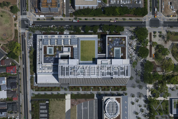
Photo Credit: Teikyo Heisei University Nakano Campus, by Studio on Site. Photographer: Katsuhisa-Kida/FOTOTECA
Representing Nature in Design
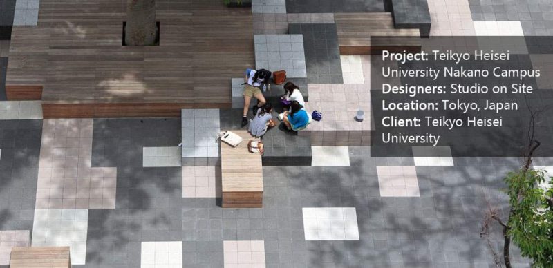
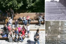
The major concept of the landscape design is inspired by something simple, and yet genius. You can see it. You can touch it. It is all around you –Nature. The reinterpretation of nature in Teikyo Heisei University Nakano Campus is achieved through a repeated square-shaped pattern. The scattering of black pavement covers both interior and exterior floors. The concept of this dispersion is to represent the sunshine filtering through foliage. Thus instilling visitors with a pleasurable sensation or one of a kind experience of the site.
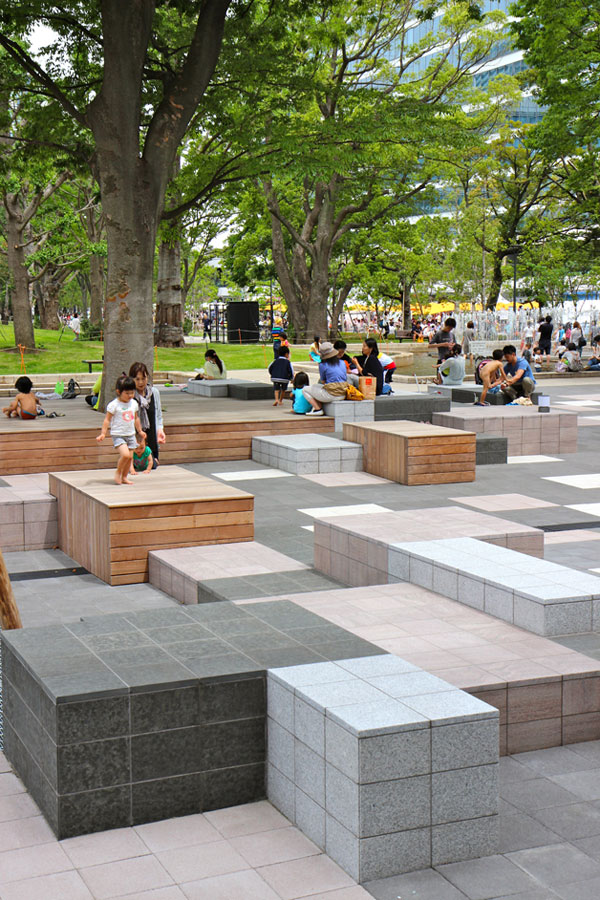
Photo Credit: Teikyo Heisei University Nakano Campus, by Studio on Site.
Design and Function Symbiosis When Representing Nature in Design
Besides the creative and aesthetic functions of the flooring, the paving also performs a directing role. This pavement pattern is a “marker” which shows where to stay in the campus. Conversely, the road zones without that motif are intended mainly for pedestrian circulation. The flooring pattern also varies vertically and horizontally by each sample unit. This difference in levels suggests diversity of uses and activities. A must-have in such a great example of public space.
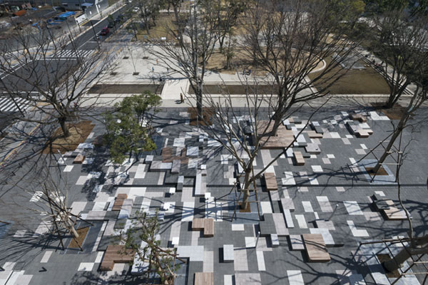
Photo Credit: Teikyo Heisei University Nakano Campus, by Studio on Site. Photographer: Katsuhisa-Kida/FOTOTECA
- 10 Great Places to Study Landscape Architecture in the USA
- 10 Great Places to Study Landscape Architecture in Europe
- Elegant Square sets stage for University Students
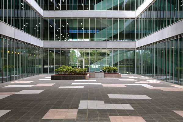
Photo Credit: Teikyo Heisei University Nakano Campus, by Studio on Site.
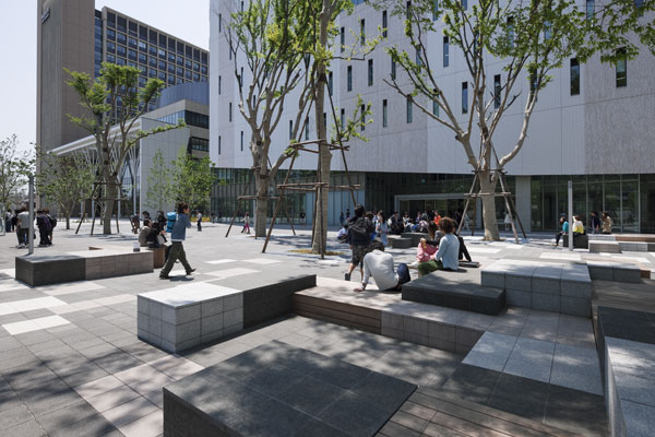
Photo Credit: Teikyo Heisei University Nakano Campus, by Studio on Site. Photographer: Katsuhisa-Kida/FOTOTECA
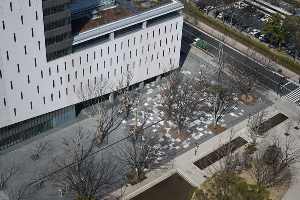
Photo Credit: Teikyo Heisei University Nakano Campus, by Studio on Site. Photographer: Katsuhisa-Kida/FOTOTECA
- 1000 Details in Landscape Architecture: A Selection of the World’s Most Interesting Landscaping Elements by Francesc Mola
- Street Design: The Secret to Great Cities and Towns by John Massengale
Article by Velislava Valcheva Return to Homepage
Published in Blog





Pingback: #AUS201718 #GroupE (0) landscape design_public space (1) Studio on Site (Hiroki ... - Modern