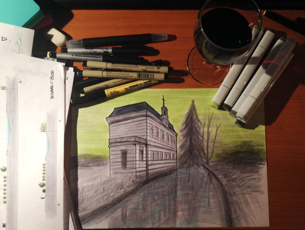
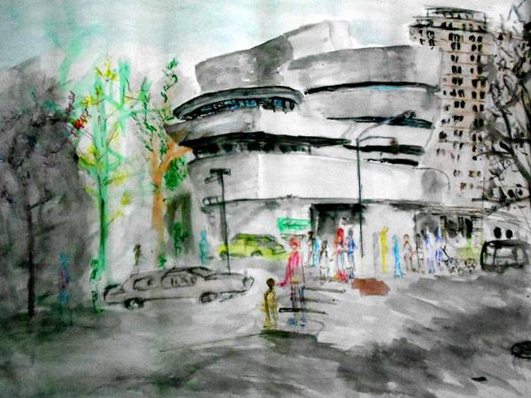
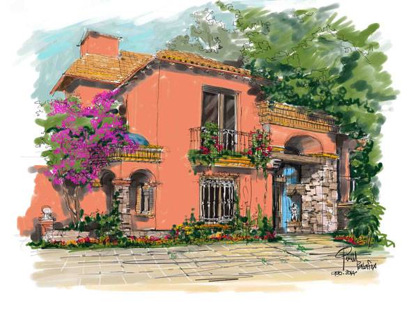
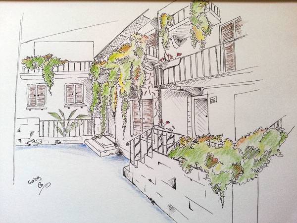
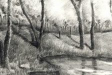
This week’s Sketchy Saturday top 10. Welcome to this week’s edition of Sketchy Saturday; the sketches have been pouring in, and the talent just never seems to stop, it is a joy to see so many creative, artistic and active people out there making use of their ability to excite, connect and inspire people into observing their environment in a beautiful way. Clearly not every entry that gets sent to us will get published in the Sketchy Saturday top 10, but this does not mean you were not close to being featured, so please keep on sketching and sending in your awesome work, we love it all. Did we pick the right sketch for top spot, you decide! 10. by Kelly Hartholt, second year ‘Landscape Design’ student from The Netherlands.
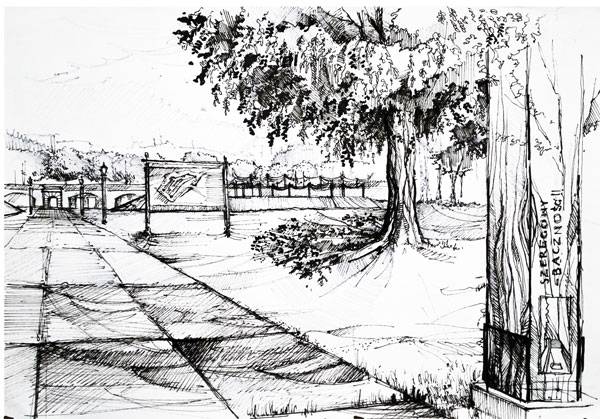
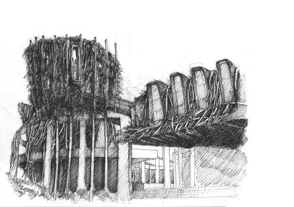
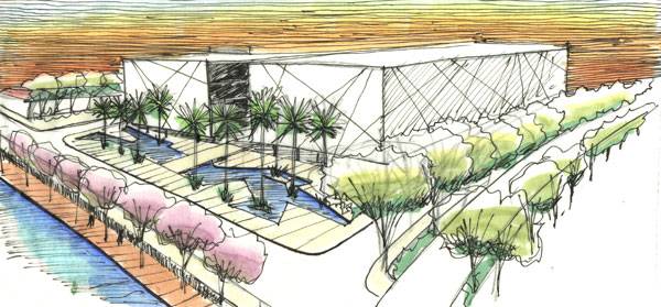
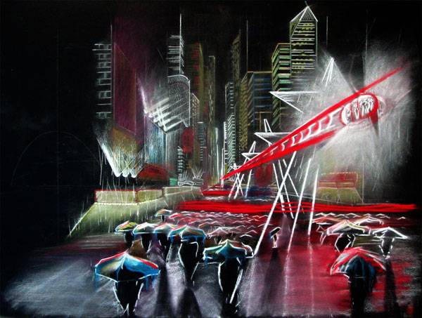
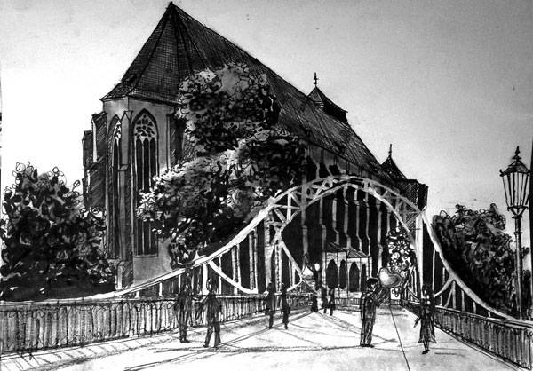
“I’m currently designing a country estate at university. I also wanted to try out my new markers and practice the mirror-effect of buildings near water. I wanted to create a sad, old, foggy look. The materials I used were Copic markers + Fineliners.” 9. by Karthik Karu, landscape architecture student “I did this sketch night at 11 :00 pm …because the next day in the morning we had our case study presentation regarding a museum ..which we did on Guggenheim Museum New York. I have taken a reference of this picture and I did this in an A1 drawing sheet. I used soft pastels, water colors and hb pencils. I spent around 1 and half hours doing it. 8. by My Name is: Jesus Palafox Garcia, architect, Mexico “The important form but of expression for my is the drawing, I have developed all my life to it, in my profession I apply it constantly and this it is an example but. The style is realistic, that is to say: the form the expressed color and materials must be interpreted thus for their future construction. This drawing is the representation of a house that I am remodeling in Morelia, Michoacan, Mexico. Technique: digital watercolor.” 7. by Gaby Elberg, a student in the Faculty of Architecture and Town Planning of the Technion institute Israel. “I took the inspiration for the sketch from the picturesque villages I traveled to a few years ago, located near Lake Como, Italy. I made the sketch on my sketchbook using a pencil, some drawing pens (0.1, 0.3) and a few simple coloring pencils that I take with me everywhere.First I used the pencil to draw the sketch with some rough guidelines, after that, I used the pens to pass all-over the sketch and to draw in the small details. At the end I erase the pencil guidelines and paint a little bit for a nice, “clean” sketch.” 6. by Natalia Zborowska, Landscape Architect, graduate student of the Cracow University of Technology, Poland. “This sketch was part of an academic project. It shows a small part of Krakow stronghold and my ways of developing this area. It shows the main entrance to the artillery fort in Krakow – a project of canopy above embankment and small architecture (information board, light and wooden gate). It was made by felt-tip pen 2 years ago.” 5. by Djordje Pralica, architect, Serbia “This sketch was a part of developing process for an initial green facade design as a part for my master thesis. (Theme of the project consisted of redesigning facades and interior of deserted structure made of concrete in the heart Belgrade’s Botanical garden). Through sketches I wanted to develop and to show my personal impression of plant dominance over man made material and find ways how to integrate green facades in the overall design. The process of making this particular sketch included visiting and exploring the site and taking photos. Afterwards, I used tracing paper, above original photograph, to sketch. Technique: H pencil and 0.2 pen.” 4. by Gustavo Garrido, landscape architect “This sketch represents a landscaping project for the redevelopment of a central area of São Paulo called Pari which included building housing units , a shopping mall and a public park. Style: free hand, Location: Pari Neighborhood, São Paulo, Material: Color marker and pen over sketch paper.” 3. by Prokopova Olga, Landscape Architect, Ukraine “This is an entry hall with trim in the Mediterranean style. Sketch executed in watercolor.” 2. by Patrick Nelligan 5th Year Landscape Architecture Student, USA “This impressionistic sketch, done in pastels on heavyweight black illustration board, was created for a competition that calls for a design that eliminates all vehicular traffic along 42nd Street in New York City. The goal was to convey a powerful and honest representation of an aerial system as it would be experienced in the dreariest of conditions. The core concept at work is personifying pedestrian activity as wavelengths of light.” 1. by Monika Kurczewska, Interior Design Student, Poland “This sketch was made in charcoal and marker in Wrocław 3 weeks ago. I’m still looking for my own style and it’s the reason why I’m always trying something new.” – That’s this week’s Sketchy Saturday Top 10, congratulations to all of you who featured, you have came out on top of a very talented bunch of people. Check out the Sketchy Saturday official Facebook album and see literally 1,000′s of incredible sketches! Follow all the winning entries on our dedicated Sketchy Saturday Pinterest page. If you want to take part send your entries into us at office@landarchs.com Recommended reading: Sketching from the Imagination: An Insight into Creative Drawing by 3DTotal Article written by Scott D. Renwick Return to Homepage Published in BlogLogin
Lost Password
Register
If this is your first time on the new site, please click "Forgot your password?". Follow the steps to reset your password. It may be the same as your old one.


