This week’s Sketchy Saturday top 10. Welcome to this week’s exciting edition of Sketchy Saturday. This week’s sketches may have been the toughest in our Sketchy Saturday history to judge the top 10. There is a fine line between what is excellent work and what is suitable for Sketchy Saturday. With Sketchy Saturday we always stretch the definition of the word sketch and display some questionable entries, but we’re always searching for a high raw element to the work and a direct relevance to landscape architecture. Enjoy this week’s Sketchy Saturday top 10! 10. by Luna Refaie , (Architect) , Jordan
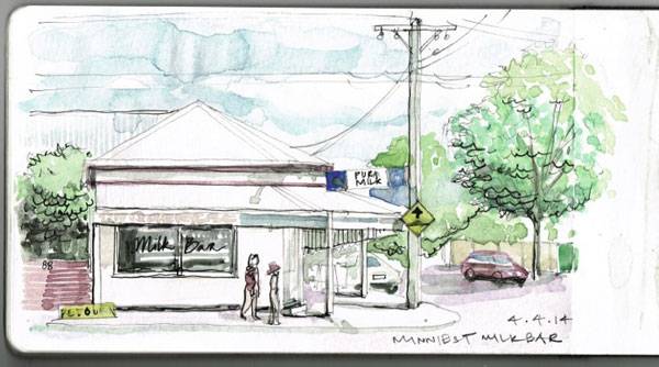
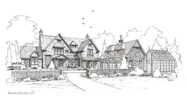
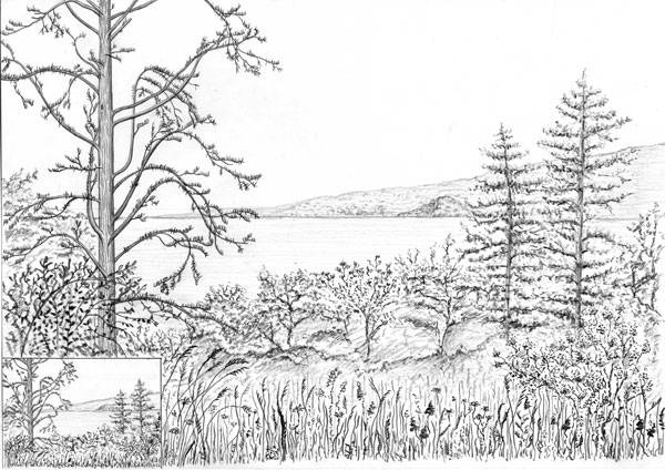
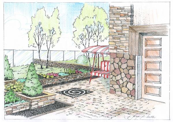
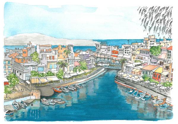
“Our earth is getting covered with buildings , Every small empty space is being built without consideration for the outdoor spaces. We became imprisoned in our houses, We started mentioning the parks, plazas and outdoor spaces as a memory in history. Our planet is crying for missing water features and the green color penetrating our cities and neighborhoods.” Utopia is the name which I would like to give for this sketch. This Utopia is located in The Middle east. – Material used : Watercolours on Fabriano Size A3.” 9. by Sahra Stolz, Master of Architecture, University of Melbourne , Melbourne, Australia “This was sketched in my A5 Moleskine in watercolour and fountain pen from the driver’s seat of my car on a warm afternoon. Minnie St, Brunswick is in the state of Victoria (Australia) where corner stores are known as milk bars. Not long after I made this sketch, this, the last milk bar in the neighbourhood, closed its doors forever, victim to to the hegemony of the chain supermarket.” 8. by Ronak Roshan Gilvaei, Architect B.A., Rasht, Iran “This video is included as part of my teaching of sketching with marker at Art & Culture’s House in Rasht , Iran. This style helps you to have a better presentation and show the wooden material. This style is called Marker and I have also used pen and color pencil in it.” 7. by Devin S. Kimmel, ASLA, Assoc. AIA, Principal at Kimmel Studio, llc “This sketch is of a proposed entry view to a new house and garden we are designing. The house is to be shingle style with a 3 car garage, greenhouse, pool house and pier house. The gardens will have formal and informal spaces, a swimming pool, vegetable garden, orchard, wetland re-vegetation, and general garden spaces. This view angle was chosen to show the relationship of the house, garage, and greenhouse to the fenced entry court garden. The drawing is ink on vellum.” 6. by Elina Richert, 3rd year student, Nürtingen, Germany “The reason and motivation was a nice trip to verbania in Italy with my landscape architecture class. We were in the great park by the villa toronto and I decide to draw the landscape around me. This is a landscape painting and I paint it with a lead pencil ( 2B , HB, 4B)”. 5. by Morozova Lada, landscape architect from Moscow, Russia. “Usually I make small colorful pencil drawings to explain my ideas to the customers. It’s more obvious and you can explain how this place will be looking like.” 4. by Jacek Gonera, landscape architecture student at Wroclaw University of Environmental and Life Sciences (Poland) “The reason for making this work is that I’ve been asked to make drawings with colour inspired by photos from holidays in Greece. I’ve spent quite long time doing this but it brought me so much joy and let me get some more experience with using watercolour technique. Painting is made in colour. It is based on the photo I received. It is my own interpretation (impression) of what I’ve seen. Location of presented painting is Greece. Technique is aquarelle (watercolour) and black ink fine liner. Paper size is A4.” Related Articles:- Freehand Drawing & Discovery by James Richards | Book Review
- How to Suck at Hand Drawings and Still be a Good Landscape Architect
- Interested But Not Confident? – Know How to be Good at Hand Drawings
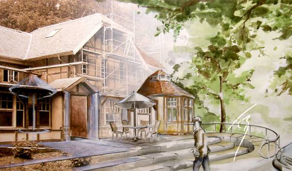
3. by Tino Beck, self-employed artist, Germany
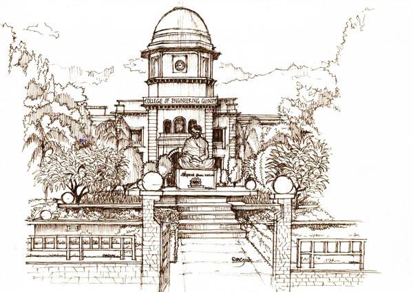
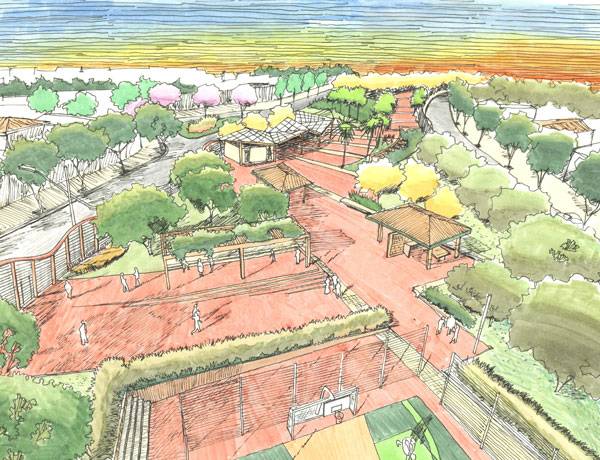
“I took photos from a historic but badly damaged building – formerly a well known resting place within a lovely forest. On my inkjet I printed them in sepia and by adding a white-to-transparent shading. To introduce the intended reorganizations of the architect I completed the white half directly on the print (grained paper A3 landscape) by including the architects ideas as tender colored hand-painting, using available alignments.” 2. by Jerome K Benhur, 5th year student, Architecture, MEASI Academy of Architecture, Chennai, Tamil-Nadu, India “The Sketch is of Anna University Admin building (Chennai,Tamil-Nadu, India), a campus of 220 years of history. I have seen the campus lots of times before, but this time, I felt the campus grand. I understood what a properly designed landscape could do to a campus. I wanted to record my feeling in the form a sketch. This sketch is done using black pen ( stabilo point88 0.4 ).” 1. by Gustavo Garrido, Landscape Architect “This sketch done to illustrate a landscape project for a small park . Free hand sketch style. Located in the City of Santana de Parnaíba, close to São Paulo, Brazil. I used pen and color markers over sketch paper.” – That’s this week’s Sketchy Saturday Top 10, congratulations to all of you who featured, you have come out on top of a very talented bunch of people. Check out the Sketchy Saturday official Facebook album and see literally 1,000′s of incredible sketches! Follow all the winning entries on our dedicated Sketchy Saturday Pinterest page. If you want to take part send your entries into us at office@landarchs.com Recommended reading:- Sketching from the Imagination: An Insight into Creative Drawing by 3DTotal
- Architectural Drawing Course by Mo Zell
Article written by Scott D. Renwick Return to Homepage
Published in Blog


