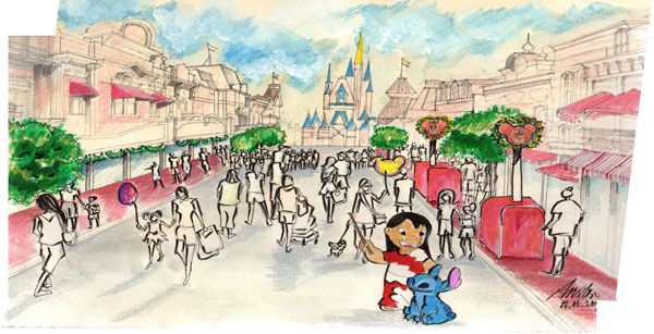
This week’s Sketchy Saturday top 10. Here we go with 10 enthusiastic, talented Sketch-Stars that have submitted their handy work to the office for this week’s Sketchy Saturday. In this week’s top 10 we see a range of styles, and levels of creativity which show that risk-taking is involved in getting your message across. Each sketch is as unique as a fingerprint and is almost like the artist’s signature. This is work that not only embodies their skills and creativity, but their experience, passion and thought process. To appreciate a creative piece of work is to open a doorway to understanding the person who created it. A gift that inspires us and connects us to one another. Enjoy this week’s Sketchy Saturday top 10! 10. by Anastasia B. Uli, Master of Sustainable Design UF student, Gainesville FL
Anastasia Uli
is
my favorite character. TECHNIQUE /Media: Canvas Canson paper, A3 size. Style : Cartoon + Realistic Canvas Drawing – 1. The background building: pencil sketch – 1-point
perspective – 2. Acrylic + watercolor
(pastel color) – 3. Pencil color for detailing – 4. Ink for shading”.
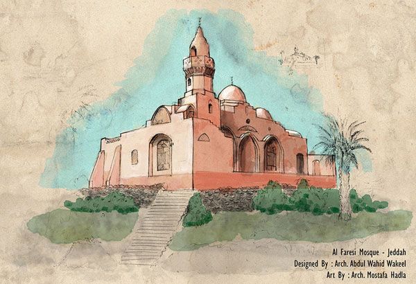
9. by Mustafa Hadla, architect, from Syria, living and working in Jeddah Ksa
Mustafa Hadla
“
This drawing is for the Farsi Mosque in Jeddah KSA designed by the Miami-based master architect: Abdul Wahid Wakeel it was drawn in freehand with regular pen and then painted with Adobe Photoshop, you can find more about it here: https://archnet.org/sites/577“.
8. by Tarsis Aires, in the last year of the Architecture and Urbanism College (UEMA) in São Luís – MA, Brazil 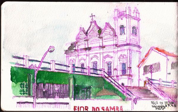
Tarsis Aires
Square,
built by slaves in the 17th century, in our city. That day it rained and you can see rain spots on watercolor, which I liked a lot”. 7. by Oana Chiriac, landscape architect, Belgium 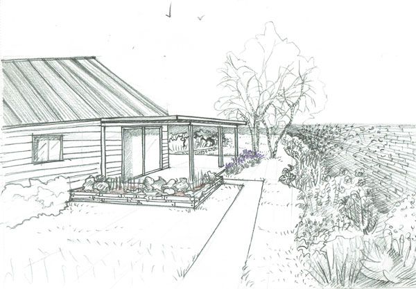
Oana Chiriac
y

Isa Eren AKBIYIK
Autoshow
exhibition area, this is only a small part of the 8 kilometer coast, 2 point perspective with 0.05 – 0.1 – 0.3 – 0.5 drawing pen on A3 size
paper. Marker pen and PS used for brightness and contrast levels. Location – KonyaaltiAntalya/Turkey”. 5. by Ginara Cristina, Architecture student, Bucharest, Romania 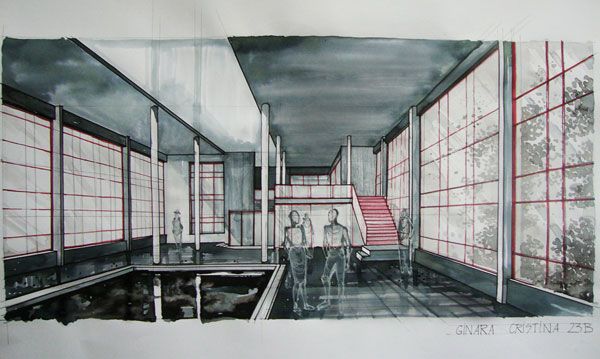
Ginara Cristina
assignment, for
which I
experimented with diluted black, blue
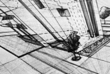
and red ink in an attempt to depict the interior ambiance.” 4. by Peter Bonette, Landscape Architect NJ, PA, OH, MD, KY
and VA. “This is a concept sketch for a home in South Jersey. It is a new house and it needed some details and a front walk. Wing wall for the house and more walls at the front steps. Near the front, door
steps are seated walls for people to chat. The drawing is on trace paper using a marker and colored pencil”. 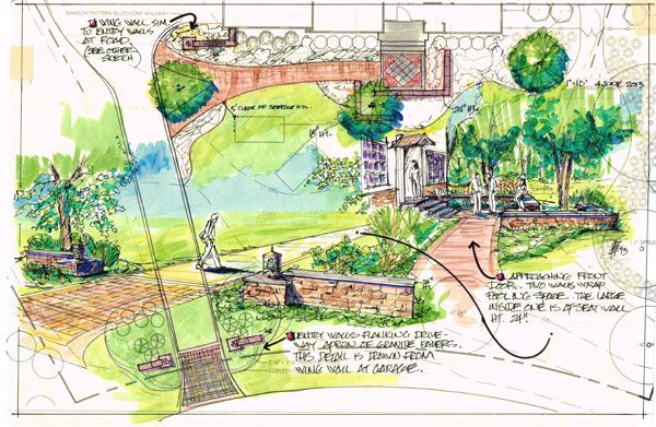
Peter Bonette
3. by Marika Cieciura, landscape architecture student at Manchester Metropolitan University, UK, on the exchange program at South Dakota State University
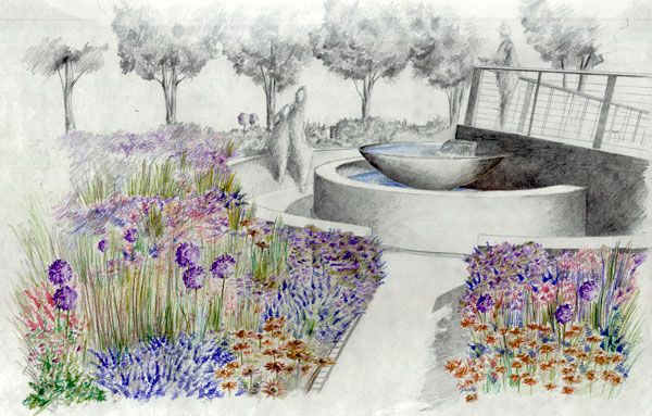
Marika Cieciura
platyphylla
‘Fargo’ (Dakota Pinnacle Birch) giving us a beautiful colour in the fall resembling gold and Acer platanoides ‘Crimson King’ (Crimson King Maple) with a purple foliage suggesting rubies, as well as the mix of pink and purple wildflowers
– the treasure of the prairies. The goal was to celebrate the moments we had with the lost ones instead of surrendering to the sorrow. – Sketches are made with the use of an F and 2H pencil and the addition of ergo soft Staedtler colored pencils. – Team: Annaliese Hoffman, Slade Mutchelknaus
, Marika Cieciura.” 2. by Maria Chughtai studying in 3rd year of bachelors
in Architecture from LCWU Lahore Pakistan 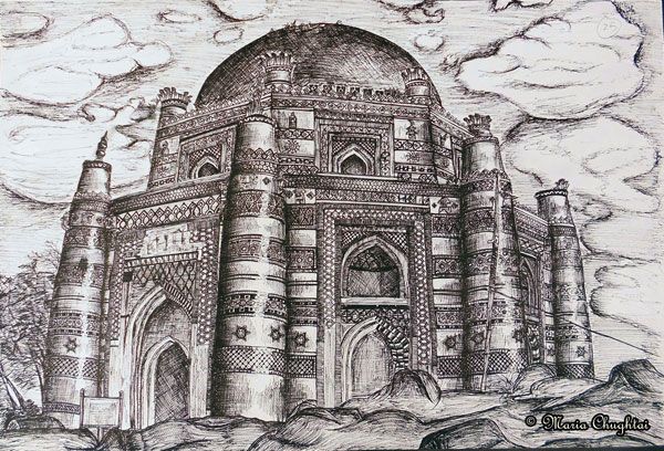
Maria Chughtai
bachelor’s
. This drawing features the Tomb of Bibi Jawindie which is located in Uch Sharif, Punjab, Pakistan. It is a UNESCO World Heritage Site. I drew the sketch with pencil first over A2 sized Canson sheet then rendered it with black felt tip pens (size 0.2, 0,4 and 0.6mm)”.
1. by Jack Tremblay, Amesbury, ma, USA, Landscape architect for 28 years 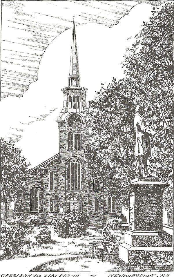
Jack Tremblay
opulux
‘ hard to get. It has changed over the years, which makes it special.” – That’s this week’s Sketchy Saturday Top 10, congratulations to all of you who featured, you have come out on top of a very talented bunch of people. Check out the Sketchy Saturday official
Facebook album and see literally 1,000′s of incredible sketches! Follow all the winning entries on our dedicated
Sketchy Saturday Pinterest page. If you want to take part send your entries to us at
office@landarchs.com Recommended reading:
Article by Scott D. Renwick Return to Homepage
Published in Blog




![10 Billion Mouths [Video]](https://land8.com/wp-content/uploads/2018/06/michael-grove-land8x8-224x150.png)
