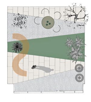
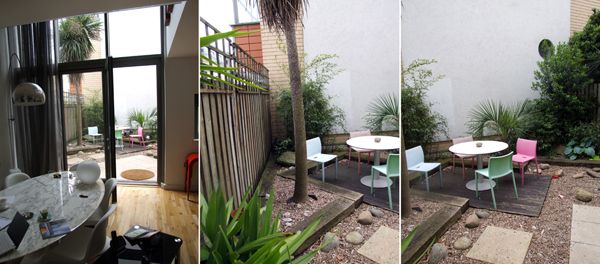
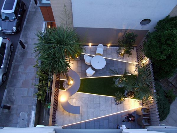
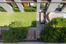
Designer Amir Schlezinger creates a stunning urban contemporary garden design. This 39-square-meter private garden is situated at the back of a terrace modern house near the Arsenal football stadium and Highbury Fields in north London, an incredibly dense urban area in the central part of the city. The owners, an Italian family, had recently moved in and wanted to modernize the outdoor space so that it was on par with the architecture of the house and their rich interior style of modern furniture and contemporary art. There was a great mutual understanding between the clients and myself right from the outset – I love walking into a space for the first time and leaving after a couple of hours encouraged by not only a clear vision of what needs to be done, but also the full support of an inspirational client. The husband – an investment banker; the wife – an attorney; and their two young children, a boy and a girl, gave me pretty much an open brief; there were no must haves or don’ts, and this was not to be a children’s play area, either — except for a bike storage cupboard we were able to situate beyond the garden perimeter, luckily. The garden faces north, but is open on the east and west. The Site
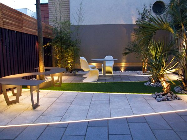
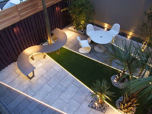
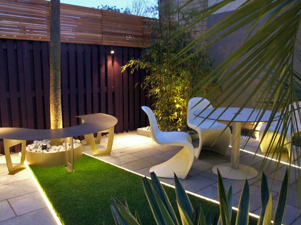
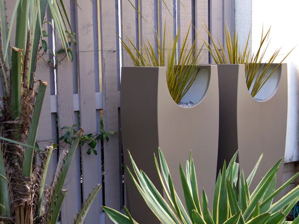
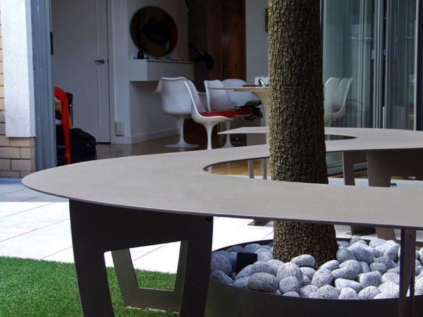
The house is part of 11 townhouses developed seven years previously to a high standard, yet the gardens were laid to railway sleepers, stepping stones, and gravel, which were completely out of keeping with the buildings. However, my immediate reaction was to retain the semi-mature tree specimens, as they provided instant scale – I have immense respect for any mature planting and, unless it is dangerous or totally out of context, will do my best to retain it and work around it. Offset to the left there was a magnificent, six-meter-tall Cordyline australis. Behind the palm was a valuable clump of Phyllostachys nigra and opposite two Butia capitata Jelly palms and a Yucca gloriosa “Variegata”. I was in my element – these are some of my favorite plants, and having those meant more of the budget could be spent on hard landscaping, which I had envisioned some rich detailing for. The fact that the house has four stories and that the garden can be viewed easily from each level meant that a strong ground pattern was very important in order to enhance the visual aerial experience. The Design The space appeared square and had a decent “hit-and-miss” fence on both sides, which meant I could paint it a dark color and tint the large back wall with a lighter shade. This technique makes the space appear longer and reduces the dominance of the back wall. I decided to triangulate lines between the existing specimen plants – luckily, this resulted in pure cross symmetry, in which the surfaces avoid damage to the roots and in turn demarcates the areas in which they are planted, thus appearing as if this was the original intention. Here I could introduce a couple of techniques I usually use on roof terraces – inserting LED light strips between the surfaces to create an additional layer of drama at night and powder-coated planters to add focal points. As the linearity of the design emerged, I felt that I needed a curve to contrast it; with the trunk of the Cordyline situated perfectly to the left, I could wrap around it a sinuous steel bench. This bench will appear lightweight, with only a six-millimeter plate as the seat with see-through leg supports so the surfaces would continue underneath to maximize the appearance of the space. The same powder-coating would then provide the finish to match the planters. A pair of curved, tall vases were specially designed for this project to amplify the curve of the bench and add a touch of height to the righthand side by the house – seen through a window. The first surface immediately outside the large glass doors is a gray flamed granite – this finish sparkles and the color blends in with the gray of the frames of the windows. The granite contrasts dramatically with the limestone, which is veined and slightly textured – this provides a tone that helps to mute harsh sunlight radiating in the morning and afternoon. The central bay features artificial grass – this gives real pull into the garden with its verdancy. From there on, the granite and limestone alternate again. The right fence, facing west, is clothed with evergreen Jasmine, while the left fence is extended further up for security – being end of terrace in a relatively high-crime area, a three-meter boundary was necessary. To contrast the dark fence, I designed a western red cedar cladding section in which three size battens alternate to create a dynamic pattern. To complete the last focal point on the righthand side at the back, a Prunus serrula tibetica multi-stemmed tree was planted in the limestone – it adds to the collection of interesting bark plants. Detailing Detailing in such a small urban space is extremely important, as it has potential to narrate the space, infuse contrast, and enrich the tactile experience. And so, matching stone samples, tweaking the surfaces, adding various aggregates to mulch any open planting beds, choosing paint colors, and even experimenting with the grouting shade for the paving are all paramount. It is an inherent element of the scheme to create rich yet subtle layers in which one can experience the craft of the design throughout all the scales and volumes of the garden. I used three types of granite in decreasing scales to compliment the paving from boulders to cobbles and chippings. White pebbles were used to add to the tone of the limestone, while the sable color of the planters and bench compliment the tone of the back wall. The distinction between the layers creates a sharp contrast – this contrast is one of the most important aspects of articulating a small urban space. The result is a low-maintenance, private, personal, yet liveable outdoor space that can be enjoyed on any day of the year. Legacy This was a great challenge for the whole team involved, and having free rein from the client enabled trying new blends of materials and lighting. Working in the summer of 2012 in London was an intensely exciting period: the Olympics, the Shard opening and for my practice, a bit of luck with a series of high-profile projects. Interestingly, this project hardly satisfied any immediately apparent reasons for celebration, but the minute the last slab of limestone received its final coat of sealant and all the tools were cleared, something felt pretty special. The space proved photogenic, and there was this constant and lasting elation from the client throughout the whole process, which sort of blessed the space. I return every other season to photograph, and since completion we have continued to make some subtle additions, such as interior planting, lighting improvements, and additional planting in the garden. See also Amir’s Contemporary Japanese Garden in The English Countryside Completion: June 2012. Length of build: 3 weeks. Cost: $35,000. Location: Highbury, north London, England, UK. Design and photographs by Amir Schlezinger Check out his website mylandscapes See more designs and updates from Amir on the mylandscapes Facebook page Recommended reading: The Contemporary Garden Editors of Phaidon Press, reviewed on LAN Color by Design: Planting the Contemporary Garden by Nori Pope Published in BlogLogin
Lost Password
Register
If this is your first time on the new site, please click "Forgot your password?". Follow the steps to reset your password. It may be the same as your old one.


