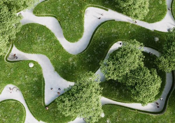
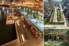
Article by Carlos Cortés Why is designing with varying levels a challenge for the user and the landscape architect? – 10 10 projects that show us how to design with varying levels. Playing with the varying levels of a landscape invites users to experience and discover what each point of the site has to offer. It promotes a more conscious visit of the place through its vistas, spots, and of course the overall big picture. Nonetheless, for designers and landscape architects, it’s a challenge to know when and how to play with levels. This is because every project is unique and responds to different conditions. Let’s take a look at 10 projects that show us amazing ways to design with varying levels. 10. Where the River Runs, by Penda, inside the 10th China International Garden Expo, Wuhan, Beijing, China Where the River Runs by Penda is a beautiful conceptual project with a lot of meaning. The designers evoked the path of a river to make people more conscious of the importance of clean water. This path has been created with wildflowers, grass, and lawns, but it also features different heights that fit incredible well into the landscape as soft hills and valleys. People can experience this landscape in various ways, including at the path level or on the grassland above the canyon. It is a very fun place to visit and relax while reflecting on our environment.
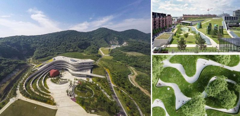
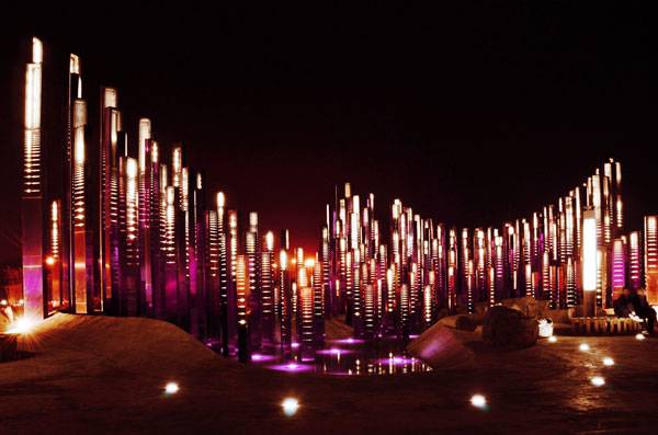
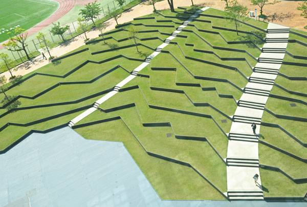
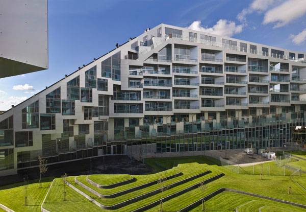
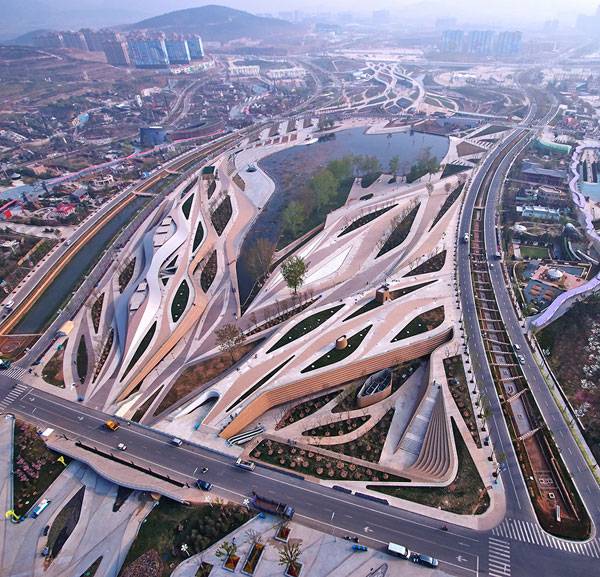
9. The Soundwave, by Penda, in Xiangyang, Hubei, China “Music is liquid architecture; architecture is frozen music.” — Johann Wolfgang von Goethe. This is another piece of art by Penda. Trying to capture the nature of music, rhythm, and dance, Penda architects show us how those elements can coexist within an already existent landscape. The varying levels are featured on the terrain, but the sculpture of sound waves that brings its name to the project is rich on movement, making this an incredible landscape! 8. Kyushu Sangyo University Landscape Design1, by DESIGN NETWORK + ASSOCIATES, Fukuoka, Japan This project for Kyushu Sangyo University involves three major areas, one of which is placed as the landscape for the amphitheater and is composed of irregular lines reminiscent of traditional terraced rice fields. This space allows users to spend time while waiting or relaxing, featuring marvelous vistas of the place that features camphor trees. This design provokes in the users the desire to experience those irregular lines for themselves. 7. 8 House and Landscape Design, by BIG | Bjarke Ingels Group, in Copenhagen, Denmark Designing with varying levels, as BIG | Bjarke Ingels Group has done with the 8 House and Landscape Design, is a perfect example on how to combine spatial experience with purpose and functionality. Here, the levels are presented in both ways — vertical and horizontal. A patio with organic topography and another with low geometric hill terraces are designed to please the user with more levels to enjoy. 6. Fangshan Tangshan National Geopark Museum, by HASSELL and Studio Odile Decq, in Tangshan, China A geopark has to feature sustainability and functionality — and in this case, a very intuitive and intelligent design. The Fangshan Tangshan National Geopark Museum, by HASSELL and Studio Odile Decq, includes various gardens, each having different qualities of a specific period of the Paleozoic era. We can appreciate how the designers played with the levels, not only in the gardens, but also in the project as a whole. One majestic example is the skylight in the center of the building.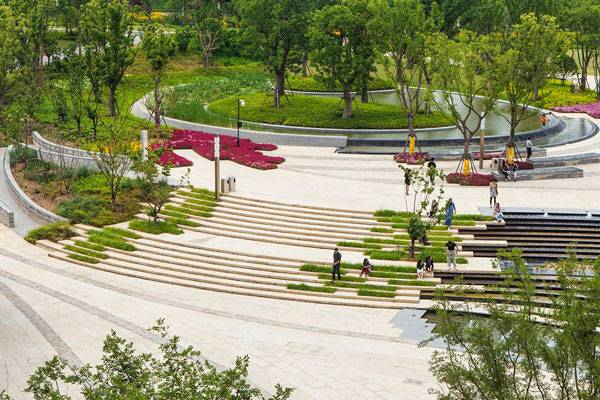
This photo captures how the landscape design curves and moves up and down in coordination with the land and how it is layered, geometrically, in a pleasing manner for the user. Photo credit: Johnson Lin
Earthly Pond Service Center of International Horticultural Exposition 2014, by HHD-FUN. Photo credit: DuoCai Photograph
Design with Varying Levels
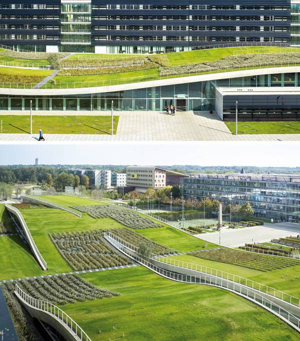
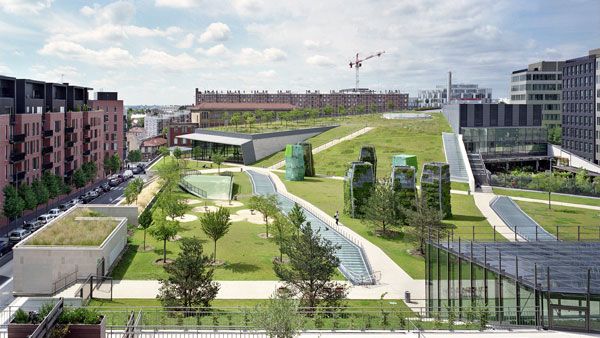
Can we play with varying levels more often? From parks, neighborhoods, rivers, and plazas, we have seen how playing with different heights can be done on almost any project. It can be featured on the furniture, be the very own topography of the place, or even the roof like in Espace Bienvenüe. Landscape architects use this to add fun to their designs and economy for the projects. As a user, I love to experience different heights at a place. Do you know any other landscape architecture with varying levels? Let us know in the comments.
Recommended Reading:
- Becoming an Urban Planner: A Guide to Careers in Planning and Urban Design by Michael Bayer
- Sustainable Urbanism: Urban Design With Nature by Douglas Farrs
Article by Carlos Cortés
Published in Blog


