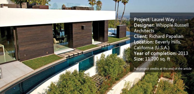
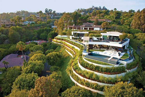
Laurel Way by Whipple Russel Architects, in Beverly Hills, California (U.S.A.) Collective imagination goes into overdrive when looking at such an iconic and well-known city as Beverly Hills. Most people know about its ostentatious properties and palm-fringed avenues, but today we will stay far from such commonplaces to introduce you to a project of a different standard. From the outside, Laurel Way Residence is a contemporary three-story house which greets Los Angeles from the top of an exuberant green terraced hill. Each internal environment of Laurel Way had to be a “jewel box; an individually conceived, precisely functional, and dramatic sensory experience” in words of the design team. This description is tempting, but not enough. Why does this project stand out, even in its luxury context? Well, because of the breathtaking way it develops an inside-outside connection.
Laurel Way. Image courtesy of Whipple Russel Architects
Laurel Way by Whipple Russel Architects
Whipple Russel Architects created an open landscaping concept that erases the conventional architectonic limits instead of utilizing vertical barriers for privacy, which is much more usual in the area. Matching the interior design and adding consistency to the whole project, we find balanced and surprising outdoor spaces. Let´s see why Laurel Way is truly special. WATCH: Laurel Way, Beverly Hills, CA
The Rules of the Game
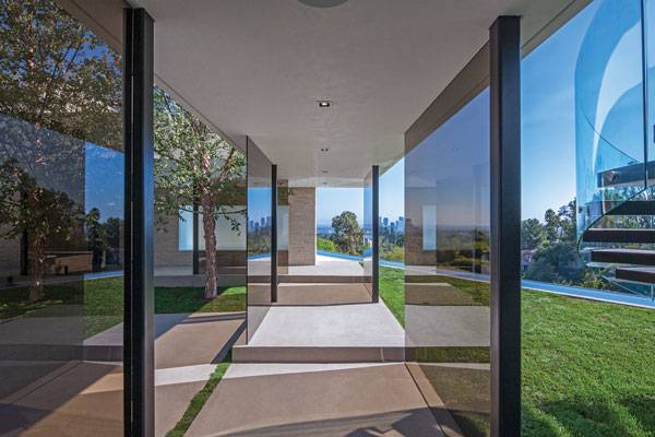
Laurel Way is of considerable size and offers a variety of different environments, but at the same time it is still easy to perceive it as a unified concept. From the general to the detail, everything follows a similar approach. The house avoids giving a massive first impression and expresses a strong desire of obtaining openness and a connection with the outdoors, of suggesting lightness, and of offering a variety of experiences as well. We can appreciate it through its fragmented volumes, its glass facades, and through the irregular perimeter creating a number of independent gardens within the site.
Laurel Way. Image courtesy of Whipple Russel Architects
Laurel Way. Image courtesy of Whipple Russel Architects
A Landscape of Opposites
This project shows a great understanding of how relationships between opposing pairs of aspects work; outside-inside, natural-artificial, lightness-mass and curved shapes-orthogonal geometry. The secret is to put a bit of one into the other, like natural elements being part of the artificial indoor environment, for example, until they become integrated. See More Articles on LAN:
- Natural Swimming Pools Designed With Nature
- Unbelievable Conceptual Pool Design That Plays With Your Mind
- Rooftop Infinity Pool with Awesome Views
Laurel Way. Image courtesy of Whipple Russel Architects
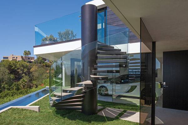
Laurel Way. Image courtesy of Whipple Russel Architects
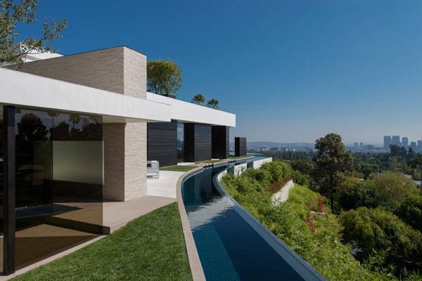
Laurel Way. Image courtesy of Whipple Russel Architects
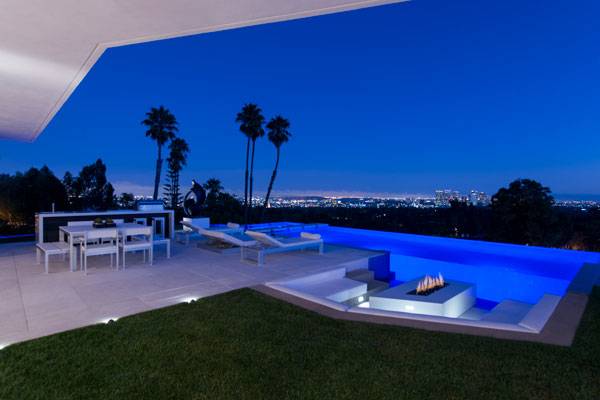
Laurel Way. Image courtesy of Whipple Russel Architects
Exploring the Place
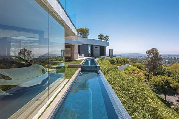
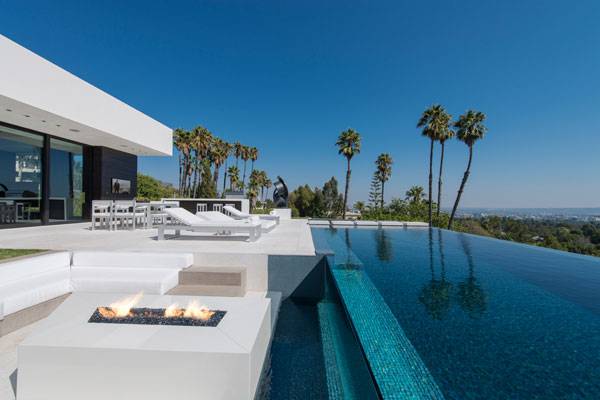
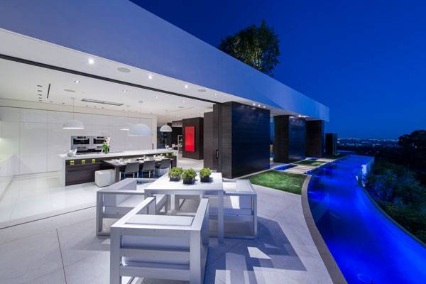
As you can appreciate through the images, the designers worked using the same short palette of neutral and sober colors for the entire project. Different materials, including the furniture, have been assimilated into the reduced color spectrum of green, blue, dark chocolate and the dominant creamy colors to create careful and studied sequences of contrasts and a sense of lightness. There are white terraces or green patches around the house, all limited by a continuous staggered water channel in a horseshoe shape. Those elements, closely dependent of the indoor spaces keep their orthogonal geometry in contrast with those more linked to nature, which adopt a more organic pattern.
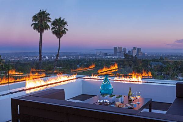
Laurel Way. Image courtesy of Whipple Russel Architects
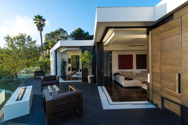
Laurel Way. Image courtesy of Whipple Russel Architects
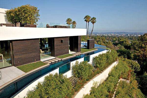
Laurel Way. Image courtesy of Whipple Russel Architects
Practical Strategies to Gain Openness
One of the strategies intentionally avoided in Laurel Way was a reliance upon vertical barriers because those would reduce openness and break the connection between environments. Then, how did the designers differentiate areas and uses? Basically, they worked on changes in pavement material, floor level, or the dimensions of elements. For example, in front of the main living-room, a small water channel becomes a spectacular pool and jacuzzi for relaxing in, merely by changing its width.
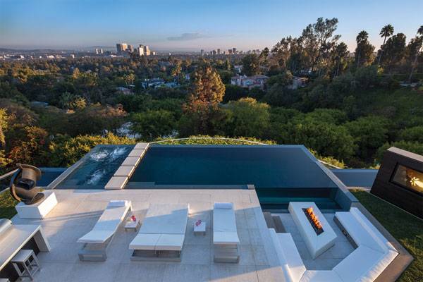
Laurel Way. Image courtesy of Whipple Russel Architects
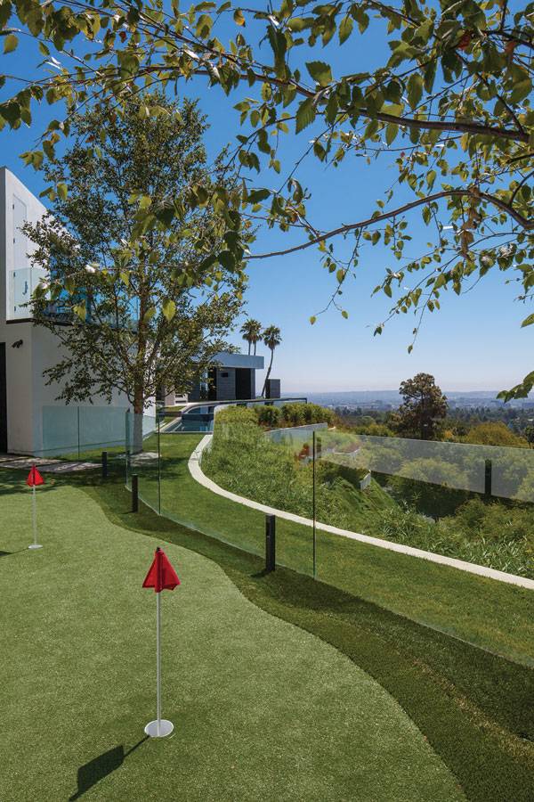
Laurel Way. Image courtesy of Whipple Russel Architects
How Laurel Way Connects Two Environments
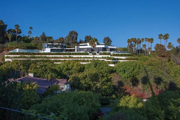
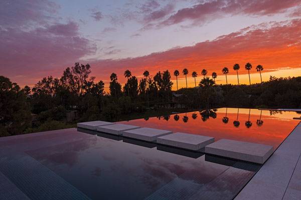
The singular location of Laurel Way, including the green hill, plays a role in the urban landscape. The design team softly transforms the steep slope by creating planted terraces which respect its organic perimeter. Thanks to the visual reinforcement of the retaining walls in white, the solution absolutely matches with the house: when we see the horizontal white slabs floating on the glass facade, does the house not seem to blend into the terraced hill like its last platform?
Laurel Way. Image courtesy of Whipple Russel Architects
Laurel Way. Image courtesy of Whipple Russel Architects
Laurel Way. Image courtesy of Whipple Russel Architects
Full Project Credits For Laurel Way by Whipple Russell Architects
Project: Laurel Way Type of project: Residential Landscape Architect: Whipple Russell Architects Architect: Whipple Russell Architects Interior designer: Michael Palumbo Lighting design: Crestron Client: Richard Papalian Location: 1201 Laurel Way, Beverly Hills, California (U.S.A.) Year of completion: 2013 Size: 11,200 sq. ft Sold: $ 31,000,000 USD Architect: Marc Whipple AIA Project Manager: Andrew Takabayashi Photographers: William MacCollum, Art Gray Photography Website: www.whipplerussell.com Facebook: www.facebook.com/whipplerussell Pinterest: www.pinterest.com/whipplerussell Youtube: www.youtube.com/user/wrarchitects Twitter: www.twitter.com/whipplerussell LinkedIN: www.linkedin.com/company/whipple-russell-architects Google +: www.plus.google.com/+WhipplerussellLA Recommended Reading:
- Urban Design by Alex Krieger
- The Urban Design Handbook: Techniques and Working Methods (Second Edition) by Urban Design Associates
Article by Elisa García Nieto. Return to Homepage
Published in Blog


