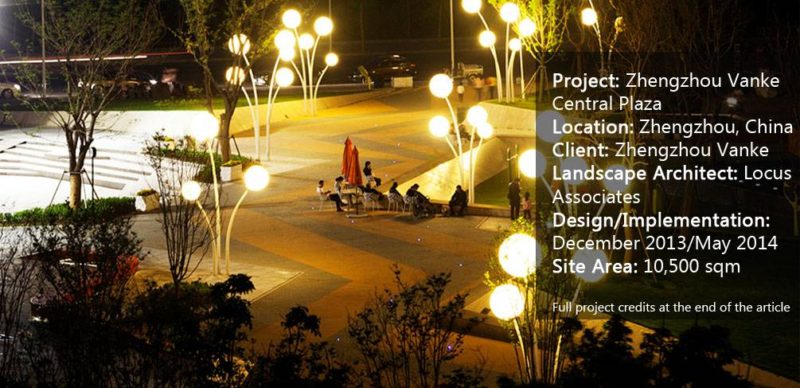
Zhengzhou Vanke Central Plaza, by Locus Associates, Zhengzhou, China. If you think that social media is the best way to bring people closer together, you might want to think again. Places are what really help people interact and build connections. It has long been a trendy idea to design meeting points. But designing places where people want to be, modeled in a way to offer something for everyone, depends mainly on the quality of the design and remembering the needs and preferences of the people who will be using the place. In other words, those people should be involved, somehow, from beginning to end when it comes to conceiving public spaces. There are many projects out there that can illustrate what a great plaza could look like. Here, we are spotlighting a landscape project in China designed by Locus Associates in 2014.
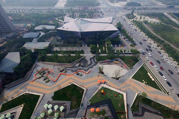
Aerial shot of Zhengzhou Vanke Central Plaza. Photo credit: Béton Brut
Zhengzhou Vanke Central Plaza
1. The People-Centered Approach
Before Locus Associates jumped into designing the plaza, the designers tried to understand the nature of the people who would use the place. That helped them to easily identify tools to facilitate group interactions and strengthen relationships among individuals. It was important to take the Chinese culture into consideration. Interactions that appear to be casual in Western cultures aren’t the same in Eastern cultures, especially when it comes to starting conversations with random people in public spaces.
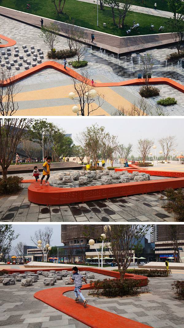
Zhengzhou Vanke Central Plaza. Photo credits: Béton Brut
2. A Public Space for All
The landscape design strategy was to showcase a variety of programs for people of all ages so they could socialize, play, shop, eat, and relax. As the designers have explained in a statement: “The Central plaza is the most active hub for Zhengzhou Vanke City. We envisioned attracting people of all age groups to participate in various active and passive programs in this civic space.”
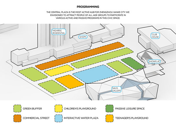
Zhengzhou Vanke Central Plaza. Image credit: Locus Associates
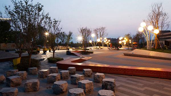
Zhengzhou Vanke Central Plaza. Photo credit: Béton Brut
- Is China Transforming its Relationship with Water? A Look at the Aiyi River Landscape Park
- Lotus Lake Park Sets Precedent for Sustainable Urban Design in China
- Contemporary Landscape Architecture in China: Beautiful or Dangerous?
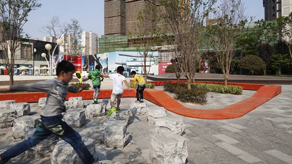
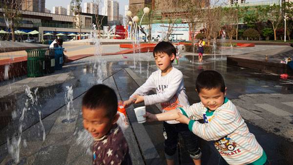
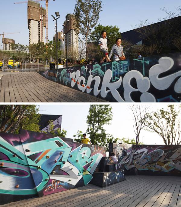
The amenities include a dry fountain and a mist garden, connected by a serpentine bench that the children have adopted as a runway. The designers have integrated the edges of the landforms to become long benches, a children’s rock climbing wall, a sunken playground, and a skating rink with seating areas dotted all around to enhance social interactions. “We pushed and pulled the earth to create different landforms. They frame view corridors, provide embankments for safety, and create interactive spaces to see-and-be-seen,” The designers said.
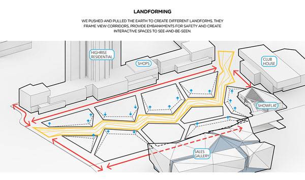
Zhengzhou Vanke Central Plaza. Image credit: Locus Associates
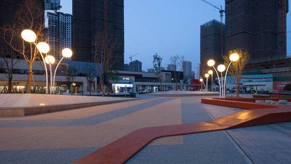
Zhengzhou Vanke Central Plaza. Photo credit: Béton Brut
3. The Human Scale
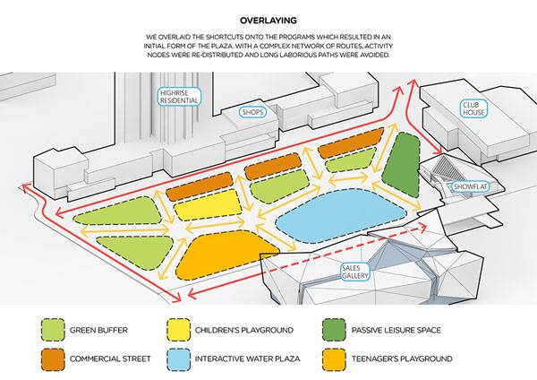
Landscape architecture is about and for people. Thus, the design of a plaza needs to be to a human scale, whether in outdoor furniture, framing views, or circulation. “There is a perimeter circulation that loops the major buildings around the large plaza together. But we wanted shortcuts to further connect various nodes and fragment the site into a more comfortable human scale,” the designers said.
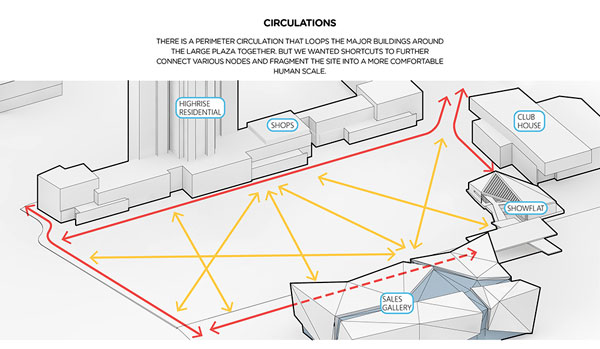
Zhengzhou Vanke Central Plaza. Image credit: Locus Associates
4. Accessibility
A plaza that actually works should be well connected and serve as many pedestrians as possible, without creating endless or narrow paths. Locus Associates has avoided adherence to a rigid design by shaping shortcuts with angular forms to break up the mass of long paths. As they have said: “We overlaid the shortcuts onto the programs that resulted in an initial form of the plaza. With a complex network of routes, activity nodes were redistributed and long, laborious paths were avoided.”
5. Diversity in the Program
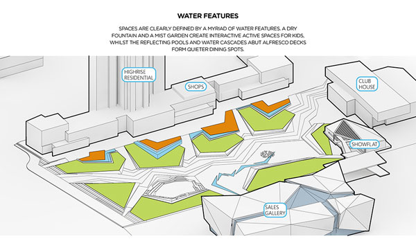
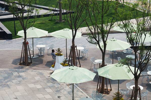
The plaza was shaped in a way to provide civic spaces and recreational activities for its future users. In doing so, various activities were smartly layered together. Starting with a series of al fresco spaces that were integrated all along the shopping area in the north, the designers have broken down the scale of the long commercial façade, opting to insert reflecting pools and water cascades. The water also works to calm the hustle and bustle of the busy Central Plaza, separating areas into zones that are less noisy and buffered with the sound of water, along with open lawns appropriate for enjoying food and beverages. “We break down the al fresco space to the north into four decks with various water features. It creates an integrated yet ever-changing commercial atmosphere. Spaces are clearly defined by a myriad of water features. A dry fountain and a mist garden create interactive active spaces for kids, whilst the reflecting pools and water cascades abut al fresco decks form quieter dining spots,” the designers said.
Zhengzhou Vanke Central Plaza. Photo credit: Béton Brut
Zhengzhou Vanke Central Plaza. Image credit: Locus Associates
6. Sustainability
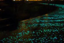
For the sustainability approach, the central plaza was toned with an animated star promenade made of environmentally friendly resin-bonded granules. The star promenade was a way to channel a further flow of energy from the western riverfront park to accentuate the connection between independent spaces and take it to the future diagonal shopping street to the east.
Zhengzhou Vanke Central Plaza. Photo credit: Béton Brut
7. Context and Identity
A plaza should always reveal its own unique appearance through cultural and contextual elements that contribute to enrich its identity by creating details that complement and enhance the overall picture of the surrounding landscape. Once again, the designers of this plaza have hit the jackpot by designing an urban square that echoes the surrounding multifaceted crystalline architectural façade, along with a series of elevated landforms. This constructed topography was integrated with dry fountains and children’s play zones, which has helped to create an interesting and enjoyable landscape experience for visitors.
By becoming a popular meeting spot, this plaza has inevitably proven that it fits into the context of the site and also preserves the cultural identity of the Chinese population.8. The Plaza in the Near Future?
Certainly, the plaza has become a model for other public spaces, and its success is bound to be more than temporary. However, this plaza is aiming to become a popular, memorable, and important hub for public reunion, not only as an events venue for commercial activities, but also for residents and for the big population of Zhengzhou that continues to grow quickly. This vibrant public space persists as a central hub for social activity in Zhengzhou. It has certainly succeeded in creating a great impact on the social life of visitors and residents by demonstrating a clear idea of how a public space can be strikingly simple while still providing a wide range of uses.
Zhengzhou Vanke Central Plaza. Photo credits: Béton Brut
Full Project Credits For Zhengzhou Vanke Central Plaza
Project: Zhengzhou Vanke Central Plaza Location: Zhengzhou, China Client: Zhengzhou Vanke Landscape Architect: Locus Associates Design Lead: Brandon Huang Design Team: Jerome Lee, Kenny Fung, Ray Wan, Jonathan Dones, Katevin Kuang, Ken Qiu LDI: Chongqing DaNaila Salhioyuan Design/Implementation: December 2013/May 2014 Site Area: 10,500 square meters Photographer: Béton Brut Recommended Reading:
- Urban Design by Alex Krieger
- The Urban Design Handbook: Techniques and Working Methods (Second Edition) by Urban Design Associates
Article by Naila Salhi Return to Homepage
Published in Blog


