When I think of William H. Whyte, that pioneer of urban observation, one image comes to mind. I watched Whyte’s 1980 film “The Social Life of Small Urban Spaces” in either 1994 or 1995 in an architecture building classroom. Still today in my mind I can clearly see that famous overhead time-lapse of people on the Seagrams Plaza as they follow the sun. But the picture that sticks with me is the one of the guy trying to find a comfortable spot in a plaza mostly bereft of seating. This overworked gent has trundled down from some beige office for his lunch break and finds all the walls are topped with short metal spikes. He is not deterred. He wads up his jacket, lays it upon the spikes and sits. In the film he looks terribly uncomfortable. Whyte’s deadpan voice-over says: “As we found out, people are very adaptable.” (See the video here; the spike-sitter is at 12:55)
What to do about seating? We know we must include it in our plazas and public spaces. Seat salespeople are in abundance. The ads in our design magazines tell us that having the coolest seating will surely attract pretty girls (and, less often, tall-dark-and-handsome men). Big projects seem to deserve custom seating, which is good work if you can get it, but also far trickier than it seems.
In my experience, public spaces tend to pick one theme for seating and stick with it. There’s a particular bench in a particular color scattered throughout the site. There’s a customized theme in metal or wood. There are walls with wide tops a comfortable 16 or so inches off the ground (usually studded these days by metal anti-skateboard strap-ons). It’s all so predictable.
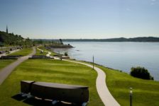
Which is why a walk around Vancouver’s Village on False Creek is like being a kid in a candy shop (or a backside in a furniture showroom). This is the old Olympic Village from Vancouver 2010. It occupies a stunning spot: cozy against the dead-end downtown bay called False Creek, with the Vancouver skyline glittering across the water. The overall development is the work of PWL Partnership, while the central plaza was designed by Phillips Farevaag Smallenberg (PFS). Both firms office in Vancouver.
Aesthetically, the seating is all over the place, which works here amongst the pleasant jumble of buildings, pavements, and elevations. Remarkably, it’s all custom designed AND comfortable. I phoned Margot Long, a PWL partner, and e-mailed Kelty McKinnon, a principal at PFS, to get the scoop. Here are my favorites and their backstories, starting with PFS’s plaza:
Bundles of wood strapped with metal reference the area’s history as a shipbuilding center. Stacks of lumber would historically have been scattered everywhere, slowly becoming boats. These seat-bundles, designed by Chris Phillips, aren’t uniform, though. It’s as if the stevedores had already pulled a few boards away, leaving the rest in a jumble. That makes for interesting seating at different elevations, some even with little arm-desks. While there I saw a mom and her son perched on the same bundle at different heights, heads level, having an adorable conversation.
Drawing on another historical reference—this time the Salt Building that still faces the plaza—low seat tables are meant to look like blocks of good old NaCl. The tops are resin and illuminated at night.
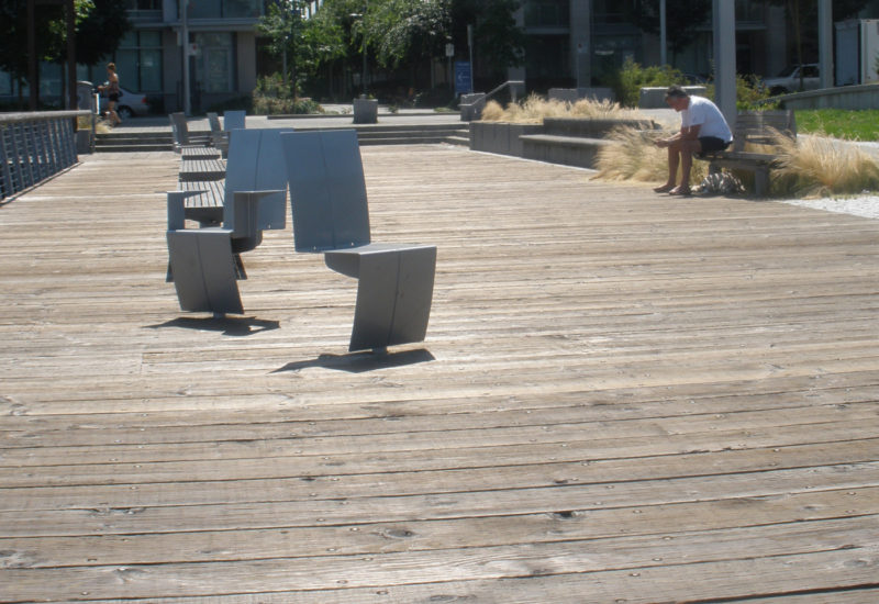
Over on the boardwalk beside the water, PWL has managed to solve the perennial problem of providing both solo and sociable seating: swiveling captain’s chairs! These simple metal elements are rooted to the substructure of the boardwalk by a single post. PWL designed them in collaboration with Landscape Forms. They’re nice on their own, but placement is key—close enough to each other for conversation, but easily swiveled away from strangers or your opposite in a lover’s spat.
Nearby, white metal chaises longues offer two vantage points at once. Stare north at the city or south at the sun (or gaze longingly at the object of your affection after the captain’s chair spat is over). PWL worked with Landscape Forms on these, too, and they got the contours just right.
My favorite seating option, though, are the wood-topped concrete walls. It took me a moment to realize what the strange indentations were for. Once I did it was hard to leave.
I see (and use and test out) a lot of seating—both custom and off the shelf. False Creek is my gold standard. There are plenty of options, and each element is either playful, meaningful, or both. Definitely no need to throw an overcoat over a spike-topped wall. William Whyte would be quite content.
In Place is a Land8 column that resurrects the design field trip. If you haven’t yet, read the intro and my previous posts here.
All photos copyright the author. No reproduction without permission.
Published in Blog


