As landscape architects we are consistently trying to involve the user in their environment and to create spaces that inspire, engage and even educate people of all ages. We do this through a variety of design strategies, often employing different and cutting edge techniques that turn a simple landscape into an dynamic and interactive world.
Now advertisers are beginning to follow our lead when they take their campaigns to the street. In particular, bus shelters are a great place to not only grab hold of a captive audience but many people waiting for their next bus are looking for something to take their mind off the wait. These days marketing campaigns take advantage of all the senses, not just sight, to engage their audience in something exciting, turning the once simple shelters into a multimedia stage.
Check out this video of Cadbury’s new bus shelter campaign for their Creme Eggs in London. This campaign turns bus shelters into fully interactive video games that challenges users to splat as many creme eggs as they can. People not only love it, but they love challenging others for a better score or themselves each time they go to catch a bus to see their score get better each day. Brilliant!
A previous campaign by Solo Mobil in Canada wanted to promote their walkie talkie feature and decided to put two way radios in bus shelters in Vancouver, Calgary, Toronto and Montreal. Anytime someone would push the button to talk to someone, they would be connected to another bus shelter in a completely different city. How wild would it be to be sitting there, waiting for your bus and then someone from across the country starts talking to you from the shelter?
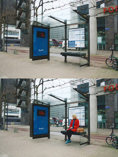
Another campaign in Rotterdam used weight sensitive technology to rig up the seats to measure riders weights as they sat down and translate that number to a screen on the inside of the shelter. This is an interesting concept to use a sensor to detect a persons presence but I would thinking putting someone’s weight on a screen for everyone to see would make many people pretty upset. This particular campaign actually had this very thought in mind and wanted people to feel that they needed to hit the gym. Once the weight appears, it draws the eyes to the board where a very simple logo appeared for Fitness First. Nuff said. This might fly in The Netherlands but definitely wouldn’t be tolerated in the United States!

image via: directdaily
This one from Science world in British Columbia created an rather gross and yet funny interactive ad, check out the video:
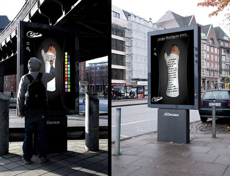
These creative Sharpie ads in many US cities give users a blank cast in order to entice them to explore their inner graffiti artist and leave their mark with a digital marker.

image via: The Cool Hunter
In Chicago, known as the Windy City, ten shelters were made warm and toasty with heated air along with ads that read “Cold, provided by winter. Warmth, provided by Stove Top.” They wanted to remind them of the cozy feeling and warm thoughts of eating a nice piping hot cup of instant Stove Top stuffing.
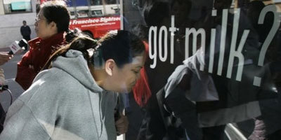
And last but not least, here’s the latest ad innovation to enhance the very well known “Got Milk?” campaign. They take advantage of scentvertising by piping in the smell of chocolate chip cookies to bus shelters with the thought that where there’s fresh chocolate chip cookies, there’s a big glass of cold milk. If nothing else, it’s a welcome breath of fresh air compared to the smell too often associated with public transportation stops.

image via: Cutting Through the Clutter
Published in Blog


Andrew Spiering
I like the sneezing bus stop!
Kevin J. Gaughan
Chris, that is very interesting. I would like to see a follow up to that article on how effective it has been nearly two years later. I will hopefully get to see for myself when I visit Sao Paulo next February.