Article by Niriti Porwal – A review of Angelopolis Corporate Terrace by DLC Architects (María Guadalupe Domínguez Landa, Rafael López Corona) in Lomas de Angelópolis, Puebla, México. Good commercial landscape planning is a matter of striking the right balance of form and function. In order to make the landscape speak for itself, it is important to think about how you want the user to interact with your design and gain a valued experience.
Angelopolis Corporate Terrace
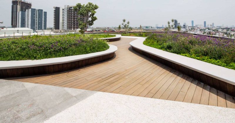
The design for Angelopolis Corporate Terrace is one such example that has set a benchmark for commercial landscape planning projects. The design approach seeks to seamlessly gratify the client’s needs by being a technically, functionally, and aesthetically rich space. Located in an urban area near the city of Puebla, Mexico, the project came with a strong design brief. Functionally speaking, the space needed to be of a dual nature: It should be flexible enough that it creates a friendly environment in which people can relax and at the same time become an extension of the workplace that allows interactions between coworkers.
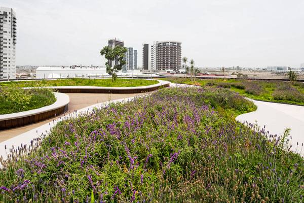
Angelopolis Corporate Terrace. Photo credit: Frank Lynen
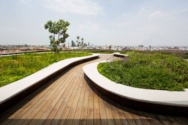
Angelopolis Corporate Terrace. Photo credit: Frank Lynen
Angelopolis Corporate Terrace Landscape Design
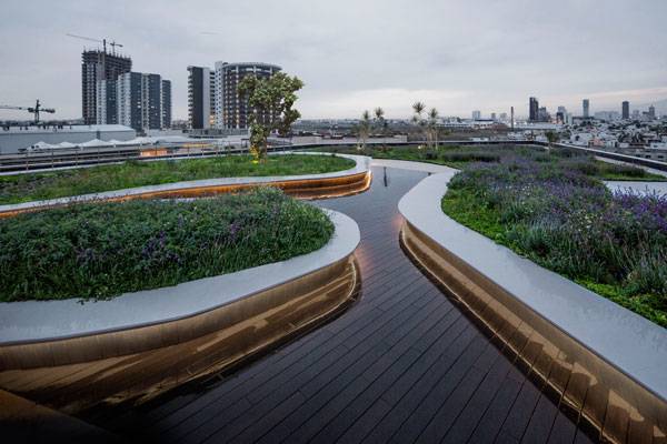
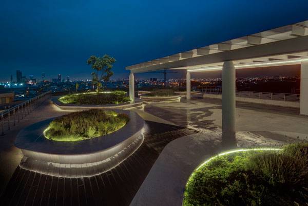
DLC Architects came up with a refreshing venue for this office extension space. The design incorporates casually yet intentionally placed “green islands” to address the site’s geometry, context, use, and as a response to the design brief. Much of the design originated from a strong analysis that linked the organic forms of landscape to the built mass in a subtle manner. To bring out the experience, each island is flanked by a lush, green mound created with soil to generate undulating spaces within the islands.
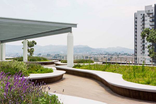
Angelopolis Corporate Terrace. Photo credit: Frank Lynen
Angelopolis Corporate Terrace. Photo credit: Frank Lynen
A “Functional-Technical-Aesthetic” Approach to Design
In order for the project to stand by the brief and become a comprehensive design solution, the following interventions were incorporated into the design building process.
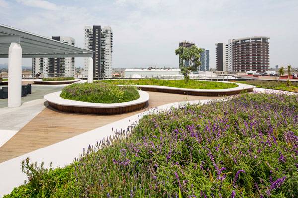
- Functionally, each island’s circumference forms a continuous edge of a bench to give a casual yet inspiring environment that encourages interactions. The strategic placement of the islands allows the space within to expand, contract, or rotate in an exciting manner. The tortuous and meandering spaces created within the islands serve two prime environments: First, one that is broad and vast, which allows a flexible placement of furniture, allowing usage of space in a diverse manner; the second, which on the contrary sits between the sharp lines of islands, is more closed and isolated, allowing users to have informal chats or meetings in a more intimate setting.
Angelopolis Corporate Terrace. Photo credit: Frank Lynen
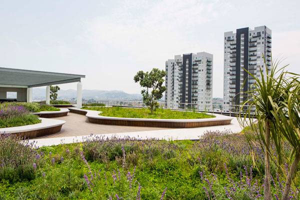
- Technically speaking, the green mound at the center of every island is generated in order to increase the soil depth, thereby allowing bigger plants and trees to grow. The undulating slope, overlapped with a creative planting scheme, produces a green fencing that breaks the visual connectivity. The structure for all green spaces is cast in situ using white concrete with a smooth finish. Among one of the several minimal interventions is the use of 100 percent Composite Wood mixed with permeable concrete and manmade pavers to define spaces used for different purposes. The above strategy allows for increased permeability and absorption of rain water run-off.
Angelopolis Corporate Terrace. Photo credit: Frank Lynen
- Aesthetically, this landscape architecture looks to have the largest amount of green areas possible. The recognizable sweeping island carved out of the existing geometry creates a sense of respect for the plot of the original “pre‐ build” state. The planting palette chosen is very responsive to current context and weather conditions.To bring out the texture, a mixture of spiky and mono-colored spreading shrubs was combined with centrally placed thematic trees for every island. Out of 650 square meters of green area, 90 percent of the planting is preferred to be native. The remaining ones are curated sensitively to adapt to the existing environment.
Angelopolis Corporate Terrace. Photo credit: Frank Lynen
A Cognizant Attempt at a Complex Setting
Whenever the word “commercial” is used, there is an assumption made about its landscape design. The designing of such spaces is rather complex; it calls for much more than just having an aesthetic appeal. It requires a solution that creates an outdoor identity unique to the brand and the building, is sensitive to the needs of the user, is environmentally responsive, and is aesthetically appealing.
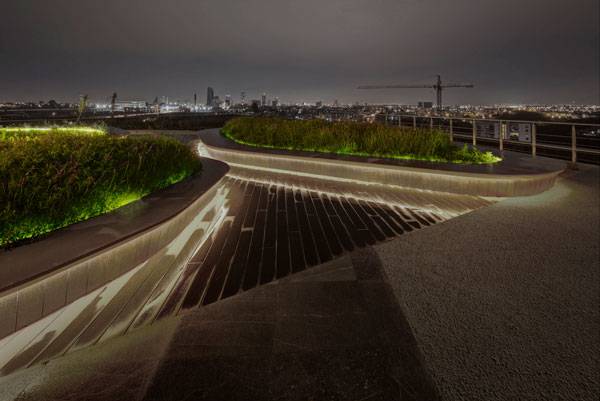
Angelopolis Corporate Terrace. Photo credit: Frank Lynen
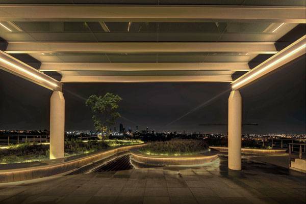
Angelopolis Corporate Terrace. Photo credit: Frank Lynen
Full Project Credits For Angelopolis Corporate Terrace:
Project: Angelopolis Corporate Terrace Client: Metropolis Design: DLC Architects (María Guadalupe Domínguez Landa, Rafael López Corona) Collaborators: Mónica Muñóz González, Adriana Herrada León Period: 2014-2015 Construction: Metropolis Lighting: DLC Architects Photos: Frank Lynen Location: Lomas de Angelópolis, Puebla, México Recommended Reading:
- Becoming an Urban Planner: A Guide to Careers in Planning and Urban Design by Michael Bayer
- Sustainable Urbanism: Urban Design With Nature by Douglas Farrs
- eBooks by Landscape Architects Network
Article by Niriti Porwal
Published in Blog


