Author: BimDjSoftech
Private Garden is The Envy of Bangkok Residents
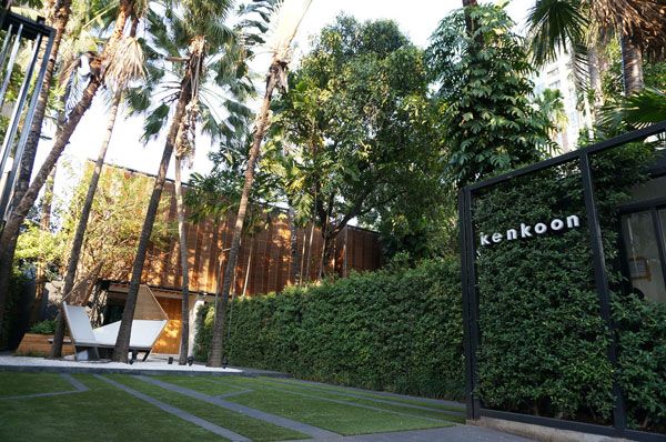
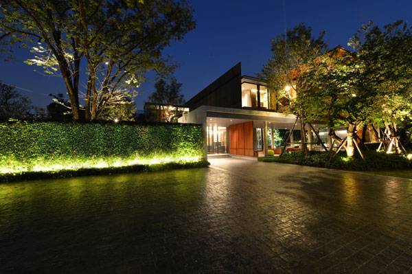
Baan Ladprao private residence, by Landscape Architects 49 Ltd., in Wang Thonglang District, Bangkok. As one of Thailand’s premier landscape architecture firms, Landscape Architects 49, a subgroup of Architects 49 Ltd., has been designing unique and innovative spaces since first opening in 1989. According to its website, the firm’s philosophy is to “apply its knowledge of urban design, landscape architecture, site planning and environmental analysis to solve design and planning problems, as well as to create innovative and workable environments.” Baan Ladprao, a stunning private residence in Bangkok, is an award-winning example of this philosophy. According to the design team, the client — the owner of Baan Ladprao and an artist — asked for a clubhouse to be situated among existing trees that are more than 20 years old on the 7.9-acre site. The owner also asked that the new structure be connected to the existing house and appear as if it had always been there. Finally, he asked for a parking area to accommodate about 20 cars, with access to the clubhouse from the parking area, and overflow parking, but separate from the main gate.
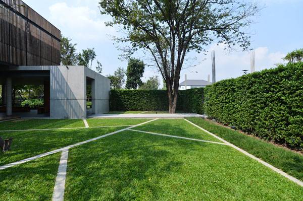
Baan Ladprao private residence. Photo courtesy of Landscape Architects 49 Ltd.
Baan Ladprao private residence
The designers were thoughtful of the owner’s requests and also created a space that can be enjoyed during the day and also for nighttime gatherings. Using simple hand sketches, they created an architecture that seamlessly flows from the clean lines of the interior to the lush green of the outdoors by overlapping spaces and mimicking materials. They also performed multiple drawing studies using function and form to come up with a design that reaped the largest benefit of each. In the end, they came up with a design that fulfills all the needs of the owner, as well as being aesthetically pleasing for all who use it.
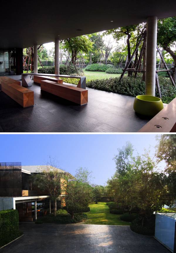
Baan Ladprao private residence. Photo courtesy of Landscape Architects 49 Ltd.
- Thai Landscape Architecture Award (TALA) 2015
- Baan Sukhumvit 16 Inspired by Ancient Japenese Philosophy
- Baan Krung Thep Kritha Turns Flooded Area into Dynamic Landscape
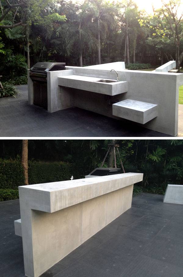
Baan Ladprao private residence. Photo courtesy of Landscape Architects 49 Ltd.
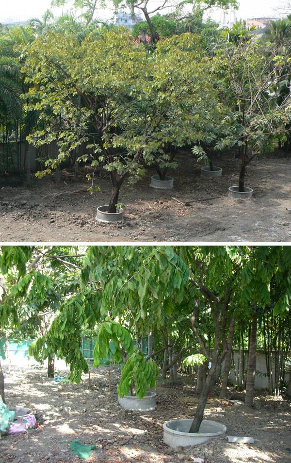
Baan Ladprao private residence. Photo courtesy of Landscape Architects 49 Ltd.
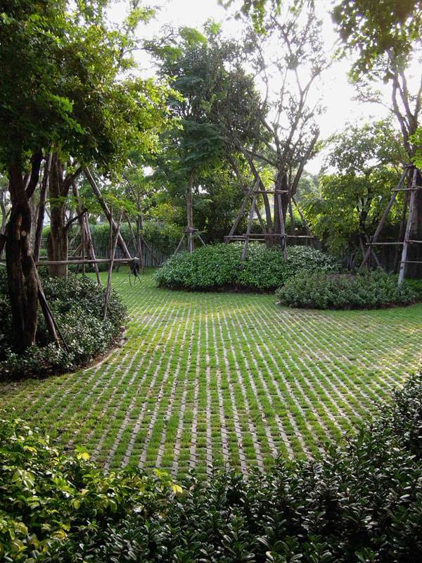
Baan Ladprao private residence. Photo courtesy of Landscape Architects 49 Ltd.
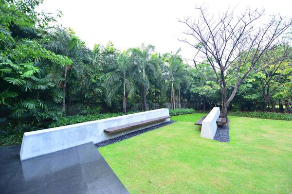
Baan Ladprao private residence. Photo courtesy of Landscape Architects 49 Ltd.
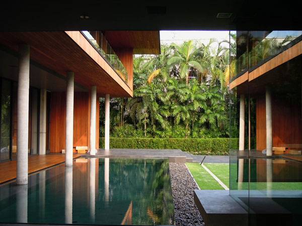
Baan Ladprao private residence. Photo courtesy of Landscape Architects 49 Ltd.
Baan Ladprao private residence. Photo courtesy of Landscape Architects 49 Ltd.
Full Project Credits for Baan Ladprao private residence:
Project: Baan Ladprao private residence Location: 155/55 Ladprao 80 Wang Thonglang District, Bangkok Designer: Landscape Architects 49 Ltd. Cost of Construction: 10MB Client: Private Residence Size: 20 rais (7.9 acres)
Recommended Reading:
- Landscape Architecture: An Introduction by Robert Holden
- Landscape Architecture, Fifth Edition: A Manual of Environmental Planning and Design by Barry Starke
Article by Erin Tharp
The Amazing Zhangjiagang Town River Reconstruction
Zhangjiagang Town River Reconstruction, by Botao Landscape (Australia), in Zhangjiagang, Suzhou, Jiangsu, China. Zhangjiagang Town River stretches 2,200 meters along busy commercial streets in Jiangsu, China. It begins at Gudu Harbor and extends to Gangcheng Boulevard, with an average width of almost 12 meters. Despite its large size, as the city began to expand around the river in the early 1990s, pollution started to overtake the water as raw sewage was drained from the surrounding houses directly into the river. The city didn’t have the means to clean it up due to the proximity of the houses, and the water quality began to suffer. This pollution began to have a huge impact on the city as a whole. The people soon became so overwhelmed by the dirty river, traffic congestion, and a failing infrastructure that they decided to seek help to clean up their beloved river with the hopes that the city would benefit, as well.
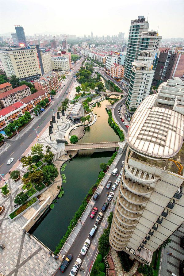
Zhangjiagang Town River Reconstruction. Image courtesy of Botao Landscape (Australia)
Zhangjiagang Town River Reconstruction
Botao Landscape was hired by the Zhangjiagang municipal government to not only clean up the river, but to also clean up and reorganize the city. Starting with a few black and white sketches, the design evolved into a complex new infrastructure for the city that includes lush plantings and a breathtaking display of lighting at night. The design team’s plan included a new road layout, with updated intersections and underground parking to resolve the problems of traffic congestion; a new ecological waterfront park meant to serve both the ecology of the river and still be welcoming to the people; and, finally, a new commercial and shopping district to improve the economy.
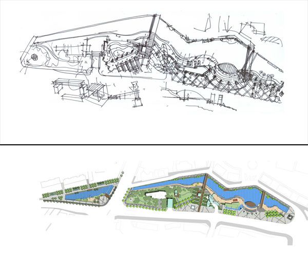
From concept to masterplan. Zhangjiagang Town River Reconstruction. Images courtesy of Botao Landscape (Australia)
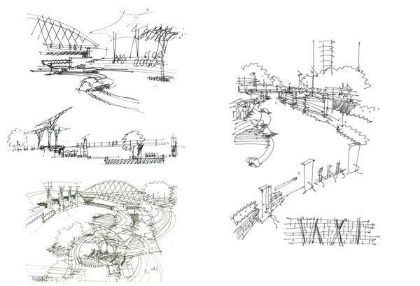
Sketches for Zhangjiagang Town River Reconstruction. Photo courtesy of Botao Landscape (Australia)
- Is China Transforming its Relationship with Water? A Look at the Aiyi River Landscape Park
- Awesome Plaza Shows You Why China Are World Leaders in Landscape Architecture
- Lotus Lake Park Sets Precedent for Sustainable Urban Design in China
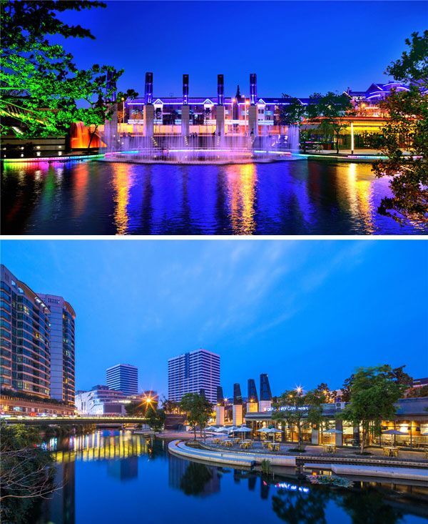
Zhangjiagang Town River Reconstruction. Photo courtesy of Botao Landscape (Australia)
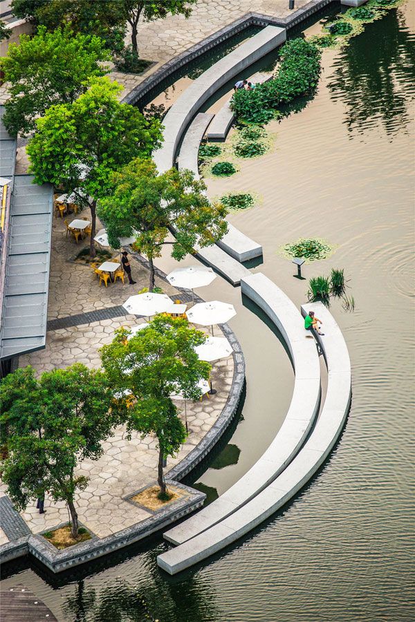
Zhangjiagang Town River Reconstruction. Photo courtesy of Botao Landscape (Australia)
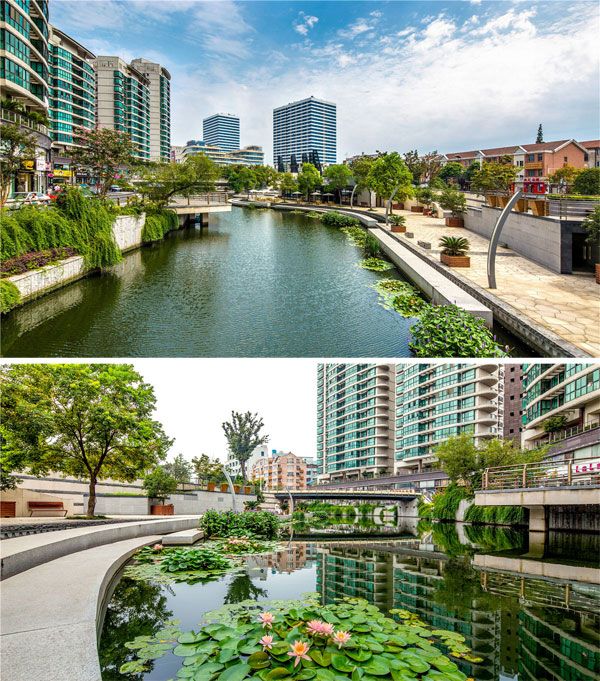
Zhangjiagang Town River Reconstruction. Photo courtesy of Botao Landscape (Australia)
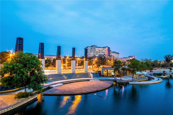
Zhangjiagang Town River Reconstruction. Photo courtesy of Botao Landscape (Australia)
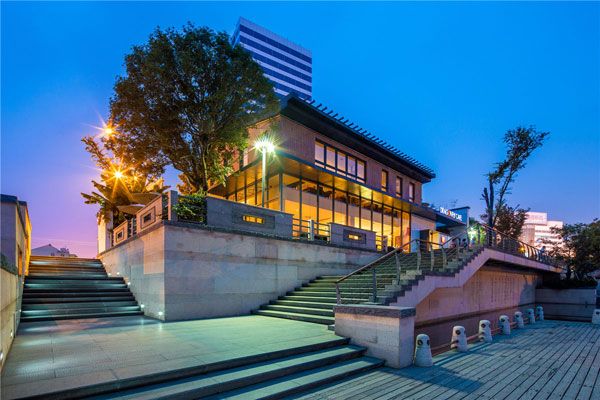
Zhangjiagang Town River Reconstruction. Photo courtesy of Botao Landscape (Australia)
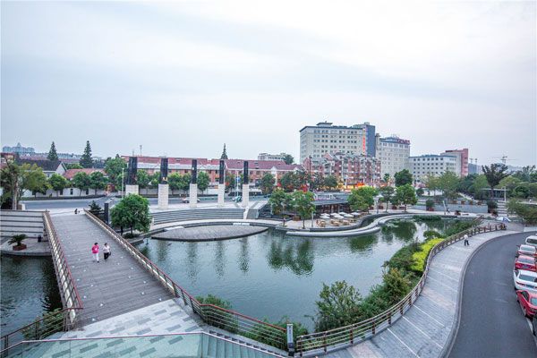
Zhangjiagang Town River Reconstruction. Photo courtesy of Botao Landscape (Australia)
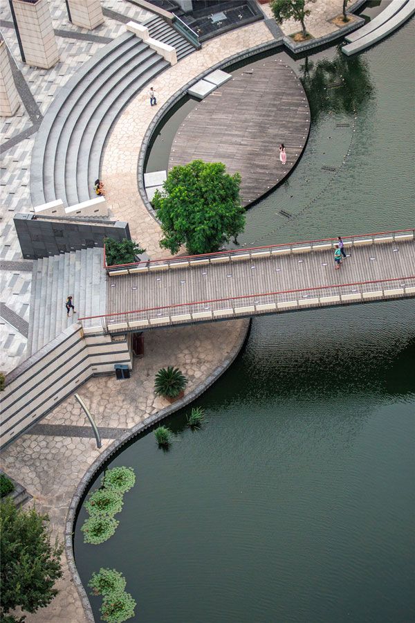
Zhangjiagang Town River Reconstruction. Photo courtesy of Botao Landscape (Australia)
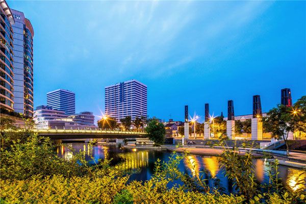
Zhangjiagang Town River Reconstruction. Photo courtesy of Botao Landscape (Australia)
Full Project Credit for Zhangjiagang Town River Reconstruction:
Project: Zhangjiagang Town River Reconstruction Location: Zhangjiagang City Price Control Bureau, 70 Renmin Middle Road, Zhangjiagang, Suzhou, Jiangsu, China, 215600 Design Team: Botao Landscape (Australia) Size: 65,000 square meters Client: Zhangjiagang municipal government Project Style: Modern Chinese Style Show on Google Maps
Recommended Reading:
- Landscape Architecture: An Introduction by Robert Holden
- Landscape Architecture, Fifth Edition: A Manual of Environmental Planning and Design by Barry Starke
Article by Erin Tharp
Grow Your Own Drugs: LAN’s Essential Guide to Ethnobotany
With lawns going out of fashion and urban agriculture making a big impression, more and more people are looking at what they can grow. Some are even looking at how to grow your own drugs. To understand the study of ethnobotany, one must first understand the meaning of the word. According to the Merriam-Webster dictionary, the word ethno means “race: people: cultural group” and the word botany is a “branch of science that deals with plant life.” So, with this in mind, one could assume that ethnobotany is the study of plants and their relationships with certain cultures. In fact, Merriam-Webster defines it as “the plant lore of indigenous cultures or the systematic study of such lore.” But how does ethnobotany relate to growing drugs? Simply put, one of the subcategories of ethnobotany is ethnomedicine — the study or comparison of the traditional medicine practiced by various ethnic groups, especially indigenous peoples.
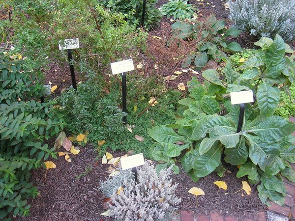
Benjamin Rush Medicinal Plant Garden, at the College of Physicians of Philadelphia, 19 S. 22nd St. Philadelphia, Pennsylvania, USA. Photo credit: Daderot. Licensed under Public Domain
Grow Your Own Drugs
Botanical Dimensions is an organization dedicated to the study of ethnobotany. According to their website, “Ethnomedicine is the study of traditional medicines, whether written (as in Ayurveda or Traditional Chinese Medicine), or remembered and transmitted via oral tradition (such as in much Native American, Latin American, or African folk medicine, or in Euro-American herbal medicine). Medical anthropology studies contemporary ethnomedicine, which includes concepts of what illness is and how healing occurs.” Herbalists and Spices from India Probably one of the most well-known examples of ethnomedicine would be that of the indigenous tribes of India, which is still in practice today by many who consider themselves to be herbalists.

An array of Indian Spices used in Indian and south Asian cuisine. Photo credit: Joe mon bkk. Licensed under CC-BY-SA 4.0
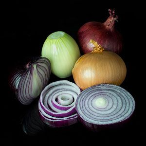
Mixed onions: red and brown onions, with and without skin, whole and sliced and in rings. Photo credit: Colin / Wikimedia Commons. Licensed under CC-BY-SA 3.0

Organically grown Garlic or Allium sativum taken at Leek and Bounds, North Hampton, NH. Photo credit: Jennifer Dickert. Licensed under CC-BY-SA 2.0
- How to Provide Easy Access to Urban Agriculture in Over Populated Cities
- 9 Ways to Incorporate Edible Planting into the Urban Landscape
- Landgrab City – Urban Farm
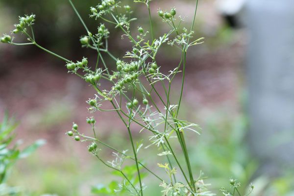
Cilantro going to seed. Photo credit: Keith McDuffee. Licensed under CC-BY-SA 2.0

These beautiful Pomegranates could be the solution you are looking for. Licensed under CC0 Public Domain
- Native American Ethnobotany by Daniel E. Moerman
- Herbal Drugs: Ethnomedicine to Modern Medicine by Kishan Gopal Ramawat
Interview with Landscape Photographer Erica Thum
LAN’s Erin Tharp interviewed landscape photographer, Erica Thum, gaining insights and expert tips on the topic of landscape photography. Once a design is installed, the next step is getting the right photos of the project to show off all its best features. This can sometimes be a challenge, especially if your photography skills are limited to the latest app on a smartphone. Landscape designer and freelance photographer Erica Thum is here to share her insights into how to really sell a project with amazing photos — with a real camera, not just a phone.
Landscape Photographer Erica Thum
LAN: Where do you find your inspiration for your photographs? Thum: I’ve been a photographer since I was about 10 years old, so photography has always just been part of who I am. Photography is how I explore the world around me. I think I use photography like many artists use drawing, as a way to stop and observe their surroundings and become more familiar with a place or people.
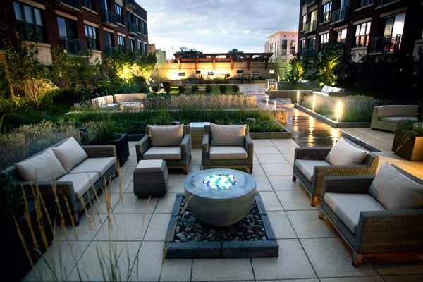
Photo credit: Erica Thum
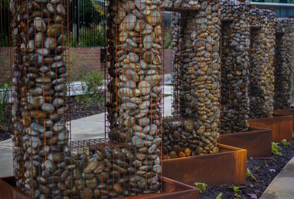
Photo credit: Erica Thum
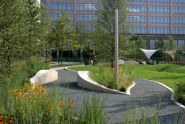
Photo credit: Erica Thum
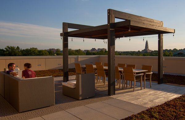
Photo credit: Erica Thum
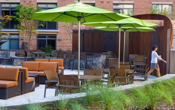
Photo credit: Erica Thum
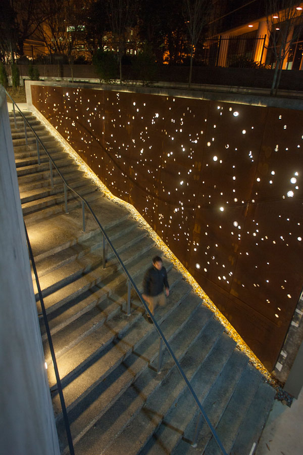
Parker Rodriguez’s Tellus project in Arlington. Photo credit: Erica Thum
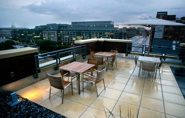
Photo credit: Erica Thum

Photo from Nepal. Photo credit: Erica Thum
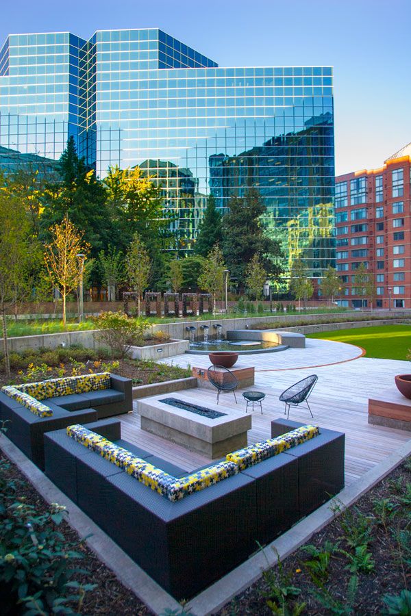
Photo credit: Erica Thum
- The Art, Science, and Craft of Great Landscape Photography by Glenn Randall
- Digital Landscape Photography: In the Footsteps of Ansel Adams by Michael Frye
Interview conducted by Erin Tharp Return to Homepage
Promenade Samuel-De Champlain Presents the Perfect Gift
Promenade Samuel-De Champlain by Consortium Daoust Lestage inc. + Williams Asselin Ackaoui + Option aménagement, in Quebec City, Quebec, Canada. The Quebec City government thought long and hard about the perfect gift to give to the city’s citizens to mark its 400th anniversary. After much debate, the majority of those involved decided a new park would make the perfect gift. This new park, The Promenade Samuel-De Champlain, became the first step in the city’s mandate to restore the St. Lawrence River by 2008. It was built along one of the sector’s degraded riverbanks, as an example of the city’s involvement in their mandate. Located in the borough of Sainte-Foy-Sillery-Cap-Rouge, between the dock and the coast of Cageux Sillery, the promenade is about 2.5 kilometers long, with 200,000 square meters ffollowing the course of the river.
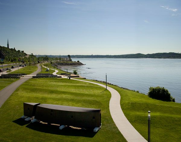
Promenade Samuel-De Champlain. Photo credit: Marc Cramer
Promenade Samuel-De Champlain
One of the main project goals was to revitalize this part of the river, and to restore shoreline vegetation that had disappeared, – which designers accomplished by building a promenade and boardwalk that would be sensitive to this fragile vegetation and allow it to grow without being disturbed, while still allowing park visitors to enjoy its beauty.
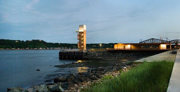
Promenade Samuel-De Champlain. Photo credit: Marc Cramer
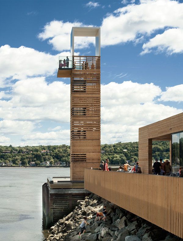
Promenade Samuel-De Champlain. Photo credit: Marc Cramer
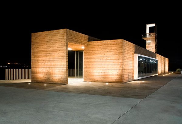
Promenade Samuel-De Champlain. Photo credit: Marc Cramer
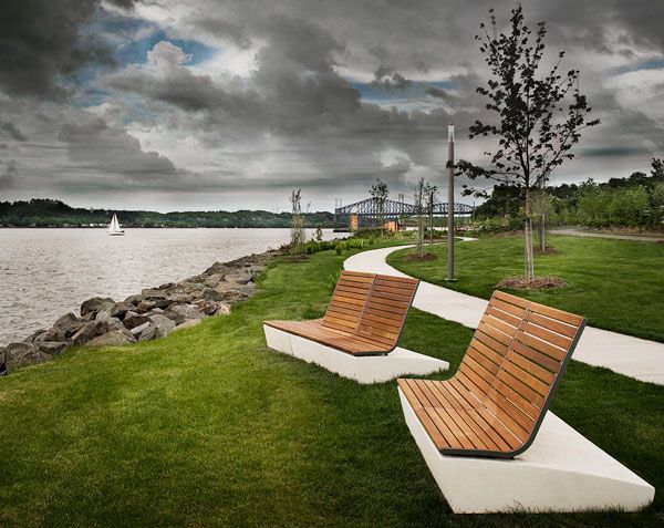
Promenade Samuel-De Champlain. Photo credit: Marc Cramer
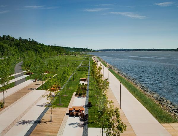
Promenade Samuel-De Champlain. Photo credit: Marc Cramer
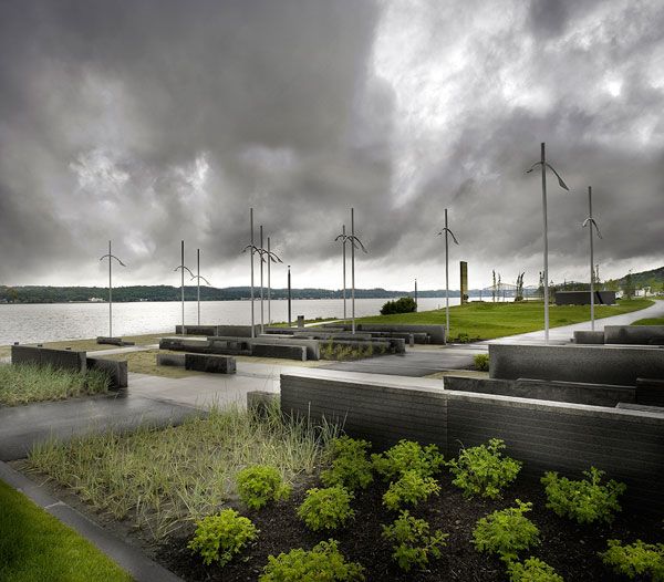
Promenade Samuel-De Champlain. Photo credit: Marc Cramer
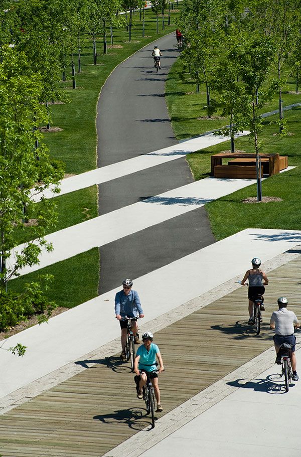
Promenade Samuel-De Champlain. Photo credit: Marc Cramer
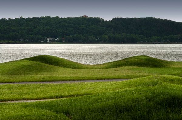
Promenade Samuel-De Champlain. Photo credit: Marc Cramer
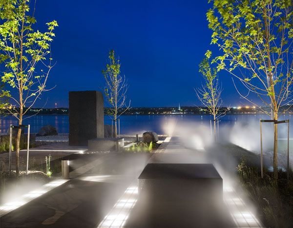
Promenade Samuel-De Champlain. Photo credit: Marc Cramer
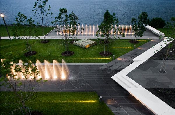
Promenade Samuel-De Champlain. Photo credit: Marc Cramer
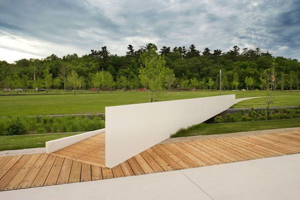
Promenade Samuel-De Champlain. Photo credit: Marc Cramer
- Urban Design by Alex Krieger
- The Urban Design Handbook: Techniques and Working Methods (Second Edition) by Urban Design Associates
Article by Erin Tharp Return to Homepage
How Uptown Normal Started an Economic BOOM!
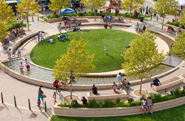
Uptown Normal, by Hoerr Schaudt in Normal, United States. Located halfway between the two major US cities of Chicago and St. Louis, Normal, IL is a mid-size city of around 52,000 people with a relatively small Central Business District and a modest governmental budget. At least it was in 2002. However, since the redevelopment project of Uptown Normal, the Central Business District, the town has seen a resurgence of new life and energy that has literally transformed a once “normal” city into a vibrantly sustainable destination. The master plan for the revitalized district required future buildings be built in masses and would be required to adopt high-performance green practices, a revolutionary idea in 2002. But it was the concept for the street that made the design stand out as unique.
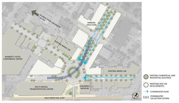
Uptown Normal masterplan. Credit: Hoerr Schaudt. (Click here to view larger version on our Pinterest Page)
Uptown Normal
At the center of the redevelopment is The Circle, which at its core is simply a traffic calming devise meant to be a resolution for a misaligned intersection. However, the designers at Hoerr Schaudt transformed this circle into much more. Hoerr Schaudt describes the Circle as “the core design feature of a larger Uptown Normal renewal plan with a heavy emphasis on sustainability. A model of smart growth, the plan directed development to the Town’s historic core to utilize existing infrastructure, transit choices, and higher density. The Circle gives Normal a public green with a strong sense of place – particularly important in a community with no distinctive natural features and a better-known sister city.”
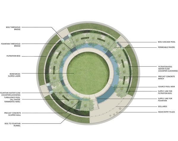
Uptown Normal masterplan. Credit: Hoerr Schaudt. (Click here to view larger version on our Pinterest Page)
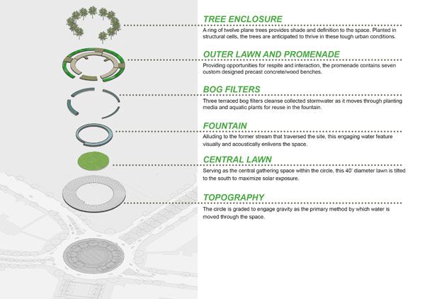
Uptown Normal. Credit: Hoerr Schaudt. (Click here to view larger version on our Pinterest Page)
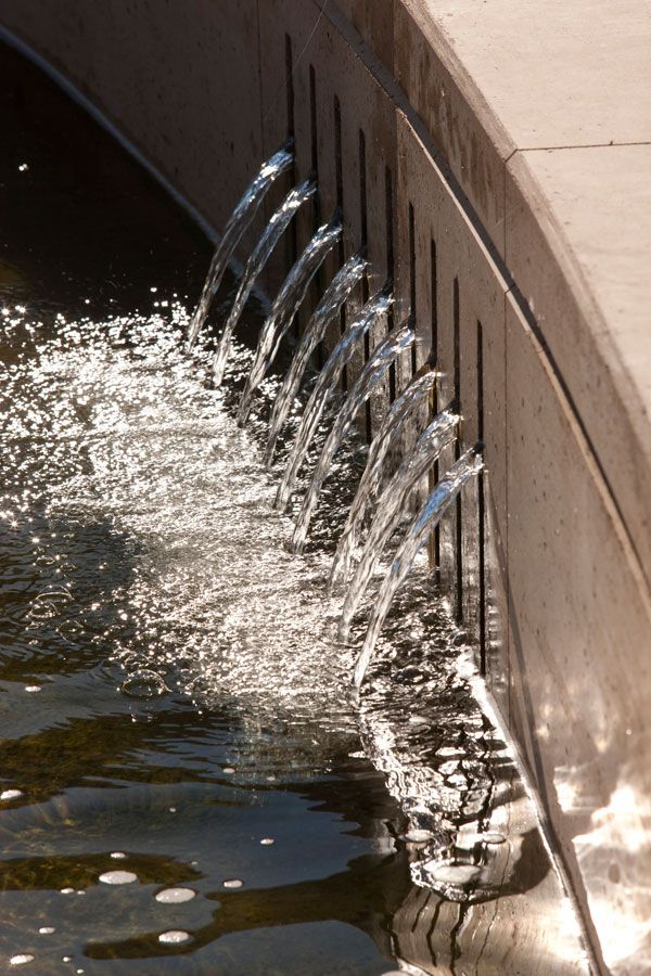
Uptown Normal. Photo Credit Scott Shigley – Hoerr Schaudt.
- Beautiful Plaza Celebrates Canadian Landscape
- Perez Art Museum Embraces the Landscape Inside and Out
- Ceramic Museum and Mosaic Garden
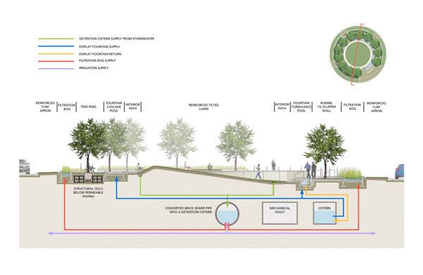
Uptown Normal. Credit: Hoerr Schaudt. (Click here to view larger version on our Pinterest Page)
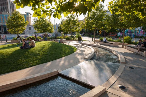
Uptown Normal. Photo Credit Scott Shigley – Hoerr Schaudt
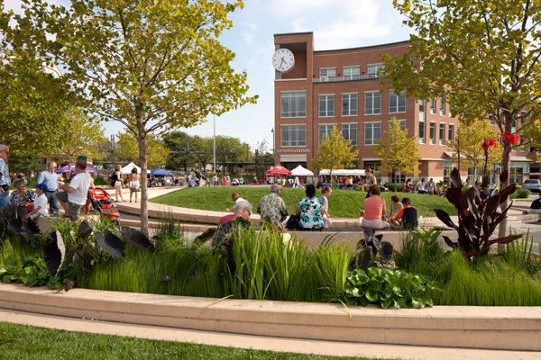
Uptown Normal. Photo Credit Scott Shigley – Hoerr Schaudt
Uptown Normal sets the Stage for Economic BOOM
The redevelopment also improved the city’s finances. The study found that the area generated more than $680,000 by hosting conferences that featured the Uptown Normal redevelopment. Property values also increased. The city noticed a $1.5 million increase from 2009 to 2010, and a phenomenal 31 percent increase from 2004.
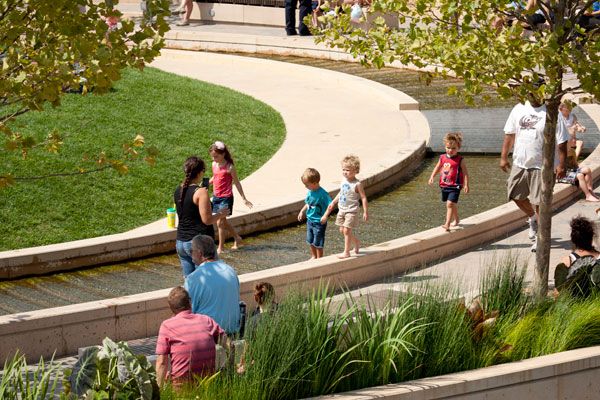
Uptown Normal. Photo Credit Scott Shigley – Hoerr Schaudt.
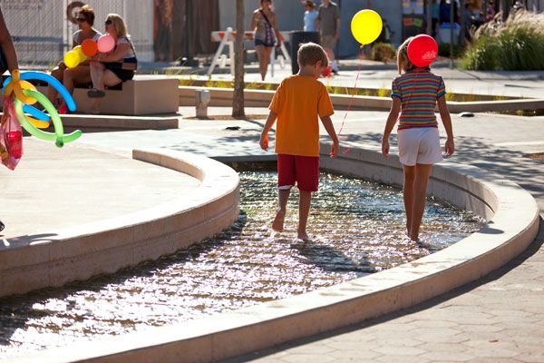
Uptown Normal. Photo Credit Scott Shigley – Hoerr Schaudt.
Uptown Normal. Photo Credit Scott Shigley – Hoerr Schaudt.
- Urban Design by Alex Krieger
- The Urban Design Handbook: Techniques and Working Methods (Second Edition) by Urban Design Associates
Article by Erin Tharp Return to Homepage
How the Coyoacán Corporate Campus is Pioneering Sustainable Ideas
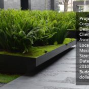
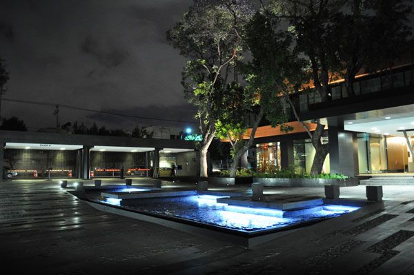
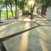
Coyoacán Corporate Campus, by DLC, in Mexico City, Mexico.
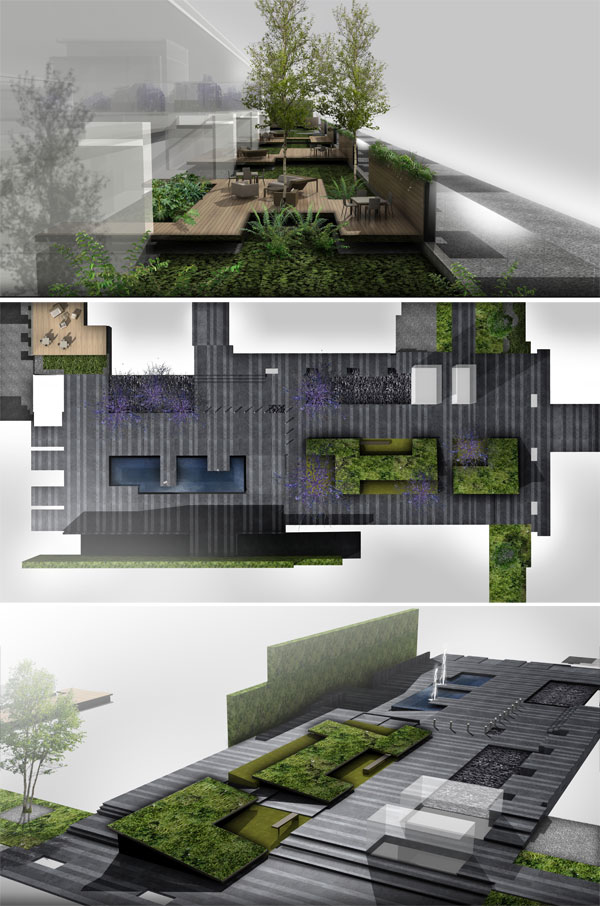
DLC is an interdisciplinary studio that describes their approach as following both the principles of aesthetics and of environmental design to create spaces that, according to owners Maria Domínguez and Rafael López, “blur the edges between design, architecture, and landscape.” This approach can be seen in one of their latest projects, the Coyoacán Corporate Campus, completed in 2013 and located in one of Mexico City’s oldest neighborhoods.
Unlike some of the more modern areas of Mexico City, the neighborhood of Coyoacán, located in the Federal District, is characterized by its old world charm and low-rise buildings, which the design team sought to emulate through their thoughtful design. Coyoacán 1622, a corporate building, is unique in its design in that it is not the typical high-rise found in other parts of the city. Instead, the project was built horizontally to take advantage of the beautiful local weather and to mimic the nearby buildings and architecture.
Renderings from DLC Architects.
Coyoacán Corporate Campus
Originally, the site was an old pharmaceutical laboratory complex, the interdisciplinary team of designers were tasked with renovating it and transforming it into an office campus or park, instead of tearing it down and starting from the beginning.
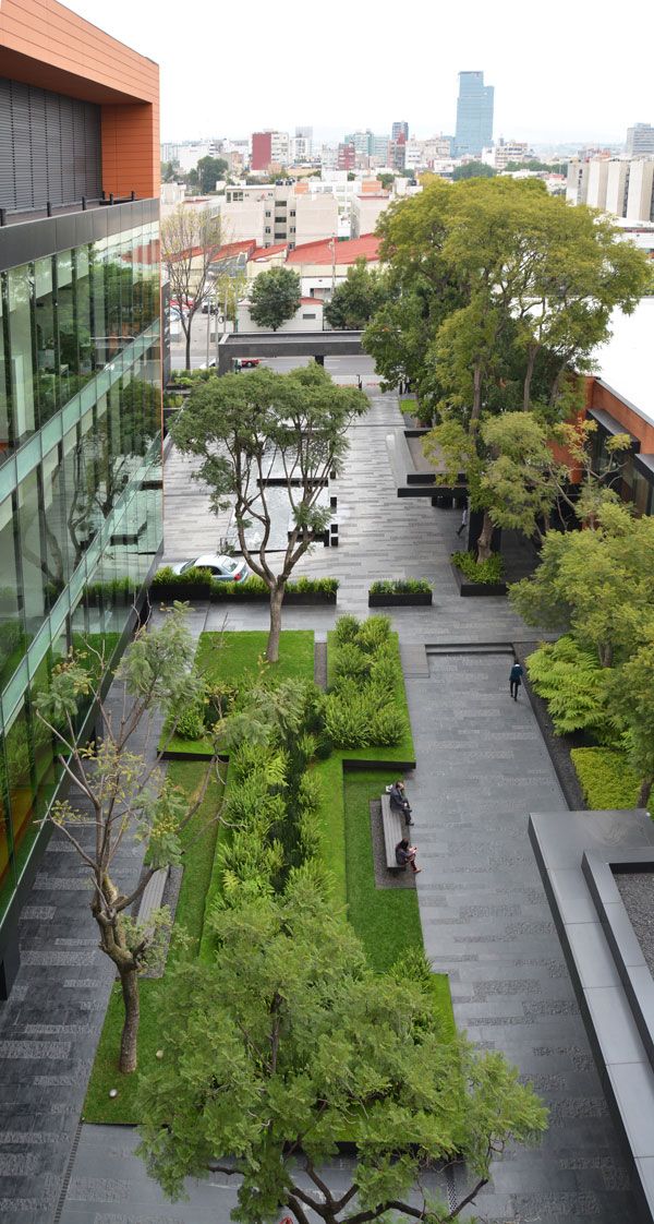
Photo courtesy of DLC Architects
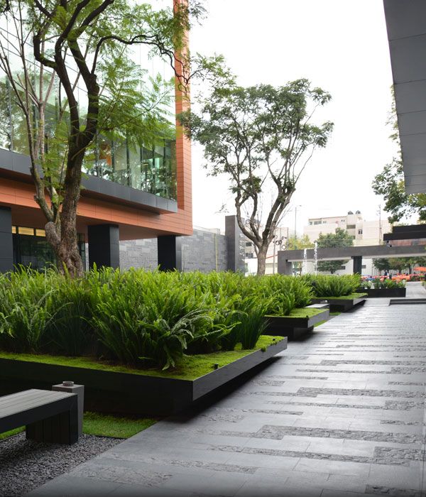
Photo courtesy of DLC Architects
- Car Park Turns into Public Park!
- Private Estate Reveals State of The Art Underground Car Park
- The Dark Secrets Behind Sustainable Urban Design Revealed in Şışhane Park
78,000 Square Foot of Green Dedication
Almost half of the 78,000 square foot site is dedicated to these green areas, with over 9,000 square feet of wooden terraces, or decks, which further enforces the importance of the outdoors to this project.
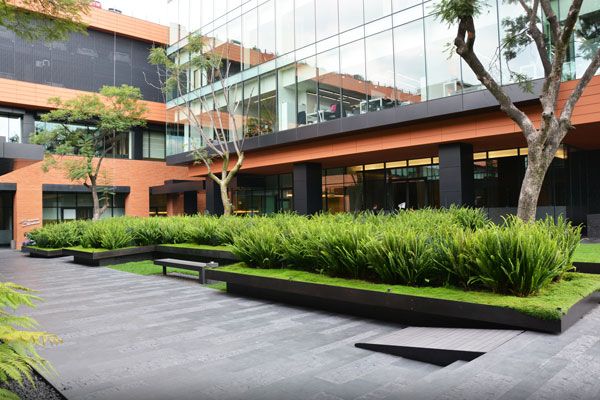
Photo courtesy of DLC Architects
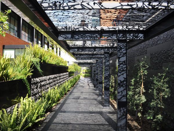
Photo courtesy of DLC Architects
“wood made of 60 percent bamboo and 40 percent non-toxic resin” The design team also specified composite wood made of 60 percent bamboo and 40 percent non-toxic resin for all of the folded wooden decks found throughout the site. Finally, planters and benches were formed from thicker than normal steel plates.
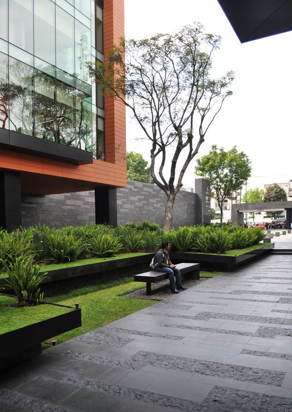
Photo courtesy of DLC Architects
- Landscape Architecture Now! by Philip Jodidio
- Street Design: The Secret to Great Cities and Towns by John Massengale
Article by Erin Tharp
2015 TALA Awards — Excellence Award Winners
We take a closer look at who finished on top in the 2015 TALA Awards. A few weeks ago, Landscape Architects Network announced the finalists in Thailand’s 2015 TALA Professional Awards competition, and now we are excited to announce the six projects to win Awards of Excellence. These projects were recognized at an awards ceremony March 21.
2015 TALA Awards
In no particular order, they are: 1. General Design — Residential Complex: Parkland Srinakarin, Bangkok, by Landscape Architects 49 Limited The design for this project was inspired by the notion of transforming the natural form into something playful, artful, and functional. Landforms and changes in topography were utilized to subdivide the spaces to accommodate individual uses and to provide privacy when needed, while plants were used to reduce the heat island effect and provide the feel of a sanctuary for residents. The firm also worked to design an underground pipe system to deal with excess stormwater runoff from the parking areas. The system deposits that runoff into a natural stream and pond.

Parkland Srinakarin. Photo courtesy of Landscape Architects 49 Limited
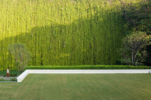
137 Pillars House. Photo courtesy of P Landscape Co., Ltd.
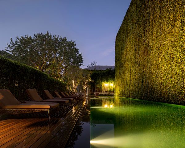
137 Pillars House. Photo courtesy of P Landscape Co., Ltd.
- Residents Get Luxurious Garden and Pool Project in Thailand
- The Garden of Hilton Pattaya by TROP : terrains + open space
- A Greener Housing Solution Reducing The Impacts in The Neighbourhood
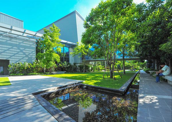
Thai Public Broadcasting Service (Thai PBS) Headquarter. Photo courtesy of XSiTE Design Studio Co., Ltd.

Suan Mingmongkol. Photo courtesy of Landscape Architects 49 Limited
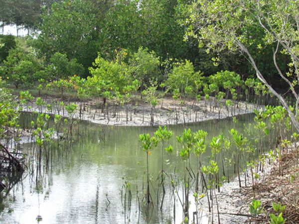
Sirindhorn International Environmental Park อุทยานสิ่งแวดล้อมนานาชาติสิรินธร. Photo courtesy of Landscape Planning Co.,Ltd.
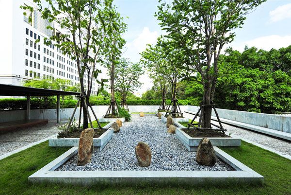
Buddhadasa Indapanno Archives (Suan Mokkh Bangkok) . Photo courtesy of XSiTE Design Studio Co., Ltd.
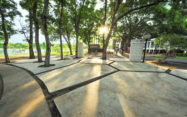
Buddhadasa Indapanno Archives (Suan Mokkh Bangkok) . Photo courtesy of XSiTE Design Studio Co., Ltd.
- Site Engineering for Landscape Architects by Steven Strom
- The Artful Garden: Creative Inspiration for Landscape Design by James van Sweden
Article by Erin Tharp Return to Homepage
8 Reasons Why You’re Going to Drop out of College and How to Avoid Them
8 insights into common reasons why students drop out of college and how they can be avoided. Every college student at some point in time has doubts about their education and every student at some point in time will threaten to drop out for every reason imaginable. Landscape architecture students are no different. In fact, their list of reasons for wanting to drop out can be quite long and creative. But in the end, for every reason you come up with for dropping out there is a more powerful argument for sticking with it. Here are the 8 reasons you’re going to drop out and how to avoid them.

THIS WILL HAPPEN TO YOU! Don’t forget to save your work repeatedly, but if you do, remember it’s not the end of the world.

Stop focusing on your over achieving class mate and start focusing on yourself. Image credit: License: CC0 Public Domain / FAQ

4/5 years will be gone before you know it, so don’t sweat it.
- 9 Ways to Milk Your Professors for Everything They’re Worth!
- The 10 Stages of Being a Landscape Architecture Student: GIF party part 2
- 7 Things You Should Never do as a Landscape Architecture Student!
By pushing you to do your very best they are preparing you for a highly competitive industry where only the best projects actually get built. So, unless you’re fine with drawing base plans and construction documents all day, listen to them and correct your projects so that when it’s time to create a portfolio you’ll be presenting your very best. 1. You don’t believe in yourself After all the bad reviews and lack of sleep, you feel like you’ll never succeed as a landscape architect, not to mention you’ve yet to land that high profile internship. This is the hardest to fix because in the end a negative outlook can be detrimental to your career. Take heart, even the best of the best have had their doubts, so take a walk, grab a snack and look back at some of your best projects and remember why you want to do this. In the end, landscape architecture is a noble profession that will allow you to change the world, even if it’s only one yard at a time, for the better. Who else can claim to be a steward of the natural environment, after all? No one, that’s who. So, suck it up, go to all your classes, stay up all night, grow a thick skin, and don’t forget to hit the local coffee shop before heading to class. Recommended Reading:
- The 4-Hour Workweek: Escape 9-5, Live Anywhere and Join the New Rich (Expanded and Updated) by Timothy Ferriss
- Getting Things Done: The Art of Stress-Free Productivity by David Allen
Article by Erin Tharp Return to Homepage Featured image: Source. License: CC0 Public Domain / FAQ
Thai Landscape Architecture Award (TALA) 2015
We preview the Thai Landscape Architecture Award (TALA) 2015. The Thai Association of Landscape Architects (TALA) is a group that, according to its own objectives, “aims to raise the standards of landscape architecture and to promote the fellowship of ethics and honor.” One way the association is doing this is through the TALA Awards, which are aimed at honoring the excellence of Thailand’s landscape architects with hopes of promoting the many landscape innovations within Thailand’s landscape and architectural design industries while inspiring the next generation of Thailand’s landscape architects. Each nominated project stands out for its innovation in lighting, planting design, and overall beauty and functionality in the space. Each project also represents the landscape of Thailand and aims to promote environmental responsibility and awareness to the people that use and enjoy them.
Thai Landscape Architecture Award
On behalf of TALA, Landscape Architects Network (LAN) would like to announce the nominees for the TALA awards. The following list of finalists represents the best in landscape architecture. They are honored in eight categories — each category will have one award for excellence and one to three honor awards. 1. Private Residences Project The projects in this category include stunning pools and breathtaking lighting schemes mixed in with lush plantings. Landscape Architects 49 is nominated three times in this category for three separate projects, all located in Bangkok. They are the Baan Sukhumvit 16, the Baan Krung Thep Kritha, and the Baan Ladprao. LOKOH= is nominated for the T. Residence, also in Bangkok.
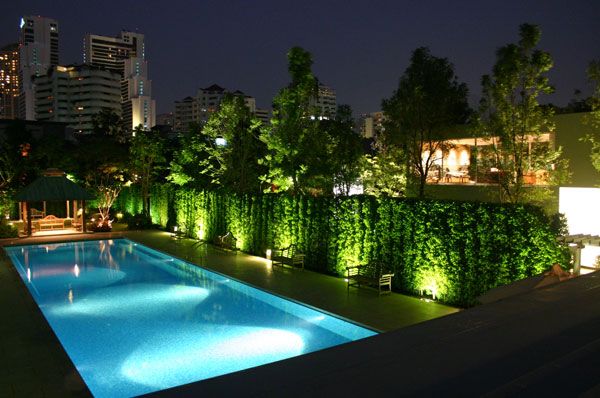
Baan Sukhumvit 16, Photo courtesy of Landscape Architects 49 Limited
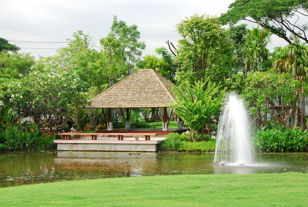
Baan KrungThep Kritha. Photo courtesy of Landscape Architects 49 Limited
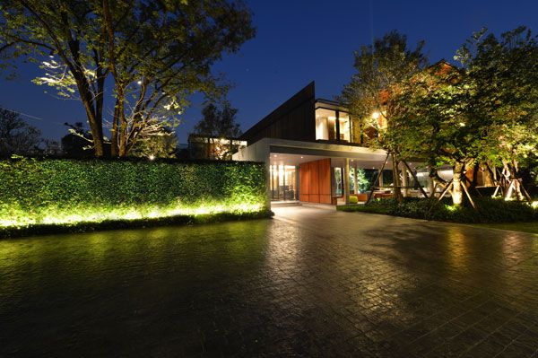
Baan Ladprao. Photo courtesy of Landscape Architects 49 Limited
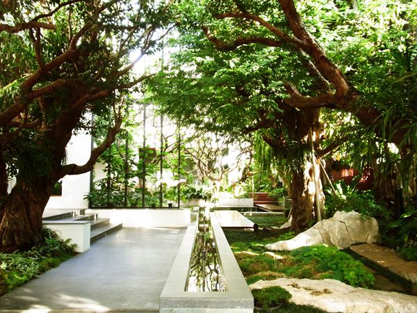
T.Residence. Photo courtesy of LOKOH= Co., Ltd.
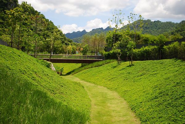
23̊ Estate. Photo courtesy of Shma CO., Ltd.
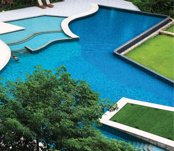
Parkland Srinakarin. Photo courtesy of Landscape Architects 49 Limited
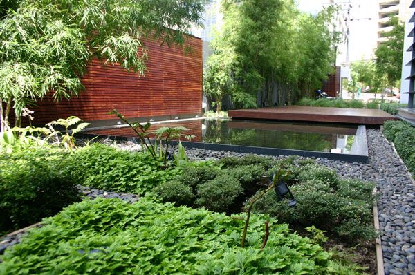
Domus Condominium. Photo courtesy of Landscape Architects 49 Limited
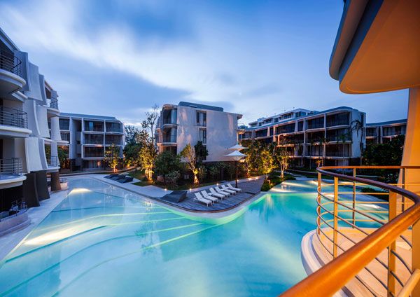
Bann San Kraam. Photo courtesy of Sanitas Studio Co., Ltd
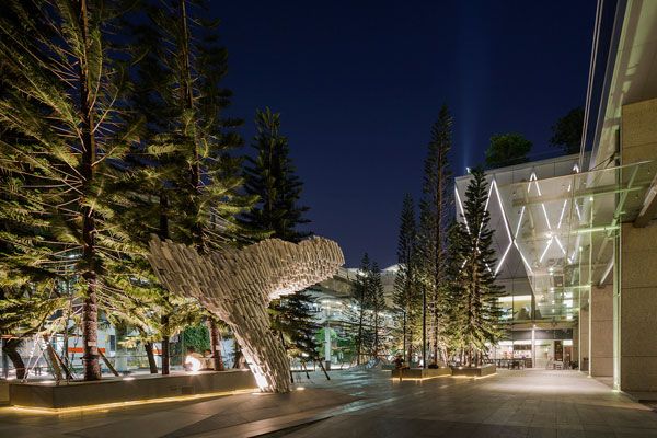
Park Ventures Ecoplex. Photo courtesy of P Landscape Co., Ltd.
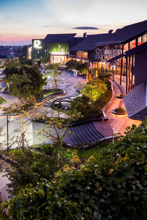
Central Chiangrai. Photo courtesy of Shma Co., Ltd.
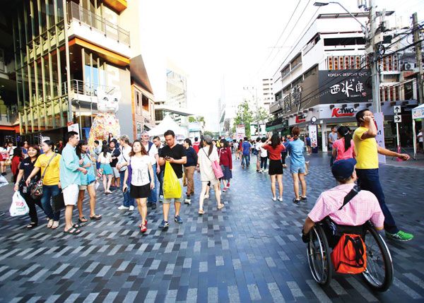
Siam Square One. Photo courtesy of Landprocess Co., Ltd.

137 Pillars House. Photo courtesy of P Landscape Co., Ltd.
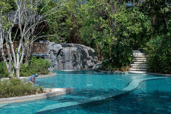
Renaissance Phuket Hotel. Photo courtesy of Landscape Architects 49 Limited
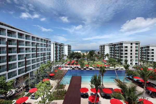
Amari Hau Hin Resort & Amari Residence HauHin. Photo courtesy of P.L. Design Company Limited
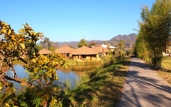
Montis Resort Maehongson. Photo courtesy of iXora Design Limited

Thai Public Broadcasting Service (Thai PBS) Headquarter. Photo courtesy of XSiTE Design Studio Co., Ltd.
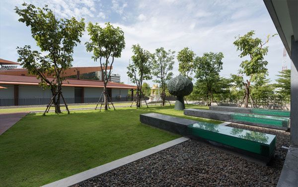
Thai Health Center Head Office. Photo courtesy of XSiTE Design Studio Co., Ltd.
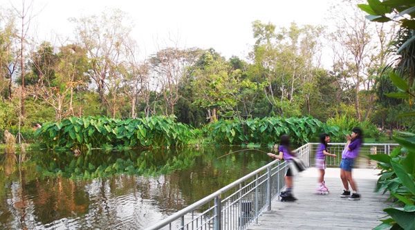
Bang Sue Environmental Education and Conservation Center Project. Photo courtesy of Group Three Design Co., Ltd.
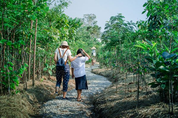
PTT Eco Forest Rayong Wanarom Learning Center. Photo courtesy of KV Art & Design Co., Ltd.
- The Garden of Hilton Pattaya by TROP: terrains + open space
- Residents Get Luxurious Garden and Pool Project in Thailand
- Top 10 Names In Landscape Architecture Today
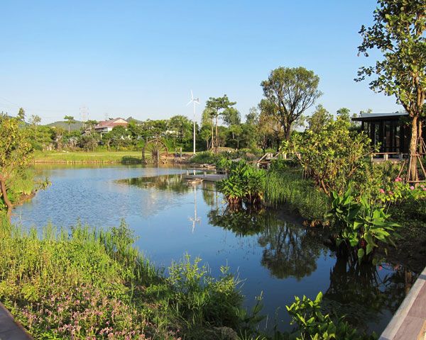
Suan Mingmongkol. Photo courtesy of Landscape Architects 49 Limited
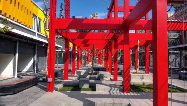
Suanluang Square. Photo courtesy of Landprocess Co., Ltd.
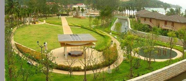
Kamala Beach, Phuket – Tsunami Memorial Park and Evacuation Route. Photo courtesy of Group Three Design Co., Ltd.
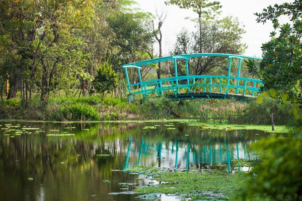
Siree Ruckhachat Nature Learning Park.AXIS LANDSCAPE LIMITED

Sirindhorn International Environmental Park อุทยานสิ่งแวดล้อมนานาชาติสิรินธร. Photo courtesy of Landscape Planning Co.,Ltd.
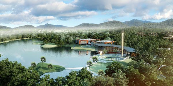
Vidyasirimedhi Institute of Science and Technology and Kamnoetvidya Science Academy (VISTEC & KVIS) . Photo courtesy of Landscape Architects 49
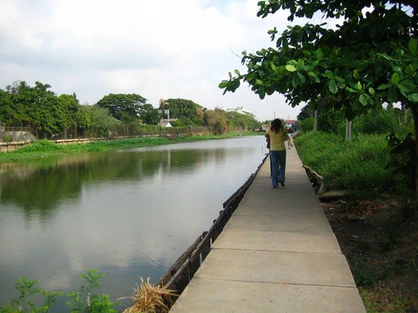
Lat Kra Bang Master Planning. Photo courtesy of iXora Design Limited

Buddhadasa Indapanno Archives (Suan Mokkh Bangkok) . Photo courtesy of XSiTE Design Studio Co., Ltd.
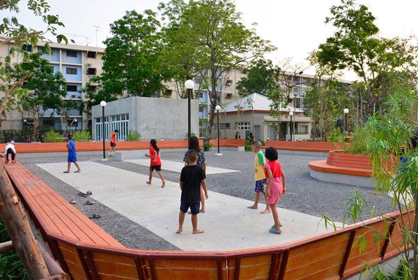
LANKILA PAT1. Photo courtesy of Shma SoEn Co., LTD.
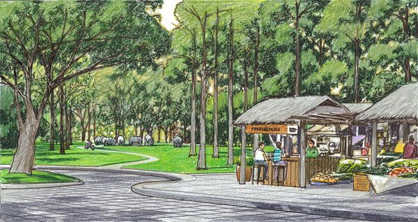
Elephant Kingdom. Photo courtesy of P.L. Design Company Limited
Thai Landscape Architecture Award Announcement
The award ceremony will be held from 3 to 9 p.m. March 21 at the Bangkok Art and Cultural Centre in Bangkok. The winners will also be announced here, on Landscape Architects Network. Recommended Reading:
- Urban Design by Alex Krieger
- The Urban Design Handbook: Techniques and Working Methods (Second Edition) by Urban Design Associates
Article by Erin Tharp Return to Homepage
How Departments of Parks and Recreation Are Making the World a Better Place
A deeper look at the contribution that the Departments of Parks and Recreation have made to the world. In the late 1800s, parks were known as “pleasure grounds.” These large tracts of land were located on the edges of large cities and were meant to simulate the countryside for wealthy urban dwellers. This was the problem with these early parks — they weren’t meant to be used and enjoyed by the working class, who had no easy way to get to them. In 1930, Robert Moses, an early commissioner of New York City’s Parks Department, changed the way parks and recreation departments around the world operated. It was because of his justification for spending money on urban parks that other cities were able to follow his lead, grow their park systems, and create public spaces that are literally changing the way the world lives and plays.
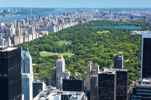
Can you imagine New York without Central Park; credit: shutterstock.com
Departments of Parks and Recreation
Nations Take the Lead One such park system that has not only brought recreation to the masses but has also been a leader in conservation and restoration is the United States National Park Service. According to its website, the national park system comprises 407 areas and covers more than 84 million acres, with public lands in every state, the District of Columbia, American Samoa, Guam, Puerto Rico, and the Virgin Islands. WATCH: An Epic sampling of America’s National Parks
These include national parks, monuments, battlefields, military parks, historical parks, historic sites, lakeshores, seashores, recreation areas, scenic rivers and trails, and even the White House. Their success and influence can be shown in their visitation rate: More than 273 million people visited a National Park Service site in 2013. Want more park related articles, check these out:
- Pocket Parks: Why size doesn’t matter
- Is The André Citroën Park Really One of The Worst Parks in Paris?
- The Flying Parks- From The Highline in New York to The Promenade Plantée in Paris!
Other countries have also turned to parks to teach the masses about conservation and sustainability. In places like China, where overpopulation and a lack of resources are common problems, parks are becoming more than just places to seek relaxation or play a game of pickup basketball.
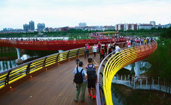
Yanweizhou Park – “40,000 visitors each day”. Credit: Turenscape
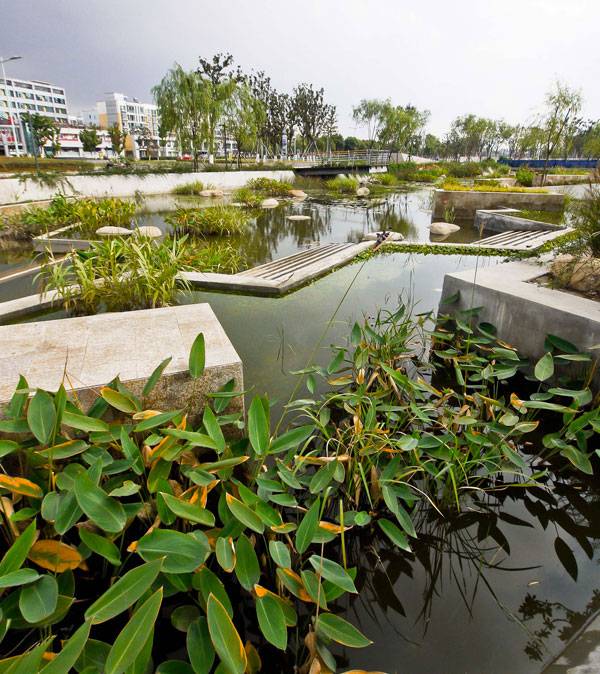
Lotus Lake Park – The parks upper ponds are large visual feature that include water cascades and plantings of the famed double-headed lotus flower. Credit: Integrated Planning and Design Inc.
Systems Becoming Models for Future Development Around the World And at the forefront of this park is public safety, due to its location. The land the park sits on is being capped with an impermeable plastic liner and eight additional layers of barrier material to separate the new park space from the landfill below. Systems in place to manage the landfill gas and leachate byproducts include visible white stacks of flare stations and the extensive underground network of piping and drainage channels. These systems are becoming models for cities around the world seeking to make the same reclamations.
No Park is Too Small for the Departments of Parks and Recreation
In addition to these grand gestures, smaller parks are also changing the lives of adults and children around the world who live in huge urban cities by simply giving them green areas in which to relax, play, and enjoy a rare glimpse of nature that they would otherwise not be able to experience.
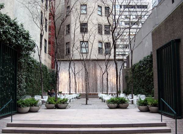
The coolest pocket park in the world – “Creative Commons Paley Park on a cloudy, chilly late winter afternoon”. By Jim.henderson licensed under CC
- Urban Design by Alex Krieger
- Digital Drawing for Landscape Architecture by Bradley Cantrell
Article by Erin Tharp Return to Homepage
7 Top Landscape Architecture Trends of the 21st Century
A list of the trends that are hitting the profession of landscape architecture. Typically a trend is something that is considered a passing craze, but the actual definition according to Oxford Dictionaries is “a general direction in which something is developing or changing.” Such is the case with landscape architecture and some of the “trends” of the 21st century. Below are the top 7 landscape architecture trends of the 21st century, listed in alphabetical order.
Landscape Architecture Trends
1. 3D Modeling While 3D Modeling Software has been around since the 1980s, these programs have really started to shine in the last decade. AutoCAD and SketchUp are seen as must know programs in almost every design office and many also require Vectorworks and Revit. And now, with 3D printers, these 3D models actually take form and bring modeling to a whole new amazing level. WATCH: Leaders Of The 3D Printing Revolution
2. Innercity Design It could be argued that Frederick Law Olmsted started this movement with his major park designs for cities like New York, Boston, and Chicago, but this trend is speaking more on the actual design of city streets, pocket parks, and neighborhood parks not just for beautification but also to improve public health.
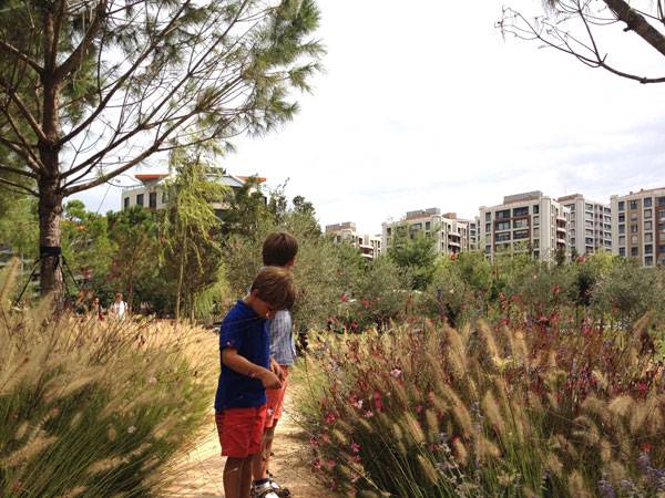
ARTICLE: How New Urbanization Can Help People Live Better Lives. Credit: SdARCH Trivelli & Associati
- 10 Mistakes Every Landscape Architecture Student Makes and How to Avoid Them
- 5 Cities a Landscape Architecture Student Should Visit and Why
- The 10 Stages of Being a Landscape Architecture Student: GIF party part 2
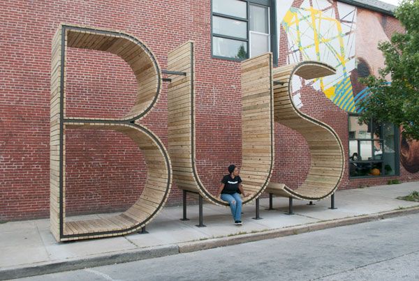
These white, curvilinear, fiber reinforced polymer panels were designed by Water Geiger and are known as the “Cascade Series,” and are meant to help bring art to the public while also providing much-needed shade to bus riders. Other innovative designs include shelters that incorporate solar panels and green roofs, or more obvious designs like the stop on South East Avenue in the Highlandtown neighborhood of Baltimore, by Madrid-based artist collective Mmmm, where the structure is actually three 14-foot-tall, 7-foot-wide letters that spell “BUS.” 4. Cycling routes Cities like Copenhagen are leading the way in designing cycling routes that don’t compete with cars or pedestrians, and other cities are starting to follow their lead. Countries like the Netherlands have over 99 percent of their population riding bicycles for their daily commute and China has almost 500 million people commuting by bike.
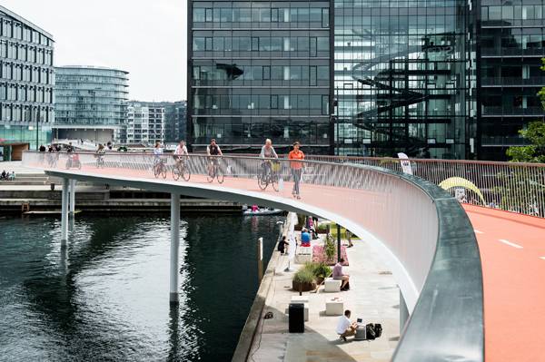
ARTICLE: Can Copenhagen be the best cycling city in the world? Credit: DISSING+WEITLING
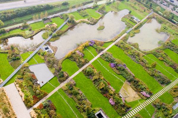
ARTICLE: A Roof Garden That’s so Good, You Might Want to Work There!. Credit: Van der Tol Hoveniers en terreininrichters bv.

ARTICLE: 1315 Peachtree Street achieves LEED standard. Credit: Perkins + Will.
- Landscape Ecology Principles in Landscape Architecture and Land-Use Planning by Wenche Dramstad
- Principles of Ecological Landscape Design by Travis Beck
Article by Erin Tharp. Return to Homepage


