


Author: Frank Varro
Libeskind’s 17 Words of Architectural Inspiration
This morning, as I was tweaking my website, I decided to add a mission statement of sorts to my front page:
“I believe in working and designing the right way, not just the easy way. I believe that a big idea with deep meaning can always be reduced to a do-able level while maintaining its impact, while a small idea cannot be injected with meaning. I believe that every design challenge should be met like a competition, with bold, innovative ideas, with the knowledge that it can be scaled back to fit real world circumstances.”
This is really the essence of what I think makes the difference between OK design and great design. The willingness to step way outside the box, into the realm of the unachievable, and then to look at how that idea can be tweaked and pulled on to get a workable design.
Not two hours after I published the addition to my webpage I stumbled onto this gem:
It may seem, as someone who blogs about technology and tutorials on Photoshop graphics, that I might at least take issue with the hand vs. computer portion, but I agree totally with what he was saying. The computer is a great way to show ideas in new, creative ways. However, I also fully believe that the hand is the best tool for any conceptual design or rough graphics, and as you can tell from my tutorials, I do think that computer rendered plans are still somewhat cold in comparison to a hand drawing.
While you may not like all of his designs, if more designers thought the way Libeskind does, instead of just a select few, we would have a much more vibrant and less stagnant industry.
Tuesday Tutorial: Waterfalls, and Streams
Waterfalls and streams are things that, in my opinion, can greatly effect the quality of your overall render , even if they are only a minor component of the design. Done correctly, they can add life and movement to your rendering, done wrong and they become strangely shaped pools. Today I’m going to go over my rendering techniques for these critical items. As always, feel free to use them, tweak them, or ignore them. Let me know what you think!
Streams and Waterfalls
Step 1: Bite Off More Than You Can Chew… Or Need
When you start the stream, the first thing you want to do is pick an area that is a decent bit larger then the area that makes up the stream, to give yourself some room to work.
Step 2: Fill and Distort
Take the area you selected, and fill it with the plain water texture you made with last Tuesday’s tutorial.
Then add the same distortion effects you used last week for the . This gives you the same bubbly water look, which works well for a flowing stream.

Step 3: Place the Water
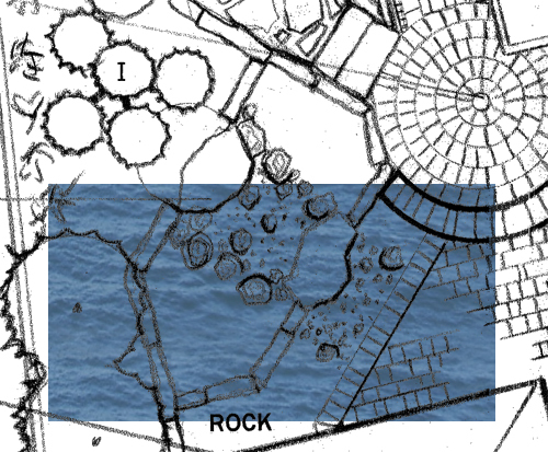
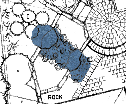
Now you first want to rotate the water so the waves run parallel to the flow of the stream. If you have a stream with curves in it, you can either just point it in the average direction, or you could warp the water to make it more closely follow the path of the stream (Although that is probably overkill). Once you have it turned- for this example I rotated it 38 degrees clock-wise. Once you do that, trim the extra water away, leaving just the stream covered in water. You can cut some corners in spots where there will be a boulder or a plan covering the stream, but try to play is fairly close in case the stones get removed for some reason.
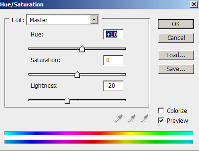
I am also tweaking the shade of blue slightly to get a richer color for the stream, to counter act the lightening that will happen by hand. For this I am selecting the layer with the water, and sliding the hue up by 10, and lightness down by 20.
Step 4: Add Some Rapids
To really create a flowing look, both to the stream, and to the waterfalls, use a soft, light opacity brush. I would do this on a sperate layer for now, and merge layers once you get a look you like; you can only take so many steps back in Photoshop – and this uses a LOT of brush strokes – so you could find yourself wanting to undo something past where it is possible. I am using a 5 Pixel round brush with 0% hardness, and 10% opacity, with pure white for the color. You then draw curving lines along the stream- have some curving around rocks, other flowing the length of the stream, and have them ramp up as you approach the waterfall, then even as the waterfall drops, and then a quick drop off after the waterfall “Lands”. If you used 100% opacity, it should look something like this at first:
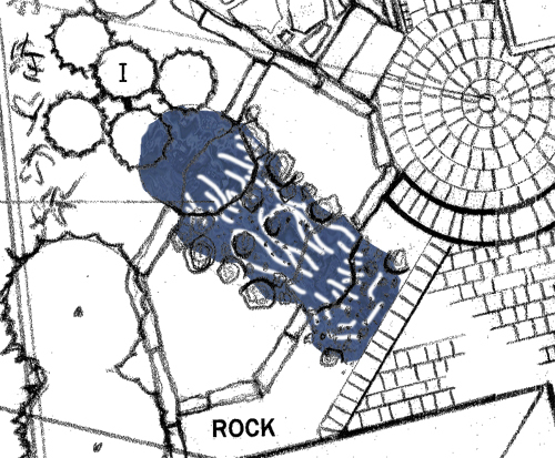
The final result, with the 10% opacity, looks like this:
Step 5: Base
Now, fill in the surrounding landscape, including plants, rocks, and the like. One touch to add is to make a gravel stream bed, so the transparent base looks a little different then the surrounding area.
Step 6: Just Add Water
Now add your water back in, merge it with your layer of white details, and drop the transparency to about 85%. Congratulations, you have a stream!
Next Week: Wetlands

Tuesday Tutorial: Water
Note: I realize that this is Wednesday- I worked an 8 hour shift yesterday, and then went to see Transformers 2 at midnight, so I didn’t have quite enough time to finish this off before this morning, sorry for the wait. oh, and I have to admit, I am surprised that Transformers 2 has more finishing moves then Mortal Kombat…
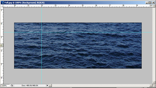
One of the things needed for a lot of renderings, whether it is for pools, lakes, streams, wetlands, or swales, is water. You by all means could get a more hand-rendered look by just selecting the area to be water, pick a color like R:52 G:90 B:187, put a wide, soft brush at say 20% opacity, paint over much of the water, then paint over the outer edges, leaving more and more of the middle alone, until you get the look you want. However, I’m going to show you the base I use to make my water, which in turn is used to make my wetlands, and things of that ilk. When making water, I’ve found that one of the best ways to create a realistic look is to use a semi-transparent photo of water. Some tweaks are needed based on what type of water it is, but the photo adds that little bit of randomness that is difficult to replicate, but that adds a lot of realism.
Step 1: Water, Water Everywhere
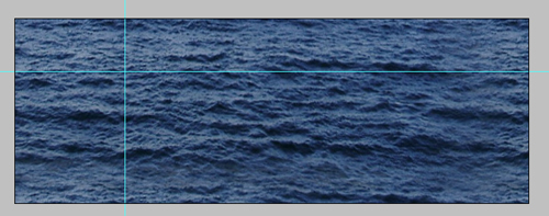
The first thing I did is found an image of ocean water that has some decent contrast, and fairly regular lighting. For this tutorial I am using http://images.zagbot.com/europe/pics/Tromso-skjervoy-goodbye-artic-ocean.jpg which is an image I found on google. The first step is to reduce some of the vertical compression caused by the fact that the picture is not taken from directly above. I did this by selecting all, then going to Edit>Transform>Warp. I pulled the top of the picture up, and then pulled the middle section up as well, tweaking the “arms” that come off of each corner point to keep the overall image square.

Step 2: Line it up
I rotated the image 6.3 degrees to the right (to get the waves to run horizontally) then trimmed it down so I have an image of just water, with fairly level lighting (When this gets tiled as a pattern in larger bodies of water, it will help reduce the tiles’ visibility.)

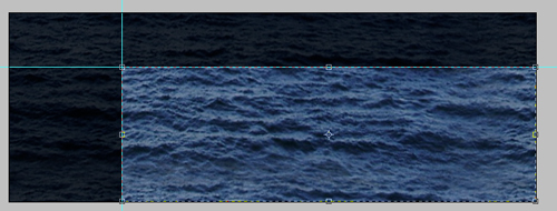
Step 3: Repeat the Pattern
The next thing you have to do is to make the pattern repeatable without it looking tiled. The first thing is to put guidelines about 1/4 of the way across, and down, the image:
Next you take the area to the left of the guideline and copy it to the right side of the image as a second layer (I made the base layer semi-transparent for the next few steps to make things easier to see):

Step 4: Blur the Edges
Next, use the eraser tool, with a wide, soft brush (I’m using a 45 width round brush with o% hardness), and with its opacity set to 25%. Erase most of the repeated section- keep an area along the boarder untouched, and create a rough edge- anystraight lines will show up when you tile the image. You may want to dim the base layer like I did, as it does make it easier to see what kind of a fade you are getting on your water.

Now repeat that until the new layer slowly fades away:

Once you do this, un-fade the base layer, and merge the two layers together. Then repeat the same process with the section on top so you end up with this:
Step 5: Cut It Down To Size
Now you want to crop the image to just the lower right quadrant. This will leave you with a piece that perfectly tiles without a hard edge.
Step 6: Color and Soften
The image as it is will be a little to harsh looking on the rest of the rendering, and the image you have may not be quite the color you want it to be. To combat this I add a new layer, and paint it solid with: R: 120 G: 165: B: 200. I then desaturate the layer to 50%, and merge the two layers together. The color and opacity will have to be tweaked based on the base image used, but I like a slightly desaturated blue overall:

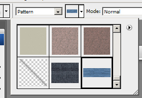
Step 7: Make it a Pattern
Select all (Ctrl+A), then go to Edit>Define Pattern, and give your water a clever name, like “water”. It will then appear at the bottom of your list of patterns- pick the paint bucket, and in the toolbar where it says “foreground”, click and select pattern. Then click on the image to the right, scroll down, and pick your water texture. Congratulations, you have water.
Step 8: Put It to Good Use
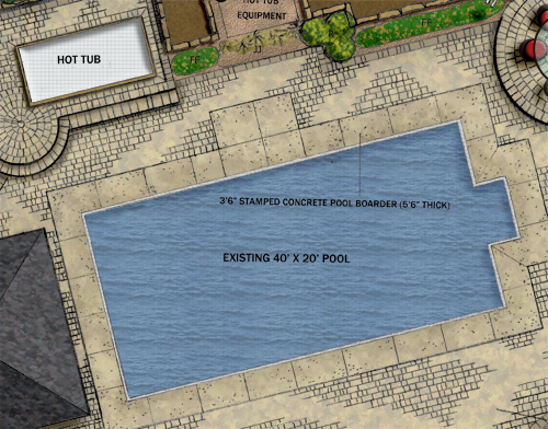
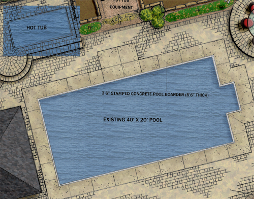
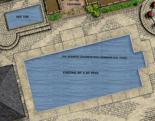
Now you just have to use the water you just made. The most basic use would be for something like a pool, or maybe a hot tub. The first step is to create the image of an empty pool, with shadows, tiles, and everything else that you would see with an empty pool.
![]()
Step 9: Fill the Pool
To fill the pool you made, add a new layer, select the area that the water will be in, and fill it with the water pattern. The real nice touch is when you then cut the layer’s opacity to around 80%.
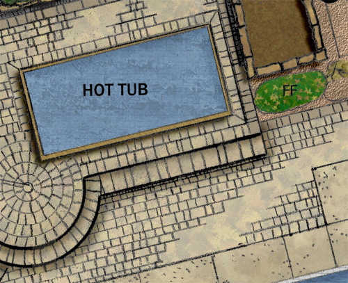
Step 10: Hot Tub Time
To fill a hot tub, make a new layer, then select an area larger then the pool by 20% or so, and fill it is the water pattern.
Step 10: Turn on the Bubbles
Since hot tubs are generally bubbly places, it looks best to add some “bubbles” to the water. You can do this by first going to Filter>Distort>Ripple. I picked a Large Ripple at 200% (This step is why you add the extra water- the ripple distortion moves the edges of the form, so you need some buffer space). Then I went to Filter>Distort>Ocean Ripple and used a size of 15 and a magnitude of 10. This gets you a much more active looking hot tub. Now delete the parts of the water that you don’t need (outside the hot tub). You then change the opacity to 80% just like with the pool, and your done!
That is how you do basic water. In upcoming tutorials I’ll talk about wetlands and streams, which use this as a base layer that you do quite a bit of tweaking and painting over the top of.

How Computer Hardware Fits In With Your Firm
“I had recently purchased a standard Dell desktop PC for my family, which the kids used for playing videogames; it came is a terabyte internal hard drive. My children had twice as much storage as my entire staff. How did this happen? The answer is simple: We had gotten stuck thinking that storage was expensive, which in fact is had become dirt cheap. We treated the abundant thing – hard drive capacity – as if it were scarce, and the scarce thing – people’s time – as if it were abundant. The corporate bureaucracy had gotten the equation backward.”
– Waste is Good, Chris Anderson, Wired – July 2009
One of the challenges that all firms have today, along with every other business in today’s world, is the decision of how much money to invest in technology. Between old-school alternatives of hand rendering, the temptation to wait “one more year” to get equivalent technology for half-price, and the possibility of buying bargain machines for cheap, there are a lot of reasons to not buy the latest and greatest machines, and for the vast majority of firms, they would be a complete waste. The trick comes in finding the correct balance, and finding that balance is not an easy thing.
The first obstacle to find the right balance is education on computer hardware. Many of the senior level people in firms have not used computers for things like production graphics in years, if ever. And many who have used them never bothered to learn what makes them tick- like most PC/Mac users, they know that they start the software, and that some will run that software faster then others, but not why. There are two things that can be done to address this.
First, everyone in a firm should get a basic understanding of how their computer works, and what can cause bottlenecks when using certain software. It is similar to how all landscape architects need to know a base level of civil engineering- even if your firm outsources its grading work, everyone needs to speak the same language. You don’t need everyone in your firm to be able to build their own graphics rig (although that would be quite a money saver), but you need everyone to be able to communicate what problems they are having, and they need to know that the upper-level person they are talking to will have some understanding of it. I am going to try to lay out a base level description of stuff here that I use at Best Buy when I am educating customers about laptops/desktops, which should be enough to get lines of communication going.
Second, follow the old adage of surrounding yourself with people who are smarter then you are, and then listen to them when they voice concerns about technology issues. Even without knowing the difference between RAM and a CD-ROM, if one of the people you hired as CAD-monkey tells you that their computer is bogging down, and that they think they need another gig of RAM, it might be best to trust their judgment. By all means, call your IT guy to see what he thinks and see how much it will cost – see where it will fall in the budget, or if it is going to have to wait a bit. However, the key thing is to both trust your workers that you hired based on their expertise in computers, and that you let them know you are looking into it, and let them know where in the pipeline their suggestion is- One of the things I have learned in my time in Best Buy’s Future Leader Program and as part of our store’s employee team that bridges the gap between managers and the sales staff is that if you want employees to talk to supervisors about ideas, you have to ensure that the supervisor keeps the employee up to date, and aware of the situation, so they don’t think that any future ideas that they have will simply be ignored.
Computer Hardware Basics
In any computer there are a few key internal components that will effect the performance of the machine, all of which have had some significant additions in the recent past: the CPU, Hard Drive, RAM, Removable Storage, and Graphics Cards. Each one of these has its own role, and will effect the performance of the computer in different ways, however a bottleneck at any one point can cause system wide problems.
The basic part of any computer is the CPU or Central Processing Unit. This is essentially the brain of the computer- its the workhorse that does most of the calculations that your computer does. The speed of the processor directly effects every other part of the computer. PC processors are generally either Intel or AMD, although there are a few other companies. For the most part the two brands are fairly close in performance, with AMD a slight bit slower, hotter, using a tad more power, and a little less expensive. In a tower, no big deal, in a laptop that might be running CAD/Photoshop? I would go with the Intel to move a half step further from possible overheating. One of the new big things is Intel Core i7 chip. Both AMD and Intel have quad core processors (For simplicity sake, its basically 4 CPU’s in one), and the Core i7 is a hyperthreaded quad core (again, to over simplify, 8 cpu’s in one). Whether this matters to you and your firm is mostly a question of software. you have to look at the software you use to see if it will be able to use 4 cores efficiently, much less 8. If it can, this could mean a HUGE advantage in time, but if you are using software that can only use 2 cores at a time, it will be a minor advantage at best.
The Hard Drive is where all data on the computer is stored. There are two factors that determine how “good” a hard drive is, other then brand to brand differences. The first is size- the more space the better in general. You can get single hard drives in multiple terabytes these days, which is one of the biggest changes in computer technology in the last few years. The advantage to having more space is two-fold. First, at any point you should have around 10% of your hard drive open for your software to use to store data on a temporary basis. Having less then that will cause noticeable slowdowns. Second, software often gets broken up into thousands of pieces when it is installed, which slows down the process of using it. The best way to combat this is to defragment your hard drive from time to time, and the more space you have open on your hard drive, the quicker and better the drive will be defragmented. The second factor in speed in a hard drive is the speed – traditional hard drives are basically a set of magnetic disks, similar to vinyl records, that have magnetic data stored in rings. The speed rating for a hard drive tells you how fast the hard drive can spin while reading, so a faster drive can read identical data faster then a slow drive. The newest thing for hard drives is Solid-State Drives. These are essentially flash drives, and have faster access times, don’t need to be defragmented, and use far less power, as there is no mechanical movement involved with them, and they are fairly expensive as of now.
RAM is one of the most misunderstood parts of any computer. The best way I have come up with to describe it is this: If the library of congress is your hard drive, then your notebook is your RAM. You can take notes on anything you want, you can easily erase notes and replace them with other information, but you have a limited number of pages. You might go in knowing that you are writing a paper on the civil war, so you fill your notebook with notes on battles. You then can start writing the paper with the notes you took. However, if you then figure out that there was a key battle that you did not get any motes on you would have to go over to the card catalog, find where to go, find the right shelf, find a book with the info you need, find the right page, and you could then start writing. When you are running photoshop with a large image, its possible that between the image, photoshop, your Operating System (Windows/Mac OS/Linux etc) take up more space then you have in your RAM, so some of the brushes for photoshop have to be taken out of the RAM to make room for the image. That works OK until you need one of those brushes that got taken out of the RAM. At that point your computer has to go looking through the hard drive for all of the fragments of the program needed for the brushes, and that takes time. While it still gets the job done, it takes much longer then if it was in the RAM ready to go. Having more RAM, and faster RAM means there is more room in the notebook, and that you will be able to read from the notebook faster. (OK, I didn’t say it wasn’t a little clumsy, but I think it gets the point across). The latest thing for RAM is what is called DDR3. Most computers sold today use DDR2 RAM, but there are new machines that use DDR3 RAM. In theory this RAM should be roughly 50% faster then DDR2, however, most software cannot use it effectively enough to make a big difference in performance. For general use, anyone running Vista should have 2 gigs of RAM, if not 3. For the type of graphic work we do, more would be far better, so on a Vista machine I would go with at least 4 gigs.
Removable Storage is everything from Flash Drives to CDs and DVDs. Most Flash drives are fairly equal as long as they fall under USB standard 2.0 which has been the standard for the last few years. USB 3.0 will bring faster speeds, but is still in development and is not expected to be on the market until 2010 sometime. The place where more evolution is happening now is in the disk based platform. CDs (with a ~700 Meg capacity) made way for DVDs (~4.7 gig) which have made way for BluRay disks (~25 gig) in the last year. BluRay disks and burners are still expensive, but no more then DVDs were in their first few years. Obviously the choice on what one of these disk formats will fit your firm best depends on what they are used for. For archiving purposes, BluRay will allow you to cut your disk count by a factor of 5, but most clients don’t need nearly that amount of data, unless there are some high quality models/renderings going on the disk. For most purposes, DVD drives are more then enough.
Graphic Cards are one of the most interesting and mysterious parts of computers for many people. This is due, in part, to the fact that graphics cards have only existed for 15 years, and still are not included in full on most home computers. A true graphics card is essentially a separate computer- it has its own processor (a GPU- Graphics Processing Unit), RAM, and outputs. However, all of these pieces are designed specifically for the purpose of making images. The RAM is similar to traditional RAM, except it is dedicated to nothing but graphics- allowing a much faster transfer of information from the RAM to the GPU. Most cards today have somewhere in the range of 256 meg of RAM to 1 gig of RAM. The outputs allow you to connect a monitor to the graphics card- it also can allow for special outputs, like HDMI, or dual monitor outputs. While the GPU is similar to your CPU, its architecture is fundamentally different- it has been designed to do many small things at the same time instead of a few big things. The best example I have seen of this was done by Jamie and Adam from Mythbusters, albeit a bit exaggerated:
While that is an extreme example, its does explain the basic principal. GPUs are good at doing multiple small things, like drawing pixels, at the same time, while a CPU can do a few big or small things at a time, which means graphics on a CPU will lag. One thing to note as well, many computers now come with what is called an integrated graphics card. That is basically a small GPU attached directly to the computers motherboard, without dedicated RAM. While it takes up the slack for most light computer users, it is far from enough for software like CAD, Illustrator, or Sketchup.
What Components are Right for You?
The right computer for your firm depends greatly on what type of firm you are, and where you want to be in 10 years. Do you want to be a firm known for great design with a classic, warm, personal hand graphic style? Or do you want to be a firm on the cutting edge, with high-end graphics and a big web-presence to pair with your innovative design? If the former is where you want to be, you should still have enough power to run CAD without a problem, so you run Vista you should have somewhere around a dual core, 2-2.5 gig processor, 2-3 gig of RAM, and a 128 meg Graphics card. While all your machines don’t need to be that fast, at that speed the computer will stop limiting the speed of your workers, and it will stop costing you money in delays.
If you are a cutting edge firm, where most people use CAD, the Adobe Creative Suite, and do some SketchUp, I would try to be somewhere in the dual-quad core, 2-3 gig processor range, with 4-8 Gig of DDR2 RAM, and a 256-512 Meg Graphics Card. You may also want one real beast machine for any high-end 3D work you do. 3D Studio Max is designed, for instance, to take advantage of network computing- meaning you can set up your network so every computer will work together to get a rendering done faster over a weekend or-night, when the other employees are home. That also means it can take advantage of pretty much anything you can throw at it. Doing what I like to do, I can tell you my current dream rig is somewhere in the range of a Core i7 CPU, with 16-32 gig of DDR3, and 2 crossfire 1 GIG graphics cards. There will still be slowdown on some really big models, but that is a given with software that can create movies like Wall-E.
The thing to remember is, speed is much cheaper then it used to be, and it is getting cheaper every day. Labor, however, is not getting any cheaper. Look at the business, and figure out what works best for your firm, but don’t discount the fact that spending $150 more on a graphics card, and $100 on an additional stick of RAM now could save you a few hours each week. You know the billable rates for your workers, and that at that rate, it will not take long for you to make that money back, and more.
Do you have any ways to describe how computer components work? Any thoughts on the AMD/Intel or NVIDIA/ATI wars? Let me know!
Tuesday Tutorial- Intro and Grass
“Don’t get me wrong, these plans look good, but after a certain point any student can do a technically good Photoshop rendering. The key is to add something else to it. It needs some artistic flair, some of your personality to really stand out, and to really work”
That is what I heard from one interviewer while looking at my portfolio shortly after I became a “Free Agent” in August – I am, after all, not technically unemployed, as I am employed by Best Buy, but I am looking for an opportunity to work with an LA firm again… plus it’s less of a blow to my self esteem. I recommend it to any other free agents out there, and I know there are a few- but I digress. It was at that point that I decided that I needed to really look at my rendering style and see how I could add some signature style to it.
Up to that point, I had been working on creating a style of Photoshop renderings that looked relatively realistic- textures on everything; no black outlines at all, complex tree shapes. I liked what I was getting, but it wasn’t perfect, as the lack of outlines meant that even with drop shadows there was no pop to things that were tall in the drawing, and it came off as flat. Through a series of chance projects with tight deadlines, I had to modify my techniques some, and ended up with a hybrid, where I used my Photoshop textures to color render inside hand drawn lines.
It still wasn’t 100% perfect- but I never expect to be 100% happy with anything I do in this profession; if I am it means I am getting lazy.
Getting to the point I am at now, however, took a lot of work, and a lot of trial and error. Part of that is due to the fact that there are, according to google at least, no Photoshop tutorials for landscape plan renderings. While I didn’t expect to find the perfect techniques there, I found absolutely nothing even close. I waded through tutorials for websites, posters, photo-editing, and searched for brushes on my own. I then had to experiment with colors, tones, transparency, and more to get the look that I wanted.
Since I put so much time into figuring out what I have so far, each Tuesday I am planning to do a new tutorial for part of my landscape plan rendering. Use it exactly as presented if you want, but even better, take what I told you, tweak it, and make it yours. Hopefully I can save you at least some of the time that I spent pulling my hair out.
TUTORIAL- GRASS IN PLAN
One of the first things I figured out how to make, and one of the things you will need in almost every plan you do, is grass. The first thing you should know is that I rarely use “patterns” to tile my textures- I have yet to find a good way to insure that there are no seams, or obvious repeating areas. Since I “hand paint” the texture every time I use it, I have two different ways to do a grass texture, one quick, one slow-but with a better look, in my opinion.
Technique 1- Quick and dirty.
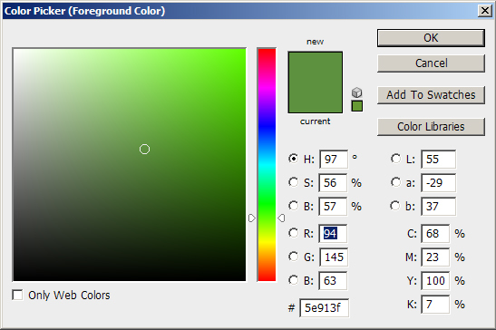
Step 1: Pick a color
I like a slightly desaturated green with at least a little yellow in it. The shade will depend some on the length/type of grass as well- for an unmown field you might choose a color that is almost pure yellow, with just a hint of green. For this turf I am choosing R:94 G:145 B:63 (After looking at it, I probably would have cheated a little more yellow then this color)
Step 2: Paint outside the lines
Since this method involves the blur filter, the edges will get ugly. Therefore, you want to color a larger area then will be seen. One method is to paint the entire page. This allows for slightly easier editing in the future if you move a path after the first rendering, and want to do a new rendering with everything the same except for the path. You can then mask off white areas with a layer that sites above the grass layer.
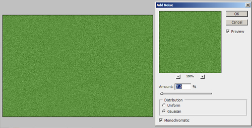
Step 3: Add Noise
To add texture to your grass, go to Filter>Noise>Add Noise You want to select the noise level you want carefully. It will depend on the size of the rendering, if its being printed or sent as a digital file, and, again, the type of turf. For this rendering, I am adding 7%, Gaussian, Monochromatic noise. This gives it a noticeable, but not overpowering texture that doesn’t repeat, but also isn’t flat.
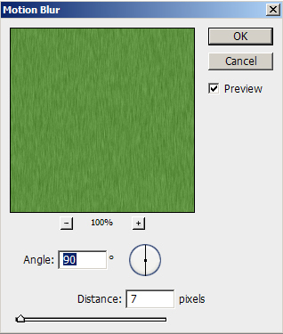
Step 4: Add Blur
You could leave the grass as is, but it has a bit of a harsh look to it still. I prefer to add a motion blur to the grass by going to Filter>Blur>Motion Blur. The amount you want the grass stretched is, again, a factor of how long the grass is, as it gives a look of long blades of grass. For this normal turf area I use a blur of 7 pixels at a 90 degree angle.
This gives a grass that has some life to it, but also doesn’t take a long time to do, and that with some nice edge darkening (Upcoming Tutorial) can give a great looking result.
Technique #2: Slow and steady
Step 1: Pick TWO colors!
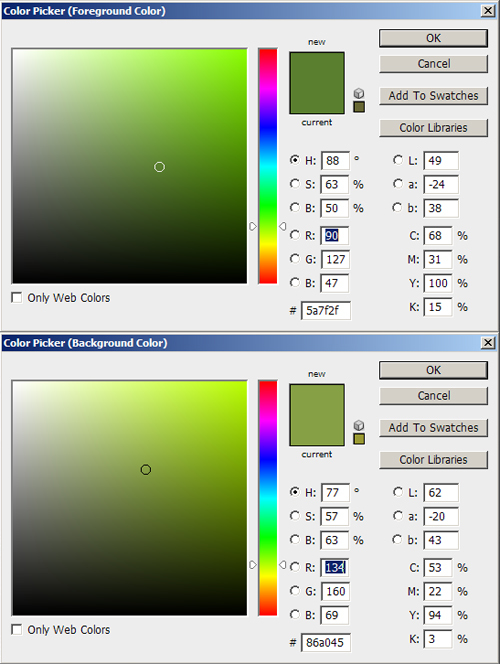
For this technique you need to pick both a background color and a foreground color. Which is which doesn’t really matter, but I generally pick one that is lighter and less saturated, and one that is darker and more saturated. I would stay in the yellow-green range again, and you might even decide to make the lighter color more or less yellow then the darker color to change the look a little. Also, as with the first technique, the longer the grass is, the more yellow I make it. For this grass- a short turf, I am choosing a foreground of R:90 G:27 B:47 and a background of R:134 G:160 B:69
Step 2: Primer Coat
As with the first technique, I recommend painting well outside the lines, an possibly blanket painting the entire sheet to allow for the most editing later. Once you have your painting area selected, put a layer of the foreground color down to ensure that there are no odd white spots in your grass later on.
Step 3: Get that Paint Brush Ready
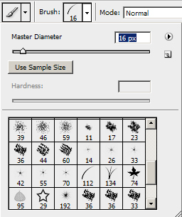
Next, you want to go into your paint brushes, and select the single blade of grass brush, and set it to a size that is appropriate for the grass type, but that will still be visible. For this example I am going to select 16 Pixel size.
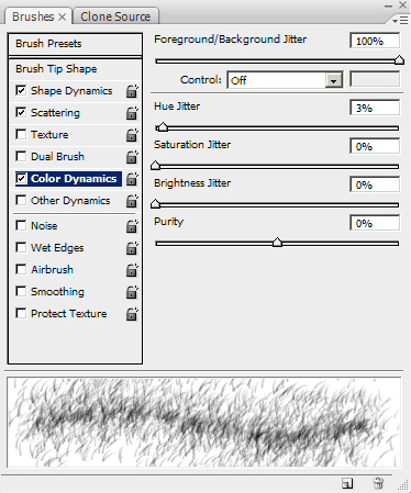
Step 4: Detailed Settings
Now you have to go into the Brush settings. First, under Shape Dynamics I set size jitter to 100%, Minimum Diameter to 15%, Angle Jitter to 10%, and both Roundness settings to 20%. Under Scatter I set scatter to both axes, at 800%, Count to 16, and Count Jitter to 50%. The only other controller I have on is Color Dynamics. Under that I have Foreground/Background Jitter set to 100%, Hue Jitter to 3%, and everything else set to 0%. The resulting window should look something like this:
Step 5: Bog Down Photoshop
With all of these settings rolling, its now time to get painting. Depending on your settings, it may take a lot of passes to get your grass area painted, and you may even see Photoshop lag behind your movements. If this happens, don’t panic, just be patient and let Photoshop catch up (I’ve had to sit and watch Photoshop paint for 30 seconds before it caught up to where I stopped.) Its annoying, but just let it catch up, and you’ll be on your way. Soon you will have a texture like this:

Again, once you do some work on the edges, you end up with what I think is a great result, that has a nice look to it that is both representative of what you would see in the space, but that also gives the rendering some life and movement.
I hope that helps at least some people out. Even if you don’t like how these look, I hope it gets you thinking about what you might do differently.

How a design firm can get the most out of its software investments
Before I started this post, I figured it would make sense to check on exactly what type of economic commitment firms have to make for the software that most see as a necessary cost of running business today, and what I saw was truly startling to me, a former employee of a small firm.
Adobe Creative Suite CS4 Design Premium: $1,799.00
Autodesk AutoCAD Civil 3D (with BIM): $8,990.00 (with subscription)
Autodesk AutoCAD 2010: $4,445.00 (with subscription)
Autodesk 3DS Max Design 2010: #3,990.00 (with subscription)
ESRI Arc Info GIS: $?????? (ESRI doesn’t give prices online apparently…)
So a firm who wants to be able to use BIM for civil projects, along with CAD, 3DS Max renderings, Photoshop/Illustrator for renderings, Dreamweaver/Fireworks for a website and for some small web design for a client, and GIS for site investigations is looking at a $14,779 investment WITHOUT factoring the mystery cost of GIS.
That means you can get that software for one person, or hire someone with a year or two of experience for 4 months. Now granted, most places don’t need more than 1 seat of GIS per 10 people in the firm, but that is the un-added mystery cost, and just means you can hire that 1-2 year person for another month or two.
With an investment in software for 4 people equaling or surpassing the income for one of the employees, it is essential that a firm gets every ounce they can out of a given piece of software. Based on the experiences of many I have talked to, this is far from the way the software is being used.
This is caused by many problems, from yearly software updates that add new techniques so fast that they cannot be learned and optimized in use before the next update, to deadlines meaning projects must be rushed out the door. However, the biggest reasons I’ve heard about for this lack of effective software use is due to a certain amount of administrative ignorance about the software, and an unwillingness to put in the upfront labor needed to optimized work-flow and output.
These are all problems that in busy times are difficult to solve, as when a firm is busy they don’t feel they have the time for associates or principals to spend working on non-critical projects. However, when talking about job security and the slower pace of todays work environment in a firm, Keith Wilson said in this month’s issue of Landscape Architecture Magazine: “I’m learning some of the software programs that I have typically delegated to junior staff, like Photoshop and SketchUp.” More principals and senior staff taking this approach would be a great asset on many levels. First, they could more easily describe what they want to see, and what they want done, and they would have a more realistic idea of the time involved in a given project, rendering, or model. Second, they would have a realistic idea of what type of upfront work might streamline the process the next time it would need to be done.
Also, from a work-flow aspect, knowing the software also means you start to learn how different software interacts, which generally is “not very well”. This is made worse for junior staff at times by filing systems that may work with how a principal’s or administrator’s mind works, but not with how InDesign works. By learning this software, the people who have the final say over how the servers are organized will have a better idea of how they should be organized.
There would also be a level of trust built between the senior level and the junior level when the principals and senior associates go to junior staff for advise on what filters to use to get the look they want, or what color looks better for a rendering of photo-realistic grass.
The biggest way that firms could immediately impact their use of the software they have already paid TENS OF THOUSANDS OF DOLLARS for, especially in “These Economic Times” would be to use underused staff to catchup on upfront work that makes projects run more smoothly in the future. Whether its a set of CAD blocks for you’re firms planting pallet; a coordinated template for title blocks, renderings, power-points, business cards, and a firm website; Photoshop blocks and patterns, 3-D models for commonly used plants, buildings, or other items; or a new font that looks “just so”. These are all things that take some upfront work, and time at multiple levels of the firm, but that make the firm far more efficient, effective, and coordinated and put-together when time does become a factor in getting a job done.
I don’t know how many times I have talked to peers who complained about how they got in trouble for using the wrong font on a last minute rendering, but they have never seen the same font used twice at their firm. Or they didn’t know which of the 30 versions of the firm’s logo to use on which of the sheets they were putting together.
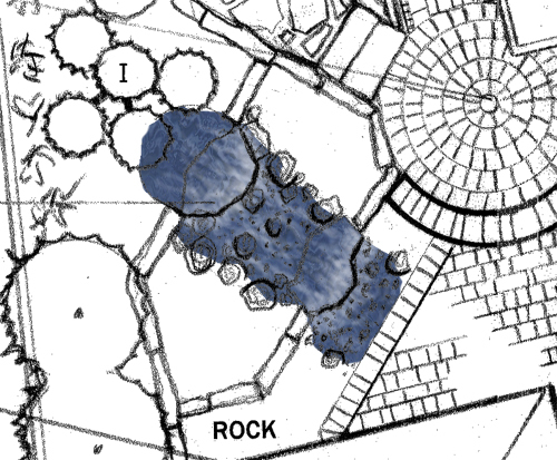
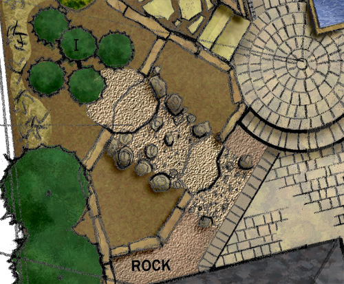
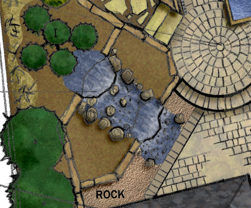
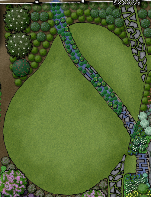
The biggest way that everyone I have talked to has said they have seen this problem is in the lack of good Photoshop plant blocks and texture patterns. After the initial front-end labor investment is made, it takes no more time to do this rendering:
then it takes to do this one:
Based on the amount you are already spending for one person to use Photoshop, isn’t it worth a labor investment so that even in a pinch you get the second result instead of the first?
Also posted at http://designplustech.wordpress.com