


Author: Frank Varro
Tuesday Tutorial: Turf, and basic techniques
As it is with many things, my technique for turf, and the similar techniques I use for other materials, were born of other needs. Namely, I hated the way my turf looked in 3D renderings. You could use a created texture, but it never looked organic. You could use a photo, but you got TERRIBLE tiling effects. You could do a slight color overlay to soften the impact of the tiling, but the color was always off, and you would lose to much of the internal texture. I tried all of these, before scouring through tutorial sites and stumbled on the idea of using two separate textures, with a masking layer to blend the two. This is used commonly in 3D models when you have to put a non-square image onto a model.
Say you have a beer… sorry I got distracted there for a second. So, you have a bottle shaped model, and you want it to be beer. The first thing you will do might be to fill the bottle with liquid, and make the material into tinted glass. You then have a very pretty blank beer bottle. It needs a label to look right. Many beer labels are not square, but no matter what the image you import onto the model will be square. You handle this by making two images. One is the image you want shown, the other is a mask, like we make for the hand drawn lines- with what you want shown in white, and what you want to have invisible in black. Now, you normally just place a single image, so you get one label. But there is no reason you couldn’t tile the material so it would repeat hundreds of times over an open field. And there is no reason this technique cannot be used in photoshop to make detailed, photograph based textured that don’t show any tiling.
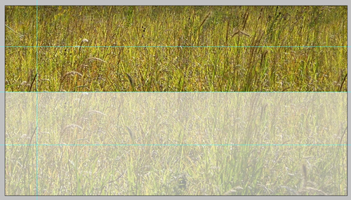
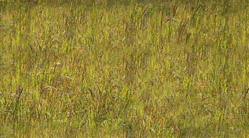
The best way to get good, organic texture, and realistic color, is by using photos. These can be photos you took expressly for texturing, or everyday photos that have a good amount of the material you are looking for. The best option is images takes specifically for texturing, as you can take a picture that will be fairly evenly lit, and taken from above, reducing the amount of perspective in the image. For this tutorial I am using two photos I took of a small residential project I designed last summer:


The first thing you do is crop the non-grass areas out of the image, so you have a decent base to work off of.

This gives you a clear area of turf to work with. Having other distracting elements removed from the photo also allows you to see inconsistencies in color. These inconsistencies will show clearly when tiled.

Looking at the image, you can see how much lighter and smaller the blades of grass are on the top and right of the image. By cropping those areas out you easily eliminate some trouble spots without resorting to the slower techniques next.

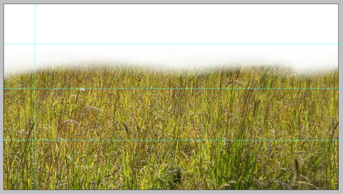
There is still a darker area to the left of the image. The way I will address that is by adding a second layer above the turf image.

By setting the layer to linear burn, and using a round, soft brush, set to black, with around 8% opacity, you are able to paint the image slightly darker in the areas that need it to even out the over all texture. By using linear burn you darken the tone of the image without adding gray to it, muting the color and texture.

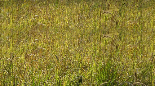
That is all the paint I needed to lay down to change the texture to this:

The image is a little more flat then i would like, so next I increased the contrast to give more sharpness to the texture itself.

As you can see, much of this process is trial and error- looking until you see a problem, fixing it, then looking for the next problem. After doing all these adjustments, I noticed that the perspective makes the foreground far more coarse than the top of frame. To fix this, I used Edit->Transform->Perspective to both shrink the foreground.

Once cropped, you have a nice smooth texture that still has a realistic amount of character.

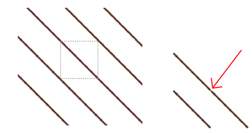
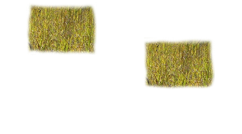
This seems like a fairly regular texture, with a good amount of color, so its time to make the image tile without a hard edge that will always show clearly. The first step is to lay some guidelines around 1/10th of the way from the edges.

Select the areas between the edge and the guidelines and the outer edge, and copy it on a new layer to the opposite side. This makes it so you have a smooth transition from the left side to the right, with no edge.

You will still have hard edges where the new layer hits the old, but you can now make a transition between the two. For this tutorial I used the most basic method, with is to use a soft eraser to fade the transition layer from the edge in.

Now by cropping down the image to where you have the guidelines you will make a tile that will not have a hard edge.

Now with a smother transition, preventing a hard edge your ready to make a pattern. Hit Ctrl+A to select all, then go to Edit->Define Pattern and name your new pattern (Something like Turf Layer 1V1.0) and save the image in a folder- mine are saved to the desktop->Render Patterns->Turf->Turf1V10.jpg.

This way you can back up all our render patterns, and move them to other computers just by opening the image, and defining the pattern again. Now give your new pattern a shot, using it to fill the turf areas in whatever rendering you are working on.

Now you repeat the same steps with the second image.

Crop

Burn

Perspective (correct for off-center image here as well)

Crop and increase contrast, copy edges and erase to eliminate straight edges

This is a key point in the creation of your second pattern. To make an organic, non-repeating pattern, you must make sure the two final patterns sizes will not allow them to line up often, creating a repeating overlap. You do this by looking first at the size of your first pattern. My layer one is 280×224. That means you will have an edge (left to right) at 0,280,560,840,1120,1400 etc, and (top to bottom) at 0,224,448,672,896,1120 etc. You want to pick sizes for your second layer that will not line up with those. I resized mine to 600×415. That means that left to right my two tiles will not repeat until 4200, and top to bottom until 92960.

Once you resize your pattern, save it and make it into a pattern just as you did with layer 1. And paste it as a second layer in the same rendering.

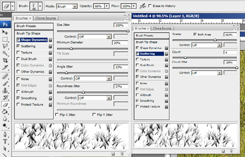
The last step is to create a clipping layer, which acts basically like a masking layer, for the grass layers that will allow the two patterns to mix. First pick a noisy, random pattern brush.

Then go into the settings for the brush, and max out the size jitter, and turn off the brush presets other than Shape Dynamics, Scattering, and Smoothing.

Then turn up the scattering, and turn the count as low as you can.

Now make a new image, and make a second layer in the image. Make a scattered spray of black over the second layer, getting fairly even, but random coverage, then turn off the background layer.
![]()
Use the same method of Guidelines, Copy, Erase to reduce edges, than use the same idea as above to resize the image to reduce overlap of the edges. Last save the image as a PSD (to preserve transparency), and with the background layer off, make the image into a pattern (Turf Mask v1.0). Spray the mask into the same area as you had the turf, into a new layer.

Put all the layers into a Turf folder in Photoshop, with the mask sandwiched between the two turf pattern layers.

Now select the top-most turf layer, and click on Layer->Create Clipping Mask

This will tell the selected layer to be masked by the layer behind it. This mask is not based on Black Vs. White, but opacity, which is why you had to make the background transparent for your masking pattern.

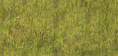
This finally gives you the final results you have been looking for:

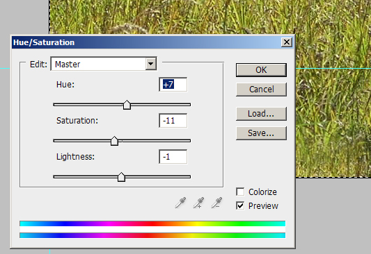
A smooth, lineless, textured, natural colored pattern. You can also look at the overall image here, and – using hue-saturation/contrast – tweak the colors until it looks a little better (This seems a tad brown and muted to me). Write down what tweaks you made, reopen the saved patterns you made, and make the same tweaks, save the version 2.0 of each, and re-define the patterns as well.


These two patterns don’t seem like they would work together with the different darkness levels, but they are what gives you the following results:

While this process is time consuming and a pain, the key is to remember that
from now on, all you have to do is paint an area with three patterns,
make one a clipping mask, and your done.
Tune in next week for the next key landscape building block: dirt.

Tuesday Tutorial Re-boot: To line or not to line
When starting a digital rendering, just like with a hand rendering, the first step is always to create the lines you are going to render within. Generally people use lines directly taken from AutoCAD for digital renderings as these are the “cleanest” lines, and allow for some shortcuts such as exporting each area as its own file.
This method, which I have used often, involves turning every layer off except 2 – one framing the layout window, and one with a single rendered material (turf, pool edging, brick patio, etc.) You repeat this with every material, then bring them into Photoshop, and create a single drawing with the different areas as layers. The advantage is that you then can use the magic wand to select even the most complex shape in a single click, regardless of how it will intersect other layers.
The end product is a clean rendering that has good line-weight, and reads easily. The problem is you also have a drawing that has perfectly straight black lines, which add neither realism or soul to the rendering.
The second method is to forgo lines altogether. Use the method described above, but turn all the cad layers off before saving (and make sure you selected both the area inside the lines, and the lines themselves to insure there are no gaps in your rendering). This moves you a step more natural, as you have slightly blurred edges between materials, making a more aerial-photographic look to the rendering. This may serve well in certain presentation settings (when trying to show the design blending in with existing conditions for instance), but the lack of hard lines, and of line-weight, greatly reduce the readability of the design.

In general, I prefer a third method that is less efficient, but gives – in my opinion – far better results than either of the other methods. This involves printing out your full design, doing the line-work by hand, and then scanning it in to render from. This involves a few levels of added difficulty, as to have a single person render they need to be equally skilled with Photoshop and a pen, a large-scale scanner is nearly a must, and there is another time-consuming step added to the process. The added style, in terms of having a drawing that reads well AND has soul, more than outweighs the challenges in my book.

I said a large-scale scanner is nearly a must because it can be done with a traditional 8.5 x 11 scanner, but the line work must be far more precise, and line-weights are much harder to balance at a small-scale. (I am using a small scanner for this project, and a .1 with a straightedge is significantly thinner than a .05 freehand drawing lines less than half an inch in length.) Some of this may be due to the fact that I am slightly out of practice on my hand rendering, but some is also the difficulty of small-scale work.

One thing I like to do to simplify the process is to first draw the ground plane with just material borders, scan that, and then fill in any detail (line hatching for decks/paving if desired, or, in this drawing, the flagstones), and rescan the whole drawing.

This has two main advantages. First, it allows you to still color as a block, and then add the detail later, when it doesn’t slow the rest of your work. Second, it allows you to tweak the line-weight on those detail lines. This may play a role even when working with a large format scanner, but it is a lifesaver when working small format. This way you can, after cleaning up the scans and making the white areas transparent, you can delete the outer edges of the detailed scan’s lines, reducing the line-weight, and increasing readability.

One of the tricky parts of this process is how to make the black lines the only thing on a layer, so you can render behind it and have the black lines not edges with a light gray halo. The first way you can do it is by selecting the white areas, deleting them, and darkening the other areas. This can often lead to white/gray artifacts in the black lines. The better way is to use masks/alpha layers. First we have the scanned image:

The first thing that needs to be done is cleaning up the white areas. The easiest way to do this, along with darkening the lines, is by increasing the contrast of the image.

Once you have a sharp black line on white, go to Image->adjustment->invert. this will give you a negative image,
with what was black white, and what was white black. Then go to Image->Adjustment->Hue/Saturation and desaturate the image.

This step is necessary to make it into a masking layer, and it also allows you to more easily see areas where the black lines (now white) are slightly gray and transparent. You can now tell if you need to up the contrast even more. Then make an additional layer of solid black. Open the masks window by going to Windows->Masks, and click on the icon for “Add a Pixel Mask”.

Select your inverted layer, Hit CTRL+A to select all, and CTRL+C to copy the image. Then select your black layer that now has a masking image (Shown with a white box in the Layers palette). The way to paste info into you mask layer is by clicking on the Channels tab of the layers palette. At the bottom of the list you will see a layer that is not active and is pure white. Turn on and select the layer, then hit CTRL+V to paste your image data.

By turning off the masking/alpha layer, you now have a layer that is pure black with transparency for your textures to shine through.

The only remaining thing is that if you do need to edit the layer, you don’t edit the black layer, you go into the channels, turn off the RGB layers, and turn on the masking layer.

Then you edit this layer. So if you need to delete a line, delete it here, or paint over it in black here. This is also where you will thin your detail lines if you need to create more line-weight. The easiest way to do this is by using the magic wand with “contiguous” unchecked. Then go to Select->Modify->Expand. A little trial and error is needed here to find the right amount to reduce the line-weight without erasing them. Once you have the right amount of expansion, make sure black is your background color, and hit delete to reduce the line-weight. Ifyou’re my method of a main line layer and a detail line layer, each will be set up this way, in one folder on the top of the layer stack.

Next time I’ll go over turf, and give the technique I use to erase the tiled look patterns normally create.

Tutorial Tuesday- Reluanching May 11th with this gem!
After about a week and a half of fine tuning techniques, taking tens of photos for reference use, and taking hundreds of screen shots, my relaunch of Tutorial Tuesday is imminent. This time, I am adding a twist to the formula. Last year, I came up with the idea of doing the tutorials based on a single project, and walking you through my process. This started with my SketchUp models. Unfortunately, soon after I began making the project model, intended to be a base for a new website, I decided to go in a different direction. However, starting next week, you will get a step by step walk-through of how I went from this:
to THIS:

As always, I am looking for feedback not only on my method of tutorials, but also the content and end results of my methods. I am making these tutorials so people will have the jumping off point that I never had. I want people to find new techniques, grow what I do. I have spent countless hours growing these methods, all I ask from you in return is that you spend a few hours developing ways to improve these techniques, and let me, and the other readers, know what you did.
With that, I’ll see you next week!

Fresh Start on Rendering Techniques
Last summer I started blogging tutorials on my new rendering methods in the hopes that it would A) help people looking to do Photoshop plan renderings a starting point to work from, B) cultivate some conversation on other people’s techniques, C) show how much work goes into any given rendering. This was (I hope) successful on at least the first and last count. However, the conversation I was looking for never really started… except in my own head. As I finished my Master’s thesis at the end of 2009, I had to render some additional views of my 3D Studio Max model, and realized how unhappy I was with the textures I had used previously. Colors were over-saturated, tiling artifacts were fairly obvious, and everything just looked off to me.
That lead to some experimenting with different methods of doing things. I had started to play around with using images for my textures some while still writing my original tutorial series. I had mixed the photo with color overlays to soften the image and give it more of the tonal quality I had been looking for:

While this solved SOME of the problems with my original method, it still relied heavily on my own eye for color selection. I know this is not my strongest skill when it comes to trying to think of something like: what color is grass, overall, REALLY. I can describe it perfectly well, but when it comes to picking the right color in Photoshop, I just seem to get lost in the sea of options sometimes. It also does not solve the problem of repeating texture tiles. My latest iteration involves not just an image with a color overlay, but two images tiled at different scales and a clipping layer (which deletes portions of the upper layer) with a pattern that tiles on yet a different scale. This creates a photo-realistic texture that is accurate in color, and is virtually tile free.

(Note: Please pay attention to the turf areas- I never re-textured the other areas )
This method is what I will focus on for my next set of tutorials. I also am going to set these tutorials up in a slightly different way. I have a residential project that I worked on in school that was made completely in model- no plans whatsoever. I always wanted to go back and create a rendering for the project as I was very happy with both my design and my model. So, as part of my impending website redesign I am going to go back and, from model photos and the original site survey, create a plan for the design, that I will then render in photoshop. The stages of this rendering will become the different tutorials- Turf, Gravel, Slate, Water, Native Grasses, Shrubs, Roofing, Woods, Cars, and Dirt. Some things will be made by scratch, some will be textures.
So, once I have the base drawn and start getting to work on this rendering, you will be the first to know- by way of NEW TUTORIALS!


ASLA Annual Meeting: See you in DC!
Each year the American Society of Landscape Architects has an annual meeting, and this year it was in Chicago. I’ve gone to three of the last four, and must say that this was one of the most enjoyable weekends. Some of that may be caused by my circumstances surrounding each meeting. (Minneapolis I was still in Grad School and a week from presentations, so my mind wasn’t fully there; San Fransisco I had just graduated and had an interview set up that I was to busy freaking out about to enjoy myself) This year I am working retail, have been out of the field for just over a year, and am feeling… disheartened. So to go to a convention center for four days straight, see talks about all the things that used to make up my daily work life, and talk to nothing but people who do what I love doing was great.
There is also something to be said for the fact that I have learned how the whole thing works a little more each time as well. I know now that If I don’t want to go broke eating lunch at a convention center, I should bring my own. I know how to read education session descriptions a little better to see which ones are going to be about things I already know, which will be informative, and which will be inspirational.
Don’t let my learning curve dissuade you; the conference each and every year was a great experience. Being in a building with 5,000 other LAs is amazingly powerful. Plus where else do you not only get to see projects that have influenced you, but see, just walking down the hall, people like Ken Smith, Peter Walker, Michael Van Valkenburgh, and Shane Coen. You also can finally meet all those people from other parts of the country who you talk to on Land8, and see your former classmates who have spread around the country. It may not be cheap to pay your own way, but it is entirely worth it.
I realize that I probably sound like some sort of cheesy commercial right now, but the truth is, I really just want to thank everyone from the ASLA who makes this meeting work as well as it does, and I want to thank all of the firms that do come to the meeting. There are a lot of firms that see networking within the profession as talking with the enemy, not a chance to grow, learn, and teach. That is part of why it means so much to see the heavy hitters at events like this.
So principals, once I get my resume and portfolio tweaked, expect to see my work on your desk, I’m coming. Everyone else, I’ll see you in DC.
National Meeting Prep Time…
As many Landscape Architects are well aware, the ASLA national meeting is in a few weeks in Chicago. I’ve gone to four of the last five meetings, and highly recommend attendance to all professionals and students at least once. The networking opportunities are amazing, as you can find yourself sitting at lunch next to your state’s ASLA trustee, and sitting in an education session next to the principal at the firm you’ve always wanted to work at. You can also join one of the national committees, which means you get to help steer the profession, and for the small cost of some conference calls and one in person meeting at the national meeting. There are also the copious amounts of education sessions that both count towards your continuing ed credits for your registration, and can be very informative.
The biggest “problem” is that while your real networking may be mostly with peers, the possibility of solid networking with higher-ups means you will want to have your business cards, website, portfolio, and cut-sheets at their most updated and perfect.
Because of that, and the fact that my computer might be needing some poorly timed “down time” back at the manufacturer, my posts will be slowing down for the time being. However I should be back and better than ever in not to long.
See you guys in Chicago!

Tuesday Tutorial: Now in 3D!
Now that you have a completed CAD base map, with all of the elevation edits needed, you have just one final step before you can Import your design into SketchUp. If you used a construction line hidden layer, turn it on, and every other layer off. Then delete all information off of the trace layer, and delete the trace layer itself. The main reason to do this is because when CAD files are imported into SketchUp, if a line exists in the same spot on two different layers, the line will be assigned to one layer, and the other will have the area blank.
As a quick software note: One of the main differences between SketchUp standard and Pro is that while CAD can be imported into either version, you can only Export non-CAD files in Pro. So if you are planning an rendering in SketchUp, or using photo editing software to tweak, either version of SketchUp will work fine. However, if you want to export into 3D Studio Max for higher end light and material rendering, you will need the Pro version.
Now its time to fire up SketchUp and get cooking.
Step 1: Importing
Once you have SketchUp running, the actual importing of the CAD file is pretty straight forward. Open the File drop down, and select Import.
Now navigate to the area where you saved the CAD file, change the file type to import to .dwg, and import your file. If you get a message about your CAD file being invalid, its possible that your CAD release is newer then your SketchUp, so just save your CAD file back to 2004 or 2000.
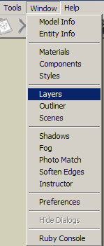
One of the nice, and not so nice, things about SketchUp is that it imports layer states along with the layers, so if you had all of your layers turned off when you saved your CAD file, they will all be turned off now. To turn them back on, go to the Window and select Layers.
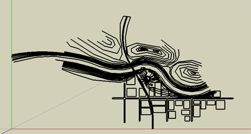
This is your layer navigator. This will be a window you want to keep open, as what ever layer has the radio button checked is the layer that what you are drawing will be on. Turn on all your layers, and then zoom to extents and select the top view, and you should see something like this:
Congratulations, you now have an Imported SketchUp model, its time to save, and move on to the topography.
Note: Save early and often in SketchUp. For as fun, quick, and easy, as it is, it is buggy as all hell, and crashes fairly often, so save yourself the grief of losing 45 mins of work.
Step 2: Let the technology do the work
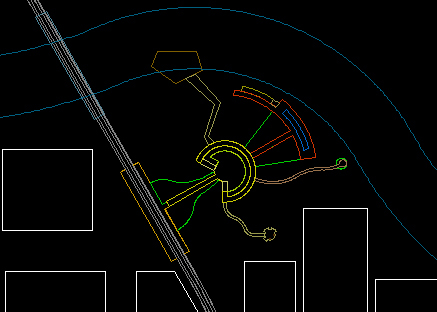
The first thing to do is turn off all your non-topography layers. Once you do that, Take a quick look around in your model. You should be able to get a good feel for the topography you have created, and the type of landscape you have. You may notice a few areas that you want to tweak. You should do that now. I noticed, when looking out from what would be my train station, that the two hills that flank my view are lower then I would like, and that the topo is not going to carry as far out as I would like. You can either jump into cad, fix the problems, and re-import, or add and move lines to fit your needs.
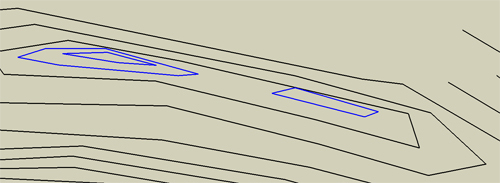
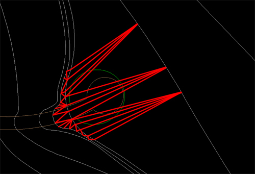
You also may notice problems like I did, where I have a hill top that is supposed to have two peaks. I made two separate contour loops as seen below (blue are the higher contours).
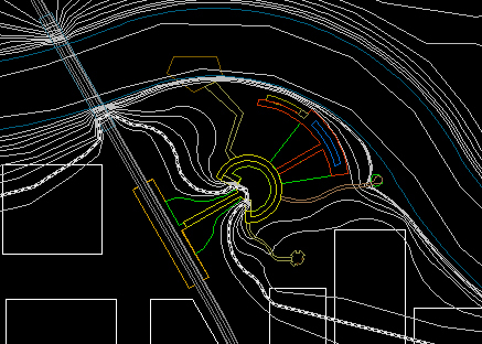
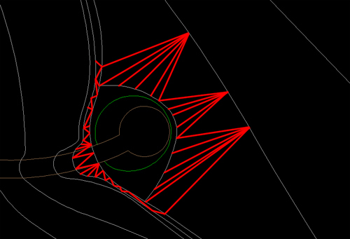
The problem is that SketchUp will simply create topo straight across between the two, as there is nothing pulling the form back down between them. This can be fixed by quickly adding a line or two that will outline where you want the low point of the pass to be.
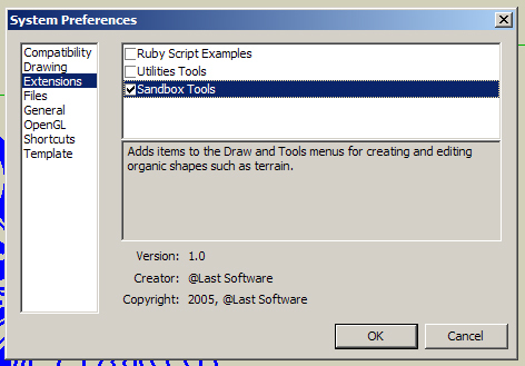
Now its time to have SketchUp do some work. First open the Window drop down, and select Preferences.
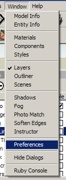
Then in the left side select “extensions”, and turn on sandbox.
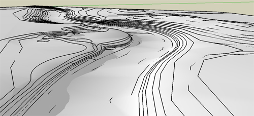
That will add the sandbox toolbar to your display. ensure that you have all layers off except topo, and that you have the topo layer selected with the radio button, and do a quick save in case the program crashes during the next step. Now click on the button on the far left of the toolbar- “From Contours”.
![]()
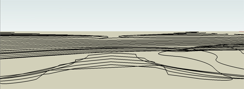
At the bottom left edge of the screen, there will be a progress bar. Depending on your processor and the size and detail of your model, it may be quick to fill, or take quite a while. If you notice the bar suddenly stop moving, don’t touch anything. SketchUp is very touchy, and its likely that your computer is using so much power to create the topo that it doesn’t have enough left to move a —->—- further to the right. I know, it sounds scary, but in SketchUp, if something starts to freeze up, don’t start clicking, just put the mouse down and go get a sandwich. If you click you may cause a crash, but if you leave it alone, you have a good chance of the computer catching up with itself and then you can save ASAP. Once its done, turn on shadows to get a little better lighting, and it should look something like this:
Step 3: That shouldn’t look like that…
Now take a close look at your model. You should be able to see all on the topo lines you drew, with a surface in between them, but you will likely see some areas that look… off. Two key things to look for are places where you see to many lines (Red), or topo lines disappear for no reason (Blue).
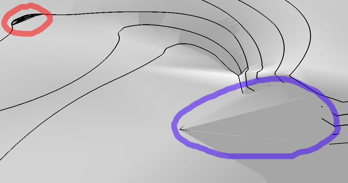
As you can see with the shadows turned on, missing lines come from an area where SketchUp arbitrarily decided to skip sections of topo lines and take a shortcut. The extra lines happen when SketchUp forgets how to draw a flat surface in a small area, so it freaks out and starts throwing lines across the area. Go to the View drop down and turn on “Hidden Geometry”. You can now see all of the polygons created by the software.
Double click the topography you created, and you’ll notice that the hidden lines now highlight when you mouse over them as you are in component editing mode. the first topo fixes you are going to do are the quick and easy ones. You might notice an area where a topo line or two are covered, like this:
Now you are going to use the tool on the far right in the “sandbox” toolbar- “Flip Edge”. This takes a diagonal line and rotates it to the opposite diagonal. Here is an animation of flipping the lines, one by one, to correct the topography.
Once you go around and fix all of the areas you can using this method, you will have the more complicated work to do of manually adding and removing polygons, but that will wait for next week.

Tuesday Tutorial: Building Your Base
When you start your 3D model, you start with a cad base, just like you have for your plan graphics and for your Bid Set. However, there are some tweaks that need to be made, and things you have to pay more attention to then normal. In this tutorial I’m going to take you up to the point of bringing your model into SketchUp. Next time we will get into tweaking topo and base modeling, and then after that, the fine modeling level, and adding plants. But for now, we are focusing on the base, as without a good base, the modeling process will be much more difficult and time consuming.
Note: When you use CAD, use Polyline, for the love of god. It is only in EXTREMELY rare cases that line works BETTER than poly line, and this is NOT one of them.
Step 1: Clean up your normal CAD base
To start, open your normal CAD base and save a copy of it in a new folder. Once you have your copied CAD file, there are a few fairly simple things you can do to clean up your base. The first is to carefully go through and create new layers based on the different materials you will have in your model, and you should name them based on what material they will be to reduce confusion.
A key point here is to make sure you have a unique layer for each of your materials, as the layers will carry over to SketchUp. Once you put everything on the correct layer, make sure all your corners are square and your polys close. You are going to have to close them eventually anyway to make them into surfaces in SketchUp, so you might as well do that now in the friendly confines of CAD.
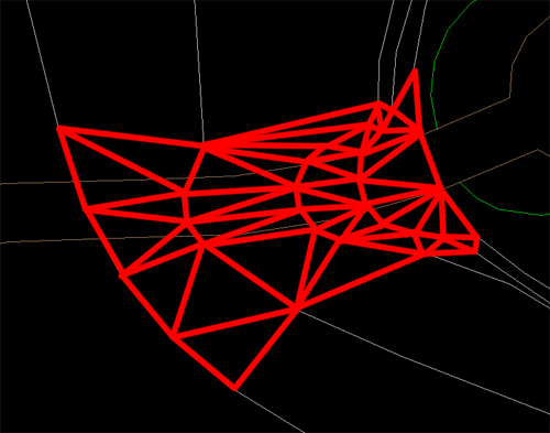
Step 2: Topography- think like a computer, one triangle at a time
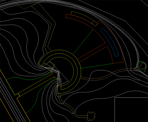
Now its time to add topography. There are two main issues you are going to have to address with topo: thinking about how the computer will create the surface, and thinking about making what goes on those surfaces. This is the basic topo for the fictional park design I am working with.
The first thing to realize is how SketchUp (or any other program) will create your topography. As a quick intro/refresher- all 3d models are comprised of polygons- more precisely, triangles. That is because 3 points makes a plane, and computers, as amazing as they are, cannot make true curves. They can make thousands of tiny angles, but not an actual curve (there are ways to fake it more, but its still really a post production fake). That is why when you make a curve in CAD and then zoom in it is suddenly angled lines that are kind of in the wrong spot. Getting back to the point- your computer will make the smooth, rolling landscape by making a bunch of triangles and “softening” the edges, but it is still made up of triangles. These triangles are made by drawing lines from intersections on one line to intersections on another line. For example, with these lines:
This is (hopefully) where the triangles would be made:
This means 2 main things for your drawing. First, and easiest: the further the camera is, the less detail that you will see, so by simplifying the lines that the triangles are made from, you reduce the number of triangles, and decrease rendering times. So, when you are getting to areas that are far out of your model, and don’t need a lot of detail because they will act simply as context, you can often get away with making those smooth curves into sharp angles, and get nearly the same result for far less CPU power.
The second, and more tricky point: if you have a flat terrace, on your topography map that is shown by an area with a bigger spread in its contours, because we interpolate a steep slope suddenly being flat as essentially a level slope, even if the contours imply a 5% slope, because the slope is likely steep beyond the last “steep” contour. However, the computer only sees what you put in, and cannot interpolate unevenly spaced contours, so it will have a slope that is steep from one contour the next, and then makes a hard turn to a 5% slope, and then a steep drop again. Because of this, you have to edit your contour layer, and break one of the cardinal rules of topography- you are going to have a contour line split and then rejoin. to create a truly level area you are going to have to surround the entire level area with equal contour lines, forcing the computer to see the contour lines your mind is reading between the lines on the map.
Level area the way its drawn on a map:
![]()
The way that would be interpreted by a computer:
The “fix” by breaking the rules:
![]()
The new triangle map (level area skipped for clarity):
Step 3: What is that path going to look like exactly?
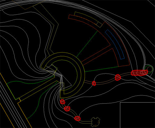
The last big complication to 3d modeling on topography is getting your paths and areas that overlap topographic changes to look right on the slope. The problem is, again, the fact that the surface of the ground will be made of triangles. this becomes an issue because your triangles may not line up with the edges of materials. There are a few things you can do to address this. First, you could simplify your topography so that a minimal amount of it intersects site amenities, as I was able to do in my thesis project, as there are not many large grading changes other then wetlands.
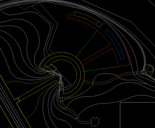
At times, however, that is not a viable option, and you need to be able to control what your slope looks like on a given face. To do that you need to ensure that a given section of slope is laterally level. The first step for that is to edit the contours so that the slope crosses the area in a straight line perpendicular to the slope. This is what my topography looks like after I add my loops for level ground:
You want to change all of the sloping areas here:
To look like this:
Once you do this, you wait for further fixing until you are in SketchUp, and that will come next week…
Step 4: Elevate to a New Level
The next thing you have to do is elevate your topography and items to the levels they will be at. In AutoCAD, you want to open the properties window for each contour line individually. Once there, you will see an option for “elevation”. This is where you input the height of a given contour line. Go through each contour line, and object and assign them to the appropriate elevation. I personally like to also change them to a set color, like magenta, so I know what I have moved. Then once everything is adjusted you can select all and move the color back to “by layer”.
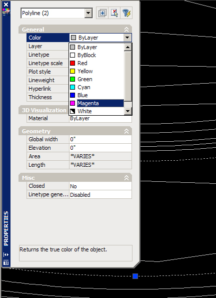
Once you have everything moved to the correct elevation, you can change the color back, and finish the fix for uneven paths.
Now its time to import into SketchUp and let the real fun begin…

Tuesday Tutorial Primer: So you want a 3D model…
The first thing you have to figure out when you want to make a 3D model for a rendering is if you really want a 3D model rendering. This decision is similar to the question of if you want a hand rendered plan or a Photoshop plan. There are of course aesthetic reasons involved. Both can work extremely well, and look amazing, but by understanding your client, your design, and the look you will get from either method of rendering you can make the choice of which is best for you on a given project.
There are more then just aesthetic differences to be looked at, however. Ask yourself what the purpose of the model is. Is it for images of a few conceptual designs, or for a final design proposal? If you are looking to do more of a conceptual design presentation, then you may want to go with a hand drawing, as they are going to be relatively quick and easy, where a 3D model, even using software like SketchUp will be somewhat drawn out and difficult, as a lot of time will be spent re-making the same things multiple times in NEARLY the same way. One of the reasons to go with a 3D model, in any level of design, is because of the ability to animate the design to increase the understanding of the place by allowing the client to “walk through” the site. Also, if you think you may want multiple angles of a space, or think the client may want to see a few additional places later on, you may want to make a 3D model, as you can always add additional camera and have a new rendering for the cost of running one of your CPUs for a few hours overnight. In the final design phase it may be far more worthwhile to create a 3D model as if a little extra time and the right software some pretty amazing images can be created.
Conceptual Hand:
Conceptual SketchUp:
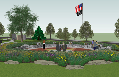
Final full 3D Rendering:
The third issue is purely a question of time: is it worthwhile to invest the time into a 3D model, or does it make more sense to do hand sketches. One of the ways computer models are different from computer plans is that a computer plan is extremely easy to edit, giving itself a big advantage over hand graphics which must always be made from scratch, and many 3D models are difficult if not effectively impossible to edit. Another time factor is the issue of the current hardware you have in terms of computers. Go back and check out my post of computer hardware, and see if you have a suitable system for 3D modeling. It can be done on almost any machine (I can run high end stuff on my 633 Mhz Celeron with 256 or RAM and a 32 Meg TNT graphics card if I’m feeling silly), but some machines will not only render slowly, but will slow down the creation process as well (See: Machine I just mentioned) to the point where you lose any hope of cost effectiveness.
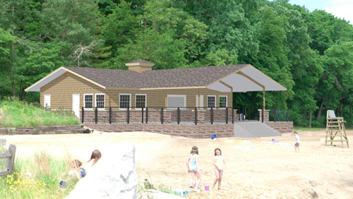
There are some special uses that 3D models suit themselves to much more as well. If you want to create a new element in an existing location, you can re-sketch the whole scene, or you could create the new element in 3D, and place it into the photo of the existing site. This can be an extremely effective rendering, and isn’t something that has to take a lot of time to do. The model for the following image is a fairly simple SketchUp model with careful lighting and camera placement to create the right angle and shadows, but was a very quick project for the quality of the end product.
In the coming weeks I will take you from a CAD plan to a conceptual model, and then off to higher end software such as Maya and 3D Studio Max for better textures, lighting, and reflections, using my new website as the structure. For the time being, pick a small simple design you have, and, if you do not already have them, put the design into CAD software. This CAD basemap will be the basis of our design, so close all your lines, and keep some decent layer organization. Next week I will address the CAD file you will import into Sketchup, and in the weeks after is when the real fun will begin.

Video Games and the creative professional
I can admit it, I’m part of the relatively new demographic of video game players. I’m in my late 20’s, I have buying power (until the economy went berserk), and I own a PlayStation3 and a Wii, and every home Nintendo console since the original NES. I enjoy games ranging from Gran Turismo (a racing simulator), to Burnout Paradise (a crashing simulator), and from LittleBigPlanet (an adorable platformer about small stuffed sack-people with stickers) to Grand Theft Auto 4 (a game where you try to rise up in the world of organized crime to live the American dream). However, there is one thing I am always looking for, and never quite able to find: a game that satisfies my creative juices. Many games keep me amused for a few months, maybe more if there was a way to hack the game directly (I’m looking at you Sims), but none has really kept my occupied fully for the long haul.
The problem is, through my increased knowledge and skills with things like AutoCAD and Sketchup, the creation tools included in any game are FAR to limited and always end with my being frustrated at trying to find work-arounds for seemingly simple things. It takes the fun in creating a customized level in LittleBigPlanet and drowns it in the work of trying to stay within the programmed physics of the game.
Imagine this: There is a new design competition to design the future Central Park in New York. They want you to imagine New York City in 200 years, in whatever way you want. It could be after most of the island is flooded by rising sea levels, it might be choked with smog, or it might have 200 story buildings with roads that are all triple decked. The historical society just re-found central park, and wants someone to turn it back into a cutting edge park, for the people of the future. Blank slate, bold ideas, and you can submit your entry in any form of media you want. *Note To Self: Find/Start a design competition like this!*
Two months in you get the Q & A packet, which includes a few rules amendments: You now have to create the park using the original topography and road layout, and all submissions must be on two 24×36″ poster boards, with their long edges aligned.
Suddenly you realize every idea you come up with either will not work or it needs to be somehow fudged to fit in the tight constraints. The great design elements you had that shifted beautifully over time now have to show as static images instead of as living art.
This is the situation that invariably finds its way to me with any creative game. I cannot tell if it is simply that I am spoiled by amazing tools like 3D Studio Max, or if non-designers feel the same way. For any of you designers who are looking for a relaxing way to stir up some creative juices, or non-designers who are wondering if they really are as creative as they think they are, I’m going to start writing some reviews of my favorite creativity involving games. From LittleBigPlanet, to The Sims, to Half-Life Mods.
Do you have any favorite creative games that you think I should try? Do you feel like sometime soon there will be a game who has enough creation power to allow it to be used for client presentations? Or do you just want to know what the appeal is in spending $400 on a piece of hardware and $60 on a game that gives around 40 hours of entertainment? Either way, let me know! To check out a video of Scribblenauts, a game that is coming soon and seems to have a good amount of creative potential, head over to my other blog at designplustech.wordpress.com
Tuesday Tutorial: Wood Decks
One of the things that most people can get to look pretty decent, but not great, is wood decking. Unlike wetlands its not one of those things that, when done wrong, looks like something fundamentally different, but being able to create a deck that really shines without spending a ton of time on it really can make a great touch.
Step 1:Paint Outside the Lines
This is a very familiar step, select and area larger then the deck itself. You need the extra room to allow for some of the filters to work without screwing up the edges of the deck. Next, pick a color for the decking- I went with R: 129 G: 87 B: 60. Its got a little orange to it, but its not highly saturated. This color will essentially be the mid-tone for the deck, so make it what you want the average color to be.
Then fill the large area you selected (On a new layer) with the brown color.
Step 2: Adding Grain
To get a nice wood grain for your decking boards, start off by adding noise. You want to use monochromatic to keep the noise to shades of brown, and I prefer using gaussian because it seems to give a less regular, boring look. I used 12.5% for the amount of noise, but it will vary some based on the scale of the rendering.

Next, you want to add motion blur to the grain to turn it into strips of color. You want to pick the same angle for the motion blur that you want to use for the boards- I’m using 45 degrees as it looks good, but also makes life easier when it comes to making the stripes. As for the distance of the motion blur, I used 66 pixels because it made any color stripe about 5 feet long in the plan, which gives it some good variation.

Step 3: Add Some Character
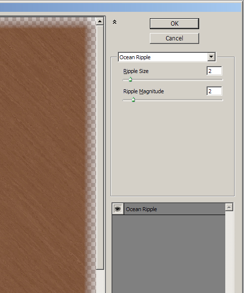
The last step for the wood grain is adding knots, imperfections, and character to the wood grain. For this I used Filters>Distort>Ocean Ripple. I went with a setting of 2 for both magnitude and size, but it, again, comes down to finding a setting that looks good based on your scale. You want to have some knots in the wood, but you still want long segments of fairly straight color.
Then trim away any excess from outside, and you have your decking base.
Step 4: On The Board Walk
The first step to adding boards to your deck is to create a pattern. First, pick a color that is a darker shade of brown. The tone can be a little more red, as you are looking down through the gaps to dirt/shadow, and you don’t want the board gaps to just look like another large straight wood grain line. I went with R: 80 G: 39 B: 26.

Now you want to make 45 degree angled stripes. Use the line tool, with a width of around 2 pixels. Then click the mouse to start a line, and push and hold shift- this will lock you into a line that is either 0, 45, or 90 degrees. That way you know that you have exactly a 45 degree angle. Then, draw a second line the same way. To make a pattern you will need at least 3 lines, so now merge the two layers of lines, and copy paste them. You should be able to move the new layer to the side until one of the lines perfectly overlaps one of the original lines, giving you three. If you used this alone as a pattern, the anti-aliasing would be screwed up from the double layering of one of the lines, so delete the doubled up line from the pasted layer, and you will have 3 diagonal lines (I went one step too far, and did 4 using the same method a second time).

Now to select an area to make the pattern from, merge the line layers together, and turn off any other layers. Using the rectangular selection tool, click on one of the squares in the center of the middle line, and again, hold shift as you drag it down, locking it to moving at a 45 degree angle, creating a square. You might be tempted to drag it down until its just outside of the two side-lines, but that will give you a strange gap in your pattern, as the repeating tile will not have the full width of the line:
So make sure that you get part of the line, essentially all of the line other then the single pixel that is grabbed in the upper left and lower right of the selection box:
As you have before, go to Edit>Define Pattern and give the line a name, like “Decking” or something of that ilk. Its key that you have all layers other then the line turned off so you have the lines on the transparency grid, or when you paint with the pattern your wood grain will be covered. Once the pattern is made, magic wand select the area not on the deck, then invert selection, and paint the decking pattern:

Step 5: Shading and Shadow
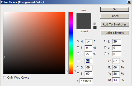
To give the decking a good three dimensional quality, you need to add shading for stairs and decking. First, pick a dark gray color, like R:69 G:69 B:69.
Then pick a brush that you will use for the railing shadows- I’m using 15 pixel, 0% hardness, 27% opacity. Turn the mode to “Linear Burn” or “Color Burn”. These both darken the color, without graying it out, like an actual shadow.
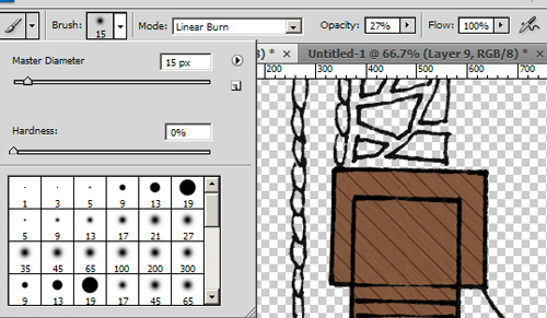
Start with any straight railings. Click the brush where you want to start a railing, push and hold shift, then click where you want the railing to end. this will give you a straight line with your brush.

Then add in any shadows that should be angled- Supports to the main railing, and for railings along stairs, the railing is at a vertical angle, so the shadow will be at an angle. The shadow will get closer to the railing as you move down the stairs, but each step will set the railing back to its original distance, so you end with a jagged look like this:

The last touch is to add shading to the decking where it would be cast from changes in elevation of the decking. Increase the size of your brush by around 2x. Now, select every other stair that will have a shadow cast on it:

Now use the same Click-Shift-Click method to paint on shadows. The trick is, run the brush so the middle of it runs along the uphill side of the selection box:
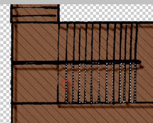
Once you do it for the selected stairs, pick the ones you skipped in the last selection and do it again.
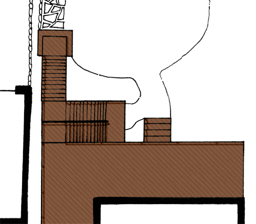
Now, to create the shadow of the deck onto the ground, you could simply to a drop shadow to the layer. However, that will leave you with the top of the deck making as much of a shadow as a stair that steps out onto the lawn, which again breaks the three dimensional illusion. The create a shadow that has depth, first, make a standard layer drop shadow, again with linear burn as its mode (Note: you will not be able to see the shadow until you turn on a layer behind it, so turn on the white background layer):
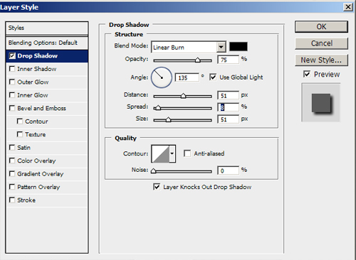
In the layer pallet, right click on the drop shadow you just made, and select “make layer”. A pop-up will ask if you really want to, and yes, you do. You will then have an editable drop shadow. Take your eraser and a nice 0% hard brush, and start deleting parts of the shadow to make the stairs angled and the low areas shorter then the tall areas:
Turn down the drop shadow layer’s opacity to around 65%, and you are all set:

Tuesday Tutorial: Fields and Wetlands
This week we are again building off of the pattern made in the water tutorial, this time to make a wetland. Wetlands are one of the trickiest things to render well in plan, in my opinion, as traditional means force you to render what looks like an open prairie field, or a lake. This type of situation, where hand graphic techniques do not allow for semi-transparency or small scale detail, at least not without a prohibitive time investment, is when Photoshop rendering can really shine. Before you can make your wetland, you will need to make a pattern for a field.
NATURAL FIELD
Step 1: Find a field
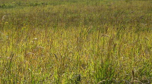
First things first: find a photo of a field of grass, a prairie, or a wetland. The best picture will be one with some regular variation to it, and that is taken from as high as possible, to create less issues with perspective correction. Optimally, you go out somewhere, and take one yourself, so you know exactly what you get, but for our purposes, I headed back to Google, where I found this gem:
http://dnr.state.il.us/lands/Landmgt/PARKS/R2/JPP/images/JPP_EastWetlandPanorama6_JPG.jpg
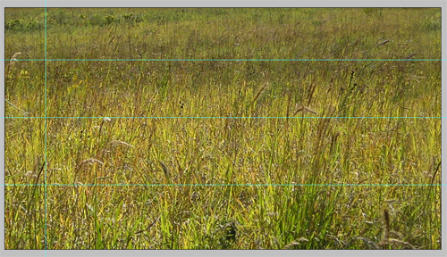
I then trimmed it down to this:
Step 2: Start Making a Pattern
With this particular image, more work is needed to make it into a pattern that won’t be obviously a repeating image.
First take the left side, as you did to make the water pattern, pull it to the right, erase the inside edge to blur it:

After placing the right side, you’ll notice a problem with this image:
Step 3: Fix the Dark Areas
Above the second line you can see that the grass gets much darker, so to resolve this, copy the area between the middle two sections, and drag it to the top of the image:
Then, as you did with the right edge, erase the top edge of the base layer, getting rid of the dark portion of grass:
Move the base layer (That you erased some of in the last step) to the top, and merge it with the top portion you copied earlier:
Step 4: Hide the Repeating Areas
Now, while the drawing looks pretty good, you can see where the repeating pattern of the duplicated white flower (on the left) and the dark chevron shaped seed heads (on the right) might create a very obvious seam look. To hide these, select an area in the middle of the pattern that is regular, and copy paste it over the problem areas, and blur the edges:
Merge all the layers, copy the top to the bottom and fade it (as you did with the left side). The last problem area is with the tuft of dark grass on the lower right. Use the heal brush to copy from a few other areas over the top of the grass:
Step 5: Fix the Color
Last, the grass is a little over saturated and yellow for a wetland, so tweak the hue/saturation to a little more green, and a little less saturated:
That gives you this pattern for fields, or for your wetland’s base:
WETLAND
Step 1: Don’t Stay Between The Lines
For this example I am drawing a wetland that boarders a prairie. (Prairie on the left, Wetland on the right) Start by painting both areas with the prairie pattern:

Step 2: Flood the Wetland
Now select the area to the right of the line. Because the line will not be perfectly hard, go to Select>Modify>Expand and expand the selection area by around 1/2 of the width of the line. (For this example, it was around 2 pixels)

Step 3: Done! Wait… No You’re Not!
This is about where most wetland renderings stop, and why I have never liked most of them. Unless this is a wetland that I can water ski in, it should not look like that. Select the eraser, and set it to something similar to these settings. The keys are the size, opacity, angle jitter, size jitter, scatter, and count- as these will create the spread to get a lose, open spray of grass. The exact numbers you will use will vary based on the side of your rendering- my full size is about 1680 x 1050.
Step 4: Put Down a Base Layer
Now spray back and forth a bit over your water layer, creating holes through which the field can be seen. Don’t release the mouse during this first layer, as that will erase areas of overlap by more then the 60% you have it set for.
Step 5: Add Some Character
Go Back over the area, and delete high elevation areas more, and create some interest by erasing small areas more to create small planting islands, and even small bridges between the islands.

Step 6: Finishing Touches
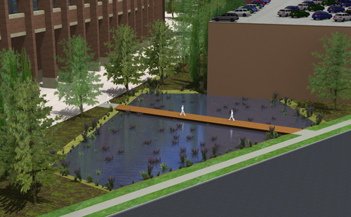
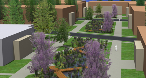
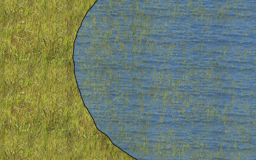
That leaves you with a wetland that looks like this:
Its still much better then standard wetland renderings are, but there is room for improvement. First, make the water semi transparent, say to around 80% opacity. This makes it so you can see some subtle grass through the areas that are still solid water.
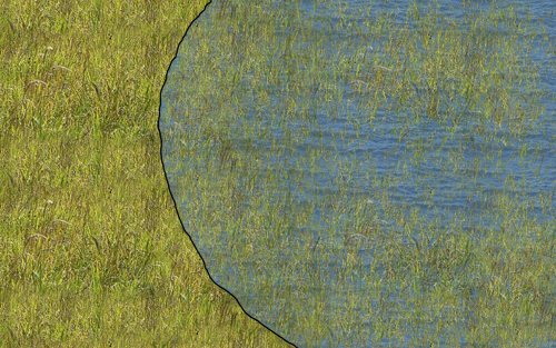
This makes the water color lose a little to much of its power though, so I then up the hue and saturation on the water layer.

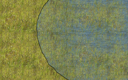
This is almost right, but there is now a tad too much water texture strength at the edge of the wetland. Run your eraser brush over this area a time or two if you need it, and do any other minor touch ups you feel are needed, and you are set!

If the wetland you are rendering is not part of your design, but an existing condition, you may want to do it without any hard line, as it will create a gentle transition, and wetlands are naturally fairly nebulous in their edge conditions.
