When starting a digital rendering, just like with a hand rendering, the first step is always to create the lines you are going to render within. Generally people use lines directly taken from AutoCAD for digital renderings as these are the “cleanest” lines, and allow for some shortcuts such as exporting each area as its own file.
This method, which I have used often, involves turning every layer off except 2 – one framing the layout window, and one with a single rendered material (turf, pool edging, brick patio, etc.) You repeat this with every material, then bring them into Photoshop, and create a single drawing with the different areas as layers. The advantage is that you then can use the magic wand to select even the most complex shape in a single click, regardless of how it will intersect other layers.
The end product is a clean rendering that has good line-weight, and reads easily. The problem is you also have a drawing that has perfectly straight black lines, which add neither realism or soul to the rendering.
The second method is to forgo lines altogether. Use the method described above, but turn all the cad layers off before saving (and make sure you selected both the area inside the lines, and the lines themselves to insure there are no gaps in your rendering). This moves you a step more natural, as you have slightly blurred edges between materials, making a more aerial-photographic look to the rendering. This may serve well in certain presentation settings (when trying to show the design blending in with existing conditions for instance), but the lack of hard lines, and of line-weight, greatly reduce the readability of the design.
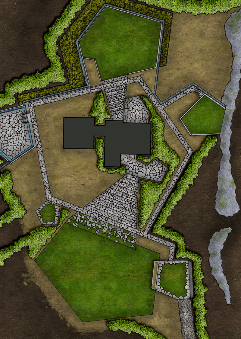
In general, I prefer a third method that is less efficient, but gives – in my opinion – far better results than either of the other methods. This involves printing out your full design, doing the line-work by hand, and then scanning it in to render from. This involves a few levels of added difficulty, as to have a single person render they need to be equally skilled with Photoshop and a pen, a large-scale scanner is nearly a must, and there is another time-consuming step added to the process. The added style, in terms of having a drawing that reads well AND has soul, more than outweighs the challenges in my book.
I said a large-scale scanner is nearly a must because it can be done with a traditional 8.5 x 11 scanner, but the line work must be far more precise, and line-weights are much harder to balance at a small-scale. (I am using a small scanner for this project, and a .1 with a straightedge is significantly thinner than a .05 freehand drawing lines less than half an inch in length.) Some of this may be due to the fact that I am slightly out of practice on my hand rendering, but some is also the difficulty of small-scale work.
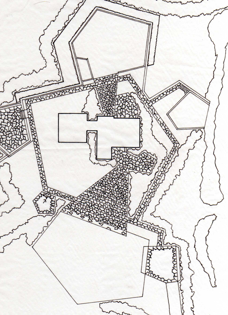
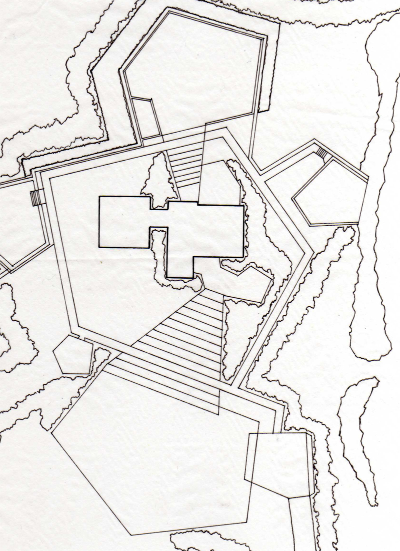
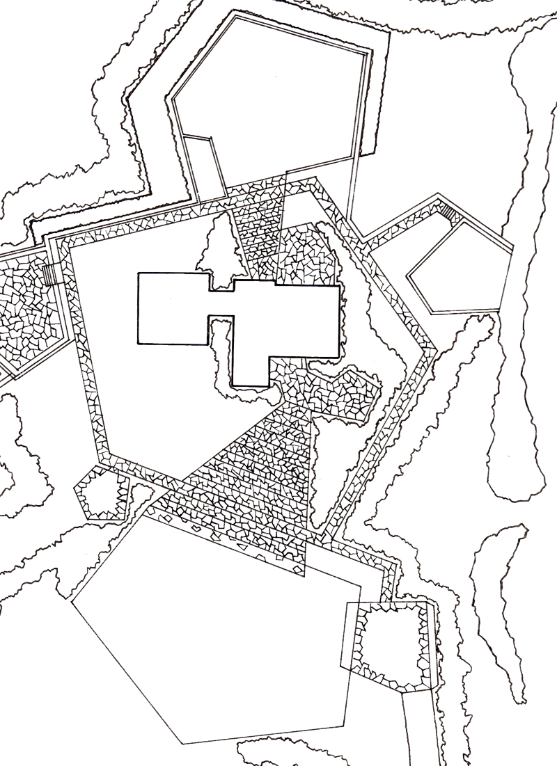
One thing I like to do to simplify the process is to first draw the ground plane with just material borders, scan that, and then fill in any detail (line hatching for decks/paving if desired, or, in this drawing, the flagstones), and rescan the whole drawing.
This has two main advantages. First, it allows you to still color as a block, and then add the detail later, when it doesn’t slow the rest of your work. Second, it allows you to tweak the line-weight on those detail lines. This may play a role even when working with a large format scanner, but it is a lifesaver when working small format. This way you can, after cleaning up the scans and making the white areas transparent, you can delete the outer edges of the detailed scan’s lines, reducing the line-weight, and increasing readability.
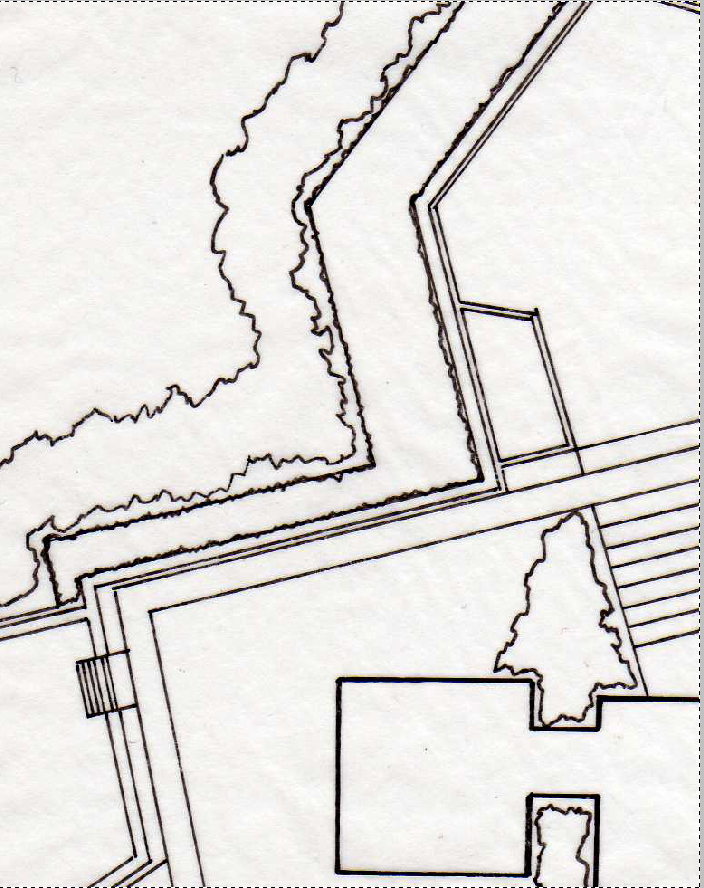
One of the tricky parts of this process is how to make the black lines the only thing on a layer, so you can render behind it and have the black lines not edges with a light gray halo. The first way you can do it is by selecting the white areas, deleting them, and darkening the other areas. This can often lead to white/gray artifacts in the black lines. The better way is to use masks/alpha layers. First we have the scanned image:
The first thing that needs to be done is cleaning up the white areas. The easiest way to do this, along with darkening the lines, is by increasing the contrast of the image.
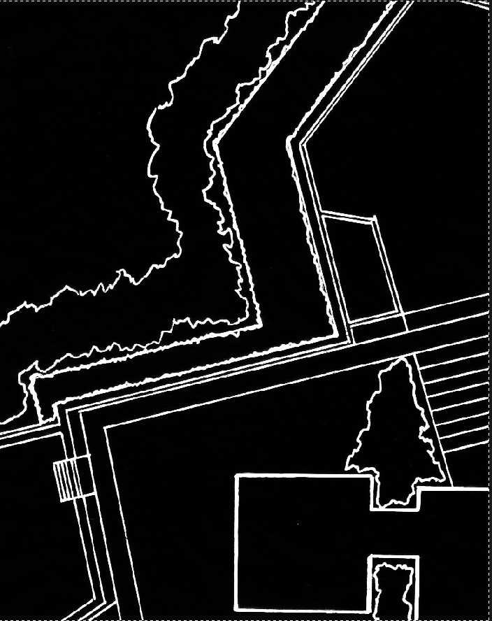
Once you have a sharp black line on white, go to Image->adjustment->invert. this will give you a negative image,
with what was black white, and what was white black. Then go to Image->Adjustment->Hue/Saturation and desaturate the image.
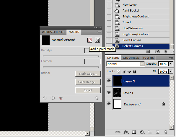
This step is necessary to make it into a masking layer, and it also allows you to more easily see areas where the black lines (now white) are slightly gray and transparent. You can now tell if you need to up the contrast even more. Then make an additional layer of solid black. Open the masks window by going to Windows->Masks, and click on the icon for “Add a Pixel Mask”.
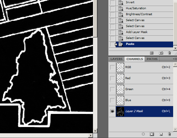
Select your inverted layer, Hit CTRL+A to select all, and CTRL+C to copy the image. Then select your black layer that now has a masking image (Shown with a white box in the Layers palette). The way to paste info into you mask layer is by clicking on the Channels tab of the layers palette. At the bottom of the list you will see a layer that is not active and is pure white. Turn on and select the layer, then hit CTRL+V to paste your image data.
By turning off the masking/alpha layer, you now have a layer that is pure black with transparency for your textures to shine through.
The only remaining thing is that if you do need to edit the layer, you don’t edit the black layer, you go into the channels, turn off the RGB layers, and turn on the masking layer.
Then you edit this layer. So if you need to delete a line, delete it here, or paint over it in black here. This is also where you will thin your detail lines if you need to create more line-weight. The easiest way to do this is by using the magic wand with “contiguous” unchecked. Then go to Select->Modify->Expand. A little trial and error is needed here to find the right amount to reduce the line-weight without erasing them. Once you have the right amount of expansion, make sure black is your background color, and hit delete to reduce the line-weight. Ifyou’re my method of a main line layer and a detail line layer, each will be set up this way, in one folder on the top of the layer stack.
Next time I’ll go over turf, and give the technique I use to erase the tiled look patterns normally create.
Published in Blog









![Assuming Beauty [Video]](https://land8.com/wp-content/uploads/2019/05/walker-macy-lara-rose-land8x8-224x150.png)

nca
Nice tutorial.
One method I typically use now is to just put all your color on one layer and select each color and create alpha channels instead of new layers.
nca
One other thing I noticed, and may have missed-
why not just put your linework on ‘multiply’?
Frank Varro
I hadn’t thought about setting the ink layer to multiply, That is one of the blending options that I am less familiar with.
As far as the colors go, each one of my textures is made of two patterns and a masking layer, so while I might be able to pull it off with alpha layers, it would probably get way to messy in my channels tab.
Thanks for the feedback!
Bob Luther
Yeah Multiply would save a bunch of steps, any black line is saved and any white space becomes transparent color behind it and you have no issues… also if you bring you line work into Photoshop from Autocad run another filter… “spatter” it will give your autocad line work an instant “hand drawn look”
Bob Luther
you can also look into the “Squiggle” Program for Autocad to produce a hand drawn effect.
Donal Oldaker
This is a really nice tutorial. Thank you. I wish my school would expose us to different techniques like this instead of the “go figure it out on your own” technique.
nca
Donal,
That seems to be the way many universities operate. Mine was the same. Check out Lynda.com videos as well for more help like this.
Frank Varro
Donal,
Thanks!
I think the problem is two fold. One: having a unique rendering style can be really beneficial, so professors push students to go off and figure out their own methods.
Two: I think most universities are lacking a staff member who renders more in cad than by hand. Speaking in generalizations, Professors went to school 15+ years ago, when the only real method taught was hand rendering. They were taught by well practiced hand renderers, and were able to take that experience and put their own spin on it. Now you are in the gap where there are no real existing experts on photoshop rendering other than people still actively rendering in firms. Its hard to find someone with the expertise and experience to show students how to render not just passibly in photoshop, but well.
My “free agent” status has allowed me the time to really work on my technique, experiment, and adjust my output greatly. If you look at my original tutorials, they are less than a year old but yield WILDLY different results. Not bad results, but more time consuming and not QUITE as crisp. It took a year on my own to build between those. It took another 2 years (half in a firm, half on my own), to move from the basic techniques that schools do teach to where I was at my first tutorial.
And I’m sure I still have a ways to go. Thats why I want to put these out. So that I can save you 3 years of trial and error, get you to where I am now, and then you can screw around for another couple months and evolve the techniques even more.
As people working on the bleeding edge of technology we unfortunately don’t have the luxury of a lot of mentors… its mostly a group of peers. Working together is the only way we can really solidify photoshop as a viable alternative to hand drawing in the minds of many firm principals.
Ryan Sand
Nick
-You might have to go into your own tutorial on that one… I remember they were teaching that as we left the university.