


“Don’t get me wrong, these plans look good, but after a certain point any student can do a technically good Photoshop rendering. The key is to add something else to it. It needs some artistic flair, some of your personality to really stand out, and to really work”
That is what I heard from one interviewer while looking at my portfolio shortly after I became a “Free Agent” in August – I am, after all, not technically unemployed, as I am employed by Best Buy, but I am looking for an opportunity to work with an LA firm again… plus it’s less of a blow to my self esteem. I recommend it to any other free agents out there, and I know there are a few- but I digress. It was at that point that I decided that I needed to really look at my rendering style and see how I could add some signature style to it.
Up to that point, I had been working on creating a style of Photoshop renderings that looked relatively realistic- textures on everything; no black outlines at all, complex tree shapes. I liked what I was getting, but it wasn’t perfect, as the lack of outlines meant that even with drop shadows there was no pop to things that were tall in the drawing, and it came off as flat. Through a series of chance projects with tight deadlines, I had to modify my techniques some, and ended up with a hybrid, where I used my Photoshop textures to color render inside hand drawn lines.
It still wasn’t 100% perfect- but I never expect to be 100% happy with anything I do in this profession; if I am it means I am getting lazy.
Getting to the point I am at now, however, took a lot of work, and a lot of trial and error. Part of that is due to the fact that there are, according to google at least, no Photoshop tutorials for landscape plan renderings. While I didn’t expect to find the perfect techniques there, I found absolutely nothing even close. I waded through tutorials for websites, posters, photo-editing, and searched for brushes on my own. I then had to experiment with colors, tones, transparency, and more to get the look that I wanted.
Since I put so much time into figuring out what I have so far, each Tuesday I am planning to do a new tutorial for part of my landscape plan rendering. Use it exactly as presented if you want, but even better, take what I told you, tweak it, and make it yours. Hopefully I can save you at least some of the time that I spent pulling my hair out.
TUTORIAL- GRASS IN PLAN
One of the first things I figured out how to make, and one of the things you will need in almost every plan you do, is grass. The first thing you should know is that I rarely use “patterns” to tile my textures- I have yet to find a good way to insure that there are no seams, or obvious repeating areas. Since I “hand paint” the texture every time I use it, I have two different ways to do a grass texture, one quick, one slow-but with a better look, in my opinion.
Technique 1- Quick and dirty.
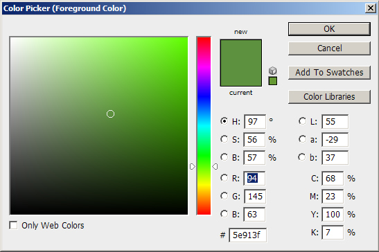
Step 1: Pick a color
I like a slightly desaturated green with at least a little yellow in it. The shade will depend some on the length/type of grass as well- for an unmown field you might choose a color that is almost pure yellow, with just a hint of green. For this turf I am choosing R:94 G:145 B:63 (After looking at it, I probably would have cheated a little more yellow then this color)
Step 2: Paint outside the lines
Since this method involves the blur filter, the edges will get ugly. Therefore, you want to color a larger area then will be seen. One method is to paint the entire page. This allows for slightly easier editing in the future if you move a path after the first rendering, and want to do a new rendering with everything the same except for the path. You can then mask off white areas with a layer that sites above the grass layer.
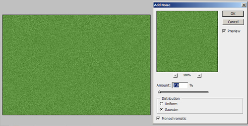
Step 3: Add Noise
To add texture to your grass, go to Filter>Noise>Add Noise You want to select the noise level you want carefully. It will depend on the size of the rendering, if its being printed or sent as a digital file, and, again, the type of turf. For this rendering, I am adding 7%, Gaussian, Monochromatic noise. This gives it a noticeable, but not overpowering texture that doesn’t repeat, but also isn’t flat.
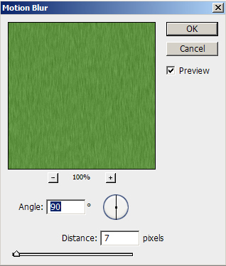
Step 4: Add Blur
You could leave the grass as is, but it has a bit of a harsh look to it still. I prefer to add a motion blur to the grass by going to Filter>Blur>Motion Blur. The amount you want the grass stretched is, again, a factor of how long the grass is, as it gives a look of long blades of grass. For this normal turf area I use a blur of 7 pixels at a 90 degree angle.
This gives a grass that has some life to it, but also doesn’t take a long time to do, and that with some nice edge darkening (Upcoming Tutorial) can give a great looking result.
Technique #2: Slow and steady
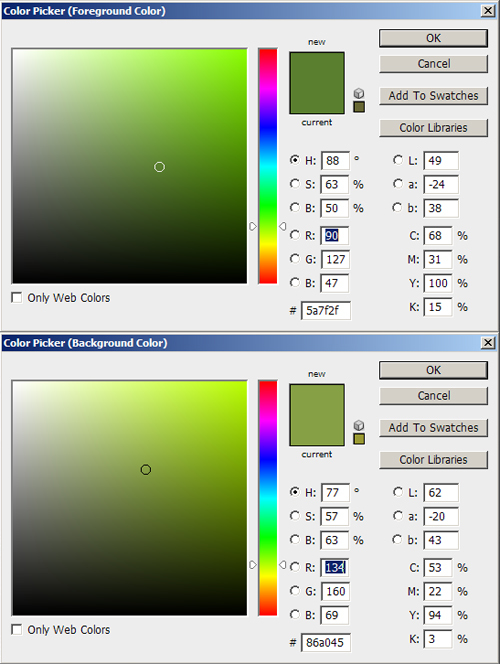
Step 1: Pick TWO colors!
For this technique you need to pick both a background color and a foreground color. Which is which doesn’t really matter, but I generally pick one that is lighter and less saturated, and one that is darker and more saturated. I would stay in the yellow-green range again, and you might even decide to make the lighter color more or less yellow then the darker color to change the look a little. Also, as with the first technique, the longer the grass is, the more yellow I make it. For this grass- a short turf, I am choosing a foreground of R:90 G:27 B:47 and a background of R:134 G:160 B:69
Step 2: Primer Coat
As with the first technique, I recommend painting well outside the lines, an possibly blanket painting the entire sheet to allow for the most editing later. Once you have your painting area selected, put a layer of the foreground color down to ensure that there are no odd white spots in your grass later on.
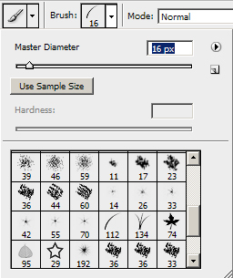
Step 3: Get that Paint Brush Ready
Next, you want to go into your paint brushes, and select the single blade of grass brush, and set it to a size that is appropriate for the grass type, but that will still be visible. For this example I am going to select 16 Pixel size.
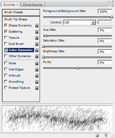
Step 4: Detailed Settings
Now you have to go into the Brush settings. First, under Shape Dynamics I set size jitter to 100%, Minimum Diameter to 15%, Angle Jitter to 10%, and both Roundness settings to 20%. Under Scatter I set scatter to both axes, at 800%, Count to 16, and Count Jitter to 50%. The only other controller I have on is Color Dynamics. Under that I have Foreground/Background Jitter set to 100%, Hue Jitter to 3%, and everything else set to 0%. The resulting window should look something like this:
Step 5: Bog Down Photoshop
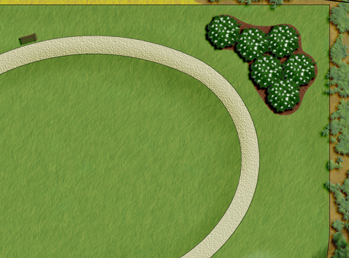
With all of these settings rolling, its now time to get painting. Depending on your settings, it may take a lot of passes to get your grass area painted, and you may even see Photoshop lag behind your movements. If this happens, don’t panic, just be patient and let Photoshop catch up (I’ve had to sit and watch Photoshop paint for 30 seconds before it caught up to where I stopped.) Its annoying, but just let it catch up, and you’ll be on your way. Soon you will have a texture like this:

Again, once you do some work on the edges, you end up with what I think is a great result, that has a nice look to it that is both representative of what you would see in the space, but that also gives the rendering some life and movement.
I hope that helps at least some people out. Even if you don’t like how these look, I hope it gets you thinking about what you might do differently.


Enrica Rinintya
I really do like your tutorial.
keep posting..^^ I used to use photoshop too during internship,
did not really master on it though..I like your way..seems easier ^^
Jim Anderson
Thanks for these posts. It is helping me a lot. Keep posting please.