


Author: Land8: Landscape Architects Network

How This Funeral Architecture is a Beautiful Tribute to Nature
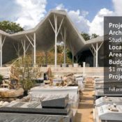
Article by Carlos Cortés Open-sided shelter, by Ron Shenkin Studio, in Pardesiya, Israel. Graveyards and cemeteries are places where we bury and say one last goodbye to our family and friends. This open-sided shelter by Ron Shenkin Studio is a spacious structure placed next to a cemetery where people converge and dedicate eulogies and words to the deceased, prior to and during the ceremonies. What is the Purpose of the Funeral Landscape? By nature, these are places where strong emotions emerge. The design for this pavilion embraces those emotions and “paints” the site with simple but effective symbolism. From a tribute in the form of raised orchards to a reminder that man comes from dust and to dust returns, we take a look at every aspect of this project that is inclusive with its landscape surroundings.
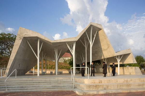
Photo credit: Shai Epstein
Those pillars tower over the people who gather at the shelter, which can hold either small or big groups while still offering the same feeling of embrace. In this woods of iron perfectly scaled with the roof, there is one living oak tree that remains inside, emerging through the roof from an opening created especially for that purpose.
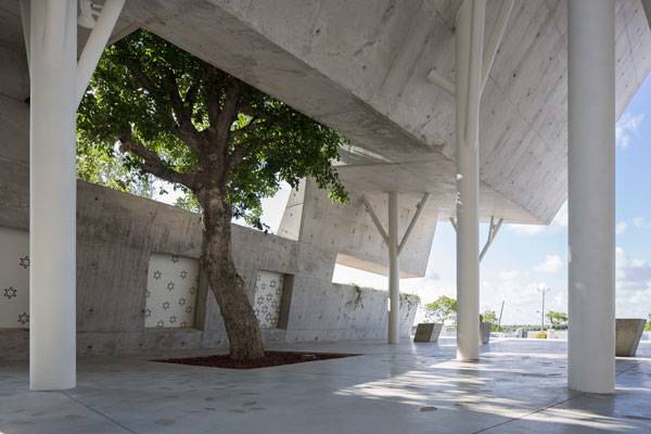
Photo credit: Shai Epstein
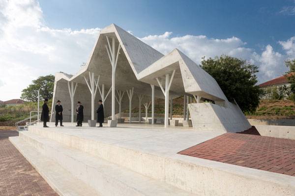
Photo credit: Shai Epstein
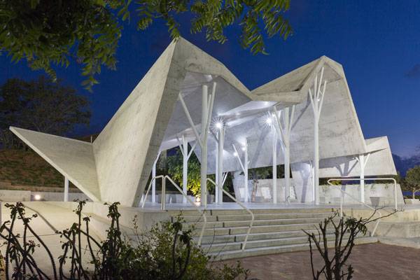
Photo credit: Shai Epstein
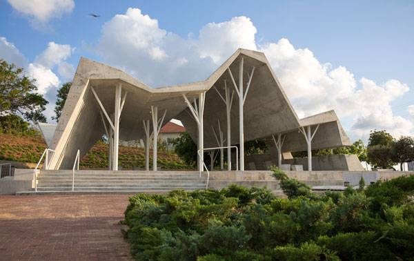
Photo credit: Shai Epstein
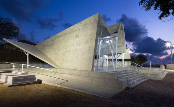
Photo credit: Shai Epstein
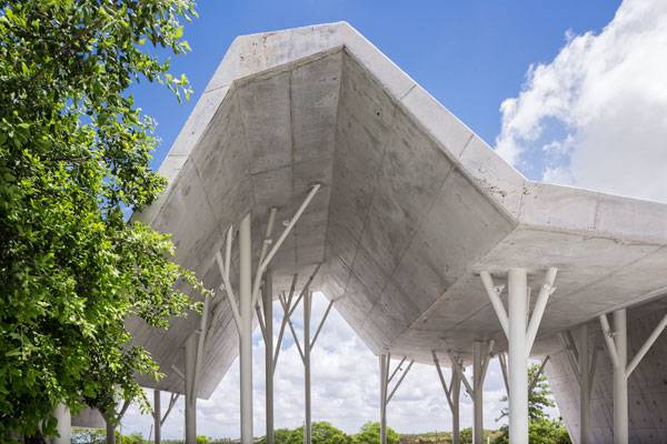
Photo credit: Shai Epstein
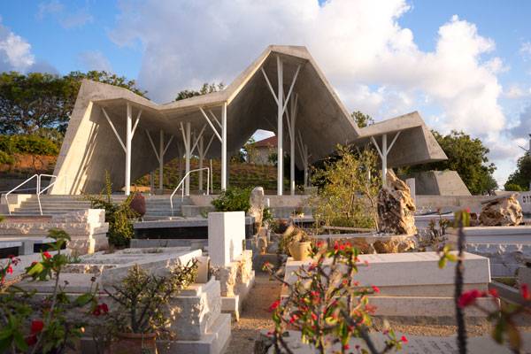
Photo credit: Shai Epstein
Full Project Credits For the Open-sided shelter, by Ron Shenkin Studio:
Project Name: Open-sided shelter Architects: Ron Shenkin Studio Location: Pardesiya, Israel Contractor: A.D. Haled Area: 3,465 square feet Budget: $500,000 to $1 million Project Year: 2015 Photographs: Shai Epstein Learn more about Ron Shenkin Studio: Website: www.ron-shenkin.com Recommended Reading:
- Becoming an Urban Planner: A Guide to Careers in Planning and Urban Design by Michael Bayer
- Sustainable Urbanism: Urban Design With Nature by Douglas Farrs
Article by Carlos Cortés Return to Homepage


15 Reasons Why Gardening Is Good For You
Article by Samantha Young Many of us love gardening and don’t need an excuse to do it, but for those of you who do, here are 15 reasons why gardening is good for you. Gardening may seem like a chore for some but with a multitude of benefits, a little pruning can go a long way. From banishing stress to burning calories and saving you money, here are 15 reasons why you should be gardening. 1. Beats Depression In a study, individuals who showed common symptoms of depression were instructed to garden for six hours per week. Not only was a measurable improvement shown after three months, these benefits continued months after the program ended. 2. It’s Great Exercise A form of low impact exercise, gardening isn’t only good for the joints, it also burns anywhere up to 300 calories per hour. 3. Reduces Risk of Heart Disease Thirty minutes of moderate exercise in the backyard, two to three times per week, can significantly prevent high blood pressure. This is exceptional news for your heart and can help you avoid life-threatening complications in the future.

By Harry Pears,”Digging”. Licensed under: Public Creative Commons 2.0, via Flickr

By jc.winkler, CC BY-SA 2.0, vis Flickr.
- Becoming an Urban Planner: A Guide to Careers in Planning and Urban Design by Michael Bayer
- Sustainable Urbanism: Urban Design With Nature by Douglas Farrs
Article by Samantha Young Return to Homepage Featured image: By J.-H. Janßen – Own work, CC BY-SA 3.0, www.commons.wikimedia.org

Is Innovative LED Technology a New Way to Improve our Streets?
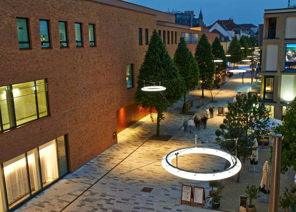
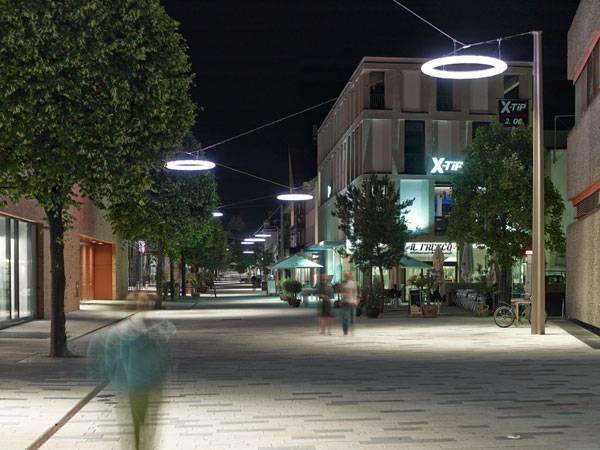
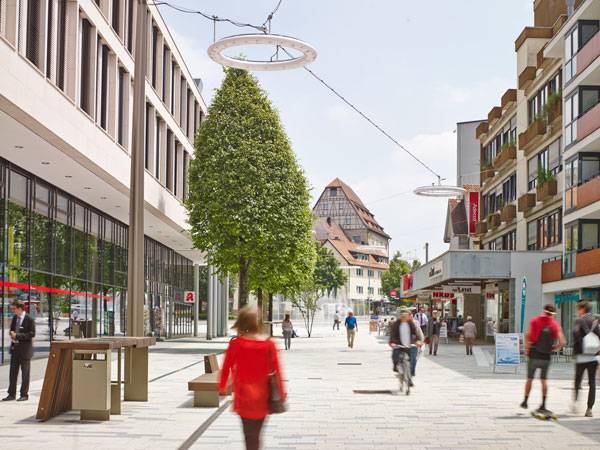
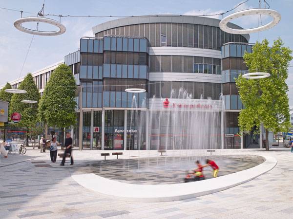
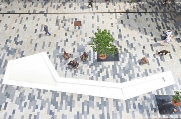
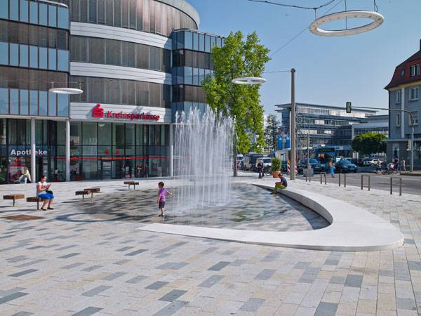
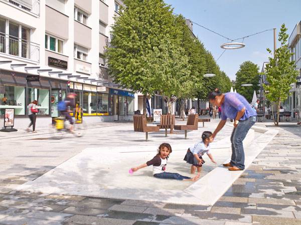
Article by Lidija Šuster Neue Meile, by Bauchplan, in Böblingen, Germany. Taking a closer look at how they use LED Technology What happens when a street is not just a physical connection between two landmarks? What if the street becomes an attraction itself rather than simple route for pedestrians? The landscape architects of Bauchplan gave us the perfect answer – linking the railway station and center of old town of Böblingen, in a way that’s more than usual. Transforming the car-friendly space into a pedestrian’s area was surely not an easy task. The landscape architects were faced with many obstacles in putting together safety, a specific location, attractiveness and comfort, and making the space both functional and beautiful at the same time.
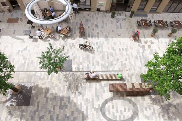
Neue Meile, by Bauchplan, in Böblingen, Germany.
LED Technology
Using lighting in a different way than ordinary helps to those characteristics become conjoined, and here innovative LED lighting plays a major role. Imagine giant-sized light rings that are hovering above the ground, magically glowing when it’s night and catching your eye during the day. Sounds magnificent, don’t you think? Thanks to the manufacturer Bergmeister Leuchten and light planners at Lumen3 Lighting Design, as well as the contribution by OSRAM of the innovative LED technology, the landscape architects of Bauchplan were able to bring to life this very unique space.
Neue Meile, by Bauchplan, in Böblingen, Germany.

Neue Meile, by Bauchplan, in Böblingen, Germany.
Neue Meile, by Bauchplan, in Böblingen, Germany.
Neue Meile, by Bauchplan, in Böblingen, Germany.
Neue Meile, by Bauchplan, in Böblingen, Germany.
Neue Meile, by Bauchplan, in Böblingen, Germany.
Neue Meile, by Bauchplan, in Böblingen, Germany.
Neue Meile, by Bauchplan, in Böblingen, Germany.
Neue Meile, by Bauchplan, in Böblingen, Germany.
Full Project Credits For „neue Meile“ Böblingen:
Project Name: „neue Meile“ Böblingen Location: Böblingen, Germany Landscape Architect Group: Bauchplan Lighting Design: Lumen³ Lighting Design Technology: Electronic Control Gear, Led, Led Modules Luminaire Manufacturer: Bergmeister-leuchten Gmbh Builder: City Of Böblingen Application Area: Traffic Systems Sub-application: Street Date Of Construction: 2013 – 2015 Size: 25,000 Sqft – 100,000 Sqft Client: City of Böblingen, amt für tiefbau u. grünflächen (department for civil engineering and open spaces) Size: incl. side streets approx. 18.000 m2 Cost: 8,5 mio Euro Photo Credits: Bauchplan ).( and C. Franke Award: 1st prize cooperative workshop Learn more about Bauchplan: Website: www.bauchplan.de Facebook: www.facebook.com/bauchplan Twitter: www.twitter.com/bauchplan LinkedIN: www.linkedin.com/in/bauchplan XING: www.xing.com/companies/bauchplan Youtube: www.youtube.com/channel Google+: www.plus.google.com/u/0/+BauchplanNetwork Recommended Reading:
- Becoming an Urban Planner: A Guide to Careers in Planning and Urban Design by Michael Bayer
- Sustainable Urbanism: Urban Design With Nature by Douglas Farrs
Article by Lidija Šuster Return to Homepage
The Best News in the World of Landscape Architecture
News report by Brett Lezon 8-February-2016 The Latest News in Landscape Architecture 2016 is sponsored by ZinCo – Life on Green Roofs – Ecological and Economical Green Roofs, worldwide. In this week’s Latest News in Landscape Architecture we showcase a tree-covered, mixed-use development in Paris, examine the benefits of long-term garden design, and explore Turkey’s urban growth. In addition, we’re trying something new with a YouTube tutorial of the week. This week features some nifty Photoshop tricks used when devising a site analysis diagram.
Latest News in World of Landscape Architecture
Here are 10 of the Best Stories in the World of Landscape Architecture:
- YouTube Tutorial of the Week
- Could Freight Hubs Become Eco-Villages?
- A Park in the Middle of the Vegas Strip?
- Moorside Landscape Design Competition
- How Ljubljana Turned Itself Into Europe’s “Green Capital”
- 2015 Landscape Architecture Australia Student Prize: University of Adelaide
- Tree-Covered, Mixed-Use Development Will Create a “Green Ribbon” in Paris
- The Benefits of Long-Term Garden Design
- The Lure of the City–Turkey’s Urban Centres Are Modernising at the Double
- Seattle Architect Says the Time Is Right for This Highway-Capping Park Design
(Click the headline for the full story)
- Site Analysis Diagram with Photoshop and Hand Sketching: N.C. A&T Landarch [YouTube Tutorial of the Week]
WATCH >>> Site Analysis Diagram with Photoshop and Hand Sketching
This detailed, hour-long YouTube tutorial shows the step-by-step process of creating a site analysis diagram using a hand sketch and Photoshop CS6. It explains how to correctly use layers and examines how to develop the necessary elements (may differ per design) such as boundaries, vehicular and pedestrian circulation, screening, green space, building footprint, text, etc. Ultimately, this tutorial demonstrates how to produce a professional site analysis diagram—giving you an edge when presenting to clients or professors. Related Article: 10 of The Best Photoshop Tutorials on YouTube for Landscape Architects
- Could Freight Hubs Become Eco-Villages?: City Lab
Your average rail-freight and agriculture corridors—often overlooked—demonstrate the hidden story of the central cities they support, plus the large-scale economy needed to make it happen. Landscape architect and Illinois Institute of Technology (IIT) professor Conor O’Shea sees a similar misconception in urbanism. There’s no such thing as “outside the city,” he believes. Interestingly enough, he has envisioned a village model much different than the cul-de-sac and strip mall lifestyle—something like an eco-friendly cross between a truck-stop and a suburban town center, with less familiar aesthetics. “These aren’t things I’m inventing. I’m just saying they could be put back together differently“, said O’Shea. Related Article: Changing the World, One Street at a Time with EcoDistricts
An oasis that borrows elements from the surrounding desert is slated to open in April 2016. Situated between Monte Carlo Resort and Casino and New York-New York Hotel & Casino, The Park will serve as the gateway to the new T-Mobile Arena. Designed by !melk landscape architecture & urban design, the respite features monumental shade structures, dynamic water features, theatrical lighting, and mature plant life. Flowerings plants such as pink hesperaloes, yellow damianitas, and purple salvias will create year-round visual interest and color throughout The Park. View the renderings here.
- Moorside Landscape Design Competition: Landscape Institute
In 2009, NuGen (a UK nuclear company) secured an option to purchase land on the West Cumbrian coast of England from the Nuclear Decommissioning Authority. In 2011, the UK government confirmed, through its National Policy Statement, that NuGen’s site was suitable for a new nuclear power station. As a result, NuGen has launched two international design competitions. One is for design concepts for the key buildings, open to architects; the other, open to landscape architects, is for design concepts for important elements and features of the landscape scheme, including significant earth bunds and mounds. The winning designs will go on to be developed as part of a future landscape masterplan, with the mounds forming an integral part of the setting of Moorside Power Station. Completed and signed entry forms are due Friday, February 26. Explore the competition timeline for complete details. WATCH >>> An introduction to the Stage 1 Consultation
Much has changed in the past 10 years in Ljubljana. The modest-sized Slovenian city has replaced traffic-clogged streets with an energetic, car-free downtown. Ljubljana’s successful fight against traffic is one reason the European Commission named the city European Green Capital for 2016. Besides its transformed downtown, the city boasts a wealth of architectural heritage and indigenous forests that make up almost half the city’s land area, a bike share program that’s quickly gaining traction, a robust recycling program, and a comprehensive network of green spaces—proving that smaller cities have lessons to offer. “Every city can increase the quality of life in very short time if the mayor has a good team,” says Zoran Janković (Ljubljana’s mayor since 2006). “You must have more projects than the money you have in budget.” WATCH >>> Tjaša Ficko – Ljubljana: 2016 European Green Capital
More Top Stories in the News This Week:
- 2015 Landscape Architecture Australia Student Prize: University of Adelaide: Architecture AU
- Tree-Covered, Mixed-Use Development Will Create a “Green Ribbon” in Paris: Inhabitat
- The Benefits of Long-Term Garden Design: The Telegraph
- The Lure of the City–Turkey’s Urban Centres Are Modernising at the Double: The Economist
- Seattle Architect Says the Time Is Right for This Highway-Capping Park Design: Next City
– Do You have something to say about this week’s news stories? Let us know in the comments section below! Go to comments For all of the hottest news continue to follow us on Facebook and Twitter. Do you have news to share? Send to office@landarchs.com News report by Brett Lezon Return to Homepage

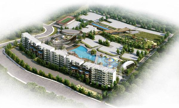
Why Green is the Only Way for This Housing Development
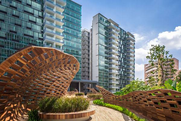
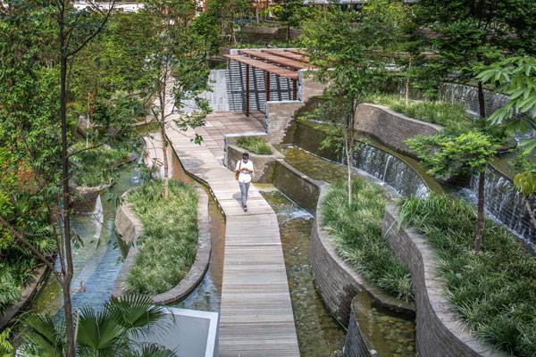
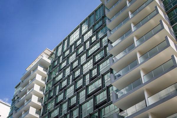
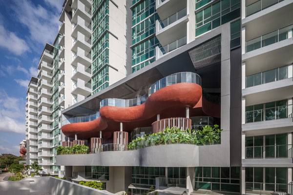
Article by Agmarie Calderón Alonso Minton Housing Development, by DP Architects in Serangoon in Singapore, Asia The Minton housing development comprises ten 15-story and eight 17-story apartment blocks, with a total of 1,145 units including 24 units of penthouses. Despite its size, this development creates a real visualization of how the landscape as open spaces can create different experiences. All blocks are oriented in the north-south direction in three linear rows, with ample spaces maintained between the blocks. Two of the three sky terraces accommodate spa facilities for residents, while the third serves as a landscaped deck connected to a bridge that links the different levels in this development.
Minton Housing Development. Image courtesy of DP Architects
Minton Housing Development
This concept of high living features the amenities that come with a standard condominium, but to another level. It is a type of lifestyle that is just unbelievable, but with an edge in its landscape surroundings. For example, this complex of housing has activity rooms for yoga, billiards, table soccer, karaoke, piano and table tennis. Furthermore they have childcare, other sports facilities, an 82-seat library and spas.
A landscaped deck connected to a distinctive bridge links the different levels in this development. Photo credit: Marc Tey
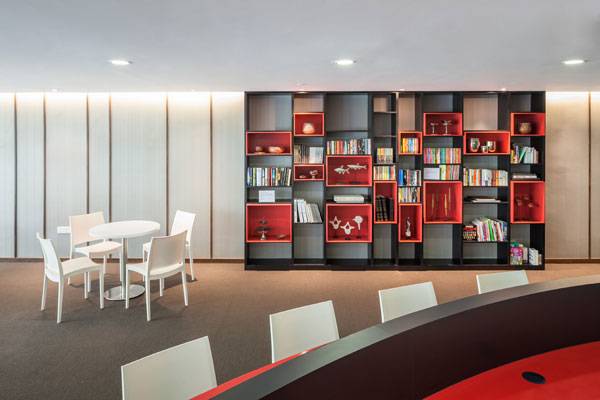
A tastefully decorated 82 seat library within the residential development. Photo credit: Marc Tey
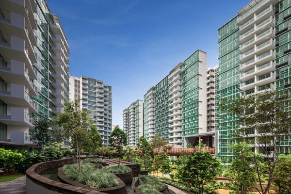
Blocks are oriented in the north south direction in three linear rows, with ample spaces maintained in between. Photo credit: Marc Tey
Lush greenery creates-an exclusive and private living environment that feels like an urban retreat. Photo credit: Marc Tey
Featuring clean lines, the development cuts a modern and elegant silhouette. Photo credit: Marc Tey
Two of the three sky terraces accommodate spa facilities for residents. Photo credit: Marc Tey
One of the many design features that aesthetically differentiates the individuals living experience from the norm. Photo credit: Marc Tey
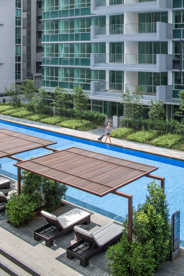
Other recreational and sports facilities, including lap and heated pools, are placed around the entire development. Photo credit: Marc Tey
The extensive use of glass panels on the elevations adds class and elegance to this suburban development. Photo credit: Marc Tey
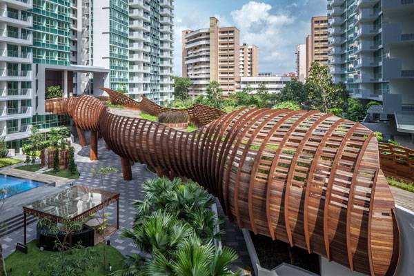
The eye catching visual spectacle of the third sky terrace, connected to a bridge. Photo credit: Marc Tey
Full Project Credits For Minton Housing Development:
Project Name: Minton Housing Development Location: Serangoon in Singapore, Asia Year of Completion: 2014 Area: 123,900sqm Architect: DP Architects Pte Ltd Project Team Members: Tong Bin Sin, Mike Lim, Wang Tse Lip, Toh Li Chuin, Divino Carrillo, Firman Saleh, Jacob Sandoval, Joseph Chua, Mochamad Herman Irfany, Pek Hui Xian, Roslinah Ahmad, Ross Vinco, Rowell Mendoza, See Phei Kee, Tan Teng Siew Learn more about DP Architects Pte Ltd: Facebook: www.facebook.com/ADM.TechnologyFormingIdentity Recommended Reading:
- Becoming an Urban Planner: A Guide to Careers in Planning and Urban Design by Michael Bayer
- Sustainable Urbanism: Urban Design With Nature by Douglas Farrs
Article by Agmarie Calderón Alonso Return to Homepage

The 2 Simple Principles Behind The Riverside Terrace
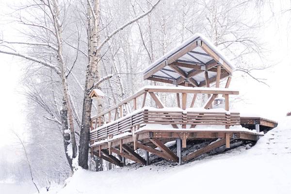
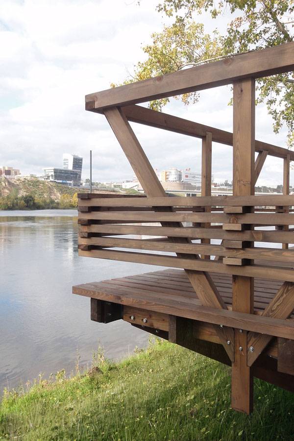
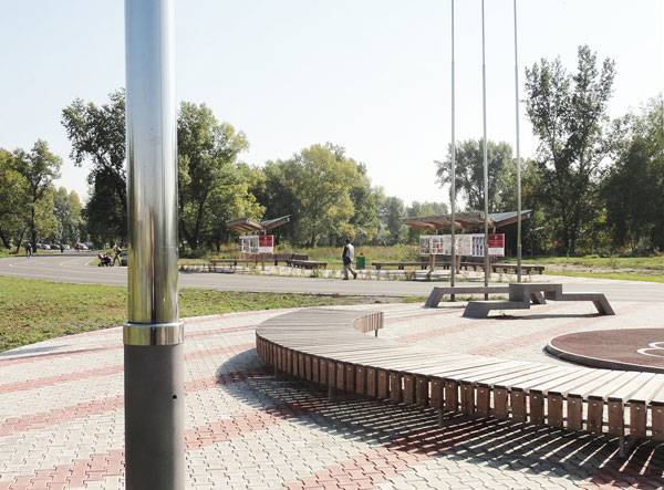
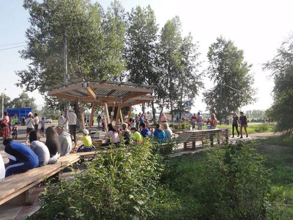
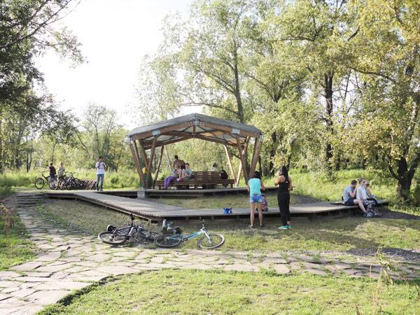
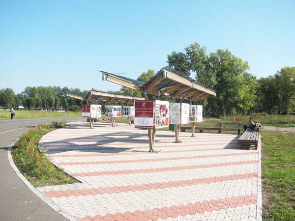
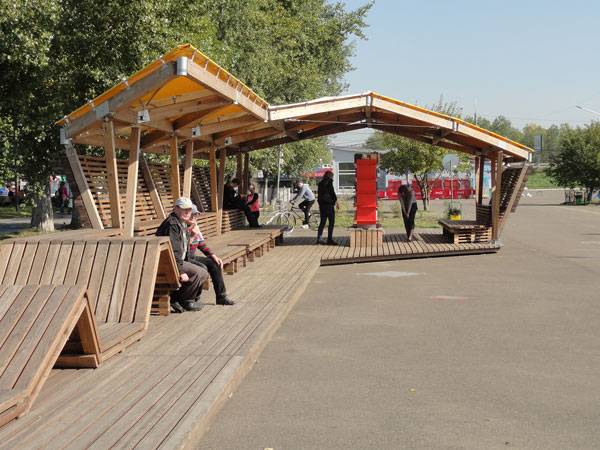
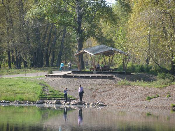
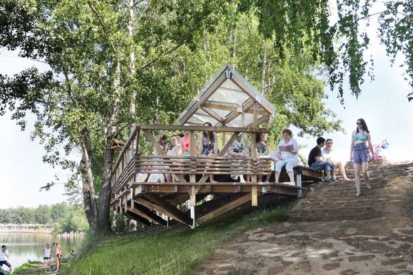
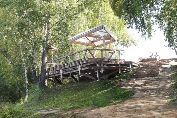
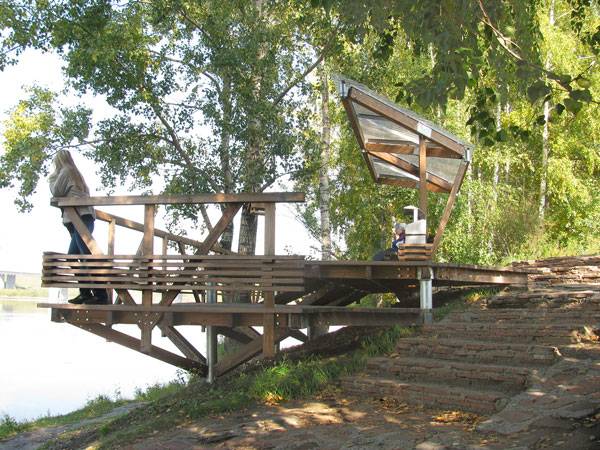
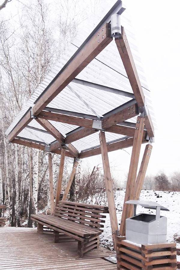
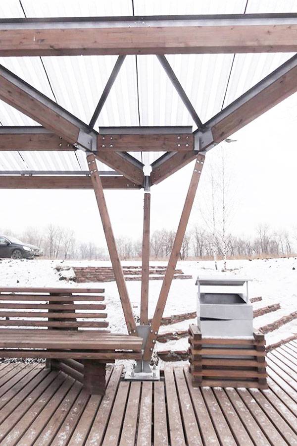
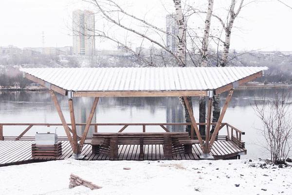
Article by Irmak Bilir The Riverside Terrace, by OOO “ADM”, Tatyshev Island, Krasnoyarsk, Russian Federation. The Riverside Terrace is a project which shows us that naturalizing a space can make a project compatible with people. Krasnoyarsk is a city, located in Siberia / Russian Federation, that is on the Yenisei River. It has a natural landscape which is shaped by the river even though it is an industrial city. The Yenisei forms some large and some small islands. Tatyshev Island is the biggest one which is in the center of Krasnoyarsk and is surrounded by urban areas but has a unique natural landscape too; therefore, it is very significant for the inhabitants of the city.
The Riverside Terrace. Photo courtesy of OOO “ADM”. Photographers listed below.
The Riverside Terrace
The Riverside Terrace, by OOO “ADM”, is located on the north side of Tatyshev Island, and shows us two simple principles which can make a project wonderful. The project is designed in harmony with the nature of the island; moreover, it thinks of mankind as a part of that ‘nature’; this is one of the two guiding principles.
The Riverside Terrace. Photo courtesy of OOO “ADM”.
The Riverside Terrace. Photo courtesy of OOO “ADM”. Photographers listed below.
The Riverside Terrace. Photo courtesy of OOO “ADM”. Photographers listed below.
The Riverside Terrace. Photo courtesy of OOO “ADM”. Photographers listed below.
The Riverside Terrace. Photo courtesy of OOO “ADM”.
The Riverside Terrace. Photo courtesy of OOO “ADM”. Photographers listed below.
The Riverside Terrace. Photo courtesy of OOO “ADM”. Photographers listed below.
The Riverside Terrace. Photo courtesy of OOO “ADM”. Photographers listed below.
The Riverside Terrace. Photo courtesy of OOO “ADM”.
The Riverside Terrace. Photo courtesy of OOO “ADM”.
The Riverside Terrace. Photo courtesy of OOO “ADM”.
The Riverside Terrace. Photo courtesy of OOO “ADM”.
The Riverside Terrace. Photo courtesy of OOO “ADM”.
Full Project Credits For The Riverside Terrace:
Project Name: The Riverside Terrace Designers: OOO “ADM” Location: Tatyshev Island, Krasnoyarsk, Russian Federation Project Year: 2013-2014 Design Architect: Aleksei Miakota Project Team: Elena Elizarova, Ekaterina Kalashnikova, Olga Loginova, Olga Zhukova Client: MAU Direktciia sportivno-massovykh meropriiatii Photographs: Aleksei Miakota, Lidiia Gribakina Learn more about OOO “ADM”: Facebook: www.facebook.com/ADM.TechnologyFormingIdentity Recommended Reading:
- Becoming an Urban Planner: A Guide to Careers in Planning and Urban Design by Michael Bayer
- Sustainable Urbanism: Urban Design With Nature by Douglas Farrs
Article by Irmak Bilir Return to Homepage

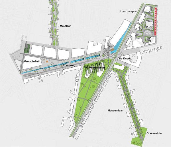
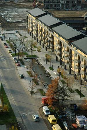
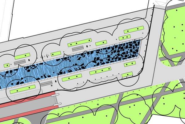
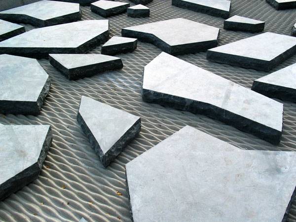
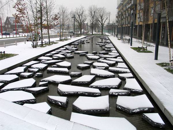
What Makes Roombeek The Brook a Remarkable Urban Street?
Article by Amela Đurakovac Roombeek The Brook, by Buro Sant en Co, in Enschede, The Netherlands Streets are one of the most important elements in any city, not only because they bring together different parts of the settlement, but also because they connect the series of events that are important for residents. Streets are the places where we live, work, and play. There are different types of streets that can be divided on the basis of exposure, location, length and width, significance of the presence of green areas, and — most importantly — the people and their presence. The social role of a street is exactly that – the option of meeting or organizing social life and allowing residents to feel safe and to contribute to the quality of the city. So what makes a successful urban street? One that is visually and functionally appropriate to its users. Can a street emulate nature, restore life in the urban center, and completely change our idea of a city roadway? Oh, yes indeed!
Roombeek The Brook. Image courtesy of Buro Sant en Co
Roombeek The Brook by Buro Sant en Co
Old for New: Bringing Back the City River In the city Enschede in The Netherlands, you can see an example of this kind of street. This street is a central point of the city, and thanks to its design, it also draws attention to one of the most important elements of the city — The Roombeek River.
Roombeek The Brook. Image courtesy of Buro Sant en Co
Roombeek The Brook. Image courtesy of Buro Sant en Co
Roombeek The Brook. Image courtesy of Buro Sant en Co
Roombeek The Brook. Image courtesy of Buro Sant en Co
Roombeek The Brook. Image courtesy of Buro Sant en Co
Roombeek The Brook. Image courtesy of Buro Sant en Co
Roombeek The Brook. Image courtesy of Buro Sant en Co
Full Project Credits For Roombeek The Brook:
Project Name: Roombeek The Brook Landscape Architects: Buro Sant en Co Location: Enschede, The Netherlands Date of Construction: Design: 2003; Implementation period: 2005 Size: 13,600 m2 Construction Cost: 16.5 million euro Client: Municipality of Enschede Learn more about Buro Sant en Co: Website: www.santenco.nl Twitter: www.twitter.com/santenco Recommended Reading:
- Becoming an Urban Planner: A Guide to Careers in Planning and Urban Design by Michael Bayer
- Sustainable Urbanism: Urban Design With Nature by Douglas Farrs
Article by Amela Đurakovac Return to Homepage


How Gordan Lederer Memorial Makes a Tragedy Beautiful
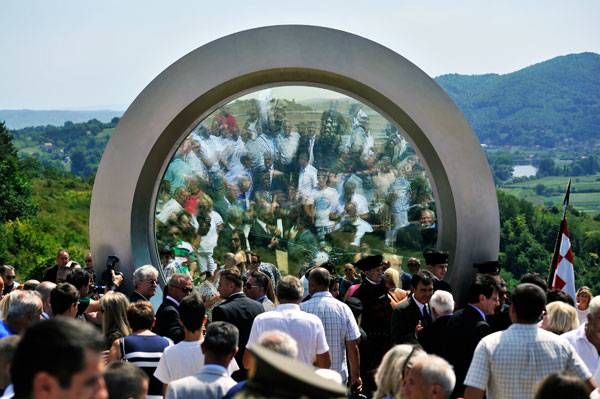
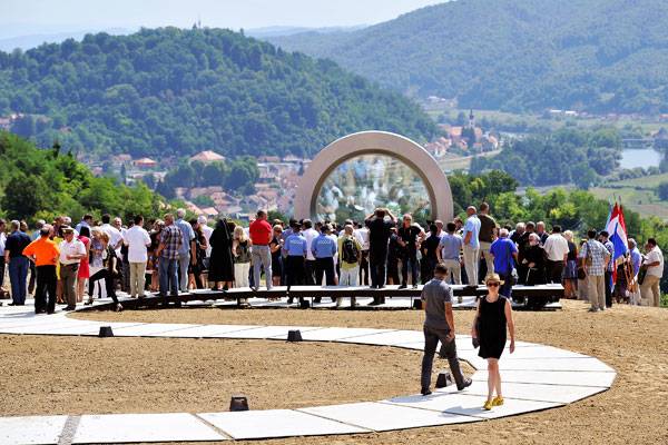
Article by Kaila Johnson Gordan Lederer Memorial, by NFO, in Čukur Hill in, Croatia. What comes to mind when thinking about a memorial? Most would perhaps say a statue, plaque, or some other singular structure aimed at commemorating a specific person or event. Memorials are erected to commemorate people, events, and significant happenings of times past. The Gordon Lederer Memorial is no different in that it commemorates a specific person and event: a Croatian photo- and videographer who was killed by a sniper while filming soldiers in the Čukur Hills. However, it does so by using the whole landscape as the memorial itself. In this particular location, photographer Gordon Lederer was killed by a sniper on August 10th, 1991, while filming Croatian soldiers in action on Čukur Hill in the Bania Region.
Opening ceremony. Photo credit: Boris Kovacev
The Story
The memorial was created as part of a design competition, put on by Croatian Radio Television (HRT), as a plan to commemorate all locations where HRT photo and videographers were killed during the war in Croatia in the 90’s. So what, exactly, does this have to do with landscape architecture? Well, the winning design, by NFO, turned the landscape into the memorial itself by injecting it with art, architecture, and sculptural elements, with a main emphasis on the breathtaking natural landscape surrounding this space.
Opening ceremony. Photo credit: Boris Kovacev
The Materials
The materials used in this landscape are especially interesting, in that they don’t actually focus on the vegetation, but on the hard, human-fabricated materials used within the design. In fact, the only vegetation actively featured in this design is the grass that surrounds the walkways. This allows the sculptural and architectural elements of the site to stand out, as well as the beauty of the surrounding natural environment to be highlighted.
Gordan Lederer Memorial. Photo credit: Daniel Pavlić
The Journey of Lederer’s Life
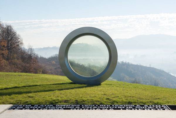
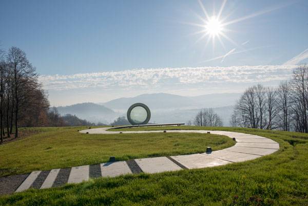
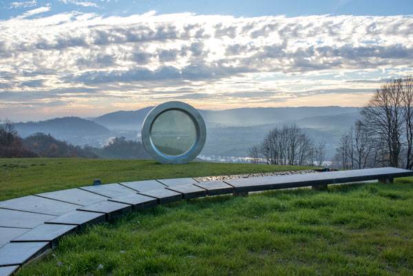
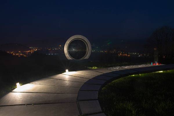
The surrounding landscape of the Čukur Hills features dense willow and poplar forests along the rolling hills. The whole design is aimed at being a pathway, which illustrates Lederer’s life as a photographer. The path is constructed out of concrete slabs which are framed by black steel, mimicking film negatives and representing significant events in Lederer’s life.
Gordan Lederer Memorial. Photo credit: Ivan Dorotić
Symbolism in Design
It begins with small blocks of concrete, spaced apart at varying distances by crushed limestone gravel and appearing to be “broken”; but as one moves along, the slabs become closer and closer together until they are strung together in a continuous pathway. See More Memorial Based Designs:
- Diana Memorial Fountain: “Reaching Out, Letting In”
- Landscape Storytelling – Memorial to Victims of Violence
- How A Symbol of Tragedy Can Encourage People to Look into the Future
Gordan Lederer Memorial. Photo credit: Ivan Dorotić
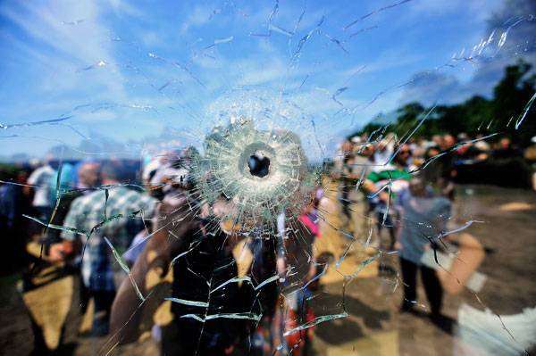
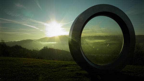
The Camera Lense and the Bullet Hole
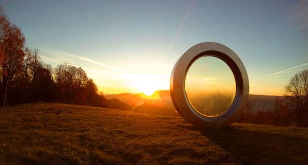
It continues along and meanders strategically across a plateau, and culminates in a large, circular glass frame that serves as a vantage point and lookout on the incredible natural landscape surrounding this space. This glass frame is encased in stainless steel, resembling a camera lens and representing the circle of life, and showcases the exact location where Lederer died taking his final shots. The glass has an imitation bullet hole within it, to undeniably illustrate the historically tragic event that took place on the site. Upon approaching the lens, the pathway splits and one section rises up beside the walkway.
Opening ceremony. Photo credit: Boris Kovacev
Breathtaking Views
Here, the visitor is free to experience the lens and the landscape from the raised portion, which can act as a bench, or they can continue across the grass to the sculpture itself for a close-up view. Once the site visitor reaches the glass lens, they are welcomed by breathtaking views of the Una River Valley, where they can reflect on the events that occurred through the sculptural elements, while appreciating nature in its raw beauty.
Gordan Lederer Memorial. Photo credit: Daniel Pavlić
The Landscape as the Memorial
In this design, the landscape is the memorial. There are architectural and sculptural elements that add to the design, and though the vegetation isn’t the primary feature of the site, the lack of vegetation allows the visitor to experience just how important the human-made features are, without detracting from the fact that it is a memorial. NFO further develops this idea by creating an experience for the visitor, with a pathway that acts as a journey, telling a story, until one comes to the end where they can see, think about, and reflect on the “end” of a life, while sharing in its beauty.
Gordan Lederer Memorial. Photo credit: Ivan Dorotić
A Memorial that Stretches the Boundaries
The Gordan Lederer Memorial by NFO is a special memorial, both for whom and what it represents, and for how it is physically represented. It serves as a constant reminder of the devastating effects of war, but celebrates the life of someone who dedicated their life to capturing the beauty in their surroundings and showcases this beauty in an everlasting, unique, and well-thought-out memorial that uses the entire landscape as part of its story. This design shows that memorials can stretch the boundaries of what they’re traditionally thought to be, without losing sight of the person, place, or event that they are commemorating. Do you think this is an effective way to commemorate someone or something? Let us know in the comments below! Go to comments
Gordan Lederer Memorial. Photo credit: Ivan Dorotić
Full Project Credits For Gordan Lederer Memorial:
Project Name: Gordan Lederer Memorial Location: Čukur hill, Hrvatska Kostajnica, Croatia Authors: NFO (Kata Marunica, architect, Nenad Ravnić, architect.) + prof.Petar Barišić,sculptor Project team: Sandra Perić, NFO architect; Nikica Pavlović,NFO architect; Filip Vidović, NFO architect; Dragan Mileusnić; Željko Serdarević Investor: Croatian Radiotelevision – HRT , project manager prof. Milan Bešlić Contractor: Beton Lučko d.o.o., Piletić staklo d.o.o., Šurba d.o.o., Telektra d.o.o. Photographers: Bosnić+Dorotić, Boris Kovačev / CROPIX, Daniel Pavlić Completion: August 2015 Learn more about NFO: Website: www.nfo.hr Facebook: www.facebook.com/nfoarhitektura Recommended Reading:
- Becoming an Urban Planner: A Guide to Careers in Planning and Urban Design by Michael Bayer
- Sustainable Urbanism: Urban Design With Nature by Douglas Farrs
Article by Kaila Johnson Return to Homepage

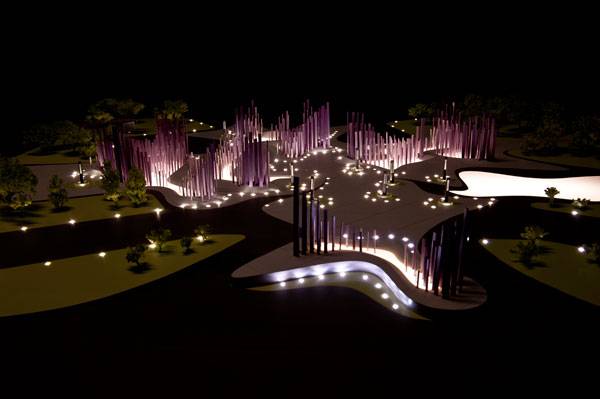
The Nature of the Soundwave Brought Out in a Landscape
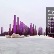
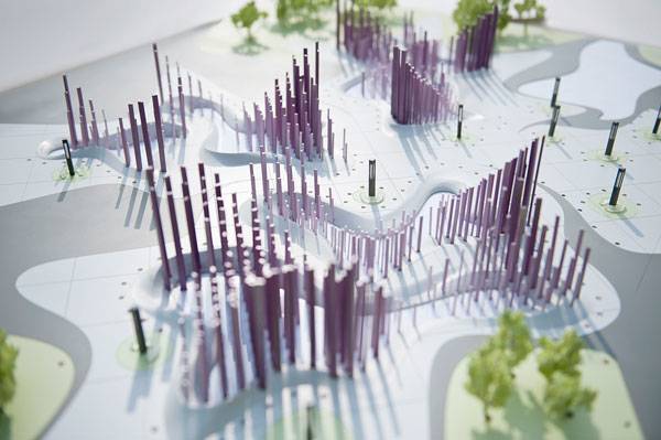
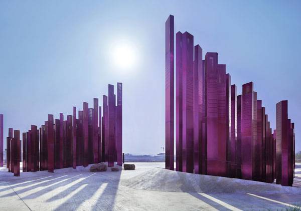
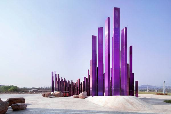
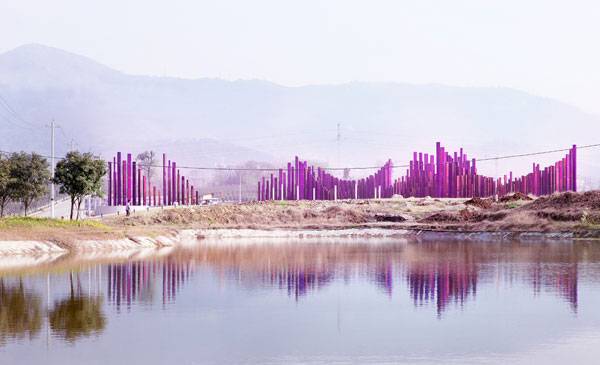
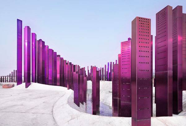
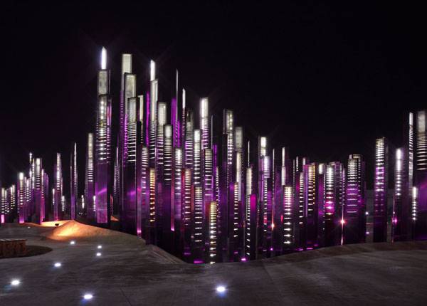
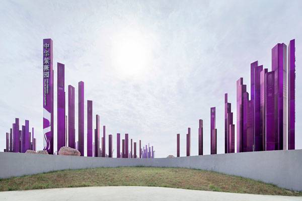
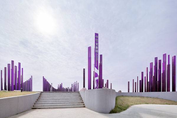
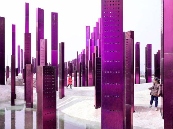
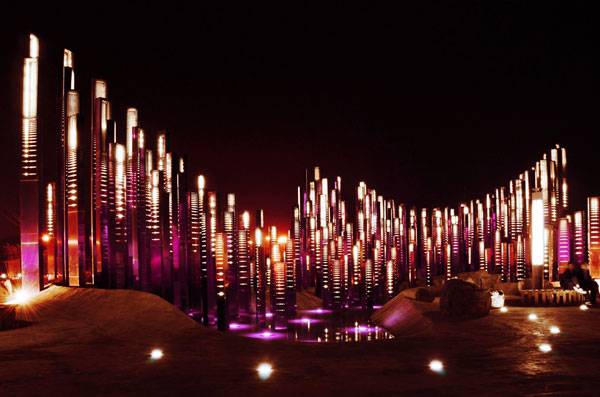
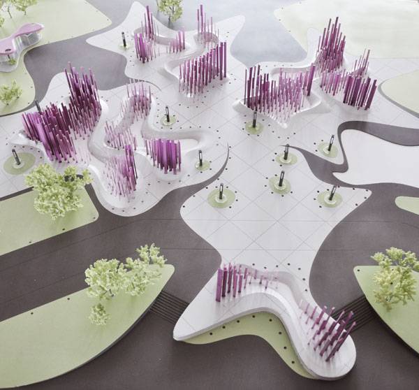
Article by Agmarie Calderón Alonso The Soundwave, by Penda, in Xiangyang, Hubei, China. The Soundwave sculpture by Penda Architects at the Myrtle Tree Garden in Xiangyang, China takes your breath away. Made up of 500 purple pillars of varying heights, the installation pays homage to the rising and falling bars of a digital sound visualizer. The Fins, which form the rhythm of the sculpture, are cladd with perforated purple stainless steel panels. Through an electrolytic passivation process (anodized), the panels were colored in a bath of electrolyte and electricity, which keeps the main characteristics of the steel unimpaired and corrosion resistant.
The Soundwave. Image courtesy of Penda
The Soundwave by Penda
How this exercise in creativity came together is just amazing. Escape the chaos of the city and enter a world of sensory experience. To let your imagination go and create something that you never thought possible, now that’s outstanding.
The Soundwave. Photo credit: Xia Zhi
The Soundwave. Photo credit: Xia Zhi
The Soundwave. Photo credit: Xia Zhi
The Soundwave. Photo credit: Xia Zhi
The Soundwave. Photo credit: Xia Zhi
The Soundwave. Photo credit: Xia Zhi
The Soundwave. Photo credit: Xia Zhi
The Soundwave. Photo credit: Xia Zhi
The Soundwave. Photo credit: Xia Zhi
The Soundwave. Photo credit: Xia Zhi
The Soundwave. Photo credit: Xia Zhi
Full Project Credits For The Soundwave:
Project Name: The Soundwave Architects: Penda Project Team: Dayong Sun, Chris Precht, Fei Tang Precht, Yongjian Huang, Zhonghua Tang, Chunlei Zhu, Junfeng Li, Runxin Tang Location: Xiangyang / Hubei / China Type: Public installation, landscape design Size: 5000, 0 sq. Year: 2013-2015 Photo Credits: Xia Zhi Learn more about Penda: Website: www.home-of-penda.com Recommended Reading:
- Becoming an Urban Planner: A Guide to Careers in Planning and Urban Design by Michael Bayer
- Sustainable Urbanism: Urban Design With Nature by Douglas Farrs
Article by Agmarie Calderón Alonso Return to Homepage


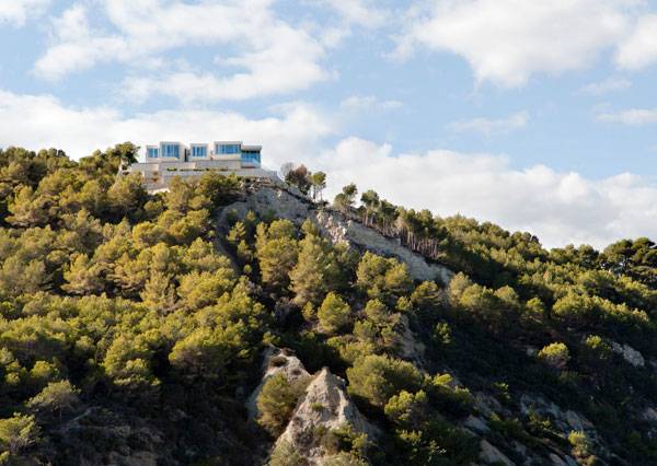
The Best Way to Live in Sunny Spain
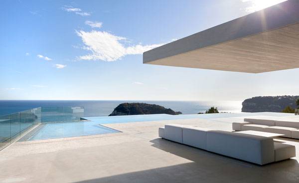
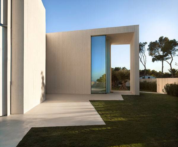
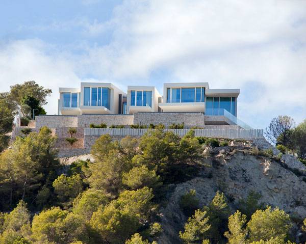
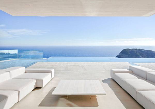
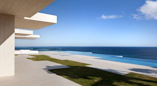
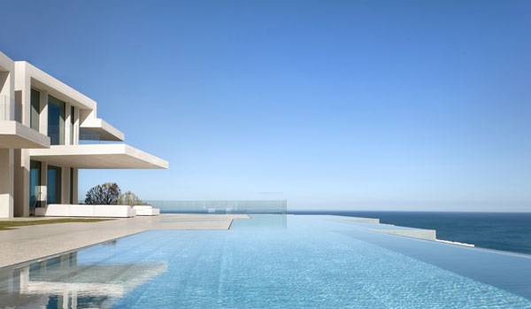
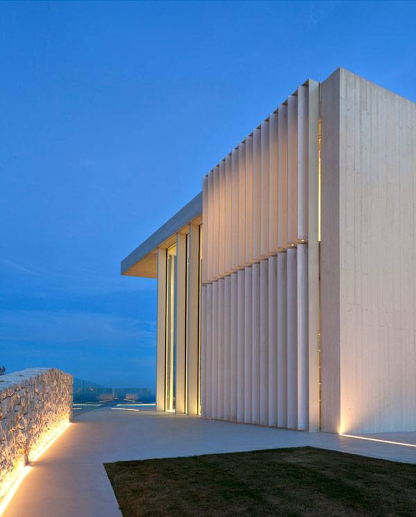
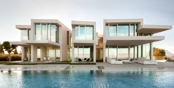
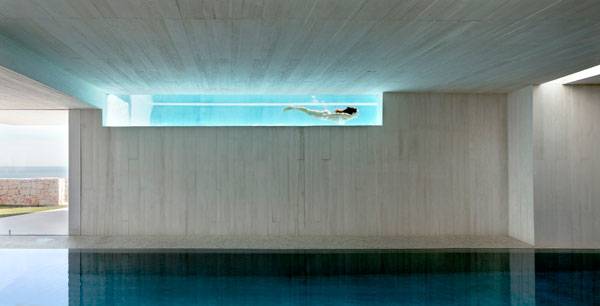
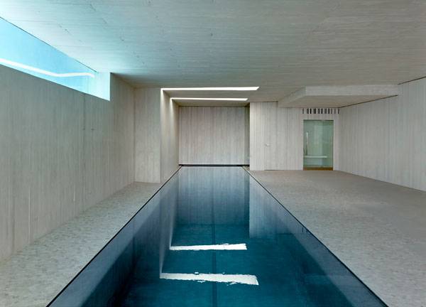
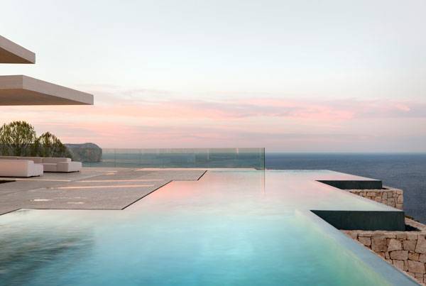
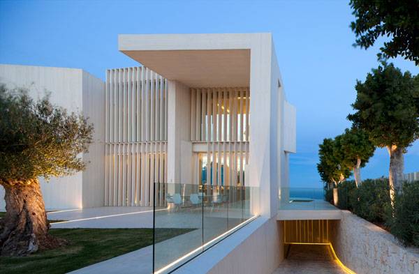
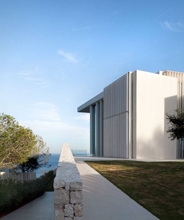
Article by Yang Su Casa Sardinera, by RAMON ESTEVE ESTUDIO, in Jávea, Alicante, Spain. People are always fascinated by romantic and adventurous islands that offer a sense of escape from their stressful lifestyles. The Sardinera House, designed by RAMON ESTEVE ESTUDIO, is located in an appealing and valued Mediterranean landscape that has a profound connection with its society and has preserved its own character over time. Sardinera House sits on the top of a hillside surrounded by the Mediterranean Sea, between EI Portixol and Cala Blanca.
Sardinera House. Photo credit: Mariela Apollonio
Casa Sardinera, by RAMON ESTEVE ESTUDIO, Spain
The unique location inspired the design concept, which is described by RAMON ESTEVE ESTUDIO: “The original idea for the design was based on enjoying and enhancing the panoramic views of the setting, by creating a relaxing, contemplative environment that allows enjoying the experience provided by the place.”
Sardinera House. Photo credit: Mariela Apollonio
Sardinera House. Photo credit: Mariela Apollonio
Sardinera House. Photo credit: Mariela Apollonio
Sardinera House. Photo credit: Mariela Apollonio
Sardinera House. Photo credit: Mariela Apollonio
Sardinera House. Photo credit: Mariela Apollonio
Sardinera House. Photo credit: Mariela Apollonio
Sardinera House. Photo credit: Mariela Apollonio
Sardinera House. Photo credit: Mariela Apollonio
Sardinera House. Photo credit: Mariela Apollonio
Sardinera House. Photo credit: Mariela Apollonio
Sardinera House. Photo credit: Mariela Apollonio
Sardinera House. Photo credit: Mariela Apollonio
Full Project Credits For The Urbanization of Historical Downtown Ripoll:
Project Name: Sardinera House Designers: RAMON ESTEVE ESTUDIO Location: Jávea, Alicante, Spain Year of Construction: 2014 Size: 1,285 square meters Collaborating Architects: Anna Bosca, Estefanía Pérez, Víctor Ruiz, María Martí Collaborators: Tudi Soriano, Natalia Fonseca Technical Architect: Emilio Pérez Constructor: Construcciones Francés Project Manager: Gonzalo Llin Photographer: Mariela Apollonio, Ramón Esteve Production and audiovisual: Alfonso Calza Construction Type: Structure and Shell made of exposed reinforcement white concrete Learn more about Comas-Pont Arquitectes: Website: www.ramonesteve.com Facebook: www.facebook.com/RamonEsteveEstudio Twitter: www.twitter.com/ramon_esteve Pinterest: www.pinterest.com/ramonesteve Vimeo: www.vimeo.com/ramonesteveestudio Google +: www.plus.google.com/EsteveEstudio Instagram: www.instagram.com/ramon_esteve LinkedIN: www.linkedin.com/company/ramon-esteve-estudio Recommended Reading:
- Becoming an Urban Planner: A Guide to Careers in Planning and Urban Design by Michael Bayer
- Sustainable Urbanism: Urban Design With Nature by Douglas Farrs
Article by Yang Su


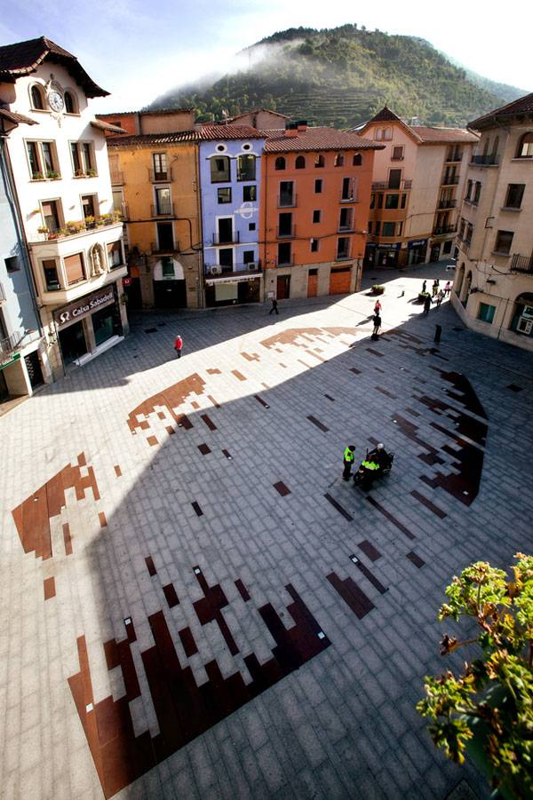
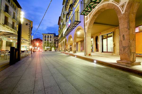
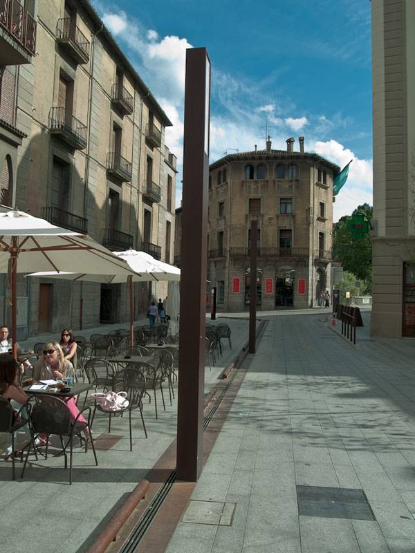
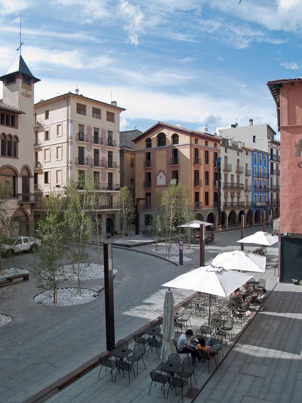
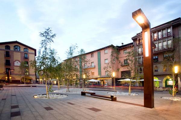
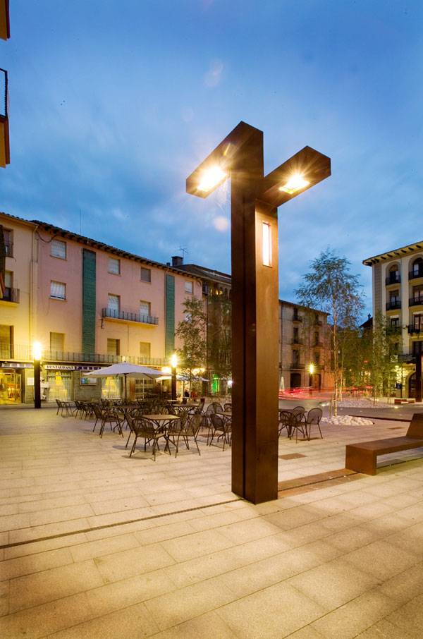
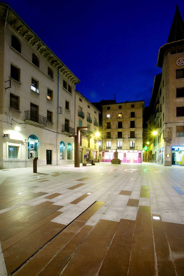
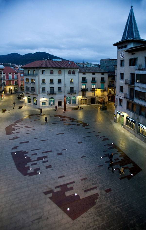
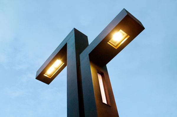
How This Old Downtown Embraced Urban Life
Article by Paul McAtomney Urbanization of Historical Downtown Ripoll, by Comas-Pont Arquitectes, in Ripoll (Girona), Spain. Historically and culturally significant urban environments offer a myriad of challenges for the landscape architect. How does one intervene while retaining the fundamental characteristics — be they physical, cultural, or social — of a place? How does one link past traces of a site with an artful telling of the landscape for future urban life? These were the questions asked of architectural duo Jordi Comas and Anna Pont, coalescing to form Comas-Pont Arquitectes, when charged with the reurbanization and pedestrianization of the historical center of the industrial mountain town of Ripoll, which sits 100 kilometers north of Barcelona in the Catalan region of Ripollés, Spain.
Urbanization of Historical Downtown. Photo credit: Jordi Comas
Urbanization of Historical Downtown Ripoll
Sliced by the rivers Ter and Freser and girdled by the Pyrenees, Ripoll was once a cultural and industrial nexus between the ninth and 19th centuries, boasting a powerhouse metallurgic and textile industry due to an abundance of natural resources. Now a busy commercial center, the capital of Ripollés owes its fame in large part to the Benedictine monastery of Santa María. Giving the Landscape Back to the Pedestrians Over the years, Ripoll’s historical center has been subject to pedestrianization through a number of isolated design schemes, both in terms of ideas and materials. Together, the two squares of plaça de Sant Eudald and plaça Gran form the historical core of Ripoll, the center of the city’s old town area, and the site of intervention.
Urbanization of Historical Downtown. Photo credit: Jordi Comas
Urbanization of Historical Downtown. Photo credit: Jordi Comas
Urbanization of Historical Downtown. Photo credit: Jordi Comas
Urbanization of Historical Downtown. Photo credit: Jordi Comas
Urbanization of Historical Downtown. Photo credit: Jordi Comas
Urbanization of Historical Downtown. Photo credit: Jordi Comas
Urbanization of Historical Downtown. Photo credit: Jordi Comas
Urbanization of Historical Downtown. Photo credit: Jordi Comas
Full Project Credits For The Urbanization of Historical Downtown Ripoll:
Project Name: Urbanization of Historical Downtown Designers: Comas-Pont Arquitectes Client: Ajuntament de Ripoll Location: Ripoll (Girona), Spain Area: 4,172 m² Photography: Jordi Comas Completed: 2009 Awards: Winning project of MADA AWARDS 2013 and selected project on VI Biennial Rosa Barba European Landscape Prize Learn more about Comas-Pont Arquitectes: Website: www.comas-pont.com Recommended Reading:
- Becoming an Urban Planner: A Guide to Careers in Planning and Urban Design by Michael Bayer
- Sustainable Urbanism: Urban Design With Nature by Douglas Farrs
Article by Paul McAtomney


How to Solve Maintenance Problems with Landscape Design
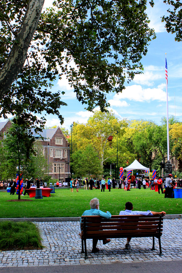
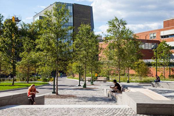
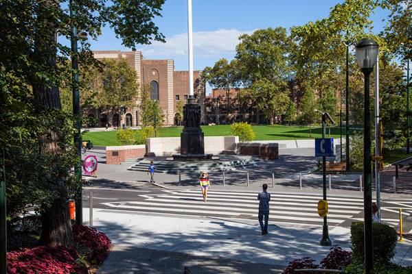
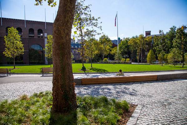
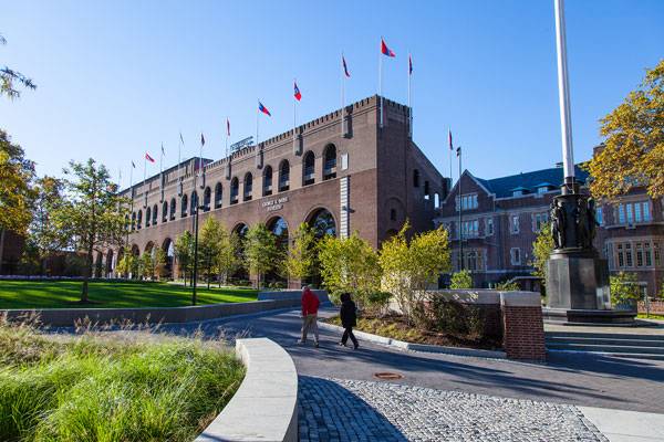
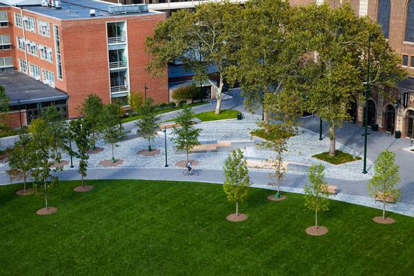
Article by Luis Guísar. Shoemaker Green by Andropogon Associates, in University of Pennsylvania, Philadelphia, PA The Shoemaker Green project designed by Andropogon Associates, a landscape office in Philadelphia, turns the eastward area of the University of Pennsylvania into a transitional space between the historical fabric of the campus core and the new, modern spaces of its eastward expansion. The subject of the landscape intervention was a residual space inside the campus that incorporated three tennis courts and narrow pathways that were not functional for the university’s expansion. The university wanted to transform the tennis courts into a functional space that would also be transitional and sustainable.
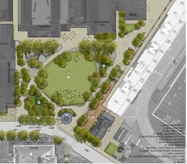
Site plan rendering. Image credit: Andropogon
Shoemaker Green by Andropogon Associates
The project divides the area into four main gardens: The memorial garden, the Palestra Plaza, the water reuse garden and the front yard. The memorial garden, located at the corner of Smith Walk and South 33rd St., is the part of the project closest to the central part of the campus. Thus, the memorial garden could be understood as a lobby for the Shoemaker Green project. The hard pavement and low wall create a unique hardscape design, which at first glance seems to separate this corner from the rest of the project. But in fact, this design produces a sensation of being in an open lobby, from which users can walk either to the front yard, or the Math-Physics Astronomy Library or access Franklin Field.
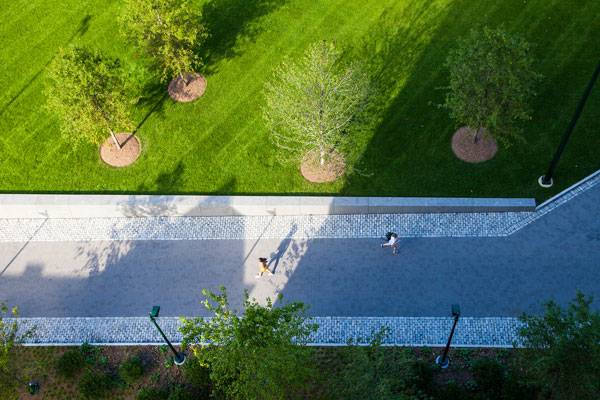
Aerial view of Smith Walk Photo credit Andropogon
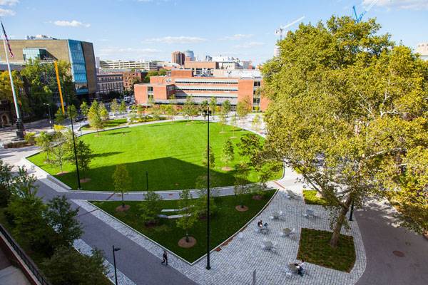
Aerial view. Photo credit B. Doherty Photography
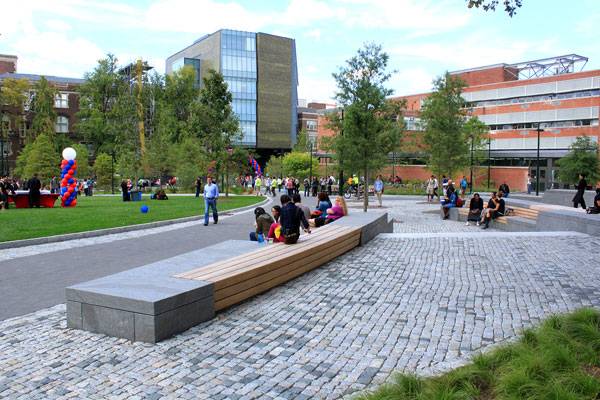
Benches serve as central gathering element. Photo credit B. Doherty Photography
View of the rain garden at night. Photo credit Andropogon.
Green during campus event. Photo redit B. Doherty Photography
Green is a gathering place for students. Photo credit B. Doherty Photography
Traffic calming tabletop crosswalk Photo credit B. Doherty Photography
Aerial view of benches Photo credit B. Doherty Photography
Walls at Shoemaker Green Photo credit B. Doherty Photography
Aerial view of benches Photo credit B. Doherty Photography
Full Project Credits For Shoemaker Green:
Project Name: Shoemaker Green Landscape Design: Andropogon Associates Ltd. Location: University of Pennsylvania, Philadelphia, PA Year of Completion: Fall 2012 Area: 2.75 acres Client: University of Pennsylvania Photographer: Barrett Doherty and Andropogon Budget: $7.3 Million Learn more about Andropogon Associates: Website: www.andropogon.com Facebook: www.facebook.com/Andropogon-Associates Twitter: www.andropogon.com/twitter Tumblr: www.andropogon.com/tumblr LinkedIN: www.linkedin.com/company Recommended Reading:
- Becoming an Urban Planner: A Guide to Careers in Planning and Urban Design by Michael Bayer
- Sustainable Urbanism: Urban Design With Nature by Douglas Farrs
Article by Luis Guísar