


Author: Land8: Landscape Architects Network

Ecological Landscape Design, Embraces Massive Body of Water
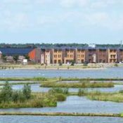
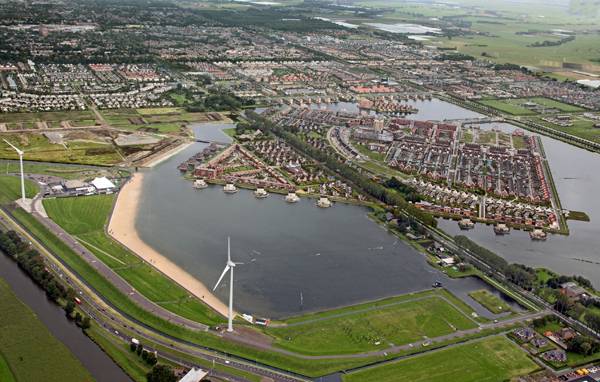
HOSPER’s ecological landscape design “Park van Luna” Park of the Moon (Park van Luna) is a beautiful open area in Heerhugowaard, the Netherlands, where the residential development City of the Sun (Stad van de Zon) is located. Carefully designed over the years – from 1997 to 2003 – the landscape features a well-balanced integration between the dwellings, the recreational area, and the water elements. The sun and the water were key elements in the project – the water for its recreational facilities and careful management, and the sun that provides free and clean electric energy to the neighborhood. Financed collaboratively by the Heerhugowaard, Alkmaar, and Langedijk municipalities, the City of the Sun is an island surrounded by a 60-ha lake that separates the residential area from its surroundings. Its master plan was developed in 1992 by architect Ashok Bhalotra, although the last houses were completed fairly recently, in 2012. The neighborhood consists of 2,600 homes designed by the architecture firm KuiperCompagnons with a sustainable and energy-efficiency approach the company is renowned for. City of the Sun and Renewable Energy
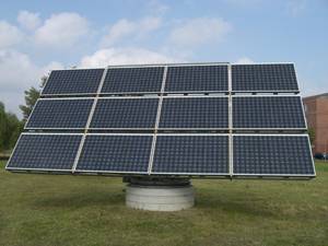
Photovoltaic panels. Photo credit: Chmee2, CC3.0
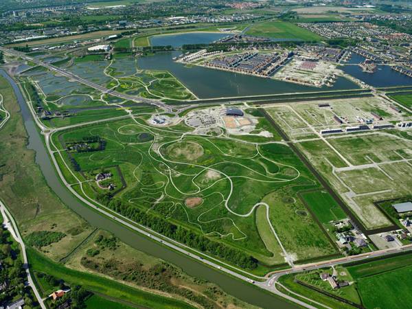
Aerial view of Park van Luna. Credit: HOSPER
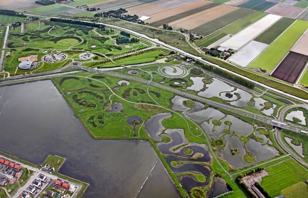
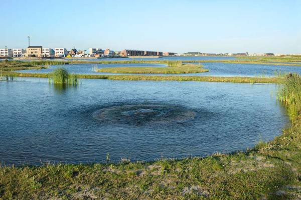
Water purification and preservation plays a big part in the park. Credit: HOSPER
Amenities on site
Park of Luna is the recreational area of the City of the Sun, designed by HOSPER and DRFTWD Office associates. It comprises 177 ha of area, including 75 ha of open water dedicated to sports and activities.
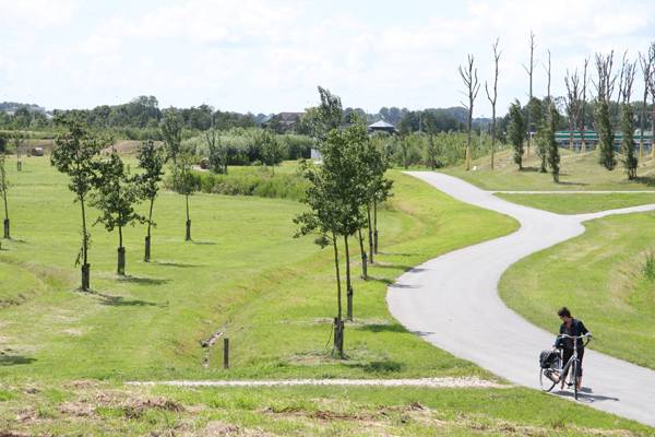
Hills formed at Park Van Luna. Credit: HOSPER
Naturalised planting at Park Van Luna. Credit: HOSPER

Hill down to the beach. Photo credit: Pieter Kers
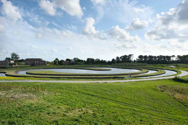
Dephosphatizing pond. Photo credit: Pieter Kers
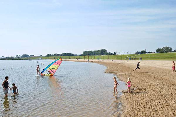
Linear beach. Credit: HOSPER
 The improvement of water management is an essential adaptation measure to reduce floods, droughts, landslides, and extreme temperatures, which can be achieved by rainwater harvesting and storage, preservation of wetlands, and creation of natural buffers. The use of green and blue open spaces not only reduces the risk of natural disasters, it also promotes environmental awareness and provides recreational areas that encourage social interaction.
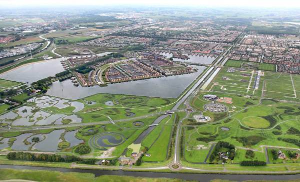
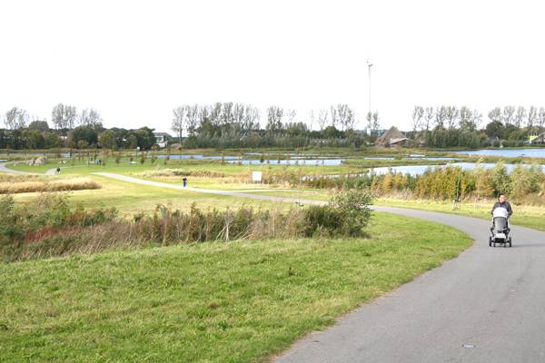
Heavily integrated mixed water uses. Credit: HOSPER
Inlet to the water purification maze. Photo credit: Pieter Kers
Designing Today, Thinking of Tomorrow A set of different strategies is required in design to achieve sustainable development. Strategies such as mixed land uses, water management, passive solar energy, and clean energy generation should become part of the urban planning practice to include the physical features as well as the environmental and socio-cultural aspects.
Contemporary landscape architecture and urban planning drive us to design climate-sensitive cities and neighborhoods as we are facing changes in the climate that imply the risk of extreme weather events. Park of the Moon and City of the Sun are a great example of how different infrastructures (green area + water area + constructed area) must go together to create a well-balanced complex, such as a naturally resilient ecosystem. Other articles HOSPER have featured in: Private Estate Reveals State of The Art Underground Car Park Top 10 Imaginative Squares World Class Entry for Park Competition! Recommended reading: Design with Nature by Ian L. McHarg Article written by Julia Lucchese Featured image: Pieter Kers

Stylish Terraced Garden Makes The Most Out of Small Space.
Modular create stylish terraced garden in London. Modular’s team was asked to redesign an outdoor living space in the charming neighborhood of Highgate in the north of London. The small 6-by-9-meter plot in the back garden was in need of a makeover. The main feature of the redesigned Highgate Garden consists of two flat terraces connected by a seven-step concrete staircase. The space had two separate but equal areas in the rectangular plot, but there wasn´t a really nice place where all the family could stay together. One positive point: The living room opens onto the garden through a folding glass door. On the negative side, the plot is surrounded on the three remaining sides by tall stone walls, so if somebody looked at the garden from the living room, the first and main things they saw were walls.
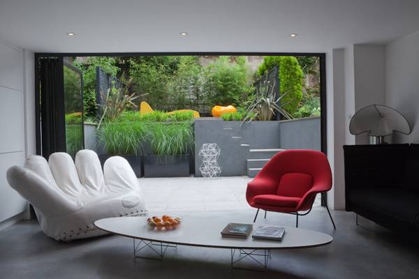
View from the house. Photo credit: Pedro Silmon Garden Photography
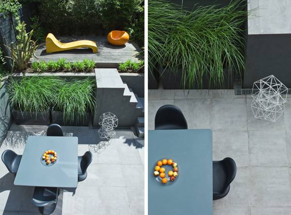
Splitting the garden into two terraces. Photo credit: Pedro Silmon Garden Photography
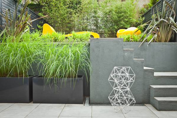
Planting style. Photo credit: Pedro Silmon Garden Photography

London College Gets Funky Rooftop Design
Studio Weave create high visual impact and welcoming outer space on this rooftop design. The architects from London based Studio Weave did not just add colors, but they used them to weave a new surface on the rooftop of the London College of Fashion building. With a bold color scheme, the roof garden has set a new pace in a landscape marked by the stability of gray and has become an attractive place where students can eat, chat or just relax. The design consists of applying timber decking painted in different colors to compose the floor, furniture and wall panels. This was a solution with low cost and rapid implementation that transformed the underutilized space atop the six-story building in a lively environment. Interviewed by Dezeen magazine, Studio Weave’s designer Eddie Bake explained his choice for the material: “The timber is just low-cost off-the-shelf larch decking. The idea was to find a super quick way of making something beautiful and colourful.”
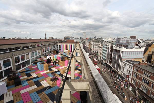
An overview of the funky roof top deck by Studio Weave. Credit: Studio Weave
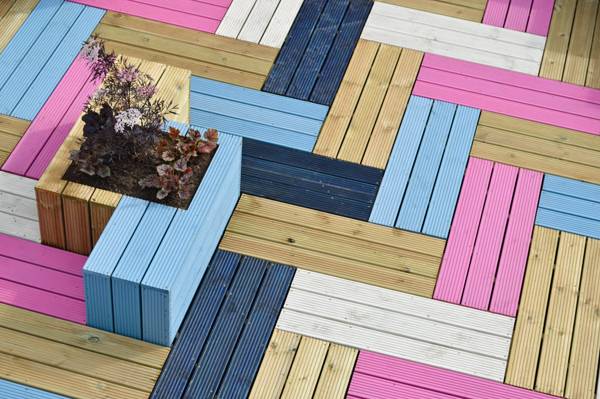
Weave pattern taking inspiration for textile design. Credit: Studio Weave
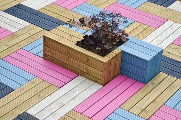
Planter in design. Credit: Studio Weave
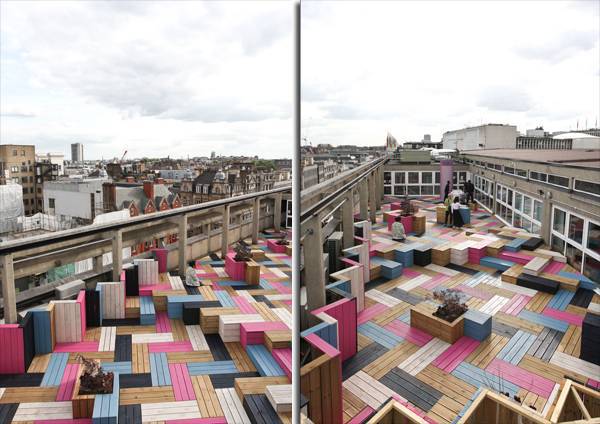
This design while outrageous, doe bring up the otherwise gray scene, making it a more desirable place to be. Credit: Studio Weave


4 Steps to Help You Get a Job as a Landscape Architect
How do you get a job as a landscape architect? So you have done everything they told you, you’ve applied every piece of information you got from your lecturers/tutors, your career guidance counselor and even professional landscape architects who are looking for workers. You’ve done everything to the letter; you’ve followed steps 1 to 10 and even thrown in a few more for good measure and somehow you are still unemployed, living with your mother and contemplating a temporary job in retail or telemarketing just to keep the funds coming in. Let’s face it, it’s been months in some cases years, you’re not getting any wiser, you’re not improving your skills and landscape architects for some reason are still not beating down your front door with job offers. You have created the best CV in the world, it’s relevant, concise, and informative and looks very professional, not only that but you’ve created a brochure that is so amazing you think “Hey I’d give me a job”. Yet interview after interview you hear the same thing, “We’re really looking for somebody with experience”, or “keep in touch with the office” or my favourite one “we’ll keep your CV on file”, wherever that is! So why, why is it you have done everything you’ve been told, you’ve done everything right and you still can’t get a job in your chosen profession. The first thing I’m going to tell you is to forget the “WHY” it’s pointless, forget the whole “why” in your life, we all have lots of “whys” in our life, “Why is life unfair, why doesn’t he/she like me, why am I always broke, why can I never get a break, why is it raining, why, why, why, why wh………” you get the idea. Just forget about the “why”, it’s really not important, get the “why” and kick it out of your life. Replace it with the “What Can I Do”. Now I’ve had my little rant, this is what you can and should be doing; I’m going to explain to you four little steps that will make all the difference in the world to you and your prospects of getting a job as a landscape architect or anything else for that matter.
STOP
Before I start, please don’t continue reading unless you have a great CV and equally great portfolio, if you don’t you’re just not at the races my friend. These things are fundamental in your search for a job, however they won’t get you ahead of the competition, so get them done and then put them to one side. If you’re still reading I guess you have them, great, now listen, many people will read what I’m about to write but only the best will apply what I’m going to say. STEP 1

Your CV is much more powerful when backed up by a quick phonecall . Credit: Public Domain CC0, source.

While there appears to be a firm “NO ENTRY” sign on the door, remember there is a window of opportunity just waiting to be discovered.

Take the time to contemplate and shape your own ideal situation. Credit, CC3.0, source.
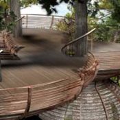

3 Incredible Nature Inspired Tree Houses
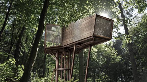
Tree Houses from Antony Gibbon Designs Antony Gibbon has redesigned the concept of tree houses with his innovative and bold ideas. His projects show how we can reconnect with nature using carefully chosen materials and a kind of design strongly inspired by the natural world. Here you have three projects based on the principles of biomimicry: so really well integrated and respectful of the landscape, but at the same time really audacious in terms of design. Embryo Embryo could be considered the most introspective of Gibbon´s designs, like a cylindrical silkworm cocoon growing spontaneously up through the trunks of the trees. However, nothing in Embryo is out of the designer´s control. Inside its distinctive shape there are two floors, which allow enough space to sleep for four people.
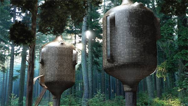
Embryo. Credit: Antony-Gibbon
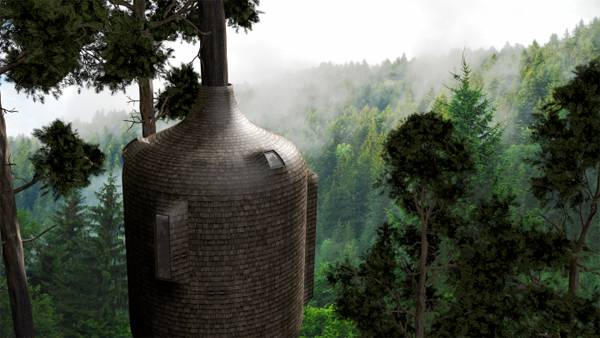
Embryo. Credit: Antony-Gibbon
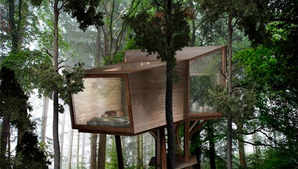
Inhabit. Credit: Antony-Gibbon
Inhabit. Credit: Antony-Gibbon
Roost Tree house
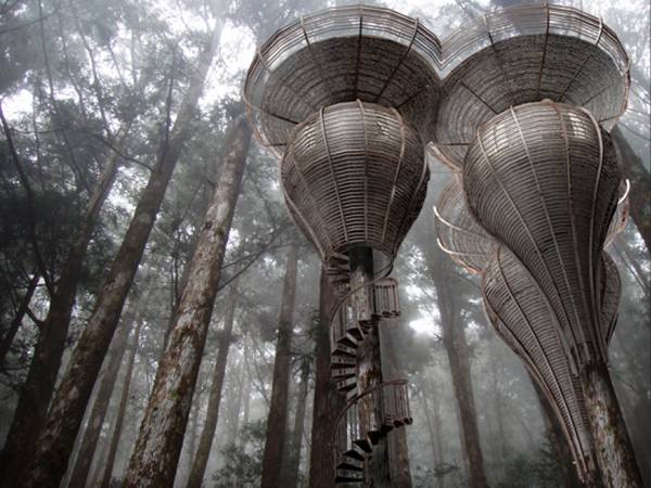
Do you think that you have seen this before? Maybe you are right, because at first sight Roost Treehouse looks a bit like Lothlorien´s house from “Lord of the Rings”. But you need to take more than just a look to understand how it works. Each tree house is formed by a variable number of capsules, one for each tree, which are connected through their outdoor upper platform. This curious design provides additional support to the structure and a really different and interesting inhabiting experience. Only one of the pods lets us access the platform from ground level, using a central spiral staircase that runs round the trunk of the tree. So we find two kinds of spaces, with a wooden outer structure around that unifies the image from the private space to the communal flat roof.
Roost Treehouse. Credit: Antony-Gibbon

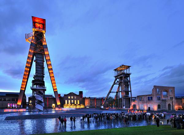
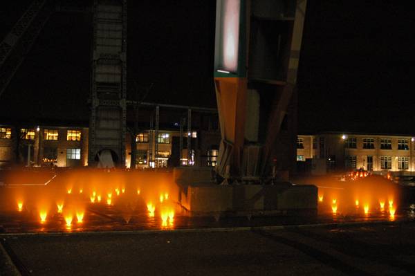
Transforming a Coal Mining Site into a Cultural Hub
HOSPER design Genk C-Mine. For much of its history, the Belgian city of Genk depended on coal mining for its economy and development. So when the mine at Winterslag closed in the late 1980s, city fathers knew that any repurposing of the site must reflect that legacy. Two initial plans for the site renovation fell through before HOSPER architects, in collaboration with Atelier Ruimteliijk Advies, created the design that has culminated in the Genk C-Mine square. The design, honed from 2006 to 2012, reconfigures the site’s open spaces around the remaining mining industry buildings and creates a cultural hub. A 0.5-hectare free space was rebuilt to accommodate a large variety of activities and events. From relaxing to chatting to watching concerts, local visitors and tourists can experience the diverse options offered by the flexible space.
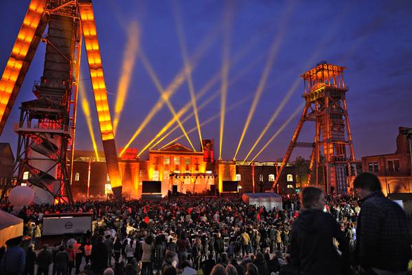
A buzzing cultural hub. Photo credit: Pieter Kers.
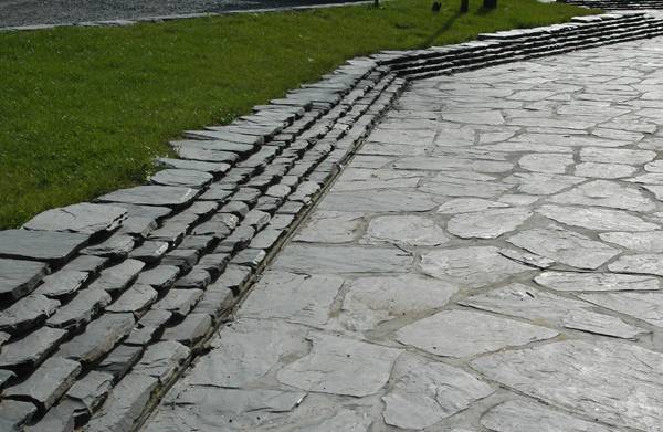
Dark slate used on the ground. Credit: HOSPER

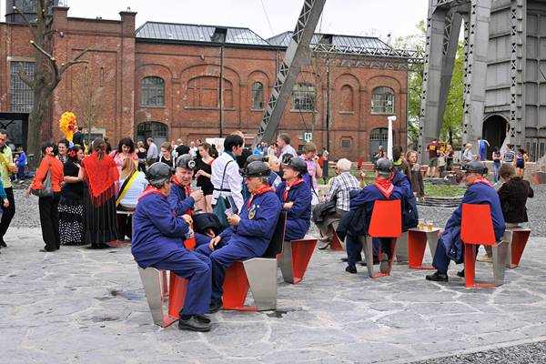
The seating elements, designed by Carmela Bogman. Photo credit: HOSPER
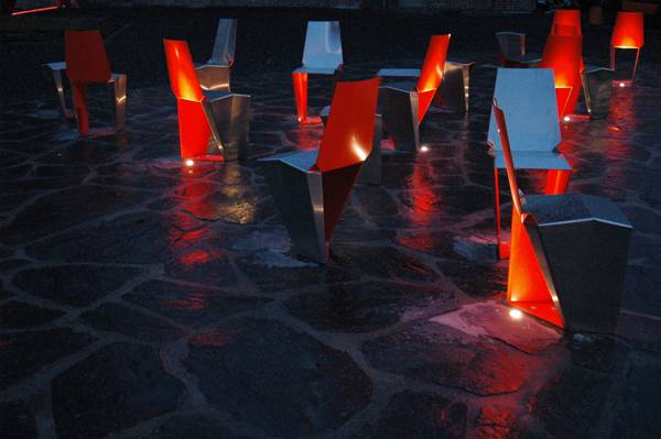
The seating elements, designed by Carmela Bogman. Photo credit: HOSPER
Renovation of buildings and industrial structures greatly adding to the feeling of the space. Photo credit: Pieter Kers.
C-Mine-Genk. Photo credit: Pieter Kers.
Lighting detail at C-Mine Genk. Credit: HOSPER
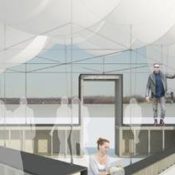

Centennial Festival of Riberboats Pavilion Design Competition
stpmj’s First Prize Winning Entry, DRIFT “DRIFT proposes a triangular arrangement of eight foot diameter balloons that create a dynamic canopy over bourbon tastings, educational spaces for children and other groups. Jurors praised the project for its unexpected playfulness and relationship to historic river imagery. The design was interpreted by the panel of jurors as a type of inverted raft with romantic allusions to the journeys of Huckleberry Finn as well as the flatboats that once populated Louisville’s wharf in great numbers. — Kentucky Museum of Art & Craft blog” On October 15, 2014, Louisville will host the Centennial Festival of Riverboats to celebrate the 100th birthday of the Belle of Louisville. During the summer of 2013, the Waterfront Development Corporation announced an international design competition for a series of temporary pavilions to be used during the celebration. Designs were required to accommodate a variety of uses and relate conceptually to the event while adhering to a stipulated material budget and public safety requirements. Interest in the project was far-reaching, attracting a variety of established firms and creative practices from thirteen countries including twenty United States.
DRIFT stpmj’s winning entry . Credit: stpmj
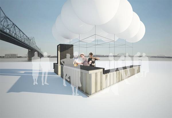
DRIFT stpmj’s winning entry . Credit: stpmj
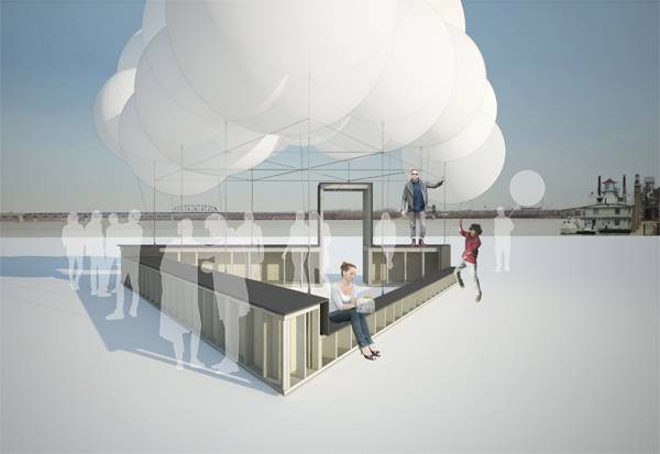
DRIFT stpmj’s winning entry . Credit: stpmj
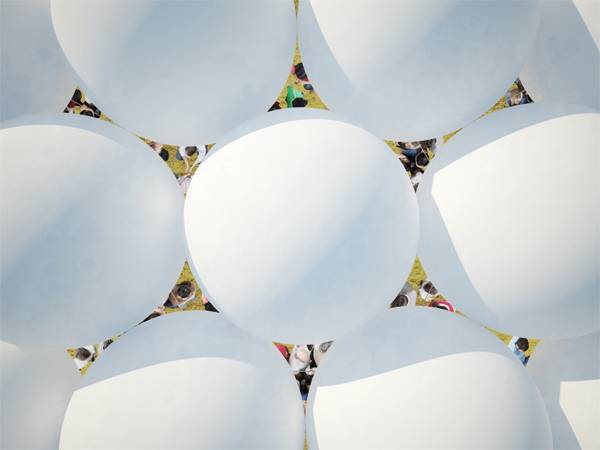
A look from above down onto the canopy . Credit: stpmj

10 Photoshop Tutorials for Advanced Photoshop Skills
Photoshop skills for advanced users. Photoshop has become one of the bread and butter tools for the landscape architect. Over the past several years, Photoshop has advanced in amazing ways and expanded the creative potential for designers in every profession. Landscape architects can keep their designs as simple and suggestive as they would like — or they can push the limits of human perception through photomanipulation. An apparent love for creating engaging and emotion-laden imagery has found a resurgence through montage-styled perspectives and otherworldly lighting and atmospheric effects. So to this end, we have collected 10 of the best “how-to” videos on the internet that show you how to move beyond the basics of Photoshop representation and advance your abilities to artistically represent your designs. But don’t be surprised if you don’t find the obligatory lens flare or flock of migrating birds in these videos. 1. Ambient Occlusion As mentioned in our introduction, having an accurate understanding of the way the world works pays dividends into the quality of our representations. Here, Alex Hogrefe shows us how to replicate ambient occlusion (or natural lighting) in Photoshop instead of using a time-consuming rendering program. The results are incredible and will save you hours of sitting at a slow computer. By: Alex Hogrefe 2. Gradient Maps Have you ever wondered how some final renderings seem to have a finishing element that ties all of the colors in a representation together? Gradient maps let you alter mid tones, shadows, and highlights with gradient overlays and blending modes. By Andrei Oprinca 3. Digital watercolor Watercolor graphics are often a crowd pleaser. But how do you take a sketchup model, site photos, tracings, and scans, and turn them into professional-quality watercolor imagery? Here’s your answer! By: Les Chylinski 4. Tilt Shift Blur Camera effects, like a shallow depth of field, are quickly entering the digital representation world. Photoshop has a great collection of filters, but one of our favorites is the Tilt Shift Blur. You can defocus the background as well as the foreground, and guide your viewers’ eyes right where they need to be. By: Howard Pinsky 5. Alex Hogrefe Alex Hogrefe is quickly becoming a staple in the architecture university. He shows us here how to quickly manipulate a few images of grass into an entire green roof. Don’t miss this tutorial on the clone-stamp tool. By Alex Hogrefe 6. Scene Creation If you haven’t discovered Pixelflakes yet, you are really missing out. Their in-depth tutorials come with stock imagery and MP4’. This tutorial will show you how to select foreground and background landscape elements, place and light entourage, and appropriately light a scene. Concrete Cliff from Pixelflakes on Vimeo. By: Pixelflakes 7. Lighting Effects Gritty images tell stories. People are starting to catch on to the standby lens flare, flock of birds, and two children running toward us holding hands (you know what we are talking about). This tutorial by Pixelflakes takes you through another step-by-step tutorial on creating emotionally driven lighting and atmosphere effects, color, and texture. This tutorial will revolutionize your Photoshop understanding. By: Pixelflakes 8. Painting FZDSCHOOL style FZDSchool is a Singapore-based entertainment design school. We feature this video first as a reminder that other disciplines are having representation dialogues that are worth participating in and learning from. In this video, FZD founder Feng Zhu does a real-time digital painting in which he teaches us about creating depth, lighting, scale, drama, and much more. By: FZDSchool 9. Non-Destructive Workflow One of the quickest ways to create trouble is poor file and layer management. Work smarter and not harder after you learn about layer masks, layer copying techniques, smart objects, and more. You will waste less time recreating work that you messed up. By: Martin 10. Clipping Masks Did you know that you can use layer adjustments and only affect the layer directly beneath your layer? There are numerous reasons for using clipping masks. This is one of the big ones. By: Andrei Oprinca Free Extra Photo Manipulation – FlewDesigns – Step into my turtle The golden egg in each of these tutorials is to slow down the video or pause your way through and watch how he creates adjustments for each of his layers. Purely brilliant. Don’t miss how he uses the HIGH PASS effect. By: Flew Designs – Lewis Moorhead The big thing to keep in mind about advancing your representation skills is to find tutorials you like. The people making these videos really know their stuff and have a wealth of knowledge that they love to share with us all. Keep looking for ways to bring up your skill level and maybe you will end up on our next beyond the basics Top 10. Also see: 10 AutoCAD Hacks for Beginners! Recommended reading: Adobe Photoshop CS6 Classroom in a Book by Adobe Creative Team Photoshop CS6 For Dummies by Peter Bauer Article written by Cameron Rodman Featured image: Print screen Youtube: Source


5 Ways to Connect With Potential Clients
Your first meeting with a potential client is usually the one which determines whether you get the job. In the short time available you need to convince them that you are a right person to design their space – be it a garden, a park or a public square. To succeed, you have to develop certain skills besides your design abilities; a lot of empathy and a bit of applied psychology will take you a long way! You must convince your potential customer that the service you provide is going to be of the highest quality. Developing a personal relationship with them is of the greatest importance, especially when it comes to designing private gardens. The following guidelines, once applied will help you gain your customer’s trust and earn you the job you desire! 1. Ask detailed questions

Children will dramatically impact which way your design turns out, so find out about them. Image credit: shutterstock.com
Check out how garden designer Amir Schlezinger addressed his clients needs in this contemporary garden, CLICK HERE!
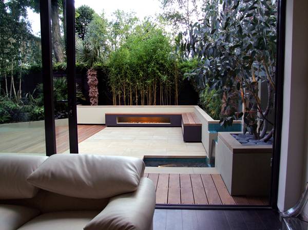
When the exterior compliments the interior. Credit: Amir Schlezinger


Sketchy Saturday | 024
Welcome to another dazzling display of sketchy talent from around the globe. Your work never fails to excite us and clearly our readership too as last week’s Sketchy Saturday was our most popular yet. In this week’s top 10 we start of with a doodle sketched at the breakfast table, which is a great example of how you can literally sketch anywhere and express your creative talent. I guarantee when this sketch by Antony (no. 10 Below) was being done that he had no idea that it would be seen by 1,000’s of people world wide, inspiring others and encouraging many more to sketch for themselves. This is what drives Sketchy Saturday, showcasing moments of creativity in order to inspire others. Keep on scrolling and check out all 10 of this week’s Sketchy Saturday. 10. Antony Comrie, principal Greeninc at South Africa
Antony Comrie, South Africa
Patrick O’Keeffe, United States
Megha Shroff, India
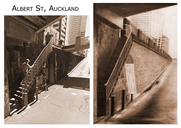
Andrea Reid, New Zealand.
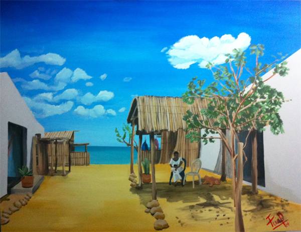
Fuad Pumarejo
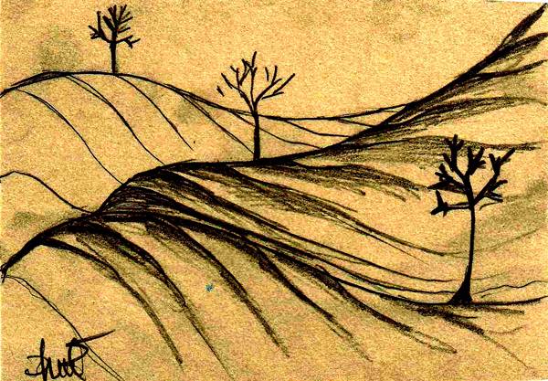
Abdulla Firag
Bhoy Biluan
Moira Bering, USA
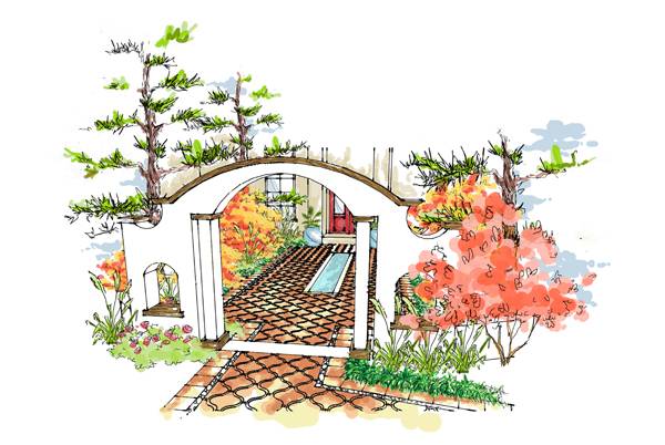
A classically designed small outdoor space, that appears to be a delightful entrance to someone’s home. a delicate blend of plants comes together nicely to offer a soothing planting palette, that works well with the decorative paving pattern. The archway is used to great effect, creating a grand entrance out of an otherwise rather small one. 2. Bhoy Biluan
Bhoy Biluan
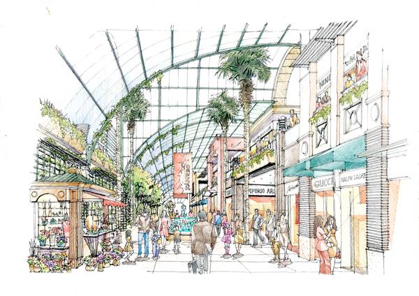
Sebastian Pajek, Poland


9 Unmissable Youtube Videos for Landscape Architects (Part 2)
Our first collection of Youtube videos for landscape architects was such a major hit, that we had to follow it up with part 2. We did our best to compose a list with a rich diversity while keeping it relevant to outdoor design, delivering to you a list with a bit of comedy, some questionable music choices and some really ground breaking, innovative ideas that are sure to alter the way you think about public space. I hope you find the time to make it through all 9, they’re worth every minute, engaging literally millions of viewers worldwide. 1.Allgood Trio Sesame steps Disabled access is something designers of public space all need to be concerned about, and often it ends up changing the course of the overall design with the primary goal of achieving functionality for all those using the space. Since disabled access is such a prominent feature it is always great to see new innovative ideas, such as these mechanical steps by Algood, which are not only designed to be functional but to blend seamlessly into the environment. Perhaps a bit expensive but a really cool idea. This video was viewed over 80,000 times 2. Junction design the Dutch – cycle friendly – way Well as many of us know the Dutch are the kings when it comes to cycling around their country, so it is no surprise that this clever design solution came from them. In this brilliantly animated video we see both a wonderful, functional idea and a life saving approach to bicycle lane design. This video was viewed over 230,000 times 3. Waterfall Swing – World Maker Faire 2011 As if swings were not fun enough, seriously I’m a grown man and will still look for an opportunity to jump on for a push, you’re never too old to be a kid, however, when someone adds a movement sensor waterfall, the fun becomes a little more sophisticated and as adults it’s our duty to test it out, for the safety of the children of course! This video was viewed over 2,900,000 times 4. Eddie George on Careers in Landscape Architecture The profession of landscape architecture is often made up of people from all walks of life, in many cases landscape architecture is a second or third career for some people. Eddie George is an excellent example of this; the former professional American football player swapped his shoulder pads and helmet for a pencil and big sheets of paper as he embarked on an inspiring career as a landscape architect, surly taking values that he learned from his pro football days into his new career. This video was viewed over 38,000 times 5. 3-Sweep: Extracting Editable Objects from a Single Photo, SIGGRAPH ASIA 2013 The potential of computer software is endless, however, while we know this it still never fails to impress us. This software allows you to take features in your photos and turn them into 3D modelling objects, allowing you to move away from standardized blocks and work with the potential of what already exists, allowing you to look at it and work with it in new ways. This video was viewed over 1,800,000 times 6. The World’s Deepest Trash Bin (Fun Theory) We’ve all seen it, the casual throwing of the cigarette wrapper on the ground, the piece of junk that didn’t quite make the “basketball” like hoop of the garbage can and the endless other trash we see on our streets. One clever initiative was the Fun Theory, the idea that you can encourage people to do mundane activities by making them fun. When this idea was attached to a trash can the results were profound and it really makes you think about how we get people to do the things they probably should be doing anyway but don’t. This video was viewed over 4,460,000 times 7. Bike Lanes by Casey Neistat As cyclists we would love to use bicycle lanes everywhere we go, not just for safety but for in efficiency to get places, without being interrupted by obstructions. However, all over the world there is a clear disregard for bicycle lanes, with obstructions everywhere,from people walking on them to motor vehicles occupying them. After Casey Neistat was fined for his lack of use of a bicycle line, he responded in the most hilarious way imaginable and rightly so! This video was viewed over 12,500,000 times 8. Amazing Hidden Pool Many of us love gadgets, big boy toys and the James Bond theme music. Well this video has all three, combined in a slighly comical way and yes the design is a bit kitsch, but you have to admit it, there is a small part of you, ok a BIG part of you that really wants this in your backyard. If not for yourself than to impress your friends and family. This video was viewed over 28,000 times 9. Theo Jansen’s Strandbeests – Wallace & Gromit’s World of Invention Episode 1 Preview – BBC One This video is extraordinary and really makes you question and wonder about what life is, what gives things and people motion, what propels them, drives them and makes them change. Well of course in this video the answer is obvious, wind, but the movement is so organic that for a moment it feels like you are looking at something with a mind of it’s own, like it knows where it is going, however, as the observer we clearly know better, or do we? This video was viewed over 3,600,000 times It was great putting this compilation together, with so much out there in the world of Youtube it was pleasure to compose a list that is relevant to design, landscape architecture and the environment. I really hope you enjoyed the videos as much as I did and that you were entertained, inspired and learned something new. We’re always looking for new videos to feature, if you know of any please email us at office@landarchs.com and let us know! See also: 9 Unmissable Youtube Videos for Landscape Architects (Part 1) Article written by Scott Renwick

Shipyard Site Transforms into Stunning Ecological Park
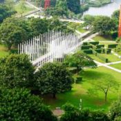
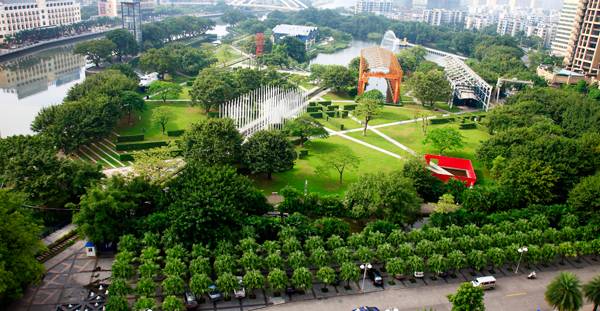
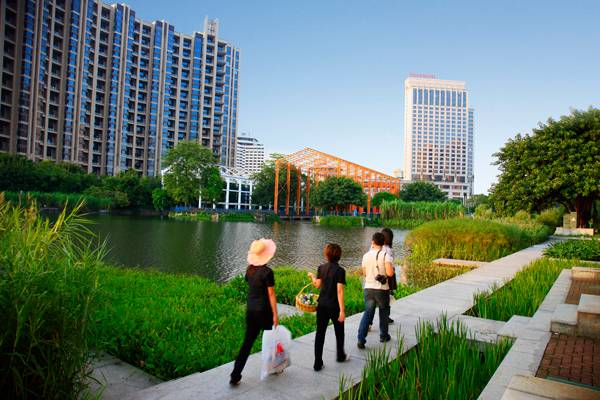
Zhongshan Shipyard Park designed by Turenscape As cities grow and space becomes tight, urban planners and architects are taking a bigger interest in how, when and which spaces can be redesigned in order to take advantage of the existing land. The main intention is not to keep cities from growing, but to design a better environment inside them. Recovering urban space requires integrating the project within its context. Integration occurs at different levels – social, urban, and architectural — but most importantly at the cultural level. The influence and success of a project depends on how it interacts with the people who live there. With this consideration, designers transforming a site into a new space must recognize the connection that exists between the site and the people.
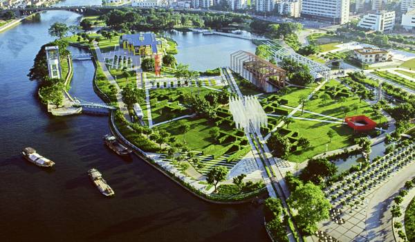
Overview of the shipyard park. Credit: Turenscape
“This industrial site represents 50 years of Socialist industrial history and was a witness to China’s Cultural Revolution”. Credit: Turenscape
An harmonious blend of city, nature and people. Credit: Turenscape
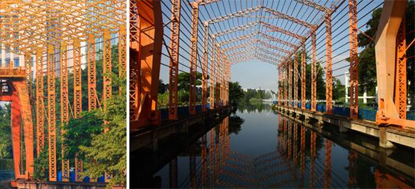
Working with existing industrial infrastructure. Credit: Turenscape
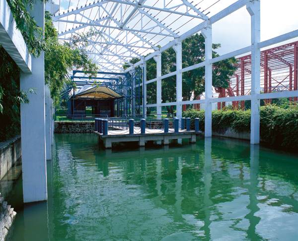
Industrial frame used to enhance design. Credit: Turenscape
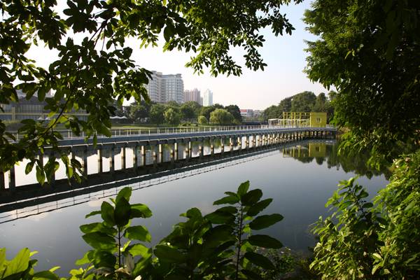
One of the bridges used at the park. Credit: Turenscape
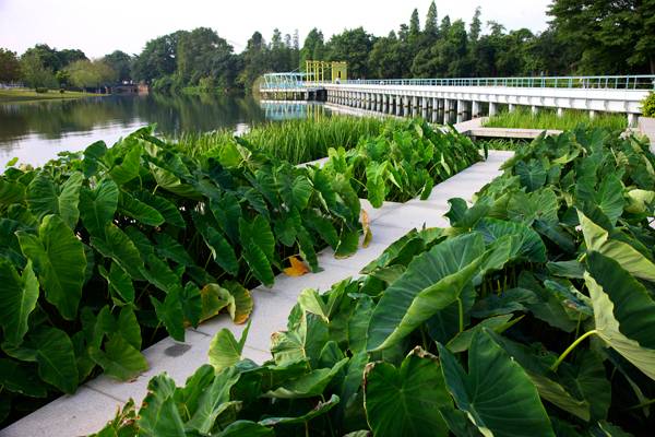
Lush vegetation help to make this park an ecological haven. Credit: Turenscape
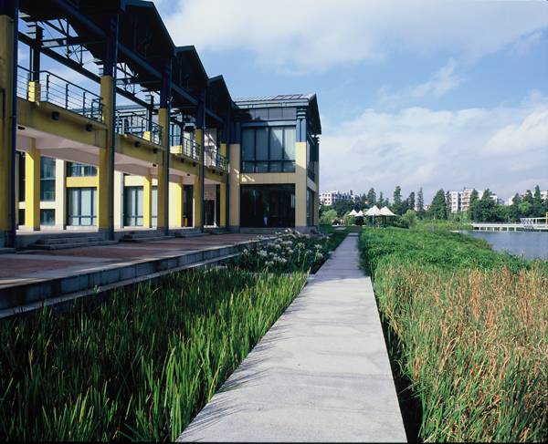
Rich planting makes for an idyllic and peaceful setting. Credit: Turenscape
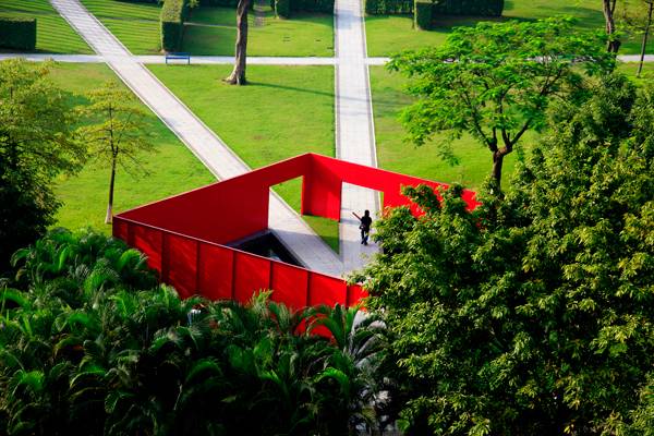
Striking red box feature makes for interesting spaces and really adds to the vibe of the park. Credit: Turenscape
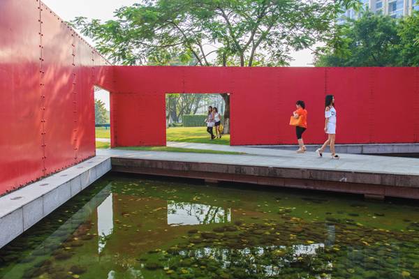
Inside the container. Credit: Turenscape