(A collaborative article by Jessica Wolff and Cortney Kirk)
By breaking the rectangular frame (implying the photograph), the viewer is drawn into the frame. This is at the heart of the Composite Landscapes Show: by drawing the viewer into the image as intimately as possible, the hope is to produce a greater understanding of the fact that the way we draw and represent the landscape is a direct representation of the way we experience it – the things we see, touch, smell and hear are difficult to abstract on paper, but through the development of expressive photomontage techniques, these and other images attempt to express a highly individual yet publicly accessible interpretation of the complex, ever-changing landscape.
– Andrea Hansen, Curator of the Composite Landscapes exhibit at the Isabella Stewart Gardner Museum
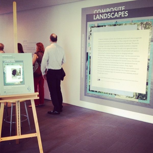
This past week was the opening of the first landscape architecture exhibit to date at the Isabella Stewart Gardner Museum in Boston, Massachusetts. Composite Landscapes: Photomontage and Landscape Architecture features such notable landscape architects as Michael Van Valkenburgh, Gary Hilderbrand, Ken Smith, James Corner, and Claude Cormier, but also showcases artistic work by such David Hockney, Byron Wolfe and Jan Dibbets, as well as Isabella Stewart Gardner herself.
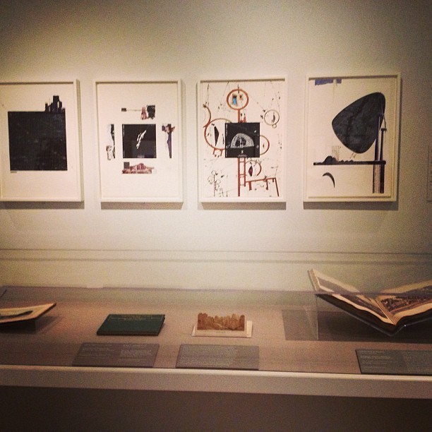
John Stezaker
Mash XLVI
2007, Collage, 9.8”h x 8”w
London, The Approach Gallery
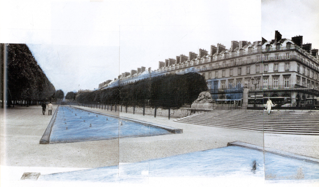
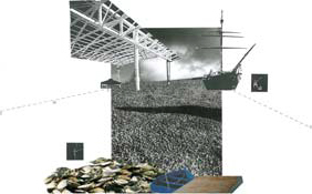
Michael Van Valkenburgh
Experiment al fish farm along the rue de Rivoli, Jardin des Tuileries
Paris, 1990, photo collage, 24”h x 36”w
New York, Michael Van Valkenburgh Associates
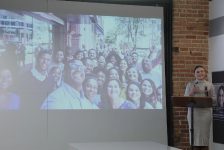
Coupled with the opening of the exhibit was a lecture and panel discussion led by Charles Waldheim, the Ruettgers Consulting Curator of Landscape at the museum and Andrea Hansen, the exhibit’s Assistant Curator. The panelists included Gary Hilderbrand, Principal of the landscape architecture firm Reed Hilderbrand and Adjunct Professor at the Harvard Graduate School of Design, and Robin Kelsey,Shirley Carter Burden Professor of Photography and Director of Graduate Studies in the History of Art and Architecture Department at Harvard University.The lecture and panel discussion introduced the exhibit through the history of montage, with the eventual introduction of photography and subsequent medium of photomontage.
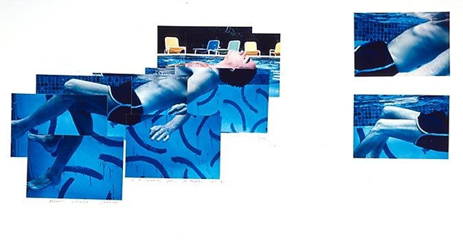
As Assistant Curator of the exhibit, Andrea Hansen began the discussion stating that photomontage is the most universally legible medium in comparison with plan and section and can be utilized to highlight temporality, fantasy, and the synthesis of complex ideas. Hansen defined terms that were created by the artists themselves in the process of experimenting with the art of photomontage, such as James Corner’s use of the “ideogram” which broke the frame of the image in order to draw the viewer into the perspective scenery. This work was influenced by Hockney’s “joiners” technique, which effectively combined large-form polaroid photos, revealing a subject in motion in both time and space. Both pieces are included in the exhibit.
David Hockney
Robert Littman Floating in My Pool
Photographic collage
October 1982
22 1/2”h x 30”w
James Corner
Ideogram, Greenport Harborfront, New York
Photomontage
1996
14.25”h x 22.25”w
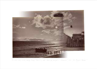
Robin Kelsey framed his discussion by defining photomontage as an artistic process, a tactic of consumption, a mode of persuasion, reconfigured space and time, critical revolutionary practice, and design principle. Kelsey focused mostly around the photographic process, citing Byron Wolfe’s work where he reveals the secrets of well know photographers by creating an image that makes viewers aware of a particular photographic technique. For example Kelsey spoke about ‘The same sunlit clouds,’ a piece in the exhibit where two separate travel images taken by Eadweard Muybridge were overlayed by Wolfe to reveal Muybridge’s technique of using the same photo negative of clouds during the printing process of both photos. Kelsey continued with how certain photographers would use their own discretion to artfully craft an image as opposed to a recording of a moment.
The same sunlit clouds passing through “Return of a coffee
launch by moonlight – Champerico” and “Las Monjas – Panama.”
Individual album pages from The Pacific Coast of Central
America and Mexico; the Isthmus of Panama; Guatemala; and the
Cultivation and Shipment of Coffee, Illustrated by Eadweard
Muybridge, 1876. (Courtesy Stanford University Special
Collections). Medium: Digital inkjet print.
2010
16″h x 22″
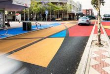
It is clear that the work by the exhibited landscape architects is artfully crafted in many ways similar to photographic techniques discussed by Kelsey. One must walk up and closely and examine each piece of work. A closer examination of Adriaan Geuze’s Schowburgplein discloses his material pallet of drafting tape and cut out colored paper, both readily available supplies in a landscape architect’s studio. The work of Yves Brunier in Museumpark, uses more of a contemporary art pallet such as mirrored sticky-backed plastic and paint. Both landscape architects work is distinctive in style and created to represent more than just a photorealistic landscape, it begins to unveil a design process at work.
Yves Brunier
The white orchard on white sand and the reflecting wall,
Museumpark, Rotterdam, Netherlands
Collage, mixed media
1989-1993
Gary Hilderbrand followed with his lecture titled ‘Augmented Realities,’ a talk that highlighted some of his own personal work as well as examples of how photomontage can be emotional, powerfully persuasive and sometimes a deceptive mode of drawing landscape architecture. His works, ‘Almost Nothing’ and ‘Glass House Reflections II’ are a tribute to Ludwig Mies van der Rohe Glass House and Philip Johnson’s Farnsworth House. Hilderbrand “juxtaposes photographs of the two masterpieces of modern architecture with photographs of their surrounding landscapes, drawing attention to the way each houses’s glass façade frames the landscape and blurts distinctions between inside and outside, front and back, figure and field”. Hilderbrand spoke very candidly about how drawing landscape in a convincing way is challenging but through the use of photomontage, especially the prolific use of digital photomontage, those with basic hand drawing skills are provided with a powerfully persuasive tool. He concluded his lecture with some ruminations about the forecast of digital photomontage in the field of landscape architecture, postulating that the field might soon be at the cusp of yet another revolution in visual representation.
Gary Hilderbrand
Glass House Reflections II
2012, Handcut collage/montage, offset print, handmade paper, 6”h x 5”w
Private Collection
This is a collaborative writing piece by Jessica Wolff and Cortney Kirk. Composite Landscapes will be at the Isabella Stewart Gardner Museum through September 2, 2013. It is a delight that this exhibit is available to a non-design audience, allowing the viewer to step into the design world where many drawings are created before, if ever, a landscape is constructed. The exhibit is a valuable record of the landscape profession as it emerges into the digital age – a must see.
Also on display in the museum’s new courtyard is Tiny Taxonomy, an installation of small, hearty plants commonly found in rocky, high altitude environments, created by Rosetta Sarah Elkin.
What do you think? Please leave your thoughts below…
Published in Blog


