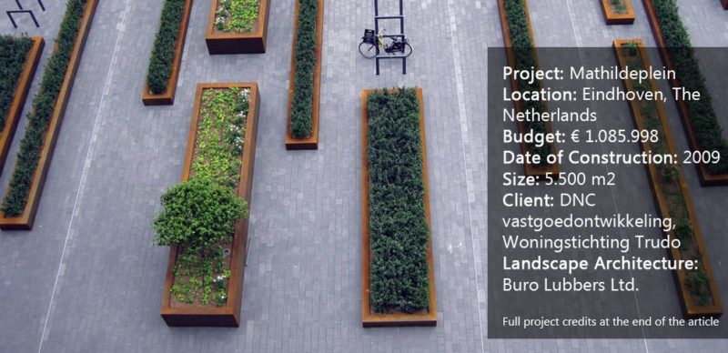
Mathildeplein, by Buro Lubbers, Eindhoven, The Netherlands. In urban environments, there is a constant battle between the need for functional public space and the social desire for intimate, semi-private spaces. Living and working in the city sounds like the ideal economic and sustainable solution, but the reality often fails to provide spaces that connect with human scale and the natural environment. Buro Lubbers aimed to address this issue through his design of Mathildeplein by providing a square that connects to the public realm while creating a green and intimate semi-public space. Mathildeplein occurs at an important traffic junction in the heart of Eindhoven, beneath the iconic Light Tower. The Light Tower is a striking building that was formerly home to the Phillips factory; its distinctive seven-sided form and large windows have become a symbol of the city. In the late 19th century, the Phillips factory moved production to other premises and the building faced demolition.
View The Full Gallery for Mathildeplein
[gmedia id=14]
Mathildeplein
However, protests to protect the building led to it becoming a historical monument. Renovation began in 2000 to convert it into residential units, a gym, a restaurant, and a hotel. With this renovation came the need to provide residents with outdoor space, and so Buro Lubbers was appointed to bring life into an otherwise hard urban space.
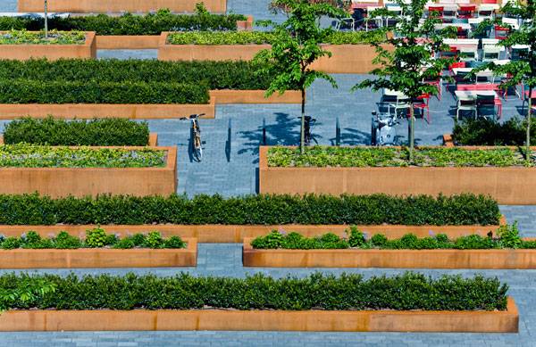
Mathildeplein. Photo courtesy of Buro Lubbers.
A Green Enclave
The concept for the square was to create a tranquil green space where people could relax away from the urban frenzy. This concept was limited by a number of technical restrictions, as well as the need to maintain the focus on the Light Tower. The first of these restrictions was the fact that the square was actually a roof garden, sitting above a two-story parking garage.
More Top Articles on LAN
- 10 of the Most Common Mistakes People Make in Planting Design and How to Avoid Them
- Interested But Not Confident? – Know How to be Good at Hand Drawings
- Top 10 YouTube Tutorials for Technical Drawing
This meant that there was no possibility for large amounts of planting, resulting in the need to plant within large planter boxes. The location of the square within the transportation hub also meant that large portions of the space had to be kept clear for emergency services. Furthermore, the top of the parking garage sat 650 mm above the level of the street, forcing the square to become physically separated from its surroundings.
Concept Driving by Technical Restrictions
Buro Lubbers took these restrictions and translated them into a strict, linear plan consisting of planter boxes of various lengths, widths, and heights. These planter boxes correspond to the structural weight restrictions on the parking garage roof, allowing structure to dictate the form and placement of the boxes.
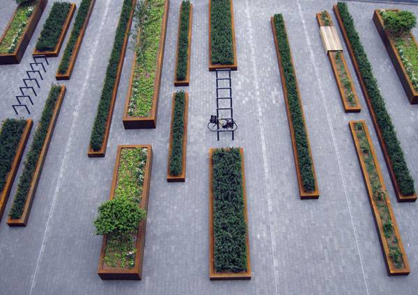
Mathildeplein. Photo courtesy of Buro Lubbers.
Recommended Reading
- Landscape Architecture: An Introduction by Robert Holden
- Landscape Architecture, Fifth Edition: A Manual of Environmental Planning and Design by Barry Starke
Continue Reading to PAGE 2 >>>
Published in Blog- 1 2


