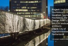
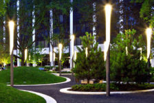
Article by Mai Nguyen – A review of Pier 4 Plaza, by Mikyoung Kim Design in Boston, Mass., USA. Mikyoung Kim Design office (MYKD) has just completed another landscape project in Boston’s Seaport District – Pier 4 Plaza. By using geometric forms following the building’s outline, the designer has established not only a connection with the external area, but also a link between the interior and exterior spaces. The dynamic and creative design of this type of public amenity helps enrich the landscape experience for visitors. Last but not least is the amazing lighting design: The harmonious integration of public amenities and lighting creates an attractive nighttime landscape experience.
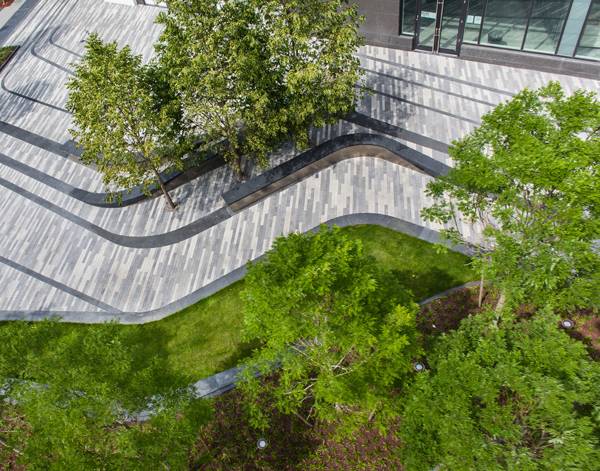
Pier 4 Plaza, by Mikyoung Kim Design.
Pier 4 Plaza
Working with only about four acres, Mikyoung Kim Design still managed to turn Pier 4 Plaza into an attractive node for the neighborhood and increase the interaction of citizens with the waterfront. Pier 4 Plaza is a good example of how a small-scale project can have a noticeable impact on a community.
Strategic Node of the Neighborhood
The project has a high-potential location: It is nestled right next to a boulevard, close to many public spaces such as the waterfront to the east, the harbor walkway and the Institute of Contemporary Art to the north, and Boston’s financial district on the other side of Seaport Boulevard to the west. Pier 4 Plaza can be seen as the connector between Boston’s citizens and nature. With its smaller scale, it also connects residents of the new 100 Pier 4 apartment building to the public space.
Paving Design Connects Landscape and Building
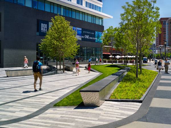
Mikyoung Kim Design used a layered paving pattern in an effort to embrace the multi-layered background history of Boston and particularly the site. More interestingly, the pattern also integrates with the entrances to the building, making the landscape area and the internal space a united, continuous arrangement. Additionally, we can see that steps are not much used in defining the levels. Instead, Mikyoung Kim Design created the ground surface by using gentle slopes highlighted with a different gray paving pattern. This design makes the space more friendly for users, especially children and people who have disabilities.
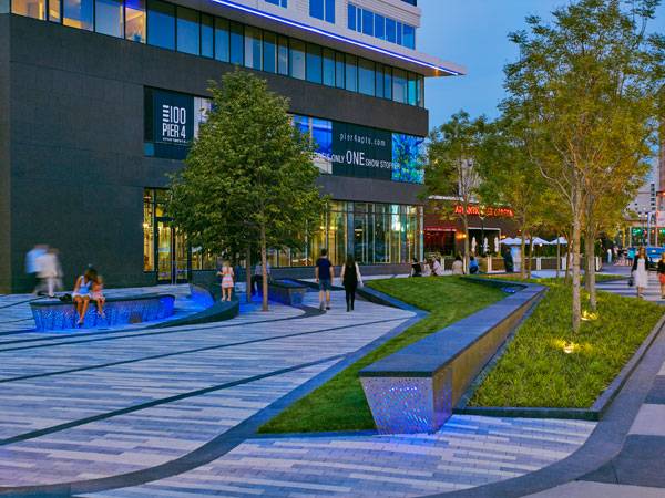
Pier 4 Plaza, by Mikyoung Kim Design.
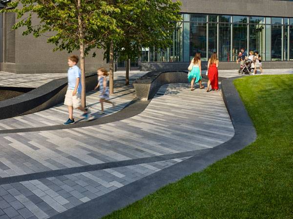
Pier 4 Plaza, by Mikyoung Kim Design.
Public Amenities Create Identity
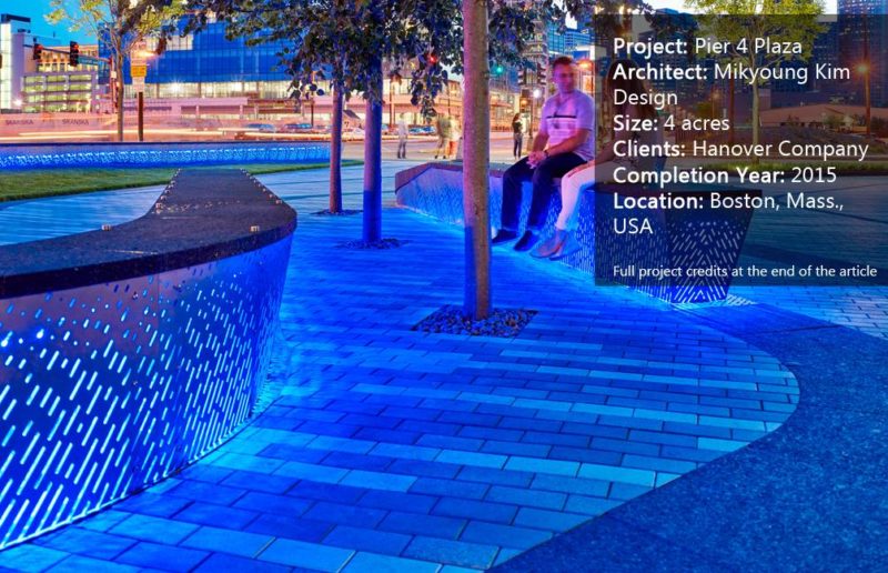
One of the most outstanding elements of this design is the integration of the paving pattern and public amenities. The long benches used in the Pier 4 project have two parts: The body is made of perforated stainless steel panels combined with LED light, and the top surface matches the floor pattern and color (the black color creating the curved lines). By doing this, Mikyoung Kim Design’s benches look like they are “emerging” from the ground. This design enhances the image of a dynamic topography, making the space experience more attractive. Plus, children can make use of this design and turn the place into their playground. Furthermore, Mikyoung Kim Design enhances the landscape design by using unique blue LED lights with the public seating. The blue light provokes a magical feeling for the space at night. By using a cold neon color instead of a warm tone, Mikyoung Kim Design has created a lively atmosphere, evoking the active living environment of the neighborhood. The blue color also reflects the image of the nearby waterfront.
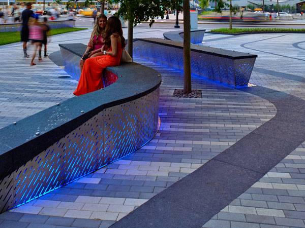
Pier 4 Plaza, by Mikyoung Kim Design.
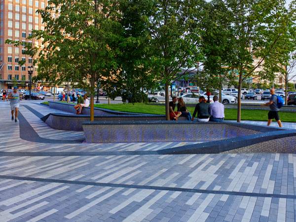
Pier 4 Plaza, by Mikyoung Kim Design.
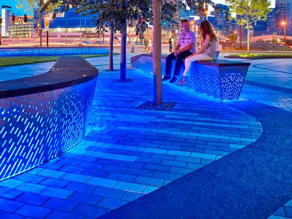
Pier 4 Plaza, by Mikyoung Kim Design.
Full Project Credits For Pier 4 Plaza:
Project Name: Pier 4 Plaza Architect: Mikyoung Kim Design Size: 4 acres Clients: Hanover Company Completion Year: 2015 Location: Boston, Mass., USA Recommended Reading:
- Becoming an Urban Planner: A Guide to Careers in Planning and Urban Design by Michael Bayer
- Sustainable Urbanism: Urban Design With Nature by Douglas Farrs
- eBooks by Landscape Architects Network
Article by Mai Nguyen
Published in Blog


![Conflict Wood [Video]](https://land8.com/wp-content/uploads/2021/07/land8-cover-ipe-land8x8-zac-tolbert-224x150.png)
