


What’s wrong with this picture? It appears that the hula dancers are beckoning riders to park their bikes here. However, it is to no avail. This was taken on the opening day of Trader Joe’s in Larkspur, California. If you live in Marin or happen to find yourself nearby, you will quickly realize two things – the hula dancers are not there and the tightly packed bike racks are never used.
In the blog post, Guidelines & Resouces, I shared a few examples of what to do and what not to do when selecting bike racks and their layout. The above picture is a good example of what not to do. I think it is pretty obvious what the main issue is here. Below is another image to reinforce it.

Allow me to point out a few positives:
- Location. The location is great. The bike racks are located close to the building and the front door. This is very important because the bicyclists can easily transition from their bike to the front door. Also, when the bicycles are locked up they can be easily seen from within the building.
- Rack Design. The inverted “U”, “A”, and the post and loop are most popular among cyclists. The 3/4 circle is a creative departure from the standard shapes but it is still effective. These shapes are preferred because they support the bicycle in two locations, prevent the wheel from tipping over, enable the frame and wheels to be secured, and they support bicycles without a diamond shaped frame. Via APBP
Now for the obvious:
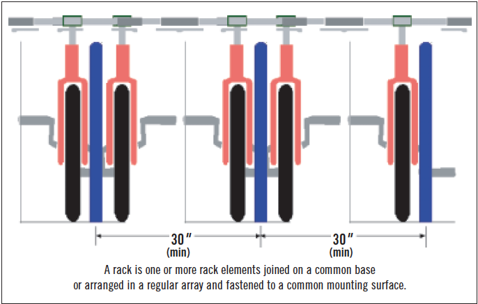
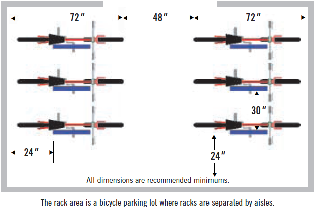
- Placement. Stairs are not a good area for bike racks. Also, the bike racks are jammed together too closely – making it difficult to maneuver a bicycle and lock it to the rack. This configuration also reduces the number of bikes that can use the racks. According to the APBP Guidelines, the minimum distance between racks is 30 inches. Below are two examples from the report.
And…The not-so-obvious.
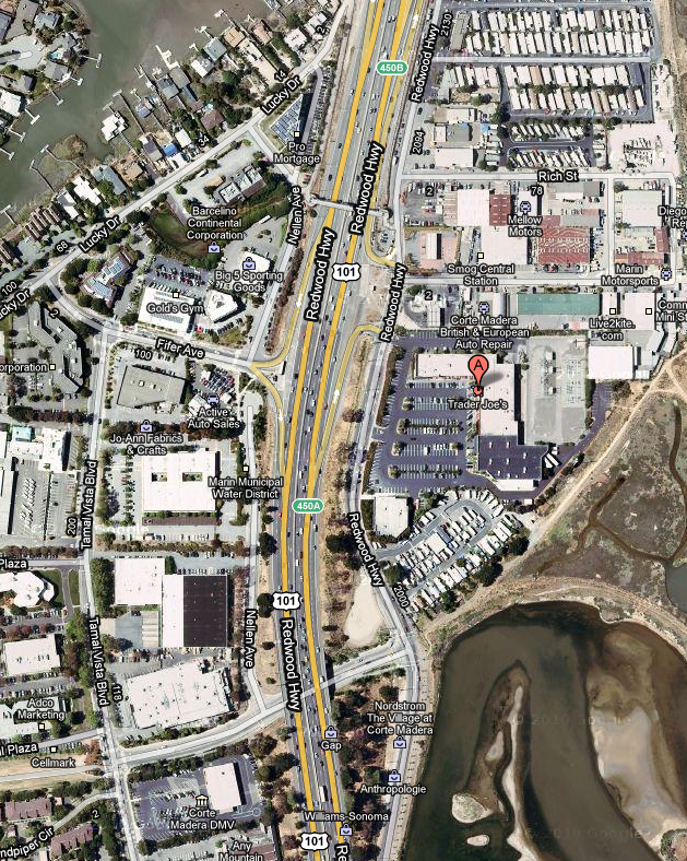
I shop here at least once a week and I have only seen one bicycle locked up on these racks. There is one more reason I believe these racks are not being used that I think is very important to point out – the store is located in an area where shoppers are forced to drive. You will notice in the google aerial below that a highway separates the majority of residential from the shopping area. This is a major deterrent for pedestrians to walk or ride their bicycles.
It is not good enough to just place bike racks in a location and hope they will be used. The “build it and they will come” philosophy does not apply in this case. Many more large-scale considerations need to be made.
Until next time…
Published in Blog


Andrew Spiering
Thanks, Melissa. I agree with you. However, it’s up to us as designers to make the layout functional. There are a few locations that are better than the current spot. Perhaps I’ll take some more photos of the site next time I buy my goods.
Jennifer L. Wait
Very fun example of trying to do the right thing in the wrong location.
Bob Luther
But just think the go a LEED point for it! It is all a sham! if the store truely had bike patrons or if it were a good location for bikes they would have been designed properly, this is a public art piece that can second as a bike rack.
Amy Verel
WOW, hilarious and depressing example of horrendous form-over-function design! I dearly hope this wasn’t done under the seal of anyone with anything resembling a landscape design education because…WOW how embarrassing. On another level, this sort of bizarre, anti-functional installation is partly the responsibility of the product rep, although I can see how Trader Joe’s probably just does massive corporate buys and then slaps the racks wherever their conspicuously uninformed site designers specify. Which is certainly depressing.
On a contrary and cheering note, the limited times that I’ve specified bike racks and spoken with suppliers, I’ve received extremely good, unsolicited advice about which products are best for security (squared-off tubes as opposed to round-harder for thieves to cut), preferred by bikers (re maneuverability), etc, even to the point where a supplier was discouraging the very “art-ey” spiral rack we liked (which they were selling) for reasons of functionality.
Great testament to the responsibility of experts to find an accessible way to impart their knowledge even when people don’t know to ask for it – if you’re friendly and credible, people appreciate it! Certainly a lesson applicable to all landscape professionals when it comes to educating clients and helping them answer the questions they didn’t even know existed. Great topic of discussion!
Ricky Peterika
At first glance I thought it was artistic/found-object kind of installation, as opposed to functioning bike racks. That parking lot makes it seem like bike racks aren’t too necessary. I don’t hate it – assuming they didn’t beat the system (a la bike-rack requirements, which Tampa doesn’t have much of)
Thomas J. Johnson
Great analysis! As a cyclist, it’s frustrating to see racks like that. It’s almost worse than not providing them at all.
I do have to object to your comment about the site being isolated though. It looks like there is a pedestrian bridge that crosses the 101 about 1/3 from the top of the picture and there is a low traffic street, with a light, that crosses the 101 towards the bottom of the page. Either of those routes seem like viable options to access the site.
Overall, though, it looks like a poorly designed store front, not limited only to the unfortunate placement of the bicycle racks.
The front walkway is way too narrow. Notice how there is barely room for one hula girl by the front door (far right). Imagine trying to navigate grocery carts on a busy evening! Two people will have a hard time passing each other, much less a swarm of hungry shoppers…
Which leads me to think that the “bike racks” were installed on the stairs intentionally, as a deterrent to using the stairs. Having three stairs (with varying rise/run) immediately outside of a grocery store exit is a disaster waiting to happen. Combined with the narrow walkway above and you would have carts/ people/ bags toppling down the stairs regularly.
While the placement of the racks may keep people from accidentally loosing their carts over the edge, they also encourage people to park their bikes in an area that is already over congested. If the upper racks were utilized it would make the landing even more difficult to maneuver with carts/ people. “Darn Cyclist, always in the way” The bikes are also be prone to damage from passing carts and parking cars.
Proposed solution: overall, the site would have benefited from eliminating the steps, thereby making the landing 18-24″ wider. A decorative handrail could be used in lieu of the bike rack/deterrent. The bike racks could then be moved to just in front of the palm trees, where the pile of bags/ashtray is, even possibly omitting one of the too closely planted trees, and everyone would be happy…
Whoever designed it should have hired me 😉
Thomas J. Johnson
Does anybody else see the irony in stairs leading directly to handicap parking…?
Baxter (Gene) Miller
This a pedestrian controll device that is more interesting than a handrail. The stairs were the give away, with out the loops people would be tumbling off the sidewalk the firest week. Please note that you can tie up your horse to the loops.
Andrew Spiering
Ha! That’s hilarious. That will be my next series… horse parking.