


One of the fairly unique features of this site is the granite outcropping that runs along its eastern edge. Giving a feature like
this both realism and readability is something that requires multiple
layers of textures, with manual manipulation required to give it an
organic, natural feel.
I am again using a photo I took as the base for my granite material. This is made more challenging due to the fact that the photo I am using
only has a small area of solid granite, in the form of Belgian block
edging. I selected a few blocks that have similar tones, outlined in
red, and used those as the base for my texture.

I used a mix of both healing brushes to fill in a large area using the existing blocks as a sample area. First I filled in the gaps with
the healing brush, then I used the spot healing brush to smooth the
transitions between the original and the pasted-in areas.

I then repeat this process to slowly spread the area out further until I have a large area filled with granite texture.

This area I then use to create my base granite material by simply cropping out the non-granite area of the photo. I also recommend
looking for any obvious inconsistencies in the texture now, as you can
use the healing brushes to eliminate them now.

You then simply use the same technique of pasting, fading, and cropping that has been used in the previous tutorials.

This texture is smooth enough that I am able to paste it into my image without needing a second layer of texture to mix it with, so for
now simply add the texture into the drawing you have after creating a
pattern.

While this granite outcropping now looks flat, although that will be helped with shading later in this series. However, this is the more
unique portion of this tutorial: to give this cliff some real depth and
realism, it is time to add some north-facing moss. First, Select a good
moss pattern and fill a new layer with that pattern. I selected one of
the turf patterns as the moss layer, as it has about the right color,
and has some good texture depth to it.

I then place this layer above my granite layer, and assign a new, empty layer as a mask. I then re-select just the area filled with the
granite.

You then want to select a brush with… for lack of a better description coming to mind, a spread, clumping form. I used a dual
brush with medium scatter and a low count, as this gives you a good
random spread, while keeping the brush in proximity to the cursor. (The
dual brush essentially assigns a masking brush to another brush, so you
can have one brush with a monster spread that would go to every corner
of your canvas, but then you mask it with a 100 pixel wide round brush,
so the only area the first brush will affect is the area also covered by
the non-spreading brush.)

Then paint what would be the north facing areas of the slope on the masking layer, with the most paint going on the most north-facing areas.

This will start to give a nice additional level of depth to the image, especially once the shading is added later on.

Next time We will tackle the longer grasses that surround the house.


Deborah Howe
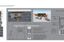
I opened this post thinking it was going to discuss how to work with a site’s natural granite outcropping — how any masonry might be integrated with the rock, how multiple layers of textured spaces and plantings could make the landscape even more readable, with an organic, natural feel. Woops! This is a dandy post for what it is; might there be a corresponding post on how the final, actual landscape came out? I’d love to see how other LAs work with quirky sites in the field.
Roger Bisbe
Deborah,
Are you looking for comments on the landscape pictured at the top of this post?
Roger
Frank Varro
The project the rendering is for was never installed, as it was a project for one of my second year MLA studios. The client also did not seem especially interested in doing anything new with the existing site, so as far as I know nothing ever really went in near the outcropping… which is a shame.
Deborah Howe
Frank, that is a shame; it would have been really interesting to see how your drawings became the three-dimensional place. (Roger, that’s really what I was looking for; at first I thought that the image at the top of the post was part of the project in question, then realized that it mainly provided the material vignette for the granite layer in Frank’s plan.)
Roger Bisbe
Deborah,
A great deal of my work today is renovation. Interestingly enough, these renovations can be of landscapes that are 2 years young and, of course, those that are many years old.
The landscape pictured above has a few aspects I would comment on, but of course I don’t know the circumstances of the site, the client’s wishes or the codes & ordinances for this property.
The walkway is very close to the building – I would like to see it further away. This would afford more space for planting design to soften and “connect” the building to the site. Also, it would make for a more pleasant feeling when traveling the walk.
I see that both sides of the walk are bordered in granite curbing. I would just make sure that the walk is draining properly.
It might be nice to consider trellis or some other 3 dimensional element on the stucco wall under the flood light. A window box of sorts for the side window would work well too. Again, with the walkway moved out a bit the window box would not protrude into the walk space.
I do like the granite. Although I certainly use manufactured elements in my designs, I instinctively lean more towards the natural. The organic colors, shapes and textures contribute so much, IMO.
In terms of the planting, it’s predominantly evergreen although the strap leaf plant (daylily?) is herbaceous. To introduce a deciduous element and help the overall composition, I’d consider an ornamental (mid-size) tree within this corner planting. This tree would provide much needed height and canopy.
Plant arrangement and spacing is frequently an issue. It’s one of the major aspects of the renovations we do. I would identify the existing plants to know their growth habit and potential. This is key information for arrangement & spacing. For example, the taller evergreens towards the back are a variety of Arborvitae (Thuja). Even without knowing the specific variety, they are clearly planted too close to the building.
I like the variety of textures and would probably introduce some new ones along with some height variations for more depth and interest.
It appears the bedline defining the garden from the turf is too close to the plantings. It would look better, be healthier for the plants and certainly easier to maintain if that line were brought out further.
I’m not sure if the small rock in the foreground is intentional. If the intent was to bring “rock” into the composition, scale and proportion are 2 key considerations. In addition, how rocks & boulders are arranged and installed is key. There are books written on the subject and/or, walks through the wilderness give great examples.
I really enjoy conversations like this and as always in design, there are numerous perspectives.
Take care.