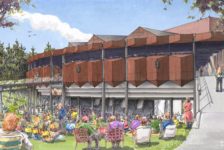
This week’s Sketchy Saturday Top 10. Sketchy Saturday is back in town for another week of fabulous Sketchy Saturday talent, showcasing the best handy work of the growing LAN community (Currently 1,164,731 fans on Facebook). What can I say, this week was as tight as ever, at least four if not five of the sketches could have been featured in the number one spot. The winning sketch was chosen because of its honesty, usefulness in the design process and a great use of mixed media to achieve the desired result. It really was a case of function over art, it was a sketch people could rely on to understand the overall design from a conceptual point of view. It did not flatter to deceive but instead told the story of the designer’s intention. Have a look at our choice for number spot this week and let us know if you think we got it right.
Enjoy this week’s Sketchy Saturday top 10!
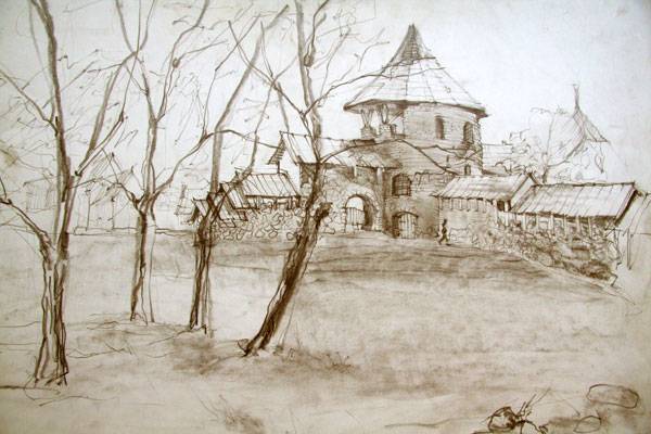
10. by Egle Garramone, Designer/Artist, in Italy

By Egle Garramone
time
when the trees in the park are still without leaves. So you can admire all the beauty and the magnitude of the castle. I used only
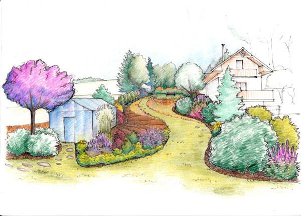
pencil on paper”. 9. by Klára Zuskinová, self-employed landscape architect at Laruu Landscapes, Slovakia 
By Klára Zuskinová
The place
is very nice and picturesque, so I decided to make a hand drawing instead of a 3D
model. I used a black pen for the lines and then
I added colour
by simple children pencils”. 8. by Kristýna Haisová from the Czech Republic. Studying Landscape Architecture at the Czech University of Life Sciences in Prague. Also, working as a planner (designer of gardens, parks) for a small local studio. 
By Kristýna Haisová

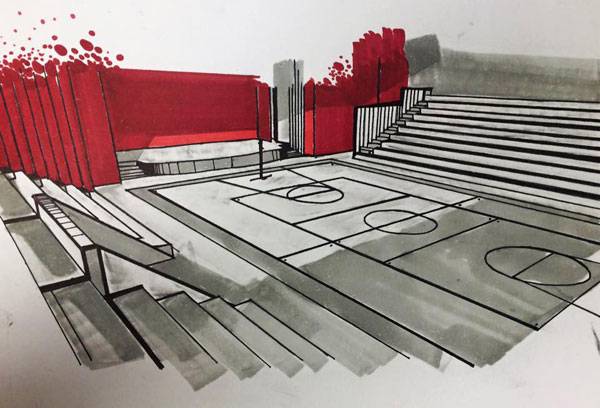
Luis Angel Rodriguez Licerio
auditorium,
as part of the presentation of a project to a competition which we won. The technique was by show of hands,
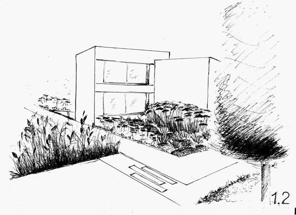
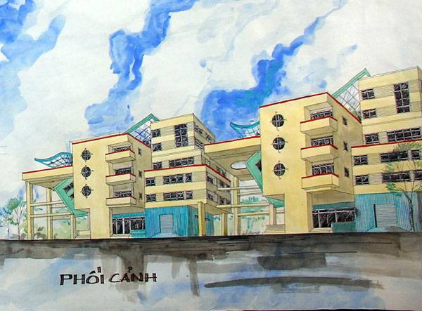
and the material used were oil and black markers down on ledger paper”. 6. by Nguyen Thi Ha, architect, living in Hanoi, Vietnam 
By Nguyen Thi Ha
model
apartment. It’s materials are some common materials: reinforced concrete, brick, glass windows and a steel
truss.”
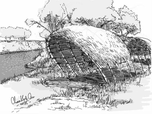
5. by Chan Kok Cen, architect and art director of Green Oceania Architect Group, Indonesia 
By Chan Kok Cen
roof
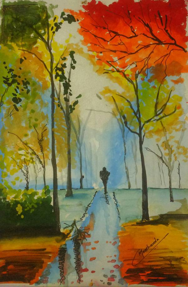
. Its’ function is for shelter around the small island.” 4. by Meet.Madhu.Chavda, a final year student of Architecture (Graduation), Country-India, Mumbai “I have a hobby of painting, Painting in few minutes, that has always been my challenge, That is the reason, artists in India are skillful with their hands rather than using technology. This painting was sketched at random and finished in 20 minutes. I would like to promote sketching especially to architects who are becoming technically oriented. I feel sketching would lead them to many innovative ideas. Poster watercolours, 2b pencil and black pilot pen were used”. 
By Meet.Madhu.Chavda

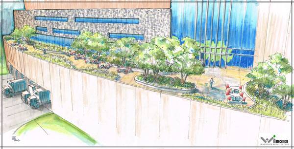
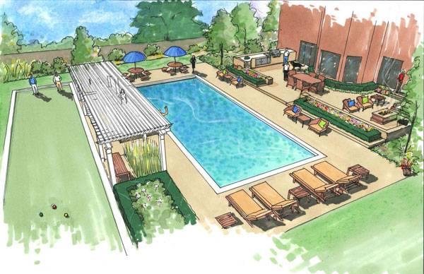
By Pete Bonette
marker
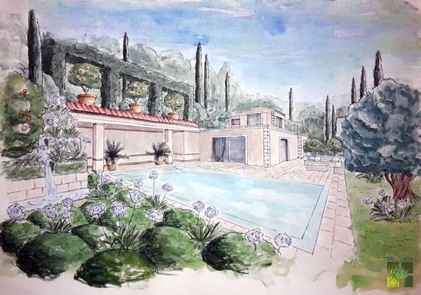
and colored pencil”. 2. by Ana-Maria-Roxana HANGAN, Landscape Designer Assistant at Riviera-Gardens (France) and Owner at Roxana H (Romania), also a master student at Landscape, Urban and Territorial Design (Romania) 
By Ana-Maria-Roxana HANGAN
beginning
, my collaborator (Stefana SAVIN) asked me to draw a sketch of this view proposing a Mediterranean
design and then to paint it in watercolour. I did not study
arts so I do not know exactly what style is this. I know that is watercolour in 2 point perspective. I used pencils, watercolour, black liner (0.05, 0.1, 0.3, 0.5) and white liner. I am quite glad about
the result”. 1. by Linda Farrington, Landscape Architect, United States 
By Linda Farrington.
– That’s this week’s Sketchy Saturday Top 10, congratulations to all of you who featured, you have come out on top of a very talented bunch of people. Check out the Sketchy Saturday official
Facebook album and see literally 1,000′s of incredible sketches! Follow all the winning entries on our dedicated
Sketchy Saturday Pinterest page. If you want to take part send your entries to us at
office@landarchs.com Go to comments Recommended reading:
Article by Scott D. Renwick Return to Homepage
Published in Blog