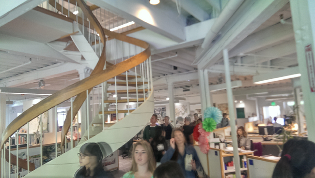
View from Laurie Olin’s Office
Visiting various different landscape architecture offices is a great way to understand each firm’s different niche and specialization. Firms vary in many different aspects: project focus (public or private), rendering styles (hand or digital graphics), office environment (a small office or one that takes up an entire building), and so on. It can be hard to grasp these differences when usually all you have to go by is their completed work. That’s why, as I’ve stated before, a landscape architecture office visit is so important. By getting the foot in the door to one of your favorite firms, you can start to get a sense of whether or not you are the right fit for their team. It provides the opportunity to ask questions and get answers on their expectations from their employees. It’s also a great way to plan for your future career and get a big picture view. Here are a few lessons learned from visiting several of the top landscape architecture firms in our field.
 Graphic poster seen at Andropogon, note the multiple types of media used.
Be Ahead of the Curve & Be Diverse With Graphics
After speaking with classmates, professors, and employees at various firms, it seems that the field is going through a major transition, both in how the field is perceived and technological innovations. As the great super heroes of landscape architecture leave, we, the younger generation, need to be there to carry the torch of great design. Not only do we need to know the foundations of designing, but the new generation of landscape architects are also expected to be knowledgeable in a wide array of up and coming technologies.
RELATED STORY: Digitising Landscape Architecture – From CAD to BIM and Everything in Between (LINK)
Just as a firms used to prefer different brands of marker, they now prefer different kinds of 3D rendering programs. From speaking to different firms, I’ve learned that it is important to be as technologically diverse as possible to gain an edge in the field. Knowing how to use everything from Photoshop to 3DS Max to hand drafting can be vital to your success. I was surprised to learn that most larger firms use Rhino now instead of SketchUp–an unpleasant shock after having just learnt SketchUp through and through. I saw many firms now learning Lumion as well; graduating with these programs under your belt could definitely put you on a higher playing field.
While it’s incredibly important to know what tools landscape architecture firms are using nowadays so that future landscape architects can properly train themselves in these programs, it’s also important to stay ahead of the curve. Because in the end, it’s about what you bring to the firm, and once you bring knowledge that employees there don’t know and can learn from, you become a much more valuable asset.
A visit to Sasaki
The Difference In Firms & You
One of the most interesting things I’ve found in the past is how each office can function in radically different ways. While all firms may produce amazing work, their process for getting there can be drastically different. At Anderson Design, it’s a one man show in his house making the big design shots. At AECOM, it’s a large industrial and interdisciplinary push to produce amazing work. The office atmosphere can also range from friendly and vibrant to dull and cold. Picking up on these differences are pivotal in your search of where you want to work and grow as a landscape architect. Most people want to work at a firm where they feel comfortable in and where their work can flourish. I sometimes found myself walking out of an office and thinking, “I could never work there.” That’s a good thing. It’s important to recognize when and why you feel out of place from a work environment especially because it’s often hard to sense that from just visiting their website.
Small rock tower while in Denali after visiting offices in Anchorage
Portfolios
It seems to me, knowing what I need to have in my portfolio was one of the prime questions I wanted answered. Most students view the perfect portfolio as the golden ticket to opening any and all doors in the professional world. But the task of boiling down all your years of schooling into a simple document is daunting. Moreover, larger firms receive stacks of portfolios and don’t pour over every detail; if there’s a glaring mistake or something they don’t like at first skim, they’re likely to throw it out without a second look. Here a few guidelines I picked up to keep you away from the trash bin.
1. PROOFREAD. The slightest spelling/grammar error could land your precious portfolio into the trash bin. If you can’t be detail oriented enough to proofread, how thorough can your design ideas and CAD redlines really be? Good tip: run your draft portfolios by your English major friends any chance you get.
2. Craft your portfolio for the firm. If it’s a firm with a philosophy of green design and hand graphics, they probably don’t want to see your office park projects created in Illustrator. While it’s important to show these skills, you need to appeal to their way of thinking. Don’t be afraid of switching out projects and keeping your portfolio a fluid piece of work. Portfolios are just like landscapes; their ever-changing nature means that they can never be completely finished.
RELATED STORY: How to Make a Portfolio: 5 Tips for Telling your Story (LINK)
3. The way you send your portfolio also makes a big difference. I recommend emailing a small PDF of your work (5-8 MB) as well as mailing in a physical copy of your full portfolio with your CV and letters of recommendation (typically 3). I’ve seen a lot of students using Issuu or Squarespace to ease this large file problem. Just don’t bog down the people you’re contacting; make your statement clear and concise.
4. Show your personal side. While it’s true that firms want professional and highly trained students, they don’t want employees they would not get along with. If you don’t show your personality through your portfolio your work could just fade to whitewash and look like everything else. One way of letting your personality peek though is by using a consistent theme throughout your portfolio. I’ve heard a lot of advice to not include a photo of yourself in the portfolio, but when I spoke to different firms, including a headshot seemed to go both ways.
5. At most universities, projects get recycled each year. While little things might get changed, the general theme may stay the same. Thus firms will open your portfolio, see which school you went to, flip the page and say: “Oh…this project again.” So go back and mix your projects up a bit. Change colors, change the format, and change the title. These changes breathe new life into your portfolio and make you stand out from your peers and alumni.
6. SCAN EVERYTHING YOU DO. I was told multiple times, “it’s the little details that end up winning us over.” Firms want to see the process you used to get to that beautiful final design. If you throw away all your trace, you’ll lose the storytelling component of your final product. Eve Kootchick at Olin specifically told me how little scribbles she made in her first year are what popped out most during her interviews. These small scraps, when culminated together, speak loudly to what kind of designer you are.
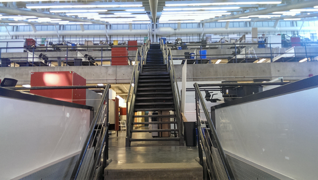
Taken at the Harvard Graduate School of Design
I learned so much on my recent travels and visits to various landscape architecture firms. Those experiences have helped shaped my direction in landscape architecture and where I want to go with the field. In conclusion, I believe that one of the most important lessons you learn from traveling and visiting these different firms is seeing the scale at which you fit into this amazing profession, that you are a tiny student who can become something so much larger, you just need the right tools. So please, go out and contact your dream firms. Find the tools that you need to reach your goals. Also, travel whenever possible!
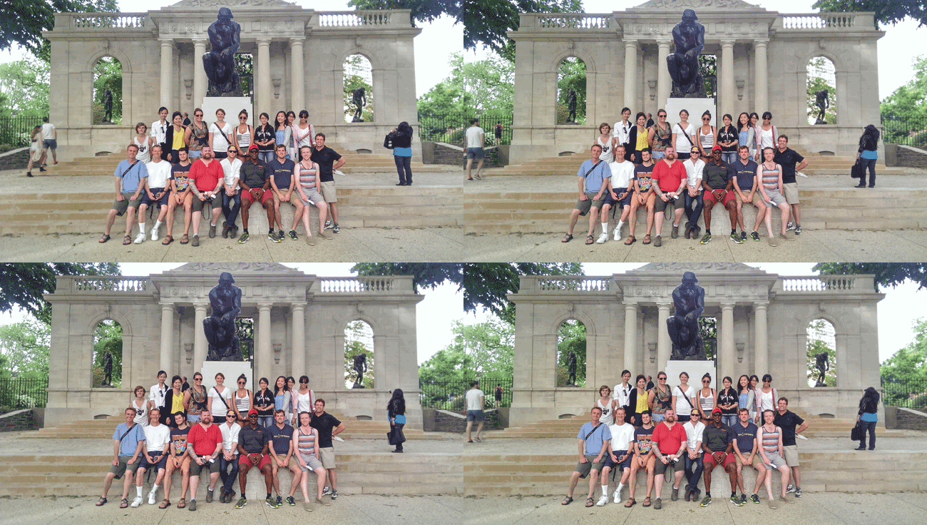
Small gif I made of me and my classmates in front of The Thinker at The Rodin Museum in Philadelphia. Love you guys!
Photographs © Kevin J. Pfeiffer
Published in Blog










Bernard Trainor + Associates
Great post and great tips, Kevin! Especially your portfolio comments. Thanks for the article.