Article by Erin Tharp Arnhem Central Station, by Bureau B+B urbanism and landscape architecture, in Arnhem, the Netherlands. Since the first steam engine carried passengers through England in the early 1800s, rail travel has been a prominent form of transportation in Europe, for both locals and tourists. While the trains have always been successful, the stations they come into have often just been places to pass through. Many countries are starting to realize this, and are seeking ways to improve them. As a way to improve transportation for both locals and visitors, the Netherlands has set about developing new public transportation stations all around the country, and the new station at Arnhem is among them.

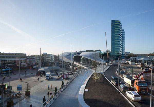
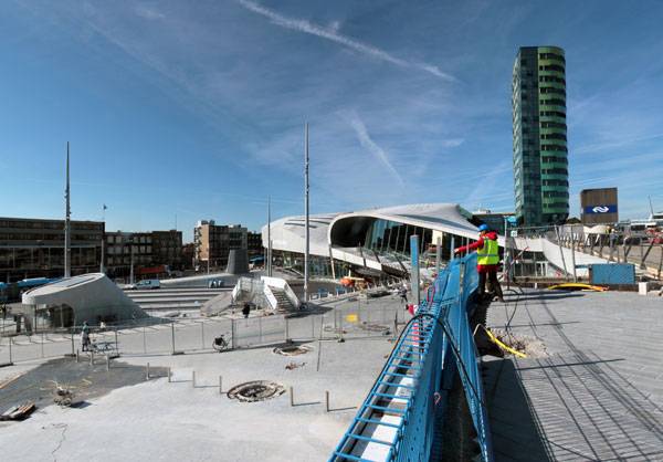
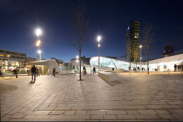
Overall picture of the station area. Photo credit: Frank Hanswijk Lowres
This movement started with the opening of Rotterdam Central Station in 2014, followed by stations in Delft and The Hague, as well as the first section of Arnhem Central in 2015. There are plans to open stations in Breda and Utrecht in 2016. All of them will be more than just interchanges for public transportation.
Arnhem Central Station
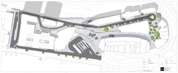
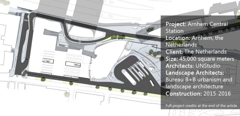
Architecture firm UNStudio drew the master plan for the Arnhem Central Station area, including the area for the public transportation terminal, platforms, new office towers, and other areas to attract visitors. The bulk of the work for these areas was completed in 2015. The final piece — the eastern section — will be completed in 2016.

Arnhem Central Station masterplan. Copyright: Bureau B+B urbanism and landscape architecture
— including international travelers — have used the station and its surrounding spaces every day. These public spaces include office towers, a cinema, a car park, shops, restaurants, and cafés. People are brought here from national, international, regional, and local trains. For the outdoor spaces, Bureau B+B urbanism and landscape architecture was called in to design the approximately
45,000-square-meter space. The location of the station was the guiding principle in the design of this outdoor space.
Dealing With The Terrain The new station is located in the area between the Hoge Veluwe national park and the land surrounding the River Nederrijn, which is characterized by a rolling topography that has height differences of up to 20 meters in certain areas. The terrain would make it seem impossible for trains to enter the area from Utrecht, but a deep lateral moraine cut into the Veluwe hills makes it possible.

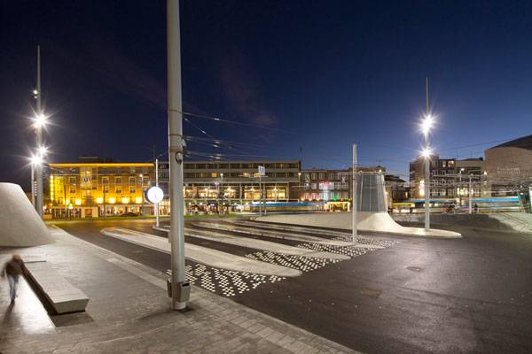
Trolleybus square. Photo credit: Frank Hanswijk Lowres
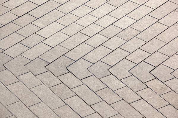
was familiar with the surrounding landscape and sought to incorporate it into its design, so that the station would appear to be continuous and coherent with the existing ground plane. To achieve this continuity, the designers chose a stone paving that is laid in various directions in order to follow the undulating ground.

Detail natural stone paving. Photo credit: Frank Hanswijk Lowres

Arnhem Central Station under construction. Copyright: Bureau B+B urbanism and landscape architecture
This stone surfacing flows from the car park entrance to the office plaza and on to the connection with both the inner city and the city center to the east. The public transportation terminal, bus station, and their immediate surroundings are also covered in the stone, so that they extend seamlessly from inside to the outdoors. Finally, the Oude Stationsstraat, which is the area that connects the station to the city, is also paved with these stones.

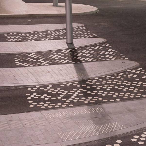
Detail trolleybus square. Photo credit: Ben Ter Mull Lowres
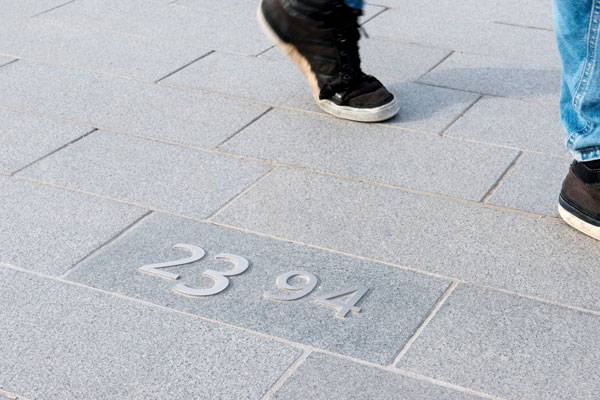
The designers knew that with such an extensive hardscape, the area might face flooding problems later on, so they outfitted the underlying surface with stainless-steel drainage lines to carry off excess water. They also wanted the public to be aware of the height differences on the site, so they placed stainless-steel topography numbers throughout the space to indicate the varying elevations.

Detail stainless steel number. Photo credit: Ben Ter Mull Lowres

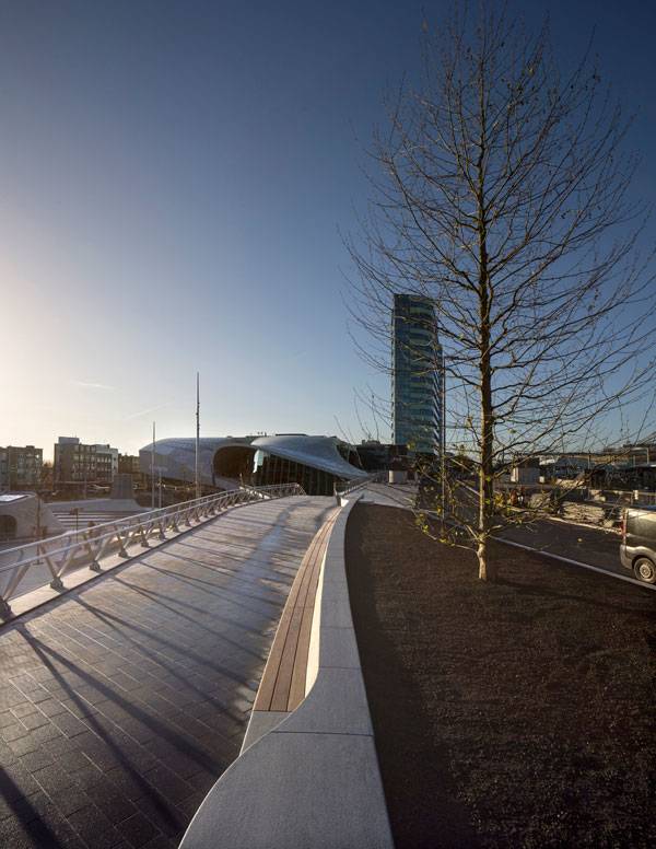
Bench City balcony. Photo credit: Frank Hanswijk Lowres
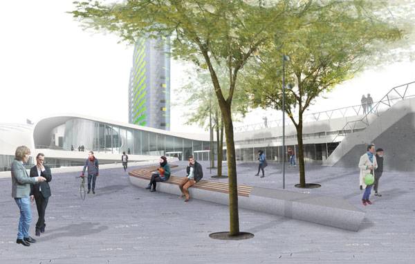
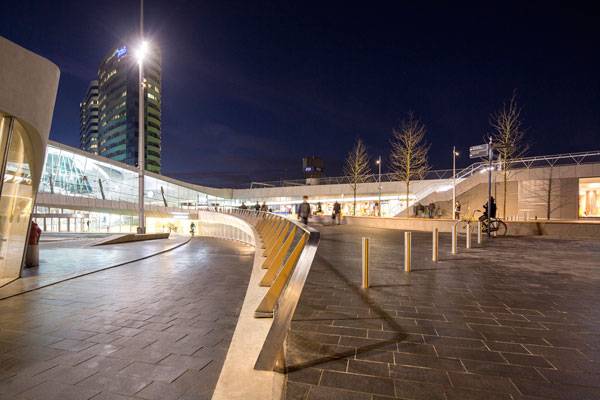
As another nod to the difference in elevations, the designers created folds in the landscape to bridge the height differences. Each one is fitted with a wooden seat that transforms the folds into benches, which also help to create spaces for greenery.
The Forest Giants and Other Small Helpers These green spaces are home to trees that play homage to the “forest giants” that are found throughout the city of Arnhem. Here, sycamores are meant to be a tribute to the green identity of the surrounding city, and smaller honey locusts are meant to signal meeting places or spots for encounters.

Arnhem Central Station. Copyright: Bureau B+B urbanism and landscape architecture
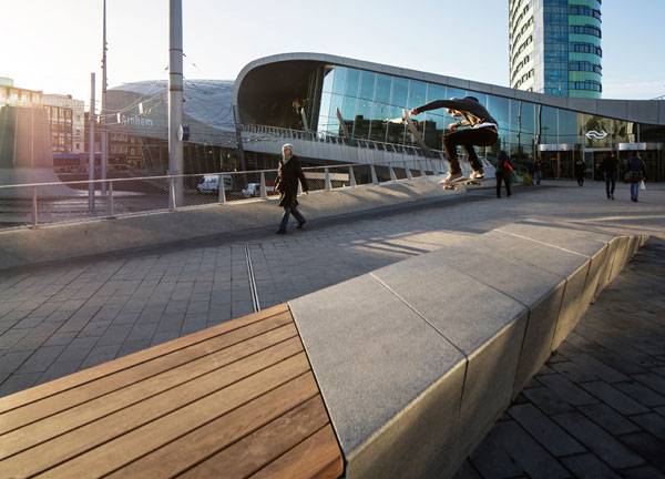
The planting scheme isn’t the only aspect to arise from the topography. The designers were pleasantly surprised that due to the topography, the space has become known as an
international skate park, where skateboarders make use of the durable street furnishings and sturdy ground plane to help enhance the vibrancy of the station at all hours of the day.

Natural stone bench at the station square in Arnhem Central. Photo credit: Frank Hanswijk Lowres

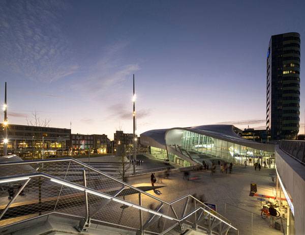
View from city balcony. Photo credit: Frank Hanswijk Lowres
In addition to the skateboarders, travelers are known to use the station at all times, so the design team knew the lighting scheme needed to be both functional and appealing to visitors. They called on
Atelier Lek to develop a lighting scheme that is low maintenance, energy efficient, and vandal proof. They also asked that it make visitors feel safe at all hours and that it reinforce the overall quality of the space.

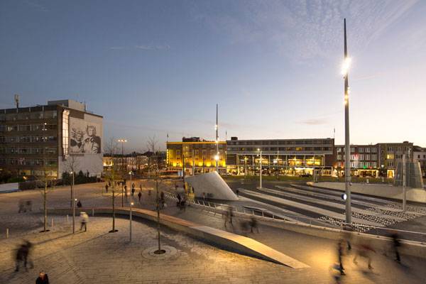
View from city balcony. Photo credit: Frank Hanswijk Lowres
In places where finding one’s way is important, such as the busy bus zone, low levels of contrast ensure that the space remains easy to navigate. In other, calmer places, light is used to strengthen the quality of the surroundings. The designers placed small lampposts close to areas of greenery and seating, while ground spotlights were used to illuminate the monumental trees around the station. Both linear illumination and lights integrated into handrails were placed so that they emphasize the folds in the ground plane and make the area walkable at night.

Bench entrance public transport terminal. Photo credit: Frank Hanswijk Lowres
All of these features add up to create a space that has become much more than just a train station. This space is an actual destination that both greets and welcomes visitors to the city, as well as locals who might be looking for a place to just hang out. It is all-encompassing designs like this one that are helping to transform not only individual sites, but cities as a whole into more viable and liveable places.
What’s the most exciting train station you’ve ever visited? Let us know in the comments below! Go to comments 
Bench entrance public transport terminal. Photo credit: Frank Hanswijk Lowres
Full Project Credits For Rike Park
Project: Arnhem Central Station Location: Arnhem, the Netherlands Client: The Netherlands Size: 45,000 square meters Architects: UNStudio Landscape Architects: Bureau B+B urbanism and landscape architecture Lighting Design: Atelier Lek Construction: 2015-2016 Get Social with Bureau B+B urbanism and landscape architecture: Website: www.bplusb.nl Facebook: www.facebook.com/BureauBplusB Recommended Reading:
Article by Erin Tharp Return to Homepage
Published in Blog