


Author: BimDjSoftech

How to Use Trees – The 10 Best Projects that Show You How
Article by Erin Tharp LAN writer of the year 2015/16 Erin Tharp, takes a look at some creative ways how to use trees in various landscape designs. Almost every successful landscape installation has one thing in common: trees. Trees are found in traditional landscapes and in ultra-modern landscapes alike. And even though the feel of the spaces may differ, the trees bring them back to nature and remind us that even the most desolate places can support life. So how do you go about becoming an expert in placing trees in your designs? Take a look at the following 10 projects that show 10 uses for trees in the landscape and prove that every space can be made better by using trees.
How to Use Trees
1. Trees as Art Visitors to the Tree Museum in Rapperswil-Jona, Switzerland, are greeted by a collection of trees — carefully placed by Swiss landscape design firm Enea — that are meant to serve as a 75,000-square-meter work of art. Enea placed several giant sandstone walls and water basins throughout the site to divide the space and to also create quiet spaces for visitors to relax and enjoy the entire collection of trees, which obviously take center stage here.
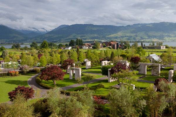
Tree Museum. Credit: Enea GmbH
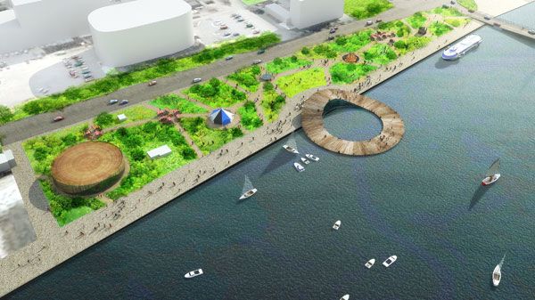
The Baltic Sea Art Park. Image credit: Kilometrezero
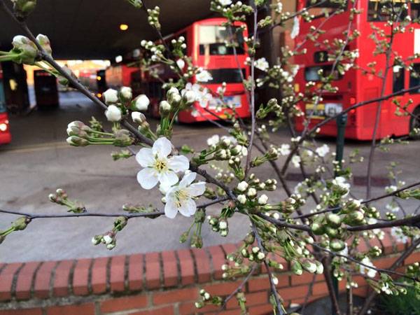
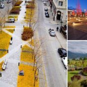
Open Orchard #1: Norwood Bus Garage, south London. Photo credit: @Open Orchard

GONÇALO DE CARVALHO; credit: Adalberto Cavalcanti Adreani
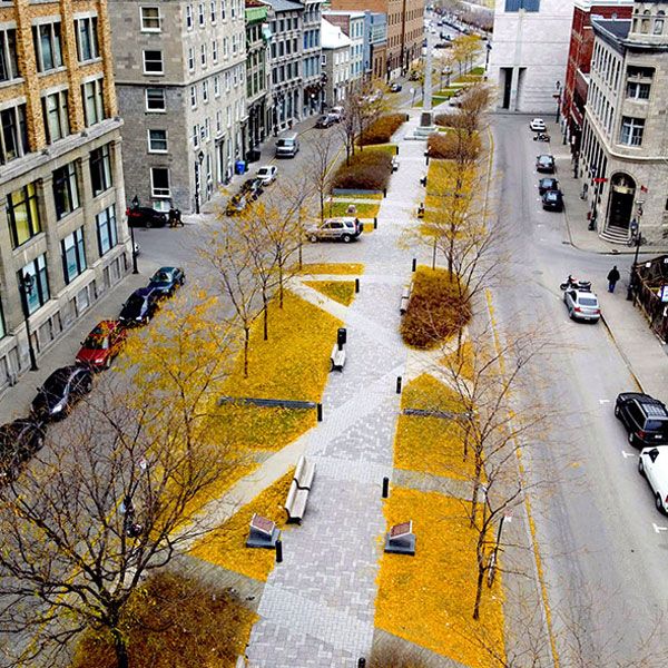
Place d’Youville. Photo courtesy of Claude Cormier + Associés.
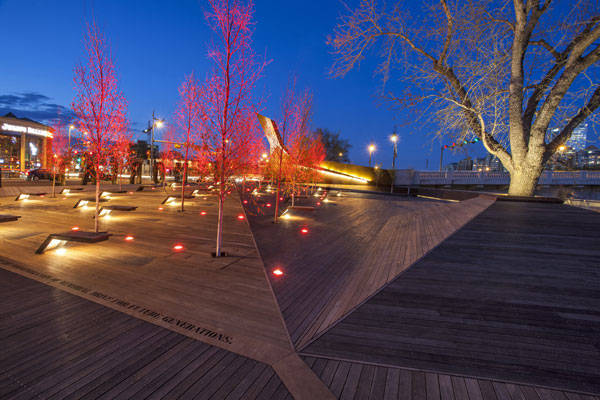
Poppy Plaza by Marc Boutin Architectural Collaborative and Stantec Consulting, Calgary, Canada
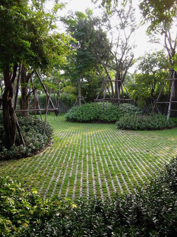
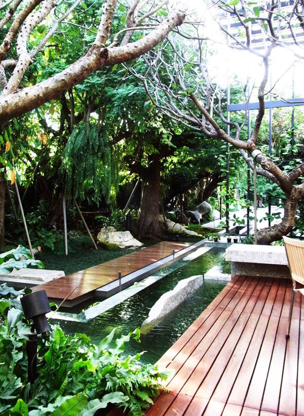
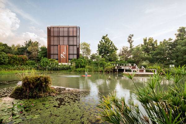
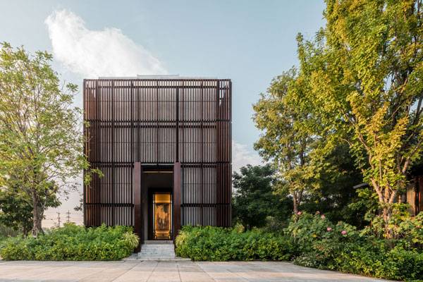
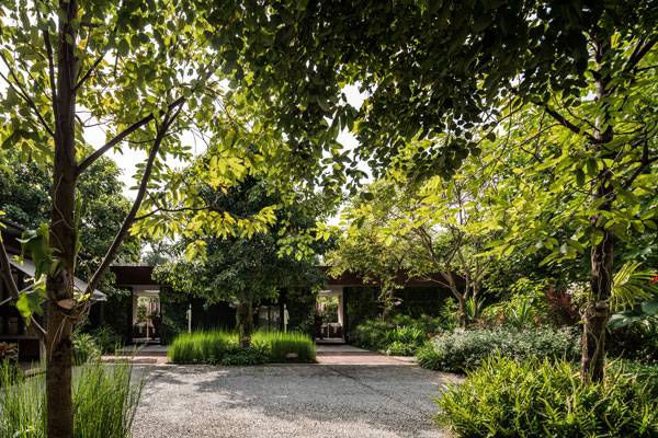
Baan Ladprao private residence. Photo courtesy of Landscape Architects 49 Ltd.
9. Trees as Survivors When Thorbjörn Andersson started designing Hyllie Plaza in Malmö, Sweden, the designers knew they wanted to create a place that would have an identity and stand out form other plazas in the country. To do this, they decided to create a minimalist beech forest. Going in, they knew that using the ever-sensitive beech could be problematic, but they had a plan and knew that if they could accomplish it, they would create a place that showcased the survival instincts of this majestic tree. They planted 28 trees in a large planting bed accessed through12 slits cut into the granite and concrete paving surface. This bed contains just the right mixture of mulch, stones, and soil to allow the trees to thrive.
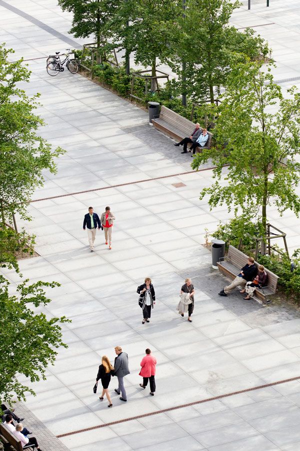
Hyllie Plaza. Photo credit: Kasper Dudzik
T.Residence. Photo courtesy of LOKOH= Co., Ltd.
>>>CLICK TO COMMENT<<<
Recommended Reading:
- Becoming an Urban Planner: A Guide to Careers in Planning and Urban Design by Michael Bayer
- Sustainable Urbanism: Urban Design With Nature by Douglas Farrs
Article by Erin Tharp


7 Lessons Landscape Architects Can Learn from Steve Jobs
Article by Erin Tharp We cross disciplines and look at the iconic Steve Jobs to see what concepts cross over from the world of Apple to Landscape Architecture. Steve Jobs, co-founder of Apple, was known for many things, including his love of technology and his innovative designs. Both of these traits can also be found in most aspiring landscape architects, so the question is; what could Steve Jobs teach landscape architects about design? Here are seven lessons from Steve Jobs to make us all better landscape architects.

The iconic Steve Jobs. By Matthew Yohe, CC BY-SA 3.0.
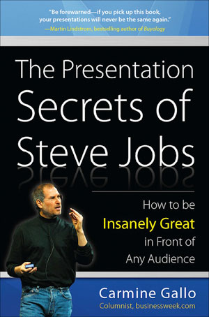
The Presentation Secrets of Steve Jobs: How to Be Insanely Great in Front of Any Audience. Get it HERE!
Go to Comments Recommended Reading:
- Becoming an Urban Planner: A Guide to Careers in Planning and Urban Design by Michael Bayer
- Sustainable Urbanism: Urban Design With Nature by Douglas Farrs
Article by Erin Tharp

Ming Mongkol Green Park: A Natural Park Fit for a King that Speaks to the People
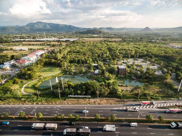
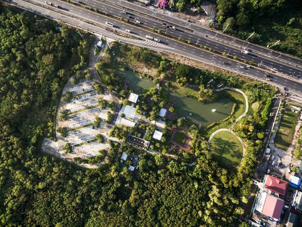
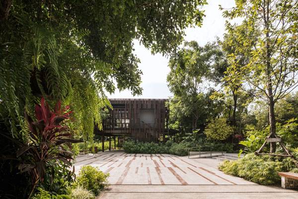
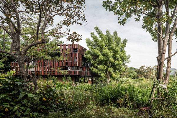
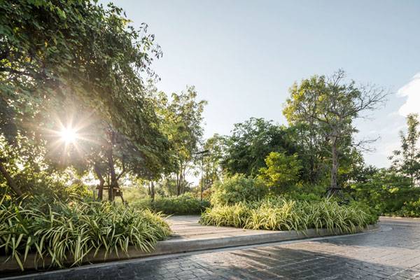
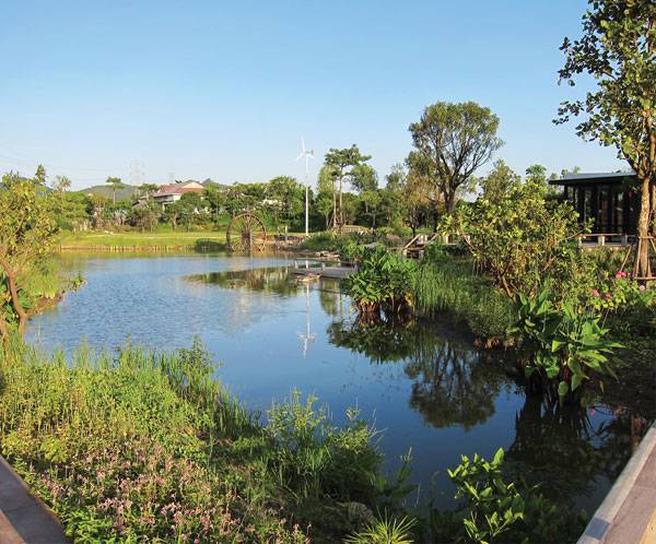
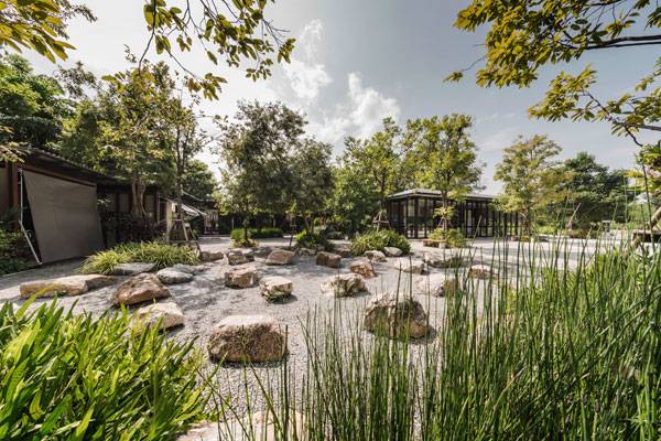
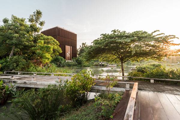
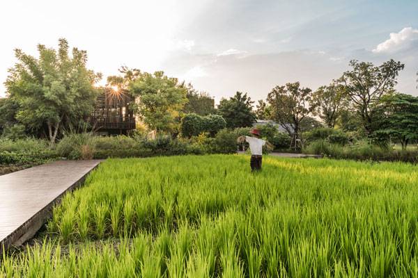
Article by By Erin Tharp. Ming Mongkol Green Park, Landscape Architects 49 Limited, in Mittraphap highway, Thap Kwang, Kaeng Khoi, Saraburi, Thailand Cleaning up and repurposing unused sites has become a major trend in landscape architecture over the last decade. Most of these sites are former brown sites that require some sort of remediation, but Ming Mongkal Green Park actually started out as a deteriorated orchard. Located on 22 rai on the Mittraphap highway near Thap Kwang, Khang Khol, Saraburi, in Thailand, the park is a Corporate Social Responsibility Initiative (CSR) by owner Siam City Cement. The owner contracted with Landscape Architects 49 Limited, which set out to create a place for environmental education and preservation awareness.
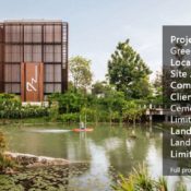
Ming Mongkol Green Park. Image courtesy of Landscape Architects 49 Limited
Ming Mongkol Green Park
They also wanted this place to help promote social service and interaction for the people who live nearby, as well as be a place that will help increase tourism and give people the opportunity to interact with nature — a leisure activity that is hard to find in Thailand’s cities. The park designers also hope to help benefit the local OTOP product and temporary market. According to the Royal Thai Embassy, “OTOP stands for ‘One Tambon (meaning subdistrict) One Product.’ It is a local entrepreneurship stimulus program which aims to support the unique locally made and marketed products of each Thai tambon all over Thailand.”
Ming Mongkol Green Park. Image courtesy of Landscape Architects 49 Limited
Ming Mongkol Green Park. Image courtesy of Landscape Architects 49 Limited
Ming Mongkol Green Park. Image courtesy of Landscape Architects 49 Limited
Ming Mongkol Green Park. Image courtesy of Landscape Architects 49 Limited
Ming Mongkol Green Park. Image courtesy of Landscape Architects 49 Limited
Ming Mongkol Green Park. Image courtesy of Landscape Architects 49 Limited
Ming Mongkol Green Park. Image courtesy of Landscape Architects 49 Limited
Ming Mongkol Green Park. Image courtesy of Landscape Architects 49 Limited
Ming Mongkol Green Park. Image courtesy of Landscape Architects 49 Limited
Ming Mongkol Green Park. Image courtesy of Landscape Architects 49 Limited
Ming Mongkol Green Park. Image courtesy of Landscape Architects 49 Limited
Ming Mongkol Green Park. Image courtesy of Landscape Architects 49 Limited
Ming Mongkol Green Park. Image courtesy of Landscape Architects 49 Limited
Full Project Credits For Ming Mongkol Green Park:
Project Name: Ming Mongkol Green Park Location: Mittraphap highway, Thap Kwang, Kaeng Khoi, Saraburi, Thailand Site Area: 32,000 square meters Completion: 2013 Project Value: 60 million baht Client/Owner: Siam City Cement Public Company Limited Landscape Architect: Landscape Architects 49 Limited Design Director: Predapond Bandityanond Project Team: Suttida Tharanatham, Thossapon Mongkhondee, Hathaichano Sukaviriya, Nattapong Meechaiya, Prachya Bausomboon Architect: Architects 49 Limited Structural Engineer: Architectural Engineering 49 Limited M&E Engineer: M&E Engineering 49 Limited Photographer: L49, W Workspace Recommended Reading:
- Becoming an Urban Planner: A Guide to Careers in Planning and Urban Design by Michael Bayer
- Sustainable Urbanism: Urban Design With Nature by Douglas Farrs
Article by Erin Tharp

7 Top Photoshop Tutorials for Digital Rendering
Article by Erin Tharp LAN Writer of the Year 2015-16, Erin Tharp, takes a closer look at 7 Top Photoshop tutorials for digital rendering. One of our roles as landscape architects is to help our clients visualize the design that we are trying to sell to them. Plan view drawings usually aren’t enough to do that and oftentimes clients ask for renderings that will reveal what the project will look like once installed. One of the best tools we have at our disposal for this is Photoshop, but to use it we need to know some tricks to make our renderings actually look realistic. So here are seven Photoshop tutorials, ranging from super easy to slightly complicated, and all available on YouTube to help you perfect the art of photo rendering.
Digital Rendering with Photoshop
1. Sketchup to Photoshop: quick Quick rendering Rendering tutorial Tutorial by Alex Hogrefe Sketchup is an easy and fast way to create a 3D image of a site design, but the main complaint with the program is that the finished product is far from realistic looking. Adding some realism to these drawings is where Photoshop comes in. This tutorial will show you how to prepare your drawing for Photoshop and then add a sky, shading and color to your Sketchup renderings and create a drawing that will leave your clients in complete awe of your rendering skills. WATCH >>> Sketchup to Photoshop: quick rendering tutorial
2. How to Load Brushes Into Photoshop by Rebekah Cornell Finally, hHave you ever wondered how your coworkers or fellow classmates got all of those grass or cloud brushes into their Photoshop program? It’s actually not as hard as you might think, and most consider it pretty basic knowledge, so if you don’t already know how to load brushes, be sure to watch this tutorial, – because sometimes a nice ghost tree is all that a rendering needs to really make it pop. WATCH >>> How to Load Brushes Into Photoshop
3. Simple GRASS Tutorial by VIShopper One thing that a lot of people complain about with Photoshopped images is that elements in them appear flat or have hard edges, but if you follow this tutorial then you’ll be able to create a 3-dimensional rendering by laying down a realistic lawn that won’t take you dozens of billable hours to create. This short, seven-minute video is easy to follow and uses simple tools that even a beginner will master in no time at all. WATCH >>> Simple GRASS tutorial
4. How to Make a Tree in Photoshop CC 2014 by f64 Academy Photoshop CC is a customized version that uses cloud cloud-based technology to provide users with access to Adobe Stock libraries that make rendering seamless. If you don’t have this version it might be worth the monthly fee to try it out because this version of Photoshop makes rendering landscape architecture projects easier by providing users with a tree library. This tutorial will show you how to use this feature with ease and make your trees look like they actually grew there. WATCH >>> How to Make a Tree in Photoshop CC 2014 by f64 Academy 5. How to Remove a Background, Then Add add Another – Photoshop CS5 by Ch-Ch-Check It Sometimes you find an element, like a bench or, planter, or a person, that you want to include in your own drawinga rendering, but how do you get that element or person into your own drawing? Well, this tutorial shows you how to create a mask that will allow you to literally pick up whatever it is you want and put it in your project and make it look like it belongs there. The video is long at 25 minutes, but completely worth it if you want to create a truly professional professional-looking rendering. WATCH >>> How to Remove a Background, Then Add add Another – Photoshop CS5 by Ch-Ch-Check It
6. How to add Light Flares by Phlearn Photoshop and Photography Tutorials It’s not too hard to create a rendering to give your clients a good idea of what their site will look like, but if you want to really wow them then you need to make your drawing sparkle. Adding light rays is a tried and true method for taking a photo to the next level and adding a level of emotion to the rendering that is sure to sell it, and t. This tutorial will give you the tools to not only take the right picture but to then also add light rays effects in a realistic manner. WATCH >>> How to add Light Flares by Phlearn Photoshop and Photography Tutorials
7. Tutorial: Render an Architectural Night Scene in Photoshop – Tạo Phối Cảnh Đêm với Photoshop In this video we learn how to create a rendering that will show off the beauty of our project at night. This one is definitely for a more advanced Photoshop user, but despite the lack of verbal instructions the information is there and the video will show you how to add a night sky as well as the proper lighting that a site would require at night. WATCH >>> Tutorial: Render an Architectural Night Scene in Photoshop – Tạo Phối Cảnh Đêm với Photoshop
See More Photoshop Related Articles:
- 10 Photoshop Tutorials for Advanced Photoshop Skills
- 10 of The Best Photoshop Tutorials on YouTube for Landscape Architects
- The Lazy Photographer’s Guide to Photoshop
Recommended Reading: Digital Drawing for Landscape Architecture. Get it HERE!

5 Residential Designs That Changed the Way People Live
Article by Erin Tharp We take a look at 5 incredible residential designs that enhanced the users living experience. For many landscape architects, designing a residence is viewed as simple, no-brain work. Plop down a few plants around the house, throw in a water feature and a path and you’re done. But is this really the way we should be viewing residential landscapes? After all, most people view their home as a place of refuge or a place to escape the world around them; perhaps if we viewed these residences with more pride and as a path to change the way people live then perhaps we could all change the world a little, one yard at a time. The following projects definitely changed the way their clients live but at the same time they also managed to change the way we will all want to live and inspire us as landscape architects to jump onto the residential bandwagon.
5 Residential Designs
1. Baan San Kraam by Sanitas Studio, in Cha-Am, Petchaburi, Thailand
Beachfront properties have always sold for a premium and are most times limited real estate, but what if a property could be transformed from having only a few beachfront units to giving the entire property waterfront views? That’s exactly what Sanitas Studio managed to do with the Baan San Kraam residential development in Thailand. The development is home to 13 buildings, but originally only two were going to have views of Cha-Am beach. In the end, though, designers were able to create a holistic setting for the entire property that mimics the seascape. So next time a client tells you they love the beach, give it to them – in their own backyard!
Baan San Kraam by Sanitas Studio. Photo credit: Wison Tungthunya
2. Contemporary Italian Garden – Private Residence, by Giuseppe Lunardini Landscape Architecture, in Ortonovo (Liguria), Italy
In school, we were all taught how to create outdoor rooms, but Giuseppe Lunardini Landscape Architecture perfected this concept with his contemporary Italian Garden in Ortonovo, Italy. While the house on the property is spectacular by itself, Lunardini was able to add 6,200 square meters of livable space by creating separate areas for a swimming pool, an outdoor kitchen, a defined entrance and a functional and beautiful parking area. Each space manages to have its own feel but all are cohesive due to the effective use of plants as structural elements and stone throughout the project. So, you have a client complaining that they want to entertain but the house just isn’t quite big enough, well then – give them some more rooms outside and expand their livable space.
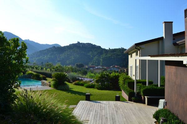
Photo credit: Andrea Simonetti and Giuseppe Lunardini
3. Mediterranean Terrace, by Studio S.O.A.P, in Alassio, Italy
Another thing we all studied in school was Italian Gardens, and with good reason; Italian gardens are some of the most inspirational examples of landscape architecture out there. But what if you had a client that loved Italian gardens but didn’t have a yard? Well, hopefully you’d do what Studio S.O.A.P did with a terrace in Alassio, Italy. Inspired by the Italian Renaissance ideals of order and beauty, designers transformed a flat, blank terrace into a lush garden defined by symmetry and views of the Mediterranean Sea. All of the pieces are here to create an Italian garden; symmetry, water, evergreen, fragrant plants, and a distinct color scheme of white, blue and yellow. These components combine to form a delicately crafted Italian garden, but on a terrace instead of a yard.
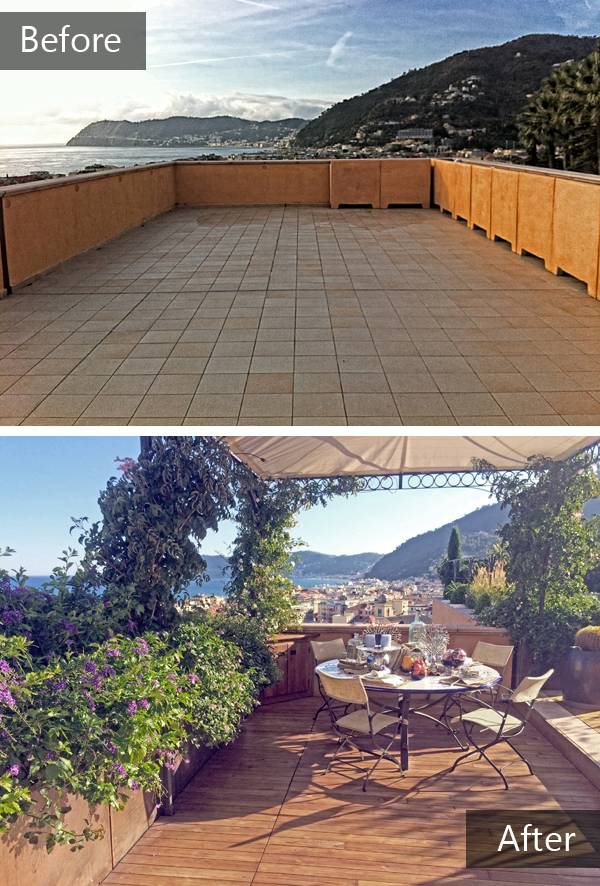
Before and after sequence. Photo credits: Simone Ottonello
4. Vale do Lobo — Vila 1148, by Iúri Chagas, Algarve, Portugal
Sustainability is oftentimes a word not associated with a residential climate that is addicted to green lawns and irrigation systems. But it is possible to convince clients that being sustainable does not equate to an ugly landscape. In fact, Vila 1148 in Vale do Lobo, Portugal, by Iúri Chagas, is just the opposite. Here, lush plantings are sustained by a drainage system that connects to a rainwater collector and the lawn area is also minimized. Chagas was selective with the choice of plants, and only selected native species or plants that are well-adapted to the climate and thus require minimal care. So, the next time a client is dead set on that huge lawn, show them what their options are, and if they won’t give the lawn up, talk them into collecting rainwater instead of installing a typical irrigation system.
Photo credit: Iúri Chagas
5. The Peninsula at Burswood, by Hassell Landscape Architects, cooperating with artist Stuart Green, Perth, Western Australia
Most urban developments rely on the infrastructure of the surrounding city to provide recreational opportunities for their residents. The Peninsula at Burswood by Hassell Landscape Architects in Perth, Western Australia, does just the opposite. Here, designers devoted more than 2.5 hectares to parks, gardens and community recreation areas within the development, ensuring that its 3,000 residents won’t have to go too far to enjoy the outdoors. The entire development is pedestrian friendly and includes places for community events, further promoting the idea that urban developments should be viewed as communities rather than just a group of buildings. Finally, to solidify the idea of community here, designers incorporated a main plaza and promenade; ensuring residents would have easy access to their beautiful surroundings. What’s the lesson here? Next time you find yourself working on a project that includes a group of buildings, be sure to leave space for residents to use and enjoy the outside too.
The Peninsula by Hassell in Perth, Australia
- Becoming an Urban Planner: A Guide to Careers in Planning and Urban Design by Michael Bayer
- Sustainable Urbanism: Urban Design With Nature by Douglas Farrs
Article by Erin Tharp

History and Imagination Used to Build a Playground for the People
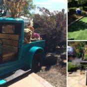
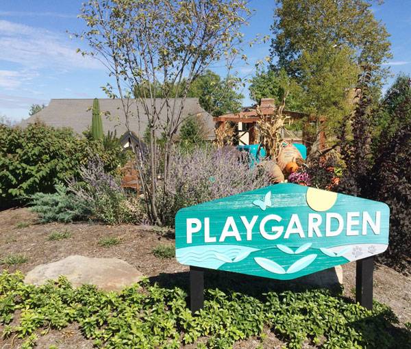
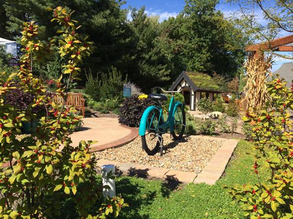
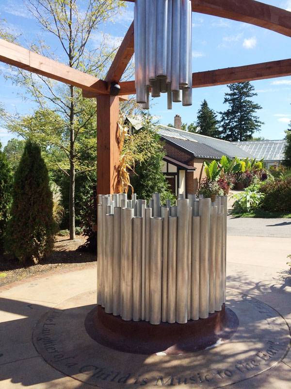
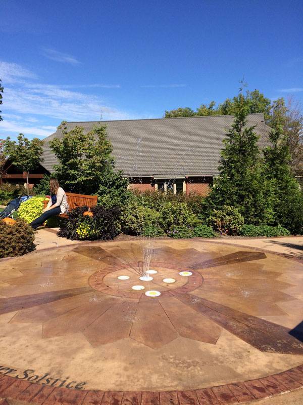
Article by Erin Tharp The Playgarden, by The Pattie Group of Novelty, in Stan Hywet Hall & Gardens, Ohio Traditionally, children’s playgrounds are found in schoolyards, at churches, or in public parks. But how about putting a playground in a more unconventional place, such as outside a National Historic Landmark? That’s exactly what The Robert O. and Annamae Orr Family Foundation did at Stan Hywet Hall & Gardens in Akron, Ohio. Opened in 2014, the Playgarden is a 5,000-square-foot playground located just north of the Corbin Conservatory on the estate’s grounds. Designed by The Pattie Group, a full-service landscaping company out of Novelty, Ohio, it features multiple areas meant to stimulate the imaginations of children of all ages and to introduce them to the history of Stan Hywet.
Playgarden. Photo credit: Ann Norman
The Playgarden, by The Pattie Group of Novelty
“The Stan Hywet project has given us another unique opportunity to design a garden specifically for children’s delight and family interaction,” said Jonas Pattie, executive vice president of The Pattie Group. “The Stan Hywet leadership team’s commitment to making this project truly special and reflective of the rich and storied history is inspiring. We are honored to collaborate with Stan Hywet to create a new garden experience for families to enjoy for generations to come.”
Playgarden. Photo credit: Ann Norman
Playgarden. Photo credit: Ann Norman
Playgarden. Photo credit: Ann Norman
- The 10 Best Playgrounds of the World
- Want to Become a Playground Design Master? Go Natural!
- Is This What Every Major Park in The World Needs?
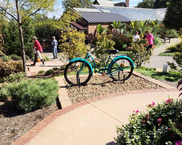
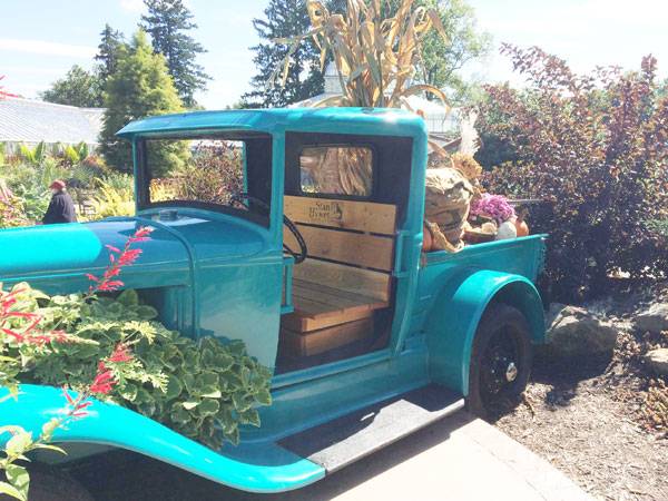
A 1929 Model A Ford Truck The Motion Garden features a restored 1929 Model A Ford truck, which is home to seasonal plantings. The truck is a nod to Seiberling’s influence on the automotive industry and invites kids to go for a “drive.”
Playgarden. Photo credit: Ann Norman
Playgarden. Photo credit: Ann Norman
Playgarden. Photo credit: Ann Norman
Playgarden. Photo credit: Ann Norman
Playgarden. Photo credit: Ann Norman
Playgarden. Photo credit: Ann Norman
Full project credits for the Playgarden:
Project Name: Playgarden Location: Stan Hywet Hall & Gardens, 714 North Portage Path, Akron, Ohio Designers: The Pattie Group of Novelty, Ohio Size: 5,000 square feet Client: The Robert O. and Annamae Orr Family Foundation and Stan Hywet Hall and Gardens Recommended Reading:
- Becoming an Urban Planner: A Guide to Careers in Planning and Urban Design by Michael Bayer
- Sustainable Urbanism: Urban Design With Nature by Douglas Farrs
Article by Erin Tharp Return to Homepage

Changing the World, One Street at a Time With EcoDistricts
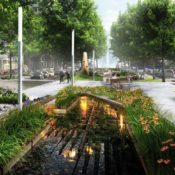
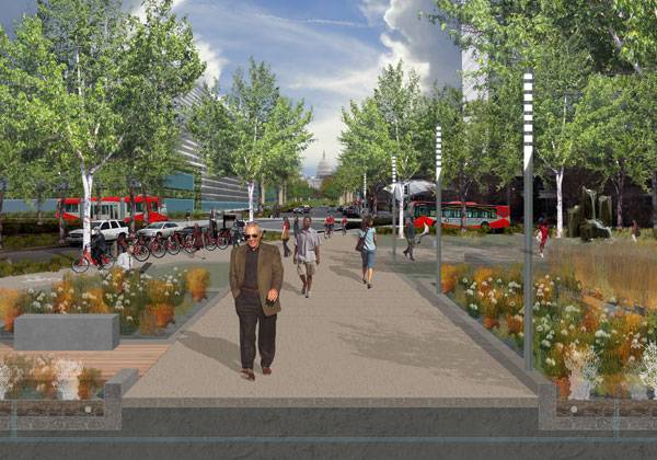
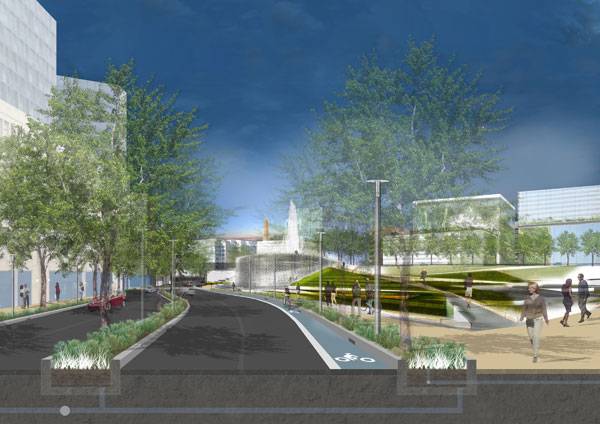
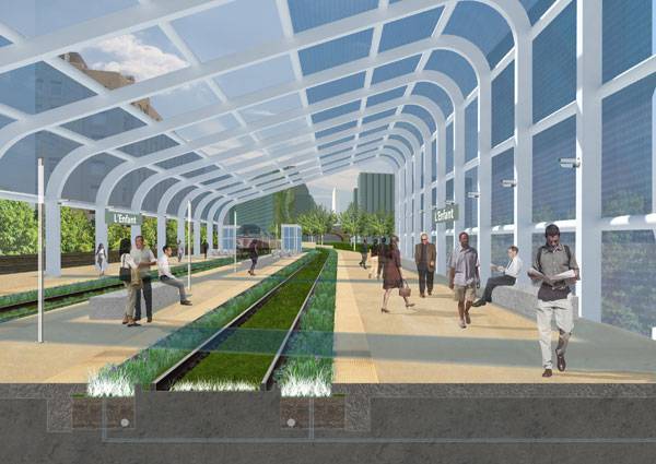
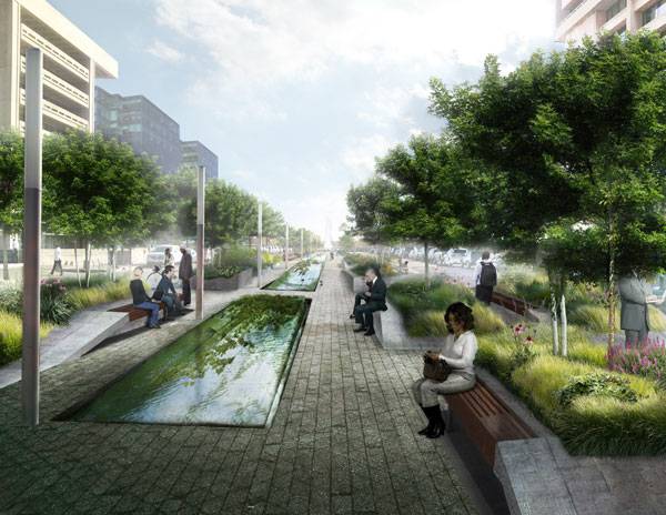
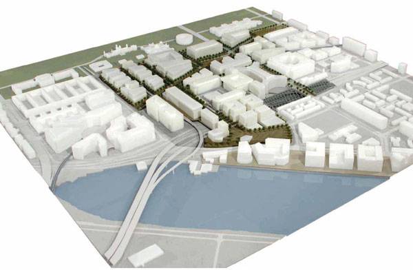
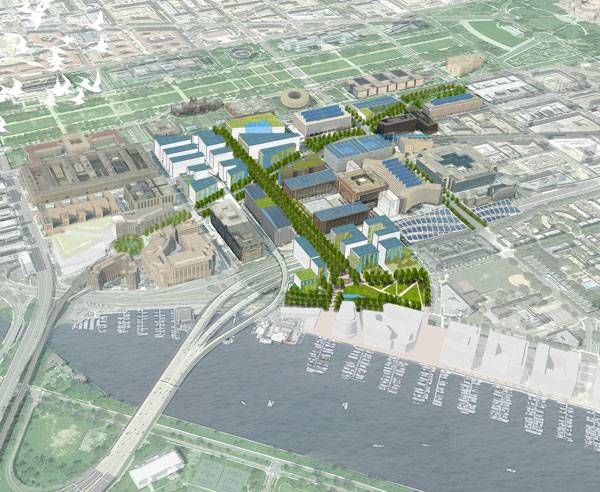
Article by Erin Tharp. Ecodistricts by ZGF ARCHITECTS LLP, in Southwest Washington, DC, United States of America. It could easily be argued that the word “sustainability” was the most talked about buzzword in the design world in 2015, and with good reason. Across the world there is an ongoing movement to create communities that are more eco-friendly, pedestrian friendly, and less reliant on non-renewable resources; or sustainable. But there may be a new buzzword on the horizon for 2016 and ZGF Architects can take credit for creating it. That word would be Ecodistrict.
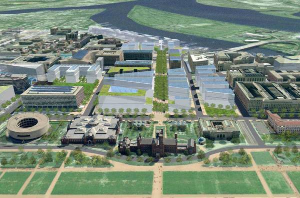
An Ecodistrict. Image credit: Courtesy of NCPC, Image by ZGF Architects
Ecodistricts
According to ZGF, an Ecodistrict “is a place that relies on a strong design idea supported with enduring community stewardship at multiple scales. It requires the concerted action of government and grassroots efforts to encompass the full potential of community shared interests, resources, and resolve. Opportunities are found where action can be taken and supported across the community through collective pursuit of individual self-interest.” But what does that mean? Basically, at the heart of an Ecodistrict is the idea that a community can make improvements that save resources and by working together, the cost is far less. Also, by planning for the system as a whole instead of just a small piece of it, placemaking is much improved.
An Ecodistrict. Image credit: Courtesy of NCPC, Image by ZGF Architects
An Ecodistrict. Image credit: Courtesy of NCPC, Image by ZGF Architects
An Ecodistrict. Image credit: Courtesy of NCPC, Image by ZGF Architects
An Ecodistrict. Image credit: Courtesy of NCPC, Image by ZGF Architects
An Ecodistrict. Image credit: Courtesy of NCPC, Image by ZGF Architects
An Ecodistrict. Image credit: Courtesy of NCPC, Image by ZGF Architects
An Ecodistrict. Image credit: Courtesy of NCPC, Image by ZGF Architects
An Ecodistrict. Image credit: Courtesy of NCPC, Image by ZGF Architects
Learn more about ZGF ARCHITECTS LLP and Ecodistricts:
Website: www.zgf.com Facebook: www.facebook.com/ZGFarchitects Recommended Reading:
- Becoming an Urban Planner: A Guide to Careers in Planning and Urban Design by Michael Bayer
- Sustainable Urbanism: Urban Design With Nature by Douglas Farrs
Article by Erin Tharp. Return to Homepage

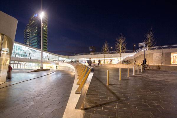
Train Stations Are Transforming Cities, Just Look at Arnhem Central Station
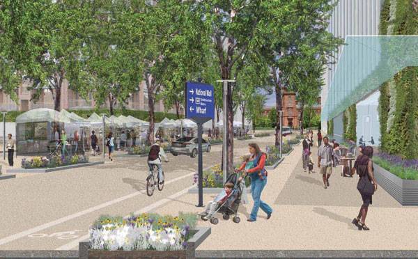
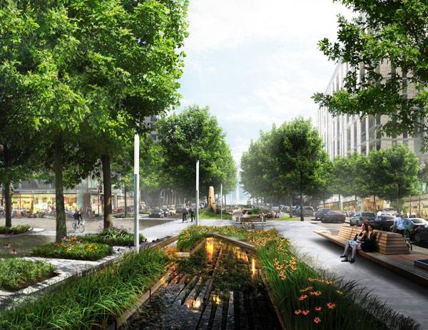
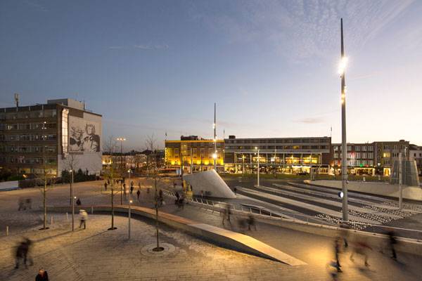
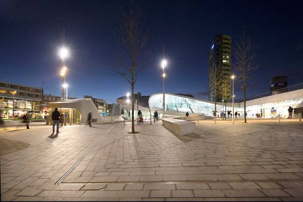
Article by Erin Tharp Arnhem Central Station, by Bureau B+B urbanism and landscape architecture, in Arnhem, the Netherlands. Since the first steam engine carried passengers through England in the early 1800s, rail travel has been a prominent form of transportation in Europe, for both locals and tourists. While the trains have always been successful, the stations they come into have often just been places to pass through. Many countries are starting to realize this, and are seeking ways to improve them. As a way to improve transportation for both locals and visitors, the Netherlands has set about developing new public transportation stations all around the country, and the new station at Arnhem is among them.
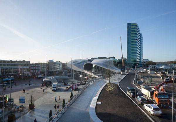
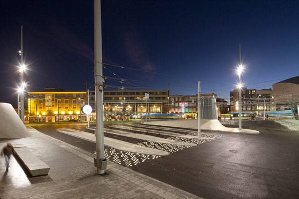
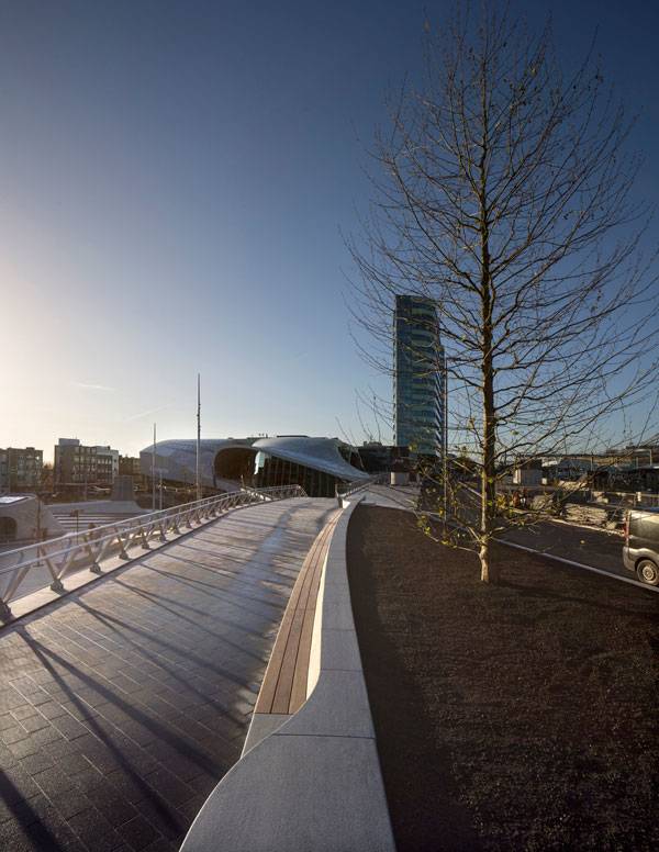
Overall picture of the station area. Photo credit: Frank Hanswijk Lowres
Arnhem Central Station
Architecture firm UNStudio drew the master plan for the Arnhem Central Station area, including the area for the public transportation terminal, platforms, new office towers, and other areas to attract visitors. The bulk of the work for these areas was completed in 2015. The final piece — the eastern section — will be completed in 2016.
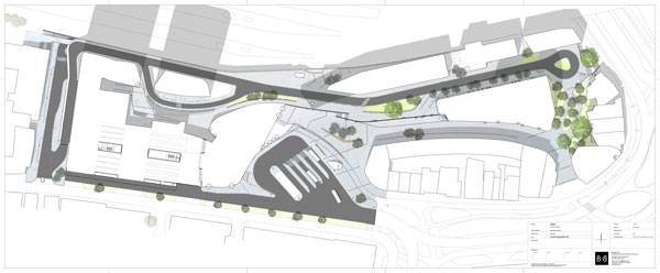
Arnhem Central Station masterplan. Copyright: Bureau B+B urbanism and landscape architecture
Trolleybus square. Photo credit: Frank Hanswijk Lowres
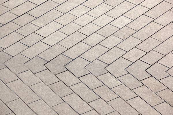
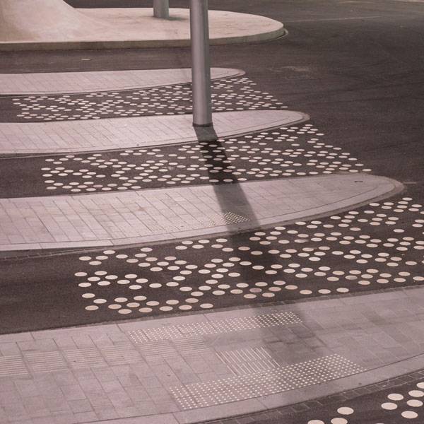
Detail natural stone paving. Photo credit: Frank Hanswijk Lowres
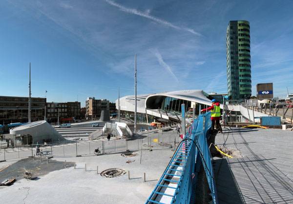
Arnhem Central Station under construction. Copyright: Bureau B+B urbanism and landscape architecture
Detail trolleybus square. Photo credit: Ben Ter Mull Lowres
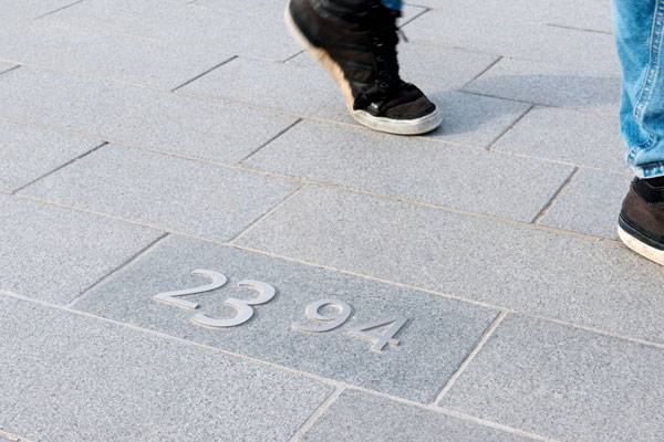
Detail stainless steel number. Photo credit: Ben Ter Mull Lowres
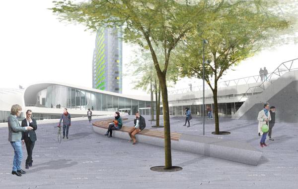
Bench City balcony. Photo credit: Frank Hanswijk Lowres
Arnhem Central Station. Copyright: Bureau B+B urbanism and landscape architecture
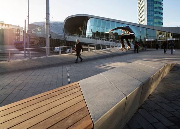
Natural stone bench at the station square in Arnhem Central. Photo credit: Frank Hanswijk Lowres
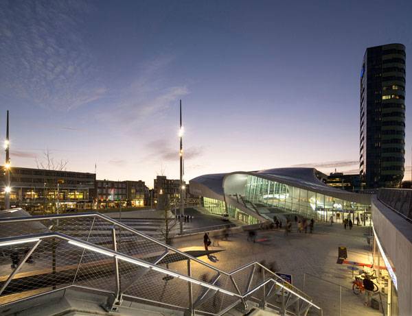
View from city balcony. Photo credit: Frank Hanswijk Lowres
View from city balcony. Photo credit: Frank Hanswijk Lowres
Bench entrance public transport terminal. Photo credit: Frank Hanswijk Lowres
Bench entrance public transport terminal. Photo credit: Frank Hanswijk Lowres
Full Project Credits For Rike Park
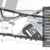
Project: Arnhem Central Station Location: Arnhem, the Netherlands Client: The Netherlands Size: 45,000 square meters Architects: UNStudio Landscape Architects: Bureau B+B urbanism and landscape architecture Lighting Design: Atelier Lek Construction: 2015-2016 Get Social with Bureau B+B urbanism and landscape architecture: Website: www.bplusb.nl Facebook: www.facebook.com/BureauBplusB Recommended Reading:
- Becoming an Urban Planner: A Guide to Careers in Planning and Urban Design by Michael Bayer
- Sustainable Urbanism: Urban Design With Nature by Douglas Farrs
Article by Erin Tharp Return to Homepage

Top 10 Landscape Architecture Projects 2015
Article by Erin Tharp We searched the world for our “Top 10 Landscape Architecture Projects 2015”. This past year has been marked by some extremely innovative and forward thinking projects in landscape architecture. When selecting the top ten for 2015 we looked for projects that were not only sustainable but also projects that gave something back to the communities where they were built and are being used and loved by the people. All of the projects were completed in some form during the past year.

Where did this project feature in our top 10? Riverside Lünen. Photo credit: Claudia Dreyße, Dortmund
Landscape Architecture Projects of 2015
10. Crescent Park – New Orleans, LA by Hargreaves Associates, completed July 2015
Due to regulations and ownership, the city of New Orleans found itself with a 1.4-mile long piece of riverfront land and nothing to do with it. Hargreaves led the design team that included executive architect Eskew+Dumez+Ripple, and architects David Adjaye Associates and Michael Maltzan Architecture, to transform 20 acres of former port lands into a connective riverfront. The new park focuses on pedestrian connections between Bywater and Marginy neighborhoods with the Mississippi River, and helps to bring French Quarter tourists into the Crescent City. Website: www.hargreaves.com WATCH: Crescent Park
9. Mariahilfer Strasse – Vienna, Austria by Bureau B+B, completed 2015
As the longest stretch of shared space in Europe, the Mariahilfer Strasse redesign includes 1.6 kilometers and stretches from the Westbanhof to the Museum Quarter in a bustling section of downtown Vienna. Designers closed off sections to vehicles to make the space more pedestrian friendly and divided the site into three zones.
Mariahilfer Strasse. Photo credit: Ricky Rijkenberg
Mariahilfer Strasse. Photo credit: Ricky Rijkenberg
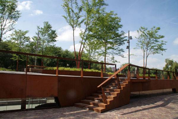
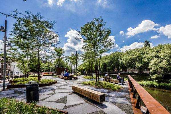
8. Riverside Lünen – Lünen, Germany by WBP Landschaftsarchitekten, completed February 2015
Due to a five-meter height difference between the park and the river designers were met with quite a challenge when asked to create a usable park along the Lippe River.

Riverside Lünen. Photo credit: Claudia Dreyße, Dortmund

Riverside Lünen
7. The Goods Line – Sydney, Australia by ASPECT, completed 2015
This unique elevated park was initiated by the NSW Government and delivered by the Sydney Harbour Foreshore Authority. What used to be an unused rail corridor running from Railroad Square to Darling Harbour is now a bustling park in the heart of one of Sydney’s most densely populated areas. “ “Once a conduit for trade, the former rail line is reinterpreted to carry the precious cargo of a thriving neighborhood – culture, creativity and community,” according to the parks website.
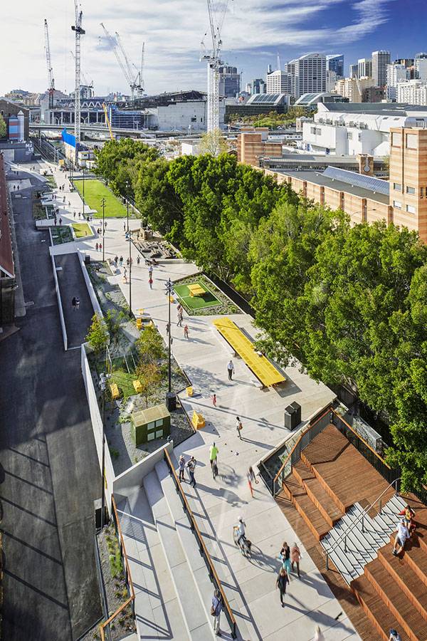
The Goods Line. Photo credit: Florian Groehn
6. Aalborg Waterfront II – Aalborg, Denmark by CF Møller, completed 2015
Based on the principles from the first stage of the project, the promenade once again becomes the unifying element. Designers also drew inspiration from the way the dunes meet the flat foreshore. At center stage is a coherent town plinth, with a raised base meant to unify the area’s distinctive freestanding buildings.
Aalborg Waterfront phase II. Photo credit: Joergen True
Aalborg Waterfront phase II. Photo credit: Joergen True
Aalborg Waterfront phase II. Photo credit: Joergen True
5. Dong Da Lakescape – Qui Nhon, Vietnam, by MIA Design Studio, completed August 2015
Just a decade ago, this land was used by fisherman to store their boats during storms, which led to the development of temporary slums nearby. The overall environment, especially the lake due to the direct inflow of sewage, was degrading rapidly and the people of Qui Nhon knew they had to repair the damage. The first step was to install a new sewer system and then work on repairing the land. Designers extended the edge of the land out into the lake to create a buffer zone and included pedestrian friendly site furnishings that attract locals and tourists alike to the new natural setting. See Previous Versions of Top 10 Landscape Architecture Projects of the Year:

Dong Da Lakescape. Image courtesy of MIA Design Studio
Dong Da Lakescape. Image courtesy of MIA Design Studio
4. Barangaroo Headland Park – Sydney, Australia by PWP Landscape Architecture, completed March 2015
This is a park meant to unite cultural references and natural processes. This historic headland on an abandoned dock in Sydney Harbor had been forgotten for too long. Now, the “Club Cape” is made new again by the incorporation of an underground cultural center, public garage, a shoreline walk with pedestrian and bicycle paths separated by a sandstone wall that flows the 1836 shore edge. Designers included native plantings and a replicated bush landscape. Website: www.pwpla.com WATCH: Barangaroo Headland Park animation
3. Soil and Water – King’s Cross, London by Ooze Architects and Slovenian artist Marjetica Potrč, completed 2015
Sometimes it’s more about the intent of the project than the look of it. This installation’s intent is why it made the list. The installation is meant to make us think about the relationship between nature and the changing urban environment, designers claim that while buildings are viewed as permanent, the undeveloped spaces around them are in constant flux. So, what is it? It’s a natural bathing pond where visitors are invited to jump on in, and it’s right in the middle of the King’s Cross development site.
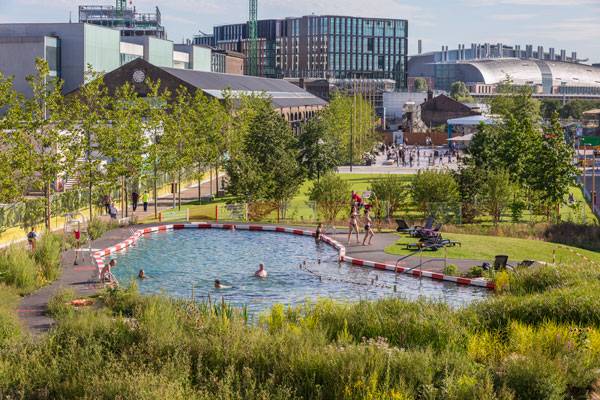
Soil and Water – King’s Cross, London by Ooze Architects. Photo credit: John Sturrock
2. Quzhou Luming Park – Quzhou, Zhejiang by Turenscape, completed July 2015
Designers used three design concepts to put together this 31.3-hectares park. Minimal intervention, productive urban farming landscape and water resilience are the driving forces behind this ecological space that is bringing in droves of visitors every day.
Quzhou Luming Park. Photos courtesy of Turenscape.
Quzhou Luming Park. Photos courtesy of Turenscape
1. Navy Yard Central Green – Philadelphia Navy Yard, Philadelphia, PA, USA. by James Corner Field Operations, Summer 2015 (June)
Towards the end of June, the Navy Yard in Philadelphia unveiled its sixth park addition to its expanding office campus. James Corner Field Operations has debuted a strong addition to Philly’s expanding simple but effective public spaces.

Philadelphia Navy Yards – Central Green. Credit: © Halkin Mason Photography

Philadelphia Navy Yards – Central Green. Credit: © Halkin Mason Photography
- Becoming an Urban Planner: A Guide to Careers in Planning and Urban Design by Michael Bayer
- Sustainable Urbanism: Urban Design With Nature by Douglas Farrs
Article by Erin Tharp Return to Homepage

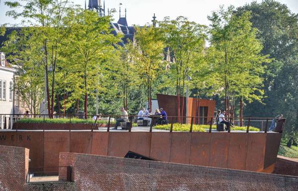
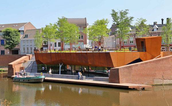
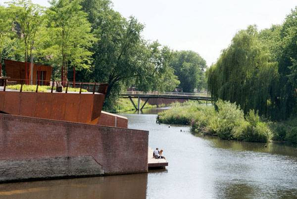
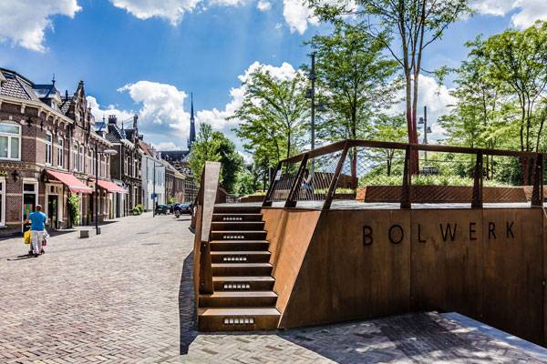
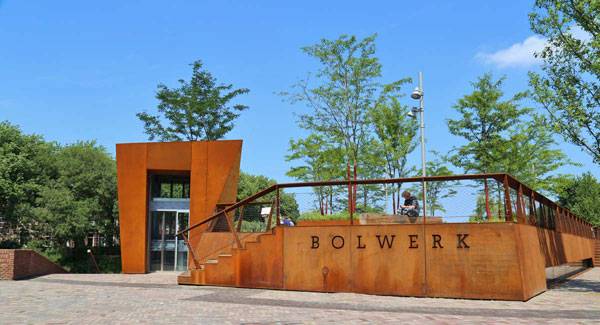
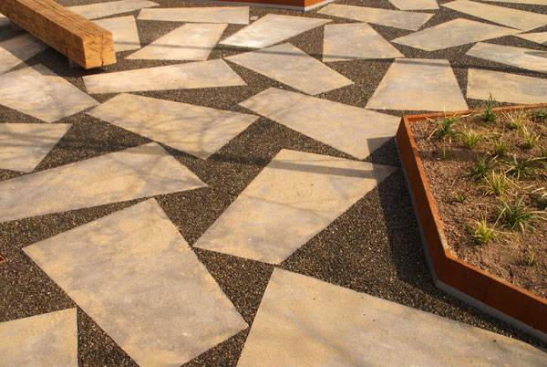
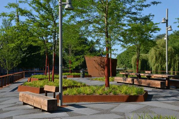
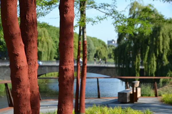
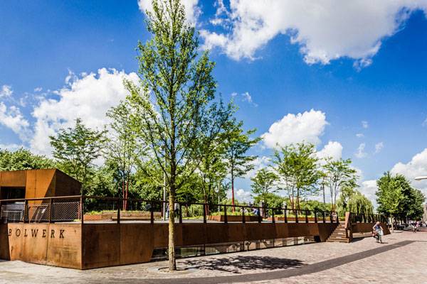
The Rooftop Park at Saint John’s Bulwark
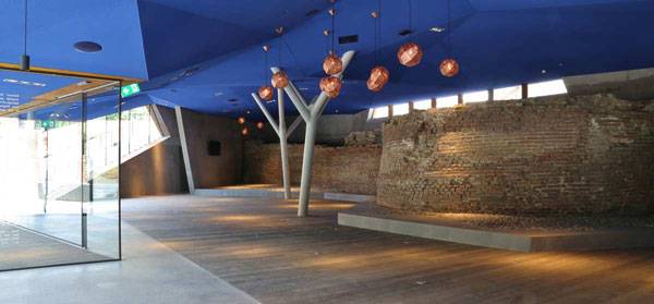
Article by Erin Tharp The Rooftop Park at Saint John’s Bulwark, by OSLO Ontwerp Stedelijke en Landschappelijke Omgeving, in `s-Hertogenbosch (Den Bosch), Netherlands. In 1999, the town council of the city of s-`Hertogenbosch began restoring the fortifications that surround the old town as a means to address flooding from the surrounding rivers. The town is home to 6.5km of walls, originally built to defend the city from invading enemy armies.

The Rooftop Park at Saint John’s Bulwark. Photo credit: Marlene van Gessel
A Brief History of the Site
By 1995 most of these walls were in disrepair and had become inaccessible to inhabitants and visitors. In addition, the city was experiencing extreme flooding from the waters of the Aa and the Dommel rivers. Saint John’s Bulwark is one of 83 projects that make up this vast restoration. Originally, this bulwark was an important fortification and a former main entrance to the city; in fact, three generations of city gates were located here. Because of this, the planners decided to make the most of the area and to create an underground building to house an informational museum and sell city tour tickets. The museum also features a terraced cafe designed by Van Roosmalen and Gessel Architects, who made use of the remaining foundation in their design and added a Cor-ten steel skin as well as thin, crooked steel columns to support the massive roof that would house the new rooftop park.
The Rooftop Park at Saint John’s Bulwark. Photo credit: Marlene van Gessel. Photo credit: Maud van Roosmalen
The Rooftop Park at Saint John’s Bulwark
This is where OSLO Ontwerp Stedelijke en Landschappelijke Omgeving stepped in. Lead architect, Martien van Osch, began working on the design for the new rooftop pocket park and envisioned that once it was completed it would become a destination for visitors to the historic city. To start, there were a few challenges to overcome, for example the space between the building roof and the ground level varies from 17 centimeters on the city side to 59 cm on the water side, and designers needed to figure out how to obtain 60 centimeters of planting depth so they could include medium sized trees in their design.
The Rooftop Park at Saint John’s Bulwark. Photo credit: Tekton Bouw Management
Stunning Views of the River
Due to the location of the bulwark on the outer bend of the Stadsdommel, there is a stunning panoramic view of the entire river Dommel from the park, but this location also means the park is situated in full sun for most of the afternoon and early evening.
The Rooftop Park at Saint John’s Bulwark. Photo credit: Martien van Osch
The Rooftop Park at Saint John’s Bulwark. Photo credit: Niels van Empel
The Rooftop Park at Saint John’s Bulwark. Photo credit: Tekton Bouw Management
The Building Design
Finally, the building beneath the park is comprised of hard lines and sharp angles, which could have complicated the design of a park. However, van Osch chose to incorporate some of these angles into his own design through the use of specialty concrete paving tiles made by Schellevis and designed with these angles in mind.
The Rooftop Park at Saint John’s Bulwark. Photo credit:Tekton Bouw Management
The Rooftop Park at Saint John’s Bulwark.
The Rooftop Park at Saint John’s Bulwark. Photo credit: Martien van Osch
The Rooftop Park at Saint John’s Bulwark. Photo credit : Rosanne Schrijver
The Rooftop Park at Saint John’s Bulwark. Photo credit : Rosanne Schrijver
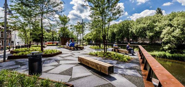
The Centerpiece of The Park
The centerpiece of the park is a communal table that is six meters long and made from a combination of Cor-ten steel and rugged Douglas fir beams. It is situated among the planting beds and was placed in a way to create small, intimate spaces in the park where more benches, created by Grijsen street furniture, are located.
The Rooftop Park at Saint John’s Bulwark. Photo credit : Niels van Empel
The Rooftop Park at Saint John’s Bulwark. Photo credit: Martien van Osch
The Rooftop Park at Saint John’s Bulwark. Photo credit : Niels van Empel
Full Project Credits For The Rooftop Park at Saint John’s Bulwark
Project Name: The Rooftop Park at Saint John’s Bulwark Client: Municipality of `s-Hertogenbosch (Den Bosch) Location: `s-Hertogenbosch (Den Bosch), Netherlands Design of Rooftop Park, Street and Scaffolding: OSLO Ontwerp Stedelijke en Landschappelijke Omgeving, Berlicum Lead Landscape Architect: Martien van Osch Design building, restoration work and exterior space downstairs: Van Roosmalen van Gessel Architects Size: bulwark and surrounding: 2500 square meters Rooftop Park Area: 700 square meters Design Rooftop Park: 2012-2015 Completion: 2015 Budget: € 160.000, Construction of Rooftop Park: Van Helvoirt Groenprojecten Photography: Tekton Construction Management, Niels van Empel, Marlène van Gessel, Martien van Osch, Maud van Roosmalen, Rosanna Schrijver. Drawing: OSLO Urban Design and Landscape Environment Get Interactive with OSLO Urban Design and Landscape Environment: Website: www.bureauoslo.nl Recommended Reading:
- Becoming an Urban Planner: A Guide to Careers in Planning and Urban Design by Michael Bayer
- Sustainable Urbanism: Urban Design With Nature by Douglas Farrs
Article by Erin Tharp Return to Homepage

Beautiful Landscape Reflects a Dark Past and Promises a Bright Future
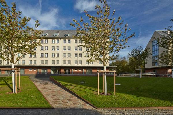
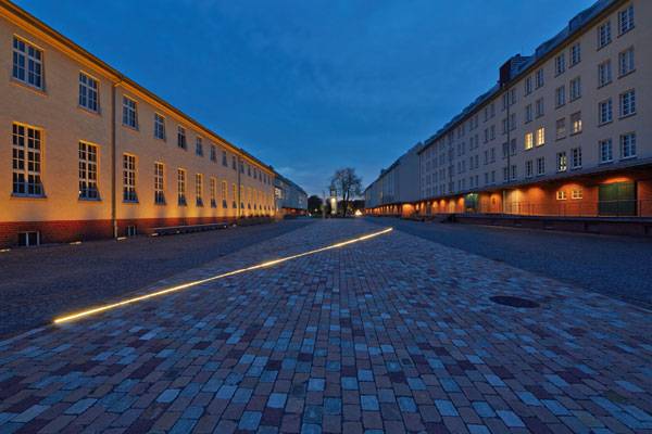
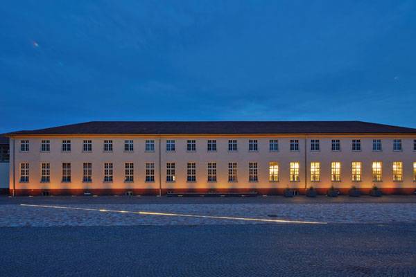
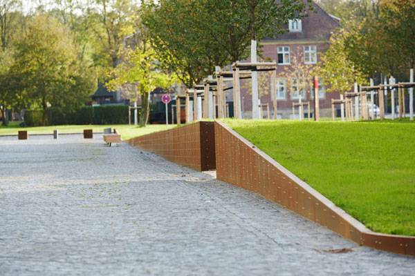
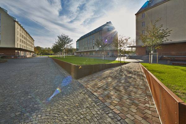
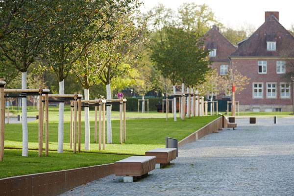
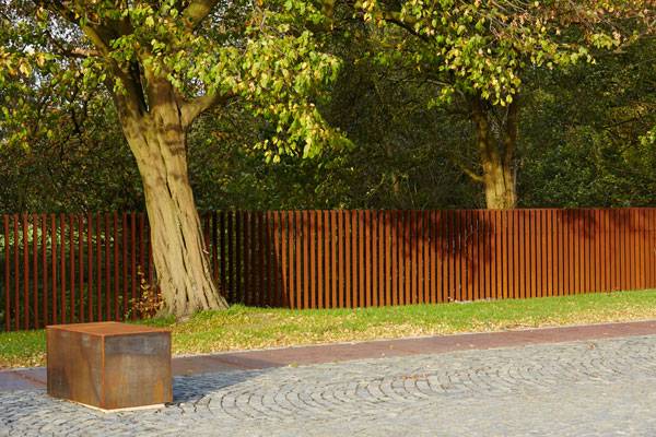
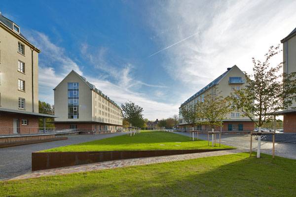
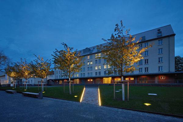
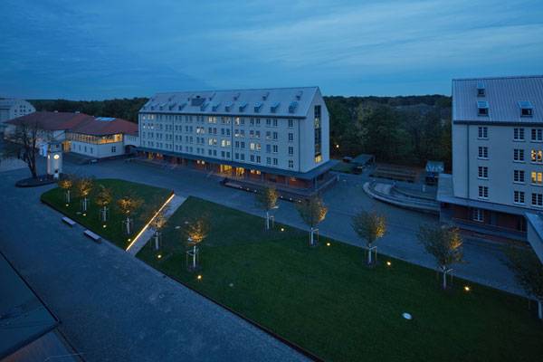
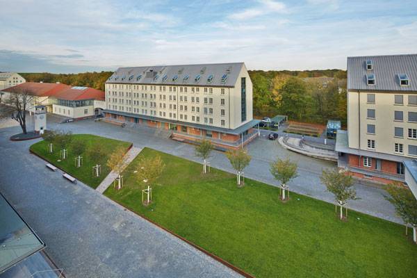
Article by Erin Tharp Storehouse City Münster, by scape Landschaftsarchitekten GmbH, in Münster, Germany Historical sites are often the hardest to work with, due to the cultural or societal significance they hold. So when scape Landschaftsarchitekten was asked to redesign the 3.9-hectare area outside of the Storehouse City in Münster, a former German army pension office, they knew they had a delicate task at hand. The renovation they came up with is both thoughtful and reminiscent of what the site once looked like, but is not an exact replica. They wished to bring the site into the modern era to make it a more viable space for both the people who now work there and for the public that visits.
Storehouse City Münster. Photo credit: Gereon Holtschneider
Storehouse City Münster
Located to the north of Münster, the site is considered a conservation area due to the significant role it played for the German military during World War II (1939-1945) as the central location for food storage and distribution for all of Northwestern Germany. At its peak, the building housed a central bakery that produced up to 30,000 loaves of bread every day. After the war, it housed the British occupying army. Today, the storehouses are home to office buildings and are often used for special events.
Storehouse City Münster. Photo credit: Gereon Holtschneider
Reflecting the Architectural Style
These buildings are massive remnants of the architectural style of the Nazis in the 1930s, with simple and what some might describe as plain facades. To emphasize this architectural style, scape Landschaftsarchitekten knew that the surrounding landscape must also be simple and not be in contradiction with the historical buildings.
Storehouse City Münster. Photo credit: Gereon Holtschneider
Storehouse City Münster. Photo credit: Gereon Holtschneider
Storehouse City Münster. Photo credit: Gereon Holtschneider
Storehouse City Münster. Photo credit: Gereon Holtschneider
Storehouse City Münster. Photo credit: Gereon Holtschneider
Storehouse City Münster. Photo credit: Gereon Holtschneider
Storehouse City Münster. Photo credit: Gereon Holtschneider
Storehouse City Münster. Photo credit: Gereon Holtschneider
The Importance of Keeping the Views Clear
Views into the space have been kept clear to allow visitors to view the Storehouse City as they approach, which adds to the openness and reflective nature of the site. Once inside, the landscape is very calm and uncluttered, meant to invite visitors to reflect on the past of the German army and on the effect the Nazis had on this area.
Storehouse City Münster. Photo credit: Gereon Holtschneider
Storehouse City Münster. Photo credit: Gereon Holtschneider

Storehouse City Münster. Photo credit: Gereon Holtschneider
Full Project Credits For Storehouse City Münster
Project Name: Storehouse City Münster Landscape Architects: scape Landschaftsarchitekten GmbH (Matthia Funk, Hiltrud M. Lintel, Prof. Rainer Sachse) Project Leader: Hiltrud M. Lintel Co-workers: Judith Heimann, Sven Herrmann, Ariane Wendt, Bernd Nengel, Yingying Zhu Client: Westfälisch-Lippische Vermögensverwaltungsgesellschaft mbH Location: An den Speichern 3, 48157 Münster – Germany Architects: Schoeps & Schlüter Architekten GmbH, Münster 48147 Area: 3.9 hectares Construction Budget: 1.83 Million EUR Dates of Construction: 2012-September 2013 Photography: Gereon Holtschneider, Matthias Funk – scape Landschaftsarchitekten Get Social With scape Landschaftsarchitekten: Website: www.scape-net.de Google +: www.plus.google.com/+Scape-netDe Facebook: www.facebook.com/scapeLandschaftsarchitekten LinkedIN: www.linkedin.com/company/scape-landschaftsarchitekten-gmbh Recommended Reading:
- Becoming an Urban Planner: A Guide to Careers in Planning and Urban Design by Michael Bayer
- Sustainable Urbanism: Urban Design With Nature by Douglas Farrs
Article by Erin Tharp Return to Homepage

The Goods Line Carries the Precious Cargo of a Thriving Neighborhood
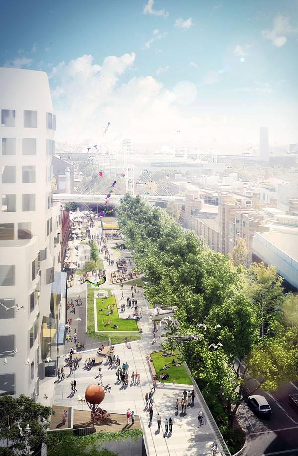
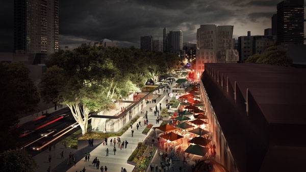
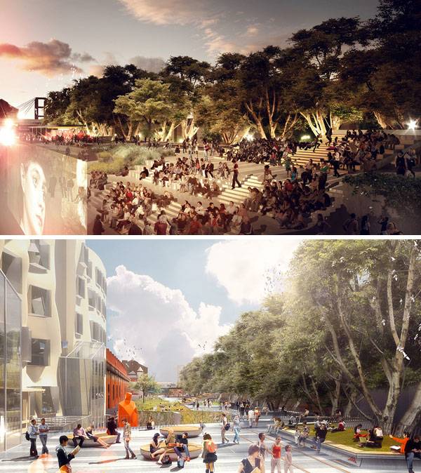
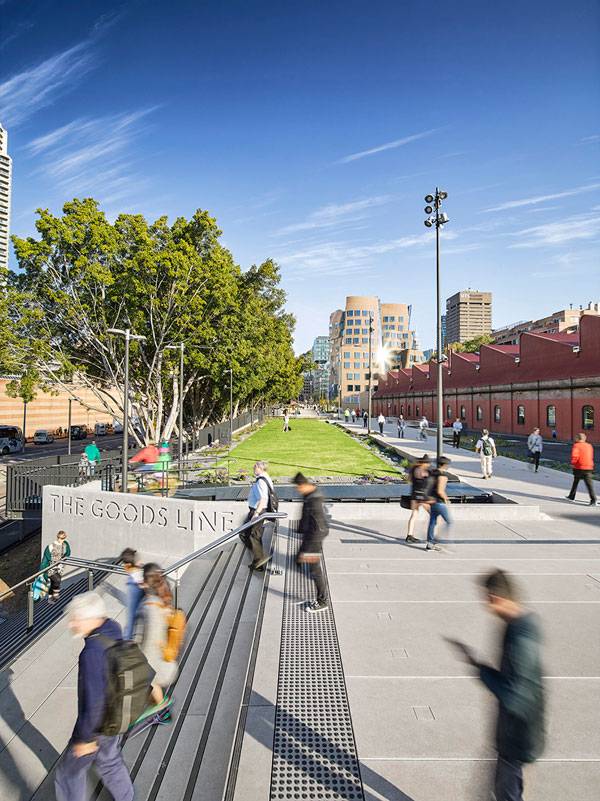
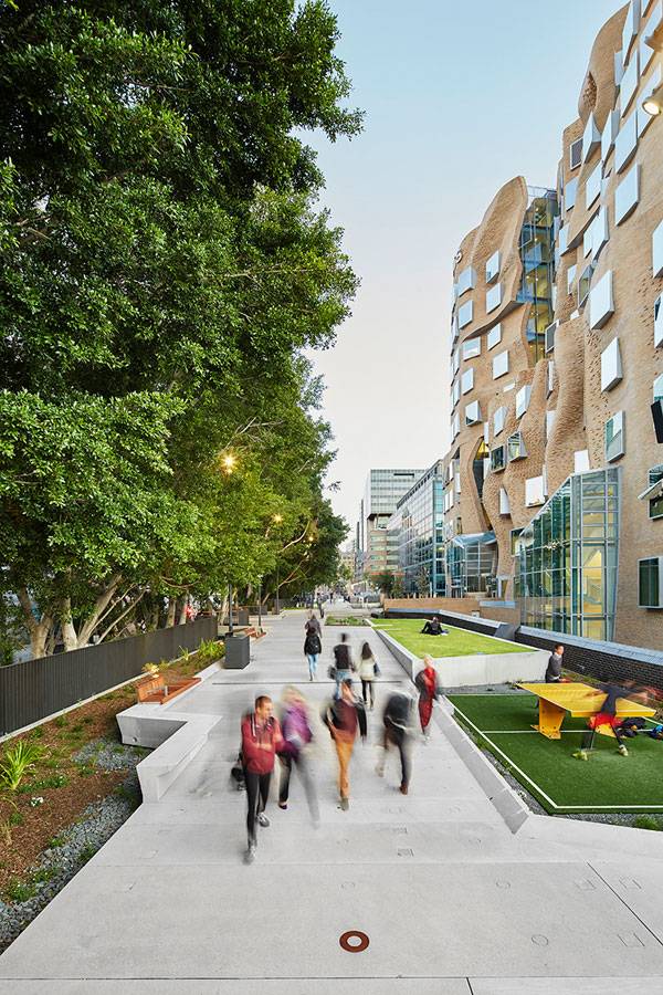
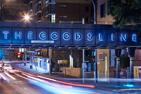
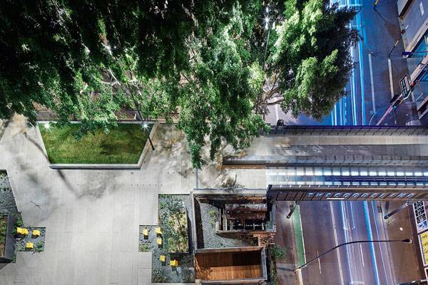
The Goods Line, by ASPECT Studios, in Ultimo, Sydney, NSW, Australia. Since 2009, when the iconic High Line in New York City opened its rails to the public, there has been a trend in landscape architecture that focuses on rail line design. Projects centered on former tracks have sprung up in Germany, the Netherlands, and San Francisco. Now the latest; the Goods Line, in Ultimo, Sydney, New South Wales, Australia, is making headlines for how it is changing the community it runs through. The Goods Line, a New South Wales Government initiative delivered by Sydney Harbour Foreshore Authority, is quickly becoming an important green space for this developing part of the city and has provided a vital connection for more than 80,000 tertiary students, locals, and visitors between the Devonshire Tunnel under Central Station to Chinatown and Darling Harbour. While the whole length of the site is 500 metres, the recent upgrade is the northern precinct, which is at 275 metres.
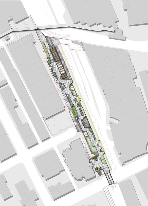
The masterplan of The Goods Line. Image courtesy of ASPECT Studios
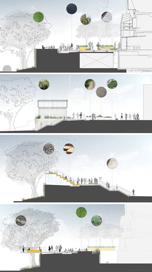
Sections through The Goods Line. Images courtesy of ASPECT Studios
The Goods Line
To create a space that could merge the lines between a former industrial site and a new social space, the design team focused on incorporating materials that are associated with the rail infrastructure of the site’s past. By using gravel, concrete, steel, and timber they were able to maintain the history of the place while bringing it into the public realm of the modern city. They utilized both digital modeling and prefab construction to bring their design to life and to create a space that encourages gathering, playing and social interactions.
The Goods Line. Image courtesy of ASPECT Studios
The Goods Line. Image courtesy of ASPECT Studios
A Truly Unique Place to Visit
No detail was left unturned as each site element was designed from the ground up. Every pre-cast concrete panel, lighting element, and stool was specifically designed with this site in mind, which makes the Goods Line a truly unique space to visit.
The Goods Line. Images courtesy of ASPECT Studios
Building on a Piece of History
Originally known as the Ultimo Road underbridge, it was constructed in 1879 and is the oldest triple-girder iron bridge in Australia. As an elevated park built on an old bridge, there were certain constraints that needed to be addressed to make the site work. First, there was the issue of lead paint on the 136-year-old bridge. To address this, crews literally wrapped the entire structure in white plastic wrap designed to contain lead particles as they sandblasted off the lead paint.
The Goods Line. Photo credit: Florian Groehn
Catering For Multiple Activities
Next, there was the issue of it being a bridge four meters above street level. To address the issue of it being an elevated site, designers created a series of platforms that are used for a variety of activities. Public entertainment, recreation, festivals, and study are just a few of the activities that these platforms allow for and they help to make for a more intimate experience.
The Goods Line. Photo credit: Florian Groehn
The Goods Line. Photo credit: Florian Groehn
Softening the Landscape With Plants
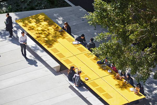
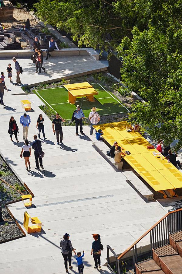
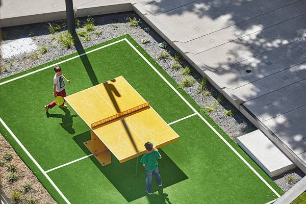
The designers also knew that with all of the hardscapes that the site might appear stark and unwelcoming, so they incorporated rows of trees, small shrubs, and grasses to help soften the space and bring life to the new park. They also included site furnishings like table tennis, a children’s water playground, cafes, Wi-Fi enabled spaces, and a 20-seat communal table to further encourage fun and relaxation.
A Project With a Deeper Meaning
But beauty was not necessarily the main goal for the design team. “This project is going to do a lot more than just beautify the area, it is going to create a communal hub and a destination,” says Sacha Coles, lead landscape architect for ASPECT Studios.
Enhancing The Public Life of Sydney
In fact, before the design became a reality, the NSW Government had a vision for a more connected Sydney and for a place that would help transform and enhance the public life of Sydney. “What was once a conduit for trade has been reinterpreted to carry the precious cargo of a thriving neighborhood: culture, creativity and community,” says Coles.
The Goods Line. Photo credit: Florian Groehn
The Goods Line. Photo credit: Florian Groehn
From One Succesful Project to Another
This project is an excellent example of how finding inspiration in another successful project can lead to even more success. In this case both designers and government officials looked to the High Line for inspiration, not only for aspects of the design, but for the actual project as a whole and what it brought to the surrounding community. In addition to the increased tourism, they used the example of the increase in property values that surround the High Line as a means to bring support from business owners and locals to the Goods Line project.
The Goods Line. Photo credit: Florian Groehn
The Goods Line. Photo credit: Florian Groehn
The Goods Line. Photo credit: Florian Groehn
Full Project Credits For The Goods Line
Project Title: The Goods Line Location: Ultimo, Sydney, 2007, NSW, Australia Client: Sydney Harbour Foreshore Authority Project Design Lead: ASPECT Studios Design Partner: CHROFI Team: ASPECT Studios – Project Design Lead (Landscape Architect) CHROFI – Design Partner (Architect) Sydney Harbour Foreshore Authority (Client) ACOR (Civil, Structural, Hydraulic, and Electrical Engineers) Deuce Design (Interpretive Design) GML (Heritage Consultant) JBA (Planning Consultant) Lighting Art + Science (Lighting Designers) AR-MA (Research and Design for precast concrete) Gartner Rose (Contractor) Photography: Florian Groehn, Simon Whitbread Year: 2015 Length: 273 metres (North section) Area size: 6,995m² (North section) Awards: 2014 Australia Award for Urban Design; Policies, Programs and Concepts – Small Scale Website: www.aspect.net.au Recommended Reading:
- Becoming an Urban Planner: A Guide to Careers in Planning and Urban Design by Michael Bayer
- Sustainable Urbanism: Urban Design With Nature by Douglas Farrs
Article by Erin Tharp Return to Homepage