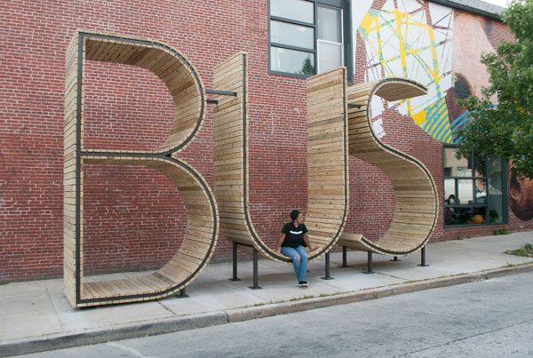
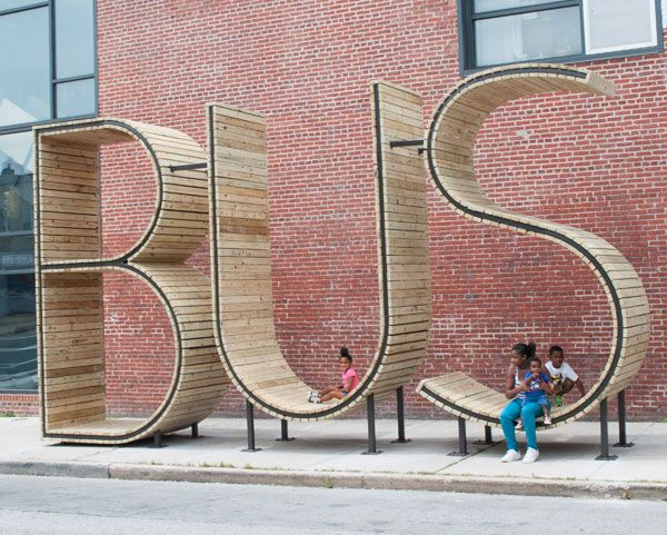
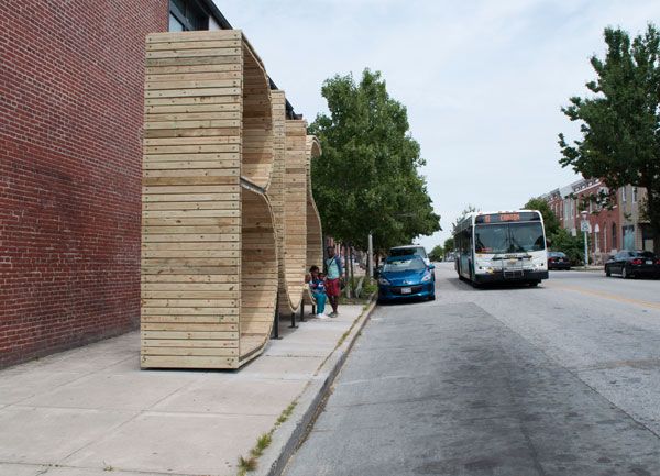
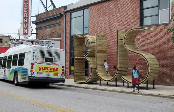
Bus Stop by mmmm… in Baltimore, S. East Avenue in Highlandtown, USA. Awhile ago, I watched an artistic installation made by the collaborative mmmm… for a bus stop in the city of Baltimore. It is undoubtedly outstanding because of its minimal and clean style, high functionality, identification, and as a positive feature in an otherwise anonymous place, but I found myself wondering, why is it beautiful? What is beauty? Is the Latin phrase “de gustibus non disputandum est” true? Is there no accounting for taste? Is beauty really only in the eye of the beholder? The question is, why do we like something? Why do we surround ourselves with nice things, live in a nice place, buy nice stuff?

Bus Stop. Photo credit: mmmm…
Bus Stop by mmmm…
But let’s start from the beginning: The city of Baltimore opened a collaboration with citizens associations and the group TRANSIT- Creative Placemaking with Europe in Baltimore in order to include European artists in the urban renewal of the city. Through this collaboration, the city was able to identify the principal needs of the community and, through a contest, examine different solutions. The winner was mmmm…’s perfect bus stop – or as the studio calls it, the obvious bus stop.

Bus Stop. Photo credit: mmmm…
The studio designed a bus stop that is very different from what we usually see, including an artistic matrix in the functionality of the object, creating a real masterpiece.
What is a bus stop useful for? It gives shelter from the weather and a place to sit and rest while waiting. It usually has a common look, often combined with advertising or signage, and is quite anonymous. Most bus stops are indistinguishable from one another, and if we don’t really know the place or read the name written upon the pole, we might not know where we are. These are the bus stations we all know.

Bus Stop. Photo credit: mmmm…
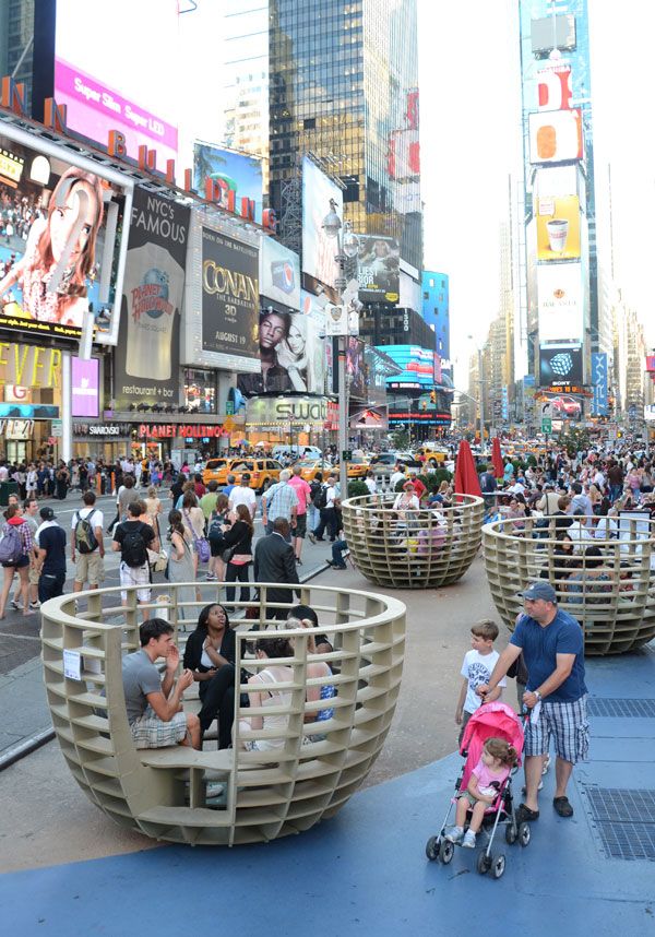
But what could happen if we give an anonymous place an artistic makeover? Something new will come about, creating a different atmosphere in a place most people pass by willy nilly. From the minds of the creators of the “Meeting Bowls” At Times Square
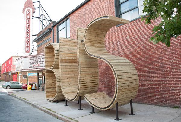
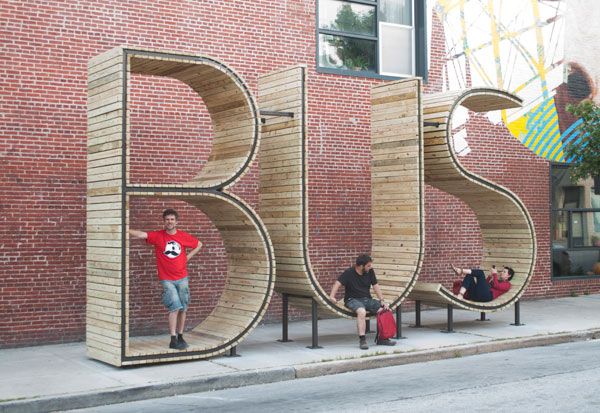
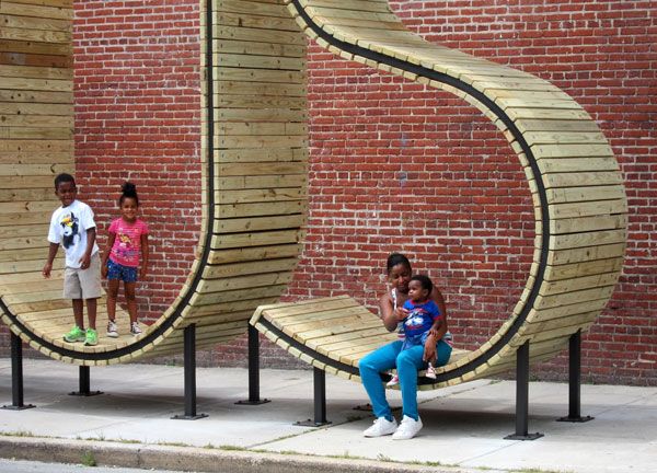
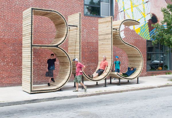
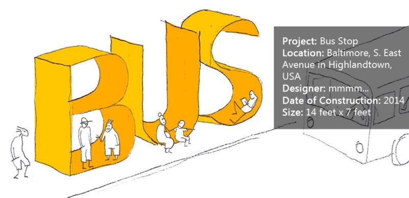
(See image below) was born an “obvious bus stop”, consisting of a sculpture of three gigantic letters rendering the word BUS, each 14 feet by 7 feet. It provides the usual shelter from the elements, but also provides preferential access to public transport for the disabled and a multifunctional bench that could be used to sit or recline. All of these features are hidden within the word BUS.

“meeting Bowls” At Times Square. Photo credit: mmmm…
What happens in a place like this is that everyone can find his own way of making the act of waiting for the bus more pleasant, and that was the aim of the artists who created this iconic meeting point, a symbol of fun, interaction, and — using their words – a way to “transform the dull experience of waiting for the bus to an entertaining, leisurely space in the middle of the hectic rhythm of the city”. Indeed, removing a plain piece of urban furniture and replacing it with a strong, positive connotation, the designers were able to influence the characteristics of an entire block.

Bus Stop. Photo credit: mmmm…

Bus Stop. Photo credit: mmmm…
The materials used for the construction are warm and engaging — not more Plexiglas and cold steel seating, but a double row of wooden joists fixed above and below to a steel structure that acts as a carrier for the entire sculpture, a surprising result both from the point of view of aesthetics and function. It is easy to see that a structure like this can be universally recognized as beautiful, and here we return to the initial question: What is beauty?
Related Articles:

Bus Stop. Photo credit: mmmm…
Let’s talk about this bus stop: It was chosen among a multitude of others, and it was the first idea drawn from the study. It was initially discarded because it was considered too trivial by the artists themselves. But it turned out to be the winner. Was the proposal instinctive? Was it the designers’ primal instinct that took them to the most immediate, the most beautiful of all, and then reasoning that brought them to study, develop, and eventually backtrack? Well, it seems that is exactly what happened. The first ideas — those conveyed by instinct — seem to be winning ones.

Bus Stop. Photo credit: mmmm…
To assist the processes of perception, there are mirror neurons in our brains (recently discovered in 1992) that are used to convey emotional states and are the key to activating the process of empathy between living beings. Indeed, they act at the primordial level, an area research has shown to be very important for those involved in the visual arts. How much might we be influenced in our daily lives if art could find more space in our cities? Maybe we could benefit from being “bombarded” by positive messages conveyed by the art. The difficulties of each individual certainly would not change, but the collective mood could be raised, with a ripple effect that could be surprising — like an obvious bus station.

Bus Stop. Photo credit: mmmm…
Full Project Credits:
Project: Bus Stop Location: Baltimore, S. East Avenue in Highlandtown, USA Designer: mmmm… Date of Construction: 2014 Size: 14 feet x 7 feet Show on Google Maps
Recommended Reading:
Article written by Valentina Ferrari
Return to Homepage
Published in Blog