Author: Helen Buckle
Filmtastic Fridays: Groningen – The World’s Cycling City
It’s no surprise that a place dubbed ‘The World’s Cycling City’ is located in the Netherlands. Dutch cities are renowned for their cycle-friendly infrastructure (as well as their bike-favourable topography). But Groningen – situated in the north of the country – boasts some exceptionally impressive cycling stats. The ancient university town is home to 190,000 people, yet there are around 300,000 bicycles and only 75,000 cars in the city. Groningen has the highest mode share of bicycle users in the world, with fifty percent of all journeys being made by bike. The city also boasts one of the world’s largest bicycle parking facilities*, with space for 10,000 bikes!
This fifteen minute documentary showcases Groningen’s widespread cycling culture and examines the planning decisions and design elements that enabled the city to become the bicycle nirvana that it is today. Featuring interviews with urban planning professionals as well as local residents, the film provides a valuable insight into how cities can promote biking as a preferred mode of transportation. The documentary acknowledges both the positive and negative aspects of a bicycle-oriented city and also explains how the town overcame initial resistance in the 1970s. It also reveals some surprising counter-effects of bike-first planning, including much quieter urban places. Imagine a city without the constant hum of traffic…
Groningen: The World’s Cycling City from STREETFILMS on Vimeo.
*Incidentally, the world’s biggest cycle parking facility is proposed in another Dutch city; Utrecht. Designed to store 12,500 bikes, it is due for completion in 2016. A fly-through of the proposed scheme can be found here.
Missed last week’s Filmtastic Friday? No worries, you can check out our full archive of films here on Land8 or follow our Filmtastic Fridays Pinterest board.
Lead image – screenshot via STREETFILMS on Vimeo
Filmtastic Fridays: The Aimless Wanderings of Hang gab Lee
Spirit of place, genius loci, atmosphere, character, ambiance, soul; whatever you want to call it, that intangible ‘thing’ that varies from place to place is often hard to articulate. In this beautiful series of short films, South Korean photographer, designer and film-maker Hang gab Lee attempts to capture the elusive notion of ‘place’ within the destinations he travels to. He does so by following one simple rule: wander aimlessly.
Beyond iconic buildings and impressive landscapes, it is within the everyday objects and seemingly mundane happenings of life that the essence of place truly lies. And this is what Lee is so exceptionally skilled in capturing.
‘Place’ is a concept that lies at the very heart of landscape architecture. Understanding where it stems from and how to design it can be incredibly challenging. But as Lee’s films demonstrate, wandering without purpose is perhaps a good place to start…
WANDER IN TURKEY from Hang gab Lee on Vimeo.
WANDER IN VIETNAM from Hang gab Lee on Vimeo.
In Lee’s next addition to his ‘Wandering’ series he hopes to uncover the beauty of the familiar as he aimlessly meanders through his home country of South Korea.You can see more of Lee’s work here.
Keep up to date with all the latest Filmtastic Fridays posts by following our Filmtastic Fridays Pinterest board. You can also check out our full archive of films here.
Lead image taken via a screenshot of Wander in Turkey
Filmtastic Fridays: The Edmonton Freezeway – A New Way to Commute!
The Canadian city of Edmonton is no stranger to the cold. For five months of the year the city is gripped by sub-zero temperatures. But rather than allowing the blisteringly cold weather to impede the life of the city, Edmontonians are always on the look out for ways to embrace their frozen cityscape. The latest addition to their wintry wonderland could be the ‘Freezeway’; a proposal designed by local landscape architecture student Matthew Gibbs.
The Freezeway is an eleven kilometre trail that would be deliberately flooded during winter months, allowing people to ice-skate or toboggan through the city as a new mode of transportation. For the most part, the envisioned route would run along two derelict rail tracks that lead towards downtown Edmonton. Occasionally, the trail would slice into parkland or cut through existing plazas, generating an exciting and unique skating experience. During the summer months, the corridor could be used as a cycle way or a walking path.
The concept was selected as the winner of the 2013 COLDSCAPES international design competition. The idea has since gained momentum and a pilot project is now being planned for next winter. Gibbs has put forward three different versions of the Freezeway – a naturally frozen path, an electrically-refrigerated one and a carved ice-block. The overall costs are not yet known but Gibbs hopes that the project can be paid for with crowd sourcing and/or corporate funding.
Gibbs also presented the proposal at Edmonton’s 2015 Winter Cities conference; an event aimed at exploring innovative ways to turn the bone-chilling winters of northern cities into an asset rather than a hindrance.
Watch the video below for more information on this exciting new proposal!
Missed last week’s Filmtastic Friday? No worries, you can check out our full archive of films here on Land8 or follow our Filmtastic Fridays Pinterest board.
Lead image courtesy of Make Something Edmonton
Filmtastic Fridays: Lost Rivers
Beneath the surface of almost every industrial city, lies a hidden landscape of buried waterways. Written and directed by Caroline Bâcle, Lost Rivers offers a fascinating insight into the secret landscapes that flow beneath our feet and the subterranean trespassers that dare to explore there. The film documents a growing movement to unearth these buried rivers, rekindling our relationship with nature and capitalising on the many benefits that flow along with the presence of water.
From the description:
“Once upon a time, in almost every industrial city, countless rivers flowed. We built houses along their banks. Our roads hugged their curves. And their currents fed our mills and factories. But as cities grew, we polluted rivers so much that they became conduits for deadly waterborne diseases like cholera, which was 19th century’s version of the Black Plague. Our solution two centuries ago was to bury rivers underground and merge them with sewer networks. Today, under the city, they still flow, out of sight and out of mind… until now. That’s because urban dwellers are on a quest to reconnect with this denigrated natural world. LOST RIVERS takes us on an adventure down below and across the globe, retracing the history of these lost urban rivers by plunging into archival maps and going underground with clandestine urban explorers. We search for the disappeared Petite rivière St-Pierre in Montreal, the Garrison Creek in Toronto, the River Tyburn in London, the Saw Mill River in New York, and the Bova-Celato River in Bresica, Italy. Could we see these rivers again? To find the answer, we meet visionary urban thinkers, activists and artists from around the world.”
Lost Rivers – OFFICIAL TRAILER from Catbird Productions on Vimeo.
You can find out more about the Lost Rivers project and the people behind it here. If you’re lucky enough to live in Montreal – or if you’re planning a visit – you can explore the city’s hidden waterways with the Lost Rivers App. Landscape Architecture Magazine also spoke with the film’s director last summer – read the interview here.
What secrets flow beneath the surface of your city?
Keep up to date with all the latest Filmtastic Fridays posts by following our Filmtastic Fridays Pinterest board. You can also check out our full archive of films here.
Lead image via mkgallery
Filmtastic Fridays: Rivers and Tides – Andy Goldsworthy Working with Time
Perhaps one of the most differentiating features of landscape architecture – when compared to other design disciplines – is its relationship to time. Landscapes grow and evolve; the work of a landscape architect is therefore never really complete. For British sculptor and environmentalist Andy Goldsworthy, time lies at the very essence of his work. He continually explores the concepts of temporality and transformation. Using only natural materials found on site – stone, wood, leaves, mud, ice – he sculpts nature into captivating visual forms, only to allow nature to deconstruct – or rather evolve – the artwork in its own, unpredictable way. His work is made, unmade and remade by nature.
Directed by German film-maker Thomas Riedelsheimer, Rivers and Tides is an enchanting, unpretentious portrayal of the work and philosophies of Andy Goldsworthy. For those who have only ever experienced his work in photographic form, the film adds another dimension. It becomes an animated gallery in which the elusive element of time manifests itself within his sculptures.
As landscape architects working with the notions of time and place, and with nature as our primary material, there’s a lot we can draw from Goldsworthy’s philosophies. Rivers and Tides is an enduring documentary I believe every landscape architect should watch.
Missed last week’s Filmtastic Friday? No worries, you can check out our full archive of featured films here on Land8, or follow our Filmtastic Fridays Pinterest board.
Lead image via http://wp.me/p2jqeW-6G
Filmtastic Fridays: “Second Nature” A Documentary Film About Janne Saario
Filmtastic Fridays is back! To kick off, we’re heading over to Finland, where landscape architect and skateboarding enthusiast Janne Saario reveals how his two greatest passions in life have influenced one another. Beautifully shot, “Second Nature” captures a softer side to skateboarding and fuses together design, art, nature, construction and community.
From the description:
“Second Nature is a 20-minute documentary on Element team rider and budding landscape architect, Janne Saario of Finland.
The short film allows a glimpse of Saario’s thoughts and dreams, which float between design, art and skateboarding. Though it also reveals the important concurrence of post-industrial areas, sustainable concepts and natural environments, and unfolds the demanding obligation, towards today’s generation and those to come, to create positive and inspiring, local communities.
Over the past two years, filmer Yves Marchon’s keen eye reels in the various aspects and angles of Janne’s life and creates the perfect portrayal of what Element is most proud of and strives to constantly stand for through their products, artists and team riders: to bring progress to skateboarding in the most honest and ethical way.”
“Second Nature” A Documentary Film About Janne Saario from ELEMENT SKATEBOARDS on Vimeo.
To keep up to date with all the latest Filmtastic Friday posts, why not follow our Filmtastic Fridays Pinterest board? You can also check out our full archive of films here.
Nimis: The Land Art that Spawned a New Nation
On a secluded rocky outcrop in southern Sweden, a series of hauntingly beautiful sculptures rise out of the rugged coastline. Named Nimis (Latin for “too much”), these eerie towers of driftwood are the work of Swedish artist Lars Vilks.
But Nimis is no ordinary piece of art. It has been the subject of an ongoing dispute between the local authorities and the artist for almost thirty years. Vilks began secretly constructing the sculptures within the Kullaberg Nature Reserve in 1980. Due to their isolated location, the authorities did not find out about them until several years later. By this point, the artworks had grown tall enough to be considered buildings. Vilks did not have permission to erect the structures so the authorities demanded their demolition.
Vilks appealed the decision but lost. After several more failed appeals, he decided to secede Sweden and declared the area a new nation. In 1996 the micronation of Ladonia was born.
Today, Ladonia is said to be a place where creativity rules. It claims to have more than 17,000 citizens from more than one hundred countries around the world. The nation operates a nomadic lifestyle policy, meaning none of the citizens reside within its borders. According to the nation’s website, “Ladonia prospers and develops, creating its own way into boundless freedom.”
Ladonia has its own language, its own currency and its own time zone (three minutes slower than neighbouring Sweden). The Ladonian flag is green with a faint white outline, supposedly the result of a boiled Swedish flag. The National Anthem of Ladonia is the sound of throwing a stone into water.
Over the past thirty-five years, Nimis has grown into a labyrinthine composition of towers and tunnels, spreading like a magnificent parasite over the landscape. It has since become a tourist attraction and the local authorities have turned a blind eye to its existence.
Last summer I travelled to the Kullaberg Nature Reserve in search of this mysterious place. As Nimis is not sanctioned by the Swedish government, it does not appear on any maps. The artworks can only be reached on foot, following a series of yellow ‘N’s painted onto trees within the surrounding forest.
Finding the sculptures can be a little difficult, but the experience of discovering them is – without doubt – an integral part of the artwork’s mystical charm. Upon arrival, the seventy-five tons of haphazardly assembled driftwood are a remarkable sight to behold. And clambering over and within the artwork’s creaking, skeletal structure is a truly exhilarating experience!
All photography by Julian Melgar
Power to the People! On-The-Go Solar Charging Could be Coming to a Street Near You!
It’s a common problem that’s caught us all out at some point: a dead phone battery and nowhere to charge it. But this frustration could soon be a thing of the past, thanks to a new wave of street furniture that’s sweeping through cities.
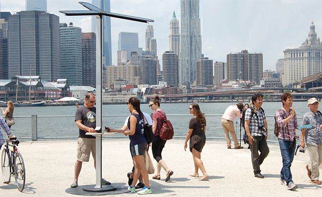
Street Charge Solar Phone Charging Stations. Image via Street Charge.
It began in the US back in June 2013 when Street Charge was launched in New York City. Intended to give power on-the-go to any electrical device with a USB connection, the open-air charging stations were installed across NYC by telecommunications corporation AT&T. Designed by Pensa, each charging station harnesses the power of the sun via three 20-watt solar panels. The sun’s energy is stored within an internal battery, ready to give users a burst of power at any time of the day or night and in all weather conditions. Each unit features three micro USB connectors and three female USB connectors, allowing users to connect mobile phones, mp3 players, cameras or their own charging cables.
Street Charge Solar Phone Charging Stations. Image via Factor-Tech.
Street Charge can be installed in any outdoor area but is particularly suited to green spaces and public transit stations. It’s also proven to be a valuable contribution to outdoor event spaces and festivals.
In the twelve months since its debut in NYC, Street Charge has become a resounding success. There are now over one hundred Street Charge stations across the US and a whole host more in cities across the world, including London, Amsterdam, Dubai and Sydney.
RELATED STORY: Are smartphones destroying the ‘public’ in our public realm?
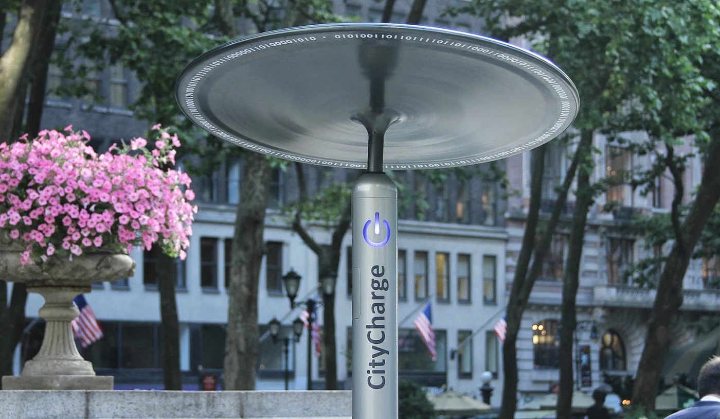
CityCharge Solar Phone Charging Stations. Image via Bryant Park Blog
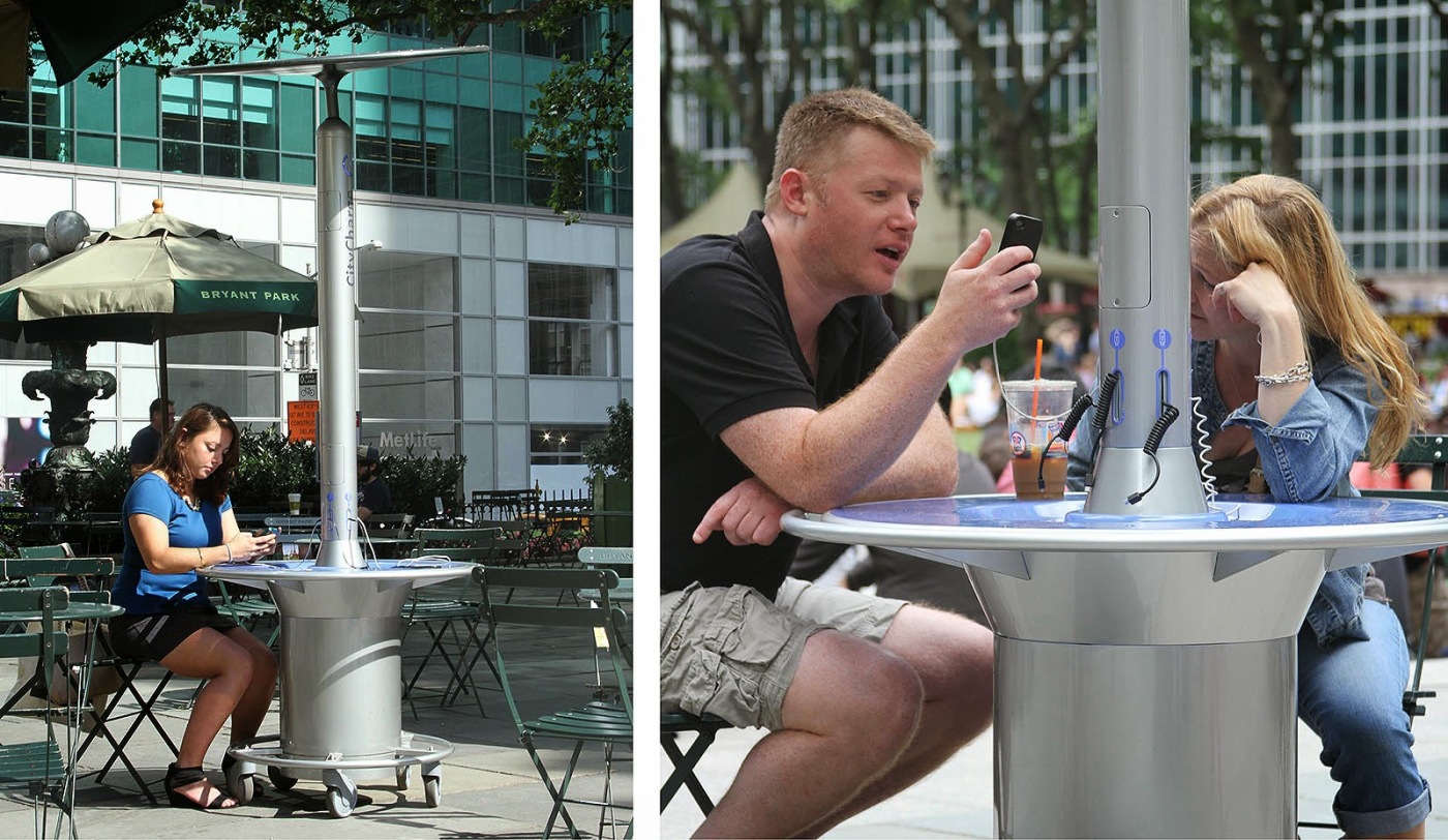
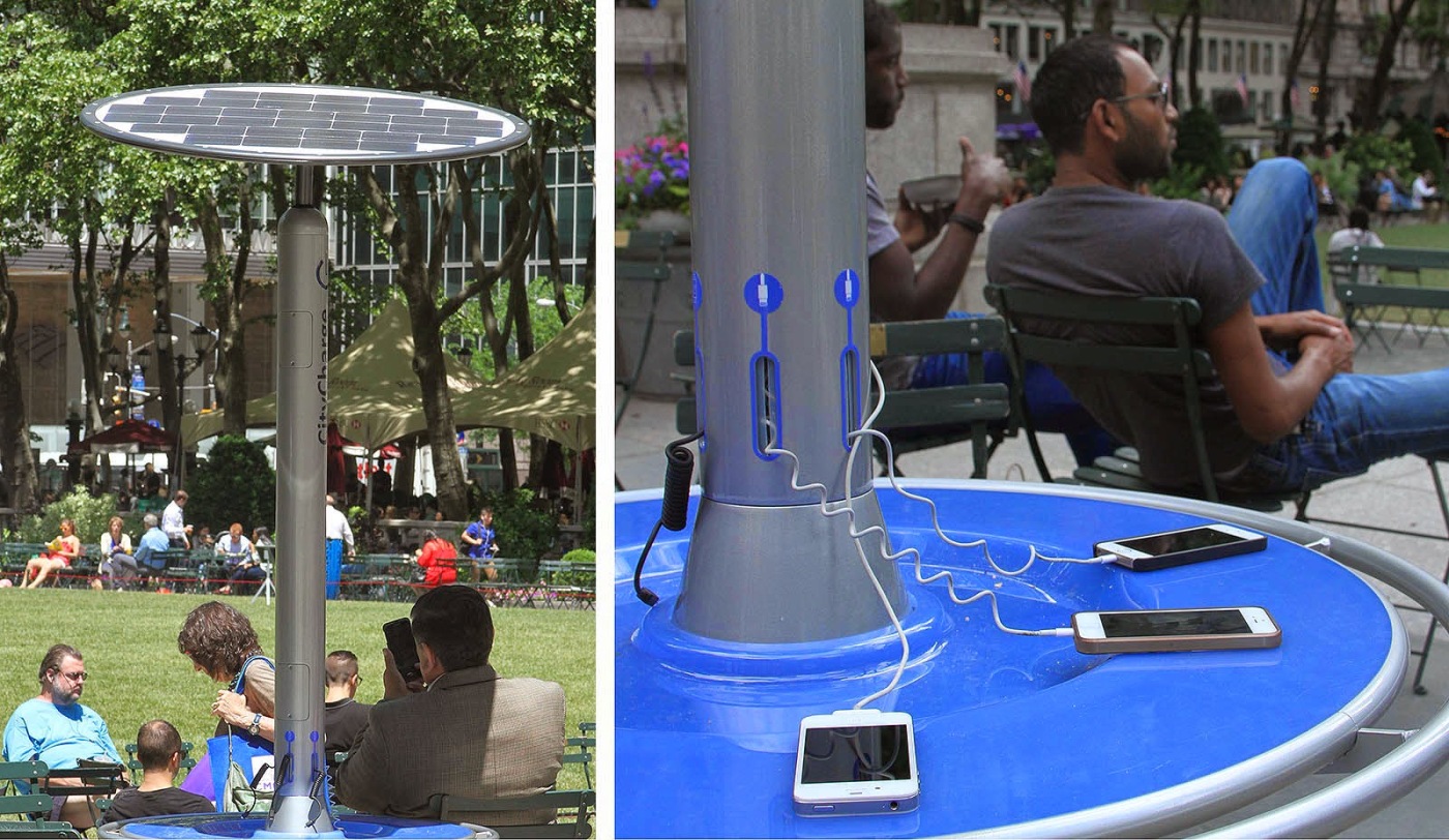
Street Charge isn’t the only one of its kind. A similar product named CityCharge popped up in Bryant Park, New York, last month. The result of a collaboration between Green Barrel Energy and Landscapeforms, CityCharge is a movable solar-powered charging station that can be rolled around the park to work with existing chairs, tables and umbrellas or to make room for events.
CityCharge Solar Phone Charging Stations. Image via Bryant Park Blog
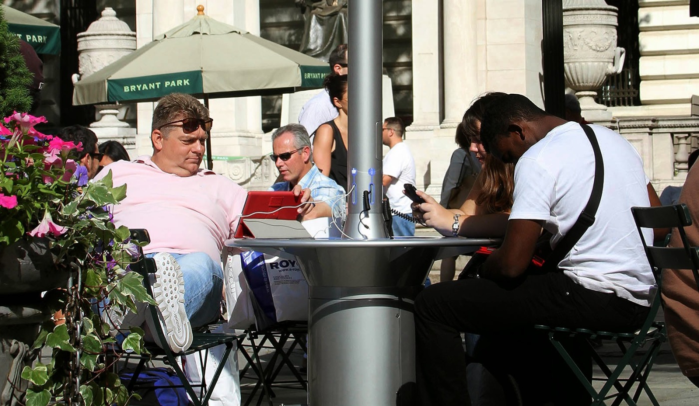
“The design was inspired by people and how they use public spaces,” explains Ignacio Ciocchini, the industrial designer behind CityCharge. “It is round, easy to move, and has a communal table that encourages social interaction.”
CityCharge Solar Phone Charging Stations. Image via Bryant Park Blog
CityCharge features a rotatable solar panel that can be moved in response to the sun. It is also a very robust and vandal-proof piece of engineering. Most parts are carbon steel with an electro-coated and polyester powder-coated finish, ensuring maximum protection against rust and UV degradation. It is also easily cleaned with residential-grade cleaning products.
CityCharge Solar Phone Charging Stations. Image via Bryant Park Blog
Green Barrel and Landscapeforms are currently developing improvements for CityCharge, based on careful observation of the prototypes in Bryant Park. Product performance and user comments are all being taken into account, with the aim of launching a commercial product in the near future.
Soofa Solar Powered Smart Bench. Image via Soofa
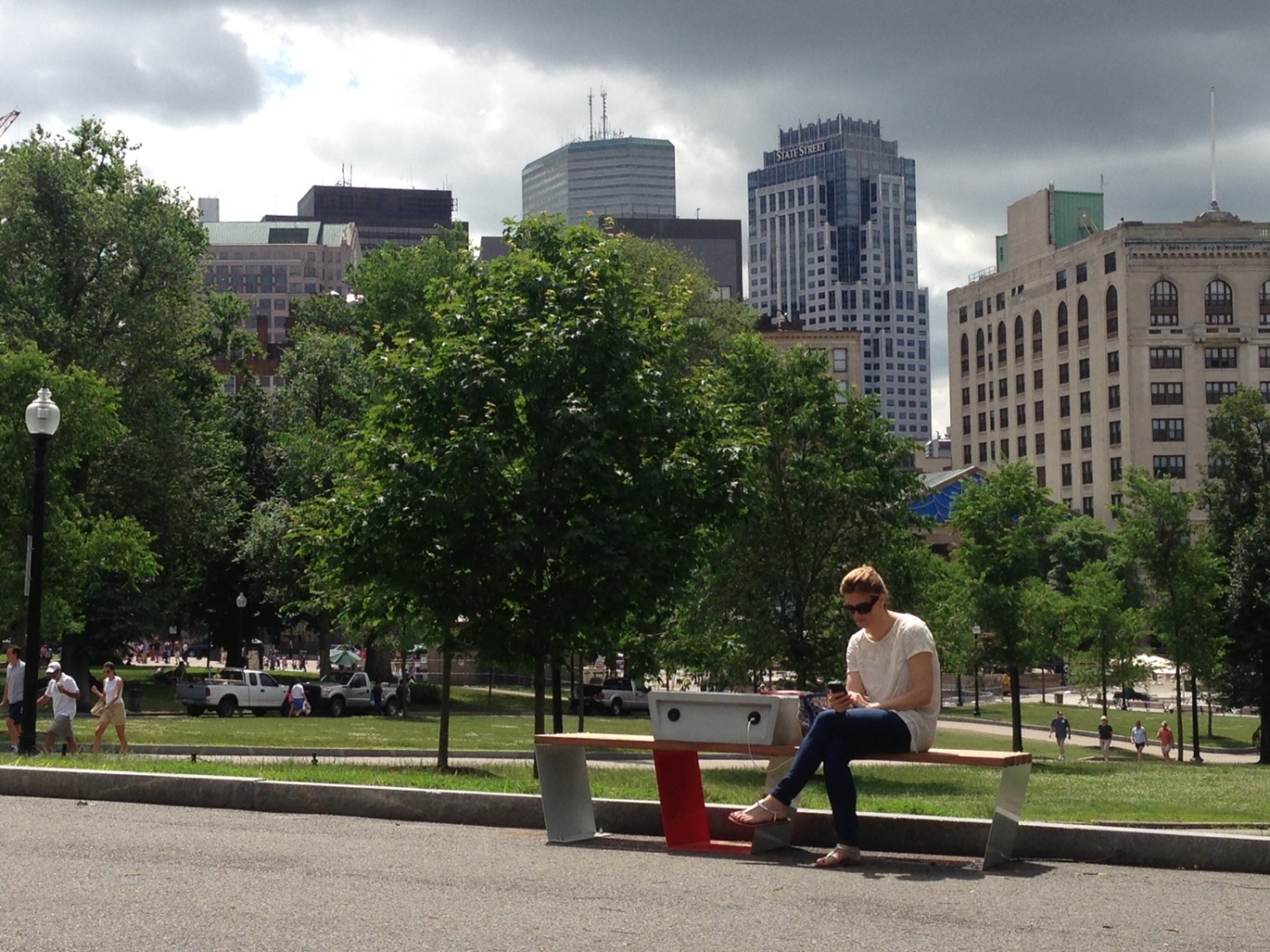
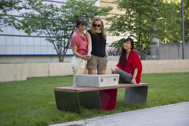
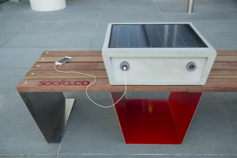
The latest addition to this emerging family of solar-powered street furniture is the Soofa. Created by Changing Environments (an MIT Media Lab spin-off company) the Soofa is a solar-powered bench that sports a pair of integrated charging points for smartphones and tablets. The ingenuity of the Soofa doesn’t stop there though; the bench also features ‘smart’ technology, with sensors that collect and share location-based information like air quality and noise level data.
Soofa Solar Powered Smart Bench. Image via Soofa
The first Soofa was installed in Titus Sparrow Park in Boston last month. The idea is that the data collected from the benches will be made available on the Soofa website, including the number of hours of solar charging, number of people who have used the service, the local air quality, and the local noise pollution level.
RELATED STORY: Big Data in the Big Smoke
Soofa Solar Powered Smart Bench. Image via Soofa
“Your cell phone doesn’t just make phone calls, why should our benches just be seats?” said Boston Mayor Marty Walsh. “We are fortunate to have talented entrepreneurs and makers in Boston thinking creatively about sustainability and the next generation of amenities for our residents.”
Residents of Boston were encouraged to suggest locations for additional Soofa benches, by placing a pin on an online map, or by tweeting or emailing their preferred spot. They were also given the opportunity to name the benches by visiting the Soofa website. Initiatives such as this help to engage citizens with their environments, encouraging innovative design solutions and more socially sustainable cities.
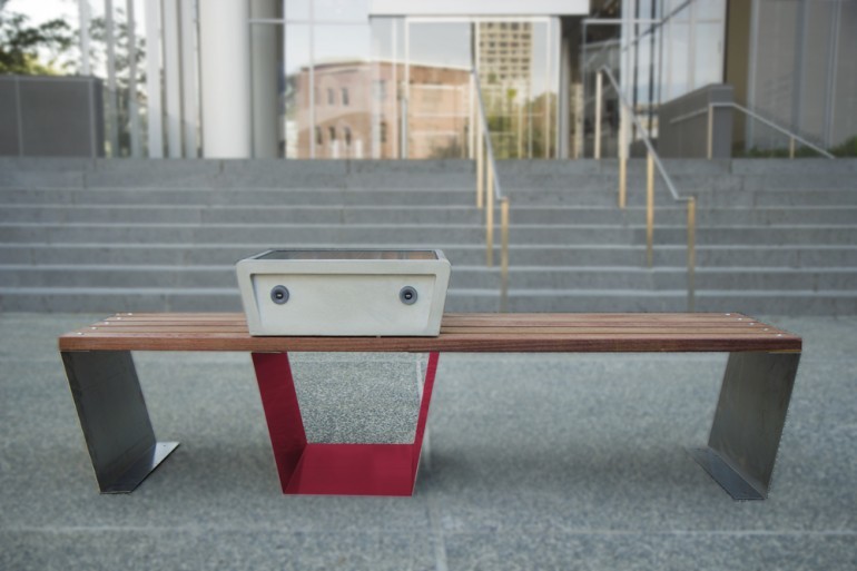
Soofa Solar Powered Smart Bench. Image via Soofa
Street Charge, CityCharge and Soofas all demonstrate how emerging technologies, ‘smart’ cities and big data are influencing the design of street furniture. By harnessing new technologies and engaging citizens in the design process, street furniture has the potential to be much more than inanimate objects in space. The future of street furniture is intelligent, mutifaceted and responsive to users’ needs. Which begs the question: what’s next for street furniture?
Lead image via Soofa
Demand for Landscape Architects in the UK is Booming! Could it be Time to Pack Your Bags?
The global economic downturn has had an undeniably profound effect on the profession of landscape architecture. From the USA to Europe, Asia to Australia, we have all been affected, albeit to varying degrees of disaster. Whilst some countries are still floundering in the aftermath, the UK is currently experiencing a somewhat unexpected predicament: a surging market and not enough landscape architects to meet the demand!
RELATED STORY: Filmtastic Fridays – I Want to be a Landscape Architect
So, how exactly did this happen and what does it mean for landscape architects like you and me?
One man in the know is Carl Thomas, founding director of UK-based Locri Recruitment. With prior experience as a landscape architect and over eighteen years advising and recruiting landscape architects and urban designers across the UK, Europe, the Gulf region and Asia, Carl has an unrivalled view of our profession. I met with him to find out more.
Hi Carl, thanks for joining me today to answer a few questions for Land8. Perhaps you could begin by giving us a brief outline of how the financial crisis affected landscape architects in the UK?
CARL: Landscape architects have had a very tough time over the last five years. Salaries plummeted and stagnated; working weeks were cut; workloads fell through the floor; many practices were close to folding and a whole generation of young designers were left adrift. It’s been a truly shocking time to be a landscape architect in the UK.
How has this changed more recently and what’s the situation like now?
CARL: In early 2013 confidence started to grow, and there were tentative signs of consolidating confidence. By early 2014 confidence was once again established and many practices were busy building and developing their teams again. It is now summer 2014 and we are at near capacity. The UK is showing signs of a shortage of landscape architects.
What do you think the reasons are for this mismatch in workforce supply and demand?
CARL: The strong employer platform developed ten to fifteen years ago remains in place, especially in London. There are still a high number of UK and international studios with strong bases in London (Martha Schwartz, Gillespies, Vogt, Gensler etc). This employer platform has been further developed by some very good new start-ups (Outerspace, Ares, Turkington Martin etc). There is a huge international workload in London; this city services a range of clients in mainland Europe, the Gulf and Africa. In addition to this there’s been strong regional growth in the UK built around the residential and renewable energy sectors. And finally, during the recession some people left the profession and the number of UK graduates fell year-on-year, leaving a void in entry-level landscape architects.
So the tables have turned! It sounds like the UK market is now an employees market?
Absolutely! It’s a good time to be a landscape architect in the UK. Salaries are rising, workloads are excellent and there is a strong confidence that this will continue for the foreseeable future.
What advice would you give to landscape architects in the face of these new market conditions?
Now is definitely the time to capitalise on this market position. How you capitalise on these conditions depends on what your primary motives are:
If you’re looking for a salary increase you should review your recent salary increases, review your increasing levels of responsibility and talk to friends and ex-colleagues at other practices about their pay structures and salaries. Get a clear idea of what you think your salary should be and then put a strong case for an improvement to your current employer.
If you’re looking for a new position, make sure you understand your motive for making a move. Try to be clear in your mind about what you are looking to do next. Then do your research; talk to as many people as possible, talk to an experienced and trusted recruiter, make sure you get a full picture of the studio and workload. And yes, negotiate hard on salary.
Maybe it’s a lifestyle change you’re after. Long – often unpaid – working hours have become the norm at many studios. But not everyone wants to work long hours and you shouldn’t presume that this is the norm everywhere. Many companies are responsible employers and only expect overtime occasionally, and some consultancies pay overtime or offer time in lieu. Again, use your network or a trusted recruiter to fully understand a studio’s working culture.
In summary, you should try to make sure your employer is a good fit for you. If you are a good fit, they will want to work hard to keep you, give you good levels of responsibility and remunerate you accordingly.
Do you have any advice for those considering a move to the UK?
Your ability to move to the UK is affected by your visa status. If you have a visa then the process is quite simple; look at job boards, recruitment sites and the Landscape Institute job board.
If you need a visa then typically you will only be supported by the larger international studios, so focus your search on these. The process is a little time consuming but it usually has a positive outcome, especially for more senior positions. Most jobs that suit an international folio are based in London, but do your research; there are many other areas with a good concentration of international designers – Bristol, Bath, Birmingham and the West Midlands, Manchester and the North West and also Scotland.
If you would like to discuss any of the points in this article further, you can contact Carl at carl@locri.co.uk
Locri also offers a free CV / portfolio clinic.
Lead image via The View from the Shard
São Paulo Transforms Parklets into Public Policy
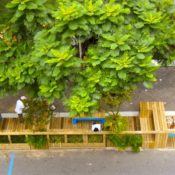
You’ve probably heard about Parklets: the simple but ingenious concept of transforming parking spaces along the street into publicly accessible recreational areas. Initially inspired by Rebar art and design studio’s one-day parklet installation created in San Francisco nine years ago, this innovative and hugely successful approach to public space management has been emulated across the globe and has now reached Brazil’s largest city, São Paulo.
A series of temporary parklets were introduced into São Paulo’s public realm during Environment Week last year. The initiative received wide-spread media coverage and was embraced by citizens, sparking a demand for more pedestrian friendly spaces throughout the city.
The city listened to the public chorus and in April of this year the Mayor Fernando Haddad signed Decree No. 55,405; a public policy order supporting the creation and maintenance of parklets. It is the first of its kind in Latin America.
So what exactly does this decree mean? Well, any individual or company within São Paulo can now install a parklet in any of the city’s streets, providing it meets with the terms laid out in the decree. Parklets cannot, for example, be installed on bus or bike lanes or on roads with speed limits above 50km per hour.
Those interested must send an application to the city, describing the dimensions of the parklet and the intended furnishings. This might include amenities such as seating, planting, bike parking or art. The parklets must comply with certain construction standards, involving maximum depth and width, preservation of street drainage and avoidance of signal lights. Most importantly, parklets must remain public and freely accessible at all times. They are essentially an extension of the sidewalk and cannot be privatized by the initiator.
RELATED STORY: Landscape Institute’ Creating Healthy Places Winners Explore Experimental Urban Design (LINK)
Parklets form part of a growing movement to make streets more human-centred, green and accessible. By repurposing something clearly intended for vehicles, they make a powerful statement: people first, then cars. Parklets also add character and identity to the street, breaking up the monotony of the road and providing opportunities for individualism. The widespread success of the initiative also demonstrates how such seemingly small interventions can gain momentum and ripple across the globe. Slowly but surely, pedestrians are reclaiming the streets the world over, one small parking space at a time.
Have parklets made it to your city yet? How would you design a parklet if you had the chance? Let us know in the comments below! And if you’d like further information about the guidelines, including a full manual and how to apply, you can find it here.
All images via FABIO ARANTES/SECOM
Putting a Price on Design: What is the Value of Public Space?
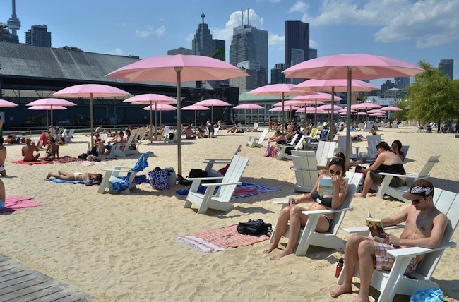
Iconic, candy-coloured and hugely popular, Toronto’s award-winning Sugar Beach is making headlines again, but this time the story’s not quite so sweet.
There’s no doubt about it, Sugar Beach has certainly been a boon to the city of Toronto. Designed by Claude Cormier et Associés in 2010, the former parking lot has won multiple design awards, including the EDRA 2014 Great Places Award and an ASLA Professional Honour Award in 2012. The playful, whimsical urban beach has been a huge hit with both Torontonians and tourists alike and has flung Toronto into the international spotlight.
But the sugar-sweet image of this candied public space recently turned sour when the price-tag was revealed. Each of the thirty-six cotton candy pink umbrellas cost $11,565 and another $530,000 was spent on two huge rocks which were trucked in from the Laurentian mountains in southern Quebec. This exposé has caused public uproar among Torontonians, with many outraged at what they believe to be frivolous spending of tax-payers money.
Both the designers and Waterfront Toronto (the agency behind revitalizing the city’s waterfront) have defended the cost of Sugar Beach with the explanation that the park is a valuable investment in the future of the city.
“Our mandate is to build great parks and public spaces to revitalize the waterfront, to help make the city a better place to live,” said Andrew Hilton of Waterfront Toronto. “These parks do that, by taking what was once dead space and turning it into active, animated spaces that are going to make the area more attractive to developers and people — and that’s exactly what’s happening.”

Sugar Beach is more than just a nice space for people to enjoy, it’s also an iconic public place for the city. “Anyone just looking at the dollar cost of the umbrellas and the two large rocks is missing the point,” says Deputy Mayor Norm Kelly. “It’s the photographs of Sugar Beach that count. It’s all of that first-class investment that gets projected around the world and brands us, the city of Toronto, as world class and first class.”
RELATED STORY: EDRA Announces Six Exemplary Winners of the 2014 Great Places Awards
“You have to look at the return,” explains project landscape architect Mr. Cormier, “the ‘Jackie Kennedy pink’ umbrellas are a unique addition to the city’s urban landscape. They’re elegant. They’re soft. It has a kind of a positive mood and we need positive moods in the city, otherwise everything is so the same.”
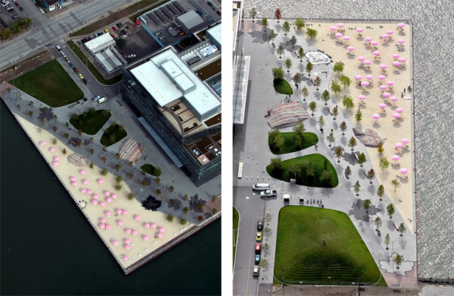
The three dozen, 2.5 meter high structures are a sculptural, functional, exemplary contribution to the city’s public realm. Yet because they happen to take the form of a simple beach brolly, they are being ridiculed. “Hilarious. I have some lovely pink and yellow striped umbrellas – only $11,000 each and fully installed. Please call me. Limited offer – best buy now,” states one sarcastic commenter. “How wonderful – year round patio umbrellas and a couple of coloured rocks,” remarks another bitter Torontonian.
Iconic public spaces must also be durable and that’s what these umbrellas are devised to be. Designed by Toronto-based industrial designer Andrew Jones, these are not your average beach parasols. They are constructed from fibreglass and stainless steel and they also function as light standards with LED fixtures and concrete footings. Expected to last 25-30 years, they are able to withstand gale-force winds, snowstorms and rust, and are even designed to minimise opportunities for vandalism. It might have been cheaper to buy standard beach umbrellas in the short-term, but they would need to be replaced every few years and would not be nearly as striking. High quality, enduring design costs money, but is worth the investment.

The total cost for the project was $14.1 million. On the face of it, this may sound like a lot but Waterfront Toronto says the project has already created $2.6-billion in development value along the water’s edge and has catalyzed a $9.6-billion growth in private sector development.

I have to admit, upon first seeing the figures, my eyes widened. But on further reflection, my viewpoint changed. I thought: well done, Toronto! Finally, a city prepared to invest serious money in high quality public spaces. Having worked on countless projects in which the landscape has been value-engineered to within an inch of its life, it’s refreshing to see a city that recognises the true value of landscape architecture and the power it has to change perceptions and generate future investment.

Landscape architecture is often an easy target for such critical remarks about frivolous spending because the value is not always easily quantifiable. Sugar Beach is a thriving public space that has changed people’s perceptions of a previously neglected area of the city. It is bringing people together, encouraging outdoor, healthy lifestyles and – most importantly – people love it! But it’s hard to put a dollar sign against such ‘soft’ values. After all, what is the price of love?
What do you think of Sugar Beach? A sweet deal? Or a gross over-expenditure?
All images via Claude Cormier et Associés
Defensive Versus Inclusive Design: Vancouver’s Urban Antidote to London’s “Anti-homeless” Spikes
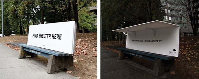
Homelessness is a social problem that affects cities the world over. The image above depicts two very different ways of dealing with the issue. To the left: London. To the right: Vancouver.
You’ve probably already heard about the “anti-homeless” spikes that caused public outcry in London a few weeks ago. The stainless steel spikes were installed outside a luxury block of flats to deter rough sleepers from taking shelter in the doorway. The installation caused a chorus of disapproval and widespread condemnation, with Twitter users claiming the spikes treated the homeless like vermin. The bed of spikes has since been removed, after an online petition reached over 100,000 signatures and the Mayor Boris Johnson branded the spikes as “ugly, self-defeating and stupid”.
“Anti-homeless” spikes in London. Image taken by Twitter user Ethical Pioneer.
Unfortunately, these metal spikes are just the tip of a growing iceberg of hostility. Defensive architecture is slowly creeping its way into our urban environments in a multitude of guises – a slightly tilted bench; a strategically placed armrest; a line of small metal nodules. These seemingly insignificant details may go unnoticed by many, but to those who live on the streets, they engender a cruel and merciless city.
Hostile architecture in central London. Photographs by Linda Nylind for the Guardian
And it’s not just the homeless who are being ostracized by such callous design. Anti-skateboard devices, anti-graffiti paint, anti-teenager sound deterrents and anti-loitering seats are just some of the additional ways in which public behaviours are being manipulated and squeezed out. They all form part of an emerging urban architecture known as “hostile architecture”.
RELATED STORY: CHAIR>bench by The Agile Landscape Project
Of course, the primary intention of many of these manifestations is to reduce crime and anti-social behaviour. However, such crude solutions run the risk of destroying the very nature of public space. Public space should be exactly that: public; inclusive; for everyone.
The examples above demonstrate just how powerful design can be as a tool to manipulate behaviour. So how can we as designers use this power for good? How can we design to ensure that our cities are inclusive places?
Images via Spring Advertising
A recent project in Vancouver provides one such example and offers the perfect antidote to London’s “anti-homeless” spikes. Initiated by RainCity Housing, a Canadian charity that provides housing and support for the homeless, the project consists of five instant pop-up shelters that provide rough sleepers with respite from the wet Vancouver weather.
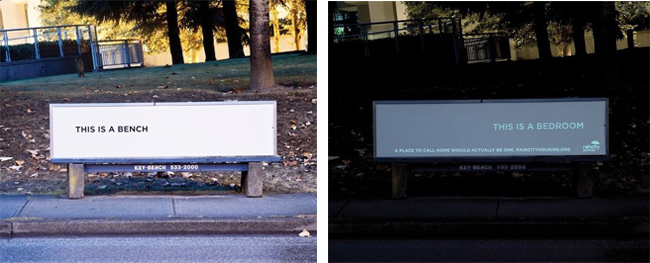
Images via Spring Advertising
The innovative design functions as a normal transit bench during the day and folds out into a shelter at night. When opened, it reveals the address of a RainCity refuge, encouraging the user to seek further help. Another design features UV letters which light up at night. During the day the words “this is a bench” display. When darkness falls, a set of separate letters emerge to say “this is a bedroom” and the user is directed to RainCity’s website. The dual purpose benches were designed by Vancouver-based creative agency Spring Advertising, as part of a month-long campaign last year entitled “Strange Acts of Kindness”.
How is the issue of homelessness dealt with in your city?
- 1
- 2


