Author: Jay Boi
Scharnhauser Park Gets Multi-Million Dollar Rainwater Management
Scharnhauser Park, by Janson + Wolfrum Architektur + Stadtplanung and Atelier Dreiseitl, Ostfildern, Germany. In the early 1990s, the Planning Department of Ostfildern owned about 70 percent of the site and had a clear aim: to create Scharnhauser Park as part of a first-class, energy-efficient neighborhood that addressed the area’s housing shortage. Alban Janson and Sophie Wolfrum were in charge of designing an ambitious master plan, with a well-integrated rainwater management design by Atelier Dreiseitl also worth our specific attention.
Scharnhauser Park
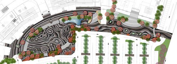
From the air, Scharnhauser Park looks like a long tongue of low-density buildings surrounded by a patchwork pattern of farmland. The district grows on a slope along the train rail, the main road, and between two tributaries of the Neckar River, all of them reinforcing the north-south direction. Designers were focused on this main line to channel the space through a central axis of public park and a boulevard of trees in a “T” shape.
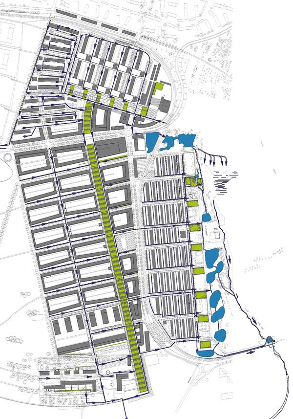
Masterplan of Scharnhauser Park. Photo courtesy of Atelier Dreiseitl

Scharnhauser Park. Photo courtesy of Atelier Dreiseitl

Scharnhauser Park. Photo courtesy of Atelier Dreiseitl

Scharnhauser Park. Photo courtesy of Atelier Dreiseitl
- How The Chicago City Hall Green Roof is Greening the Concrete Jungle
- Potsdamer Platz in Berlin Becomes a Sustainable Ecofriendly Urban Square
- How Bishan Park Became “The Central Park” of Singapore

Scharnhauser Park. Photo courtesy of Atelier Dreiseitl

Scharnhauser Park. Photo courtesy of Atelier Dreiseitl

Scharnhauser Park. Photo courtesy of Atelier Dreiseitl

Scharnhauser Park. Photo courtesy of Atelier Dreiseitl
Recommended Reading:
- Landscape Architecture: An Introduction by Robert Holden
- Landscape Architecture, Fifth Edition: A Manual of Environmental Planning and Design by Barry Starke
Article by Elisa García
How a Dazzling Lighting Scheme Design Transformed a Dark City Center: Torico Square
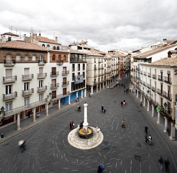
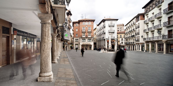
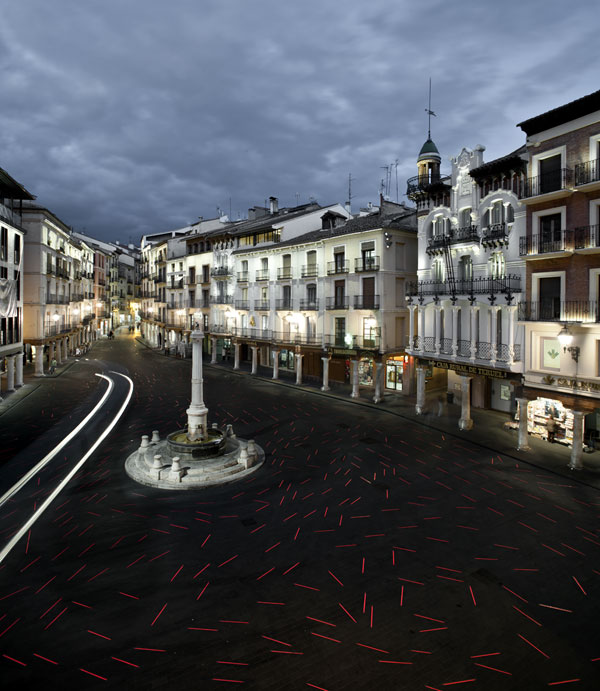
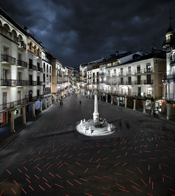
Torico Square by b720 Fermín Vázquez Arquitectos, Teruel, Spain We have a special chance to delve a little deeper into one of the most sensitive and exciting tasks of any landscape architect: the challenge of redeveloping historical sites. In this case, the 37,674-square-foot area called Torico Square in Teruel, Spain, has been the heart of the city’s urban life and a meeting point for ages. Even being surrounded by great architectural heritage and having a complex underground water system, the focus of the square is a beloved bull sculpture called Torico, which is located 32 feet above the square, at the top of a very particular fountain.
Revealing the Architecture Through an Innovative Lighting Scheme Design
The local b720 team developed a surprising remodeling proposal based on making the underground water facilities and the architecture visible in different senses. Instead of adding new elements to the small square, they created an innovative lighting-paving project that reinforces the prominent role of the empty space and the existing values.
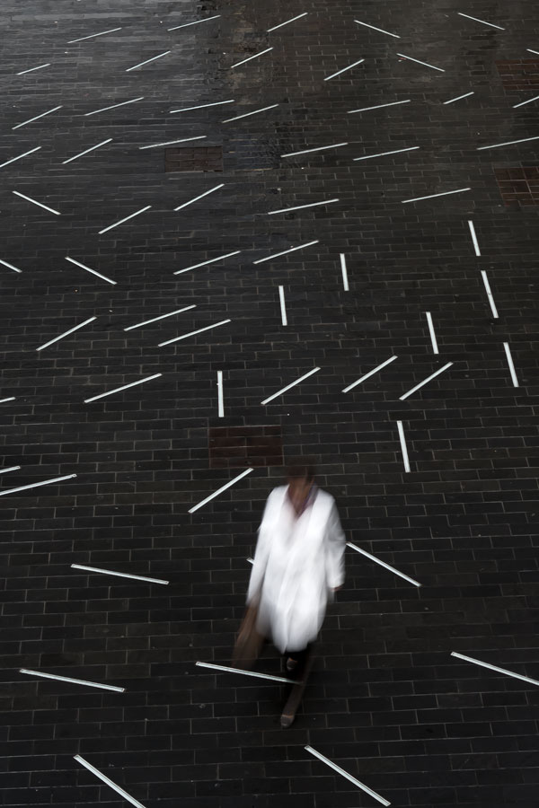
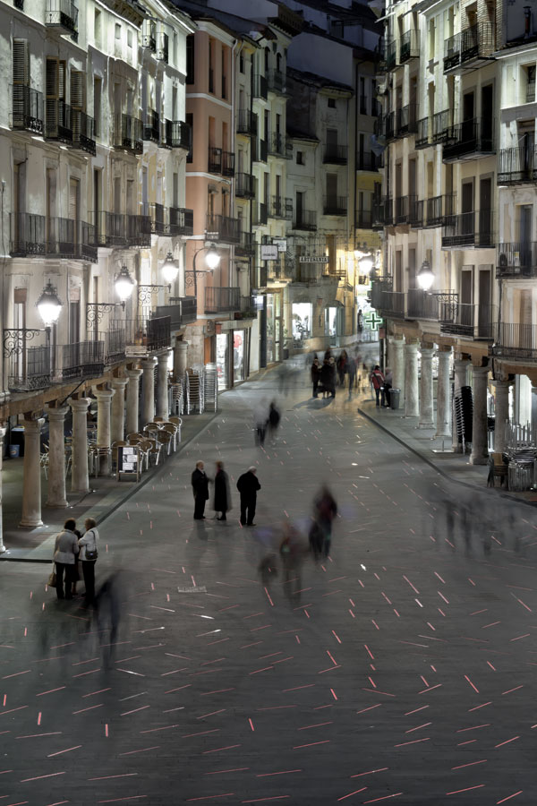
Revealing Past Footprints Through Design Strategy Torico Square didn´t look very different from any other part of the historic city center. However, the underground space maintained uncommon and high-value structures from the Middle Ages: two reservoirs and a secret arch were waiting to be revealed. The Design Pattern The designers’ approach consisted of raising the reservoirs and their connections to welcome visitors, renovating the paving of the square, embedding a special lighting scheme design within it, and adjusting the vertical lighting to EU laws. The design pattern was inspired by the idea of circulation and fluency coming from the watery world below. When this light stream finds an existing element on the square´s surface, a reaction happens. Its density weakens over the reservoirs and surrounds Torico´s fountain. Facades and porches use diffuse downward lights, and the popular fountain is illuminated by beams of light from the surrounding buildings.A Lighting Scheme Design With True Exclusivity
The LED luminaires embedded in the basaltic paving were exclusively designed for this project. Here we find two different sizes of lighting to create the whole composition of more than 1,200 light sections: 18.11 x 1.45 inches and 30.31×1.45 inches. They were expected to face very particular conditions of charge, adding bull-running events to the usual rolled traffic ones, and complicated soil features in terms of watertightness. One of the most attractive effects is provided by the informatic software that controls the luminaires, allowing operators to program working timetables and different colorful patterns and light intensities. As a result, lighting transforms the night scenery in surprising ways. Shadows Behind the Bright Picture Controversy has held hands with the project since the very beginning. As you can see, the dynamic lighting design at night is visually powerful and seems to look to the future. But some human factors could not be quite worked out. Have you noticed that there are no benches anywhere allowing people to stay and enjoy the place?
The luminaires are another focus of strong criticism, because although they took almost a third of the more than 6 million euros budget, it wasn’t long until they created technical problems. In fact, at least 30 percent of them needed to be removed early on. and three years after the Torico Square redevelopment ended, all the luminaires were finally replaced by an improved design. Unfortunately, a few months later, they turned off again. High watertightness requirements might interfere with the heat evacuation needs of the LED system. Related Articles:- Lighting Scheme Transforms Public Space
- Lighting Solutions – World’s Tiniest Recessed LED Luminaire – 1PUCK LP by MINIMIS
- The Secrets Behind the Smart Highway
- Urban Design by Alex Krieger
- The Urban Design Handbook: Techniques and Working Methods (Second Edition) by Urban Design Associates
Article by Elisa García
Hunter’s Point South Park Leads The Way in Green Innovation
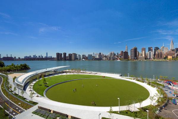
Hunter’s Point South Park in New York City by ARUP, Thomas Balsley Associates, and Weiss / Manfredi. The first chapter of Hunter’s Point South Park story was closely connected with the industrial past of Queens neighborhood, in New York City. Years after abandoning East River infrastructure, the area was not integrated within the new blossoming wider urban context. Fortunately, waterfronts are places with an incredible urban and economic potential, so redesign projects always knock on the door. In this case, the idea of a public park was included in a larger masterplan providing residences, retail and a public school in a whole 30 acres post-industrial area. Great designers from ARUP, Thomas Balsley Associates, and Weiss / Manfredi took the challenge to realize a truly green landscape for a new neighborhood.
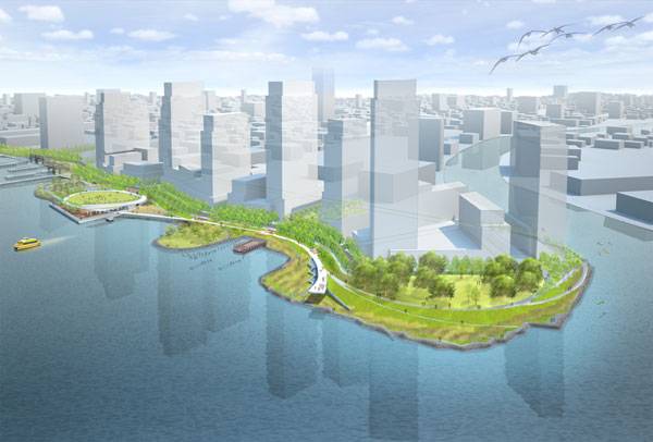
Hunter’s Point South Park in New York City. Image Credit: Thomas Balsley Associates
Hunter’s Point South Park
Meet the multi-layered park. One of the main features of Hunter´s Point South Park is its openness. It works to reinforce the social role of a public space, involving a flexible multi-layered strategy that makes everyone welcome. Delicate, almost diaphanous, surfaces dominate the scenery, allowing strong visual connections with the existing Manhattan skyline.
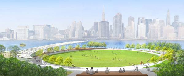
Hunter’s Point South Park in New York City. Image Credit: Thomas Balsley Associates
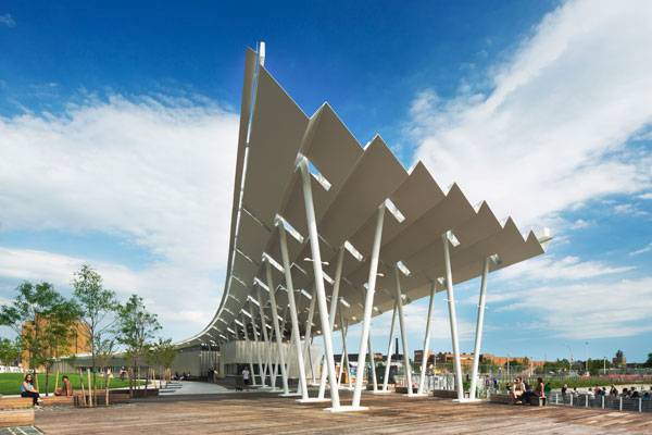
The shade structure. © Albert Večerka/Esto
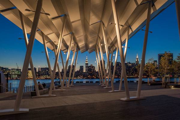
Hunter’s Point South Park. Photo credit: Wade Zimmerman
- Historical Landscape Gets Modern Day Makeover
- 15 Great Examples of Historical Landscape Architecture
- 30 Landscape Architecture Firms To Keep Your Eye On!
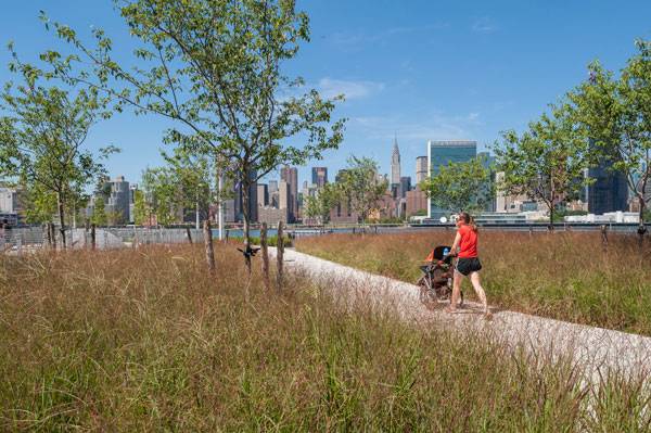
Planting at Hunter’s Point South Park. Photo credit: Wade Zimmerman
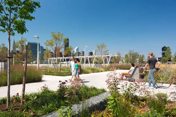
Planting at Hunter’s Point South Park. © Albert Večerka/Esto
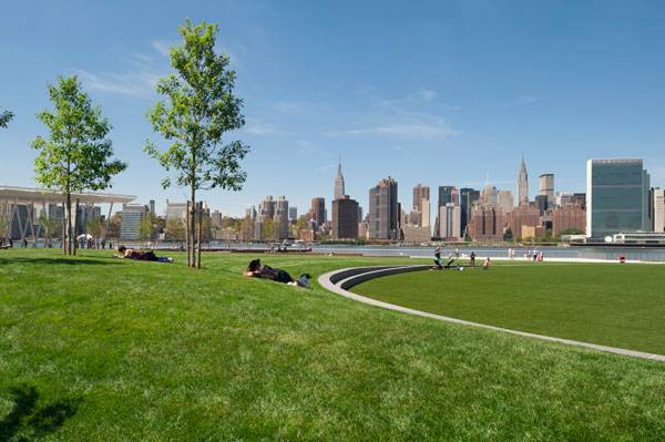
Hunter’s Point South Park. Photo credit: Wade Zimmerman
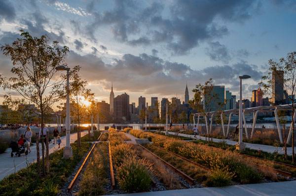
Planting at Hunter’s Point South Park. Photo credit: Wade Zimmerman
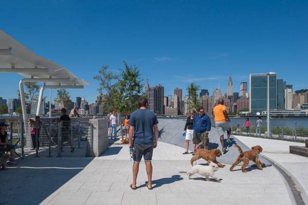
Paved areas at Hunter’s Point South Park. Photo credit: Wade Zimmerman
WATCH: A truly beautiful time lapse displaying Hunter’s Point South Park
Recommended Reading:
- 1000 Details in Landscape Architecture: A Selection of the World’s Most Interesting Landscaping Elements by Francesc Mola
- Street Design: The Secret to Great Cities and Towns by John Massengale
Article by Elisa Garcia Sign up to our Weekly Newsletter Here!
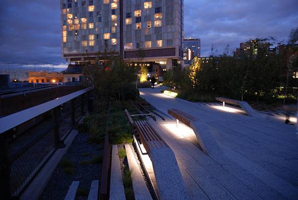
7 Facts About The High Line That Will Impress Your Friends
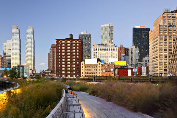
Facts about the famous High Line project to share and impress your friends with. The High Line in New York City is one of the most well known and amazing redesign landscape projects in recent years. While inspired by the French Promenade Planteé, the beloved park has kept its own character and written its name in capital letters on New York City. Transforming the High Line from an elevated rail line serving the city’s industrial district to the 1.45-mile-long public space we enjoy today meant bringing together a lot of different fields, ideas, and people. Yes, a lot has been said about the High Line, but here we dig a little deeper to reveal some interesting tidbits that may not be so well known.
7 Facts About The High Line
1. Changing the Rules of the Urban Ecosystem The bright High Line has had a strong influence on its surrounding neighborhood in many ways — some of them a little controverted. Its post-industrial location attracts the attention of new businesses focused on economically higher classes, meaning that the Median Market Value grew 103 percent between 2003 and 2011 for the closest places. But that hasn’t translated to an improvement in area residents’ earning power. WATCH: New York’s New High Line Park 2. The Drainage System One of the main challenges of gardening the High Line is that you only have an average depth of 18 inches. This brings up questions about how to drain water when necessary and how to improve water retention during the hottest seasons. The drainage system uses open-jointed concrete planks for draining and a series of specific layers under the topsoil. The first of them is the subsoil and a filter fabric as a drainage mat. Then there is a plastic egg-crate drainage panel that allows the retention of water for more efficient use. You can find more detailed information here. WATCH: The High Line Design Video 3. The Garden was Already There
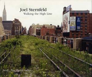
As photographer Joel Sternfeld showed through his amazing book, “Walking the High Line”, nature had beautifully taken over the abandoned structure many years before anyone thought of creating a park there. The powerful images of that wild, elevated landscape grown from the ruins are a bit melancholic and full of meaning. The designers took this and focused their effort on preserving the essence of an unexpected garden in the sky of New York City. That is especially notable along Section 3.4. What the High Line Could Have Been
Have you ever thought of the High Line as a lap pool? That was one of the winning projects, among others, in the 2003 Ideas Competition that the Friends of the High Line organized when they were looking for innovative purposes. They received 720 possible projects, including ones from the well-known Steven Holl Architects and Zaha Hadid Architects. If you are curious to know more about the alternative ideas, you can have a look at them here. You may be surprised by the different points of view. 5. Behind the Movable Chaise Lounge Chairs You can find one of the most iconic and enjoyable parts of the High Line at the Sundeck: the wooden, movable chaise lounge chairs. Installed on the original rail tracks, the chairs allow people to closely connect with the urban landscape, as William Whyte studied in 1980. He conducted a series of experiments in New York City, which were shown in the film, “The Social Life of Small Urban Spaces”, and in the book of the same name. As you can see, his ideas have been very influential in public space design, with the purpose of making these spaces more human. 6. Sustainable Goals From the Furniture The seating steps and the “peel-up” benches you can find in Section 2 have skeletons made of hardwood from demolished buildings and exterior skin made from FSC-certified Brazilian wood. In the future, all of that material could be reused again in a different way.
7. Agri-tecture Keeps the Wild Touch There is a wide range of possible effects and combinations between completely artificial hard paving and 100 percent wild, vegetated ground. This is what James Corner Field Operations and collaborators explored through the concept of Agri-tecture when designing strategies for the High Line. They created planting beds in the railway as nature had previously done, used open joints among the pre-cast paving planks for letting plants grow wildly, and reinforced the idea of gradient along the cultivated boundaries. WATCH: Elevated Thinking: The High Line in New York City (56:49 minutes of viewing) You can learn more about the High Line on the Friends of the High Line website.Recommended Reading Related to The High Line:
- High Line: The Inside Story of New York City’s Park in the Sky by Joshua David
- On the High Line: Exploring America’s Most Original Urban Park (Revised Edition) by Annik LaFarge
Article by Elisa García Nieto Return to Homepage
Find the Perfect Plants for Your Projects
Find the perfect plants for your projects with this unique online plant finder. Have you ever sat in front of your project, wondering which plants would be the best options for it? Even the most expert landscape architects have to stop to think before making this essential decision. As living things, plants have their own needs in terms of soil conditions, temperatures, or sun exposure, and designers also have their expectations about the landscape. Putting them together is a key factor in the success of any garden or landscape design. Fortunately, there are several awesome tools available to make this easier. This week, we want to introduce you to one of them — PlantSelectr.com, an online search tool created by Sven Henrik Karlsson.
An Easy Tool to Use for Finding Plants
At first sight, PlantSelectr looks like an easy-to-use search engine — and it really is. Basically, there are 15 possible inputs on which to base your selection, and you can choose which one you want to use. Some are keys for plants’ survival, such as soil conditions, range of temperature, or sun exposure. Others are more focused on designers’ requirements, such as height, color, or commercial availability.
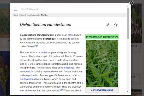
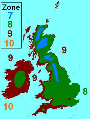
The most technical inputs could create doubts about what search criteria they are taking. How to resolve it? Every single input provides a short explanation under an information icon. As soon as you fill in the gaps, photographs of your possible plants connect you with their identity cards from Wikipedia. There are a lot of plants on the database, although a few of them are short on detailed information. Measurement References As with many resources on the Internet, PlantSelectr has been prepared in terms of the well-known measurement system coming from the English speakers’ field. For example, the information about ranges of temperature, which is particularly useful for outdoor plants, is called “Hardiness Zone.” It takes the USDA chart as a reference and works with minimal winter temperature averages. For projects outside of the USDA area, knowing this simple data is enough to determine the correspondence in this scale, from extreme 0 to 12. You should also keep in mind that the Plant Height at Maturity information is listed in feet, so if you use any other unit of measurement, you may need to use online converters. Related Articles:Alternatives for Technical Inputs General soil conditions have a significant influence on the development of your plants. Soil has to be tested in the laboratory to obtain certain knowledge, but if this information is not available, you should have in mind at least the soil salinity and soil pH levels. How to do it? A visual diagnosis could help you determine if the salinity level is high. According to UGA publications you should pay attention to gray-colored soils and to white or brownish-black crust on soil surfaces. In addition, if there are plants around, they would be expected to show water stress. You can check the acidity and alkalinity levels by using quick DIY kits showing alkalinity for values above 7.0 and acidity for values below 7.0. The presence of calcium carbonate can be confirmed by adding vinegar to a soil sample. Fizzing means a positive result. For more detailed information, you can click here. WATCH: Soil Testing the Easy Way Carefully choosing your plants can make the difference between a blossoming garden and severe plant development problems. Whether you are a student, a casual gardener, or a landscape architect, tools such as PlantSelectr offer a fantastic chance to tap the industry’s collaborative knowledge. Try Plantselectr out for yourself and tell us what you think about it. Recommended Reading:
- Planting: A New Perspective by Noel Kingsbury
- The Planting Design Handbook by Nick Robinson
Article by Elisa García Nieto. Return to Homepage
Inspiring and Innovative Response to Urban Rooftop
Mandela Park, by Karres en Brands Landscape, Almere, The Netherlands. Almere in The Netherlands is the perfect example of a low-density city constructed from zero. Architects had a great opportunity here to demonstrate to the world how innovative and contemporary design works. Mandela Park, which opened in 2011, was designed by Karres en Brands Landscape and planned by OMA as part of the master plan for the next stage in the development of Almere. This plan focuses on the location of future business areas.
Designing the Urban Rooftop
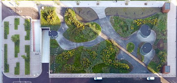
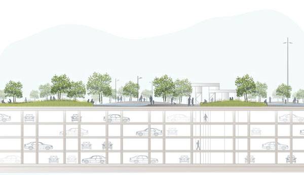
As you can imagine, creating a new business center means ensuring easy availability and providing for new parking needs in the area. In this case, four-layered underground parking garages provide service to three massive towers. But in Mandela Park, designers looked up — using a roof top for a park and reinforcing the identity of a place with no references.
Human and Urban Scale Work Together The freed rectangular space of Mandela Park contrasts with the 120-meter-tall office towers in front of it. The scale of the park replies to its high-density surroundings and gives visual balance, even though the entire surface seems oversized from the point of view of human action. The designers took two existing channels crossing the place to start adjusting the scale, dividing the park into three smaller areas. One of these channels was softly redirected to work as a diagonal connection for pedestrians and the other as a means of direct transversal break. A secondary net of winding paths manages the internal circulation and creates a variable scheme of green islands among them. The Rules of a Place in Between Urban elements in direct contact with Mandela Park are basically four roads that limit the park’s extension and one that cuts it. There is a clear difference in how the park reacts to the transversal boundaries in comparison with the longest ones. As the 200-meter-long parking roof wanted to be shortened, Karres en Brands extended its transversal limits in the form of squares that don’t follow the general scheme of the park. They are an intermediate point between the language of the city and the park in terms of geometry and materials. A series of bar codes made of grass break the lines drawn by the roads and introduce the green into the gray, making the longitudinal transition a little softer and facing the curved design of the park in front of the three towers for a stronger connection. Related Articles:- London College Gets Funky Rooftop Design
- A Roof Garden That’s so Good, You Might Want to Work There!
- A Greener Housing Solution Reducing The Impacts in The Neighbourhood
The Giant Patchwork The designers worked with a range of different materials to form an awesome composition inside the three sub-areas of the park. All of them have the same curved scheme, very similar to a patchwork made of a mix of natural and artificial elements — which is a clever decision if you think of the park being seen by a lot of people from the high towers. It offers a doubly powerful visual experience.
Materials have a key role in the final result of Mandela Park as a place for recreation. The paths are made of terrazzo asphalt that looks like the natural stone we find in the paving of the surroundings. Vegetation and water features bring nature to the park using ponds, grasses, and perennial and flowering shrubs. The image of the patchwork changes with the seasons like the beautiful and colorful landscape that it is. Wouldn’t you like have this view from the window of your office? Mandela Park has been featured in landscape magazines around the world because of the vegetal green roof. But we also find it interesting in terms of being an outdoor space that brings together different levels of work while preserving the nice sensation of living in the periphery even in the city’s business center. Recommended Reading:- Detail in Contemporary Landscape Architecture by Virginia McLeod
- Landscape Architecture: An Introduction by Robert Holden
Article written by Elisa García. Return to Homepage
Land Art Masterpiece Meets Ecological Urbanism in Stunning Park
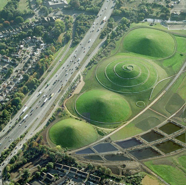
Northala Fields, by Peter Fink and Igor Marko, London, UK. This large park opened in 2008 as part of an ambitious plan for Northolt and Greenford Country Park in West London. The plan called for creating high-quality outdoor spaces along highway A40. There is a word to describe the surroundings before Northala Fields: pollution. That pollution manifested itself in terms of noise, visual impact, and poor air quality. Artist Peter Fink and architect Igor Marko took on the challenge of exploring economical solutions for sustainable design. Here’s how they made a difference and created an enjoyable place along the highway.
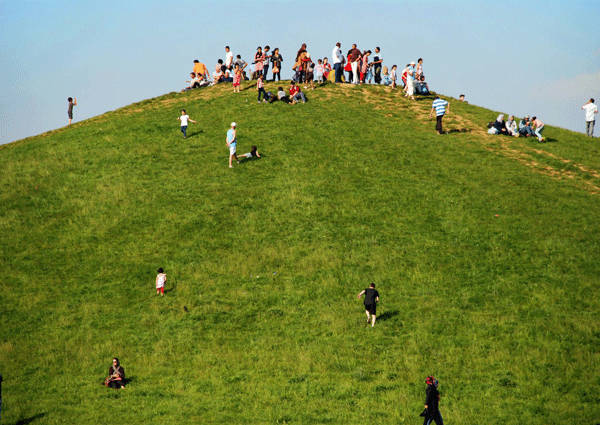
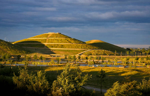
Redesigning the Connections of the Landscape One of the main questions was about how the park would create connections and barriers to its surroundings and why. The park turns its back on the road through four distinctive artificial hills along the highway, which protect the large field behind them and reduce the visual impact and noise of the A40. While Northala Fields snubs the highway, it is otherwise very focused on creating connections within the park, making every place accessible by foot or bicycle and reinforcing a sense of unity. A well-designed hierarchical network of paths includes the whole Country Park, the different areas inside the park, and the public network. As well, visual connection plays a role on top of the mounds, showing off London from an awesome new perspective.The Key features of Ecological Urbanism
The 27-acre Northala Fields has achieved something more than just being clean during its construction phase and lifetime: It also achieved the goal of creating extra ecologically beneficial points to the place where it is. What was the strategy to do that? Basically, it came down to providing different habitats for wildlife through a new design for the watercourse, careful planting, and a plan to recycle nearby waste materials. Water is a central feature of the design, creating recreational areas and giving support to wetlands for flora and fauna through its six interconnected lakes where people can fish, and a series of wildflower meadows.
In addition, a woodland habitat was reinforced in the perimeter and a range of grassland covers the artificial hills, creating four different conditions for a variety of wildflowers. The mounds themselves are made of timber, concrete, and bricks originally imported from demolished projects such as The Wembley Stadium. Could there be a better second life for all that material? This decision created economic benefits, too, meaning no cost to taxpayers, which made the project more sustainable in many perspectives. Related articles:- Top 10 Reused Industrial Landscapes
- Community Turn Abandoned Industrial Site into Public Park
- Industrial Regeneration Park Proves Vital to Urban Sustainability
A Topography That Makes People Move The sinuous artificial topography is the subtle language the park uses to invite us to put ourselves into action. This particular geometry, strongly inspired by nature, encourages people to explore the place from the paths around the huge mounds to those in the large field, where the topography is softer.
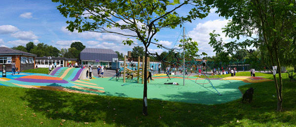
The park reveals the landscape when people walk through it. There are some places for contemplative activities, but the park has been designed to provide dynamic recreation. The design of the topography creates a sensation of continuity through the different areas, including a lake for model boats and a colorful playground. Winner of the Landscape Institute Award in 2008 and Green Flag Award in 2009, Northala Fields is an involved and active member of the quiet revolution of ecological urbanism. Giving voice to the environmentally and economically responsible design won’t change past excesses, but it will enlarge our expectations as we go forward. Recommended Reading: Phytoremediation: Transformation and Control of Contaminants by Steven C. McCutcheon Phytoremediation: Role of Aquatic Plants in Environmental Clean-Up by Bhupinder Dhir Article written by Elisa Garcia Return to Homepage6 Surprising Tricks You Need to Know for a Site Visit
With so much to take in on a single site visit, we thought these 6 tricks might help make your job just that bit easier. Visiting a new place can be an amazing experience. But sometimes circumstances – like a change in the weather – can put a dampener on even the most positive visitor’s enthusiasm. Here we offer a variety of useful tricks for being prepared and some fresh ideas for overcoming any obstacles. All the tips in this guide are easy to use, from simple ways to predict the weather to an interesting method to keep yourself oriented. 6. Getting interesting effects for your photos Do you take a lot of photos but think that they could show more? Sometimes getting the most expressive images is all in the way you look at things. Interposing something like vegetation between the focus of attention and the camera can result in a strong sensation of revealing an almost secret scene. Blurring the focus on certain elements is a good way to emphasize what you consider to be more relevant.
To do this, create distance between the main objects and the less important ones to make the latter seem like background. Where you position the camera can be key: Taking a photo with the camera on the ground will produce a completely different image than taking it from an upright angle. For more photography tips, I highly recommend this website. 5. What common animals tell us about the weather Most of animals react when humidity or air pressure levels change because of their extraordinary sensitive senses, so if you have the chance of see them during your visit you could take advantage of their behaviour paying a little attention to the following signs. In case of bad weather is coming, several animals outside, except frogs, usually stay more quiet or nervous than normal, although there are a wide range of clues depending on the animals. In general, if you notice that birds fly down, cows stay together and lying down on the ground and cats lick themselves insistently, taking an umbrella will be a very good decision.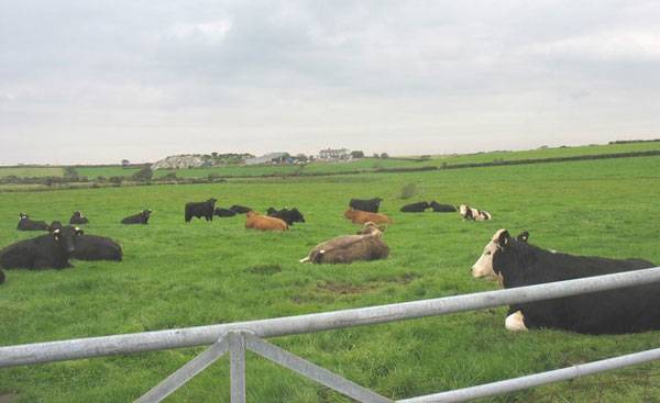
Can cows predict the weather?
Image: Lying cattle at Treferwydd Folklore. Credit: CC 2.0, by Eric Jones
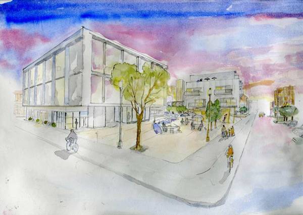
Invest in some watercolor pencils just like Brett Freeman did for this Sketchy Saturday entry.
Amazing Kinetic Sculptures That Could Hypnotize You
A Review of Anthony Howe’s Outdoor Kinetic Sculptures. When Anthony Howe imagines his next masterpiece, he thinks about it in terms of shape, as other artists do. But his creative mind also works with an unexpected factor that absolutely makes the difference: the idea of movement. From the most subtle to the most obvious way, everything around us is involved in processes that bring change and dynamic patterns. Why shouldn’t sculptures have a little of that lively touch? In designing his bold creatures over the past 25 years, Howe seems to have sensed how essential movement is for our visual experience. In fact, his sculptures attract our senses in a powerful way as soon as we lay eyes on them.
Amazing Kinetic Sculptures
The Challenge of Playing with Nature Movement makes sense of these structures; their designs can´t be perceived completely if we only look at them as scenes caught in photographs. Rather, we should view them as live performances. And while each sculpture has a major role in this unusual play, the surroundings also play a part. The sculptures work as icons that drive the attention to themselves in outdoor spaces, making those spaces distinctive. Circular movements strongly emphasize the natural world around them and connect the sculptures with each other. For that reason, these sculptures work everywhere in their unique and authentic way. Instead of copying the environment or being camouflaged, they are influenced by the landscape, without denying the artificial world they come from and the process that created them. WATCH: Findle
Meet the Kinetic Sculptures That Can’t Be Quiet
Howe´s sculptures look like a family of awesome creatures, each with its own strength and its own way of affecting its surroundings. There are lots of interesting optical effects, such as using two different rotating speeds in the same structure. That is the case for KweeBe, which could remind us how microorganisms move in liquid substances. Watch: KweeBe in action The popular series of sculptures called Octo are also absolutely surprising. If you are in front of them, they will show you the horizon through a dynamic hole that appears and disappears constantly. However, if you take a lateral position, they will turn into beautiful jellyfishes swimming on the air. WATCH: Octo 3 Other sculptures highly enlarge the perception of movement by the lighting effects, as the energizing Spines does. Its reflective stainless steel triangles rotate and light the surroundings in its crazy dance. There are a special group of sculptures showing a different pattern: They are formed by mobile panels creating the illusion of fragmented surfaces. WATCH: Spine Tower Related Articles:
- The Art and Science of Wind Propelled Sculptures
- Mark Nixon’s Chimecco Chime Bridge
- How Can You Make a Stunning Waterfall Even More Stunning?
My Father´s Influence is a really good representative of them. The mirrored panels reflect everything around, keeping each image just for a few seconds, and compounding an always dynamic whole vision made of changing points of view. WATCH: My Father’s Influence The Making of the Kinetic Effect Howe uses strong support from CAD software and less high-tech systems during the assembly process, which can last only 30 minutes. But how does he make the difficult so apparently easy? We can find some common keys in his strategies: Using light and resistant materials, such as fibreglass or steel, to take advantage even of the lightest breezes is a great point, but sometimes he needs to add a gear motor, too. In general, each sculpture is formed by two ranges of pieces working together. There is a stainless steel skeleton that includes mobile axles to create every single movement, and a group of pieces to catch wind through their curved, wider surfaces. Very often, this gives us the impression of floating in the air by themselves, like Ring Around does. WATCH: About Face There is a lot of Anthony Howe in these giant wind toys that seem to swim, dance, or breathe in their own beautiful way. They take the space around them and give it back to us connected with underwater worlds, faraway universes, and our powerful imaginations. Recommended Reading:
- Drawing on the Air: The Kinetic Sculpture of Tim Prentice by Tim Prentice
- Land and Environmental Art by Jeffrey Kastner
Article written by Elisa Garcia Return to Homepage
- 1
- 2


