


Author: Land8: Landscape Architects Network

Thailand’s Got Talent -10 Awesome Projects from Thailand
Article by Andrea Robezzati Following on in our world series we have selected 10 awesome projects that perfectly represent projects in Thailand today. Take one of the poorest and most problematic countries in the world and imagine finding some of the best examples of landscape architecture. Welcome to Thailand! The place where the worst natural catastrophe in history happened; the place where growing urbanization and climate change problems are the most significant. The tsunami disaster of 2004 left a deep mark on Thailand’s culture and people, and the motto “Build Back Better” became a strong and amazing reality in just a few short years. Let’s check out these excellent examples!
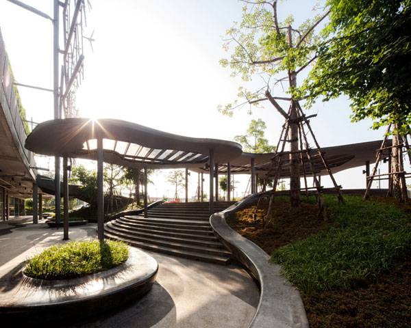
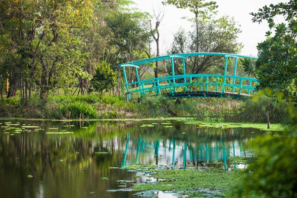
Projects from Thailand
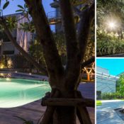
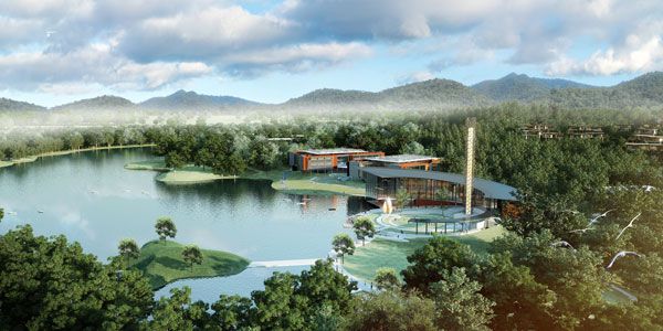
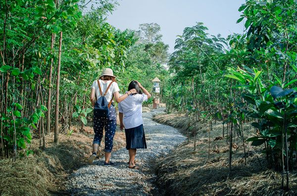
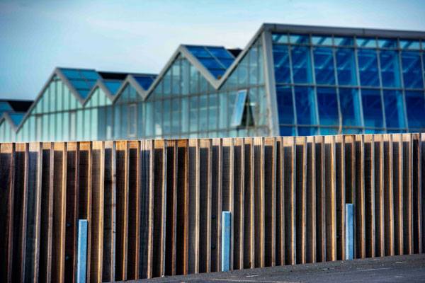
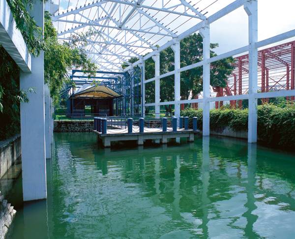
10. Ladprao Condominium Garden, Shma Co. Ltd, Bangkok, 2011 Situated on one of the most congested and polluted roads, with very limited space available, this 3200 m2 garden makes the most of it, both on the ground and in the sky. Shma designed a small, high-density urban forest, with attention to providing the maximum diversity of plants to help purify the air, reduce noise pollution, offer a variety of wildlife habitats, plus secluded space for inhabitants, greatly improving the overall quality of life in the city.
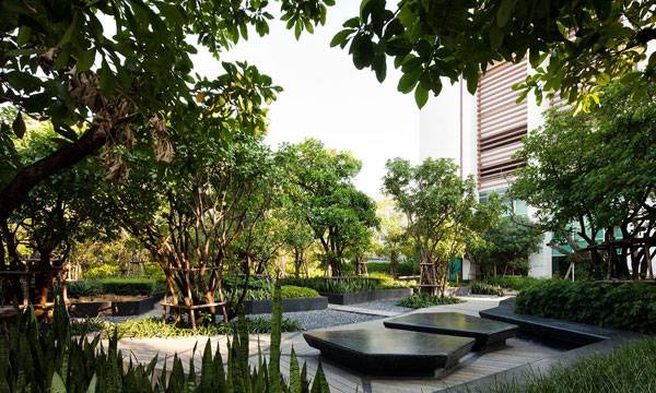
Ladprao Condominium Garden, Shma Co Ltd, Bangkok, Thailand. Photo courtesy Shma Design
Central Plaza in Chiang Rai by shma.
Siree Ruckhachat Nature Learning Park. Axis Landscape Ltd.
Vidyasirimedhi Institute Of Science and Technology and Kamnoetvidya Science Academy (VISTEC & KVIS) . Photo courtesy of Landscape Architects 49
Ming Mongkol Green Park. Image courtesy of Landscape Architects 49 Limited
Thai Public Broadcasting Service (Thai PBS) Headquarter. Photo courtesy of XSiTE Design Studio Co., Ltd.
Baan San Kraam by Sanitas Studio. Photo credit: Wison Tungthunya
PTT Eco Forest Rayong Wanarom Learning Center. Photo courtesy of KV ART&DESIGN CO.,LTD
Renaissance Phuket Hotel. Photo courtesy of Landscape Architects 49
- Becoming an Urban Planner: A Guide to Careers in Planning and Urban Design by Michael Bayer
- Sustainable Urbanism: Urban Design With Nature by Douglas Farrs
Article by Andrea Robezzati


How to Exhibit the Beauty of Green Power
Article by Luis Guísar Windlicht artwork by Studio Roosegaarde, in Eneco wind farm at Sint Annaland, Zeeland, The Netherlands Studio Roosegaarde, founded by Dutch artist Daan Roosegaarde and located in Rotterdam, The Netherlands, “creates interactive designs which explore the dynamic relation between people, technology and space” – Studio Roosegaarde. The studio is concerned about sustainability and art, which has led it to create a series of projects such as The Windlicht artwork and a smog vacuum cleaner in Rotterdam that is designed to improve the city’s air quality. To create the Windlicht artwork, Studio Roosegaarde wanted to transform the Dutch landscape by adding playful values. They also wanted to show how beautiful green wind energy could be. The inspiration came from a small town named Kinderdijk and its windmlls. The design team decided to take an old-fashioned and out-of-favor icon and turn it into something fresh. For Daan, “these windmills from 1740 are a perfect example of Dutch innovation. Reconnecting with the landscape and creating a positive image around green energy also drives him.” (Studio Roosegaarde). So, how did Studio Roosegaarde break the natural skyline without causing a major ecological disaster?
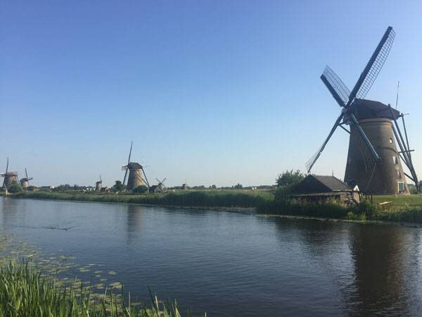
Photo courtesy of Studio Roosegaarde
Photo courtesy of Studio Roosegaarde
A Spectacle of Lasers, Color, and Wind The first impressions we get from studying the Windlicht artwork are visual. They are produced by the combination of lasers, rotational movement, and the context of the site. The green light of each laser transforms the site’s skyline in ways we may think are impossible. First of all, the gentle and elegant movement of each blade are relaxing. This sensation is strong enough to make us not notice the fact that each blade rotates at 280 kilometers per hour, according to Studio Roosegaarde calculations. Here is the official movie in which you can witness this spectacle. The installation also transforms the rotational movement of the blades into a sort of light gear, which is in fact the truth: Windmills function and generate green energy based on mechanical gears. This way, we are witnesses to how two or more windmills interact, creating a unique synchronization. Each laser not only transforms the skyline of the Enco wind farm in Zeeland, it also changes the perception of the windmill itself and its surroundings. It is necessary to perceive the installation from the bottom of the windmills, at the foundation of the columns. A unique spectacle of contrast between the windmill structure and the reflection of the green light laser on the ground increases an abstract appreciation of both elements, allowing for personal interpretation.
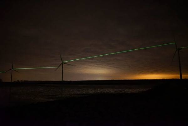
Photo courtesy of Studio Roosegaarde
Credit: ‘Daan Roosegaarde’ and Heijmans
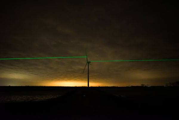
Photo courtesy of Studio Roosegaarde
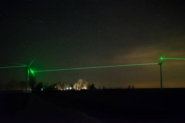
Photo courtesy of Studio Roosegaarde
Full Project Credits For Windlicht Artwork:
Project Name: Windlicht artwork Design: Studio Roosegaarde Location: Eneco wind farm at Sint Annaland, Zeeland, The Netherlands Partners: KPN Design Timeline: 2014-2016 Completion: 2016 Photos: Studio Roosegaarde Recommended Reading:
- Becoming an Urban Planner: A Guide to Careers in Planning and Urban Design by Michael Bayer
- Sustainable Urbanism: Urban Design With Nature by Douglas Farrs
Article by Luis Guísar


Cultural Corridor Chapultepec Makes Ambitious Proposal for Public Space
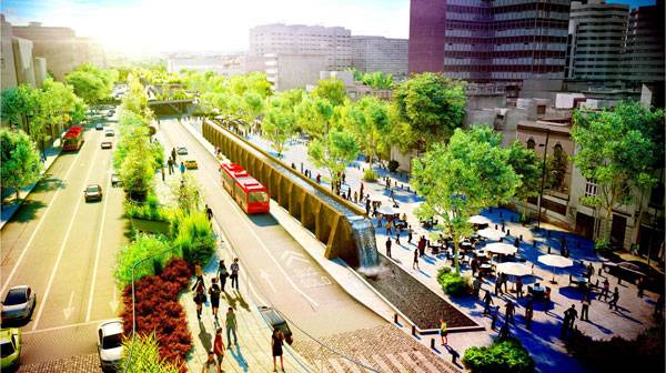
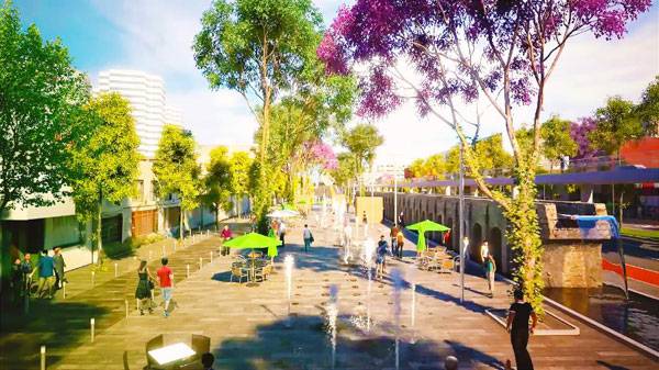
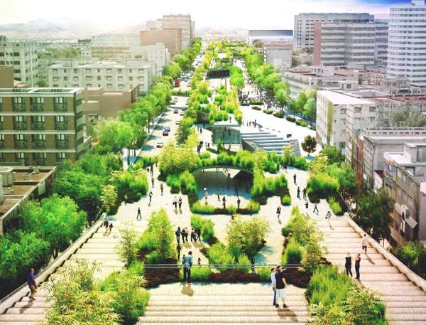
Article by Cristina Ferrara Cultural Corridor Chapultepec by FR-EE, in Chapultepec Avenue Mexico City. How many times, strolling on the street with your head held high, have you felt upstaged compared to the surrounding vehicles and buildings? Who, at least once in their life, desired to freely walk in the urban center, without worrying about one’s safety from cars, dangerous crossings, and the traffic noise? Well, something is going to change now in Mexico City because there will be a solution that is going to make the difference; a two-level green corridor running from Chapultepec Park down to the Glorieta de los Insurgentes, dedicated to pedestrians, bikes, skaters, wheelchairs, and strollers at the street level, in specifically designed lanes. It is the CCC– The Cultural Corridor Chapultepec by FR_EE Fernando Romero Enterprise, 1.3 kilometers of reinvented urban space specifically designed to give relevance to public spaces that embrace the history of places and which considers how crucial the presence of green areas are for high quality of life in any city.
Cultural Corridor Chapultepec. Image courtesy of FR-EE
Cultural Corridor Chapultepec
The project aims to “organize the surroundings, will double the green areas, will enhance connectivity and will celebrate the cultural diversity of the city” – says Fernando Romero, general director of FR-EE. Different Functions, one Goal: Make People Happy… and Active! The CCC is a multicultural approach, encouraging people to visit different creative and artistic open rooms; the theater and cinema area, water dedicated spaces, a reading and learning location, music places, and art settings. They are the fil-rouge of the pedestrian tape that lies on two levels; the ground floor and mezzanine, and the first level. Free time can be spent having ping pong matches with friends, visiting art galleries, or reading in the digital public library. Dancing spots and urban musical instruments, speakers, and a dance hall are available for all music-loving people, while a range of emotions are guaranteed at the open air auditorium; others might be stimulated at the first level cinema. If you have children, you can try kids-and-adults’ workshops, interactive fountains, or water exhibitions. All these attractions are perfectly mixed with a restorative mass of vegetation making this site the perfect place to relax and have fun.
Cultural Corridor Chapultepec. Image courtesy of FR-EE
Cultural Corridor Chapultepec. Image courtesy of FR-EE
Full Project Credits For the Cultural Corridor Chapultepec:
Project Name: Cultural Corridor Chapultepec (Spanish: Corredor Cultural Chapultepec) Client: Sapi de CV Date: 2015 – 2017 Location: Chapultepec Avenue, between Lieja street and the Glorieta de los Insurgentes, Delegación Cuauhtémoc, 06700, Mexico City Program: Mixed use Construction Area: 452,085 square feet (42,000 square meters) Architects: FR-EE / FRENTE / RVDG Landscape Design: Mario Schjetnan GDU FR-EE Team: Fernando Romero, Mauricio Ceballos, Raymundo Zamora, Ignacio Méndez, Gustavo Pérez, El Mehdi Belyasmine, Montserrat Fragoso, Libia Castilla, Diego Velázquez, Alba Díaz, Gaia Cella, Pedro Ramírez, Ignacio Herrera, Aarón García, César López, Cecilia A. Pérez, Angélica Ortiz, Alejandro Magallón, Carlos Flores, Karen Soto, Antonio Carpio, Miguel Araujo, Diego Venegas, Christian García, Jessica Wang, Rigel Scarlett Dávila Cantú, Christopher Alexander Hernández Muñoz, Alan Mauricio Parra Vázquez, Ana Laura Cardoso Rodríguez, Vania Velasco Rodríguez, Oswaldo Guzmán Montero, José Jorge Carbajal Domínguez, Clarissa Moreno Tapia, María Fernanda León Sánchez, David Ari Orozco Suarte, Saúl Flores López, Adriana Jaquez Anguiano, Martha Angélica Villa Vivas, Diego Venegas Cuevas, Luis Enrique Torres Lira, Raymundo García Meneses, Edgar Campusano Ramírez, Araceli Damián Navarrete, Annia Rocha, Luis Enrique Pérez Cervantes, Viridiana Quintana García, Manuel A. Archundia Reyes, Osvaldo Jasso Vargas, Aranza Campeche Ramírez, Johana Vega Baltazar, Rodolfo Romero Chávez, Diego Guzmán Penella, Lucy Alejandra Rodríguez Iglesias, Christian García Díaz, Isabel Landín, Yair López Marín, Diego Jacobo Ruvalcaba, Alejandro Hernández Morales, Eunice Marisel Salinas Yáñez, Paola Castanedo Shaadi FRENTE / RVDG Team: Juan Pablo Maza, Ruysdael Vivanco, Jonathan Estrada, Narciso Martínez, Oriana Barrera, Mario Ramos, Mario Alquicira, Tania Juárez, Diana Pérez, Omar Velasco, Ana Pérez External Team: 24 Studio, Colinas de Buen, Ingeniería Experimental, ICA Ingeniería, Lighteam, Ildefonso Rodríguez Recommended Reading:
- Becoming an Urban Planner: A Guide to Careers in Planning and Urban Design by Michael Bayer
- Sustainable Urbanism: Urban Design With Nature by Douglas Farrs
Article by Cristina Ferrara


Top 10 Books for Hand Drawing
Article by Irene Crowo Nielsen We take a look at a selection of our top 10 books for hand drawing, helping you to get better at this wonderful skill. Always wanted to grip a pencil and draw beautiful drawings? Have you looked at others and thought, “wow, that looks easy”, but when you try it is so hard! If yes, keep reading! Because here are some seriously inspiring books to improve your hand drawing skills whether you are just starting out, think you suck at hand drawing or are a more experienced drawer looking to take your drawing skills to the next level. Whether you want to draw realistic cityscapes, lifelike trees, or completely master the art of perspective drawing. It’s time to embark on your creative journey. Pick up your pencil and begin today!
Books for Hand Drawing
10. Drawing Trees (2007), by Victor Perard This book is super-inspiring for how to draw realistic trees using different sketching techniques. It also offers plenty of trees in every height, shape, and type to trace.

Front cover of Drawing Nature for the Absolute Beginner by Mark Willenbrink, Mary Willenbrink
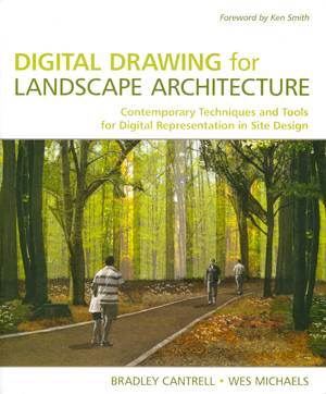
Front cover of Digital Drawing for Landscape Architecture
5. The Art of Perspective: The Ultimate Guide for Artists in Every Medium (2007), by Phil Metzger If the concept of perspective makes you shiver, because you expect pictures of confusing angles, fancy measuring gadgets, and complicated theories, get ready for a very pleasant surprise! This book demystifies perspective, and presents simple but powerful techniques for achieving a convincing illusion of depth and distance. 4. You Can Draw in 30 Days: The Fun, Easy Way to Learn to Draw in One Month or Less (2011), by Mark Kistler If you want to start drawing, but you don’t know how or where to begin, this book is perfect for you! This book shows you quick and easy step-by-step instructions for drawing, from simple spheres to apples, trees, buildings, and the human hand and face. The mantra of this book “…In just 20 minutes a day for a month, you can learn to draw anything, whether from the world around you or from your own imagination.” 3. Experimental Drawing , 30th Anniversary Edition: Creative Exercises Illustrated by Old and New Masters (1992), by Robert Kaupelis This book is not your average “how-to-draw” book. It focuses on how you can improve the way you form ideas and concepts. You will most likely take your drawing skills to a new and more intriguing level by performing some of the innovative exercises you will find in the book. How about drawing models while blindfolded or integrating a grid system?
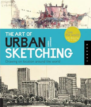
Front cover of The Art of Urban Sketching
- Drawing for the Absolute Beginner: A Clear & Easy Guide to Successful Drawing (Art for the Absolute Beginner) by Mark Willenbrink
- You Can Draw in 30 Days: The Fun, Easy Way to Learn to Draw in One Month or Less by Mark Kistler
Article by Irene Crowo Nielsen


Living Roofs | Book Review
Book review by Rose Buchanan – Total reading time 3minutes A book review of Living Roofs, produced by teNeues and written by Ashley Penn Can you imagine living without a garden? For many people the thought of this is unbearable. Gardens provide us with green, private spaces that we enjoy in the company of others or in treasured solitude. For this reason the idea of a large house in a leafy suburb with sprawling lawns is often held as the ideal lifestyle. However, with the growing population there is a greater need for people to live in a high density city. This usually means a confined living space in high rise apartments with no gardens. In reaction to this, there has been a growing trend for inner city residential spaces to include rooftop garden spaces. Not only do these spaces provide personal gardens, but their sustainable advantages for the city are numerous. These gardens provide habitat for birds and insects, clean the polluted city air, retain stormwater, and can even improve the climatic functions within the building while reducing the amount of heat radiated outwards. Architects have begun to take this into account, blurring the lines between inside and outside through using roof gardens as an extension of their buildings while choosing planting as alternatives to roof sheeting. Order this book here. But if you’re still not convinced read on!
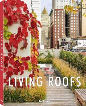
Living Roofs with texts by Ashley Penn. Get it HERE!
Living Roofs
“Living Roofs” by Ashley Penn is a beautiful coffee table book which has recognized the growing trend for roof top gardens and has showcased various examples through strong visuals and informative text. The book features thirty-five rooftop gardens from around the world with each example as a unique response to its site, context, and architecture. These projects range from compact but extensive green roofs and roof gardens, to luxury penthouses with intensive roof planting. Each featured project serves as inspiration for a whole range of approaches from creating hardscaped contemporary solutions to urban gardening and green oases. About the Writer Ashley Penn is a Chartered Member of the Landscape Institute in the United Kingdom and has worked for many years as a landscape architect. He is no stranger to Landscape Architects Network and is currently the Content Director for the site while freelancing as a landscape designer. He has also written numerous articles for the network, including articles on green roofs such as “An Essential Guide to Extensive Green Roofs”. In the book’s foreword, Ashley describes the term “roof garden” as referring to “green roofs or roof terraces where plants are planted in containers”. The foreword also explains the difference between intensive (deeper planting) and extensive (thin, lightweight planting) and each project is described in terms of these differences.
What do you get From this the book Living Roofs?
- An understanding of what green roofs are
- Large photographs of outstanding residential green roofs
- Detailed descriptions of the projects, highlighting their unique aesthetic characteristics
- Captions with project details including location, designer, size, material, and plants used
- Plan and elevation layouts
Living Roofs with texts by Ashley Penn.
Why you Should buy the Book – Living Roofs?
Living Roofs is the type of book that you can pick up and page through or sit and delve into the projects in detail. The images are spectacular and provide the reader with a complete understanding of the projects while instilling a sense of inspiration and continued interest. Each page is well-constructed and formatted, making it easy to navigate without dwelling too long on one project. Ashley’s narrative of the projects provides just the right amount of technical and aesthetic information while critically engaging with the specific design intentions. Information such as the climatic zones and planting palette take the text beyond simple descriptions while labelled plans add an essential component of understanding for fellow architects or designers.
Living Roofs with texts by Ashley Penn.
Living Roofs with texts by Ashley Penn. Get it HERE!
If you love this book review on Living Roofs, check out these other book reviews:
- Landscape and Urban Design for Health and Well-Being
- Digital Drawing for Landscape Architecture
- 10 Books to Read in Your Fourth Year of Landscape Architecture
Order your copy of Living Roofs today!
Book review by Rose Buchanan


When Going on Holiday is One Step out the Front Door
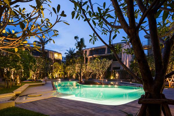
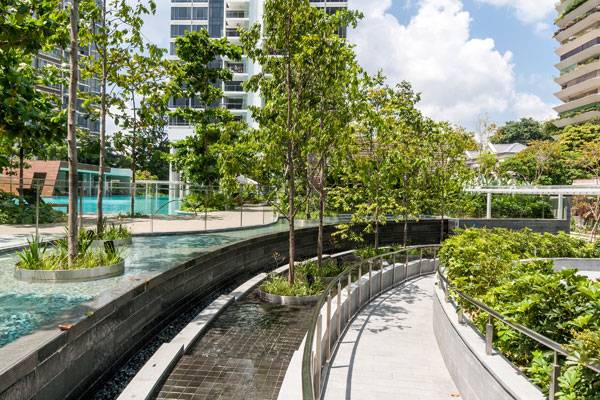
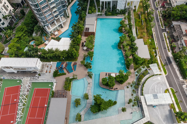
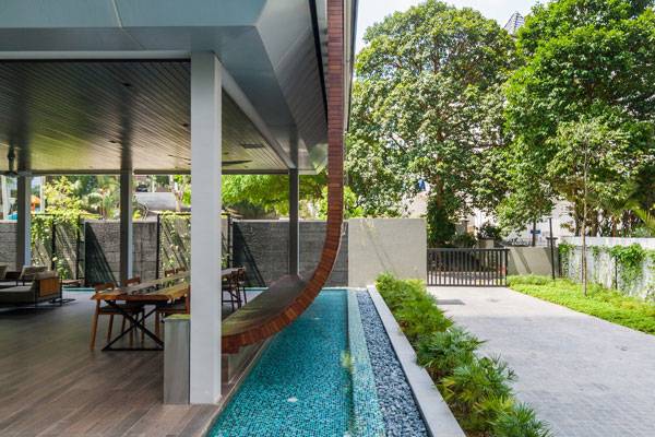
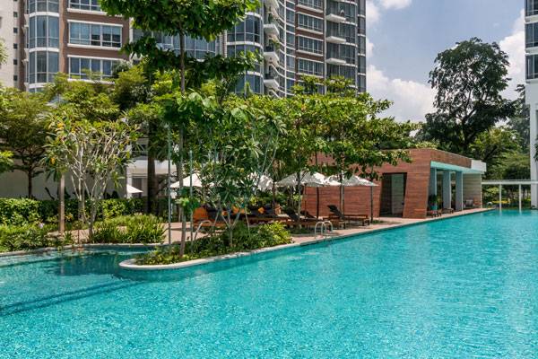
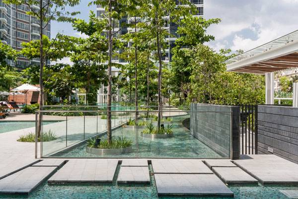
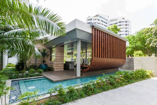
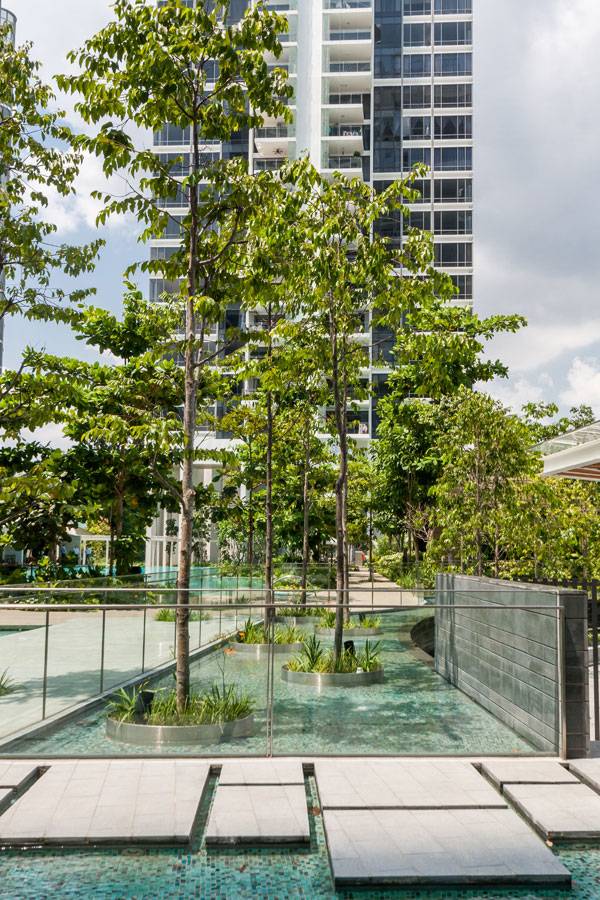
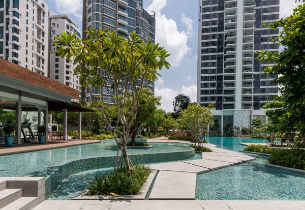
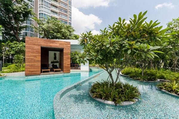
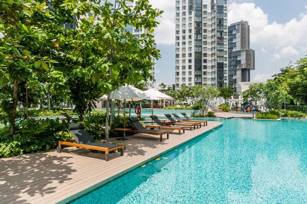
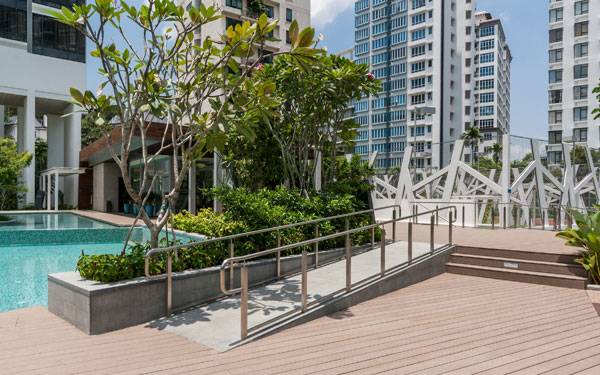
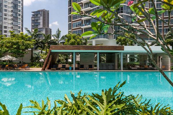
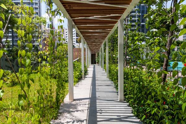
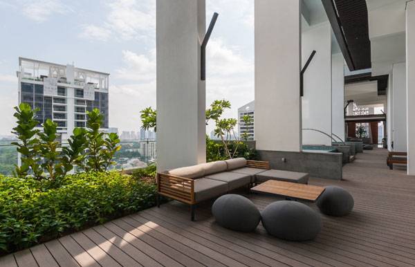
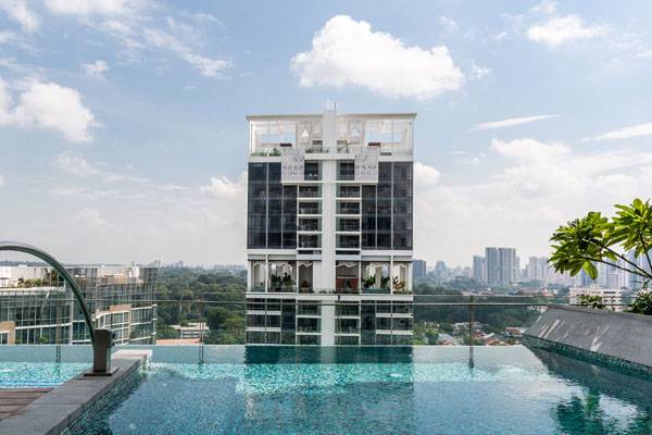
Article by Rose Buchanan – Total reading time 3 minutes Cyan, by ONG & ONG Pte Ltd, Bukit Timah, Singapore It’s not often that you see a residential development dominated by outdoor recreational space. In fact, most developments squash as many tiny living spaces as possible onto one property to “maximize” their return. This is not true of Cyan, a prime residential development located in Bukit Timah in Singapore. Cyan’s two 24-story towers cover just 18 percent of the total land area, leaving the rest of the site open for landscaping. What’s more, this landscaping does not simply consist of rolling lawns and occasional plantings, but boasts fully programmed spaces that create a magical, resort-like setting within the city center. With a gym, children’s play areas, spa facilities, various “themed” swimming pools, a 50-meter lap pool, sun decks, and a considerable area of lush vegetation, this is far more than an ordinary apartment development.
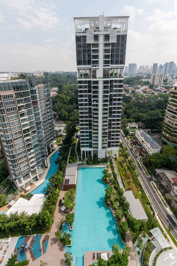
Cyan. Photo credit: Bai Jiwen
Cyan. Photo credit: Bai Jiwen
Cyan. Photo credit: Bai Jiwen
Cyan. Photo credit: Bai Jiwen
Cyan. Photo credit: Bai Jiwen
Cyan. Photo credit: Bai Jiwen
Cyan. Photo credit: Bai Jiwen
Cyan. Photo credit: Bai Jiwen
Cyan. Photo credit: Bai Jiwen
Cyan. Photo credit: Bai Jiwen
Cyan. Photo credit: Bai Jiwen
Cyan. Photo credit: Bai Jiwen
Cyan. Photo credit: Bai Jiwen
Cyan. Photo credit: Bai Jiwen
Cyan. Photo credit: Bai Jiwen
Cyan. Photo credit: Bai Jiwen
Full Project Credits For the Pavilion for Cyan:
Project Name: Cyan Landscape Architect: ONG & ONG Pte Ltd Location: Bukit Timah, Singapore Date of Construction: 2013 Director: Lena Quek Photographer: Bai Jiwen Recommended Reading:
- Becoming an Urban Planner: A Guide to Careers in Planning and Urban Design by Michael Bayer
- Sustainable Urbanism: Urban Design With Nature by Douglas Farrs
Article by Rose Buchanan

How a Stunning Plaza Can Make College Students Realize Their Full Potential
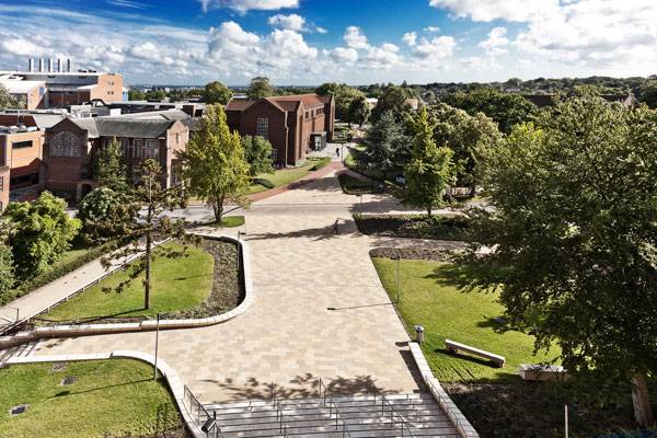
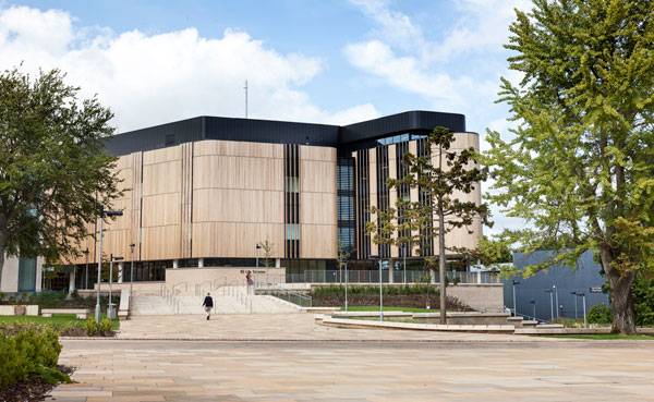
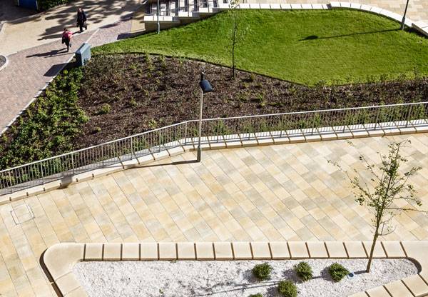
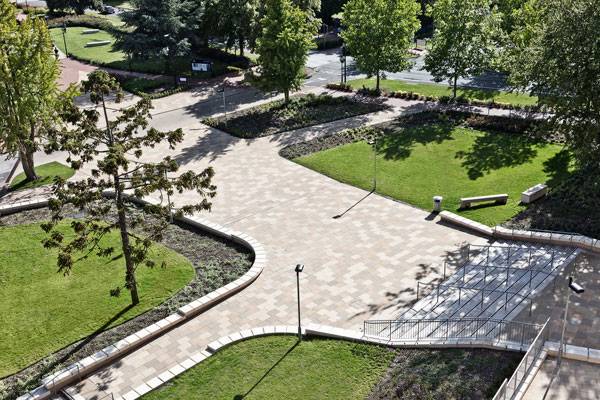
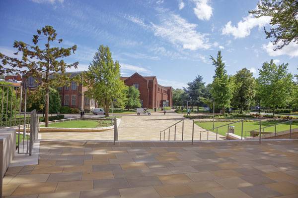
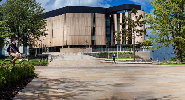
Article by Nour Adel – Total reading time 3 minutes Jubilee Plaza, by Ubu Design, in University of Southampton “Space to walk is also space to think, and I think that’s one thing landscapes give us: places to think longer, more uninterrupted thoughts or thoughts to a rhythm other than the staccato of navigating the city.”― Rebecca Solnit, Storming the Gates of Paradise: Landscapes for Politics Who would not love a spacious outdoor plaza at their college, where they have a space for relaxing, socializing, and brainstorming? You guessed it; Nobody. The learning process has been changing throughout the years and students need spaces where they can sit back, relax, and unleash their creativity without being confined in a lecture hall.
Jubilee Plaza. Photo credit: ©martingardner
Jubilee Plaza
Ubu Design has been commissioned to undertake the design of a new piazza at its Highfield Campus situated on the leafy outskirts of Southampton City Centre. Right in front of the award-winning Life Sciences building, the piazza, known as Jubilee Plaza, occupies the former site of a building known as the George Moore building. Multi-purpose Piazza The main purpose of the plaza is to improve pedestrian access to the area, creating an attractive route between the Life Sciences Building and Library Square while offering a series of awesome spaces for users to gather, sit, and relax.
Jubilee Plaza. Photo credit: ©martingardner
Jubilee Plaza. Photo credit: ©martingardner
Jubilee Plaza. Photo credit: ©martingardner
Jubilee Plaza. Photo credit: ©martingardner
Jubilee Plaza. Photo credit: ©martingardner
Full Project Credits For Jubilee Plaza:
Project Name: Jubilee Plaza, University of Southampton Architects: Ubu Design Client: University of Southampton Consultants: NBBJ, Plincke, Arup, AKT, EC Harris (undertaken while working for Plincke) Status: Completed Awards: RIBA 2011 regional award winner Photography: ©martingardner Recommended Reading:
- Becoming an Urban Planner: A Guide to Careers in Planning and Urban Design by Michael Bayer
- Sustainable Urbanism: Urban Design With Nature by Douglas Farrs
Article by Nour Adel

How Nature Explains Itself Through Architecture
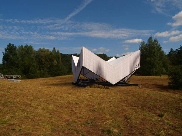
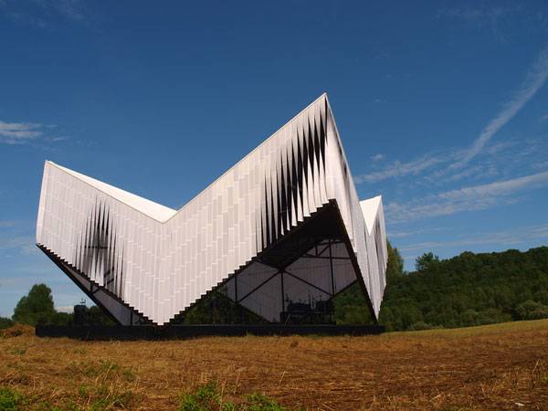
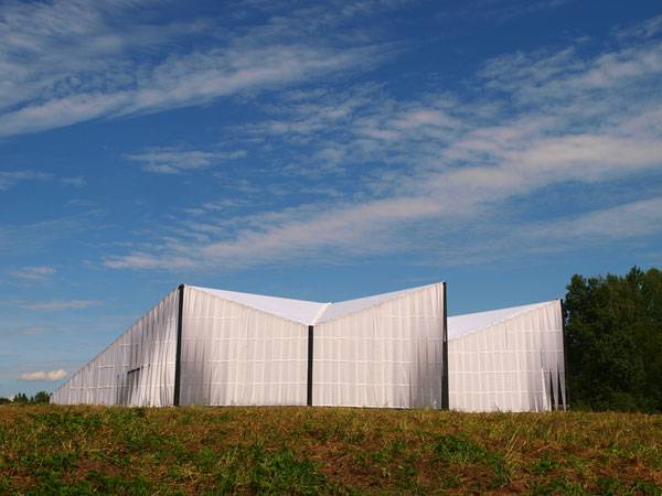
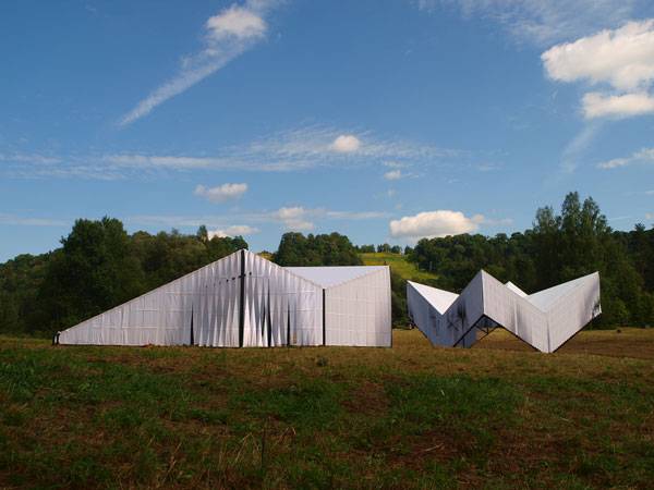
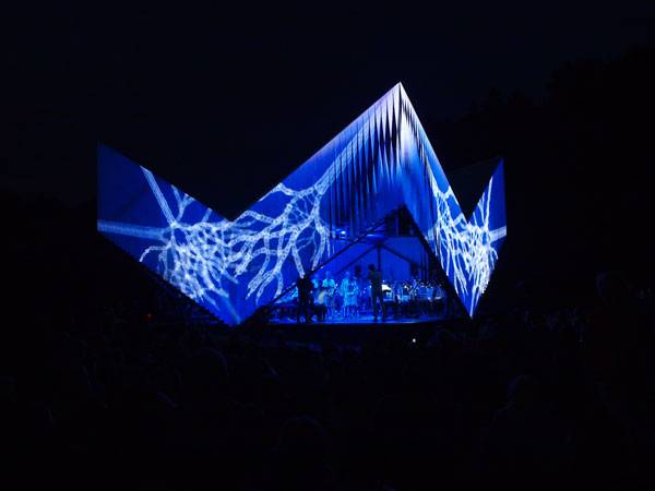
Article by Eleonora Fiorin – Total reading time 4 minutes Pavilion for the Nature Concert Hall, by Architecture office DJA (Didzis Jaunzems Architecture), in Gauja National Park, Sigulda, Latvia. Sometimes, architecture breaks its boundaries and combines its identity with other human expressions to reach a higher level of communication with our sensibilities. This is the case with the Nature Concert Hall pavilion in Sigulda, Latvia. As we inquire into this construction, we will face something more: an idea revealed in an atmosphere, an experience realized only because of people believing in it, that goes beyond simple architecture. It has something to teach us. Nature Concert Hall 2005 is a non-profit organization whose aim is to create occasions, interactive events, and shows to help people understand and reconnect with nature. The association is trying to offer not only a classical educative approach, but a strong and sensitive life experience.
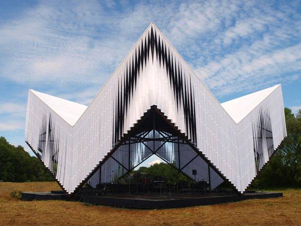
Pavilion and Workshops for Nature Concert Hall. Photo credit: Ernests Sveisbergs
Pavilion and Workshops for Nature Concert Hall
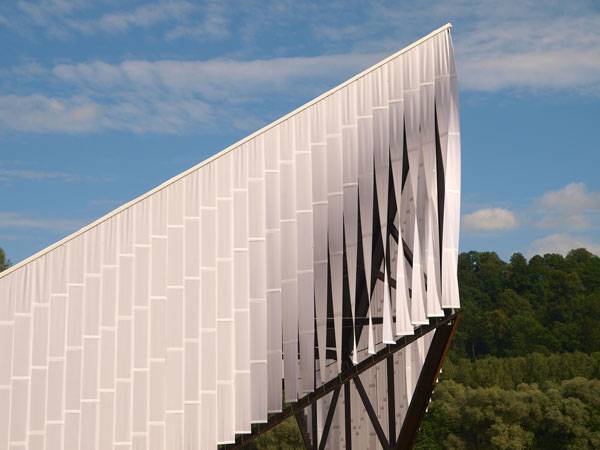
Every summer the group organizes multimedia, nature-educational events incorporating science, theater, music, and arts with different characteristics according to the theme of each year. To do so, they provide exhibitions, lectures, and — of course — buildings. The pavilion we are talking about here was designed and constructed by Didzis Jaunzems and Klinta Pickaine in 2014, and can be reasonably considered the architectural concretization of the spirit of attention, appurtenance, and deep feeling that should connect us to the environment that surrounds us.
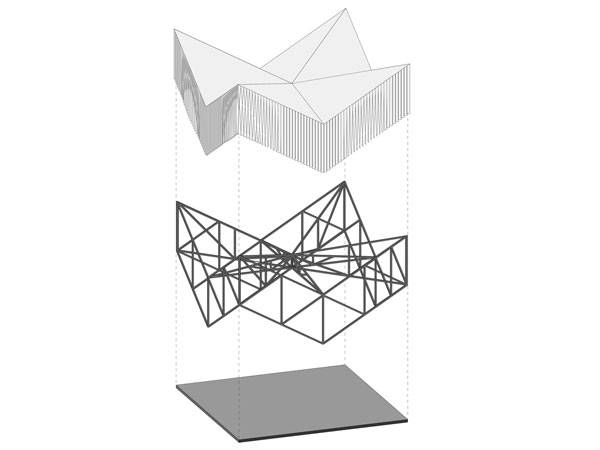
Diagram of the structure of the Pavilion and Workshops for Nature Concert Hall. Image courtesy of DJA
Pavilion and Workshops for Nature Concert Hall. Photo credit: Ernests Sveisbergs
Pavilion and Workshops for Nature Concert Hall. Photo credit: Ernests Sveisbergs
Pavilion and Workshops for Nature Concert Hall. Photo credit: Ernests Sveisbergs
Pavilion and Workshops for Nature Concert Hall. Photo credit: Ernests Sveisbergs
Pavilion and Workshops for Nature Concert Hall. Photo credit: Ernests Sveisbergs
Pavilion and Workshops for Nature Concert Hall. Photo credit: Ernests Sveisbergs
Full Project Credits For the Pavilion for the Nature Concert Hall:
Project Name: Pavilion and Workshops for Nature Concert Hall Location: Gauja National Park, Sigulda, Latvia Client: Association “Nature Concert Hall” Project Author: Architecture office DJA (Didzis Jaunzems Architecture) – Didzis Jaunzems, Klinta Pickaine Area: 150 square meters Year: August 2014 Engineers: “Veldrums and Partners” Ltd. Builders: „Hanza Film Service” Ltd. Photos: Ernests Sveisbergs Recommended Reading:
- Becoming an Urban Planner: A Guide to Careers in Planning and Urban Design by Michael Bayer
- Sustainable Urbanism: Urban Design With Nature by Douglas Farrs
Article by Eleonora Fiorin


How can a bridge Serve as Outstanding Eco-Infrastructure?
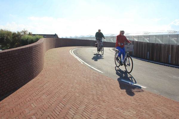
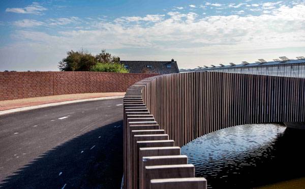
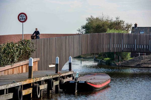
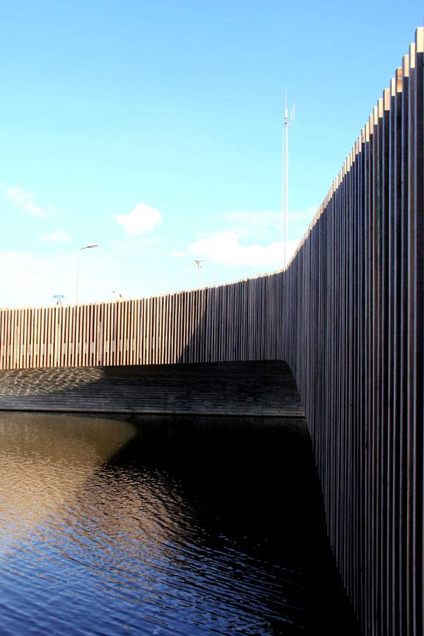
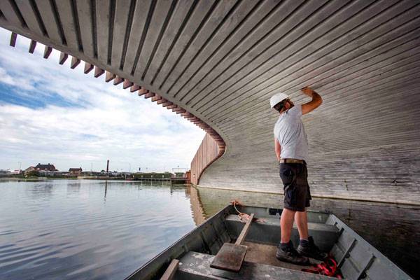
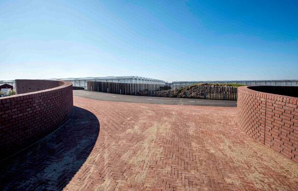
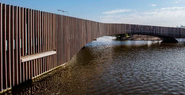
Article by Eni Çeka – Total reading time 5 minutes Vlotwatering Bridge, by NEXT Architects, Monster, Netherlands The Vlotwatering Bridge is a unique eco-friendly bridge that connects the residents of the Dutch town of Monster with the Poelzone, a recreational area located in the Westland region of South Holland. The 70-meter “Batbridge” was designed by NEXT Architects, a design office based in Amsterdam and Beijing and the construction was finished last October. The bridge improves the ecological value of its environment by providing an attractive roosting space for the local bat colony, who feed off the river insects. The architects were able to successfully merge the bat’s needs with a curvilinear path conducive for walks and bicycle rides. The serpentine structure is not only functional and aesthetically pleasing but also offers an overlook to the best landscape views. The project was endorsed by bat expert Marcel Schillemans of the Dutch Mammal Society, “A textbook example of how a functional object can at the same time serve nature.”
Vlotwatering Bridge. Photo credit: Raymond Rutting
Vlotwatering Bridge
How did the Architects Create the Ideal Habitat for Various bat Species? The bridge design offers differing habitats aiming to grow a large bat colony around the bridge. Through a well-thought-out design, the structure has three specific bridge components that provide year-round accommodation for bats. The northern abutment has been designed for winter hibernation. The structural space in the cross section is cleverly used to implement the roosts. The underside of the bridge is provided with entrance slits which are part of a pattern of grooves in the concrete arch. The slits are largely kept out of sight to protect bats from natural predators such as owls. The openings are very small and have a rough finish for grip. They are marked by a series of tinted bricks with open joints on either side. During summer, the bats can stay in the openings underneath the deck and the brick balustrade.
Vlotwatering Bridge. Photo credit: Raymond Rutting
Vlotwatering Bridge. Photo credit: Raymond Rutting
Vlotwatering Bridge. Photo credit: Raymond Rutting
Vlotwatering Bridge. Photo credit: Raymond Rutting
Vlotwatering Bridge. Photo credit: Raymond Rutting
Vlotwatering Bridge. Photo credit: Raymond Rutting
Why Spend Time, Energy and Money on a bat Habitat? Despite the popularity of the bat bridge in Austin, bats are still among the world’s most endangered and least appreciated animals. Unfortunately, besides suffering from habitat loss and environmental pollution, the primary cause of bats’ decline is persecution from humans. Is it time to give bats a break by not falling for the old myths describing them as scary and dark creatures?
Vlotwatering Bridge. Photo credit: Raymond Rutting
Vlotwatering Bridge. Photo credit: Raymond Rutting
Vlotwatering Bridge. Photo credit: Raymond Rutting

Vlotwatering Bridge. Photo credit: Raymond Rutting
Full Project Credits For Vlotwatering Bridge:
Project Name: Vlotwatering Bridge Location: Monster, Netherlands Architects: NEXT Architects Client: Municipality of Westland Date of construction: 2015 Budget: € 700.000 Photographs: © Raymond Rutting Team: Bart Reuser, Marijn Schenk, Michel Schreinemachers, Jurriaan Hillerström, Sylvia Hendriks, Luuc Sonke, Anne Hilgers, Anna Korzeniowska Awards: ARC15 Detail Award Recommended Reading:
- Becoming an Urban Planner: A Guide to Careers in Planning and Urban Design by Michael Bayer
- Sustainable Urbanism: Urban Design With Nature by Douglas Farrs
Article by Eni Çeka


How to use Computer Games in Landscape Architecture
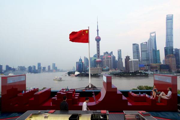
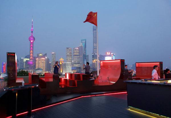
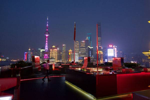
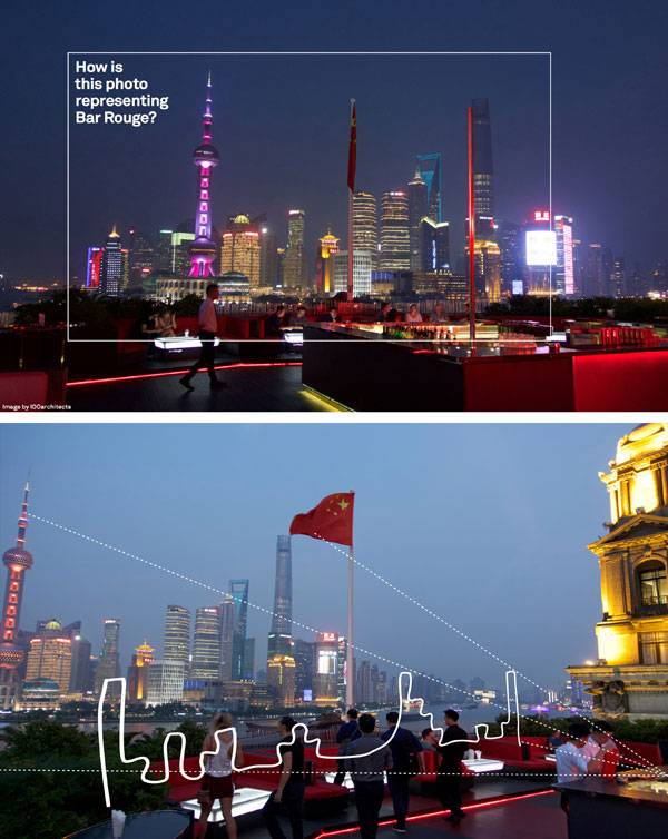
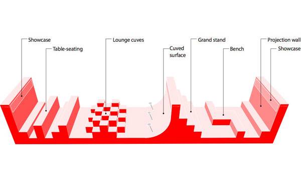
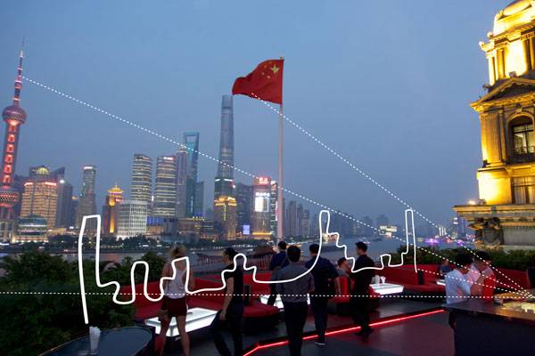
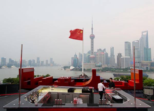
Article by Paula Uzarek – Total reading time 5 minutes Red Rouge, by 100architects, in Shanghai, China Do computer games influence landscape architecture; the art of arrangement of elements in a given space? When talking about inspiration, they sure do. It is also known that certain kind of games have an impact on our brain activity as they stimulate the processing of spatial elements. But what connects Tetris with public space design, and with the world of design itself? When looking at Red Rouge in Shanghai, it is striking that the simple, geometrical shapes of polyominoes from a popular tile-matching puzzle game can create an array of seating, tables, and walls in Bar Rouge terrace. This, Shanghai’s most privileged balcony, with a stunning view of the Pudong area, is enriched with a new, red, VIP Lounge area. Red Rouge maximizes the impact of the panorama, just as Tetris boosts our cognitive skills. So how does this project increase the value of landscape design?
Red Rouge. Image courtesy of 100architects
Red Rouge. Image courtesy of 100architects
Red Rouge. Image courtesy of 100architects
Red Rouge. Image courtesy of 100architects
Red Rouge. Image courtesy of 100architects
Red Rouge. Image courtesy of 100architects
Red Rouge. Image courtesy of 100architects
Full Project Credits For Red Rouge:
Project Name: Red Rouge Location: Shanghai, China Designer: 100architects Size: 14,85 x 2,7 meters Client: VOL Group Recommended Reading:
- Becoming an Urban Planner: A Guide to Careers in Planning and Urban Design by Michael Bayer
- Sustainable Urbanism: Urban Design With Nature by Douglas Farrs
Article by Eni Çeka


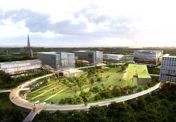
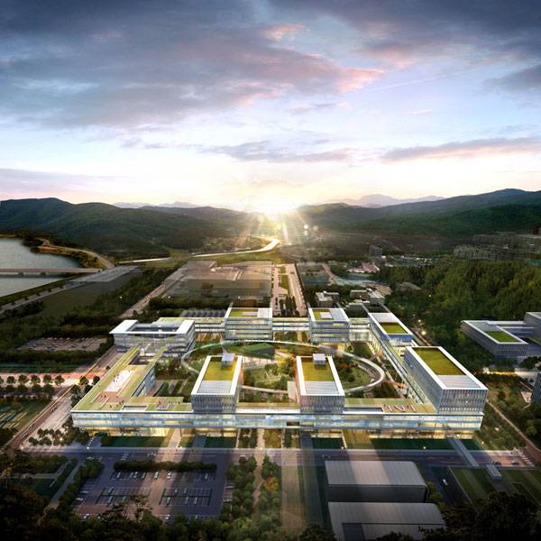
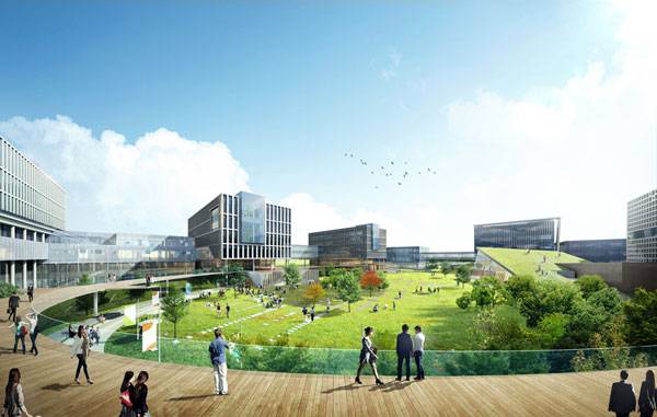
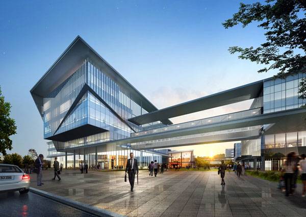
IBS Headquarters Phase 1 is an Inspirational Space for Science
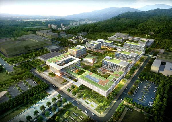
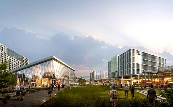
Article by Aybige Tek IBS Headquarters Phase 1, by Samoo Architects and Engineers, in Daejeon, KOREA. How does one create office spaces with a global sense of creativity within a fabulous landscape for people who are interested in science? Samoo Architects & Engineers, global design competition winner for the IBS Science Institute in Korea, absolutely nailed this. Their project for IBS Headquarters Phase 1 has brought to life a hub filled with study, research, and culture. The theme of the competition was “Cloud World”, which describes being a cloud of resources for scientists. The designers took the theme literally, creating building elevations that look like clouds with different blue color tones.
IBS Headquarters Phase 1. Image credit: Samoo Architects and Engineers
IBS Headquarters Phase 1
Breathing Life into a Space for Science The site has a lot of entry points. This makes the complex breathe. All the buildings are surrounded by greenery, either as grass or trees or both. If we were to simplify the landscape design, it would basically be a rectangle of grass, with trees and a circular central green plaza in the middle. There are a lot of picnic spots where people can sit down and enjoy the grass and open fresh air in warm weather. The trees are evergreen and newly planted at about three to four meters in height. Korea’s climate is good for pine and pinus densiflora trees. The gardens have newly planted trees in a variety of colors, with patterned designs creating harmony.

IBS Headquarters Phase 1. Image credit: Samoo Architects and Engineers
IBS Headquarters Phase 1. Image credit: Samoo Architects and Engineers
IBS Headquarters Phase 1. Image credit: Samoo Architects and Engineers

IBS Headquarters Phase 1. Image credit: Samoo Architects and Engineers
IBS Headquarters Phase 1. Image credit: Samoo Architects and Engineers
IBS Headquarters Phase 1. Image credit: Samoo Architects and Engineers
IBS Headquarters Phase 1. Image credit: Samoo Architects and Engineers
Full Project Credits For the IBS Headquarters Phase 1:
Project Name: IBS Headquarters Phase 1 Architect: Samoo Architects and Engineers Project Location: Daejeon, KOREA Date of Construction: 2014 Date of Completion: 2016 Size: 106,592 square meters Floors: 7 Stories and 1 Basement Collaboration: Haeahn Architecture, HHM Architects & Engineers Recommended Reading:
- Becoming an Urban Planner: A Guide to Careers in Planning and Urban Design by Michael Bayer
- Sustainable Urbanism: Urban Design With Nature by Douglas Farrs
Article by Aybige Tek

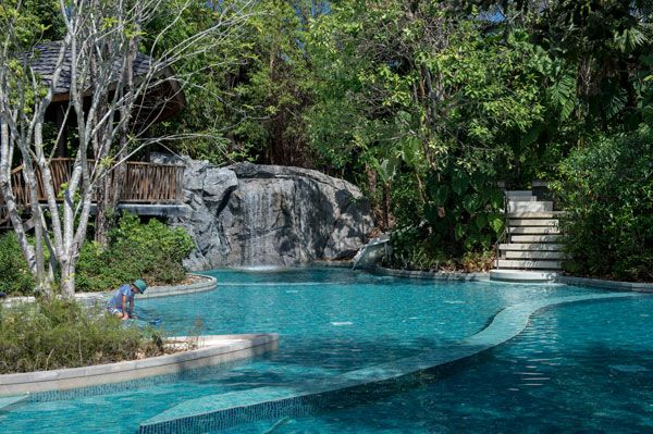
10 Extraordinary Urban Regenerative Strategies for Public Open Space
Article by Rosa di Gregorio Urban regeneration strategies are a very broad and complex topic with endless variations. In this article, we address the issue of urban regeneration applied to residential neighborhoods, in regard to their degradation and marginalization. In talking about urban regeneration, the degraded public space can represent a specimen “to design laboratory”, capable of allowing investigations and experiences aiming to establish a new quality of life in housing, spaces, relationships, environments, and social interactions. The regeneration process of public residential areas can find its solution through a new way to approach open spaces. Today, many of these open spaces can be found in areas that have been abandoned or are incomplete, degraded, or unsafe. Regardless of their situations, if one takes a proactive view, they are definitely convertible and can become an opportunity to start anew. The following 10 design strategies and projects are a significant testimony to urban regeneration.
Urban Regenerative Strategies
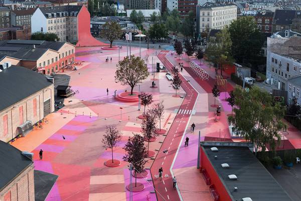
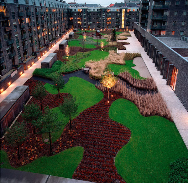
10. Diversity Diversity means to design the existing environment so that it is easily recognizable by the citizens, providing in those environments a clear, defined use and function of its places. Doing so requires that each open space be defined in terms of treatment, hierarchy, and readability. An extraordinary example of this is Superkilen Park in Copenhagen, Denmark.
Pedestrian friendly street.
“Creative Commons BIG – Bjarke Ingels Group – SUK – Superkilen Park, Copenhagen, Denmark”. Source Forgemind ArchiMedia, licensed under CC 2.0
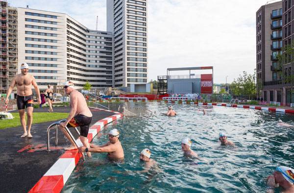
The King’s Cross Pond Club. Photo credit: John Sturrock
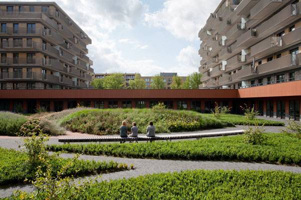
Amstelveen Zonnehuis Care Home. Photo credit: Ferry Streng
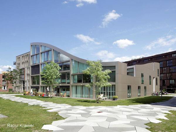
Funen Blok K. Photo credit: Raoul Kramer
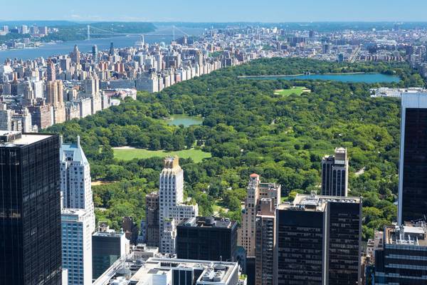
Central Park, designed by one of the earliest known landscape architects Fredrick Law Olmstead. Photo credit: shutterstock.com
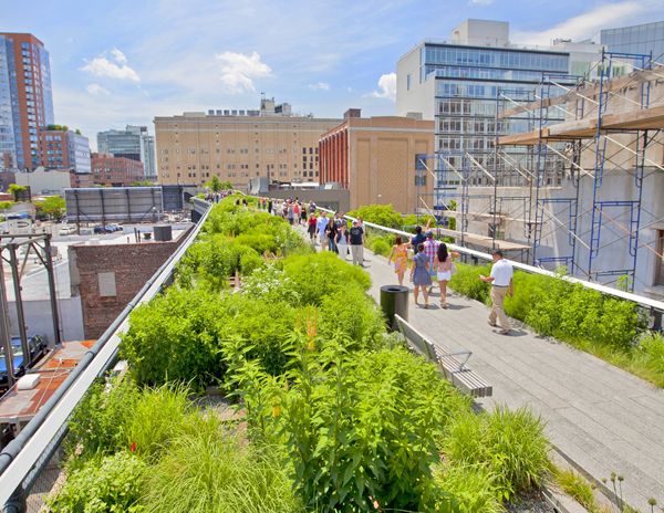
The Highline is a great example of a planting scheme increasing biodiversity in an urban area; credit: shutterstock.com
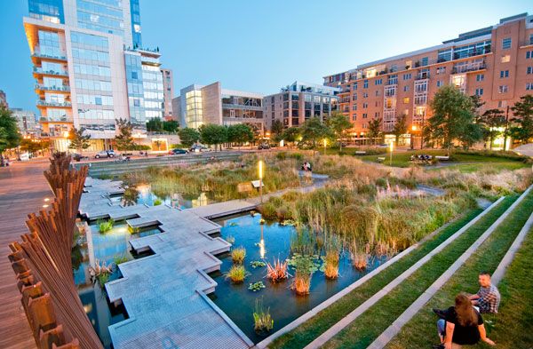
Tanner Springs Park. Photo credit: GreenWorks
Industrial frame used to enhance design. Credit: Turenscape

Landscape-architecture – Mont Evrin Park. Credit: Urbicus
Charlotte Garden. Photo credit: Torben Petersen.
Recommended Reading
- Natural Swimming Pools: Inspiration For Harmony With Nature by Michael Littlewood
- You Can Draw in 30 Days: The Fun, Easy Way to Learn to Draw in One Month or Less by Mark Kistler
Article by Rosa di Gregorio