


Author: Land8: Landscape Architects Network


Cor-Ten Steel: The Essential Guide
Here’s what you need to know about Cor-Ten steel. CORrosion resistance-TENsile strength. Does this sound familiar to you? If it doesn’t, think of the name of one of the most popular materials used in architecture nowadays. That’s right, the name Cor-Ten steel stands for those two properties, which best describe this cutting-edge material. You’ve seen this natural-looking hardscape in buildings, bridges, retaining walls, fences, as edging, or even as sculptural masterpieces of art, everywhere around you. It is frequently used in architecture, construction engineering, and mostly, in landscape architecture.

Architecture Info centre Kamp Amersfoort in the Netherlands/ Photo credit: Gerardus, licensed under Public Domain
Cor-Ten Steel
Are Cor-Ten Steel and Weathering Steel the Same Thing? The first thing that needs to be clarified lies in the question: Is there a difference between Cor-Ten and weathering steel? The truth is that both names are used as synonyms, but they differ in their meanings. Weathering steel is a group of steel alloys designed to avoid the need for painting, which form a stable, rust-like appearance if exposed to the weather for several years.

Angel of the North,made from Cor-ten steel. Image credit: © Copyright Andrew Curtis and licensed for reuse under this Creative Commons Licence. 2.0

Cor-Ten steel featured heavily in this private garden design. Photo credit: Iúri Chagas

A sculpture made of Corten steel in Arganda del Rey in Spain. Photo credit: “Laevolucióndelavida”. Licensed Public domain via Wikimedia Commons
- Combination of strength and durability with minimal thickness, resulting in the creation of fine, elegant solutions for the outdoor space.
- Generally available in sheet and plate form, facilitating the process of construction.
- Natural, warm, and specific hues, which easily blend into the overall landscape and add to the identity of a unified site
Related Articles with Cor-Ten steel can be found here:
- Modern Meets Mediterranean in an Outstanding Private Garden Design
- Designer Achieves Outstanding Results With Terraced Garden
- Metamorphous: The Constantly Changing Seawall Sculpture
Uses in Landscape Architecture The numerous architectural projects worldwide display the diverse uses of Cor-Ten steel, serving as excellent examples of the opportunities this material has opened to design. Fancy-looking Cor-Ten steel retaining walls, with their thin profile, significantly spare outdoor space. This is a plus that a concrete wall certainly doesn’t have. Weathering steel can also be used to design terraced or raised beds for vegetation, tapered strips to sculpt a terraced garden or steel-framed planters. Don’t forget the art installations and sculptures, where, once again, Cor-Ten steel has deservedly earned its fame.

Retaining walls with Corten steel, as featured in our hit article of the Hilgard Garden. Credit: Mary Barensfeld Architecture
The Shortcomings of Cor-Ten Steel
After illustrating the numerous advantages of weathering steel, attention should be paid to the shortcomings of the material. Cor-Ten steel requires alternating wet and dry cycles to form a properly functioning protective coat. It shouldn’t be used in areas with salt-laden air, high rainfall, humidity, persistent fog, or generally hot, humid climates. Other challenges relate to construction in terms of special welding techniques. And –lastly, Cor-Ten steel may also stain surfaces located near it through its rust.

Image from our Metamorphous article. Photo courtesy of Paul Sangha Landscape Architecture
- Minimal maintenance
- Long lifespan (some Cor-Ten bridges can reach 120 years)
- Exceeding all LEED requirements (100 percent recyclable)
Flawless or not, Cor-Ten steel is the appealing, rusty trend in landscape architecture, which, if used properly, simultaneously provides an attractive, low-maintenance, and economical design solution. Recommended Reading:
- The Innovative Use of Materials in Architecture and Landscape Architecture: History, Theory and Performance by Caren Yglesias
- Landscape Architecture, Fourth Edition: A Manual of Land Planning and Design by John Ormsbee Simonds
Article by Velislava Valcheva Return to Homepage Feature image: Abetxuko Bridge by J. Sobrino, PEDELTA, Abetxuko, Vitoria, Spain. Licensed under CC BY-SA 3.0


Facing Environmental Problems at Thalie Park and Solving it with Landscape Design
Thalie Park, by Urbicus, in Chalon-sur-Saône, France. Have you ever wondered how a landscape architecture project can be successful in a flood plain with polluted soil? Chalon-sur-Saône is located in the heart of Burgundy, France, and is well known for being the birthplace of photography inventor Nicéphore Niépce. It is a cultural capital town of art history and home to many tourist attractions. The city is also known for its Carnival festivities (one of the most famous in France, according to Chalon-Sur-Saône), for the wine trade, and especially for its cultural event, “Chalon dans la Rue”. Bike paths and green spaces have been implemented to make the city more green and enjoyable, and Chalon-sur-Saône has begun to stand out in the environmental field, as well. In 2013, the Association of Mayors of Major Cities in France and the French Committee for Sustainable Development rewarded the city with ribbons for sustainable development in recognition of its commitment to the environment. In the same year, a new park was opened in the city.

Thalie Park masterplan. Image credit: Urbicus
Thalie Park
Designed by Urbicus, Thalie Park is surrounded by the natural areas of the Thalie Valley. It is also located in a site with aspects that are usually avoided in constructions. The site of approximately 13.4 hectares is a former landfill at the edge of the railway infrastructure, in a flood zone; this was certainly a major point of concern in the project that needed to be tackled by the design team.

Thalie Park. Photo credit: Charles Delcourt

Thalie Park. Photo credit: Charles Delcourt

Thalie Park. Photo credit: Charles Delcourt
- How to Make an Unnatural Space Feel Like a Natural Park
- Turenscape Design Outstanding River Park
- Shipyard Site Transforms into Stunning Ecological Park
With the completion of the project, the city depolluted the soil, gained another park while providing great views from the hospital, and improved the ambiance for the patients. A Great Solution by Urbicus Another great solution implemented by Urbicus was the creation of two ponds that allowed the management of water influx due to rises in the river water level or rainfall. The aquatic ecosystem existing in the ponds is comprised of species particularly chosen in consultation with fishing associations and state departments.

Thalie Park. Photo credit: Charles Delcourt

Thalie Park. Photo credit: Charles Delcourt
Thalie Park – Seeing Opportunity in the Face of Adversity
It is a fact that polluted soil is generally far from being the preferred choice for projects such as Thalie Park. And this is what makes the project so special: Instead of ruining the project, the characteristics of the soil and the fact it had to deliver the functionality of a flood area were major contributors to the design of the park and have actually led to the success of the project.

Thalie Park. Photo credit: Charles Delcourt
- Design with Nature by Ian L. McHarg
- Meadows by Design: Creating a Natural Alternative to the Traditional Lawn by John Greenlee
Article by Sarah Suassuna Return to Homepage


Could West Harlem Pier Park Be a Model of Environmental Justice?
West Harlem Pier Park, by W-Architecture and Landscape Architecture, LLC, in West Harlem, New York City. What is a public space? Are we prisoners of the cities in which we live? Are we powerless against events and bigger forces? What is the value of our desires? This is the story of a place built amongst the abandoned manufacturing and industrial areas of New York City’s West Harlem neighborhood, a place that was once a bustling harbor, but faded into decay after the construction of the George Washington Bridge and the Henry Hudson Parkway. The area that is now West Harlem Piers Park had lost its strategic value, remaining a marginal area cut away from the city by vehicular and subway viaducts, left to the destiny decided by its owners’ succession. The narrow area situated in the northern section of Manhattan’s peninsula, with a potential westerly access to the river, fell victim to pollution, criminality, unemployment, and social disadvantages.

West Harlem Piers Park. Photo courtesy of W-Architecture and Landscape Architecture, LLC
West Harlem Pier Park
Things could have gone from bad to worse if not for the development of the park, thanks to the design by W-Architecture and Landscape Architecture, LLC and the resolute perseverance of 40 fervent groups of citizens, which took a position against city proposals to use the land in ways that didn’t satisfy the real needs of the local neighborhood. Reviving the River The park, first proposed by these groups and the city at the end of the 1980s, reached the design stage in 2003. It was built in 2008, healing wounds to the urban pattern and reviving access to the Hudson River, previously denied by fenced zones and parking lots.

West Harlem Piers Park. Photo credit: Barbara Wilks
- Extraordinary Development Re-connects City With The River Bank
- Turenscape Design Outstanding River Park
- Green Revival Brings Life Back to River Park
A Charming Design The charming design opens view corridors to the water directly from the streets, inspires itself from the cove and the valley, mimics the movement of the river, and creates a connection between the urban area and the water. Thanks to a new zoning plan relocating narrow activities in favor of small shops and bars, new life has been breathed into the area.

West Harlem Piers Park. Photo courtesy of W-Architecture and Landscape Architecture, LLC

West Harlem Piers Park. Photo courtesy of W-Architecture and Landscape Architecture, LLC

West Harlem Piers Park. Photo courtesy of W-Architecture and Landscape Architecture, LLC

West Harlem Piers Park. Photo courtesy of W-Architecture and Landscape Architecture, LLC
Preserving the Past at West Harlem Pier Park
But memories haven’t been lost: Many elements of the design, such as the benches, come from the area’s original narrow bulkheads and seem to have been carried by the force of the river to be set down in the park. The renewed viability, the relocation of the parking lot from the waterfront, the widening of the park area by the half closure of the marginal street next to the park, have all created a haunting park that includes post-industrial-themed sculptures by Harlem-based artist Nari Word. The sculptures underline and reflect the narrow personality of the area.

West Harlem Piers Park. Photo courtesy of W-Architecture and Landscape Architecture, LLC

West Harlem Piers Park. Photo courtesy of W-Architecture and Landscape Architecture, LLC

West Harlem Piers Park. Photo courtesy of W-Architecture and Landscape Architecture, LLC

West Harlem Piers Park. Photo credit: Tatiana Choulika
- Design with Nature by Ian L. McHarg
- Sustainable Urbanism: Urban Design With Nature by Douglas Farr
Article by Valentina Ferrari Return to Homepage


10 Great Places to Study Landscape Architecture in Asia
After covering United States and Europe, we look at 10 Great Places to Study Landscape architecture in Asia. In Indonesia, “pekarangan,” also known as home gardeners, are instrumental in developing and maintaining public open space. Just as in many other Asian countries, the reason there are grand gardens, palaces, plazas, and public parks is because of these dedicated home gardeners who have a connection to the land and a strong understanding of their climate, culture, and city. Throughout Asia, there are many universities that offer landscape architecture undergraduate and graduate degrees. All of them provide students with an opportunity to study local landscape history and culture. This list of 10 great places to study landscape architecture in Asia is comprised of universities that stand out due to program content, geographical region, international study opportunities, or other unique facets.
Study Landscape Architecture in Asia
(Click the name of any of the top 10, to go directly to their website) 1. Beijing Forestry University (China) Beijing Forestry University is a top institution specializing in forestry and environmental ecology in China. There are various university research centers, as well as student exchange programs available for those interested in expanding their studies and increasing their travel opportunities. Additional blog and news articles about the School of Landscape Architecture highlight how professors and students are active citizens in their town, city, and neighborhood by engaging in various volunteer and extra-curricular activities outside of the university. WATCH: Presentation of Mahasarakham University and 8th QS WorldClass 2015
2. Bogor Agricultural University (Indonesia) Located in Indonesia, Bogor Agricultural University offers a wide range of major classes, including site mapping and landscape managements. The focus at this university is on science and technology to support landscape architecture and on global responsible and sustainable development. The university offers various supporting classes, such as colloquium and seminar opportunities, to create a more holistic and collaborative learning environment. 3. Mahasarakham University (Thailand) This Thai public university with two campuses offers a variety of settings in the city and subdistricts to study urban design and landscape architecture. The degree program for landscape architecture is five years, culminating in a thesis and seminar in landscape architecture. Courses evaluate topics such as environmental management, housing, and real estate development, and park and recreation planning. WATCH: Picture overview of Beijing Forestry University
4. National University of Singapore (Singapore) This university is the oldest higher education institute in Singapore and has the largest student body and curriculum options. There is a two-year master’s of landscape architecture offered in the Department of Architecture in the School of Design and Environments. The unique element of this master’s program is that it focuses on the design of “urban and mega-urban elements of landscape architecture.” With opportunities to study and visit other countries and cities within Asia, the school focuses on educating designers who can solve problems in high-density population areas. If you’re looking for a school that addresses landscape design in rural or suburban areas, this is not the school for you. WATCH: NUS Campus Video
5. Seoul National University (South Korea) Within the College of Agriculture and Life Sciences is the Department of Landscape Architecture and Rural Systems Engineering. The Program in Landscape Architecture focuses on the exterior environments of urban and rural areas. One topic that was highlighted on the Seoul National University website was the training students gain in converting industrial lands to a multipurpose space for public use due to Korea’s limited natural resources. Specific research areas, including but not limited to historic preservation, environmental aesthetics, landscape history, and Geographic Information Services (G.I.S.), outline the program topics of study. WATCH: Seoul National University (SNU) Promotional Video
6. Tokyo University of Agriculture (Japan) According to the website of the Tokyo University of Agriculture, the Department of Landscape Architecture Services offers undergraduate studies in landscape architecture covering a wide range of studies. The school divides the curriculum into various laboratories that are similar to a studio course. Each laboratory has a set group of faculty instructors and topics to cover. Areas of study throughout the undergraduate degree program include gardening, rooftop gardening, urban re-vegetation methods, park design, planting of urban green space, landscape planning, nature conservation, and restoration of national parks. WATCH: Welcome to Tokyo University of Agriculture and Technology
7. Tunghai University ( Taiwan) I found the Department of Landscape Architecture page to be easy to navigate and complete with up-to-date information compared to some of the other Asian landscape architecture department pages I browsed through. This department in Taiwan was established in the early 1980s as a part of the College of Agriculture. The department focuses on training students to become landscape architecture professionals who are planners and designers, as well as resource and environmental conversationalists. I found the curriculum — including drawing, ecology, structures, and studios — to be quite similar to American universities. Additionally, there is a required internship credit as a part of the major requirements. Related Articles:
- 10 Great Places to Study Landscape Architecture in Europe
- 10 Great Places to Study Landscape Architecture in the USA
- 10 Books To Read In Your First Year Of Landscape Architecture
WATCH: 東海大學影音專區 Tunghai University ,Taiwan (not in English, but impressive visuals)
8. University of Hong Kong (China) At the University of Hong Kong, the Division of Landscape Architecture emphasizes the interdisciplinary nature of the degree program as well as ample study abroad opportunities. The program includes project-based and experiential learning. Since 1993, there is a four-year degree and a two-year postgraduate degree available. WATCH: Welcome to HKU (English)
9. University of Moratuwa (Sri Lanka) The University of Moratuwa is the most sought after technological university in Sri Lanka. While the landscape architecture program is young, it is a four-year program covering topics such as design communication, engineering, and plant science. The school is accredited, so graduates with experience are eligible to apply for membership in the Sri Lanka Institute of Landscape Architects (SLILA), which is also a part of the International Federation of Landscape Architects (IFL). WATCH: Possibly the most bizarre video you will ever see, coming out of a University (Viewed over 76,00 times)
10. Universiti Teknokolgi Malaysia (Maaysia) UTM is the oldest public engineering and technological university in Malaysia. The Bachelor of Landscape Architecture degree at UTM focuses on sensitive design. There are classes unique to the location of the university, including courses about local Malaysian dynamics, Islamic and Asian civilization, and tropical plants and studies. The undergraduate program culminates with a final comprehensive project. WATCH: Universiti Teknologi Malaysia (UTM) – Corporate Video
Study Landscape Architecture in Asia
Remember to do your research and talk to as many experienced and knowledgeable students, faculty members, and advisers as possible when making the decision to study abroad. For some, study abroad programs suffice as an opportunity to immerse oneself in a new culture and understand design from a new perspective. But for others, completing an undergraduate or graduate degree in landscape architecture in Asia offers opportunities to learn a new language, travel, and pursue future career goals and dreams. There are many strong programs in various countries throughout Asia. The key, as always, is to find the program that suits you best. Recommended Reading:
- Landscape Architecture: An Introduction by Robert Holden
- Landscape Architecture, Fifth Edition: A Manual of Environmental Planning and Design by Barry Starke
Article by Rachel Kruse Return to Homepage

How the Aberdeen City Gardens Blend Buildings and History with the Landscape
Aberdeen City Gardens, by Mecanoo Arcitecten, in Aberdeen, Union Terrace Gardens, Scotland. Each city has its unique qualities that make it stand out. Each has its own characteristics, but all have one thing in common: They all tell a story. There are cities that take you back in time with their ancient buildings and civilizations. Some describe a rich history through the mix of local and foreign architecture. Others seem to bring you to a different world through their skyscrapers and science fiction-inspired buildings. But what about a sophisticated city, one that displays a beauty with class and elegance? Our idea of sophistication when it comes to architecture may be within the façade and interiors of a building itself. But what if I tell you that sophistication can be both indoors and out? How can you make a modern city garden that pays tribute to a city’s elegant image?

Aberdeen City Garden. Image courtesy of Mecanoo Architecten
Aberdeen City Gardens – The Granite City
Aberdeen is the third most populated city in Scotland, and it is the 37th most populous metropolitan area in the United Kingdom. It is famous for the elegant look of its buildings. Aberdeen’s architecture was popular during the Victorian Era because of the use of granite in the façades of the structures, giving them a sophisticated vibe. This characteristic of the city led it to be locally called the Granite City, the Grey City, and the Silver City with the Golden Sands.
Aberdeen City Garden Project Competition
In 2011, Malcom Reading Consultants sponsored an international competition called The Aberdeen City Garden Project. The £140 million project’s purpose was to redevelop the simple, plain Union Terrace Gardens in Aberdeen — which cover approximately two and half acres of land — in order to match the city’s sophisticated look. The project aimed to transform the 19th-century gardens and to cover the unattractive Denburn dual carriageway and railway line.

Aberdeen City Garden. Image courtesy of Mecanoo Architecten
- The Building That Wants to be a Landscape at Delft University of Technology
- How to Transform a Road into a Spectacular Park
The Flower of Scotland One of the entries in the competition was the “The Flower of Scotland” by Mecanoo Arcitecten. The idea was to create a grand and iconic space to unite and bring harmony to the buildings and the landscapes, making the design sensitive and complementary to the existing buildings around it. As visitors walk outside, they will see the intricate floral patterns that give a feeling of sophistication. Through this proposed park, one will be able to see a modern but classy distinctive identity and atmosphere.

Aberdeen City Garden. Image courtesy of Mecanoo Architecten

Aberdeen City Garden. Image courtesy of Mecanoo Architecten

To see this image in larger size click HERE! Image courtesy of Mecanoo Architecten
- The Green Roof Manual: A Professional Guide to Design, Installation, and Maintenance by Linda McIntyre
- Green Roof Construction and Maintenance (GreenSource Books) (McGraw-Hill’s Greensource) by Kelly Luckett
Article by Katrina Elpos Return to Homepage


How Can Redesigning a Public Space Change People’s Behavior?
Plaza de la Luna, by Brut Deluxe, Ben Busche Architects, Madrid, Spain. Drug traffic, degradation of housing, and prostitution were all problems emanating from the cohesive and anti-functional construction of Plaza de la Luna in Madrid, Spain. The square had no coherent space because a street divided the place into two separate zones. Uneven mixed levels, walls, ramps, staircases, ventilation towers, and vents from an underground car-park also divided the place visually. Plaza de la Luna needed to be reorganized and unified to create a new attractive and vandalism free square.
Plaza de la Luna
The central idea of designer Ben Busche and his team was to give the space a new topography. The former one hindered pedestrians from comfortably crossing the square and tended to focus on the worst part of the site – the space beneath the arcades. To solve that, a new large central space was created to make sure the focus of the users was no longer in the arcades, but in a new center.

Plaza de la Luna by Brut Deluxe and Ben Busche Architects.
- The Central Plaza Parkscape That Has it All
- Beautiful Plaza Celebrates Canadian Landscape
- Awesome Plaza Shows You Why China Are World Leaders in Landscape Architecture
How Does it Prevents Vandalism? All the elements have been renewed with anti-vandalism in mind. All of the furnishings are made of 3mm, naturally rusted Corten steel to deter vandalism. It’s very hard to write on, glued papers drop off, and it’s easy to remove sprayed graffiti. But to give the Corten steel a less cheap and rusted look, the designers punched or stamped it with a floral motif. The use of the same material throughout the project gives the place a more unified and organized look, which is strengthened by the doubling of the amount of trees and vegetation.

Plaza de la Luna by Brut Deluxe and Ben Busche Architects

Plaza de la Luna by Brut Deluxe and Ben Busche Architects

Plaza de la Luna by Brut Deluxe and Ben Busche Architects.

Plaza de la Luna by Brut Deluxe and Ben Busche Architects.
- 1000x Landscape Architecture by Braun Publishing AG (COR)
- Street Design: The Secret to Great Cities and Towns by John Massengale
Article by Sander Van de Putte Return to Homepage
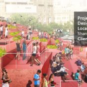

Shanghai Red Carpet Park Lets People Reflect on Their Everyday Lives
Red Carpet by 100 Architects, East Nanjing Road, Shanghai, China. How do you transform a busy walking street into a flourishing and interesting attraction for a whole neighborhood? That was the question the designers at 100 Architects asked themselves when the Shanghai government asked them to create a new feature for the East Nanjing Road’s century square. The East Nanjing Road is a famous pedestrian street in the center of Shanghai, China. Historically, this road was the link between the port in the east and the old city in the west. It has become the main economic axis of the city, supporting a variety of cultural and social activities. The street has maintained its importance as the number one commercial street in Shanghai, with thousands of pedestrians traversing it every day. What was the objective of the Red Carpet Project? The eastern part of the street consists of a car-free area with a small performance stage that is used only once or twice a year. What’s missing is a landmark to accentuate the unique character of this street.

The Red Carpet project. Visualisation courtesy of 100 Architects.
Red Carpet Park by 100 Architects
In their new design, they have created a theater-like construction where people can watch and the observe passersby. In this way, they engage people to see something as simple as going to the mall from another perspective.

The Red Carpet project. Visualization courtesy of 100 Architects.
- Plaza Design Turns Dead Space Into a Vibrant Livingroom at Stadtlounge, Switzerland
- Gasworks Into Artworks – The Rebirth of Dublin’s Waterfront
- Fantastic River Park Unveils the Value of the Natural Landscape

The Red Carpet project. Visualisation courtesy of 100 Architects.

The Red Carpet project. Visualization courtesy of 100 Architects.

The Red Carpet project. Visualisation courtesy of 100 Architects.

The Red Carpet project. Visualisation courtesy of 100 Architects.
- Land and Environmental Art by Jeffrey Kastner
- Natural: Simple Land Art Through the Seasons by Marc Pouyet
Article by Tom De Bleser Return to Homepage


Are Animal Bridges Life-saving for Wildlife?
We reviewed Youtube video Five Crazy Bridges for Animals by Minute Earth, looking at the innovative solution of animal bridges. “Why did the chicken cross the road? We may never know since she probably never got to the other side“. This is how Minute Earth’s educational video (Five Crazy Bridges for Animals) puts forth a plethora of questions for discussion. What are the consequences of wildlife roadkill? Can wildlife and highways coexist safely? What exactly are wildlife crossings? How effective are animal bridges? Or is it all about our own attitude or the absence of one? If you feel skeptical about the effectiveness of wildlife crossings, there’s nothing wrong with that. This video doesn’t seek to convince anyone of something they don’t want to believe. On the contrary, its basic purpose is to inform and shed light on a subject that is widely discussed, but narrowly assimilated.
Animal Bridges
Even within the short two minutes, the animation will manage to set you thinking. What’s most important is that after watching it, you can’t just stay indifferent. After that, you will at least have an opinion. And you’ll soon realize how everything depends on your own attitude. Watch the whole video here:
The essence of the problem To start going deeper into the problem, let’s take a look at some of the statistics. It is said in the video that, “In the U.S. alone, about a million animals are flattened by passing motorists each day – and that doesn’t count all the bugs.” We all know that wildlife-vehicle collisions happen, but did you know the statistics? And do you know why this is happening? Although we can’t clarify why for sure, a part of the explanation lies in the nature of animals. “Animals are constantly confronted with barriers, some of them completely natural, and others that we build are barely barriers at all. As we build our own infrastructure, we’re also adding to this obstacle course without meaning to, and these unintentional fences are some of the most effective animal barriers out there,” the video explains.

Natural and manmade barriers that prevent animals from crossing. Image credit: Printscreen/source
- Why Humans Do Not Make The Best Architects
- Biomimicry: What is it, and What Does it Mean For Landscape Architects?
- Biomimicry UK: Interview With Richard James MacCowan
The negative consequences After discussing the reasons why wildlife-related car accidents happen, now you need to examine closely the negative results of those collisions.

“If enough animals become isolated from food, mates, and protection, entire populations can dwindle and even disappear”. Image credit: Printscreen/source
The solution – Animal Bridges
With all those unfavorable effects of wildlife-vehicle collisions, there has to be a rational solution. The first thing that comes to people’s minds is “no obstacles, no problem”. But on second thought, giving up roads, power, and pipelines doesn’t sound like such a good idea. Even if we get rid of all the physical barriers, wildlife has already strongly memorized them, meaning that their restrictive power is still active. So basically, this is not a solution.

Man-made solutions for keeping animals safe. Image credit: Printscreen/source
In order to estimate the results of animal bridge construction, cameras are installed as a method of observation. As you can see in the following video, the results are more than satisfactory. WATCH: A Busy Wildlife Crossing – Slow Version
Recommended Reading:
- The Environmental Planning Handbook for Sustainable Communities and Regions by Tom Daniels
- Environmental Land Use Planning and Management: Second Edition by John Randolph PhD
Article by Velislava Valcheva Return to Homepage


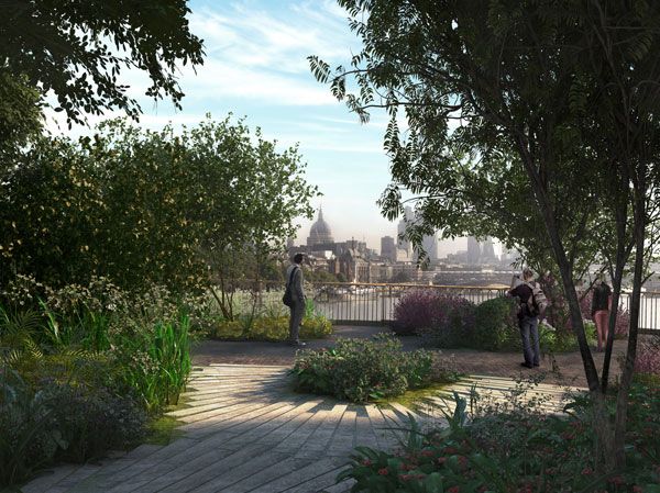
A Groundbreaking Garden Bridge Over Thames to be Developed in London
Garden Bridge, by Heatherwick Studio, London, UK. A new approach to designing bridges and traffic routes leads to one of the most controversial projects in London: a garden bridge over The Thames. A project that will increase the global attractiveness of the city as a tourist destination, say officials. The blueprint of this project has been approved by Boris Johnson who has served as Mayor of London since 2008 and is championed by British national treasure Joanna Lumley. The London Garden Bridge project has been designed by Heatherwick Studio, and is intended to be a new pedestrian bridge that links the Temple Underground Station with the South Bank over Thames. This idea follows Transport for London’s trend for projects that improve pedestrian links across the river. London is already one of the greenest cities of its size in the world, and a project like this will be another iconic trademark.

Garden Bridge. Image credit: ARUP
No to cycling on bridge over Thames
This innovative project will be an important pedestrian route between north and south, that will feature plants, trees, woodland and meandering walkways to be used and enjoyed by all pedestrians. The ambitious project, lead by The Garden Bridge Trust, will enrich London’s diversity in landscape and technology. Unfortunately, on this new bridge cycling will not be permitted.
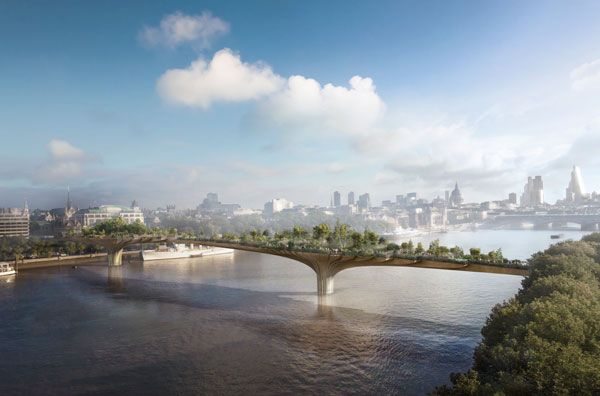
Garden Bridge. Image credit: ARUP
- Land Bridge is an Ecological Masterpiece
- Top 10 Pedestrian Bridges
- The Street Bridge Park Everyone’s Talking About
Planting on the Bridge The Garden Bridge project claims lands on both the north and south banks of the River Thames within the City of Westminster and the London Borough of Lambeth. The garden planted on the deck of the bridge will be a mix of 270 trees (approximately 45 species), shrubs, herbaceous plants, climbers, perennials and grasses (both native and non-native species).
Garden Bridge. Image credit: ARUP
It’s a very tough task to anticipate if the key strengths of this project outweigh the the weaknesses. But what is for sure, beside the fact that the construction of the bridge is being challenged, it’s that Heatherwick Studio made us all dream about a walk on this futuristic bridge. Recommended Reading:
- Site Engineering for Landscape Architects by Steven Strom
- The Artful Garden: Creative Inspiration for Landscape Design by James van Sweden
Article by Diana Ispas Return to Homepage

Baltic Sea Art Park Crosses the Boundary Between Land and Water.
The Baltic Sea Art Park, Pärnu, Estonia, by Kilometrezero. Waterfronts are naturally enticing places. In the urban setting, they provide residents with a nearby place to escape the pressures of the city and commune with nature. As cities grow, so do these waterfront leisure spaces – and the need for someone to design them. Over the last few decades, waterfronts have become the frequent subject of design competitions. A design for the Baltic Sea Art Park in Pärnu, Estonia, was born from a 2013 competition for a site on the banks of the Pärnu River. Designers were asked to create a park encompassing a ground program and floating buildings. Kilometrezero, a Paris and Barcelona-based architecture studio founded by Jan Kundlicka and Alvaro García Mendive, was up to the challenge, creating dynamic spaces and innovative buildings that would enhance the landscape, provide magnificent views of the city and the river, and enable the urban infrastructure to cross the boundaries between land and water.

Masterplan for the Baltic Sea Art Park. Image credit: Kilometrezero
Baltic Sea Art Park
How did they work with the land? The site is connected to the urban fabric by streets that form perpendicular and parallel axes to the riverfront, but it lacks internal axes to organize the open space. The designers decided to address that by using the existing trees as a starting point for the project. As those trees don’t form any pattern, the team reorganized the space by creating small squares separated by a sequence of smaller paths connected by circular areas. This approach would allow for the creation of spaces that stimulate social gatherings, while keeping the existing trees and encouraging the planting of new ones in the created squares.

The Baltic Sea Art Park. Image credit: Kilometrezero
- RheinRing Bridge is a Work of Art!
- Top 10 Pedestrian Bridges
- The Street Bridge Park Everyone’s Talking About
How did they work with the water?

Countries surrounding the Baltic Sea Art Park. Image credit: Kilometrezero

The Baltic Sea Art Park. Image credit: Kilometrezero

The Baltic Sea Art Park. Image credit: Kilometrezero

The Baltic Sea Art Park. Image credit: Kilometrezero
- Site Engineering for Landscape Architects by Steven Strom
- The Artful Garden: Creative Inspiration for Landscape Design by James van Sweden
Article by Tania Gianone Return to Homepage


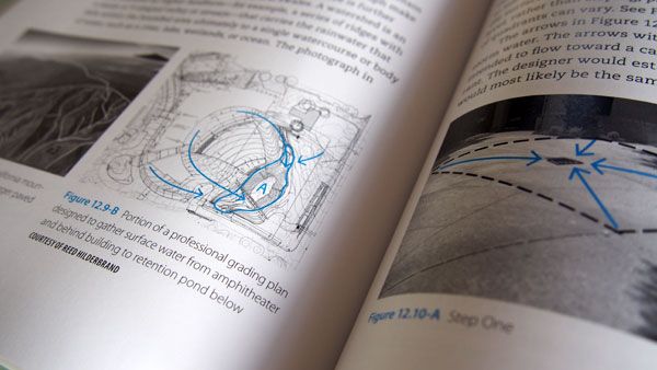
Landscape Site Grading Principles: Grading With Design In Mind | Book Review
A book review of Landscape Site Grading Principles: Grading With Design In Mind by Bruce G. Sharky. Traditionally, the use of grading textbooks by landscape architecture students has been limited to those produced by engineers, who tend to approach the subject, not in visual terms, but in terms of mathematics and problem-solving. These teaching mechanisms prove problematic, often neglecting or omitting the inherent design implications associated with grading — essential constituencies given that landscape architects learn and think visually and spatially. The impetus of “Landscape Site Grading Principles” is to provide landscape architecture students with a visual, practical approach to site grading concepts that advocates and illustrates the interconnectedness of grading and design, and to put forth the ambition for a greater synthesis of the two in tertiary education.
Landscape Site Grading Principles
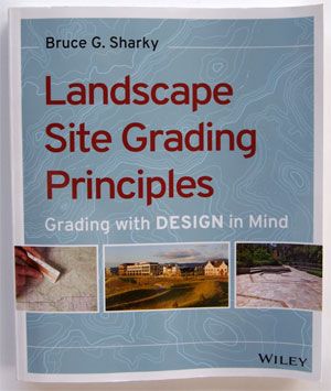
Front Cover. Click HERE to get this book! Photo credit: Paul McAtomney
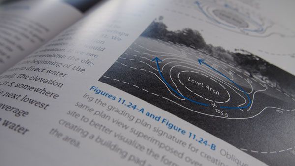
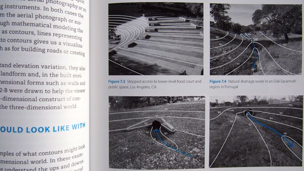
Inside the book. Click HERE to get this book! Photo credit: Paul McAtomney
- Landscape and Urban Design for Health and Well-Being
- Digital Drawing for Landscape Architecture
- 10 Books to Read in Your Fourth Year of Landscape Architecture
Inside the book. Click HERE to get this book! Photo credit: Paul McAtomney
Inside the book. Click HERE to get this book! Photo credit: Paul McAtomney
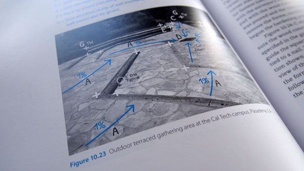
Inside the book. Click HERE to get this book! Photo credit: Paul McAtomney
Pick up your copy of Landscape Site Grading Principles: Grading with Design in Mind
Article by Paul McAtomney. Return to Homepage


5 Ways to Avoid Technical Drawing Becoming Your Worst Nightmare
Apply these 5 tips to get your head around technical drawing. We all at one point dread the day when our social lives will turn into weekend parties with T-squares and inking pens. Those of us who studied technical drawing look back and cringe at the thought of having to go through that one day-long exam again. But I will quit being so apocalyptic now and tell those who are going to take this course soon that, fortunately, there are several steps you can take to make the best out of your technical drawing class — and even enjoy it!
5 Technical Drawing Tips
1. Ditch the comfort of home for the studio group dynamic Back in high school, I didn’t very much like the idea of studying in a group. It seemed too distracting and like an easy ticket for procrastination. But as soon as you get into design, you realize that things here work differently. The studio experience is especially vital for “first years”, as they are still unfamiliar with the system and with design itself.

Get stuck into group learning and benefit from one another. Photo credit: shutterstock.com
2. Don’t be afraid to say, “I don’t understand. Could you repeat, please?” This doesn’t only apply to technical drawing, of course, but it is particularly true for these kinds of lectures, which can be so overwhelming. The truth is that most instructors I’ve encountered who lecture on technical software or skills are really good at what they teach, and they assume that everyone is able to catch onto it as fast as they do. So they tend to explain it a bit too fast. Don’t be afraid to ask the instructor to repeat things or to go slower, or to schedule individual appointments. Doing so is much easier than going through hell during the assignments or, worse, finding out that you lack some basics during design projects later on. Trust me; I know this, having been through a similar experience in the shades and shadows section. Related Articles:
- Is Drawing Dead?
- How to Suck at Hand Drawings and Still be a Good Landscape Architect
- Interested But Not Confident? – Know How to be Good at Hand Drawings
4. Handle inking carefully Technical inking pens can be such a pain. They are expensive, they come in all kinds of thicknesses, which is confusing at times, and they break easily! And the worst thing is, they can turn a project into an unalterable mess. For this reason, it is always a bad idea to start inking right after finishing a drawing. Take your time to double-check the drawings, possibly with a friend or an instructor, before inking. However, accidents happen sometimes. So in case you dropped some ink on your paper or made a small mistake that you would like to correct, bring a sharp cutter and rub the ink lightly with its side — it will disappear like magic! Although do be careful about dropping blood spots, in that case. 3. Lecturers are not handling it well? Try tutorials OK, so you asked, they repeated, and yet you still didn’t understand it. Maybe they didn’t make the effort you were really expecting to make things clearer. Luckily, today you can find tutorials online for almost ANYTHING (really — even how to darn socks or put the battery in your smartphone). WATCH: Check out this Drawing Tutorial – 2 Point Perspective
Also, don’t forget that YouTube and websites are not the only sources you can use for further explanations. Chances are that the university you study in has a wide range of architectural books on technical drawing. Examples include “Basic Technical Drawings” by Bert Bielefel and Isabella Skiba and “Basic Perspective Drawing: a Visual Approach” by John Montague. WATCH: Check out this tutorial on How To Draw Perspective Shadow – Drawing Shadows In Perspective
5. Work with little models The technical drawing project that I found to be most exciting (yes, contrary to popular belief, technical drawing can be fun at times) was the one in which we had to construct our own Lego model, then draw it in 3D and 2D plans and sections. Visualizing in three dimensions can be hard, which is why creating little models of your assigned drawing with Lego, cardboard, or any other material can make your job so much easier. WATCH: Scale Model Tips – 13 quick tips in less than 3 minutes
On a side note, working with models will also prove to be a great help in later stages in design projects. Also, it’s your one chance to get crazy (a girl I know once made an edible model). Majoring in design, while it is overall a wonderful and enriching experience, can be frustrating at times. But the challenges will become easier once shared with someone who has been through the same experience and once you seek further help. Also, make sure to drop by our page from time to time for inspiration! Recommended Reading:
- Drawing and Designing with Confidence: A Step-by-Step Guide by Mike W. Lin
- Landscape Perspective Drawing by Nicholas T. Dines
Article by Dalia Zein. Return to Homepage