


Author: Land8: Landscape Architects Network

Turenscape Design Outstanding River Park
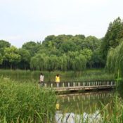
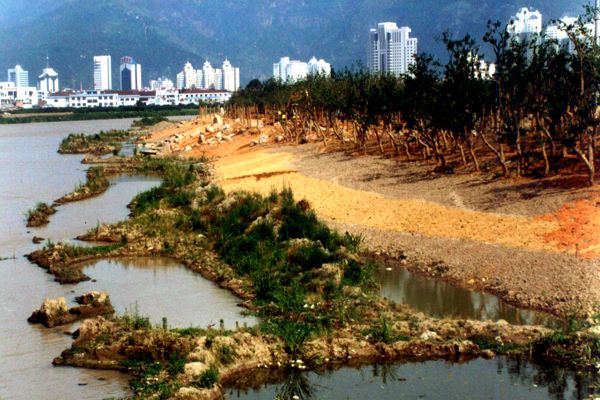
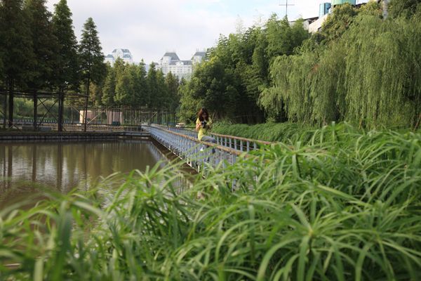
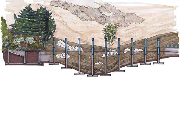
The Floating Gardens by Turenscape The term “floating gardens” usually brings to mind the famous Chinampas or the historical vegetable gardens planted by Aztec communities in the shallow lakes of Mexico that date back to two thousand years. But in 2004, an added value was brought forth to the term when world renowned Chinese landscape architecture firm Turenscape used it as a title for their Yongning River Park. The Mission: Aims and Challenges The design of this park was a response to a request made by Taizhou City, East Coast China to upgrade the park site along the riverside which was embanked with concrete as part of the local flood control policy. The task proved to be challenging, as the landscape architect sought an alternative and more ecological approach to flood control and storm water management that would at the same time have easy access to both tourists and locals.
The park under development: Concrete was removed, diverse terrain on the river bed and along the riparian plane were laid to create various habitats for native plants, and the river bank was graded, allowing for people to access the water; credit: Turenscape

Incredible scenes created at the Floating Garden; credit: Turenscape
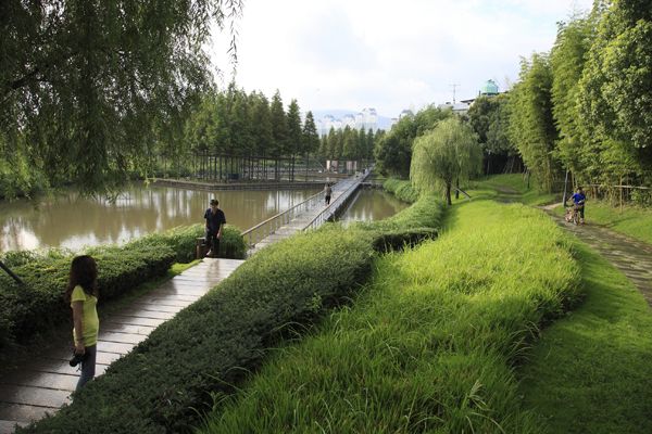
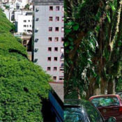
Lush vegetative planting at the Floating Gardens; credit: shutterstock.com
The Floating Gardens; credit: Turenscape
The phenomenon of overusing concrete, especially when damaging to the natural or cultural landscape, is not only present in China but sadly has become global. The significance of projects such as ‘Floating Gardens’ lies not only in their high aesthetic and functional qualities, but also in their ability to showcase that stubborn dead interventions such as concrete canalizing or sea landfill lead to the detriment of creativity in design rather than its development.
Name of Project: The Floating Gardens—-Yongning River Park Project Location (city/state/zip): Taizhou City, Zhejiang Province, China Project Type (park, commercial campus, memorial, etc.): park Date of Completion: March 2004 Owner/Client: The Government of Huanyan District, Taizhou City Other articles Turenscape featured in: Top 10 Names In Landscape Architecture Today Top 10 Names in Planting Design Article written by Dalia Zein.

GONÇALO DE CARVALHO: Beating Global Warming Like a Boss
In recent years, global temperature has increased significantly and encouraging the use of outdoor spaces is becoming a challenge for landscape architects and urban planners. Planting trees to cool the urban environment is an effective strategy to provide comfortable open areas in hot countries; but urban greening is more than just an environmental concern, it is a social preoccupation too as inefficient open spaces can lead to exclusion and isolation. GONÇALO DE CARVALHO One of the most inspiring examples of how green areas contribute to upgrading the quality of the urban environment is Gonçalo de Carvalho, which is considered by many as “the most beautiful street in the world” (and we do not dare to disagree). It is indeed the most beautiful street in the world, not only because of the impressive visual effect this green tunnel creates but also because of the touching love the residents have for these stunning trees.

GONÇALO DE CARVALHO; credit: Adalberto Cavalcanti Adreani

GONÇALO DE CARVALHO; credit: ‘Amigos da Gonçalo de Carvalho
- Solar radiation
- Temperature of surrounding surfaces
- Air temperature
- Humidity
- Wind speed.
- Trees can improve each of these parameters by:
- Creating shade, which prevents solar radiation from heating surfaces
- Cooling the air through evapotranspiration
- Increasing relative humity through transpiration
- Reducing air speed, acting as barriers.
We can say they pretty much work as natural air-conditioners (check out the 5th fact at “8 Amazing Facts About Trees You Didn’t Know”) with regards to improving climatic conditions. This is of major importance in landscape architecture as comfortable environments promote the use of open spaces and increase vitality of cities. QUALITY OF OUTDOOR AREAS & THE NEED TO PRESERVE There is no doubt urban trees have a positive effect on people’s lives. Green areas improve the physical, environmental, economic and social aspects of the landscape which are very important in the planning of more sustainable cities. Climate change is upon us and an increase on energy demand for cooling systems could lead us to a global crisis. This situation compels us to seek ’green solutions’ and Gonçalo de Carvalho is an example of how quality of life in cities can be improved with a zero-energy approach. Besides, the street also brought the community together in the need to preserve their heritage fo future generations, strengthening public power in a country that is so in need of it. – A special thanks to Cesar Cardia and the organisation “Amigos da Gonçalo de Carvalho”. For more information, contact them at: You can follow them on there blog and at their Facebook page. Article written by Julia Lucchese


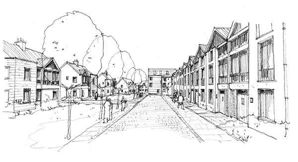
Sketchy Saturday l 014
This week, we’ve got a new batch of sketchy, fresh out of the oven. I say that because they are deliciously detailed and drawn! We at LAN are constantly bedazzled by the talent of our readers and their amazing sketches! We think you’ll love our 14th edition of Sketchy Saturday. Check them out below! No. 10 by Ahmad Benbela Muzakal, Landscape Architect, Malaysia
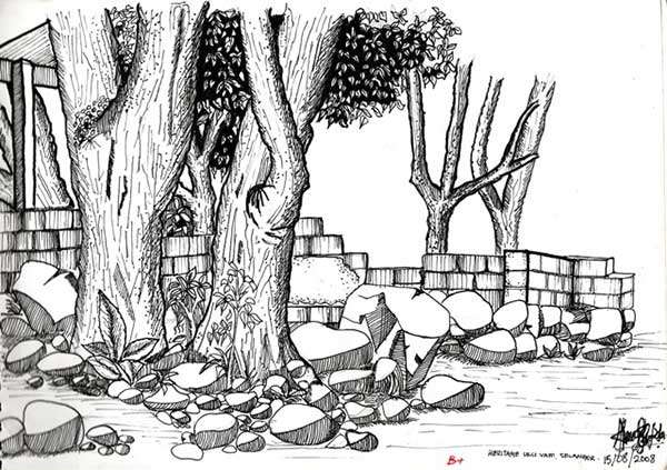
Ulu Yam, Selangor, Malaysia
Mocoli, located in Guayaquil Ecuador

A peaceful stone bridge and water scene
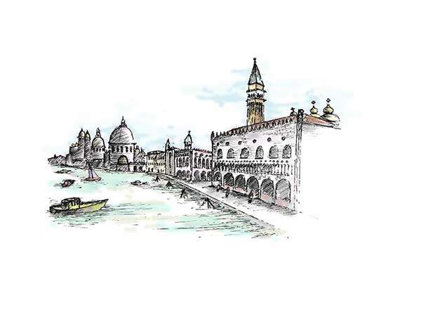
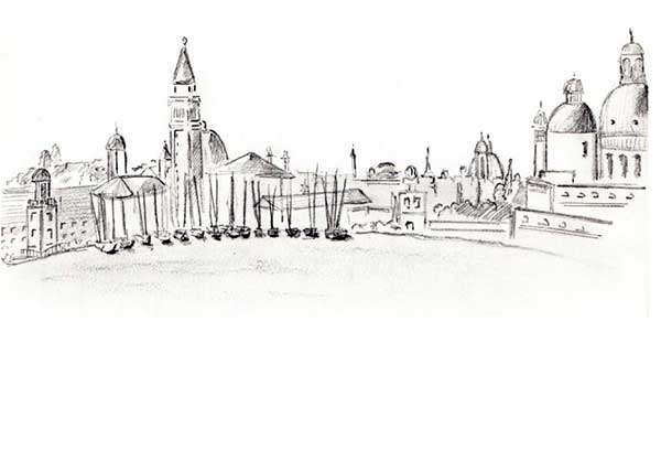
San Marcos Piazza in Venice, Italy
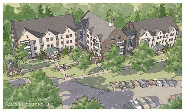
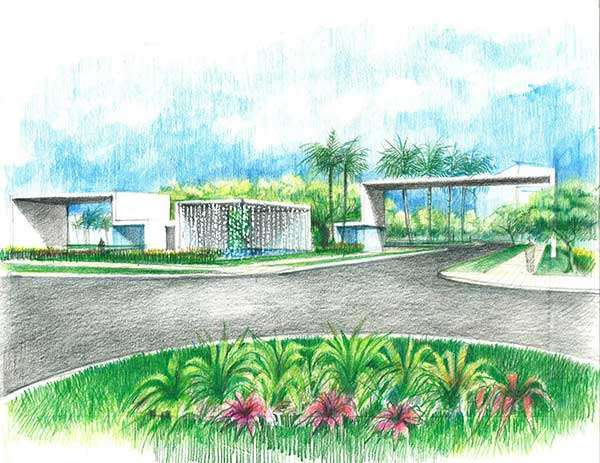
Concept design of a new residential dormitory building

A temporary project in Geneva

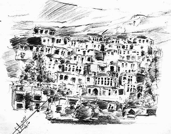
An old church square located in a village north of Lebanon
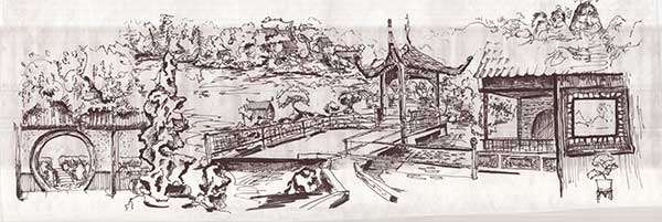
Aspects of Chinese landscape design

Cathedral of the City of Mexico
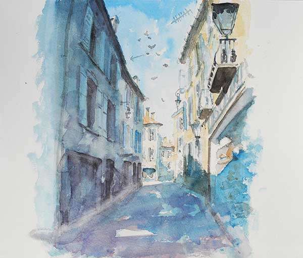
A street in Albi, Southern France


Life as a Landscape Architect: GIF Party part 1
Here’s some little light-hearted fun in the shape of the current “GIF Party” trend. In no way are these statements meant to offend, but they are surely something all landscape architects can relate to at one point or another! 10. When CAD or Photoshop Crashes and you JUST saved your work

9. Not knowing the name of the plant when your friend asks “What’s that?!”

8. When someone calls what you do “landscaping”

7. When you get a nice new Sharpie or some other nice pen

6. When you get a plant name like “physocarpus opulifolius diabolo“ or “Leucospermum hypophyllocarpodendron” on a plant ID test

5. When you see something like this happen  and you just think…
↓↓
↓↓
↓↓
↓↓
↓↓
↓↓

4. Getting ready for a site visit…

3. Watching a landscape urbanist and a new urbanist have a debate
 2. When you tell someone you do landscape architecture and they say “Oh, is that gardening?”

1. When you realize you love being a landscape architect and that what you do is actually pretty damn cool!

I hope you have enjoyed the GIF Party. Let us know via our Facebook or Twitter pages, or leave a GIF comment below! Article written by Sonia Jackett


Top 10 Reused Industrial Landscapes
Advancements in ecology and environmental studies have been particularly prevalent over the past few years. We recycle waste on a daily basis in the hopes of preventing past mistakes, because decades ago we did not understand the full extent of pollution. In the spirit of reusing waste, we have adapted contaminated sites to become useful once again through many means of cleansing and renovating the soil and surrounding structures. Here is a list containing some industrial landscapes that, helped along by Mother Nature and man, have become core to the surrounding communities, remembering the past while embracing the future. 10. Concrete Plant Park — Bronx, New York
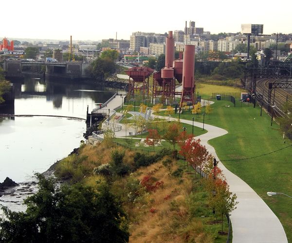
Concrete Plant Park; credit: Malcolm Pinckney-NYC Parks
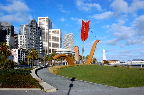
“Creative Commons Rincon Park and Cupid’s Span in the Embarcadero, San Francisco, California, USA” by Dewet is licensed under CC BY 3.0

“Creative Commons A beach in the industrial section of Hanapepe, Kauai called “Glass Beach” due to tons of smooth glass pebbles on the beach” by Travis.Thurston is licensed under CC BY 3.0
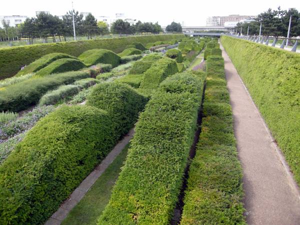
“Creative Commons Thames Barrier Park” by Matt Kieffer is licensed under CC BY 2.0
“Creative Commons Ayalon Park” by Israel Peled is licensed under CC BY 3.0

“Creative Commons Trail of the Coeur d’ Alenes” by Robert Ashworth is licensed under CC BY 2.0
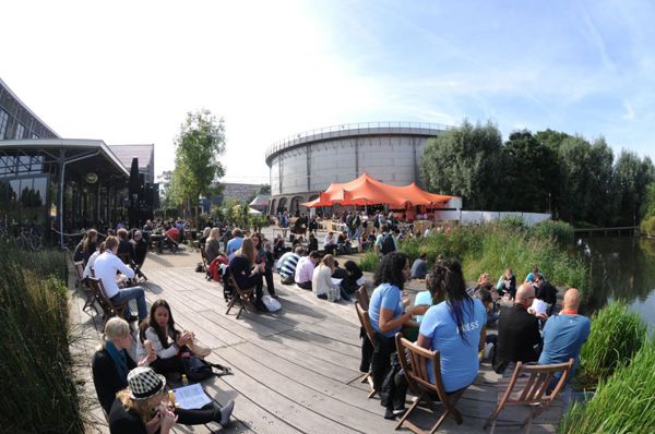
Westergasfabriek Culture Park; ; credit: photo courtesy of Gustafson Porter


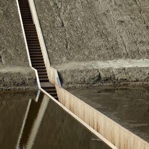
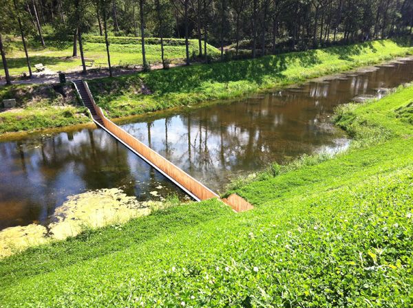
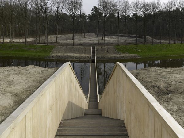
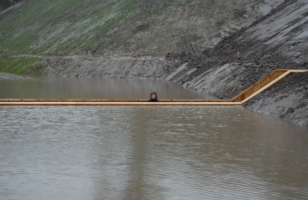
Moses Bridge : Walking Through Water
RO&AD Architecten surprise the world with their Moses Bridge. Dutch design has always been great reference when it comes to creativity and innovation – in this case, it is no different. The Moses Bridge is a very unusual pedestrian bridge (already featured in our “Top 10 Pedestrian Bridges”, check it out!) built in a fort located near Halsteren, in the Netherlands. What makes it so unique? Well, it offers more than just access from one side to the other like an ordinary bridge – it takes you in a journey back in time… THE FORT DE ROOVERE
Moses Bridge; credit: RO&AD Architecten

Can you see the Moses Bridge? Credit: RO&AD Architecten
 Credit: RO&AD Architecten
The Moses Bridge The bridge blends in the landscape so well that you can barely see it from distance. As the structure is partially submerged, the narrow trench only opens up once you are right in front of it. We can easily guess why it has taken on the name “Moses Bridge”: it appears to have divided the moat’s water and the crossing is literally like walking through the water, as featured in the biblical narrative where Moses crosses de Red Sea. The bridge covers 50m2 of constructed area and its total cost was of 250.000 euro. It is entirely made of wood (Accoya Wood and Red Angelim), waterproofed with EPDM foil.
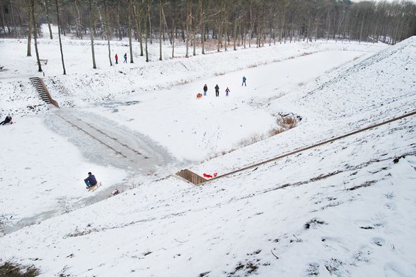
Moses Bridge in the snow; credit: RO&AD Architecten
Moses Bridge; credit: RO&AD Architecten
Moses Bridge; credit: RO&AD Architecten


Sketchy Saturday l 013
This week’s sketchy selection has been particularly inspiring, with all kinds of interesting works coming in. Our readers have been especially imaginative with these. This is why I’ll start this selection with a quote from one of this week’s entries by Emilie Marques Jordao: ‘You should give hand drawing a shot even if you have a non-artistic background. Find something that inspires you and your sketching abilities will flourish!’ No. 10 by Nancy Sarai Vazquez, Landscape Designer, USA
A view of Venice harbor
Kings Street, Penang
Section elevation of a design solution
Abyaneh is located in Kashan, central part of Iran
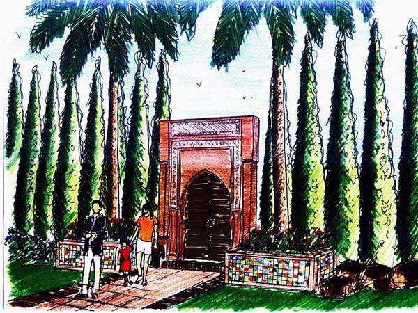
Two different styles of gardens
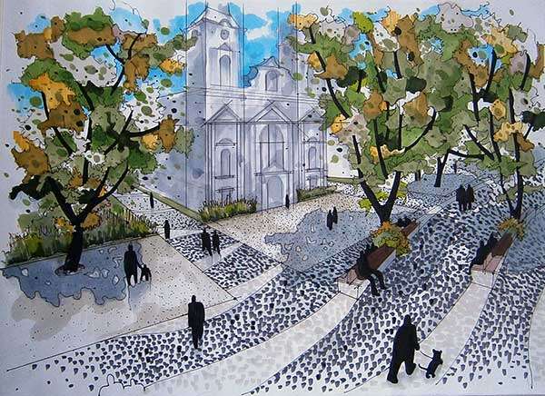
Project based upon the space of the city square
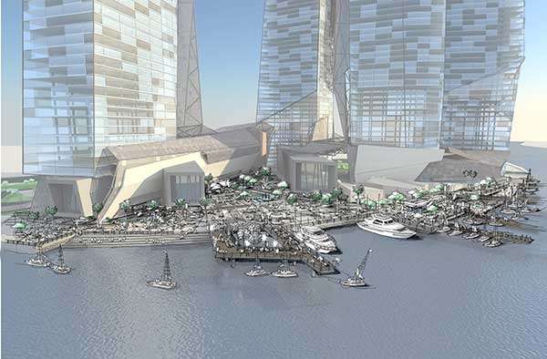
Proposed building in Abu Dhabi
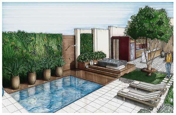
Garden in a residence in São Paulo, Brazil
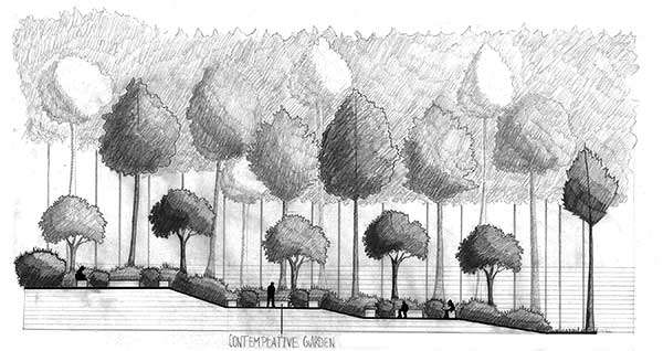
Contemplative garden at a Buddhist community in Massachusetts
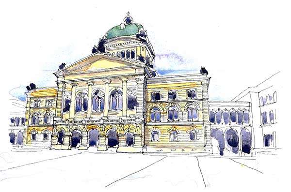
Iconic building in Europe

How to Suck at Hand Drawings and Still be a Good Landscape Architect
So you suck at hand drawings? Your trees look like lollipops and your people seem as though they have stepped from the canvas of a van Gogh painting. Things could be worse though right? You thought so until you saw the look of confusion on your client’s face when you pulled out your life time master piece (which most likely took all night to produce). For centuries, hand drawing with a pen, pencil, or marker has served as the prized and idealized method for communicating by the design community. These works are not simply beautiful images which adorn the walls of many public and private collectors. They serve as a way to communicate form, function, scale, social issues, and more. University students around the world are entrenched deep within the debate of if designers must have excellent representation skills. They are bombarded with the ideal and the famous; not the everyday and common. This is acceptable though because schools are meant to challenge and expand students’ abilities and skill sets.
Hand drawing by Miguel Lievano, displaying some sharp drawing skills.
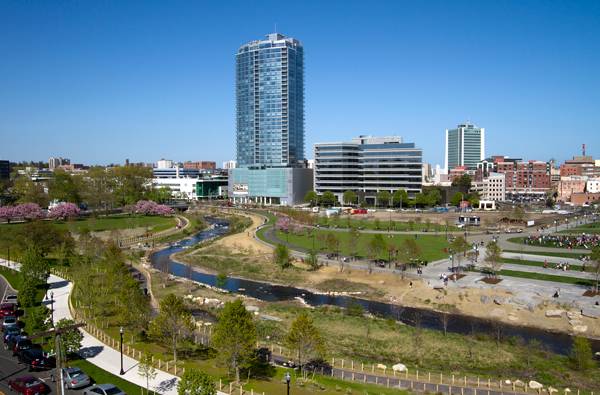
Mill River Park and Greenway; image © OLIN / Sahar Coston-Hardy
The power of 3D modeling software, credit: shuttersock.com
- Sketching from the Imagination: An Insight into Creative Drawing by 3DTotal
- Architectural Drawing Course by Mo Zell
Article written by Cameron R. Rodman Return to Homepage


Contemporary Japanese Garden in The English Countryside
Designer Amir Schlezinger Creates an exquisite Japanese Garden This 3,000-square-foot private garden is nestled on the Eastern boundary of a 1.5-acre site in the middle of the Essex countryside, just an hour’s drive north of London. The owner, a software developer, was inspired by a visit to Japan. He wanted to recreate the peace he felt at temple gardens — the plants and rocks, the disciplined raking of gravel, and the sound of water. He had taken his family to Japan during the school holidays, and he wanted his own garden to not only represent the family unit, but to blend with his contemporary ideas and with the soulful tradition of ancient Japanese gardens. The Site The client had acquired the site a few years earlier and had restored an old barn and its outbuildings, using oak beams, black cladding, slate tiles, and flint walls. This is the family’s country home during the weekends; weekdays are spent in a high-rise penthouse apartment in the center of London. Their weekend home is the ideal peaceful family retreat, with all the children could wish for: a place to run around, fresh air, a pool, and a sports barn. The site is close to Stansted Airport, handy for business travel, but now that work is less on the agenda and the children are older, the client wanted to create a Japanese garden in which to indulge peace.
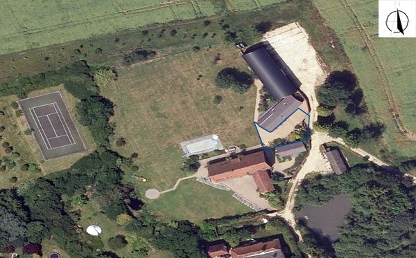
The site for the Japanese Garden
Designing The Japanese Garden
The plan links the four boundaries of the site, all set at different angles, and responds to the existing character of the architecture. The site runs east to west and is surrounded by two building and a perimeter wall and is open on the western side. The orientation of the sun is ideal for growing Japanese woodland plants. Initially, the ground was pretty level and laid to paving, allowing access to the buildings but serving not much of a visual purpose. Lowering a large part of the space as a sunken garden gave it a temple feel and allowed for a better edge definition.
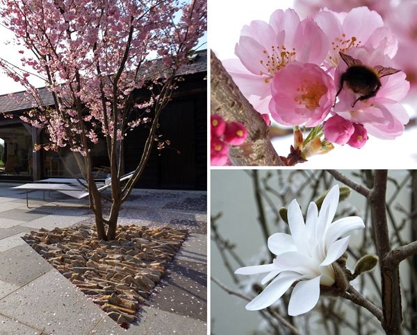
Retaining the existing tree in the Japanese garden.
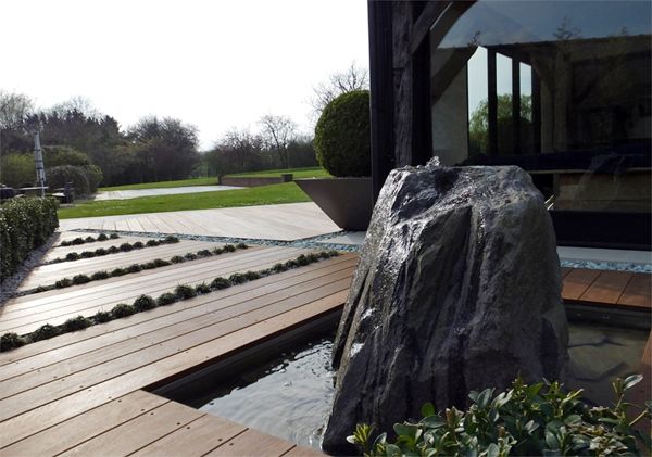
The deck feature and a sample of the planting in the Japanese garden
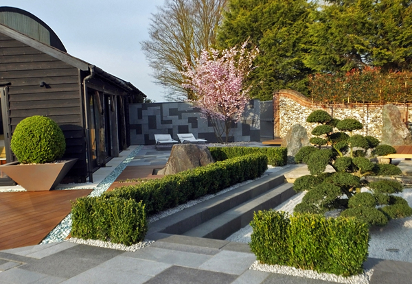
Japanese garden in the day
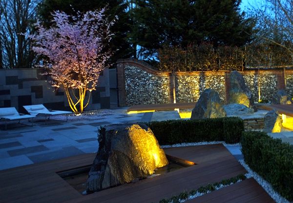
Night time shot of the Japanese garden

Ambient tones set the pace of this Japanese garden

Before and After, the journey of this Japanese garden


100 Lessons Learned From Studying Landscape Architecture
After spending the past 4 years studying to be a Landscape Architect, LAN writer Joe Clancy divulges on what he picked up during his time studying, with some funny moments and lots a practical notes these 100 lessons learned form studying Landscape Architecture is a list not to be missed. Enjoy! #100 Drink coffee. #99 Avoid negative people and those who hang around the watercooler. #98 Help those who need help. #97 Don’t waste your time with people who don’t want to work. #96 Always be reading at least 3 books, on different subjects, which are related to landscape architecture. #95 Plan for the “What can go wrong, will go wrong” scenario. #94 Never leave printing to the last minute. #93Question your lecturers. #92 Take breaks. #91 Travel as much as possible. #90 Never use “erm”, “kinda”, “its not great”, “i just” during a presentation or critique. You might as well shoot yourself in the foot. #89 Drink coffee. #88 Post-design rationalisation is fantastic if you can pull it off, but never rely on it.

#87 Photoshop and AutoCAD do not make you a good designer.

#73 Objectives don’t make sense if a SWOT doesn’t identify them.

#58 Draw on BIG pieces of paper

#33 “If you can’t explain it simply, you don’t understand it well enough” – Albert Einstein
#16 Perspective drawings will sell any project.

CLICK on the image and pick up the T-shirt,on sale Now


Landgrab City – Urban Farm
Landgrab City – Urban farm challenging the reality of our cities. From the outset, this temporary urban farm, installed in the middle of the Shenzhen/Hong Kong Biennale of Architecture/Urbanism congress is a unique piece of landscape. Not only because it represents an urban farm, but also because it represents one of the most important values of landscape architecture: challenging the reality of our cities. The conception and construction of this project creates an iconic precedent in our search as landscape architects, to motive people to think about solutions for a future that, day by day, seems to be darker.
Landgrab City copyright : Shenzhen Biennale of UrbanismArchitecture Organizing Committee
Each plot represents a different food group; copyright : Shenzhen Biennale of UrbanismArchitecture Organizing Committee


How to Grow a School Garden – Book Review
How to grow a School Garden. A Complete Guide for Parents and Teachers by Arden Bucklin – Sporer and Rachel Kathleen Pringle The children brought up in the big cities are often sadly separated from nature. They often do not even realise where their food comes from, have never seen a vegetable patch, let alone a farm or a field – all they know are the sterile, clean vegetables packed neatly on the supermarket shelves. A school garden can literally change their lives. The children’s contact with living plants, the experience of growing food with their own hands cannot be overestimated. “How to grow a School Garden. A Complete Guide for Parents and Teachers” by Arden Bucklin – Sporer and Rachel Kathleen Pringle is a great tool for all those interested in children’s education and development. Overview

How to Grow a School Garden – CLICK on the image and get the book today; credit: Timberpress

Inside “How to grow a School Garden” – credit: Marta Ratajszczak