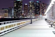
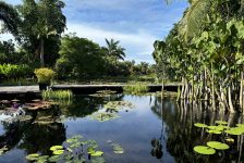
Freundschaftsinsel Potsdam, POLA, in Potsdam, Germany. Sitting between the Alte Fahrt and Neue Fahrt waterways in Berlin is the Freundschaftsinsel, which translates to “Friendship Island”. Freundschaftsinsel is located in the historic center of Potsdam, where old castles, gardens, and parks are waiting to be explored. Friendship Island is a local favorite, and a beautiful place to spend an afternoon. It is home to many little parks and garden areas, one of which was a botanical center started by none other than Karl Forester, famous for his work with perennials and the namesake of Calamagrostis x acutiflora, or Feather Reed Grass. An open theater, a children’s play area, and a popular coffeehouse are also attractions within the island.
Competition Time
A competition was held to re-design an entrance to the islands’ parks, and the winner was the firm POLA (Permanent Office for Landscape Architecture) of Berlin.
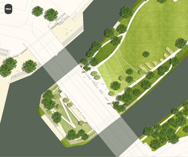
Masterplan of Freundschaftsinsel Potsdam. Image credit: POLA
Freundschaftsinsel Potsdam
The New Face of Freundschaftsinsel
POLA landscape architects proposed a new design for the site in 2006 and the project had its grand opening during the summer of 2010. The design for the new entrance of Friendship Island is simple — but simplicity is not a bad thing, nor does it mean that little effort went into the design. The design was planned in a way that creates a sense of openness that leads visitors into the area. The transition from the new entrance to the rest of the island is effortless, and minimal disturbance of the original site worked to preserve the history that makes Freundschaftsinsel so special to Berlin.
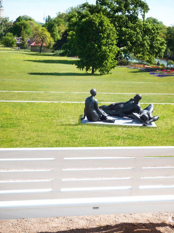
Freundschaftsinsel Potsdam. Photo credit: Joerg Michel, Berlin
Walkways Throughout the Park
Walking up to the entrance, you are greeted by a small plaza space on the upper level. Steps then take you down to other plaza spaces and walkways that meander through the park. With water on both sides of this island park, the walkways become more like boardwalks, where you can walk right against the water’s edge.
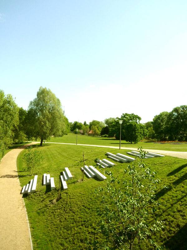
Freundschaftsinsel Potsdam. Photo credit: Joerg Michel, Berlin
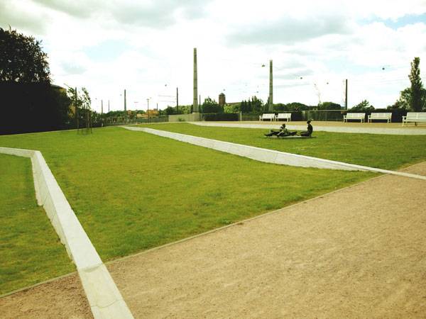
Freundschaftsinsel Potsdam. Photo credit: Joerg Michel, Berlin
Contrasting Materials Used to Great Effect
The variation in materials is subtle in the design, but the texture changes create a more attractive and thoughtful look to the eye. The walkways are a neutral tan tone, composed of light gravel, while the plaza spaces have a rustic cobblestone appeal. The furniture placed in the plazas include concrete seats shaped like asterisks, making for plenty of seating options and providing another fun break in texture that is striking to the eye.
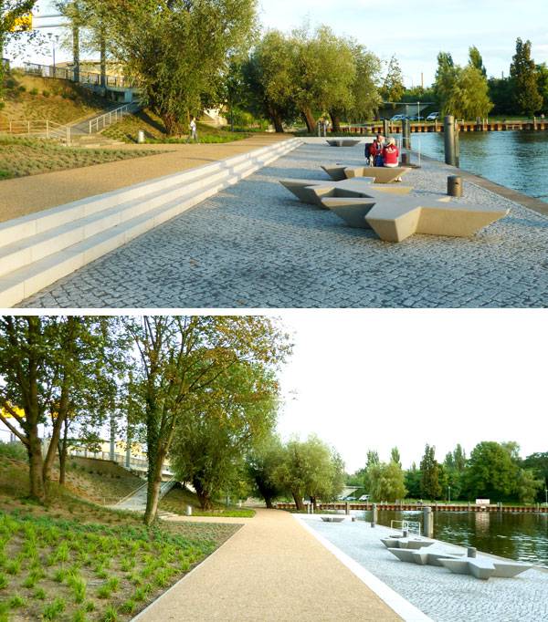
Freundschaftsinsel Potsdam. Photo credits: Joerg Michel, Berlin
Planting on The Site
Plantings around the site fit with the riparian area. Trees draping over the river are mimicked through the planting of new trees that will grow to create the same effect. Lush grass covers a large amount of the site, occasionally interrupted by riparian plantings in areas near the river or entrance space.
Why is This Site So Popular?
Site projects such as the new entrance to Freundschaftsinsel are important for keeping urban areas healthy because of the focus they place on parks and recreation. An emphasis on people, recreation, and open space makes for a happier and healthier community. Through the creation — or in this case, the renewal — of a park space, visitors and locals are given the opportunity to change the way they spend their free time. Just like how universities almost always have a quad or internally located gathering space, a city should have at least one great park. The fact that Friendship Island is a local favorite is no surprise.
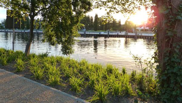
Freundschaftsinsel Potsdam. Photo credit: Joerg Michel, Berlin

Freundschaftsinsel Potsdam. Photo credit: Joerg Michel, Berlin
“The Best Parks Tend to be the Simplest Ones”
As odd as it may sound, some of the most successful parks are the ones that don’t try too hard to be the best. The best parks tend to be the simplest ones — spaces where activities such as walking your dog, riding a bike, and spending time with friends are all easy to do because the space has been left open for you to define. Open grass areas are inviting, much like the ones on this site, and are popular for picnicking, basking in the sun, and even studying.
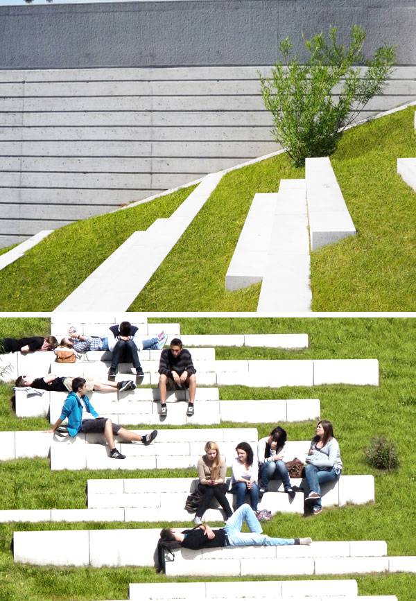
Freundschaftsinsel Potsdam. Photo credit: Joerg Michel, Berlin

Freundschaftsinsel Potsdam. Photo credits: Joerg Michel, Berlin
Full Project Credits For Freundschaftsinsel Potsdam
Project Name: Freundschaftsinsel Potsdam Design Budget: 1.1 million euro Dates of Planning/Construction: 2006-2011 (opened in 2010) Site Size: 3.4 hectares (size of entrance) Client: VIP Verkehrsbetriebe Potsdam (Germany) Location: Potsdam, Germany Images: POLA Design: POLA Photographer: Joerg Michel, Berlin Recommended Reading:
- Urban Design by Alex Krieger
- The Urban Design Handbook: Techniques and Working Methods (Second Edition) by Urban Design Associates
Article by Megan Criss Return to Homepage
Published in Blog


