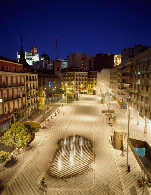
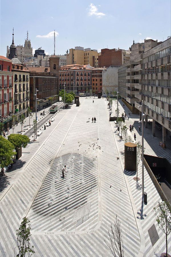
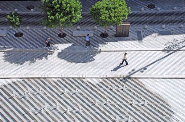
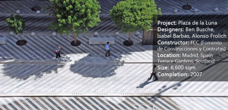
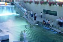
Plaza de la Luna, by Brut Deluxe, Ben Busche Architects, Madrid, Spain. Drug traffic, degradation of housing, and prostitution were all problems emanating from the cohesive and anti-functional construction of Plaza de la Luna in Madrid, Spain. The square had no coherent space because a street divided the place into two separate zones. Uneven mixed levels, walls, ramps, staircases, ventilation towers, and vents from an underground car-park also divided the place visually. Plaza de la Luna needed to be reorganized and unified to create a new attractive and vandalism free square.
Plaza de la Luna
The central idea of designer Ben Busche and his team was to give the space a new topography. The former one hindered pedestrians from comfortably crossing the square and tended to focus on the worst part of the site – the space beneath the arcades. To solve that, a new large central space was created to make sure the focus of the users was no longer in the arcades, but in a new center.

Plaza de la Luna by Brut Deluxe and Ben Busche Architects.
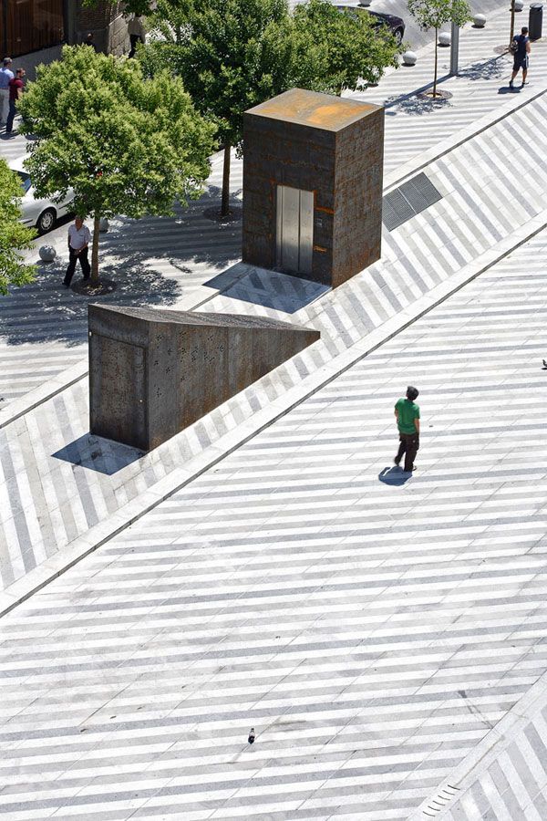
The central space is a perfect example of how to create a public space. It is a multifunctional, indeterminate, and open area that provides a more dynamic space for all kinds of activities that need a lot of space. Toward the edges of the central space, low steps accommodate trees and existing elements, such as ramps, stairs, and ventilation towers. By its organization, the center does not determine fixed places for activities but provides the opportunity for diverse uses, such as street markets, musical performances, or sports. In the zone around the central area, more contemplative and static activities can take place.
If you love plaza design, here’s three more stunning projects:
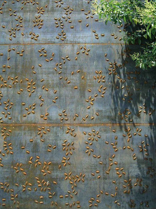
How Does it Prevents Vandalism? All the elements have been renewed with anti-vandalism in mind. All of the furnishings are made of 3mm, naturally rusted Corten steel to deter vandalism. It’s very hard to write on, glued papers drop off, and it’s easy to remove sprayed graffiti. But to give the Corten steel a less cheap and rusted look, the designers punched or stamped it with a floral motif. The use of the same material throughout the project gives the place a more unified and organized look, which is strengthened by the doubling of the amount of trees and vegetation.

Plaza de la Luna by Brut Deluxe and Ben Busche Architects
The chestnut trees (Castanea) placed between the steel elements give shade in summer. They strengthen the depth of the square and give the space a vertical dimension that covers the neglected façades of the surrounding houses. Because everyone knows that vandalism happens most often when boredom strikes, the designers added a water fountain at the lowest point of the square that doubles as a place for children to play and as a refreshing focal point on hot days. At the highest point of the square, a children’s play area was placed near an area where seniors can gather.

Plaza de la Luna by Brut Deluxe and Ben Busche Architects
To hold the attention in the middle of the square and not on the arcades, the lighting under the arcades of the surrounding buildings is very scarce. As a counterpoint to make sure that the arcades aren’t too dark – and, therefore, attractive to vandals — a new false ceiling is covered with white tiles that reflects the light and gives a safer feeling at night. The white ceiling offers an adequate possibility for all kinds of activities, such as a screen for projectors.
Paving Design The paving of the square focuses on texture. Designers chose granite blocks of different, highly contrasting colors – white, green, black, and grey. The main pattern is of alternating diagonal directions common to each zone of steps. It comes across like a big carpet, inviting you to play. The colors aren’t just placed but are used according to their position.

Plaza de la Luna by Brut Deluxe and Ben Busche Architects.
In the center, dark green is prevalent; on the edges, the green gives way to other colors that integrate with the surrounding streets. The designers hope the paving schemes will encourage higher pedestrian use. The street that crosses the square has been removed, and the streets surrounding it have the same paving as the other parts. This makes the place feel bigger and gives it a unified look.

Plaza de la Luna by Brut Deluxe and Ben Busche Architects.
In his mission to make Plaza de la Luna attractive and vandalism free, Ben Busche and his team have created an open square with imprecise boundaries. The visually uncluttered space, in combination with the right lighting, anti-vandalism materials, and ease of use for different activities, makes the place less attractive for small crimes. This kind of square, with a multifunctional nature that can be used every hour and every way, was the center Madrid was lacking.
And if we can believe Ben Busche, “
The best squares are those that are basically empty and indeterminate.”
Photographs: Roland Halbe, Miguel de Guzman, Estudio BD
Recommended Reading:
Article by Sander Van de Putte Return to Homepage
Published in Blog