Place de la République, by Trévelo & Viger-Kohler , in Paris, France. Most people know that Paris is often called “The City of Love”. Fewer have heard that Paris is also known as “The City of Light”. The first alias needs no explanation; the second one certainly does. Paris has been called “The City of Light” because of its leading role in the Age of Enlightenment, but also because France’s capital was one of the first European cities to adopt gas street lighting. Another interesting fact about the city is that — unlike the majority of other world capitals — Paris has never been destroyed by war or catastrophe. And despite modernizing the urban scape, architecture, and infrastructure, the city zealously guards its earliest historical tracks on its street map. IN THIS ARTICLE, we will discuss the redevelopment of one of the most key and special places in the city – the 3.8-hectare grand Place de la République square. If you are curious to find out how The City of Light has once again manifested its classy attitude toward architecture, join us now; you will be fascinated at the end.

Place de la République before and after. Above photo credit: ©AIR IMAGES. Below photo credit: ©TVK-Myluckypixel
Place de la République: Before and After
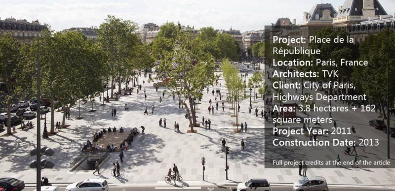
Before the design intervention of the French architecture and urbanism agency TVK, Place de la République had a different organization. The square was comprised of two gardens and a busy roundabout in between, with the statue of the Republic soaring above the traffic flow. Because the square holds a very significant location in the city due to the intersection of three Parisian districts and seven major arteries, the road traffic had often been heavy and blocked. The team of TVK came up with a design solution aiming to transfigure Place de la République into the largest pedestrian area to represent one of the most appreciable 21st century monuments in Paris.

Place de la République. Photo credit: © Clement Guillaume
Green Light to Pedestrians
To create a vast concourse ready to accommodate a great stream of people, the designers had no other choice but to abandon the circle model of traffic. Thus, an undisturbed and bracingly calming two-hectare space was defined – free of vehicles and full of trees and people.

Place de la République. Photo credit: © Clement Guillaume

Place de la République. Photo credit: © Clement Guillaume
One Axis, Multiple Uses
Besides shaping a more contemporary appearance, the reconstructed landscape provides a spirited urban place that welcomes versatile uses. The main axis outlining the composition is formed by four elements — the statue of Marianne, the reflective pool, the pavilion, and the tree rows. These four components together and separately add a sense of representativeness, accompanied by an ambiance of vivacity and aspiration.

Place de la République. Photo credit: © Clement Guillaume

Place de la République. Photo credit: © Clement Guillaume
Why Asymmetrical Design?
Place de la République’s transformation continues with the induction of two-fold dissymmetry along the long axis, adding a functional and environmental value to the project. The asymmetrical composition not only incorporates the large pedestrian square into the surrounding environment, but also considers the climate characteristics of the place. This type of tree arrangement reinforces the vital presence of greenery while letting sunbeams reach the alleys and warm winds penetrate and refresh the air. Respectively, in winter, the trees block the cold winds.

Place de la République. Photo credit: © Clement Guillaume

Place de la République. Photo credit: © Clement Guillaume
Materials Choices in the Design
The impression of unification appears on the surface of the esplanade, as well. The mixture of light and dark paving slabs covers both the open and shady areas. Varying in size and hues, the prefabricated, durable concrete slabs “play” with the surrounding pavement while complementing and enriching it. The only edifice popping out from the surface is the pavilion, which houses a “World & Media”-themed café, eager to cooperate with social and cultural initiatives.

Place de la République. Photo credit: © Clement Guillaume
Resonant Architecture and Landscaping
The pavilion has a subtle and minimalistic design, in accordance with the holistic, representative appearance of the square. Facing the statue of the Republic and the reflective pool, the café’s walls are transparent so that they do not obscure the vista. See More Great Projects From Paris, France:
- Is The André Citroën Park Really One of The Worst Parks in Paris?
- Incredible Double Footbridge in Paris
- Is France Leading the Game in Sustainable Urban Planning?

Place de la République. Photo credit: © Clement Guillaume
The Use of Water in The Design
Now that we have mentioned the reflective pool, it’s necessary to highlight the water features and their meaning for the plaza. Besides the reflective pool, water takes form in a circular basin surrounding the monument. Water in the square functions aesthetically, socially, culturally, and ecologically – a plethora of virtues needed for an up-to-date urban design.

Place de la République. Photo credit: © Pierre Yves Brunaud
The Careful Selection of Vegetation
Last but not least, we focus on the vegetation — more than 150 plane and honey locust trees. The strict tree rows once again underline the dignified appearance and character of Place de la République.
Place de la République in Numbers

Place de la République. Photo credit: © Clement Guillaume
Was TVK’s Redevelopment the Best Possible Design Solution?
Having gone through the profound analysis of Place de la République’s new design, a few questions come up. People’s opinions are controversial, and some of them don’t approve of the removal of the green lawns and the fountains. It is not certain if the traffic has been optimized since the roundabout was removed, either. However, the benefits from the reconstruction have an incalculable value. The fact that people can now reach the Statue of the République freely and literally touch the history of France is sufficient on its own. People need to be connected to their history, to their city, and to each other. And that’s exactly what the new Place de la République offers. What is your opinion? Was TVK’s design solution appropriate? If not, what are your arguments?

Place de la République. Photo credit: © Clement Guillaume
Full Project Credits For Place de la République
Project Name: Place de la République Location: Paris, France Architects: TVK / Trévelo & Viger-Kohler Landscaping: Martha Schwartz and AREAL Client: City of Paris, Highways Department (Direction de la Voierie et Déplacements) Area: 3.8 hectares + 162 square meters Technical Consultants: ATEC Traffic and Movement Consultants: CITEC Fountain Consultants: JML Consultants Lighting Design: AIK – Yann Kersale Environmental Consultants: Transsolar Dialogue and Consulting: Ville Ouverte Team Square: TVK, Areal, Martha Schwartz, Atec, JML, Citec, Transsolar, Ville Ouverte, AIK, Segic Team Pavilion: TVK, ARC, Atec, Transsolar, NP2F Project Year: 2011 Construction Date: 2013 Website: www.tvk.fr Recommended Reading:
- Urban Design by Alex Krieger
- The Urban Design Handbook: Techniques and Working Methods (Second Edition) by Urban Design Associates
Article by Velislava Valcheva Return to Homepage
Published in Blog


