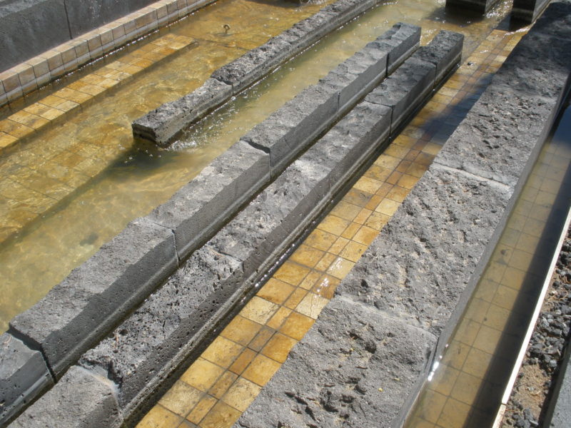
The dry arroyo wasn’t dry when I visited Mesa Arts Center last fall. This gold tile and lava rock gash in the so-called Shadow Walk that arcs through the site was supposed to be dry most of the time—like an actual desert arroyo—but it seems the water runs almost constantly. “I don’t know of anybody that has seen it dry,” Shauna Gillies-Smith told me recently. She was one of the key designers of the project at Martha Schwartz Partners (Design Workshop’s Tempe, Arizona, office was the local LA of record). The planned dryness would reference the surrounding Sonora, of course, but Schwartz’s office also had a practical reason.
Gillies-Smith, who now has her own office called Ground, remembers that MSP had just finished Exchange Square in Manchester, UK. There, it was unclear whether there would be enough money or maintenance to run the fountain all the time, so MSP designed it to look good wet or dry. I am sure you have a mental image of that project: the fragmented grey strip looking like, well, an eroded mesa. “[Manchester] was in the back of our minds,” says Gillies-Smith, “as we started Mesa Arts.”
I should be more clear. The arroyo wasn’t dry, but it also wasn’t full. The project description from MSP’s ASLA award entry (Mesa Arts Center, completed in 2005, won an Honor Award in 2007) says the arroyo was meant to flood exuberantly from time to time. When I visited, it was obvious from the wear of the lava rock and the water-staining on the tile that the water had been higher. I could picture how much more dramatic the flow would be in flood, but the half-full condition wasn’t bad either.
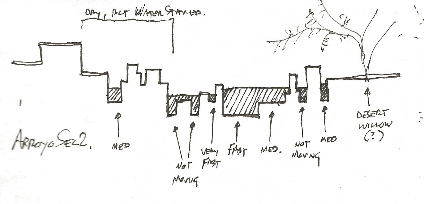
That’s credit to the cross-section. The arroyo is essentially a tile basin with a jagged bottom. Fins of lava rock rise from the basin, creating channels of different widths, depths, and (this is the best part) water speeds. Water in one channel might be moving twice as fast as the water on the other side of one of the black fins. When the fins end and the channels combine, the water roils and churns, trying to find another path and some equilibrium of velocity. Then the flood splits again, some of it spreading out, some slipping into a micro-canyon and rushing downstream.
Find more videos like this on Land8.com
Find more videos like this on Land8.com
Neither the section nor the abrupt beginnings and endings of the black fins have any documentable rhyme or reason. The design is intricate and carefully detailed, but not beholden to any overwrought formula or module.
Gillies-Smith told me the office explored the design of the arroyo physically—with a “casual working model,” in her words. That allowed the landscape architects to visualize the design and play with form and line. “You can get your eyes right down in it,” she says. Interestingly, during the design process the arroyo materials swapped places. Early on, the lava rock formed the base and the tile the upper levels and fins. That might seem more geologically accurate, I suppose, but I have to say the final gold base and black crest achieve an important contrast and more effectively show the movement of the water.
When there’s water, that is. Which is most of the time, it seems. Which is too bad—but not too too bad.
In Place is a Land8 column that resurrects the design field trip. If you haven’t yet, read the intro and my previous posts here.
Photos, video, and sketch by the author.
Published in Blog


