Bernard Trainor is founding principal and design director of Bernard Trainor + Associates in Monterey, California. Many of BT + A’s large-scale projects include sites adjacent to California’s protected areas and state preserves. So by necessity and desire, BT + A’s design work performs that integral dance between design intent and the elements of nature. His recent monograph, Landprints: The Landscape Designs of Bernard Trainor, by Susan Heeger, beautifully portrays 10 of these special places.
“I have come to realize that I am just adding a layer to the good work of the many who came before me. I am happy with that–I just want the layer I am adding to be really good!”
How does a young surfer from southeast Australia find himself designing regionally appropriate landscapes in central California?
Timing is everything. I would say that I arrived into the right environment at the right time with an intent to create meaningful designs. In retrospect, it appears like I had been working toward this, and when it all came together, it felt right.
Coming from Australia, do you believe you see the California landscape differently than one who has been here most, if not all his or her life?
I don’t think about, it but when asked I guess so. Maybe I look at the landscape with more inquisitive eyes than one who takes it all for granted. That said, I have met with clients who come here to build and on occasion they import ideas from elsewhere without looking for a connective tissue with this culture or place, so seeing it fresh does not always lead to good things. One has to arrive with open eyes and humility for the place. Too many people, unknowingly of course, want a design that would overpower and suffocate the local identity.
So how do you believe that difference informs your approach to regional design?
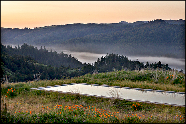
I try to remember that the best gardens I have seen throughout the world all have one thing in common—they look like they have grown from their particular location. This means the designer looked closely at what exists there. This is what I aim to do.
You’re known to spend many days walking a site before beginning work on a design. What happens on these walks?
I try not to arrive with any agenda. Naturally I stay open to my responses to the existing site. Yet these responses are not the design, they only inform and initiate the design process. Design can’t shy away from intention and intervention. My designs are certainly tailored and responsive to the site. They enhance the existing context, without replicating or being afraid to show that humans are involved–after all, we are nature too.
You spoke at Dwell on Design this past June; where you discussed the work on an Eichler remodel project in Sunnyvale California as informing your approach to some of the more recent projects. Can you give us an example or two of what sounds like a bit of adjustment in approach?
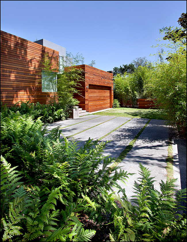
I would say the urban gardens are about manufacturing a sense of place, using all available design tools–while the rural projects are more about great site design without using all the design tools and gimmicks.
Where it can be gleaned, how much does the “original intent” of a previous design come into play when working on a remodel project such as the Eichler house?
On the good houses, I think there is a nod to the past. But time did not stand still since it was built, so I use everything I can to update the gardens toward a ‘today’ attitude. That said, the new ideas are an extension of the original design philosophy rather than being in opposition to it.
In the introduction to Susan Heeger’s Landprints: The Landscape Designs of Bernard Trainor, you mention your learning process as including some clumsy mistakes along with fulfilling successes. Your honesty has to be refreshing to emerging designers. For the sake of educating others, can you speak (in general terms of course) about a clumsy mistake made early in your career?
Scale, scale, and scale…look at the “overall” rather than item by item. Let me state the obvious: It is said often but rarely enacted well–less truly is more! Start with a clear analysis of the place and let this inform a clear design intent.
While reading Landprints, I was reminded of a quote by Richard Nuetra that advises designers to “heighten and intensify what it (in this case landscape) has to offer, never work against its inner grain and fiber”. This sounds like Bernard Trainor could have written this himself. Does this quote resonate with you?
The design masters who practiced from the 1930s through the 1960s are full of quotes like this. I am a bit of an old soul and many of my favorite Californian designers are from this general period. When I was younger, I tended to think the work I was doing was breaking some new ground, but in fact I have come to realize that I am just adding a layer to the good work of the many who came before me. I am happy with that–I just want the layer I am adding to be really good!
The most dynamic and vital zones within a landscape are the transitional spaces, particularly the zones that unite the domestic with the wild space. There is a wonderful quote in Landprints about your role as a landscape architect as “mediating between the human and the natural worlds”. Can you please speak more about these inclusive areas and your philosophy about their importance?
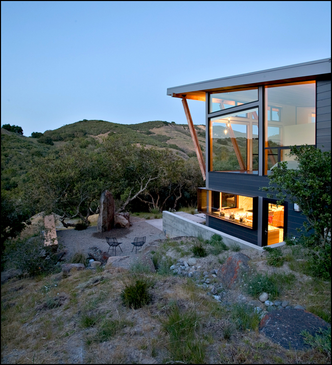
For me this is one of the most important parts of my work. It is very simple really–each of these zones has its own needs and these needs have to be acknowledged. It is about the tissue between them. There really is no formula. It is a feeling you get about what feels right–in a word, balance.
In my opinion, your work achieves that elegant and intuitive balance you speak of—the balance between, on the one hand design/development, and on the other, being a true advocate for the site itself, and the region beyond. Does this dual role create conflicts for you during the design process?
Not really–this is my thing and I have failed if there is a conflict there.
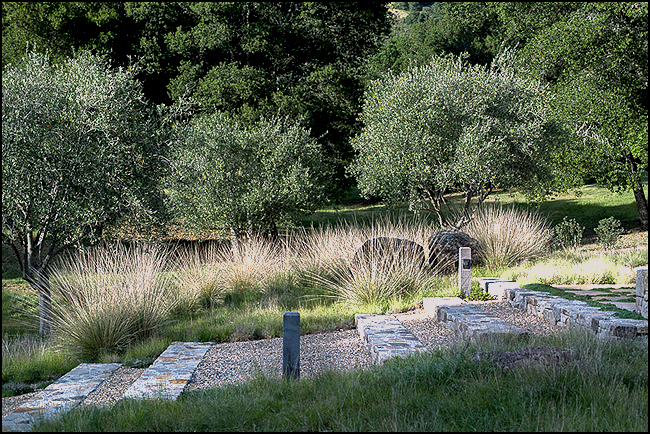
The incorporation, or re-use of existing (onsite) materials is a common element in much of your design work. Besides their sustainability value, can you tell us why these materials (both soft and hardscape) are important to you?
For a couple of reasons–there are of course the sustainable and economic reasons. Then it just feels so good to re-purpose something in a fresh way–to give something a new purpose and a fresh meaning in the context of the new design is thrilling.
Many visual artists struggle with the issue of “knowing when (or where) to stop.” In Landprints, you speak of a “total inevitability”. Can you define this phrase “total inevitability” for us? Also how do you approach this question of completion?
I am known for constantly refining the total design during the process. I think this has to happen in landscape design. That said, I am adamant that the philosophy behind the master plan be adhered to and there has to be a good reason for change. When I look back at our overall designs, they barely change, but the details are always being evaluated during the process–the ‘little’ things matter.
Who are some of your design influences from outside the world of landscape architecture?
David Nash, song writer Paul Kelly, Apple, Big Sur, and my girls.
Is there anything “on the boards” that you can share with the readers of Land8?
I would say there are many good projects. The thing that is most gratifying is the variety and professional level of architects we get to work with. It makes me proud to form long-lasting relationships with collaborators who are proponents of our work.This may sound cheesy, but the team in the studio is my best design–Michael Bliss, David LeRoy, Ben Langford, Chris Merritt, Vanessa Hefti, Braden Patterson, and my wife Melanie. If I had not put this group together I could not work on these projects–especially at the high level of design we aspire to.
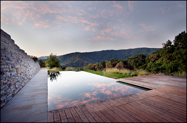
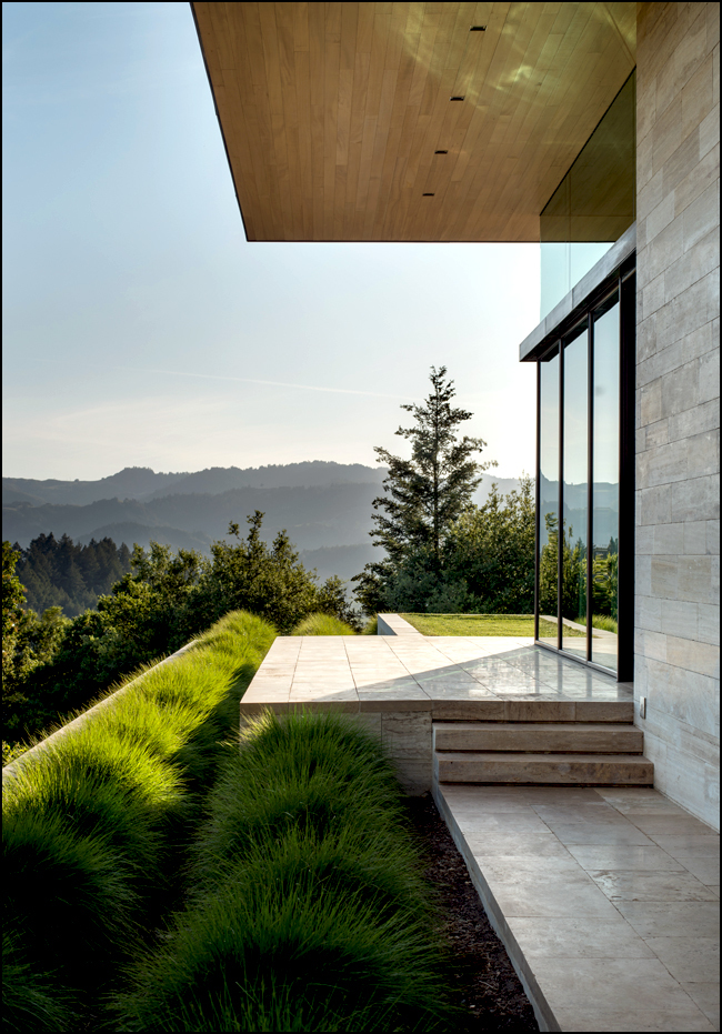
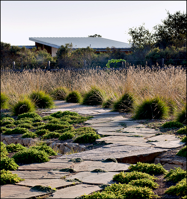
All images courtesy of Jason Liske
Related Posts:
Book Review: Landprints: The Landscape Designs of Bernard Trainor | Ben Boyd
Member Spotlight: Interview with Bernard Trainor | Jessica Wolff
Published in Blog




Mitch Howard
More of Jason Liske’s amazing photography work: http://www.jasonliske.com/