A design portfolio, especially for the young and less experienced designer, is an intimidating document to create. We’ve all heard rumors of older students with silver bullet portfolios that secure them endless job offers from prestigious firms. Who doesn’t want to be fought over for employment?

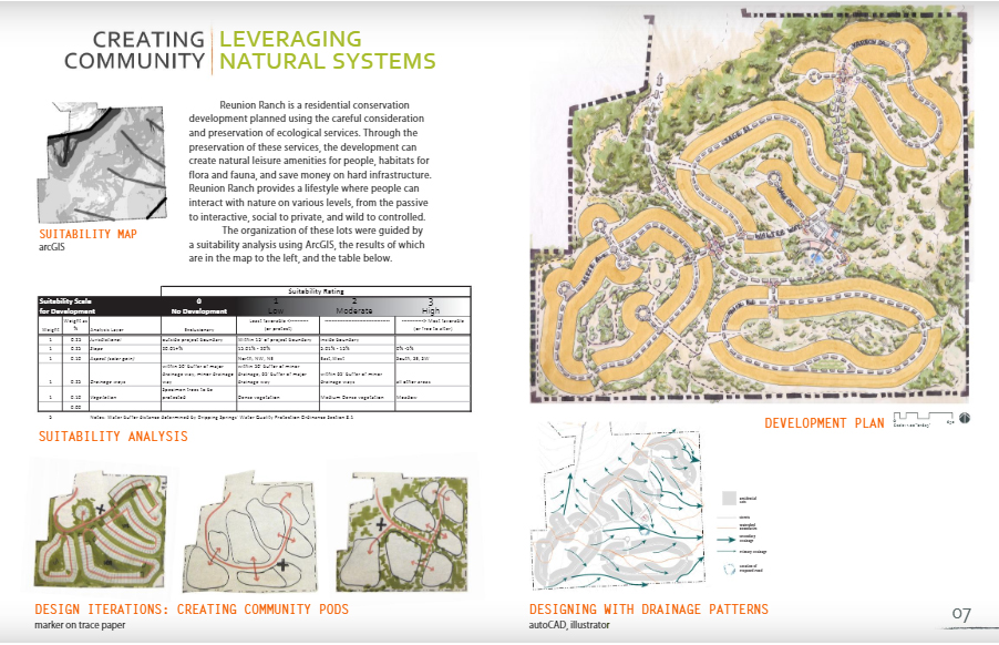

These three spreads from Ashley Schwemmer’s student portfolio demonstrate how to use multiple types of graphics to build a compelling story about a project. Schwemmer is a currently a landscape architect with West8 based in New York City.
The ideal portfolio represents the breadth of your skills and abilities. It demonstrates that you can communicate verbally and visually. It proves that you can think critically. That’s a lot of pressure on one document, which you preferably want to keep to no more than 10-12 spreads (5MB).
Design portfolios are useful tools. They demonstrate prospective employees’ aesthetic sensibilities, problem solving skills, communication styles, and technical abilities. But no 12-spread document can fully represent a person. There is no silver bullet portfolio.
After working with hiring teams at several different types of firms, I’ve been on both the creating and reviewing sides of the portfolio. Here are some considerations that can help you feel confident that the document appropriately represents you to potential employers.
- Make sure the document is easy to view. Many offices receive hundreds of portfolios for each job posting. The portfolios that will be remembered are those that are graphically clear and compelling. Make sure each spread reads at a quick glance. Format for easy viewing on small phone screens. Your knowledge of graphic and typographic design, layout, page structure, and hierarchy is reflected in your portfolio. Plan for good contrast so everything reads on a small phone screen or printed out in grayscale. You want to draw attention to the work itself, not to a complicated graphics scheme. Avoid complicated keys and labels.
- Minimize text. You’re a designer. Keep descriptions short. Demonstrate problem solving and critical thinking through graphics. No one is going to spend thirty minutes reading your description of a bioswale planting.
- Show design thinking. Pretty graphics are only part of the story. Tell the story of your processes through sketches leading to more refined graphics. Captions that include information about what tools/programs you used to create specific graphics and a rough estimate of the time it took you to create the graphic can be useful to a potential employer.
- Demonstrate multi-scalar thinking. Use different types of drawings (exports from 3D models, concept sketches, photomontages, plans, sections, etc) together to show that you’re accustomed to thinking through design problems at multiple scales and in varying degrees of precision.
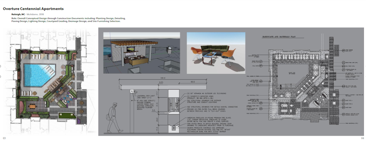
This spread from Ryan Albracht’s professional portfolio demonstrates design thinking at multiple scales, with a plan relating to construction details and exports from a 3D model. Albracht is a 3D visualization specialist with McAdams in Durham, North Carolina.
- Use space wisely. You have 10-12 spreads to capture a potential employer’s attention. Don’t waste it. One of the most useless sections I’ve seen in a lot of design portfolios is a photography section. If you’ve made it through design school, you can probably compose a successful image. Use this space to demonstrate a unique skill.
- Tie everything visually together as much as possible. Your portfolio, resume, website, and social media should read as a coherent experience that supports your expertise and areas of interest as a designer.
- Demonstrate unique knowledge & skill. Design is all about application of specialized knowledge and skill. It’s hard to spend much time developing new skills when you’re in the middle of a busy design practice. As a younger designer, you probably have skills (particularly in technology and social media) that may add capabilities to a firm – enabling them to offer new services and take on new types of projects. Demonstrate the design research techniques that you’ve learned in school and show how to apply them in design projects. If you have statistics knowledge that informed a project, demonstrate that. If you know some neat tricks and tips, show them in your portfolio. If you have experience in fine art, list competitions and exhibitions. Show off your fluency with different media.

This spread from Elizabeth Levkulich’s student portfolio demonstrates explorations of mixed-media drawing in a Jon Hunt’s Poetic Image studio at Kansas State University. Levkulich is a landscape designer with TBG Partners in Dallas, Texas.
- Demonstrate hands on experience. Hands-on experience with landscape maintenance, retail horticulture, construction, graphic design, research methods, and business administration can be highly useful to landscape architecture firms. Demonstrate how real-world experience supports your creative practice.
- Customize some of your portfolio. Keep a major block of your portfolio ready to go, but customize a few pages for firms that you’re particularly interested in. Do research and you’ll get a feel for the firm’s aesthetic – both in graphics and built work. Read staff bios – you’ll often get a sense for the type of language that firm appreciates. Google around to find out about new projects they’ve obtained and what they’re working on – you may have skills that enable a firm to take on new types of projects and offer new products.
- Have a personal professional website. This doesn’t have to be fancy. It can be a wordpress site that just includes the material from your portfolio. Keep adding to it over time, even in practice. You’ll find that it’s highly useful to have an online place where you can demonstrate expertise.
- Make it easy to contact and find you.




J. Robert (Bob) Wainner
A well written article, Caleb, concerning Landscape Architect’s Portfolios. You’ve made some excellent suggestions!
I agree that the LA’s Design Portfolio is critical to getting a job offer. I was always taught early on in my career…..to always put your best foot forward with respect to your Portfolio. If the example is not “outstanding” don’t include it. I think LA firms are wanting to know if and how a candidate can contribute….looking for that potential. Having a great GPA with your University work is definitely a positive, but, having outstanding computer drawing & hand drawing skills (color renderings), etc. is more important…a strong Portfolio will get you a closer look from a potential LA Firm.
I think too, producing a “creative” approach with your LA design portfolio is a plus. For me, coming out of Texas A&M University back in 1977, my Dad (who was an exceptionally gifted Advertising Artist & Graphic Designer) recommended I take a creative approach with my Resume’ (that acted also as a brief design portfolio). My Dad suggested I produce a creative & graphic “poster”. And, stay away from the typical 8″ x 10″ Resume’ format. So, I was able to include Resume’ info. & some LA graphic samples of my work on a Poster…roll them up and mail them in a mailing tube. Again, that was way back in 1977…times have changed. I agree, 10 to 12 very good Portfolio Samples is best today.
But, I did receive some very positive feedback from that “poster idea”. I received a letter from EDSA in Ft. Lauderdale (at that time, they were the #1 LA firm in the World) & I received interest from Lane Marshall’s Florida office (Lane was the President of ASLA at the time). I ended up getting an invite to interview with Lane Marshall…and then an offer from him. My first LA position was with Lane Marshall in 1977 in his Sarasota, Fla. office.
So, some “creativity” in both a Resume & a Portfolio will definitely help an LA candidate.
Your idea of having a website that contains several Portfolio Samples is a good one. Over the years, I maintained a FLICKR website with my Professional Portfolio Samples…and as I completed new projects, I would add photos, color renderings and photos of some of the final contract documents. But, ensuring ONLY my best samples were on that FLICKR website. I’m sure there are other types of websites that LAs can use. Maintaining a Portfolio throughout your LA design career is very important to your continued success.
Regards,
J. Robert (Bob) Wainner – Plano, Texas
Tim Daugherty
Good stuff Caleb, and great tips for those first assembling a portfolio. I love your suggestion for demonstrating “hands on experience”.
I’ve hired quite a few designers in my career and one additional suggestion is to clearly acknowledge team projects and what your role was. Whether academic or professional.