This week’s Sketchy Saturday top 10. This week’s Sketchy Saturday top 10 is as electrifying as ever. However with such a diverse range, one does have to question – “How do we put the various styles up against each other and choose a top 10? It’s not easy, mind you, but let’s start by looking at the name “Sketchy Saturday“, the key word is “Sketchy” and preference will always be given to work with a high sketchlike presence and raw style as opposed to the more refined rendered types. However with such a diversity of style and no control over who enters on what week, keeping a level of consistency in the judging process is a challenge in itself, and sometimes the sketchy entries are swamped by the more refined styles. This week we achieved a good balance between the raw sketches and the more artistic entries. Enjoy this week’s Sketchy Saturday top 10! 10. by Anastasia B. Uli, University of Florida, Urban Designer at Florida Community Design Center, Gainesville, FL

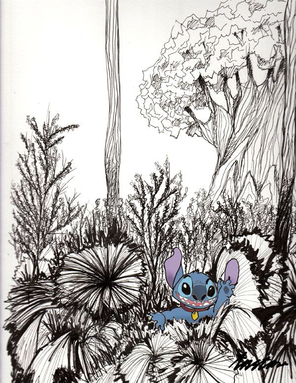
By Anastasia B. Uli
“I love to draw, paint and sketch, especially combining the reality and imagination. I call it Realistic-Comical. This drawing ” The Stitch at Animal Kingdom, Orlando, FL” was done in less than 45 minutes. I always set the time limit to practice my sketching ability. The sketch was made using ink and pencil (Color) technique on canvas canson paper”.
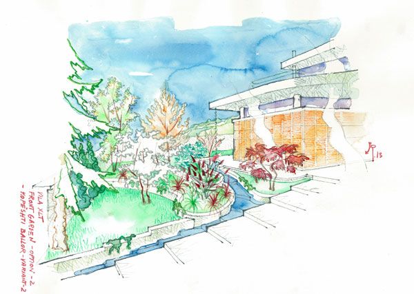
9. by Andi Papastefani, Boston, MA, USA. student (graduate candidate) of Landscape Institute of the Boston Architectural College 
By Andi Papastefani

By Vanessa Marques de Souza.

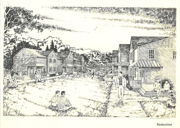
By Jack Tremblay

By Camille Briez Chauvey

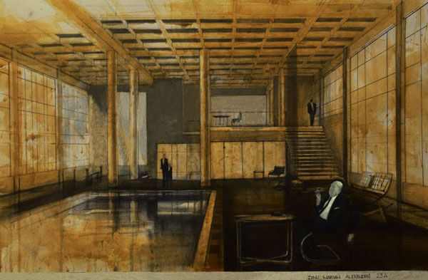
By Dinu Marian Alexandru
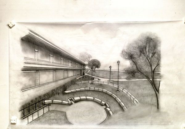
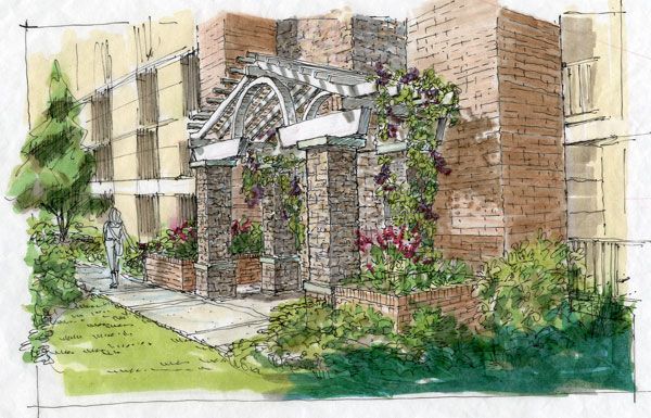
“This represents a new entry portal to an existing amenity space or courtyard. The drawing is on trace using a marker and colored pencil”.
Drawing Related Articles:

By Peter Bonette

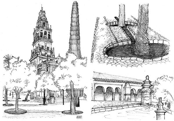
By Eirini Mouka
“I am a Landscape Architect from Greece and now I’m doing my master’s study in the Neapolis University of Pafos, in Cyprus. This sketch was made for a school project, in order to learn how to observe and note the elements of famous historical gardens. Firstly I drew it with pencil and then with a pen. It shows some site views from “Patio de Los Naranjos”, a great historical court in Cordoba, Spain”.
2. by Karl Bergot, an Interior designer specialized in high end residences for Middle east 
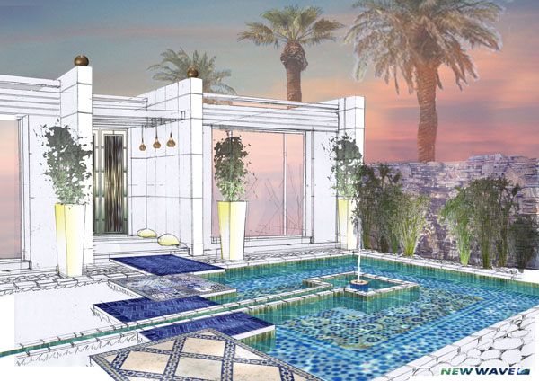
By Karl Bergot
“This is the first proposal for the guest house of a quite huge villa in Dubai. The techniques are hand sketch perspective and then after scanning inlays of photoshop to improve ambient in drawing”.
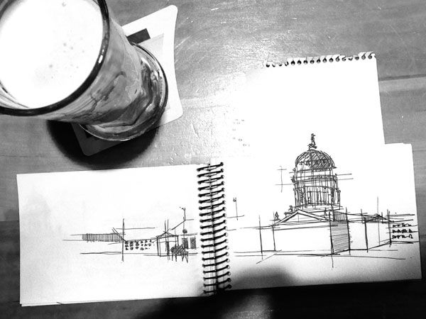
1. by Pablo Saiz del Rio, Architecture student, Spain 
By Pablo Saiz del Rio
– That’s this week’s Sketchy Saturday Top 10, congratulations to all of you who featured, you have come out on top of a very talented bunch of people. Check out the Sketchy Saturday official
Facebook album and see literally 1,000′s of incredible sketches! Follow all the winning entries on our dedicated
Sketchy Saturday Pinterest page. If you want to take part send your entries to us at
office@landarchs.com Recommended reading:
Article by Scott D. Renwick Return to Homepage
Published in Blog