This weeks Sketchy Saturday sees a few surprises as we break away from conventional methods and scenes and break into new realms of creativity and awareness of public space, displaying not just in how it’s built but in how people use it to. Congratulations to everyone who took part in this weeks Sketchy Saturday, there was so many sensational entries however not everyone can get published on the website. We’re very excited to reveal this weeks Top 10, here they are: 10. by Zanyar Feizi, M.A.student of Landscape Architecture, Iran

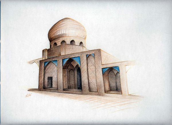
Zanyar Feizi, M.A. student of Landscape, Architecture
“This sketch which has been drawn using colored pencil,indicates the identity of old Iranian Architecture that was created in particular after Islam in Iran. Dome is one of the remarkable elements of this architectural style”.
9. by Elvis Kaltofen, a student on the Academy of Architecture in Maastricht. 
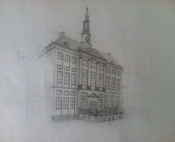
Elvis Kaltofen, a student.
“This drawing is of the town hall of Den Bosch, located in the Netherlands. One a day my friend and I saw a beautiful coatrack with a graphic silhouette of iconic buildings in Den Bosch. Now, to surprise him, I couldn’t afford this coatrack, but I could afford a pencil and paper. So I drew some iconic buildings like this one with just a pencil. I like this drawing style where you can feel the experience of the renaissance building.I drew it more with an architectural style with basic quick lines, so the focus would be on the Town hall”.
8. by Scott Wardell a husband, father of two little girls and hopeless skate rat. 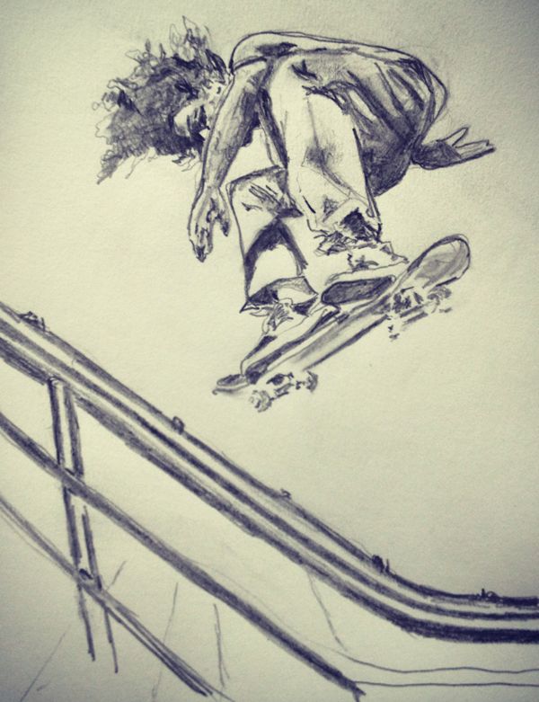 “My drawing is focused on skateboarding- and I post my work on instagram @Scottwardell Pro skater Chuck Treece calls me a ‘gnartist’ I try to capture the motion, emotion and immediacy of skating with pencil and paper. Art allows me to tap into the raw energy of skating without the physical risk”.
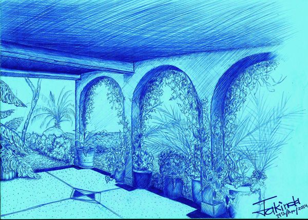
7. by Mike Jakinda a landscape architecture student at JKUAT, Kenya 
Alan Ramiro Manning, 4th year student
We really loved this blue sketch by Alan Ramiro, the style and colour create an ambient mood that draws you in and makes you wonder about what it would be like to be there. The plants involved are synonymous with a hot and dry climate which makes the blue over tone all the more contrasting, making for one interesting piece or work.
6. by Abraham Smith 
Abraham Smith
This drawing shows the beautiful union between art and technical skills, showing how both disciplines can compliment each other and make for a powerful dynamic drawing that is both functional and compelling to look at and giving us a glimpse into the artists mind and perspective.
5. by Aaron Christopher Elswick a first year Masters in Urban Design student at the Savannah College of Art and Design. 
Aaron Christopher Elswick a first year Masters in Urban Design
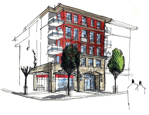
We really loved the minimal use of colour in this drawing, sometimes less really is more and Aaron pulled off this concept really well by not finishing with the pencil, but allowing you to finish the drawing with your mind. “This drawing was part of an urban design proposal and was intended to depict the contextual materiality of the proposed mixed-use infill. With a background in landscape architecture this was one of my first attempts at a render where the architecture was the focus. The quick sketch was done on tracing paper with ink and markers; without the use of a straight edge.”
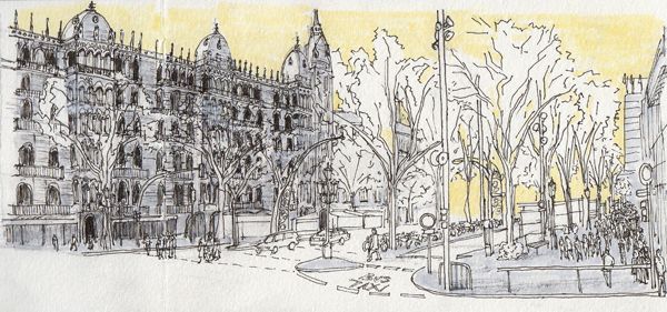
4. by Alan Ramiro Manning, 4th year student at Woodbury University, Burbank, Ca, USA. (on exchange in Barcelona, Spain) 
Alan Ramiro Manning, 4th year student
“I made it my goal to do a urban sketch every day when I moved to Barcelona for an internship and to study. This is the first detailed sketch of the series. A one point perspective sketch on location. Drawn with a Micron pen and Prismacolor marker on Moleskine watercolour notebook, size (cm) 21×13. Daily sketches can be followed through my Instagram
@seethelines. ”
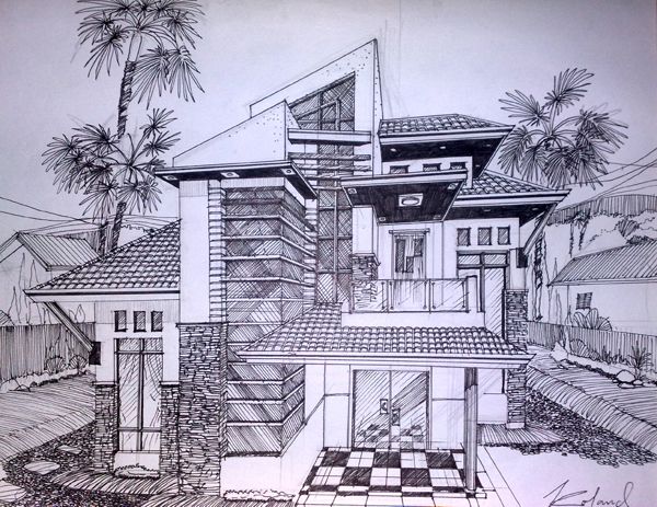
3. by architect Roland B. Cepeda Manila, Philippines 
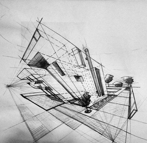
Architect Roland B. Cepeda
“Manila, Philippines
“As an answer to maximize daylight in modern living, I manage to create a design concept evolve in futuristic and modern style with windows big enough to welcome light in tropical areas like here in Philippines. As to landscape height is important to me, to put vertical emphasis and incorporate it in my design I used to develop design with palm trees as its mean landscape feature,of course this is tropical country. Drawn with pen and Ink on sketch paper”.
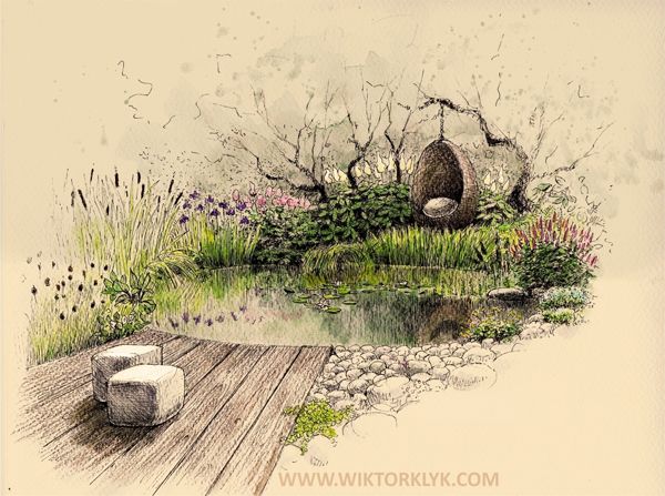
2. by Wiktor Kłyk 
Wiktor Kłyk
Wiktor is a regular contributor to Sketchy Saturday and from this drawing you can see why, what is there to not like; feeling, depth,warmth, style, this sketch has it all. Everything about this space makes you want to be in it. The sketch isn’t enough, take me there NOW!
1. by Eric Whiting 
Eric Whiting, Saratoga Associates’ staff member
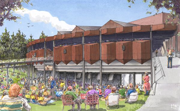
This drawing of the Saratoga Performing Arts Center (SPAC) is sensational, the artist does more than create an illustration of an outdoor space, he captures a moment, which is what public space is all about, a series of interconnected moments all coming together to make a place, memories and refuge.
__ Choosing the top 10 for Sketch Saturday is never an easy task, but I hope these ones motivated you into entering for next time! Stay enthused and check out the
Sketchy Saturday official Facebook album . If you want to take part send your entries into us at
office@landarchs.com Article written by Scott D. Renwick
Published in Blog “My drawing is focused on skateboarding- and I post my work on instagram @Scottwardell Pro skater Chuck Treece calls me a ‘gnartist’ I try to capture the motion, emotion and immediacy of skating with pencil and paper. Art allows me to tap into the raw energy of skating without the physical risk”.


