As it is with many things, my technique for turf, and the similar techniques I use for other materials, were born of other needs. Namely, I hated the way my turf looked in 3D renderings. You could use a created texture, but it never looked organic. You could use a photo, but you got TERRIBLE tiling effects. You could do a slight color overlay to soften the impact of the tiling, but the color was always off, and you would lose to much of the internal texture. I tried all of these, before scouring through tutorial sites and stumbled on the idea of using two separate textures, with a masking layer to blend the two. This is used commonly in 3D models when you have to put a non-square image onto a model.
Say you have a beer… sorry I got distracted there for a second. So, you have a bottle shaped model, and you want it to be beer. The first thing you will do might be to fill the bottle with liquid, and make the material into tinted glass. You then have a very pretty blank beer bottle. It needs a label to look right. Many beer labels are not square, but no matter what the image you import onto the model will be square. You handle this by making two images. One is the image you want shown, the other is a mask, like we make for the hand drawn lines- with what you want shown in white, and what you want to have invisible in black. Now, you normally just place a single image, so you get one label. But there is no reason you couldn’t tile the material so it would repeat hundreds of times over an open field. And there is no reason this technique cannot be used in photoshop to make detailed, photograph based textured that don’t show any tiling.
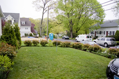
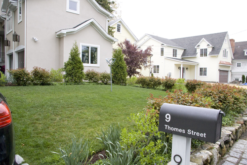
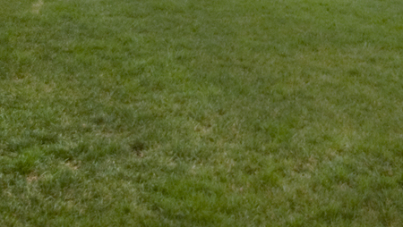
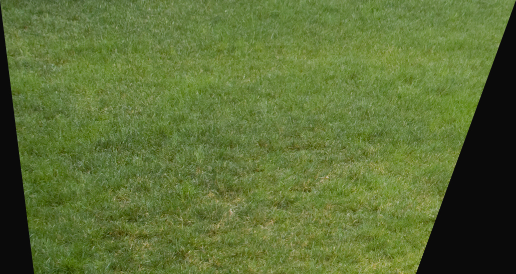
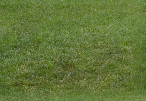
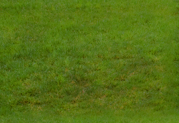
The best way to get good, organic texture, and realistic color, is by using photos. These can be photos you took expressly for texturing, or everyday photos that have a good amount of the material you are looking for. The best option is images takes specifically for texturing, as you can take a picture that will be fairly evenly lit, and taken from above, reducing the amount of perspective in the image. For this tutorial I am using two photos I took of a small residential project I designed last summer:
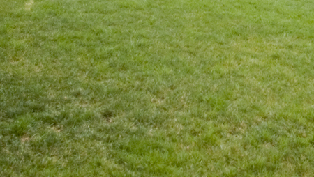
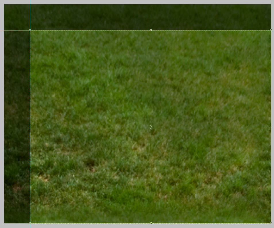
The first thing you do is crop the non-grass areas out of the image, so you have a decent base to work off of.
This gives you a clear area of turf to work with. Having other distracting elements removed from the photo also allows you to see inconsistencies in color. These inconsistencies will show clearly when tiled.
Looking at the image, you can see how much lighter and smaller the blades of grass are on the top and right of the image. By cropping those areas out you easily eliminate some trouble spots without resorting to the slower techniques next.
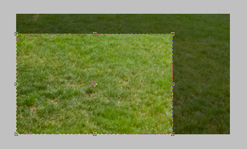
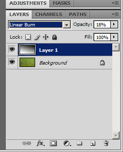
There is still a darker area to the left of the image. The way I will address that is by adding a second layer above the turf image.
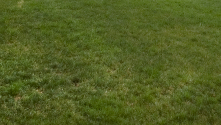
By setting the layer to linear burn, and using a round, soft brush, set to black, with around 8% opacity, you are able to paint the image slightly darker in the areas that need it to even out the over all texture. By using linear burn you darken the tone of the image without adding gray to it, muting the color and texture.
That is all the paint I needed to lay down to change the texture to this:
The image is a little more flat then i would like, so next I increased the contrast to give more sharpness to the texture itself.
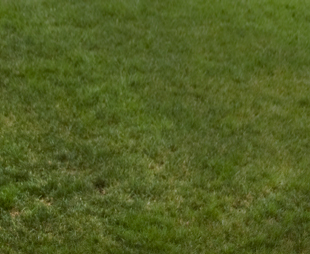
As you can see, much of this process is trial and error- looking until you see a problem, fixing it, then looking for the next problem. After doing all these adjustments, I noticed that the perspective makes the foreground far more coarse than the top of frame. To fix this, I used Edit->Transform->Perspective to both shrink the foreground.
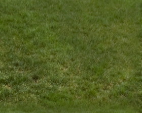
Once cropped, you have a nice smooth texture that still has a realistic amount of character.
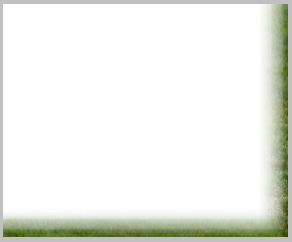
This seems like a fairly regular texture, with a good amount of color, so its time to make the image tile without a hard edge that will always show clearly. The first step is to lay some guidelines around 1/10th of the way from the edges.
Select the areas between the edge and the guidelines and the outer edge, and copy it on a new layer to the opposite side. This makes it so you have a smooth transition from the left side to the right, with no edge.
You will still have hard edges where the new layer hits the old, but you can now make a transition between the two. For this tutorial I used the most basic method, with is to use a soft eraser to fade the transition layer from the edge in.
Now by cropping down the image to where you have the guidelines you will make a tile that will not have a hard edge.
Now with a smother transition, preventing a hard edge your ready to make a pattern. Hit Ctrl+A to select all, then go to Edit->Define Pattern and name your new pattern (Something like Turf Layer 1V1.0) and save the image in a folder- mine are saved to the desktop->Render Patterns->Turf->Turf1V10.jpg.
This way you can back up all our render patterns, and move them to other computers just by opening the image, and defining the pattern again. Now give your new pattern a shot, using it to fill the turf areas in whatever rendering you are working on.
Now you repeat the same steps with the second image.
Crop
Burn
Perspective (correct for off-center image here as well)
Crop and increase contrast, copy edges and erase to eliminate straight edges
This is a key point in the creation of your second pattern. To make an organic, non-repeating pattern, you must make sure the two final patterns sizes will not allow them to line up often, creating a repeating overlap. You do this by looking first at the size of your first pattern. My layer one is 280×224. That means you will have an edge (left to right) at 0,280,560,840,1120,1400 etc, and (top to bottom) at 0,224,448,672,896,1120 etc. You want to pick sizes for your second layer that will not line up with those. I resized mine to 600×415. That means that left to right my two tiles will not repeat until 4200, and top to bottom until 92960.
Once you resize your pattern, save it and make it into a pattern just as you did with layer 1. And paste it as a second layer in the same rendering.
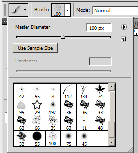
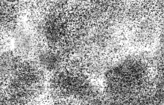
The last step is to create a clipping layer, which acts basically like a masking layer, for the grass layers that will allow the two patterns to mix. First pick a noisy, random pattern brush.
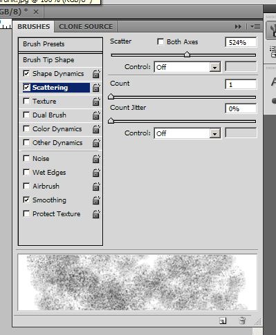
Then go into the settings for the brush, and max out the size jitter, and turn off the brush presets other than Shape Dynamics, Scattering, and Smoothing.
Then turn up the scattering, and turn the count as low as you can.
Now make a new image, and make a second layer in the image. Make a scattered spray of black over the second layer, getting fairly even, but random coverage, then turn off the background layer.
Use the same method of Guidelines, Copy, Erase to reduce edges, than use the same idea as above to resize the image to reduce overlap of the edges. Last save the image as a PSD (to preserve transparency), and with the background layer off, make the image into a pattern (Turf Mask v1.0). Spray the mask into the same area as you had the turf, into a new layer.
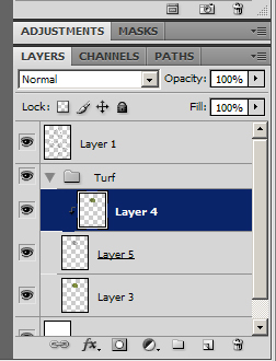
Put all the layers into a Turf folder in Photoshop, with the mask sandwiched between the two turf pattern layers.
Now select the top-most turf layer, and click on Layer->Create Clipping Mask
This will tell the selected layer to be masked by the layer behind it. This mask is not based on Black Vs. White, but opacity, which is why you had to make the background transparent for your masking pattern.
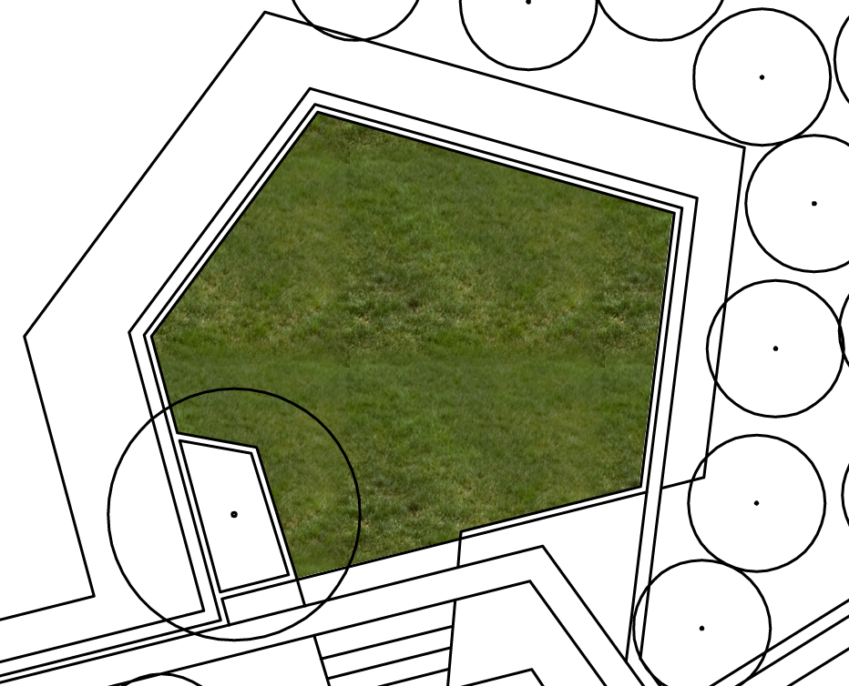
This finally gives you the final results you have been looking for:
A smooth, lineless, textured, natural colored pattern. You can also look at the overall image here, and – using hue-saturation/contrast – tweak the colors until it looks a little better (This seems a tad brown and muted to me). Write down what tweaks you made, reopen the saved patterns you made, and make the same tweaks, save the version 2.0 of each, and re-define the patterns as well.
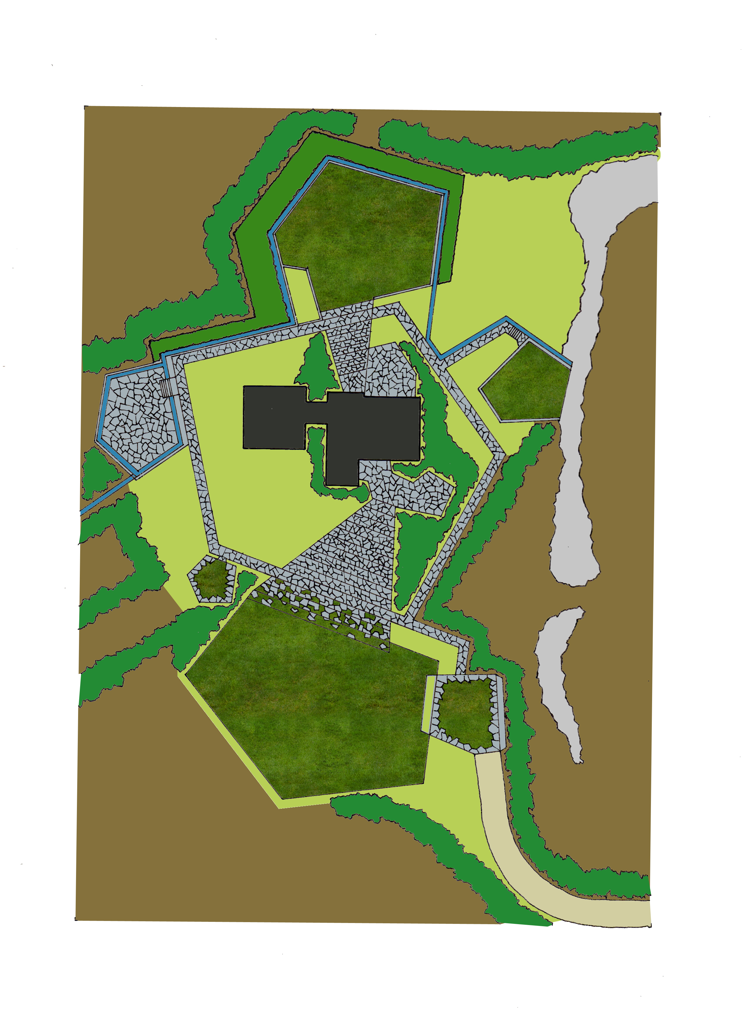
These two patterns don’t seem like they would work together with the different darkness levels, but they are what gives you the following results:
While this process is time consuming and a pain, the key is to remember that
from now on, all you have to do is paint an area with three patterns,
make one a clipping mask, and your done.
Tune in next week for the next key landscape building block: dirt.
Published in Blog


