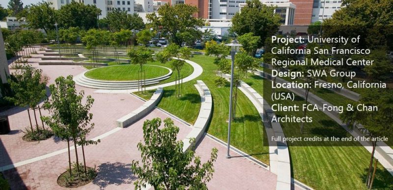
Article by Elisa García Nieto University of California San Francisco Regional Medical Center, by SWA, Fresno, California (USA) When working on a new project, landscape architects have to find suitable clues in their background and in the environment to define the best design strategy. We tend to think that contexts that do not impose a great number of conditions and limitations are more favorable to face. But there are vital challenges to overcome when sites seem not to have a clear identity of their own or references around them. The University of California San Francisco Medical Center is part of an ambitious plan consisting of multiple phases of development in a three-acre, empty area that had been divided into four regular regions, with a roundabout in the middle. The starting point was the creation of the educational building and its outside space in the northeast quadrant. The landscape architects of SWA were in charge of designing the public area.
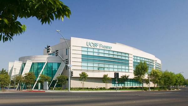
University of California San Francisco Regional Medical Center. Photo Credit: Tom Fox
University of California San Francisco Regional Medical Center
Working on Identity The most distinctive feature of the area was the rounded exterior perimeter, which was taken to align the educational building. The repetition of the curved geometry made it gain prominence through the architecture and created a vertical reference for the space. The landscape designers followed the same scheme, reinforcing what seemed to work as an identity footprint for the site, instead of entering a competition. Looking at the building and responding to its concave back facade, the design plays a mirror effect that tries to complete and enclose the pattern. Contrasting with the orthogonal borders of the plot, the curved geometry provides irregular walkways where both languages meet. The resulting space transmits a sense of unity and internal consistency.
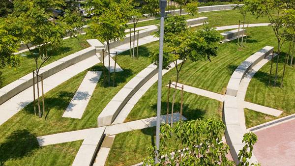
University of California San Francisco Regional Medical Center. Photo Credit: Tom Fox
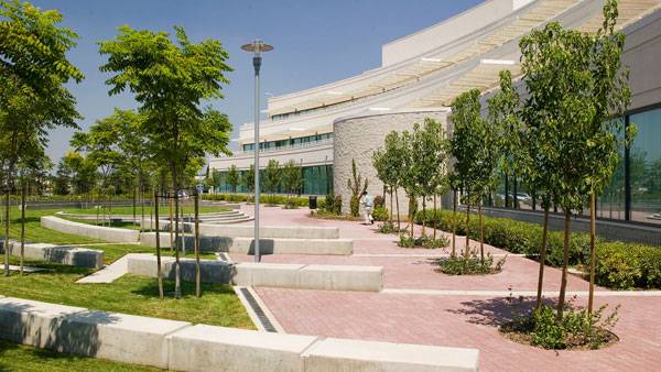
University of California San Francisco Regional Medical Center. Photo Credit: Tom Fox
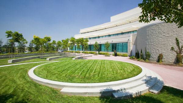
University of California San Francisco Regional Medical Center. Photo Credit: Tom Fox
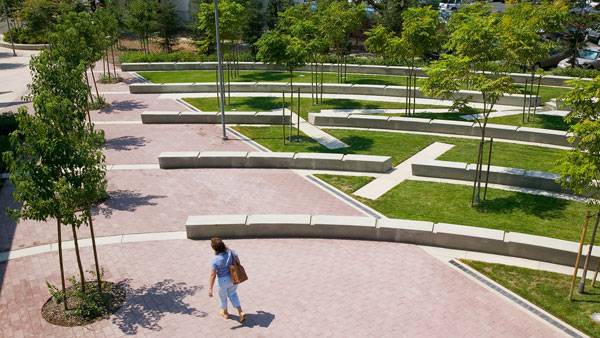
University of California San Francisco Regional Medical Center. Photo Credit: Tom Fox
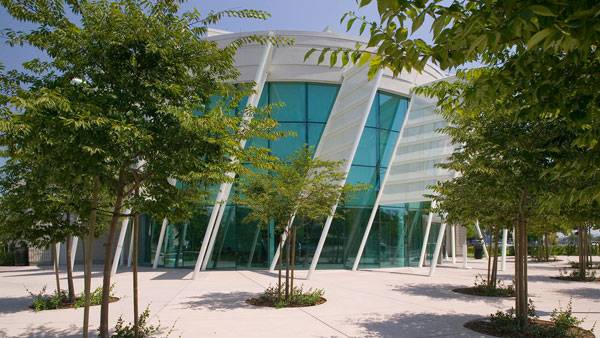
University of California San Francisco Regional Medical Center. Photo Credit: Tom Fox
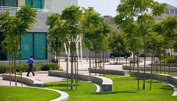
University of California San Francisco Regional Medical Center. Photo Credit: Tom Fox
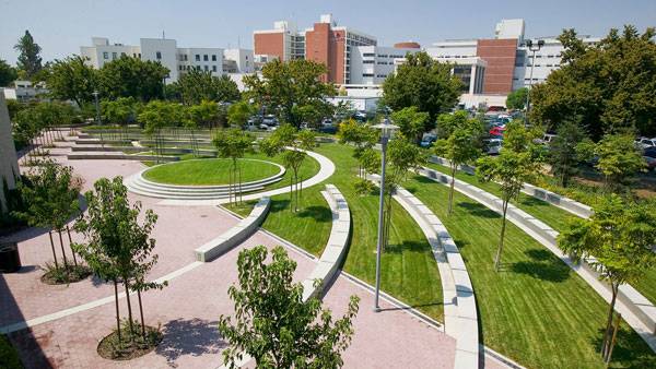
University of California San Francisco Regional Medical Center. Photo Credit: Tom Fox
Full Project Credits For the University of California San Francisco Regional Medical Center:
Project Name: University of California San Francisco Regional Medical Center Type of Project: Exterior open space for medical education building Design: SWA Group (Landscape Architectural Services) Location: Fresno, California (USA) Client: FCA-Fong & Chan Architects Recommended Reading:
- Becoming an Urban Planner: A Guide to Careers in Planning and Urban Design by Michael Bayer
- Sustainable Urbanism: Urban Design With Nature by Douglas Farrs
Article by Elisa García Nieto
Published in Blog


