Author: Andrew Spiering
Topos 72: Design and Function
I am always excited when the latest issue of Topos arrives in my mailbox. Not only are the projects reviewed inspiring and the writing excellent, the whole magazine is high quality – even down to the weight. (Those who have picked one up know what I mean.) Topos 72: Design and Function did not fail to impress.
Do the designs for open spaces meet the needs of their users? Topos 72 uses 17 different international projects to answer this question. In good fashion.
To discuss the current issue, check out the Topos group here on Land8 Lounge. Order the current issue and subscribe to Topos here.
Cities of Tomorrow: Envisioning the Future of Urban Habitat
I have been following eVolo magazine for several months now and their latest issue looks great. The major question that they consider How do we imagine the cities of tomorrow?
Here is their description:
“This is one of the most difficult questions that architects, designers, and urban planners need to answer in a time where more than half of the world’s population lives in urban settlements – a mere century ago only ten percent did.
Now Available: Vectorworks 2011 Product Line
Columbia, Maryland (Sept. 14, 2010)—Nemetschek Vectorworks, Inc. is pleased to announce the availability of the 2011 version of its award-winning Vectorworks® line of design software, including: Vectorworks Designer, Architect, Landmark, Spotlight, Fundamentals and Renderworks™.
“Vectorworks 2011 takes a major step in positioning the Vectorworks brand as the AEC 3D technology leader,” says Dr. Biplab Sarkar, Chief Technology Officer of Nemetschek Vectorworks. “Taking a page out of the MCAD world, Vectorworks now supports drafting on arbitrary working planes and interactive modeling based on the drafted entities. Vectorworks 2011 also reinforces Vectorworks Architect as a major global BIM product. Users will find the new 3D wall components, floors with components, and improved space and stair objects very useful to create the building model. This release also delivers major improvements on the 2D side. Text and dimension improvements, scalable symbols and tiling are some of the long-awaited features. And, we have vastly improved the performance and quality of the renderings from Renderworks 2011 by integrating the CINEMA 4D render engine.”
The 2011 version of Vectorworks software delivers several major improvements, including:
- 2D/3D integration. Vectorworks software has now, more than ever, a true 3D modeling environment. 2D planar objects can be created and edited within a planar context, where they display with all their attributes. Users can work in Top/Plan view as usual, or switch to a 3D view and continue working in the same way, with the same tools and operations.
- Improved Building Information Modeling (BIM) capabilities. The Vectorworks Architect program is even easier to use, and its state-of-the-art capabilities, new tools and features help get the job done faster and better, while communicating and exchanging files with colleagues and partners. It offers a greatly improved space object, along with new 3D wall components, and a new slab tool to enable architects to more accurately model and associate building components.
- Best-in-class rendering. Renderworks 2011 is faster, easier, and more powerful than any previous version. Now based on the robust CINEMA 4D render engine, the results are breathtaking and easier to achieve. The new engine is fully integrated into Vectorworks software, so users can seamlessly visualize their work throughout the design process, producing clear and accurate renderings. With the click of a button, rendered viewports will update as the design evolves.
Vectorworks 2011 also includes more than 70 improvements in usability and addresses some long-time wishes, such as the addition of “perfect preview” text editing, new tile fills, improved access to resource libraries and smaller file sizes.
With the launch of Vectorworks 2011, Nemetschek Vectorworks will expand its subscription option, Vectorworks Service Select, to customers in the U.S. and United Kingdom. This option is also currently available in Germany, Switzerland and Austria, where it was begun as a pilot program last year.
“Vectorworks Service Select has received a tremendous response from our customers in the markets where it was first launched,” says Stewart Rom, Chief Marketing Officer. “We are pleased to be able to offer this option to more Vectorworks users who will now be able to experience the added value this type of service provides.”
For a look at all of the new features by product, as well as feature movies, please visit www.vectorworks2011.net. To learn more about Vectorworks Service Select, visit http://serviceselect.vectorworks.net.
Available Since 1985: Vectorworks for Mac
After Autodesk’s announcement last week of the release of AutoCAD for the Mac, I wanted to find out what the folks over at Nemetschek Vectorworks had to say.
From an email I received from a public relations specialist with Nemetschek Vectorworks, Inc., I gathered that they remain confident that their sales will not be effected. They suggested that it might even help their sales as, “Windows based firms to explore the Macintosh as a future platform for their design technology.”
They also believe their long history on the Macintosh platform and the relationship they have with their users gives them an distinct advantage:
 On September 14, 2010, Nemetschek Vectorworks, Inc. announced their 2011 product line. (You can read about it here.) Here is their list of the Top 11 new features in Vectorworks Landmark 2011:
- New Retaining Wall Site Modifier
- New Existing Tree Tool
- New Grade Tool
- New Create Stepped Wall Command
- Site Model Improvements
- Improved 3D Environment
- Push/Pull Tool
- Design Layer Section Viewport
- “Perfect Preview” Text Editing
- New Scalable Symbols
- New Renderworks with CINEMA 4D Render Engine
You can watch it in action below:
All images via Nemetschek
In my next post, I will explore the pros/cons of both CAD solutions. Please feel free to leave a comment below…
Related Stories
Nemetschek Vectorworks, Inc. partners with Maxon Computer – Architosh
Vectorworks 2011 Makes Leaps in Rendering, BIM, and 2D/3D Modeling – Cadalyst
Now Available: AutoCAD for Mac
I thought the iPhone on verizon was too good to be true. Now, Mac supports AutoCAD…Can it be?
For all of you devout Mac users, you will no longer need to run Windows (via parallels or boot camp) on your Mac in order to harness the power of AutoCAD. Autodesk announced that it has officially returned to Mac OS X after an 18 year absence.
They did not stop there. Autodesk is also bringing an AutoCAD app to the iPad and iPhone that will allow users to import, modify and export CAD files on the go.
They are enticing potential users with a 30-day free trial. Though, after the 30 days, you are looking at a hefty price tag of $3,995 USD (MSRP).

AutoCAD offers an intuitive interface with a look and feel that will be familiar to Mac users.
Related Stories
Hell Freezes Over: AutoCAD Returns to Mac – Mashable
AutoCAD App Coming to the iPad – CNBC
AutoCAD Coming to Mac, iPad, and iPhone – Digital Trends
The Results: Planting Design Contest 2010
1st Place: Jeffery Gordon Smith – Smith Residence
Congratulations to Jeffrey Gordon Smith of Paso Robles, California for winning 1st Place in the Land8 Planting Design Contest 2010! He will receive a $250 Gift Card, $500 of Monrovia plant material, and a copy of Vectorworks 2010.
2nd Place: Jane Carol Gates – Pinkle Residence Plan
3rd Place: Henry Cohen – Fountain Garden at Trump Towers
There were so many excellent entries that the jurors wanted to select additional projects based on the strength of their planting selections, project summary, and overall composition. Below is the Judge’s Choice Award and two honorable mentions.
Judge’s Choice Award: Tim Zhang – Urban Farmland: Eye of the Ripple
Tim will receive a 1-year subscription to Sitephocus.com for winning the Judge’s Choice Award.
Honorable Mentions:
Wyatt Thompson – Pony Express Park
Chris Markham – Rockford Michigan Master Plan
Congratulations to all the finalists! Thanks again to all of you that participated, Monrovia and Vectorworks for sponsoring the event, and to our Jurors – Donald L. Bounds, Eric Gilbey, Lisa Gimmy, Katharine Rudnyk, and Lissa Thompson – for your expertise in judging this contest.
Bike Parking: Design mis-Considerations
What’s wrong with this picture? It appears that the hula dancers are beckoning riders to park their bikes here. However, it is to no avail. This was taken on the opening day of Trader Joe’s in Larkspur, California. If you live in Marin or happen to find yourself nearby, you will quickly realize two things – the hula dancers are not there and the tightly packed bike racks are never used.
In the blog post, Guidelines & Resouces, I shared a few examples of what to do and what not to do when selecting bike racks and their layout. The above picture is a good example of what not to do. I think it is pretty obvious what the main issue is here. Below is another image to reinforce it.

Allow me to point out a few positives:
- Location. The location is great. The bike racks are located close to the building and the front door. This is very important because the bicyclists can easily transition from their bike to the front door. Also, when the bicycles are locked up they can be easily seen from within the building.
- Rack Design. The inverted “U”, “A”, and the post and loop are most popular among cyclists. The 3/4 circle is a creative departure from the standard shapes but it is still effective. These shapes are preferred because they support the bicycle in two locations, prevent the wheel from tipping over, enable the frame and wheels to be secured, and they support bicycles without a diamond shaped frame. Via APBP
Now for the obvious:
- Placement. Stairs are not a good area for bike racks. Also, the bike racks are jammed together too closely – making it difficult to maneuver a bicycle and lock it to the rack. This configuration also reduces the number of bikes that can use the racks. According to the APBP Guidelines, the minimum distance between racks is 30 inches. Below are two examples from the report.
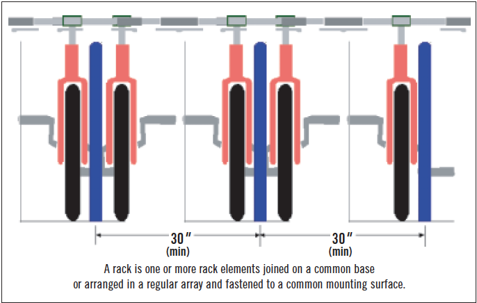
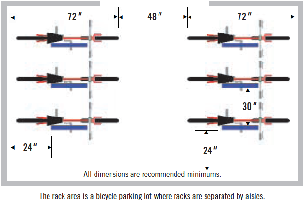
And…The not-so-obvious.
I shop here at least once a week and I have only seen one bicycle locked up on these racks. There is one more reason I believe these racks are not being used that I think is very important to point out – the store is located in an area where shoppers are forced to drive. You will notice in the google aerial below that a highway separates the majority of residential from the shopping area. This is a major deterrent for pedestrians to walk or ride their bicycles.
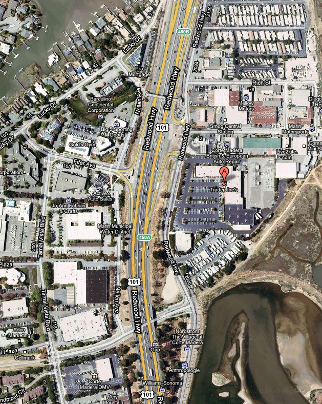
It is not good enough to just place bike racks in a location and hope they will be used. The “build it and they will come” philosophy does not apply in this case. Many more large-scale considerations need to be made.
Until next time…
Bike Parking: Guidelines & Resources
Ride by Landscape Forms
I have been paying closer attention to bike parking lately and wanted to share with you a few resources that I found useful.
First, bikeparking.com, is a good site to gather information on what to avoid, what cyclists want, installation of bike racks and lockers, and about finishes that will help you when designing spaces for bike parking.
For example, here is a list of things that cyclists want:
 Heavy-duty material on which to lock. |
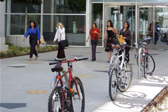 Racks placed in line of sight from building, near entrance and constant foot traffic. |
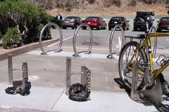 Give cyclists the choice of regular racks or security racks. |
 Sheltered or even inside a building is a definite plus. |
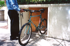 Functioning, quality lockers. |
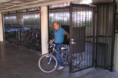 A dedicated cage is quite the rage. |
Makes sense right? Well, here are a few common mistakes to avoid:
 Installed too close to wall. Bikes can’t park perpendicularly at a rack designed for 5 bikes. |
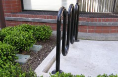 Again, installed without regard to the bikes actually parking. No room in front or on sides of rack. |
 Can’t really lock your frame to this design. Bye-bye bike! |
 Same story. Also note how often the material has been cut by bike thieves. |
 These were supposed to be installed 90° to what you see here. Complete waste. |
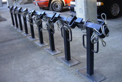 Racks installed too close together. Also, attached wimpy cables to rack offers nothing. |
 Lockers without built-in door frames WILL settle, causing door opening problems. |
 Notice how seams are not welded. This makes a weak locker. |
 Combat boots easily kick in water-soaked particle board lockers. |
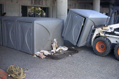 These needed to be replaced since they did not use fire-resistant resin. |
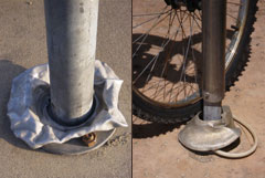 Flange covers are just plain stupid. |
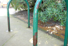 Look at these “new” racks at the S.F. Zoo. When will primates learn to think about finish before installing racks next to the ocean? |
Next, the SF Bicycle Coalition is “Promoting the Bicycle for Everyday Transportation.” Their website offers information on local events and bike rallies, Safety and Security Tips, Maps, Bike Laws, and other resources. The most useful resource that I found was The Bicycle Parking Guidelines that was published by the Association of Pedestrian and Bicycle Professionals. The guidelines give recommendations on rack design, layout and spacing, and proximity to buildings. The guidelines also mention the need for creative designs, as well. Which leads me to my final point.
There are a number of product manufacturers that produce bike racks. One that is worth mentioning is, Landscape Forms. Although, a few of their designs break the general guidelines in the above resources, I have to say their line of bike racks pushes the design beyond the status quo. I plan to write a separate blog post reviewing each design, but the Ride is by far my fav.
Feel free to leave a comment and share other resources that you have found helpful.
Architecture in Motion – Santiago Calatrava and the New York City Ballet
Anyone heading to New York City between now and June 27th, 2010 may want to check out Architecture of Dance – New Coreography and Music Festival. There are seven new ballets with commissioned scores by the New York City Ballet in collaboration with world-renowned architect, Santiago Calatrava.
Here’s some copy from their website:
“One of the world’s preeminent architects, the sweeping lines and graceful movement of Spanish-born Santiago Calatrava’s structures “don’t sit on the ground; they dance above it.”
Long an admirer of Calatrava, Peter Martins thought that he would be the perfect collaborator for a season of innovative new work. But it wasn’t until their first meeting that Martins’ realized the scope of Calatrava’s talent: equal parts prolific painter, sculptor, architect, and engineer.
Calatrava was immediately inspired and approached the festival the same way he does many of his projects: by sketching twisted and turning human bodies that he then works into structures. His early drawings are found on these pages and will ultimately materialize as scenic designs for five of seven world premieres.
While Calatrava’s art has been seen in the world’s great museums, Architecture of Dance marks his first work for the stage.”
Paper Cutouts: The Fast Growth of Charlotte, NC
I wanted to share this stop motion animation below created by the artist, Rob Carter. He made it entirely from images printed on paper, and charts the growth of one of the fast growing cities in the United States – Charlotte, North Carolina. The video also touches on an extreme issue of water shortages that many expanding U.S. cities face today.
Metropolis by Rob Carter – Last 3 minutes from Rob Carter on Vimeo.
I originally found this via UrbanTick that they found via Brand Avenue – two blogs worth subscribing to.
Spread the Love… It’s WORLD Landscape Architecture Month!
April is National WORLD Landscape Architecture Month! The designation was made in 2008 by the International Federation of Landscape Architects (IFLA).
We have a new T-Shirt design in our Land8 Shop that will help promote our profession. I encourage everyone to “spread the love” by wearing the shirt and telling friends and neighbors, and even strangers on the street, bus, and in the supermarket why Landscape Architecture is a vital profession. Education starts on the street. Now, let’s get moving…
Click the images above to purchase.
Labash 2010: Day 2
Wow. Another great day at Labash 2010! I want to give a BIG HUMONGOUS thank you to the students of UNLV that planned such a successful event. These guys know what hospitality is all about!
Last night’s Happy Hour went really well. We helped score the students discounted drink prices at Hennessey’s Tavern in downtown Las Vegas. This was the first stop on their nine-hole pub crawl.
Just a side, you have to check out downtown if you ever visit Vegas. It has the old-school charm of the historic Las Vegas set under a light dome, known as the “Fremont Street Experience.” Here is a video I found on YouTube:
Back to the crawl… The students set out on a “social networking” expedition where they went to several establishments on Fremont Street sampling the local food and beverages – in moderation of course. Just think, Irish Car Bombs, Mechanical Bulls, and 150 students parading from bar to bar.
Today’s expo ended well. Our booth was full of students lounging on our sofa and orange arm chairs. We raffled off iTunes gift cards around 1 o’clock before the students attended the last lectures of the day.
Our new friends over at Permaloc had the great idea of passing out fake poker chips and gave cash prizes for the schools that turned in the most at the end of the event. I believe Ball State came away with the grand prize – $250 of cold, hard cash. Not bad, eh?!
Here are some photos we snapped as we closed down the expo. The first is with our buddy, Dean Hill, from GreenScreen. The second is with our friends over at Landscape Forms. (Just an FYI, those green lounge chairs are extremely comfortable and were donated to the school after the expo.)
After resting up back at the hotel, we all took double-decker buses to the closing ceremonies at the World Market Center to finish out the festivities with a slight downer. The key note speaker, Dale Chihuly, was a no-show. He was supposedly too sick to make his flight, but I don’t buy it. Everyone’s reaction when the announcement was made let me know I wasn’t the only one disappointed. We ended up watching a video presentation of Dale Chihuly’s work presented by documentary film maker and friend of Chihuly, Mark McDonnell. I have to say the work was brilliant, my favorites being his Jerusalem installations. But it would have been much more impressive if it were given in the 1st person. You know?
After the presentation, everyone woke up by voting (by noise) on the two video entries from Miami and Montreal for the 2012 bids. And the winner goes to… MIAMI! See you there in 2012…
Overall, Labash 2010 was a smashing success thanks again to Samantha, Fidel, Landon, and the other UNLV students that helped organize the event. We can’t wait for Labash 2011 at Purdue. Be sure to join the group to keep up-to-date until they get their site up and running. Also, please start saving up now for next year. From what I have already heard, it is going to be awesome!
Did you attend Labash 2010? If so, join the Labash 2010 group and share your stories, photos, and videos from the event.
Thanks again!
Andrew & Kevin


