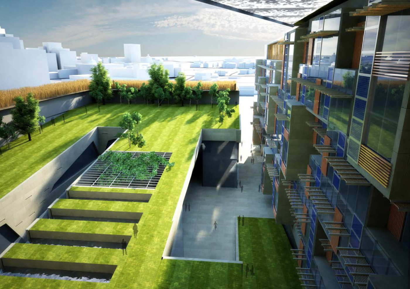
Author: Andrew Spiering
Ripple Effect: New San Francisco Bus Shelters Go Solar
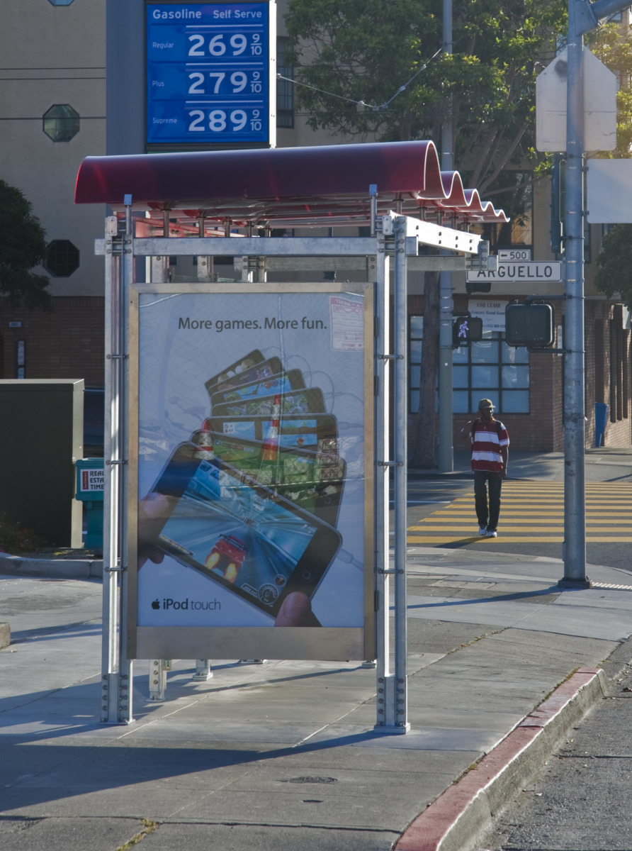
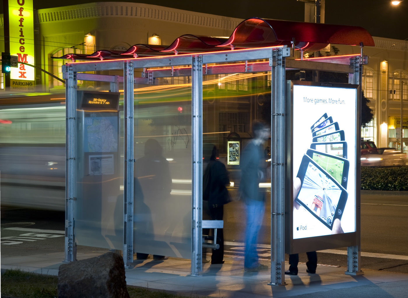
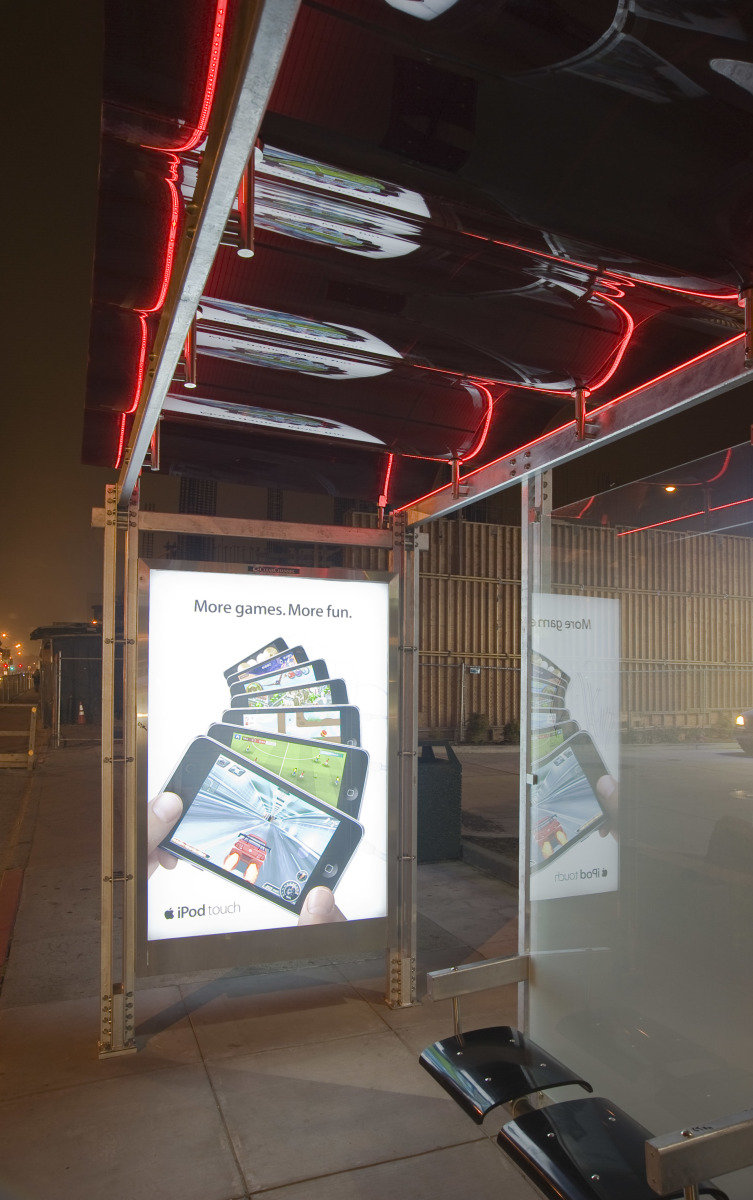
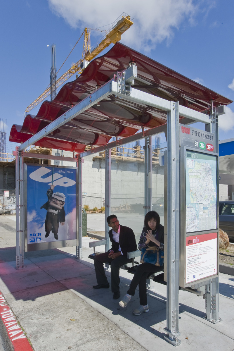
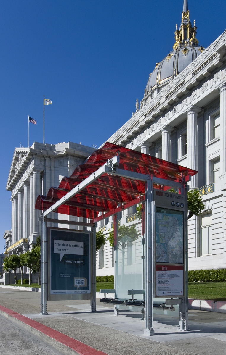
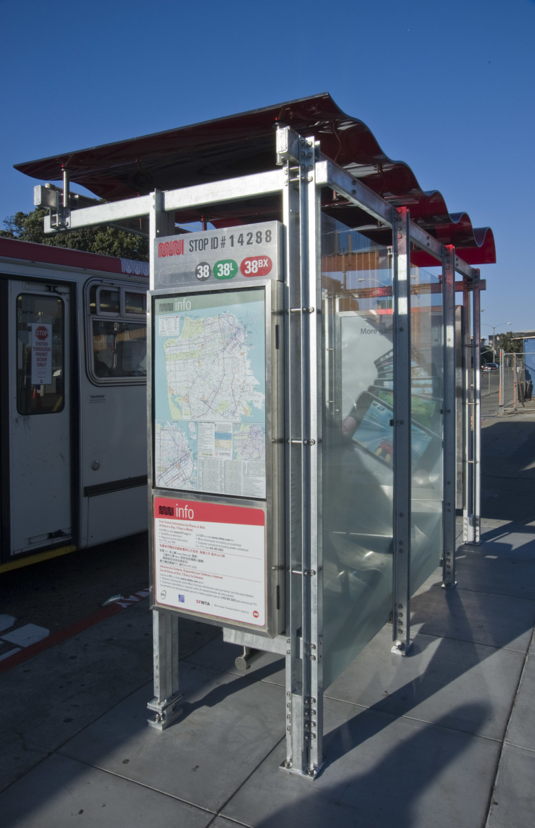
SAN FRANCISCO (CA, USA)—The first of 1,200 new, sustainably designed transit shelters have been installed in neighborhoods throughout San Francisco, the product of a joint project by the San Francisco Municipal Transportation Agency (SFMTA) and Clear Channel Outdoor, Inc. The shelters feature an undulating, wave-form roof made with 40 percent post-industrial recycled content; in one-third of the locations, the roof will house a solar array panel that is laminated into the wave form. Made specifically for San Francisco, the visually arresting roof is an abstraction of a seismic wave, according to Olle Lundberg, principal of Lundberg Design, the San Francisco architectural firm that won the competition among 35 firms to design the new shelters. “But the nice thing is that people have been coming up with their own interpretations—a ribbon fluttering, the Muni logo stretched, the San Francisco hills or surf,” commented Lundberg. So far, five new shelters are operational, in the Richmond, Mission, and Financial districts, in Union Square, and at City Hall. The program calls for their complete installation over the next five years.
The new shelters are larger and roomier than their predecessors and provide more information, including NextMuni and Push to Talk (for customers with low vision) technologies, and wireless Internet access. Additionally, the new shelters have more green features: long-lasting, energy-efficient LED lights, recycled steel, and 40 percent post-industrial recycled content in each roof panel. Lundberg Design used tough materials—tempered glass, galvanized metal, stainless steel and layered polycarbonate—to help the shelters withstand both weathering and graffiti. Overhead lights provide increased safety and identification.

3Form of Salt Lake City, UT, in collaboration with photovoltaic film manufacturer Konarka, developed the proprietary Building Integrated Photovoltaic technology to allow the lamination of the solar array between layers of undulating polycarbonate. 3Form is fabricating all the roof panels with final assembly of the shelters completed by Clear Channel Outdoor in San Francisco.
 |
 |
Lundberg Design is working closely with PG&E, the local utility company, to analyze the feasibility of solar panels on a per-location basis; exposure to sun, available connection to the power grid and shelter size are all determining factors. Wind-powered shelters may be considered at select locations if the technology proves to be feasible. All the shelters will be grid-tied, feeding any excess energy produced during the day into the grid and drawing from the grid at night.
 |
 |
Clear Channel is paying for 100 percent of the shelters. The SFMTA will receive 55 percent or a minimal annual guarantee payment of the advertising revenue generated, whichever number is higher. There is no financial burden on the SFMTA or its customers. Lundberg Design’s prototype was selected from numerous entries submitted by architectural and advertising firms from around the world. Lundberg emphasized that his firm’s design was specific to San Francisco and would not be appropriate anywhere else.
About Lundberg Design
Lundberg Design, founded in 1984, works for private and commercial clients throughout the United States. In 1996, the firm designed Oracle CEO Larry Ellison’s San Francisco residence and has continued to work for individuals and corporations seeking a reflection of their own individuality. Lundberg Design has its own dedicated, 4,000 square foot metal fabrication facility for custom design work and experimentation. All of the design work is centered on the qualities of materials—how they can be plied, molded, bent and cut to produce a visual and tactile result. Recent project work includes The Moss Room at The Academy of Sciences in San Francisco, Hourglass Blueline Estate in Napa Valley, Heaven’s Dog, a new restaurant for famed restaurateur and chef Charles Phan, and The Slanted Door at San Francisco’s Ferry Building.
Photo Credits: Ryan Hughes
Defining Landscape Architecture: An Interview with Tim Waterman
Tim Waterman studied landscape architecture in the US at the University of Idaho and went on to become of Master of Landscape Architecture at the Rhode Island School of Design. He now lives and works in London and lectures in landscape architecture and urbanism at the Writtle School of Design. With his new book,The Fundamentals of Landscape Architecture, he hopes to illuminate, “the meaning of the profession,” to the general public, young students looking for a career path, and professionals from other disciplines. This might be the perfect gift for those people that continually fail to understand what it is a landscape architect really does. (No more questions about pruning roses or mowing lawns!) In this interview, Tim and I traded a few emails to talk about his new book.
AS: Can you tell me a little background?
TW: The Fundamentals of Landscape Architecture, came about because of a clear need for a concise introduction to landscape architecture. While there is no dearth of marvelous books about landscape, for a long time there has been nothing that has been comprehensive and aimed at a general market. Landscape architects spend much time complaining that the profession remains undefined, and hopefully the book sheds some light on the meaning of the profession.
The book is aimed at a number of different audiences. First of all at people who are interested in exploring career options, either young people just finishing school, or older people considering a career upgrade. I have tried to avoid any condescending tone, so that it may also be useful to professionals from other disciplines who are seeking to find out more about landscape architecture. It is also a suitable text for students of landscape architecture in their first and second years, and useful to landscape architecture firms who are interesting in educating their clients about the range of services they might provide. Finally, I have tried very much to engage an international readership, using projects as case studies from all over the world.
The book is organised in six chapters:
1. History and ideas – a quick overview of history and theory from Stonehenge and Skara Brae all the way to the present.
2. Site and context – understanding site inventory and analysis
3. Inhabiting the landscape – the basics of designing for sites
4. Representation – how LAs use drawing and modelling to explore concepts and communicate ideas
5. The Anatomy of a Project – a summation of the design process
6. Careers – different landscape career paths
AS: How long did it take to research?
TW: The book was written over the course of a very feverish year – I signed the contract in January of 2008 and the book was for sale in bookstores by the June of 2009.
AS: What was your motivation for writing this book?
TW: I have been very keen to promote landscape architecture as it is, of course, absolutely clear that the profession can provide good answers to many of the most urgent issues of our time, from climate change to water management to the coming food crisis. We need to attract the very best and brightest to the profession. The next generation will be landscape architecture superheroes.
AS: How will the profession benefit from the book?
TW: By presenting the profession with simplicity, clarity and enthusiasm.
AS: What has the greatest reward been so far?
TW: A very esteemed former colleague and friend wrote to me upon reading the book that she had a better understanding of the profession, despite having worked within it with distinction for years. She said, ” . . . at last I can work out what we are actually supposed to be doing!”
Look for my upcoming book review on The Fundamentals of Landscape Architecture. Tim has another book on Urban Design due out in October. You can pre-order the book here.
Re:Vision Dallas Winning Entries – Vote Now!
Hey remember when we told you about Re:Vision Dallas? Well, if you missed it here, let me get you up to speed. Urban Re:Vision set out to make something incredible happen in downtown Dallas. With their competition, Re:Vision Dallas, applicants transformed a single block into a place that creates economies, supports community, facilitates relationships and generates resources.
“The winners of Re:Vision Dallas have created plans that challenged us, engaged us, and inspired us. And their ideas, from local materials and vegetated screens to integrated greenways, will shape how people will live and work here in the future.”
My vote goes for David Baker’s entry, Entry #136: Greenways Xero Energy, because he focused not only on the building but the pedestrian experience as a whole. The imagery really shows that his building is outward focused and pays respect to what is happening on the street. I am seeing a lot of architecture that claims to be “sustainable” and “futuristic” that is going upward rather than staying grounded (where people usually feel most comfortable). David’s project seems to do everything – up, down, and greenways. But that is just my opinion…
I am interested to know which winning entry is your favorite. Take a look and cast your vote below!
Here are the winning entries:
Entry #193: Forwarding Dallas
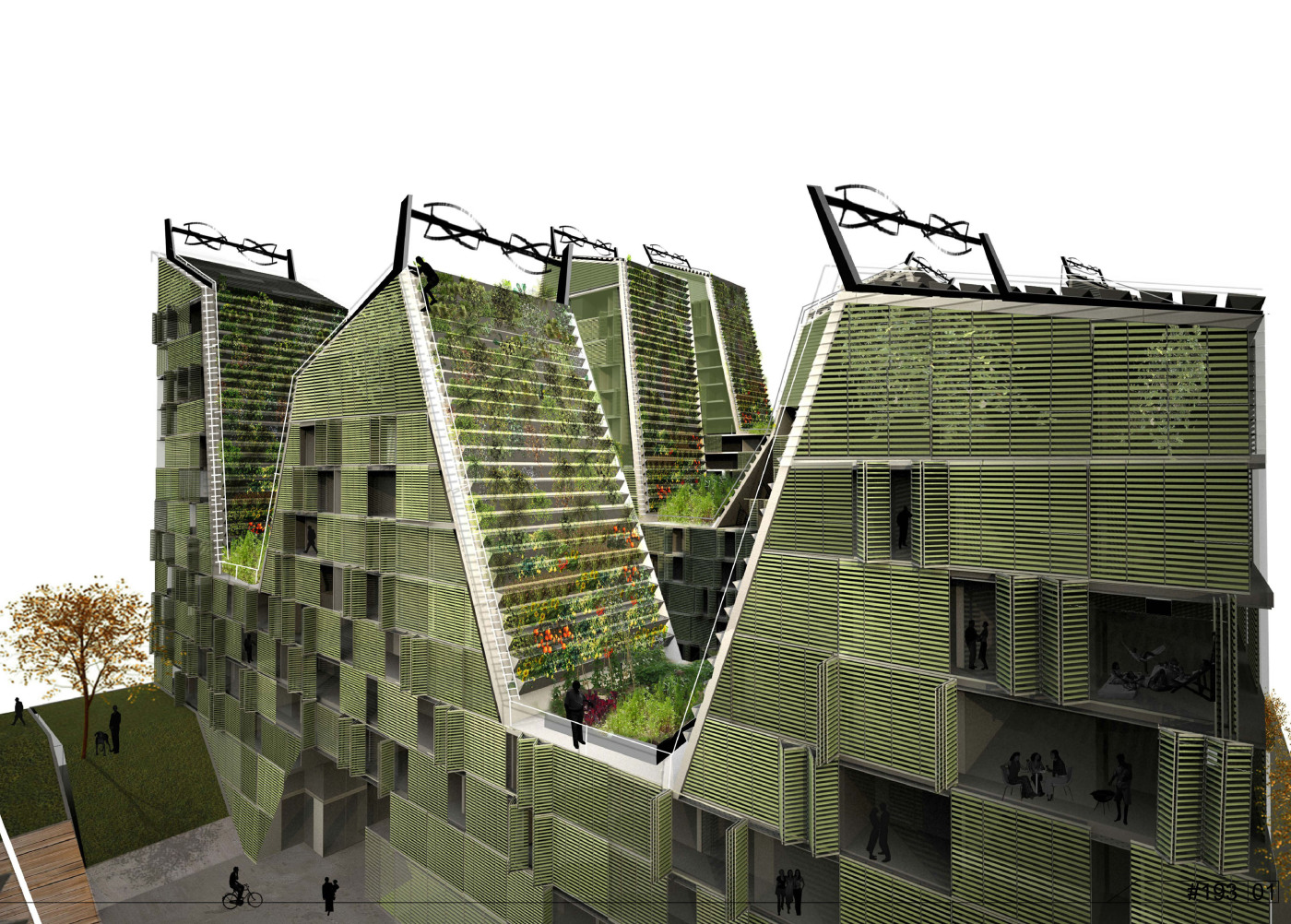


Architectural Firm: Atelier Data & MOOV
Lisbon, Portugal
Authors:
António Louro (MOOV)
Filipe Vogt (Atelier Data)
Marta Frazão (Atelier Data)
Collaborators:
André Almeida (Atelier Data)
Carolina Pombo (Atelier Data)
Inês Vicente (Atelier Data)
José Niza (MOOV)
João Calhau (MOOV)
Landscape architecture:
Susana Rodrigues
Energy efficiency and resources:
Maria João Rodrigues
João Parente
Concept communication:
João Rato
Forwarding Dallas is modeled after one of the most diverse systems in nature, the hillside. The site is a series of valleys and hilltops. The valleys contain trees and more luxurious plants which transition into more resistant plants as the altitude increases. Atop the hills, solar thermal, photovoltaic and wind energy is harvested.
Design components include:
• Heavy utilization of native vegetation
• Open ‘green’ spaces including wooded paths and interior courtyards as well as green roof prairies and orchards
• 100% prefabricated construction system, integrating building materials from local sources
• Housing options from studio apartments to three bedroom flats fit to accommodate approximately 854 residents
• Combination of photovoltaic (solar) and wind power which will providing 100% of the energy needed for each resident
• A Southwest façade set up for solar gain in a venetian-blind-like system which adjusts according to the season
• A Northeast façade made from prefabricated, thick, high thermal mass straw bales provides added insulation
• Rooftop water catchment system designed to recycle water collected from rooftops and store underground for later use
• Public green houses, including a sensorial greenhouse, swimming pool green house and meeting point green house
• Water permeable paved areas to prevent pooling and flooding
A spiritual space, gymnasium, café and exhibition space are also provided to accommodate various lifestyles. There is a temporary accommodation center as well as a daycare center designed for both children and the elderly.
Entry #136: Greenways Xero Energy
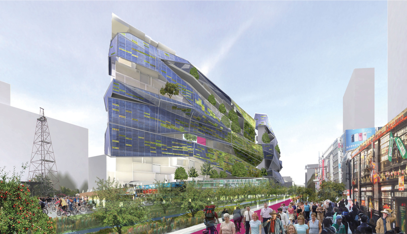
Architectural Firm: David Baker and Partners Architects and Fletcher Studio
San Francisco, California
Team Members:
Mark Hogan
Amit Price Patel
Ian Dunn
Amanda Loper
From Fletcher Studio:
David Fletcher
Sarah Donato
Rendering assistance from Mike Brown and Megan Morris of Medized.
The Greenways Xero Energy design, which centers around a working landscape, focuses heavily on making connections with surrounding neighborhoods. The 12-story building is divided into three, four-story sections and houses 210 bedrooms total.
Design Components Include:
• Walkable “greenways” serving as the public space infrastructure
• Multi-modal transit center designed to decrease reliance on cars
• Ground level and balcony gardens to provide shade and improve air quality
• Self-sustainability through urban agriculture practices including vertical farming and slow food restaurants
• Water catchment from adjacent buildings to provide grey water irrigation system
• Micro-retail space offering a variety of goods and services
• Domestic solar hot water system
• Photovoltaic panels in a grid-tied system on south façade produce electricity during daylight hours
• Alternating courtyards integrated into the building design creates a variety of micro-climates across different seasons
• Landscaped surfaces wind up from the street level and continue onto the green roof providing additional shade to south façade
• Ground source heat pump combined with hybrid dessicant cooling system provides air conditioning during summer months with minimal energy use
By nature of its concept, Greenways Xero Energy allows for easy integration of surrounding areas into the block, each ‘district’ having a unique identity; one might be the arts district while another is the historic or design district. Elements of this unique platform include public orchards, community gardens, private planter boxes, food stalls and locally supplied restaurants, all designed to appeal to the surrounding Dallas community and connect this block with surrounding neighborhoods.
Entry #113: ENGTANGLED BANK

Architectural Firm: LITTLE
Charlotte, North Carolina
Team Members:
Bradley Bartholomew
Ashley Spink
Stacy Franz
Kevin Franz
Kumar Karadi
Don Breemes
Coby Watts
Chad Lukenbaugh
Jason Bizzaro
Ryan Davis
Philippe Bouyer
Bo Sun
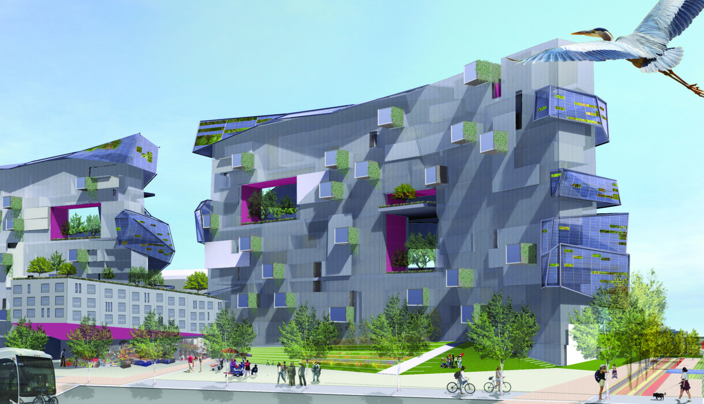
Inspired by Darwin’s Entangled Bank, this fully-integrated project is designed to create a network of reliance that supports residents of all income levels. The mixed-use development combines residence and retail, making each sustainable through the integration of education and green technology.
Components of this design include:
• Intensive green roof system providing the base structure for an elevated park
• Residential units ranging from 350-1500 square feet (studio – 3 bdrms)
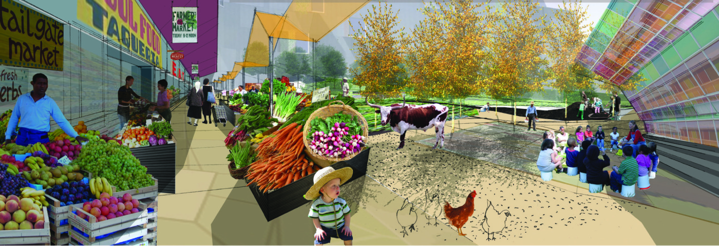
• A grain field providing seasonal vegetation for livestock grazing in the ‘sky pasture’
• A vertical farm which climbs the side of the building, providing each tenant space to grow produce for their own consumption or to sell at the market below
• Micro-CHP system designed to produce electricity on-site through the combustion of fuel; heat released in this process is captured for heating water
• Photovoltaic arrays/solar cells are attached to the exterior providing up to 100% of the power required on each of the 500 units
• A vertical axis wind turbine, providing power for core needs including common lighting, retail space and parking level ventilation
• Greywater system which treats and re-distributes domestic waste water (dishwashing, laundry, bathing etc…) for use in landscape irrigation
• Glass ponds situation on elevated park level to capture water runoff not captured by surrounding vegetation
• Onsite educational facilities including an Environmental Learning Lab and Nutritional Institute, Organic Culinary Institute and Organic Farming Institute
• An open market, located at the center of the property provides a community gathering space for exchanging goods and services, doubling as an entertainment venue in the evening
• Green space in the form of a wide meandering path which winds its way throughout the property
Additionally, the Entangled Bank offers amenities which include an organic grocery, a slow food restaurant, a spa, a fitness facility and a day care center where children, the disabled and the elderly can all be cared for in one space.
To learn more about Urban Re:Vision, see all of the winning entries and honorable mentions, visit http://www.urbanrevision.com/
A Vision for the Berlin Wall
Dutch Landscape Architect Gives New Life to Death Strip
After 20 years of laying barren, a Dutch landscape architect wants to transform the former no man’s land into a series of secret gardens and recreational areas. Joyce van den Berg is the curator of an exhibition, “New Light on No Man’s Land,” opening July 10th at the German Center for Architecture (DAZ) in Berlin, which looks at what can be done with the remains of the former border strip surrounding West Berlin. Her careful research helped to map out exactly where the former pieces of No Man’s land actually were 20 years ago.
On what was formerly called the “Death Strip”, van den Berg wants to encourage new plant life. Her plan would see the barren strips of sand moved at regular intervals in order to encourage new plant life to take root as well as the ongoing formation of the “mega-dunes” that are already evolving naturally in the German woods.
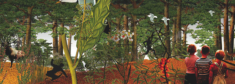
Van den Berg wants to make space available in the former No Man’s Land for quiet contemplation and relaxation, maybe even for the site’s users to consider what was here before.
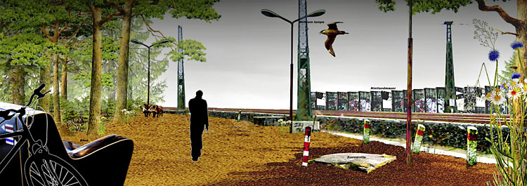
The remains of former watch towers, once used by East German border guards, could be transformed into secret indoor gardens full of exotic and young plants.
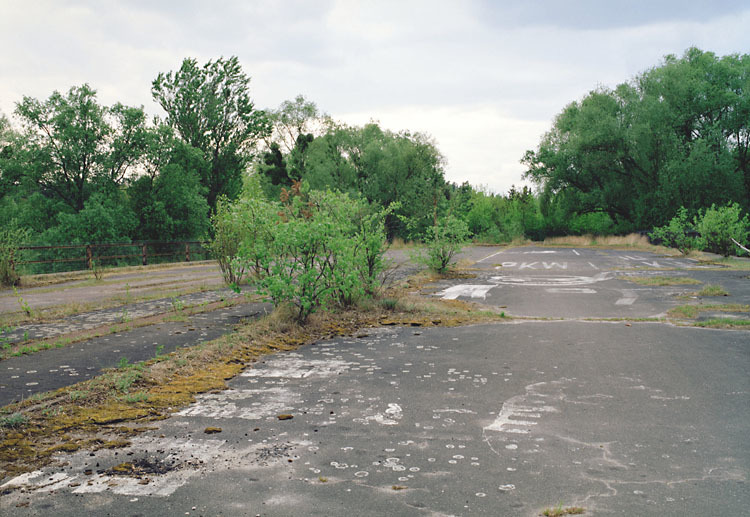
These long neglected pathways were once used by East German border guards. (Photo: Nina Kopp)
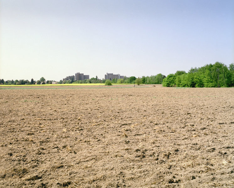
One of the main problems with landscaping and preserving what was once the death strip is that of private ownership. Although many belong to the state, some of the sites have already been sold to private individuals. (Photo: Nina Kopp)
The exhibition, which begins on July 10 and runs until the end of August in central Berlin, will give visitors an overview of van den Berg’s suggestions. Visitors will also be able to sign up for two bicycle tours, one of which will be led by van den Berg herself, along the cycle trail that already exists on Berlin’s former East-West border. “There are a lot of bad memories bound up in this former border area,” says the DAZ press release about the exhibition. “(Van den Berg’s) concept stands for positive changes.”
Congratulations Bloggers
Congratulations Bloggers
Land8 Lounge Members featured in June Issue of LAM
In this month’s issue of LAM, Daniel Jost features seven note-worthy blogs in his article, “The Dirt on Blogging: How can blogs change the way we communicate about Landscape Architecture?” Out of all the exceptional landscape blogs out there, I was happy to see that 5 out of the 7 bloggers mentioned in this article are members of Land8Lounge.
Landscape+Urbanism – is a blog written by Jason King that focuses on the integration of ecological processes into cities. He describes his blog as, “dialogue and siftings from Portland, Oregon focusing on landscape architecture, sustainable urbanism, vegetated architecture, urban agriculture, living walls, green roofs, ecological planning and landscape urbanism theory.” Visit Landscape+Urbanism
Design Under Sky – is a blog written by Adam E. Anderson with “conceptual and imaginative” posts on a variety of subjects related to landscape architecture. In his own words DUS, “is a blog/design studio engaged in innovation immersed in the elements, focusing on sustainable landscape architecture and environmental design. D.U.S. conjures conceptions that create a sense of place while responding to the existing environment, as well as possessing integrity, clarity, and harmony.” Visit DUS
Studio G – is a blog that focuses on garden designers working on hotels and spas, and residential projects. Rochelle Greayer updates the blog daily with fresh content and inspirations. In her words, Studio G is “a design blog dedicated to sharing landscape ideas, hotel resort and spa gardens, outdoor art and design, the latest in landscape products and services and to inspiring readers to recognize a sense of place so as they travel the world they can celebrate and value it.” Visit Studio G
Places & Spaces is a blog written by David Tulloch that focuses on, “Comments and news about Environmental Planning and Design. Intended for all audiences including students and alumni of the Rutgers major of Environmental Planning and Design.” Visit Places & Spaces
Christian Barnard Landscape Blog is an extension of his Landscape Studio where he, “explores the connection between art, ecology and architecture with the natural and created landscape.” Visit CBLB
The other Blogs mentioned in the LAM article are Playscapes and Sprout and are definitely worth checking out, as well. Congratulations again and keep up the great work!
—–
We have a list of blogs that we subscribe to located in our Blog Roll. Check them out here. If you have any suggestions on blogs to add, please let us know.
Major F/X: An Interview with David Farmer
David Farmer is a licensed Landscape Architect and the founder and CEO of Ecografx, Inc. He graduated from Cal Poly, San Luis Obispo with a degree in Landscape Architecture in 1974 and Architecture in 1976. David still resides there where he practices on “the side” and perfects the software he developed – Land F/X. He is passionate about design, efficiency, and construction details. In this interview we talk about Buckminster Fuller, military projects, how he and his son created Land F/X, and his advice to young designers.
Can you tell us a little bit about your background?
I basically went to Cal Poly, SLO for my education. I was in the Architecture program there. It was a bit of a conservative program at the time and I was getting a bit disillusioned by it. So, when the Landscape Architecture program opened up, I went into that and got a degree in that.
While I was in the architecture program, I was always interested in the bigger picture. The architecture, while interesting, was not the major focus. I was doing more site design because I found it to be more exciting. Then, once I got into Landscape Architecture and got to deal with site design, I was like, “what does that building look like?” So, after I finished up Landscape Architecture, I finished architecture, too.
It is funny how one fed into the other.
What did you do after graduation?
All through school, I had to work a lot. I worked doing construction-related things. After graduation I worked in construction. I was designing homes and finished between 6-8 homes. Then, I started working for an architect and brought my construction background with me. If you are going to build something, you need to know how it is going to be put together. In terms of details, construction is details. I was the young punk who said that they couldn’t build something the way they had drawn it. I would say, “You can’t frame it like that because they won’t build it that way…”
So, when did you go out on your own?
So, I worked for architects and landscape architects and ended up taking over an LA firm that was consulting for the company I was working for at the time. They were pretty much just going out of business. So I took it over and started my firm in 1982. It was a bit of a forced early entrance into a professional practice.
What do you mean by that?
I would not have normally jumped into starting my own business at that particular time, but there was a series of events that made it happen. I was the liaison at this other company and they asked if I wanted to take it over. I figured they just wanted to unload their furniture on me but I liked the idea of stepping right into a firm. So, it just seemed to work out that way. I had just gotten my license when I stepped in. In fact, I made the agreement before I passed the exam. So, I studied intensively for 4 hours a day for six months straight. And I nailed it!
Are you familiar with the exam these days?
I am not. No, this was back in 1982. I nailed it then and I was familiar with it then but am not now.
You had your practice for 30 years. Are you still practicing?
Yes, I am. I would say it is a really good R&D method to utilize and implement Land F/X. And of course, the program evolved from a practice. And that is where It should have evolved from – is from a practice (in one form or another anyway). So, I still practice very low key. And I do not actively look for work. But I still do it, because I can make money at it, especially with Land F/X. But it is really cool for R&D because it helps fine-tune the product. I can wish for this or that and because of my position I can make it happen.
What types of projects do you take on? More Residential or Public?
In the past, it was a range. Not a whole lot of residential. I considered myself “the architect’s Landscape Architect” because I had degrees and experience in both. I am the guy who can talk the lingo of the architect.
I was working on larger projects. Because I left a firm as a senior person, I got a lot of there projects. I worked for Vandenberg Air Force base. It is now considered “the jewel of the Air Force.” It is a beautiful and pristine area. It was interesting because, I had done one project there when I worked for the architect. So, head of architecture knew me and asked me to participate in a project that began to grow and grow. Quite frankly, military projects are interesting because they are like cities. You do daycare centers, streetscapes, and parks. Everything you do in a city you do there. And they do less design by committee – which is great. Often times, you are presenting to a General or a Colonel and they say, “That’s good. Do it.” And that is it – more rational decisions and sometime more creative.
I was blown away by the amount of sensitivity that most military personnel have to design. They want a decent lifestyle, too, and were interested with the artistic nature of the design.
The first project I did was a guard shack. It would have taken me two days if I did it by hand. They said, “Oh, by the way you have to use Cad.” Luckily, I had two years of experience using Cad. [I bought some Cad software two years before that after I saw a picture in Aviation Week of McDonald Douglas’ office. There were computers on every desk – not a pencil in site. And I thought WOW! So, I bought some Cad software. Back then it was all in DOS – what a nightmare! ] This little shack turned into 10 million dollars worth of work. If the door opens and you are ready – you never know what will happen.
You have seen things evolve from the drafting table to CAD. What impact has it had on our profession? And what does the word “efficiency” mean to you?
Efficiency is an interesting word. We have an art and we should never forget that art and what that means. And we should never lose using our hand and using our mind. But efficiency is important.
I saw Buckminster Fuller in 1969 speak for 4 hours without notes. Rapid fire. He was unbelievable! He was a different architect. He was concerned with efficiency. I remember him saying, “We as architects should strive not to design one home every six months but 600 homes every month.”
He said a lot of great quotes that night but that one happened to stick with me. I wanted to know how that idea effected our profession and why we should do that. The way I interpreted it was if you increase your efficiency, you are making your art more available more to the common man. Otherwise, there are just million dollar homes and landscapes that are worth 200 bucks. There is still this disconnect with the value of our art. If you are more efficient, you are allowing yourself to produce art more for the common person rather than just the elite rich.
I think, what he [Fuller] was saying is that if you are more available if you are more efficient. The good news is that you are not just cranking stuff out. You are making your art more available to more people. That is the important part of efficiency – the “art” part of it.
I was a consultant for a firm who would not make the transition from pencil on vellum to ink on mylar and an overlay system. In other words, they wouldn’t transition to the next level. They ended up going out of business. I think they went out of business because their clients were tired of complaining – and the firm was unwilling to accept a technological change.
What is out there right now that allows designers be more efficient? And where does Land F/X fit in?
You have basic CAD. Autocad is 80% of the market. Another cad engine is Vectorworks. Bricscad is another that is licensing Autocad engine. It is a Danish company that is working very hard and is 1/10th of the cost. They [Bricscad] are a viable CAD engine. Vectorworks is another viable CAD engine.
So Autocad (or Bricscad for that matter) is like being in a large warehouse with all the tools imaginable that you could every want to use. But it takes so much time to find the tools you actually need. So, what we do, is take the tools you need and organize them in a place that is within reach.
Then, you need imaging software. Photoshop is great. SketchUp for 3D is an interesting one because it is free and it seems to be the platform to use for 3D (seems to be). We just got back from Disney where we were showing them our SketchUp connection. And it is very interesting to them because all of them do their design development in SketchUp because it is quick and easy. They can get a good handle on it before they move into something more powerful like 3ds Max. The consultants I work with use Sketchup for their buildings. It is easier, quicker, and faster. It works. It may not be as perfect for the visualization of all the textures but Sketchup is easier and much quicker to use. And free.
But, how do you deal with the CAD? I think right now, in my opinion, the real viable alternatives are Autocad or Bricscad (both work with Land F/X) and use Land F/X as the engine to drive it. Or, Vectorworks (that is not Autocad related) with Landmark that operates their cad engine.
Basically, there are two platforms to choose from. There are others out there but they really don’t seem to be the front-runners.
How did you dream up the idea of Land F/X?
It is a team effort. Jeremiah Farmer is the CTO and my son. We got our first computer when he was in the 6th grade. It was a Commodore 64 . The guy is a certifiable genius! He programed and sold his first program in the 6th grade using the Commodore 64. When I bought my first PC (which was DOS), he immediately sat down with the instruction book and 2 hours later he plopped the book down and said “I got it!” He had it. Just like that he learned how to program our computer.
I eventually transitioned to Autocad and found that it couldn’t do a lot of things. I mean – a lot of things! I remember the first thing I wanted to do was draw some dots – like on pavement. So I asked Jeremiah and he programmed it for me.
And the next thing was to do text. I told him, we are probably going to shift to whatever program comes down the pike, but for now why don’t we make this thing start to work the way I wanted. And that’s basically how it started – just customizing it for my firm.
Even when he went off to college and he was still programming for me. In 1995 (or there about), we stepped back and saw that it was becoming a program. So, we started developing it as a program. By 1999 we incorporated and had beta users but no “real” product. By 2002, we were getting a tight enough program that Jeremiah worked full time for me and I was working 70-80% of time on it. Then we started selling the product. We officially launched it at the 2004 ASLA Expo. So, it took 9 years before we had product that we could sell.
What rewards have you experienced with working with your son? And how rewarding is it to actually see your product come to fruition?
Jeremiah is not only my son but my best friend. He has always been very close to me (even as a young child). We always played together (laugh). Even today I play with my grand son. I will get down on the ground and roll cars around with him.
I believe it would take 100 people to do what we did. This is a very special team of programming and designers. I am looking at the profession of landscape architecture in a bigger picture and he (Jeremiah) is looking at programming in a bigger picture. I remember him saying how you have to program from a human perspective. It is true in design and true in programming – making a complex thing simple.
So what are the rewards?
When you realize that you have invented something (completely from scratch) and then you hold it out to the public. And pretty soon people start buying it and really like it. There is a lot of rewards in that.
It’s more than simply designing something like a car that you think is the best thing in the world that nobody wants to buy. It’s more than that. It’s convincing someone to buy it and then it becomes popular. Not many people can say that – and that is a great reward for me. Thinking that someone from an isolated community like SLO [San Luis Obispo] who started this thing from a seed and can have a positive impact on the world-wide design community – that is quite fulfilling.
What advice do you have to young designers?
I would say this – someone coming out of school as a young designer you are very unsure and insecure. You have been through school but now you have to enter the real world. It is a bit scary and it’s a recessionary time. When I graduated from college in 1976, it was a recessionary time, too. But when we were graduating we had these great feelings of insecurity and not a lot of hope for the future. We were saying things like, “This is a terrible time,” “Am I relevant,” and, “Maybe I should have been a doctor like my mom said…[laugh]”
I can tell them this – this is the best time to be what you are going to be. The absolutely the best time! That you are going to achieve anything that you want to achieve. Everything is going in our favor. The economy will improve. The profession has a lot of doors – a door as a designer, set designer, in cities and planning, site sculptor, or environmentalist. There are so many doors.
And every one of them is a fun door!
When I graduated, I remember how depressed we were because there were not jobs. My advice would be to not let it bother them. Even if it takes five years or whatever. Who cares!? Just hang in there because the future is so open to you. You are in the best profession there is – you are an artist, environmentalist, scientist, planner. What can be better than that?
Ten to Watch: Landscape Architects
Ten Landscape Architects were mentioned In the May/June 2009 issue of California Home + Design, as the top ten Landscape Architects to watch in California. I was happy to see a Land8Lounge member was among “these rising stars.”
Ive Haugeland and Tyler Manchuck of Shades of Green Landscape Architecture Studio in Sausalito, CA have a contemporary approach to sustainable design. They start from the soil up and enjoy creating innovative things from found objects.
Sky-Terra: A Towerable Mistake
San Francisco-based designer Joanna Borek-Clement has envisioned these neuron cell-inspired, Sky-Terra skyscrapers to cope with the growing need for green urban space in Tokyo. The towers rise up to 1,600 ft above the street level and expand out until they reach the flat top plaza layer. These plazas offer many options and configurations, from public parks, greenbelts, playing fields, jogging paths, amphitheaters, pools, and bath houses.
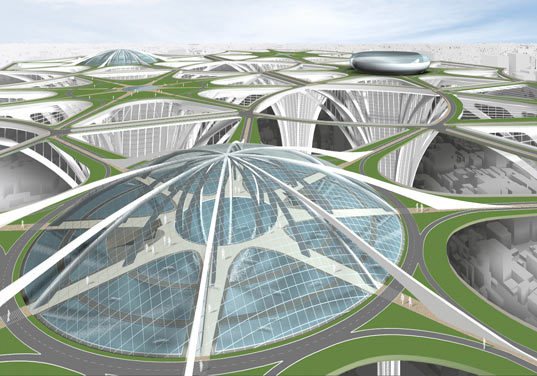
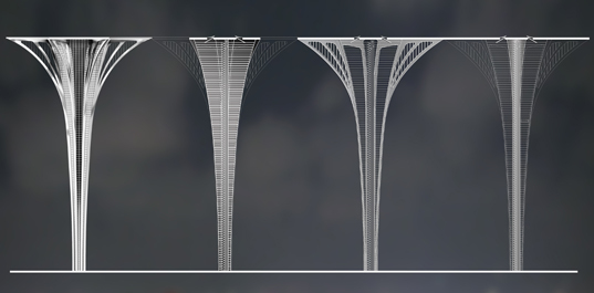
I have to admit that I was drawn to the concept of building a sustainable cloud city. But what about the pedestrian experience? Where is the connection to the street and the natural environment? And how can one get a sense of place? This idea is repeating a historical mistake. Take Le Corbusier for example.
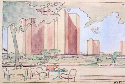
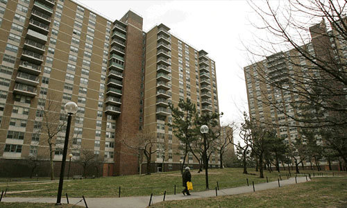
“The desire to increase the amount of green space led first to the Garden City movement and then the Radiant City type designs of Le Corbusier and others. These movements advocated for “tower in a park” designs during the “urban renewal” era of city planning. These developments, commonly found in housing projects but also found in high-end residential and commercial developments, destroyed the street grid and strangled street life, leading to spookily desolate urban environments.” DMIBLOG
Via The Book of Jabe The City of Tomorrow, Radiant City
Via Skyscraper World Perspective, Radiant City
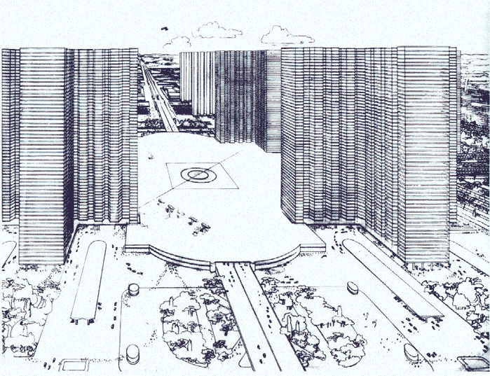
Via Tesugen Color Perspective, Radiant City – Where are the people?
Via DMIBLOG Tower in the Park
Romanian Road Trip
AN INTERVIEW WITH ELLEN FETZER
Ellen Fetzer is a dynamic player on the international landscape architecture community scene. In this interview, we talk about how she found the profession, her road trip across Romania, and how she plans to reshape the structure of the traditional university system.
What is your background with regard to Landscape Architecture?
I studied landscape architecture at the University of Kassel. Kassel is located in the centre of Germany and is known for hosting the documenta – a principal art exhibition taking place every fife years. Studying landscape architecture in Kassel is inspiring because of the integration with architecture and urban planning and the strong studio-based teaching. I enjoyed it a lot!
How did you find the profession? What lead you to Landscape Architecture?
I was looking for a profession integrating the sciences, the humanities and engineering with a strong environmental mission. I think landscape architecture is the only profession offering this. I have never regretted my decision.
Tell us a little about your “Across Romania” project.
“Across Romania” was a follow-up of “Berlin-Ankara” and both projects aim at documenting people’s relationships to open spaces. People have a very strong relationship to their open spaces. In particular, to those “everyday” spaces a landscape architect would hardly ever look at. I think we need more awareness of this issue. So we both, Siri Frech and I, tried to find a method for communicating these relationships. “Berlin-Ankara” resulted in a short movie and currently, we are working on the “Across Romania” movie. It is a continuous project and they are being collected under the domain landscape-diary.net.
Here is the Berlin-Ankara trailer:
Was the outcome successful? What did you learn?
Well, I think for the circumstances we were facing (this was a private initiative without particular funding) it was successful. The point is that there is endless material and messages out there but you have to find a way of telling the story. That is the actual challenge and perhaps a new task for landscape architects. For the Romania journey, we are still struggling with the plot but this is how we learn, too.
Do you have any projects planned for the near future?
Romania will be our focus area for the coming years because there is so much transformation going on in this new EU member state. Well, the other theme I am working on is international web-based collaborative teaching in landscape architecture. We were running an urban landscapes seminar completely online during the last term and now we will soon start a follow-up on rural landscapes. The idea behind it is to move towards horizontal universities working across institutional boundaries. Apart from being most stimulating for both staff and students my idea is to make landscape architecture education more accessible across the globe. Access to landscape architecture education is not equal yet.
Tell us about the International Masters in Landscape Architecture (IMLA).
This programme is a collaboration of three landscape architecture schools, two German ones, Nürtingen-Geislingen and Weihenstephan, and a Swiss one, HSR Rapperswil. The three schools started to collaborate in 2001 in order to bring their assets and strengths together. The programme is targeted at international graduates. People mainly join on the basis of a bachelor in landscape architecture but there are also architects and urban planners.
What is your role at the school?
I am mainly in charge of coordinating the programme which is quite demanding because both staff and administration are at three locations. In addition I am in charge of the department’s public relations. Last but not least I am doing a PhD on collaborative web-based teaching and the online seminars I was telling about before are part of this.
What is unique about IMLA and what does it offer that other Universities do not?
I think that the strong emphasis on the four programme mainstays is quite unique. These focus areas are: Planning and Design in Europe, Planning and Project Management, Planning and Design Methods and Information Technologies in Planning and Design. These theory modules are applied to project areas across Europe. Our aim is to prepare students for working in an international context. So they are confronted with unknown planning systems, cultures and terminologies in the various European countries where the IMLA is organising studios. We think that the students are really developing themselves a lot on the basis of this confrontation. Furthermore, they get to know many different perspectives since colleagues from three different faculties are involved in the education.
For more info visit her Folio: http://www.land8lounge.com/profile/EllenFetzer
West 8 Wins Almere Hout Noord Competition
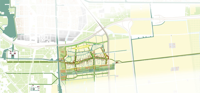
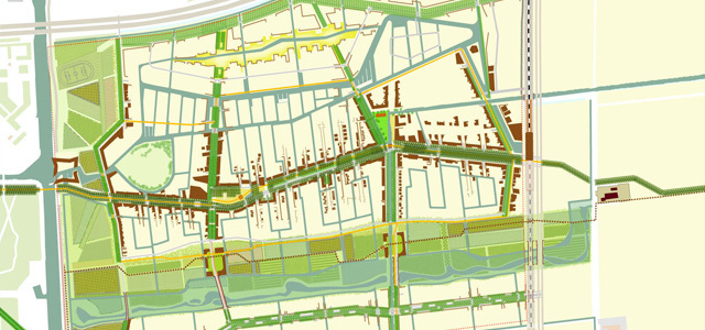
Congratulations to West 8 for winning the Almere Hout Noord competition. The competition entry for Almere Hout Noord West 8 prepared for housing corporation Ymere was unanimously chosen by the municipal assembly of Almere as the winning design.
Promoting small-scale networks of the different residents, the design for the new development of Almere Hout Noord envisions a socially sustainable residential and office neighborhood. While a partnership between Ymere and the local government will be responsible for the development, the management and exploitation of the new neighborhood, residents will be encouraged to join and bring about different initiatives.
Alderman Adri Duivesteijn of Almere stated: “We are convinced by the quality of the plans and like the idea that the corporation – especially now as we are experiencing a economical crisis – will be co-initiator of Almere Hout Noord, where we will realize 4.200 dwellings and 2.500 workplaces.”
Construction will begin in 2011.
Via World Lanscape Architect
Mermaids Heal the World
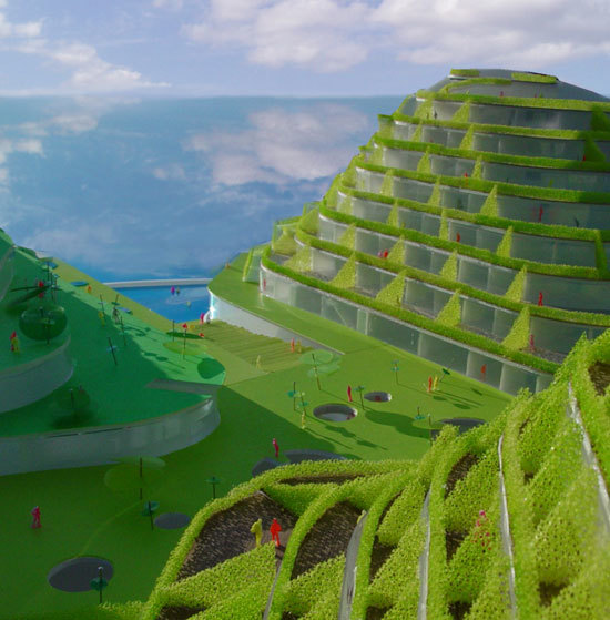
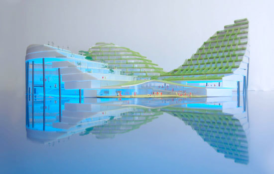
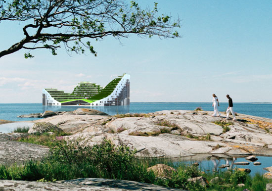
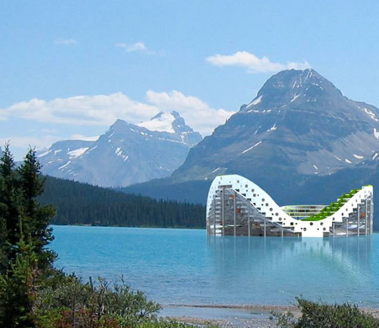
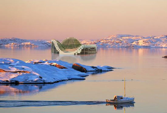
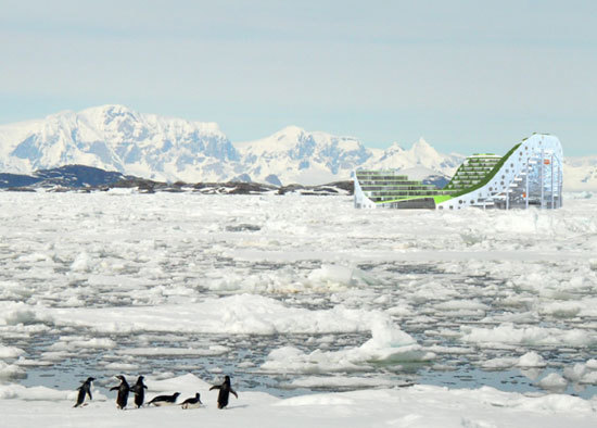
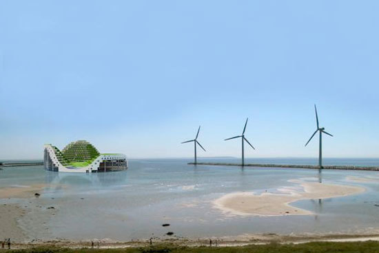
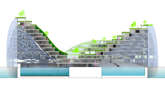
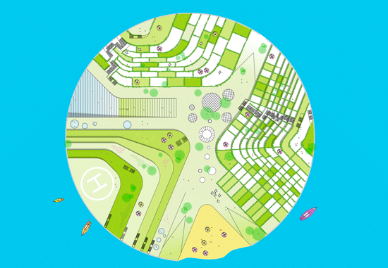
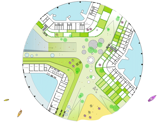
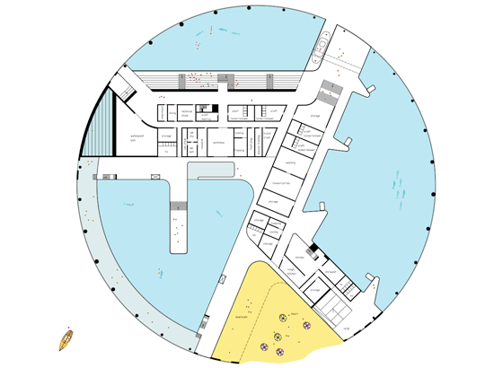
‘Mermaid’ is a private development-project designed by JDS Architects which aims to establish a large dolphinarium and wellness-center, together with hotel and holiday-apartments. The goal is to make ‘Mermaid’ the frame in which sea, air and light converge to stimulate the experience of health and wellness. With dolphins as the primary attraction, ‘Mermaid’ will offer a unique experience for the new ‘health tourists’ with focus on life quality, time, personal development and plenty of space for the individual.
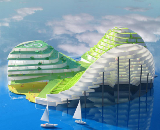
To achieve this goal, ‘Mermaid’ has four main functions; dolphinarium in the caves beneath the hills, wellness-center within the smallest hill, holiday-apartments in the medium hill and hotel in the largest hill; a unique combination of program, combined in the mermaid island.
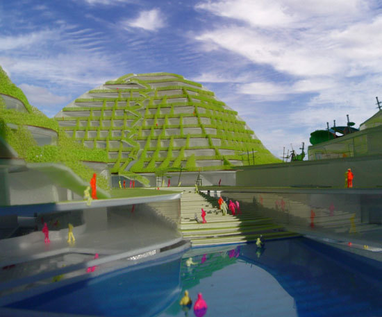
Since the inspiration came from a mythological sea creature that, “drown men out of spite,” (see Wikipedia), I am in agreement with our friends at Inhabitat who called it, “both ridiculous and incredibly thought-provoking.” Managing Editor, Emily Pilloton asks, “Is this just a glorified cruise ship? (With somewhat suspect structural support?) Or a new model for private development that truly is responsive to its aquatic surroundings?”


You can also read about it on InHabitat
[[adsense]]
Mistakes in the Landscape: Part I
LESSON LEARNED: A Tree Well Detail
I remember when I saw Michael Jordan miss a dunk in game 3 of the semi-finals against the New York Knicks. I was shocked and so was everyone else watching. They did not seem to know what to say. We were used to seeing a high-flying, gravity-defying, basketball god plastered on magazine covers, posters, and cereal boxes. It was an eye-opening experience that taught me a valuable lesson. Even the best players make mistakes.
Everyone makes mistakes and, usually, we try very hard to make sure nobody notices. Right!? Well, that is not always the case. In Jordan’s case, he could not avoid the millions of spectators. Here is a “slam dunk” (well, maybe not as spectacular) that one of my favorite designers missed on a project of hers in San Francisco.
via orphanjones
The DG is unsupported and collapsing. This can not be seen in this photo but the rest of the patio is warped, as well, which creates an uneven walking surface and a number of puddles in the rainy season.
What good is a mistake if you do not learn from it? It is easy to let your mistakes rule you even if they are not made in front of millions of spectators. Picking yourself up and dusting off is important. Well… that and not repeating the same mistake!
Here are a few pictures of a recent project where the same tree well detail has been perfected.
via wheretoguide
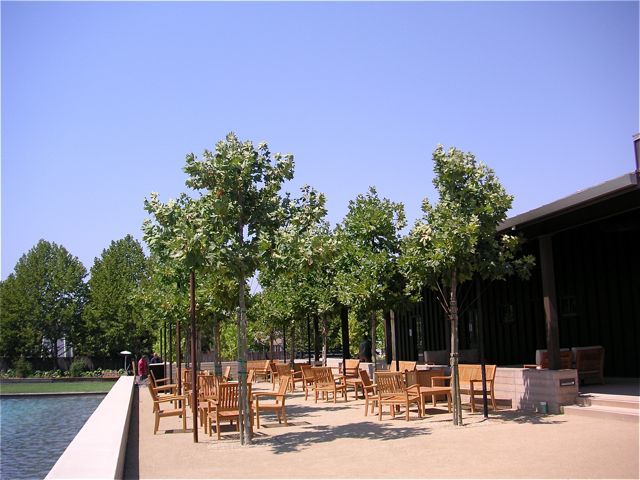
This is a recent project of hers located in Rutherford, CA. You can see how the DG is holding up nicely and is maintaining an even grade.
Here is a closer look at the DG patio and the tree well. That is a retention basin in the background that is used as fountain.
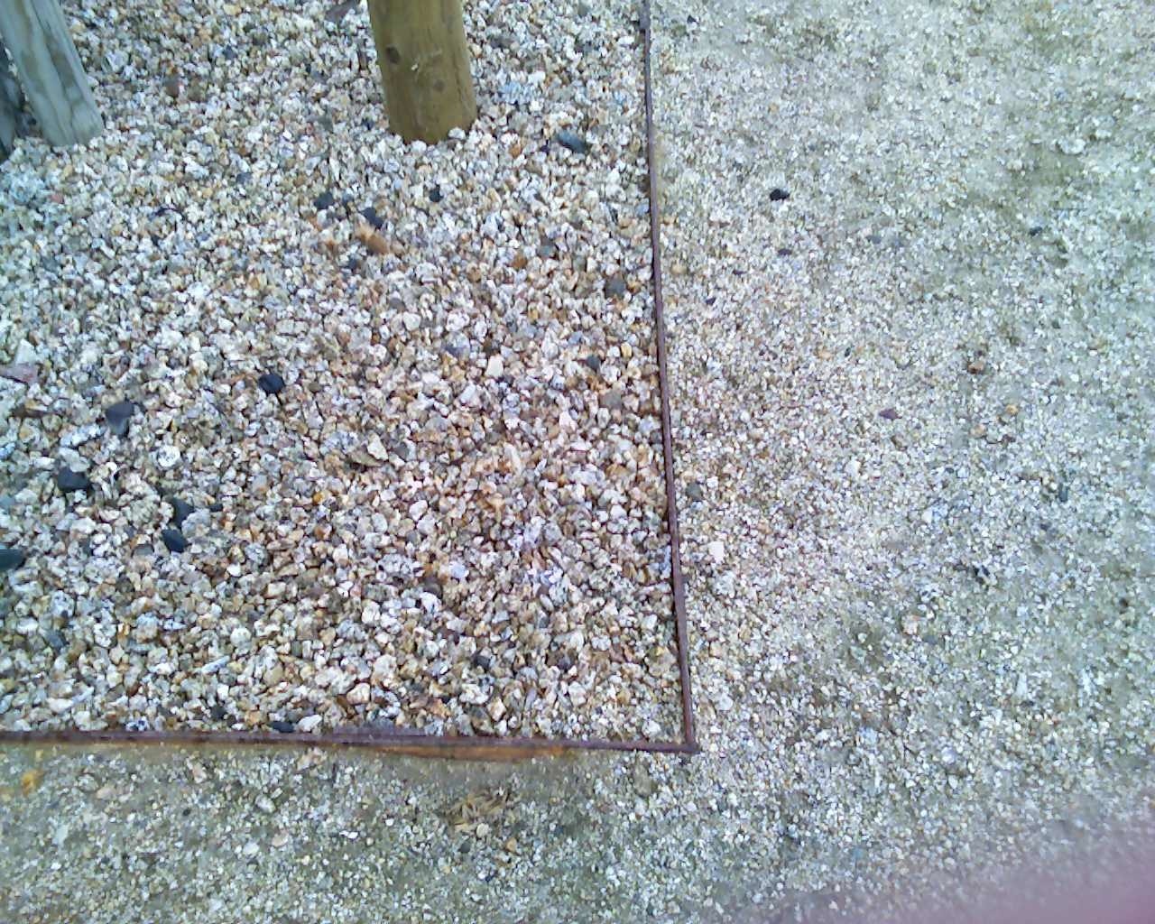
An even closer look at the detail. This is simple steel header with metal stakes.
What happened after Michael Jordan missed that dunk? He went on to lead the Chicago Bulls to six straight NBA championships. Lesson learned.



![Reblog this post [with Zemanta]](https://img.zemanta.com/reblog_e.png?x-id=c1bdefcf-776d-4d75-99f6-b0f5aa877112)
![Reblog this post [with Zemanta]](https://img.zemanta.com/reblog_e.png?x-id=ee3cb0e0-1727-498f-bac1-7d131915f2ea)

