Author: Benjamin Boyd
Vectorworks Design Summit 2016 Chicago Recap
This year’s annual Vectorworks Design Summit brought together an international mix of landscape architects, architects, engineers, lighting designers, and hosts of other professionals from around the design industry. They gathered here to first, learn more about Vectorworks’ comprehensive range of products, but they also came to be inspired by a bevy of industry leaders who utilize their software to create and design innovative spaces around the world. Land8 was fortunate enough to have a presence at the conference, and we will be bringing you a few separate articles about this year’s event.
WHAT IS VECTORWORKS?
Vectorworks is a collection of software under the umbrella of Nemetschek based out of Munich, Germany. Created in the mid-1980’s as Diehl Software, the software was popular among Macintosh users, many on the west coast. Since then, the program has been adopted by firms on both sides of the Mac/PC aisle and incorporated BIM technology into its base software. Vectorworks headquarters is located in Columbia, Maryland with a few other office scattered throughout the country.
Built on the core software Vectorworks Designer, the Landmark variant boasts a plethora of planting and grading related capabilities. The most compelling aspect of Landmark, however, is that it is designed with landscape architects, specifically, as it’s target user. Here is a full-service software for our niche of designers that isn’t a plugin or an add-on. That is something that Autodesk has yet to, and may not ever, create.
Here is a full-service software for our niche of designers that isn’t a plugin or an add-on.
THE SUMMIT
The Summit, held this year at Chicago’s Fairmont Hotel just off Millenium Park, was billed as an event to connect “you with visionaries who share you passion for design.” There was a huge selection of educational sessions and in every timeslot, there was an option for landscape architects with LA CES credit available.
While the conference was targeted at the existing user base, as it should be, there were many opportunities to diverge from the software and for designers to be inspired by some of the work that these Vectorworks users have been producing. The nearby Park at Lake Shore East, for instance, was designed by the Office of James Burnett a little over a decade ago. Since putting the first trees into the ground, the neighborhood around it has flourished and emerged as a premier residential enclave. Studio Gang’s iconic Aqua Tower anchors the west end of the sunken green space with its undulating balconies and glistening blue windows. Kyle Fiddelke of OJB had a session to explain the history of the project and to share some of the original graphics and drawings produced in Vectorworks. Later in the day, a group of us joined Kyle and a current resident of Aqua around the site as they shared combined insights from the designer and the user.
Other sessions focused on how Vectorworks Landmark software was changing the game for landscape architects. Eric Gilbey‘s presentation on the software’s Power Duo: Plants and Site Models showed off the smart object features in Landmark. These BIM (or SIM according to Vectorworks) objects allow manipulation of embedded data and enhanced analysis. The neat thing about Landmark is that all of these objects have a 2D form, the familiar tree symbol, as well as a 3D object. The strength of the program is that when you put a plant in place, it exists in both conditions. Eric walked users through the best practices of smart object use and troubleshot a range of questions from the group of users.
These BIM (or SIM according to Vectorworks) objects allow manipulation of embedded data and enhanced analysis.
Another interesting presentation by Robert Anderson, private practitioner, and Eric Berg of Pacific Coast Land Design delved into Collaborative BIM Workflows. Eric showed how his firm utilized BIM elements from the project onset. He explained how being in a 2D/3D environment early gives designers the ability to be precise and comprehensive in their design. Eric’s workflow started in a model and allowed a more efficient transition to section, plan, and perspective exhibits. When he wanted a more polished 3D images and fly-throughs, he showed how the model can be brought right into Lumion. Robert’s consulting experience included transitioning firms from AutoCAD environments into Vectorworks. He showed multiple examples of projects where having an integrated model gave him and his clients an advantage against some terrain-oblivious architects. Also, the benefits of quick schedules and inventories give him a real edge.
My favorite presentation was by Eva Franch, Chief Curator and Executive Director of Storefront for Art and Architecture. In the last day’s keynote, Eva focused on “the importance of experimental ideas and practices in design, as well as the possibilities and insights garnered through an appreciation for taking risks.” One of Storefront’s most recent notable projects among the vast range of initiatives is OfficeUS Atlas. “The OfficeUS Atlas collects the exhibition research in an archive of nearly 1000 architectural projects. Organized according to individual firm histories, the Atlas documents the development of U.S. architectural offices working abroad from 1914 to the present.” Eva’s presentation was lively, fast-paced, and inspiring. Since much of the Summit focused on the product, it was a refreshing break for designers to take a step back and reflect on the goals and impact of their designs. Eva put that work in focus and highlighted the many varied ways the Storefront in New York City acts to inspire and innovate the discussion of architectural design.
THE PROGRAM
This year’s Summit also served to introduce many of the new features of the product. Land8 will be covering Vectorworks, the program specifically, in some upcoming posts by Nicholas Buesking. However, here is a rundown of the newest improvement to the program’s extensive capabilities that were shared by Vectorwork’s new CEO, Biplap Sarkar:
- A revamped, intuitive interface for accessing Vectorworks resources called the Resource Manager.
- The Structural Member Objects empowers designers to quickly and accurately model common structural elements.
- Irrigation Tools will aid in the design documentation and analysis of irrigation systems.
- With Vectorworks Analytics, the collected data from users who opt-in to share data will be used to improve the workspaces and interface of future lines of Vectorworks software.
- Previously unavailable to everyone, Vectorworks Cloud Services for All is now an option at all program levels.
- Significant performance improvements to the Vectorworks Graphics Module (VGM).
- Web View/Virtual Reality will offer the ability to export designs from Vectorworks software to a web-based interface that works on virtually any hardware and operating system that supports a web browser.
…the first night consisted of a Lego building competition in an underground ping-pong bar.
THANKS TO VECTORWORKS
Land8 would like to thank Vectorworks for allowing us to come out and take a sneak peak at the program’s newest functions as well as to learn more about the people that use it every day to create amazing designs. Vectorworks, in addition to putting on educational sessions, also put on a great party over the course of the 3-day conference. For example, the first night consisted of a Lego building competition in an underground ping-pong bar. How fun is that? Attendees were able to meet new people and test their creative skills with the chance to win some sweet Lego swag. All this while enjoying great food and drinks provided by our hosts. The customer appreciation dinner was held on the second night in the Chicago Art Institute’s modern and contemporary wing. The beautiful setting was a great place to mingle and dance with other designers, builders, and reps from the company. Land8 had a great time meeting the broad range of people who come out to learn and support Vectorworks and very much appreciated the opportunity to share this exciting event with the rest of the landscape architecture community.
—
Benjamin Boyd is a landscape architect practicing in Baltimore, Maryland. If you would like to check out what books he is reading or reviewing currently, check out his profile on Goodreads. Ben tweets at @_benboyd.
Bruce Sharky Wants You to Start Thinking About Landscape Architecture
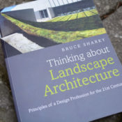
For many people not working in the design world, landscape architecture may be a difficult profession to describe. It’s not a term they see in the spotlight often and therefore their assumptions are often woefully inadequate. We have all had someone, when hearing that we are a landscape architect, default to inquiries about designing their front yards and while that is a part of what some of us do, we all know there is so much more to the profession. In Thinking about Landscape Architecture: Principles of a Design Profession for the 21st Century, Bruce Sharky, a professor at Louisiana State University, comprehensively dissects the history and place of the landscape architecture in the modern world. His new book gives a complete overview of the discipline and might greatly serve those that are new to the profession or students who want to learn about what their future career may be like.
Admittedly, if you are already a practicing landscape designer, much of Thinking about Landscape Architecture will not be earth shattering to you – and it isn’t supposed to be. Sharky aims to “provide those new to the subject with the foundations for future study and practice.” With this targeted audience in mind, the book launches into a general, but comprehensive look at the structure of modern day practice. Questions are explored and answered such as:
-
How do I become a professional and why is that important?
-
What is a design studio like?
-
Why is sustainability important?
This guide paints a picture for a future career in landscape architecture as well as the realities of what may be expected of you in a modern design firm. Our profession is very different from many others and it is helpful to the uninitiated to lay out the ground rules early.
After a very brief turn at history, Thinking takes a pass at explaining the general governing concepts of design. The design process is probably the most important aspect of practice and Sharky explains the major points without getting lost in the weeds. While the text comes from a scholarly source – and reads as such – the passages are very approachable which is much appreciated given the intended audience.
Probably the most enjoyable part of the book for me was Chapter 6: Gardens, Communities, Parks, and Urban Design. This clearly shows the breadth of the field and how similar design principles and process can be applied in a wide range of projects. This range allows designers to work within a niche that they find enjoyable or perhaps to shift focuses while maintaining a core set of skills.
There is a chapter on the finer points of planting that includes considerations like seasonality, regionality, growth and survival, as well as aesthetics. Following that is a brief exploration of materials such as metals, woods, and aggregates.
The final chapters outline the process of bringing a design to fruition, sustainability principles, and then the future of the profession in general. The last of these is where I found the text to be more of general trends rather than better exploring the optimistic future of landscape architecture through a topic like landscape urbanism.
Bruce Sharky is a Fellow of the American Society of Landscape Architects and a professor at the Robert Reich School of Landscape Architecture at Louisiana State University in Baton Rouge. He is also a registered professional landscape architect. Other great books by Bruce include Ready, Set, Practice and Landscape Site Grading Principles, the first of which is a staple in most professional practice classes.
Benjamin Boyd is a landscape architect practicing in Baltimore, Maryland. If you would like to check out what books he is reading or reviewing currently, check out his profile on Goodreads.
Landscape as Urbanism – Charles Waldheim Outlines the General Theory
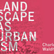
Though the title may beg otherwise, there is nothing “general” about Charles Waldheim’s newest book, Landscape as Urbanism: A General Theory. For many, landscape urbanism is a realm of theoretical design thinking that they believed might never breach into their daily practice. Those unfamiliar with the movement might have once thought Landscape Urbanism was perhaps a new style of design and even might have written it off altogether after seeing the so called Landscape Urbanism Bullshit Generator a while back. I believe, as does Waldheim it seems, that these folks are in fact at the cusp of a evolution of the field and that the urban issues of today are actually often best addressed by the skill sets of those same landscape architects.
Those who have kept up with the development of the theory, from James Corner’s Landscape Imagination to Chris Reed’s Projective Ecologies, understand that it actually advocates for landscape architects – not planners, urban designers, or architects – to become the focal points of a new era of designing the world around us. Even more boldly, Waldheim surmises that “the fundamental assumption that planning is the medium through which public policy and community participation are brokered may also be open for debate.”
And while it is very empowering to discuss the possibility that landscape architects may be the new leaders in urban design, development has not been without its doubters or naysayers either. New Urbanism’s champion Andres’ Duany asserts that the competing theory’s application as more “practical” in Landscape Urbanism and its Discontents. This is a drum that is continually echoed by those who are working within the current status quo of planning commissions, form based code, or architectural led projects. While there are many examples of this regime shifting, it is important to note that even getting to our current state of green or sustainable awareness has taken decades to push through. The question of whether it is the right method is a case that Waldheim is making it rather thoroughly in this newest book.
LANDSCAPE URBANISM’S CASE
A General Theory walks you through the history of planning, architecture, and landscape architecture and makes a case for landscape urbanism’s necessity and, perhaps, inevitability. Waldheim surmises that the impetus to derive a new form of urban thinking came from planning’s focus on a social science model and away from physical design over the past half century. This while urban design “committed to neotraditional models of town planning” (a clear reference to New Urbanism).
Moving beyond its origins, Waldheim argues for a “new understanding of landscape as integral to urban design and planning.” He asserts that, “…landscape thinking enables a more synthetic (derived of observation rather than logic) understanding of the shape of the city, understood in relation to its performance in social, ecological, and economic terms.”
 James Corner Field Operations’ High Line in New York City
PROMINENT PROJECTS
Waldheim’s examples, and some of the more useful bits of information for those not keeping up with global projects, was a chapter that spotlighted projects reflecting the emerging nature of the theory. Collectively these projects represent “the landscape architect as the urbanist of our age.”
- Fresh Kills – James Corner Field Operations
- The High Line – James Corner Field Operations
- East River Waterfront – Ken Smith Workshop + SHoP
- Hudson River Park – Michael Van Valkenburgh Associates
- Brooklyn Bridge Park – Michael Van Valkenburgh Associates
- Governor’s Island – Adriaan Geuze + West8
- Millennium Park, Lurie Garden – Gustafson, Guthrie, and Nichol
- Bloomingdale Trail – Michael Van Valkenburgh Associates
- Navy Pier – James Corner Field Operations
- Northerly Island – Studio Gang Architects
- Waterfront Toronto – Gueze + Corner + Van Valkenburgh
- Toronto Central Waterfront
- Lake Ontario Park
- Lower Don Lands – Michael Van Valkenburgh Associates
- Longgang Town Center – Architectural Association
- Qianhai Port City – Various (competition)
REFLECTION
All encompassing and thorough, Waldheim’s synthesis is as comprehensive as much as it tends to fall flat for it’s apparent intended layman readers. And while there were moments I felt as if the people over at the Generator were on to something, I also happily found that the vagueness of my ideas surrounding Landscape Urbanism were beginning to clear and my understanding of the big picture was beginning to sharpen, despite some of the verbiage and vocabulary.
While I understand the academic origins of this text and the need to clearly define and structure a theory, plugging every possibility and nuisance with information and assertions, the structure Waldheim text is, in my opinion, sometimes bloated and unnecessarily difficult. Having the word ‘general’ in the title and then exasperating the language left me feeling that either I wasn’t versed enough for something “general” or perhaps the intended audience wasn’t “general.”
The future of landscape urbanism, if it remains to be called that, is in the hands of those out there putting work in the ground. As a landscape architect, I found myself finding a lot of parity in my work with what Waldheim was presenting as design principles. The big difference however, is that often by the time the project makes its way to the landscape architect, the benefits of landscape forward planning have been either compromised or neglected. Therefore, the theory’s assertion that LAs have a larger role to play earlier in the process is both as valid as it is a challenging goal to set.
RELATED LINK: Princeton University Press explains Landscape as Urbanism’s design
Benjamin Boyd is a landscape architect practicing in Baltimore, Maryland. If you would like to check out what books he is reading or reviewing currently, check out his profile on Goodreads.
The Canadian Society of Landscape Architects Announces Awards
The Canadian Society of Landscape Architects (CSLA) has recently announced the winners of its National Awards of Excellence. 11 projects received a national award and one project, Lasdowne Park was selected for the Jury’s Award of Excellence, “given to one project per year which best demonstrates the CSLA’s vision of advancing the art, science and practice of landscape architecture.”
Per the CSLA, winners were selected by a national jury of landscape architects. The principal criteria applied by the jurors were:
- Demonstration of a deep understanding of the craft of landscape architecture and attention to composition and detail
- Demonstration of excellence in leadership, project management, breadth of work, new directions or new technology o Innovation in concept, process, materials or implementation
- Promotion of the discipline amongst related professions, clients and the general public
- Demonstration of exemplary environmental and / or social awareness
Lansdowne Park
PFS Studio
Contact: Greg Smallenberg Category:
Public Landscapes Designed by a Landscape Architect
University of Ottawa Campus Master Plan
Urban Strategies Inc.
Contact: George Dark
Category: Planning & Analysis | Large-Scale Design
Peace Garden at Nathan Phillips Square, Toronto City Hall
PLANT Architect Inc.|Perkins + Will Canada in Joint Venture with Hoerr Schaudt Landscape
Architecture and Adrian Blackwell Urban Projects
Contact: Lisa Rapoport
Category: Public Landscapes Designed by a Landscape Architect
The West Don Lands The Planning Partnership and PFS Studio
Contact: David Leinster and Greg Smallenberg
Category: Public Landscapes Designed by a Landscape Architect
City of Toronto: The Grow More Manual
Forest and Field Landscape Architecture
Contact: Matthew Sweig et Michelle Lazar
Category: Research | Communication
230 Sackville
Scott Torrance Landscape Architect Inc.
Contact: Scott Torrance
Category: Residential Landscapes Designed by a Landscape Architect
Bayview Glen Sustainable Neighbourhood Retrofit Action Plan (SNAP) Schollen & Company Inc.
Contact: Mark Schollen
Category: New Directions | Conceptual Work
City of Kitchener: Cultural Heritage Landscapes
The Landplan Collaborative Ltd.
Contact: Rod MacDonald
Category: Research | Communication
Technopôle Angus
NIPPAYSAGE
Contact: Michel Langevin
Category: Planning & Analysis | Large-Scale Design
YUL/MTL: Paysages en mouvement
Chaire en paysage et environnement et Chaire UNESCO en paysage et environnement de
l’Université de Montréal
Contact : Philippe Poullaouec-Gonidec
Category: Research | Communication
Benjamin Boyd is a landscape architect practicing in Baltimore, Maryland and very much enjoyed that one time he went to Canada so much so that he proposed to his wife there.
Book Review: The Cultivated Wild – Raymond Jungles
When I was a student, I had the wonderful opportunity to take a school field trip to south Florida and tour some of it’s most iconic landscapes. We embarked with the intent of inspiring our young minds with the possibilities of unique and prolific tropical flora as well as the colors, sights, and sounds of South Beach. Though I was struck by the breadth of Fairchild Gardens and the charm of Lincoln Road, the most wonderful part of the trip was a private tour of a sprawling residential landscape by the designer who had actually led the project. I found myself in disbelief that the plants and rocks before me had actually be set there with intent. Everything looked so natural! My classmates and I were dumbfounded and many of us hoped (and still hope) that one day we would have the skill to craft such seamless landscapes. A professor once told me that the greatest compliment he ever received was someone saying he “hadn’t had to do much” on a project that was, in fact, extensive. He knew that though you can’t replicate the complexity of nature, a deft approximation is nevertheless impressive.
All that being said, if anything, Ray Jungles’ third and most recent monograph, The Cultivated Wild, seeks to exemplify the best of his most recent work without simplifying him as only the talented protege of famous Brazilian landscape architect, Roberto Burle Marx. While the project he toured us through was wonderful, this books seems to show off some of Jungles’ projects in more varied locations and plant typologies. The landscape architect’s last book was published in 2008 and named The Colors of Nature: Subtropical Gardens by Raymond Jungles. It was mostly residential, mostly modernist, and mostly in Florida. This book is a “geographic expansion and typological broadening.”
The new book features 21 gardens from his hometown Miami to the Bahamas, but also in less expected places like Mexico, Montana, and at the New York Botanical Garden. Each project is supported by stunning photos, a combination of handdrawn plans and digital graphics, as well as a wealth of descriptions and planting information. In this monograph incarnation, Jungles does a much better job providing scientific names for plants used that can be helpful for readers that are not well versed in tropical typologies.
 After an introduction by the venerable Charles Birnbaum of the Cultural Landscape Foundation, Jungles leads off with his new Sky Garden at Lincoln Road. The space is above a parking garage but you would hardly know if from the pictures. The design was afforded some planting depth, hard to come by on roof designs, and the designer used every inch of it to sock in a varied palette of philodendrons, grasses, and hardy bromeliads and agaves. Despite what may be a difficult context, Jungles manages to create a naturalistic scene that balances with Herzog & de Meuron’s stark concrete forms.
Down below, Jungles’ most prominent project yet races down an alley of high end shopping and outdoor dining with irregularly shaped fountains and a very Burle Marxian paving pattern. 1111 Lincoln Road is the reimagining and revitalization of one of the most iconic streets in South Beach.
One of the real gems of the book are the hand drawn planting plans like that for the Naples Botanical Garden. Here you can really see the complexity of the plan and it’s something that a fellow practitioner really might find interesting.
My favorite highlighted project is the New York Botanical Garden’s exhibition Brazilian Modern where Jungles sought to design an orchid show that “reflects the spirit and tropical vibrancy of present-day Brazil.” The presentation space was very narrow, but allowed a proliferation of orchids to surround and overwhelm a visitor. Pieces of Burle Marx art were also included.
Jungles’ newest monograph is a well conceived and beautiful presentation of the landscape architect’s most recent work. More care has been taken to show process drawings and to identify planting, which is appreciated. I personally would love to have even more information to pair with all the wonderful photographs. Jungles still is able to amaze with his naturalistic designs and mastery of tropical flora. The book itself is a well situated hardcover with crisp, thick pages by Monacelli Press, the publisher of other notable books such as Hummelo by Piet Oudolf and The Authentic Garden by Richard Hartlage. I am very excited to see what the most applicably names landscape architect has in store for us next.
Benjamin Boyd is a landscape architect practicing in Baltimore, MD and sometimes misses getting to use more tropical plants in his designs.
Book Review: Infrastructural Monument and Scaling Infrastructure
Each conference’s book divides itself into panels of 4 individual and varied presenters. In a text format reminiscent of the now ubiquitous TED talks, each presenter gives a synopsis of their field of expertise and a statement of belief in what they see as crucial themes of the future of urban design along with case studies.
INFRASTRUCTURE MONUMENT
“The future of urbanism will look nothing like it did in the past.”
Infrastructure, however, is monstrously complicated. It’s use, scale, lifespan, and location are all subject to political forces and, in America, public opinion. Henk Ovink of Rebuild by Design (RBD) makes the case that though a simple solution is always sought, “if we simplify reality, it will quickly catch up to use and make all our efforts… utterly meaningless.” He believes the embracing complexity allows us to craft solutions that are meaningful. This means changing the status quo, government process of identifying a need, filtering down the program, and then at the end reaching out to designers. He believes that shifting the trajectory of planning will require embracing research by design as a political tool.
“Collaboration through alliances is key.”
In this volume, Moderator Brent Ryan focused on the decline of cities and the fundamental issue surrounding loss of population. Ryan explains that the increasing mobility of capital and the trend of prosperous people having less children and higher rates of relocation creates a difficult problem that is in contrast to the usual focus on the increasing needs of growing cities.
Sonja Beeck of Chezweitz asserts that “90 percent of our cities are built. The task we have now is change management.” She shows that Germans, dealing with population decline in various areas due to loss of industry, focused a variety of approaches of revitalizing those regions to better adapt to the future. By implementing more flexible approaches, stable systems can be developed more easily over time.
CONCLUSIONS
Challenging the questions of our urban future is a crucial exercise that is taken head on in these two conferences and accompanying manuscripts. New challenges arise with each passing day and designers must meet them with innovative, thoughtful, and implementable solutions. These companions books a wealth of ideas applied to the spectrum of urbanity’s issues.
Infrastructural Monument and Scaling Infrastructure were published by Princeton Architectural Press on January 26th, 2016.
Design Intelligence 2016 Landscape Architecture Program Rankings
Another indicator of success could be the 2015 ASLA Student Awards whose recipients by and large go to the schools below.
UNDERGRADUATE
- Louisiana State University
- Pennsylvania State University
- Cornell University
- University of Georgia
- Texas A&M University
- Cal Poly San Luis Obispo
- Purdue University
- Ball State University (tie)
- Iowa State University (tie)
- Ohio State University
- Harvard University
- University of Pennsylvania
- Louisiana State University
- Cornell University
- University of Virginia
- Kansas State University
- Pennsylvania State University
- University of California, Berkeley
- Texas A&M University
- University of Georgia
Book Review: Infographic Designers’ Sketchbooks
I found Infographics to be particularly useful in reflecting on my own process of graphic representation. Often, landscape architects are required to create seemingly simple diagrams to relate their process to clients – many of whom are not designers at all. One level of explanation is in the design’s final state. Another, arguably more important, are in the other layering elements that comprise the project. Program, circulation, ecology, etc need to be considered and related in a manner that all can understand. Architecture is for people, after all – even those that may never fully understand the complexities of your design. Infographics reminds us that even the smallest diagrams deserve thoughtful consideration and that there is a careful balance between too much and too little information.
One caveat, I will say, is that the book is image heavy. Many of the sketches are very interpretive, with maybe a sentence or two to describe the thought process behind them. That being said, it was a feat to gather all these process pieces when most designers may have just thrown process out. Some examples could have had a little more explanation.
The physical book is large and does a great job of presently rough and, some would say, “ugly” sketches in an attractive manner. The are numerous and varied examples which made leafing through it a fun task. Inevitably, some of the final products may not be to one’s taste, but the sheer number of entries will surely provide you with no loss of inspiration. Thick, full-color pages make the quality of the read enjoyable.
Looking for other great resources for your design library?
We’ve curated a whole library of essential Landscape Architecture Books >>
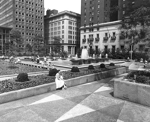
Book Review: Mellon Square – Discovering a Modern Masterpiece
Review: Digital Drawing for Landscape Architecture – 2nd Edition
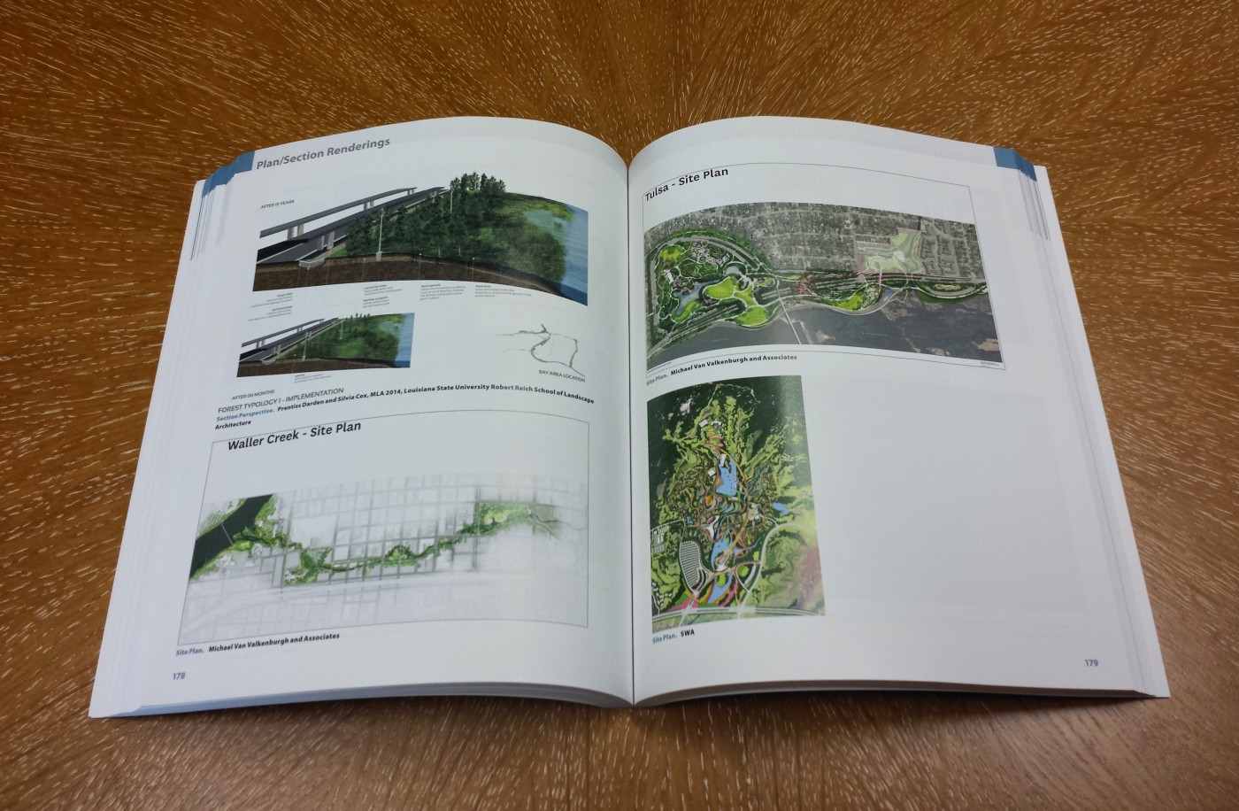
The advent of the digital age has long been upon us. For most practices, this has created an interesting mix of skill sets within an office. Recent graduates have a great handle on the most current programs while those that have been in the industry for a little longer are finding themselves playing catch up. More often than not, a general amount of knowledge and appreciation is present, but the ability to produce the most striking of visuals is usually not there. Digital Drawing for Landscape Architecture is a comprehensive presentation of easy to follow tutorials and guides to help the digitally aware become the digitally adept.
Digital Drawing does an excellent job of stressing the important things about this form of graphic making – flexibility is key. You can achieve the same result a multitude of ways, however, your ability to adjust a graphic quickly down the road will vastly improve the efficiency of your overall project.
Some of the most seemingly mundane tasks that are part of a graphic’s construction are given entire chapters in Digital Drawing – and for good reason. Chapter 8 gives some quick but extremely useful directives for managing large files while Chapter 18 is 10+ pages on importing PDF line work. I believe that getting these mandatory techniques correct is very important because it sets the tone for the rest of your work on a given product. Better layer management, for instance, can be the difference between a quick, last minute edit and a sluggish, deadline missing revision.
Looking for other great resources for your design library?
Head over to our resource section where we have curated a collection of essential Landscape Architecture Books >>
About the Authors:
Benjamin Boyd is a licensed landscape architect working Baltimore, Maryland and is a proud graduate of the University of Florida School of Landscape Architecture. He also writes at Landscape Invocation.
Review: Private Landscapes – Modernist Gardens in Southern California
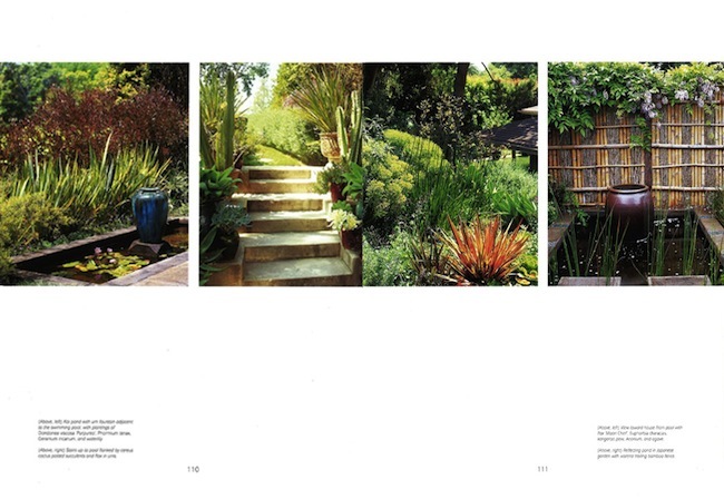
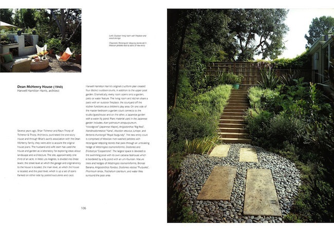
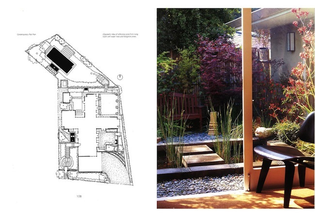
Modern landscapes are a dime a dozen these days, but have you ever wondered how they got started? “Private Landscapes” by Pamela Burton and Marie Botnick explores the development of modernist gardens in this updated paperback reprint of the 2003 original. The book profiles twenty significant homes and landscape gardens created by celebrated architects such as Richard Neutra, Rudolph Schindler, Gregory Ain, Raphael Soriano, Harwell Hamilton Harris, A. Quincy Jones, and John Lautner. Although the Southern California modernist style has been abundantly covered by architectural books over the years, “Private Landscapes” shines the spotlight on the landscapes that helped create a harmonious relations with the home design.
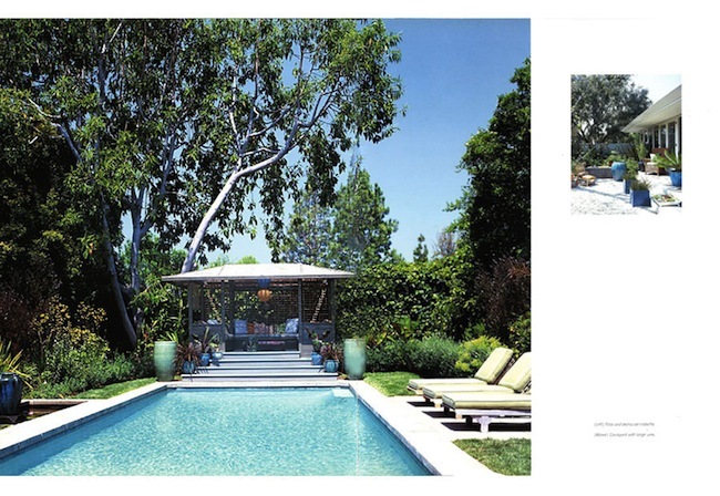
The modernism movement is generally regarded as a European movement (see: Bauhaus), but there are many examples of modernist design in Southern California dating back to 1911, such as the works of Irving Gill. Gill was one of many American architects that contrasted European designers such as Mies van der Rohe in that they included the landscape as an integral park of their designs. The most significant leap in the modernist movement occurred with the arrival of Garrett Eckbo, who brought his work in and around Los Angeles between 1945 and 1965.
(Related Article: Five Modernist Landscape Architects)

Looking for other great resources for your design library?
Head over to our resource section where we have curated a collection of essential Landscape Architecture Books >>
Norway’s “Memorial Wound” for Victims of Massacre is Beautiful Land Art
It’s been nearly three years since a right-wing extremist blew up a bomb in the city of Oslo and then attacked a summer camp on the coast of Norway. These horrifying terror attacks claimed 77 lives in total, marking the deadliest attack in Norway since World War II.
To commemorate the victims, Swedish artist Jonas Dahlberg was recently awarded the bid to design Norway’s memorial after a closed competition. Titled the “Memorial Wound,” the winning entry uses land art as a major component.

The first memorial will be located on the Sørbråten peninsula facing the island of Utøya. The memorial is designed to be a “wound or cut within nature itself,” says Dahlberg. “I noticed how different the feeling was of walking outside in nature, compared to the feeling of walking through the rooms of the main building. The experience of seeing the vacant rooms and the traces of extreme violence brought me—and others around me—to a state of profound sadness.”
Outside, however, the environment feels very different, as though nature was already in regeneration. “Although we stood directly on the very place where many people had lost their lives, nature had already begun to obscure all traces,” he explains.
The design concept slices the rocky promontory in two, creating a 70-foot wide channel between the two land masses. The names of the victims will be inscribed on one side of the gap and a viewing platform for visitors will be located opposite. “The names will be close enough to see and read clearly, yet ultimately out of reach,” says Dahlberg, “the cut is an acknowledgement of what is forever irreplaceable.”
To strengthen the connection between the two memorial sites, Dahlberg proposes using excavated material from the “wound” in Utøya as the foundation for the temporary–and later permanent–memorial in Oslo. Trees and plant life from the rocky island landscape would also be transported to the Oslo site as well.
Similar to the design at Utoya, the Oslo memorial will cut into the land to create another “channel.” One side of the channel is enclosed by a curving wall engraved with the names of those who perished in the attacks, a design reminiscent of the Vietnam Veterans Memorial. The other side would consist of seating or steps that connect to an elevated landscape planted with Utoya trees.
These “symbols of regeneration,” writes Dalhberg, “from the trees along with the inscribed names, will be transferred to the permanent memorial, carrying with them the patina and fullness that comes with the passage of time.”


